# install the `ggridges` package.
install.packages("ggridges")
library(ggridges)

library(tidyverse)
library(ggthemes)
library(hrbrthemes)
library(RColorBrewer)
library(ggrepel)
library(ggtext)
library(skimr)Homework 4
Add Labels and Make Notes on ggplot; Advanced ggplot Charts
📌 Directions
Submit one Quarto document (
.qmd) to Brightspace:danl-310-hw4-LASTNAME-FIRSTNAME.qmd
(e.g.,danl-310-hw4-choe-byeonghak.qmd)
Due: April 20, 2026, 11:59 P.M. (ET)
✅ Setup
Question 1
Use the following data.frame for Question 1.
hdi_corruption <- read_csv(
'https://bcdanl.github.io/data/hdi_corruption.csv')formulais available ingeom_smooth()formula = y ~ log(x):geom_smooth()fits withy ~ log(x).
Code
country_highlight <- c("Germany", "Norway", "United States",
                       "Greece", "Singapore",
                       "Argentina", "Senegal",
                       "China", "Egypt", "South Africa")

corruption <- hdi_corruption |>
  mutate(label = ifelse(country %in% country_highlight, country, NA))


ggplot(data = corruption |> filter(year == 2014),
       aes(cpi, hdi)) +
  geom_smooth(method = lm,
              color = "maroon",
              fill = "maroon",
              lwd = 2,
              formula = "y ~ log(x)",
              se = T) +
  geom_point(
    aes(fill = region),
    size = 2.5,
    alpha = 0.5,
    shape = 21
  ) +
  geom_text_repel(
    aes(label = label),
    size = 6,
    box.padding = 2.5,
    face = "bold"
  ) +
  scale_y_continuous(
    limits = c(0.3, 1.05),
    breaks = c(0.2, 0.4, 0.6, 0.8, 1.0),
    name = "Human Development Index, 2014\n(1.0 = most developed)"
  ) +
  scale_x_continuous(
    limits = c(10, 95),
    breaks = c(20, 40, 60, 80, 100),
    name = "Corruption Perceptions Index, 2014 (100 = least corrupt)"
  ) +
  scale_fill_tableau() +
  guides(fill = guide_legend(nrow = 2,
                             override.aes = list(alpha = 1,
                                                 size = 5)),
         color = "none"
         ) +
  theme_minimal() +
  theme(
    plot.margin = unit( c(1.75, .75, .75, .5), "cm"),
    legend.position = c(.5, 1.05),
    legend.direction = "horizontal",
    legend.text = element_text(size = 12),
    legend.title = element_text(face = "bold",
                                size = rel(1.5))
  ) +
  labs( color = "Region",
fill = "Region") 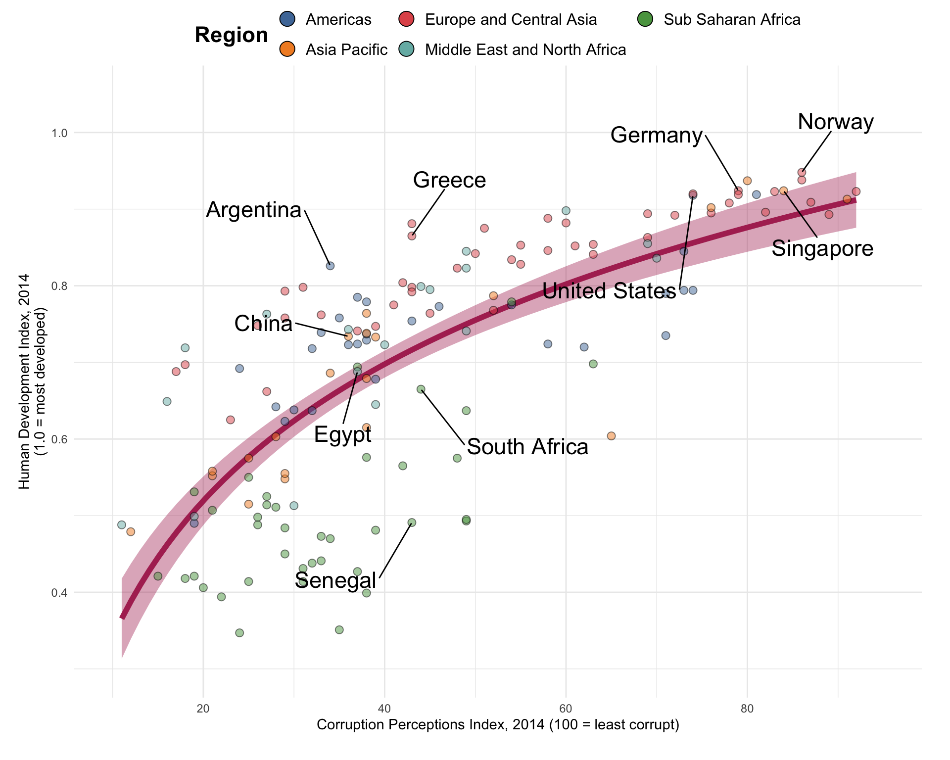
Question 2
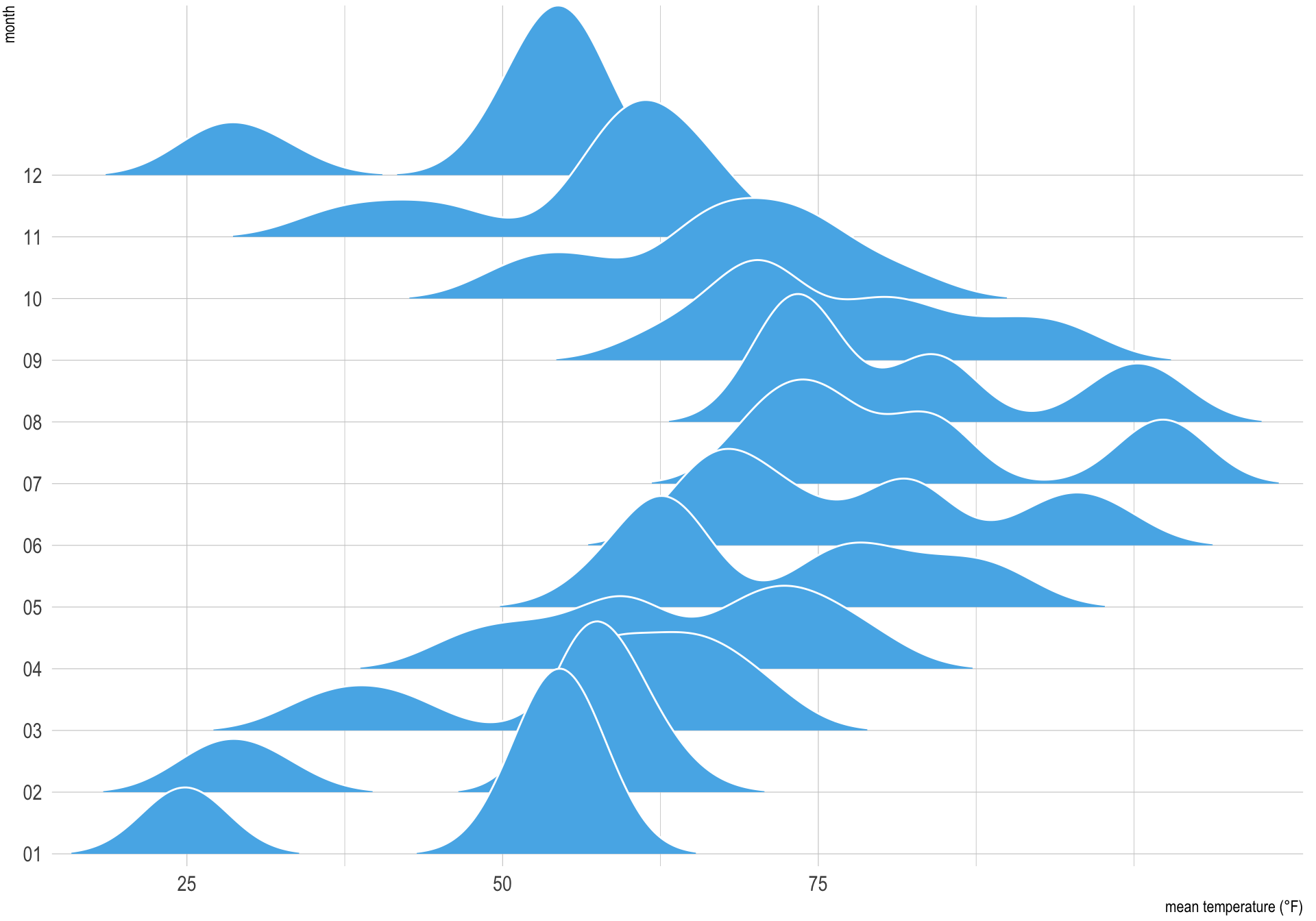
Use the data.frame ncdc_temp and ggridges::geom_density_ridges() for Question 2.
ncdc_temp <- read_csv(
  'https://bcdanl.github.io/data/ncdc_temp_cleaned.csv')
Code
p <- ggplot(ncdc_temp,
            aes(x = temperature, y = month))

p + geom_density_ridges( # Adds a layer to the ggplot object with a smoothed density plot of the temperature data using the 'ridgeline' plot type.
  scale = 3,
  rel_min_height = 0.01, # Sets the scaling and minimum relative height for the plot.
  bandwidth = 3.4,
  fill = "#56B4E9",
  color = "white" # Sets the bandwidth for the plot, as well as the fill and color for the plot elements.
) +

scale_x_continuous( # Adds a scale to the x-axis for continuous values.
  name = "mean temperature (°F)", # Sets the label for the x-axis.
  expand = c(0, 0),
  breaks = c(0, 25, 50, 75) # Sets the expansion and the break points for the x-axis.
) +

scale_y_discrete(
  name = "month",
  expand = c(0, .2, 0, 2.6)) + # Adds a scale to the y-axis for discrete (categorical) values, with a label and a custom expansion.

theme_ipsum() +

theme( # Applies a custom theme to the ggplot object.
  plot.margin = margin(3, 7, 3, 1.5) # Sets the margin of the plot.
)
Question 3
Use the following data.frame for Question 3.
starbucks <- read_csv(
  'https://bcdanl.github.io/data/starbucks.csv')
Variable description
Product_Name: Product NameSize: Size of drink (short, tall, grande, venti)Milk: Milk Type type of milk used0none1nonfat22%3soy4coconut5whole
Whip: Whip added or not (binary 0/1)Serv_Size_mL: Serving size in mlCalories: KCalTotal_Fat_g: Total fat gramsSaturated_Fat_g: Saturated fat gramsTrans_Fat_g: Trans fat gramsCholesterol_mg: Cholesterol mgSodium_mg: Sodium milligramsTotal_Carbs_g: Total Carbs gramsFiber_g: Fiber gramsSugar_g: Sugar gramsCaffeine_mg: Caffeine in milligrams
Q3a
- Add the following two variables to
starbucksdata.framecaffeine_mgml: Caffeine in milligrams per mLcalories_kcml: Calories KCal per mL
Code
starbucks1 <- starbucks |>
  mutate(caffeine_mgml = caffeine_mg / serv_size_m_l,
         calories_kcml = calories/ serv_size_m_l,
         .before = 1) |>
  select(product_name, size, serv_size_m_l, milk, whip, caffeine_mgml, calories_kcml)
Q3b
- Calculate a mean
caffeine_mgmland a meancalories_kcmlfor eachproduct_name.
Code
starbucks2 <- starbucks1 |>
  group_by(product_name) |>
  summarise(caffeine_mgml = mean(caffeine_mgml, na.rm = T),
            calories_kcml = mean(calories_kcml, na.rm = T)
  ) |>
  mutate(rank_caffeine = dense_rank(-caffeine_mgml),
         rank_calories = dense_rank(-calories_kcml)) |>
  filter(rank_caffeine <= 10 |rank_calories <= 10 )
Q3c
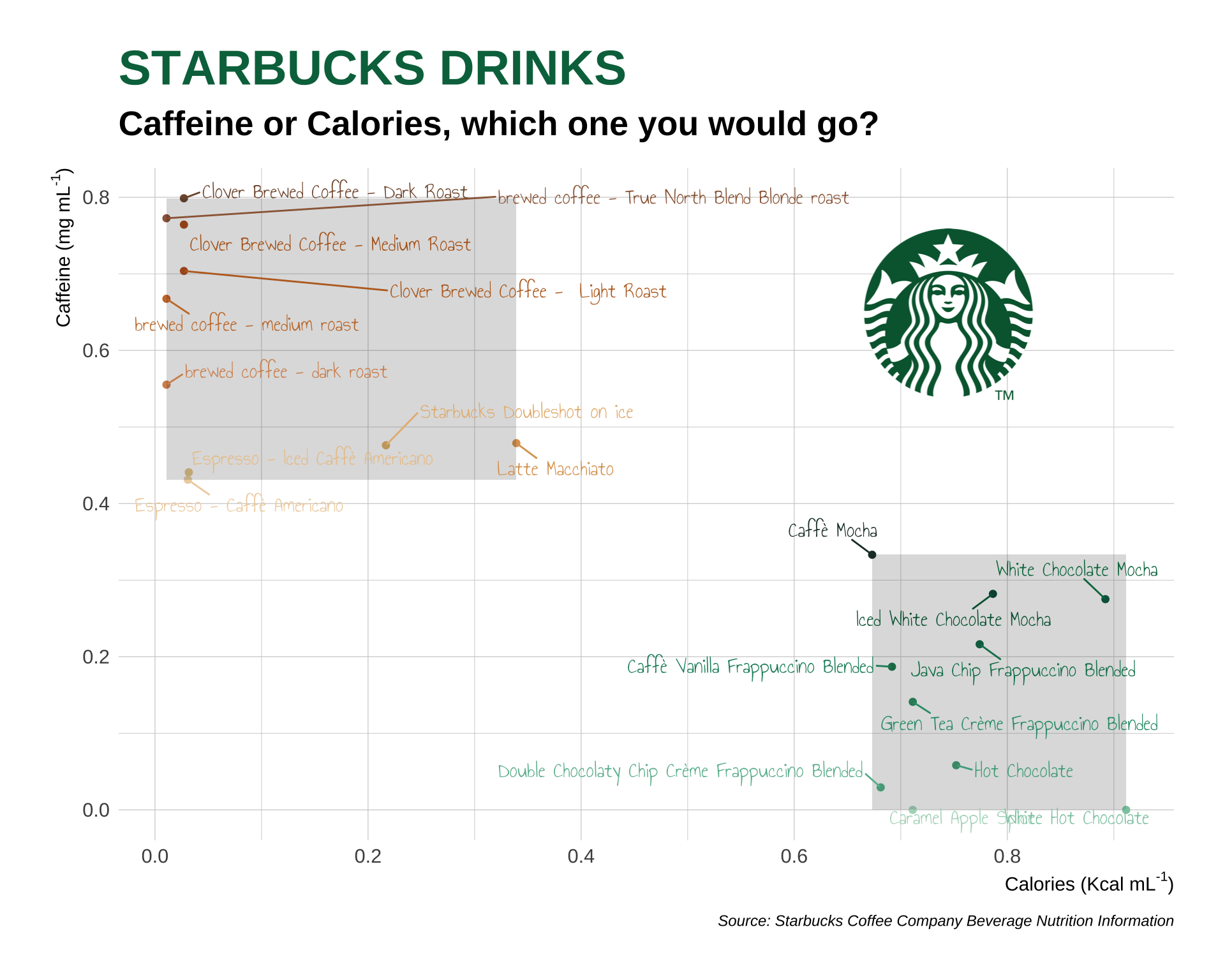
For the top 10
product_namein terms ofcaffeine_mgmland the top 10product_namein terms ofcalories_kcml, replicate the ggplot below.Use the following commands for showing texts in the plot:
# install.packages("showtext")
library(showtext)
showtext_auto()
font_add_google("Annie Use Your Telescope", "annie")- Use the following
annotate()geom to insert the starbucks image in the plot:
# install.packages("ggtext")
library(ggtext)
img_href <- "<img src='https://bcdanl.github.io/lec_figs/starbucks.png' width='100'/>"

annotate("richtext",
           x =  ,
           y =  ,
           label = img_href,
           fill =  ,
           size =  ,
color = )- Use the following
geom_text_repel()geom to use theanniefont
geom_text_repel(size =  ,
                max.overlaps = ,
                box.padding =  ,
family = "annie")- Use the following colors for labels
caffeine_10 <- c(
  "#1E3932",
  "#006241",
  "#00754A",
  "#0A7F5A",
  "#198C6A",
  "#2E9B7A",
  "#49AA8A",
  "#6ABA9C",
  "#8CC9AF",
  "#AED8C2"
)

calories_10 <- c(
  "#7F5539",
  "#9C6644",
  "#B5651D",
  "#BC6C25",
  "#C97A34",
  "#D4915D",
  "#DDA15E",
  "#E6B980",
  "#EBC799",
  "#EFD2AD"
)- Use the color,
"#00704A", for the title.
Answer:
starbucks_caffeine <- starbucks2 |> filter(rank_caffeine <= 10)
starbucks_calories <- starbucks2 |> filter(rank_calories <= 10)

caffeine_10 <- c(
  "#1E3932",
  "#006241",
  "#00754A",
  "#0A7F5A",
  "#198C6A",
  "#2E9B7A",
  "#49AA8A",
  "#6ABA9C",
  "#8CC9AF",
  "#AED8C2"
)

calories_10 <- c(
  "#7F5539",
  "#9C6644",
  "#B5651D",
  "#BC6C25",
  "#C97A34",
  "#D4915D",
  "#DDA15E",
  "#E6B980",
  "#EBC799",
  "#EFD2AD"
)

drink_label_colors <- c(rev(caffeine_10), rev(calories_10))

starbucks2 |>
  mutate(product_name =
           fct_reorder(product_name, caffeine_mgml)) |>
  ggplot(aes(x = calories_kcml,
             y = caffeine_mgml,
             color = product_name,
             label = product_name)) +
  geom_point(show.legend = FALSE) +
  geom_rect(aes(xmin = min(starbucks_caffeine$calories_kcml),
                xmax = max(starbucks_caffeine$calories_kcml),
                ymin = min(starbucks_caffeine$caffeine_mgml),
                ymax = max(starbucks_caffeine$caffeine_mgml)),
            fill = "#27251F",
            color = NA,
            alpha = 0.008)+
  geom_rect(aes(xmin = min(starbucks_calories$calories_kcml),
                xmax = max(starbucks_calories$calories_kcml),
                ymin = min(starbucks_calories$caffeine_mgml),
                ymax = max(starbucks_calories$caffeine_mgml)),
            fill = "#27251F",
            color = NA,
            alpha = 0.008)+
  geom_text_repel(max.overlaps = 6,
                  size = 4.5,
                  box.padding = 0.67,
                  family = "annie") +
  annotate("richtext",
           x = quantile(starbucks2$calories_kcml, probs = .78),
           y = quantile(starbucks2$caffeine_mgml, probs = .78),
           label = "<img src='https://bcdanl.github.io/lec_figs/starbucks.png' width='100'/>",
           fill = NA,
           size = rel(2.25),
           color = NA) +
  scale_x_continuous(breaks = seq(0, 1, .2)) +
  scale_y_continuous(breaks = seq(0, 1, .2)) +
  scale_color_manual(values = drink_label_colors) +
  labs(y = expression(paste("Caffeine (mg mL"^"-1",")")),
       x = expression(paste("Calories (Kcal mL"^"-1",")")),
       caption = "Source: Starbucks Coffee Company Beverage Nutrition Information",
       title = "STARBUCKS DRINKS",
       subtitle = "Caffeine or Calories, which one you would go?") +
  guides(color = "none",
         label = "none") +
  theme_ipsum() +
  theme(plot.title = element_text(color = "#00704A",
                                  face = 'bold',
                                  size = rel(2.5)),
        plot.subtitle = element_text(face = 'bold',
                                  size = rel(1.75)),
        axis.title.x = element_text(face = 'bold',
                                  size = rel(1.25)),
        axis.title.y = element_text(face = 'bold',
                                  size = rel(1.25)))