Exam
DANL 310-01: Data Visualization and Presentation
Descriptive Statistics
The distribution of scores for Midterm Exam is shown below:
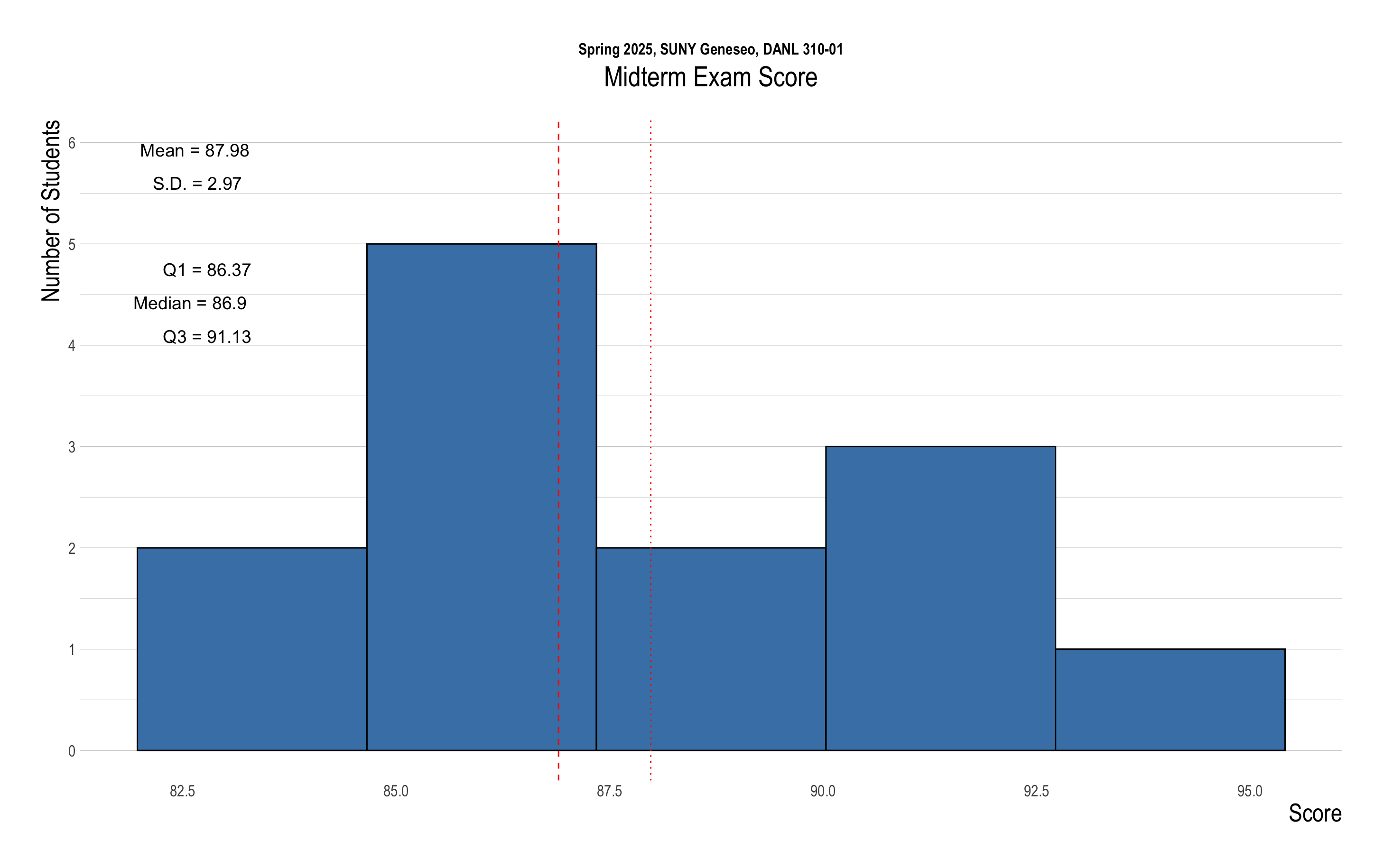
The following provides the descriptive statistics for each part of the Midterm Exam:
Below is R packages for this exam:
library(tidyverse)
library(ggthemes)
library(hrbrthemes)
library(lubridate)
library(socviz)Question 1
The walmart data.frame is for Question 1:
walmart <- read_csv("https://bcdanl.github.io/data/walmart_albers.csv")Variable Description
opendate: Opening date of original storest.address: Addresscity: Citystate: State (abbreviated)type: Store type- Wal-MartStore: The traditional Walmart retail format, typically smaller than a SuperCenter. It focuses on a broad mix of general merchandise with a limited grocery selection. It’s designed for convenience, serving local communities with everyday products.
- SuperCenter: A large, full-service retail store that combines a comprehensive grocery supermarket with a wide range of general merchandise, pharmacy services, and additional offerings such as a garden center or auto care. It serves as a one-stop shop for a variety of daily needs.
- DistributionCenter: Unlike the retail locations, a DistributionCenter is a logistics and warehousing facility. It doesn’t sell directly to consumers; instead, it stores, organizes, and distributes products to Walmart stores, ensuring efficient supply chain management.
x_albers: Longitudey_albers: Latitude
Additionally, below data.frame is for Q1a and Q1b:
county_data <- socviz::county_dataQ1a (Points: 12.5)
- Provide code and a brief explanation to explore the relationship between the following two state-level variables:
n: Number of Walmart stores in a statepop: State population size
- What kind of pattern do you observe, and why might this pattern exist?
Example Answer:
- Data preparation
Click to Check the Answer!
state_data <- county_data |>
group_by(state) |>
summarise(pop = sum(pop, na.rm = T),
hh_income = mean(hh_income, na.rm = T),
)
state_walmart <- walmart |>
group_by(state) |>
summarise(n = n()) |>
left_join(state_data)- Visualization 1
Click to Check the Answer!
state_walmart |>
ggplot(aes(x = pop, y = n)) +
geom_point() +
geom_smooth(method = lm)
- Visualization 2
Click to Check the Answer!
state_walmart |>
ggplot(aes(x = log(pop), y = log(n))) +
geom_point() +
geom_smooth(method = lm)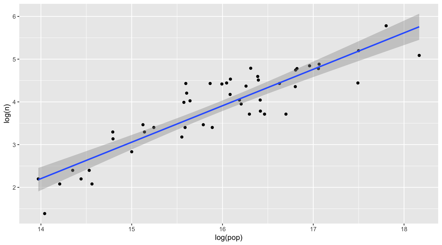
- Brief Explanation:
- State population size is positively associated with the number of Walmart stores in a state.
- Walmart may prefer new store locations in areas with large population sizes.
Q1b (Points: 15)
- Provide code and a brief explanation to explore how the relationship between the following two state-level variables varies by Walmart
type:n: Number of Walmart stores in a statehh_income: Average of county-level median household income in the state
- What kind of pattern do you observe, and why might this pattern exist?
Example Answer:
- Data preparation
Click to Check the Answer!
state_walmart <- walmart |>
group_by(state, type) |>
summarise(n = n()) |>
left_join(state_data)- Visualization 1
Click to Check the Answer!
state_walmart |>
ggplot(aes(x = hh_income, y = n)) +
geom_point() +
geom_smooth(method = lm) +
facet_wrap(~type)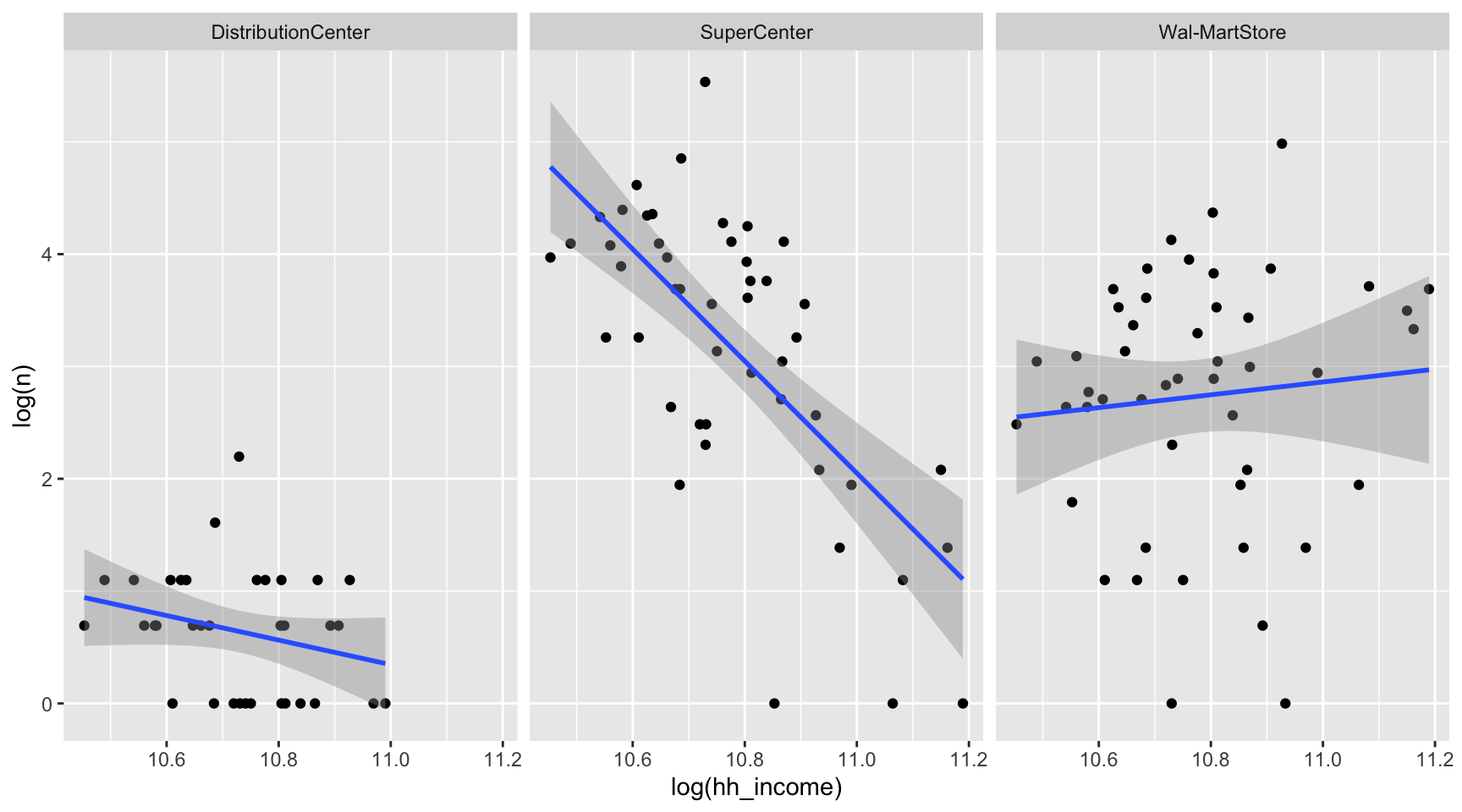
- Visualization 2
Click to Check the Answer!
state_walmart |>
ggplot(aes(x = log(hh_income), y = log(n))) +
geom_point() +
geom_smooth(method = lm) +
facet_wrap(~type)
- Brief Explanation:
- The number of SuperCenter is negatively associated with household income in the state
- The number of Wal-MartStore in a state is nearly independent with that.
- The number of DistributionCenter in a state is independent with that.
- This suggests that Walmart SuperCenter may favor locations with lower-income households over those with higher-income households.
Q1c (Points: 20)
- Replicate the above ggplot using the
walmartdata.frame.cumsum()can be useful.cumsum()compute a cumulative sum. For example, below explains how it works:
# Create a sample tibble with numbers
df <- tibble(
day = 1:10,
value = c(5, 3, 6, 2, 4, 7, 1, 8, 3, 5)
)
# Calculate the cumulative sum of 'value'
df <- df |>
mutate(cumulative_value = cumsum(value))# Create a sample tibble with a grouping variable
df <- tibble(
group = rep(c("A", "B"), each = 5),
day = rep(1:5, times = 2),
value = c(1, 2, 3, 4, 5, 10, 20, 30, 40, 50)
)
# Calculate the cumulative sum of 'value' for each group separately
df_grouped <- df |>
group_by(group) |>
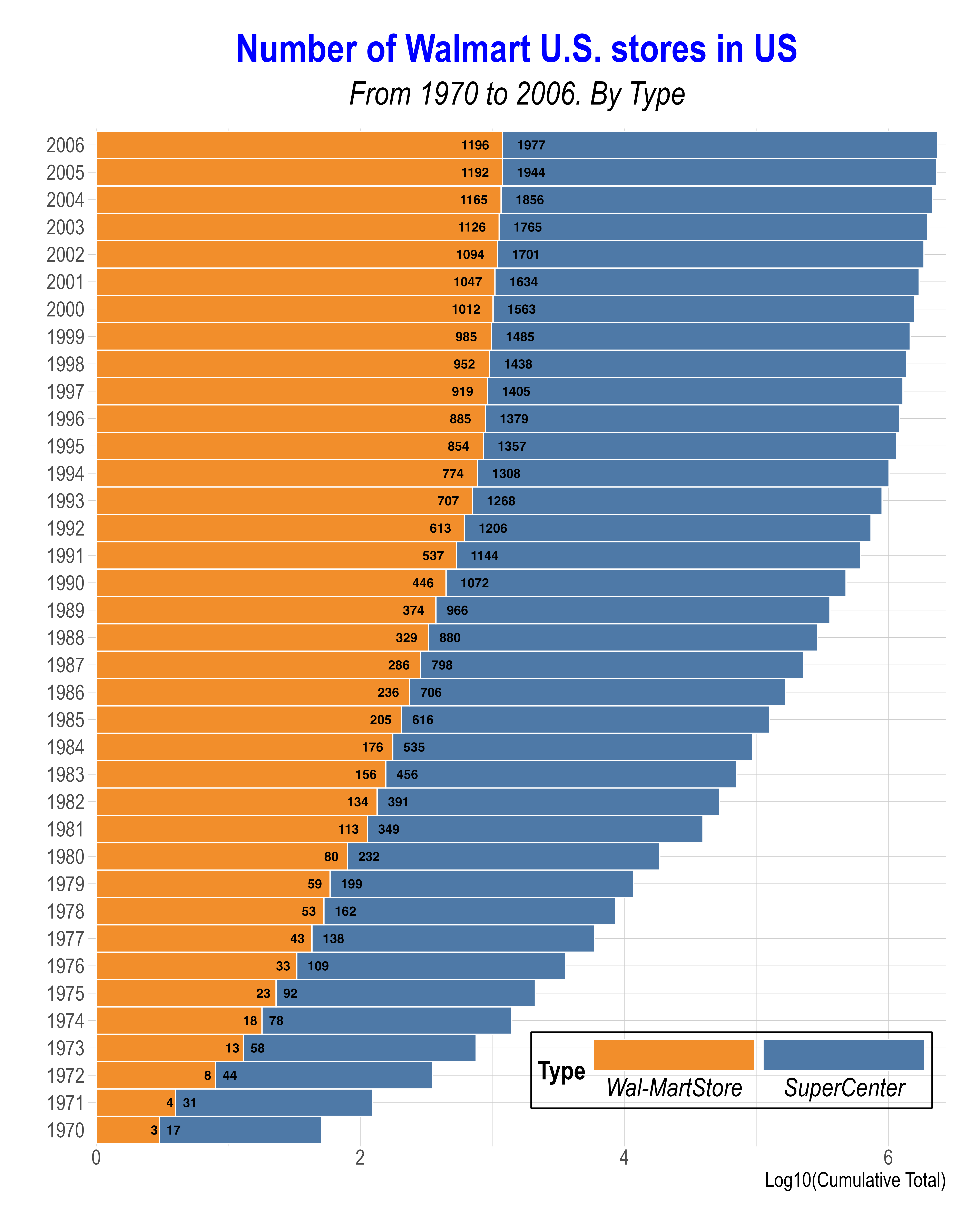
mutate(cumulative_value = cumsum(value))Note that each number within a bar segment represents the number of Walmart stores for that particular
Typein a given year, while the x-axis is scaled on a base-10 logarithmic scale.The given figure uses color-blind friendly colors from
scale_*_tableau()Below is for the labeling:
txt_y = "Log10(Cumulative Total)"
txt_title = "Number of Walmart U.S. stores in US"
txt_subtitle = "From 1970 to 2006. By Type"Example Answer:
- Data preparation 1
Click to Check the Answer!
q1c_mid <- walmart |>
mutate(year = year(opendate)) |>
count(year, type) |>
group_by(type) |>
mutate(tot = cumsum(n)) |>
filter(type != 'DistributionCenter', year >= 1970)
q1c_mid_loc <- q1c_mid |>
filter(type == "Wal-MartStore") |>
mutate(type = "SuperCenter") |>
select(-n) |>
rename(tot_loc = tot)
q1c_mid <- q1c_mid |>
left_join(q1c_mid_loc)- Visualization 1
Click to Check the Answer!
p <- ggplot(q1c_mid, aes(y = factor(year))) +
geom_col(aes(x = log10(tot),
fill = type),
width = 1, color = "white") +
geom_text(data = q1c_mid |> filter(type == "Wal-MartStore"),
aes(x = .95*log10(tot),
label = tot),
size = rel(4),
hjust = .75,
fontface = 'bold') +
geom_text(data = q1c_mid |> filter(type == "SuperCenter"),
aes(x = log10(tot_loc), label = tot),
size = rel(4),
hjust = -.5,
fontface = 'bold') +
scale_fill_tableau() +
scale_x_continuous(expand = c(0.01,0)) +
guides(fill = guide_legend(reverse = TRUE,
title.position = "left",
label.position = "bottom",
keywidth = 10,
nrow = 1)) +
labs(y = "", x = "Log10(Cumulative Total)", fill = "Type",
title = "Number of Walmart U.S. stores in US",
subtitle = "From 1970 to 2006. By Type") +
theme_ipsum() +
theme(
legend.position = c(0.75, 0.075),
legend.background = element_rect(color = "black", fill = NA),
legend.text = element_text(size = rel(2),
face = 'italic'),
legend.title = element_text(size = rel(2),
face = 'bold'),
legend.key.size = unit(2, "lines"),
axis.text.y = element_text(size = rel(2)),
axis.text.x = element_text(size = rel(2)),
axis.title.x = element_text(size = rel(2)),
plot.title = element_text(size = rel(3),
hjust = .5,
face = 'bold',
color = 'blue'),
plot.subtitle = element_text(size = rel(2.5),
hjust = .5,
face = 'italic')
)
p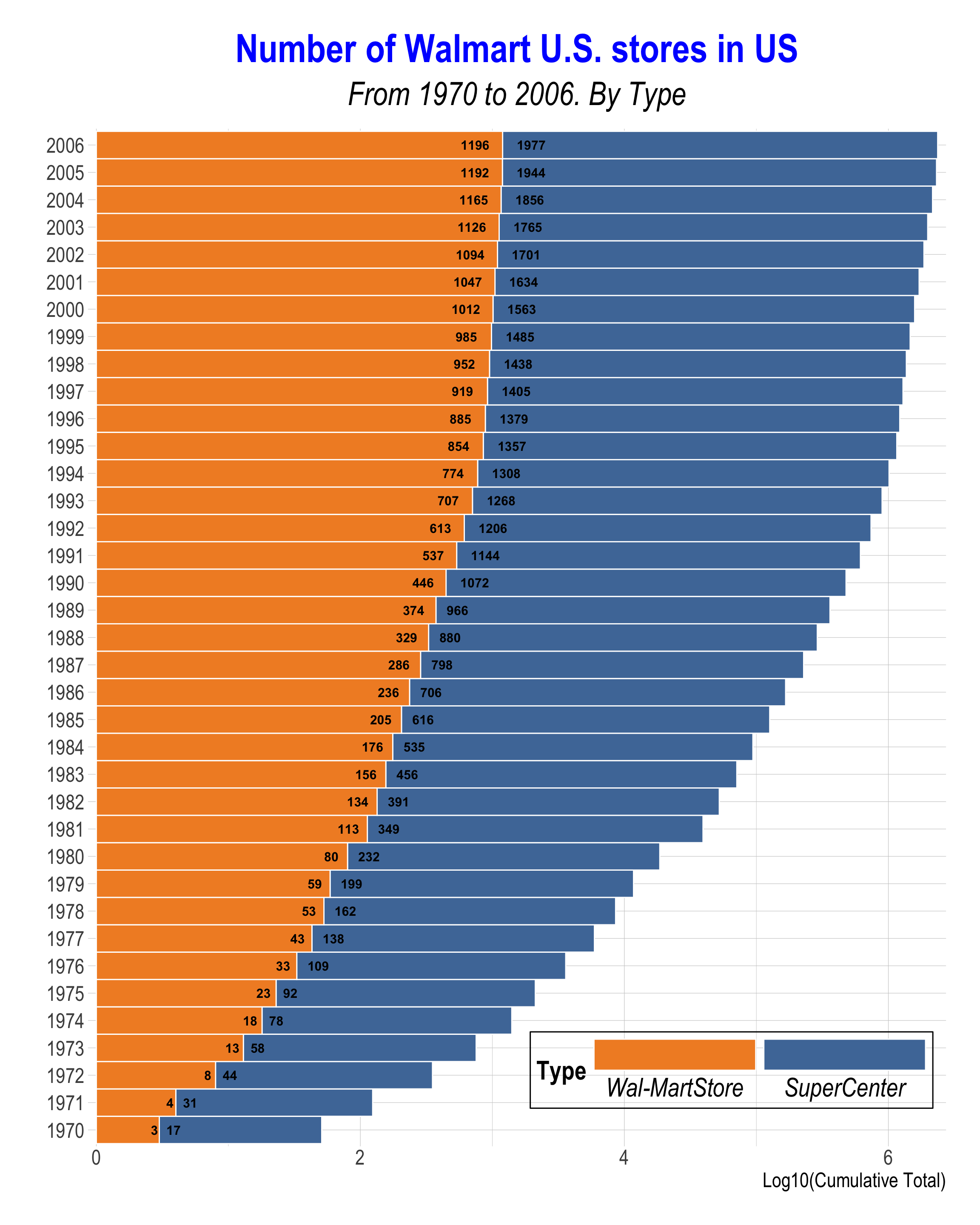
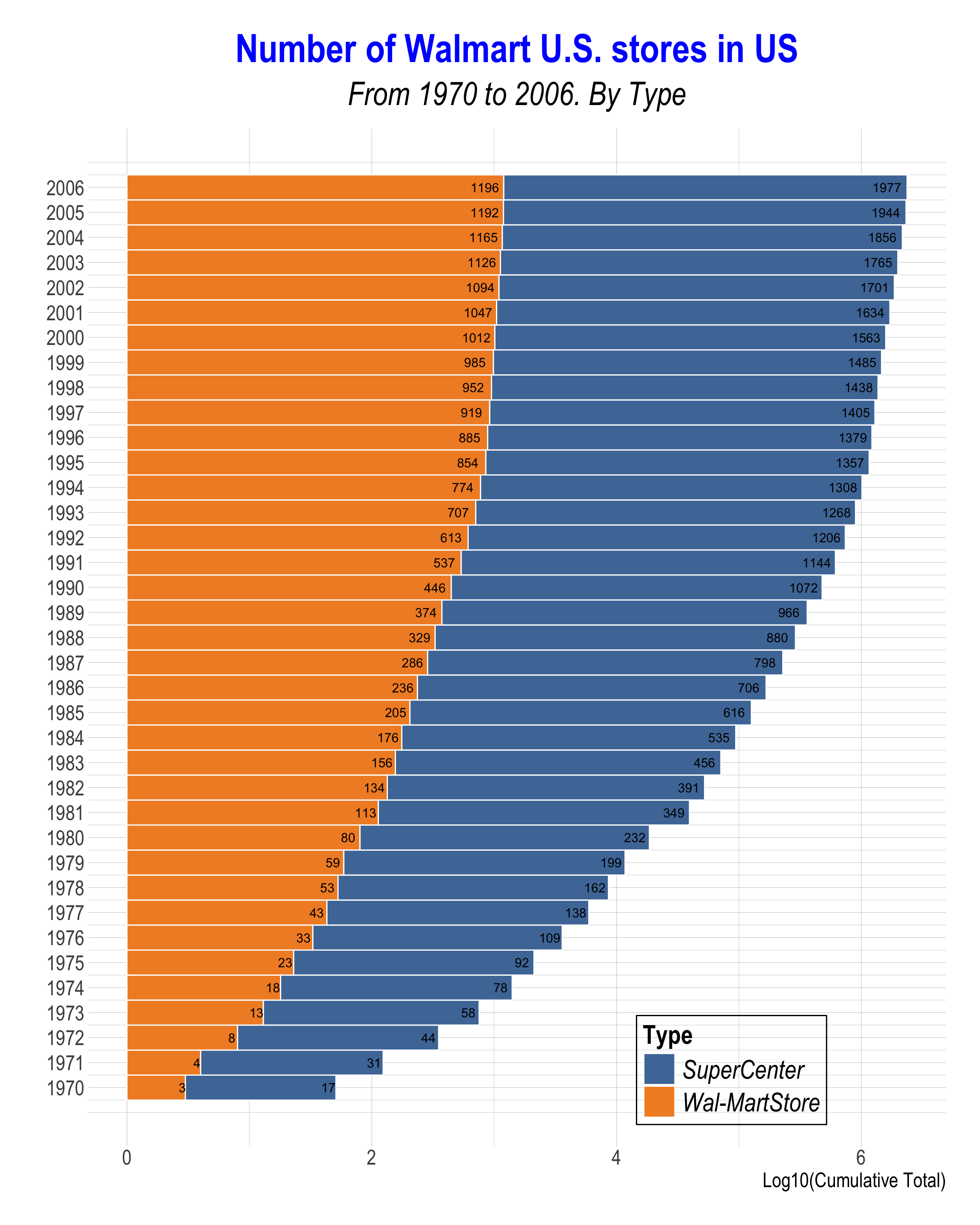
- c.f., Data preparation 2
Click to Check the Answer!
q1c2 <- walmart |>
mutate(year = year(opendate)) |>
count(year, type) |>
group_by(type) |>
mutate(tot = cumsum(n))- c.f., Visualization 2
Click to Check the Answer!
# Plot with position_stack
q1c2 |>
filter(type != 'DistributionCenter',
year >= 1970) |>
ggplot(aes(x = year, y = log10(tot),
fill = type)) +
geom_col(width = 1,
color = 'white') +
geom_text(aes(label = tot),
position = position_stack(vjust = .95),
size = rel(4)) +
scale_fill_tableau() +
scale_x_continuous(breaks = seq(1970,2006,1)) +
coord_flip() +
labs(x = "", y = "Log10(Cumulative Total)", fill = "Type",
title = "Number of Walmart U.S. stores in US",
subtitle = "From 1970 to 2006. By Type") +
theme_ipsum() +
theme(
legend.position = c(0.75, 0.075),
legend.background = element_rect(color = "black", fill = NA),
legend.text = element_text(size = rel(2),
face = 'italic'),
legend.title = element_text(size = rel(2),
face = 'bold'),
legend.key.size = unit(2, "lines"),
axis.text.y = element_text(size = rel(2)),
axis.text.x = element_text(size = rel(2)),
axis.title.x = element_text(size = rel(2)),
plot.title = element_text(size = rel(3),
hjust = .5,
face = 'bold',
color = 'blue'),
plot.subtitle = element_text(size = rel(2.5),
hjust = .5,
face = 'italic')
)
Q1d (Points: 25)
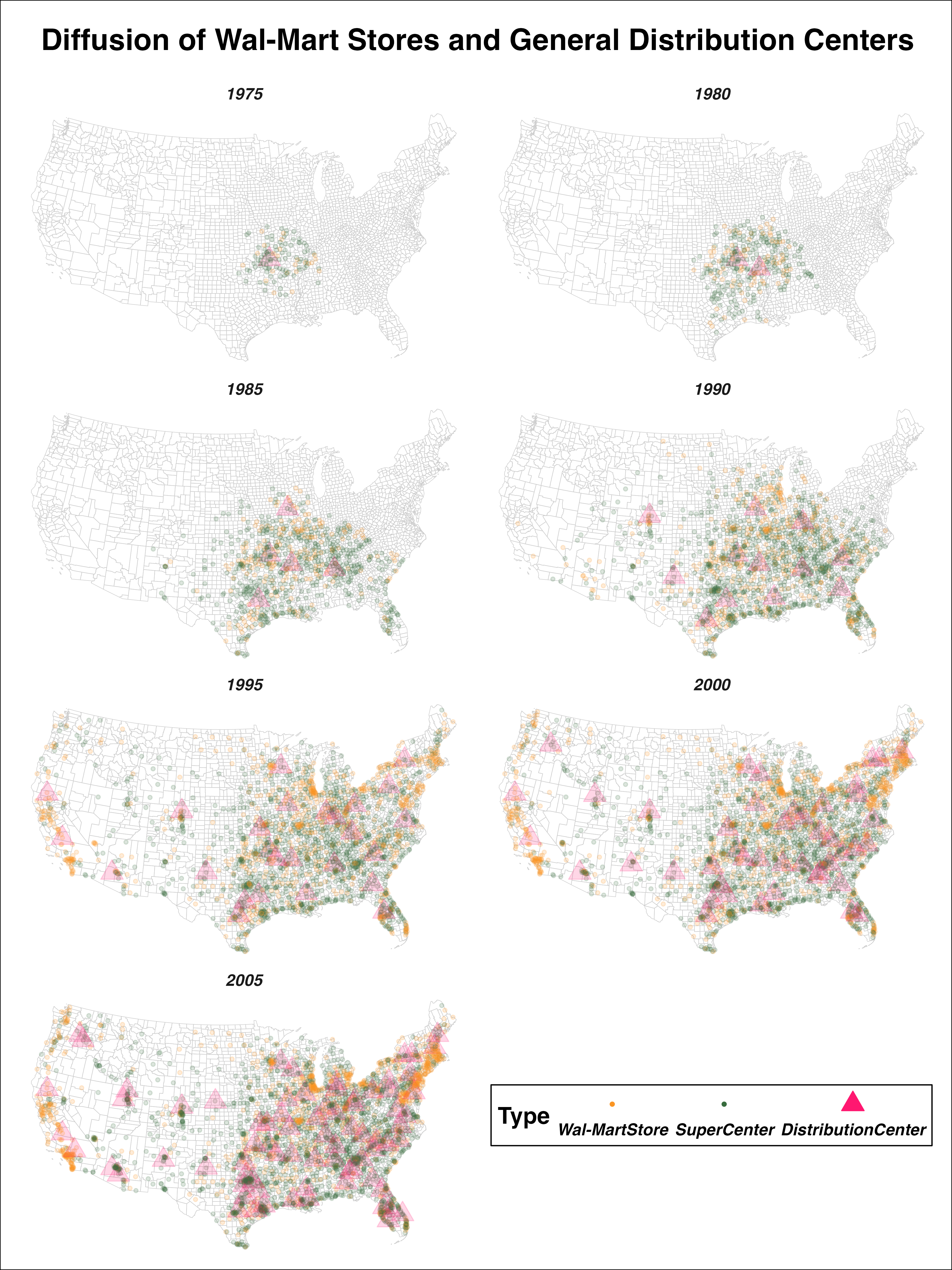
- Replicate the above ggplot map using the
walmartdata.frame and the following two data.frames:
county_map <- socviz::county_map