pop <-read_csv("https://bcdanl.github.io/data/us_population_age_group_5yr_1900_2024_long.csv")
Code
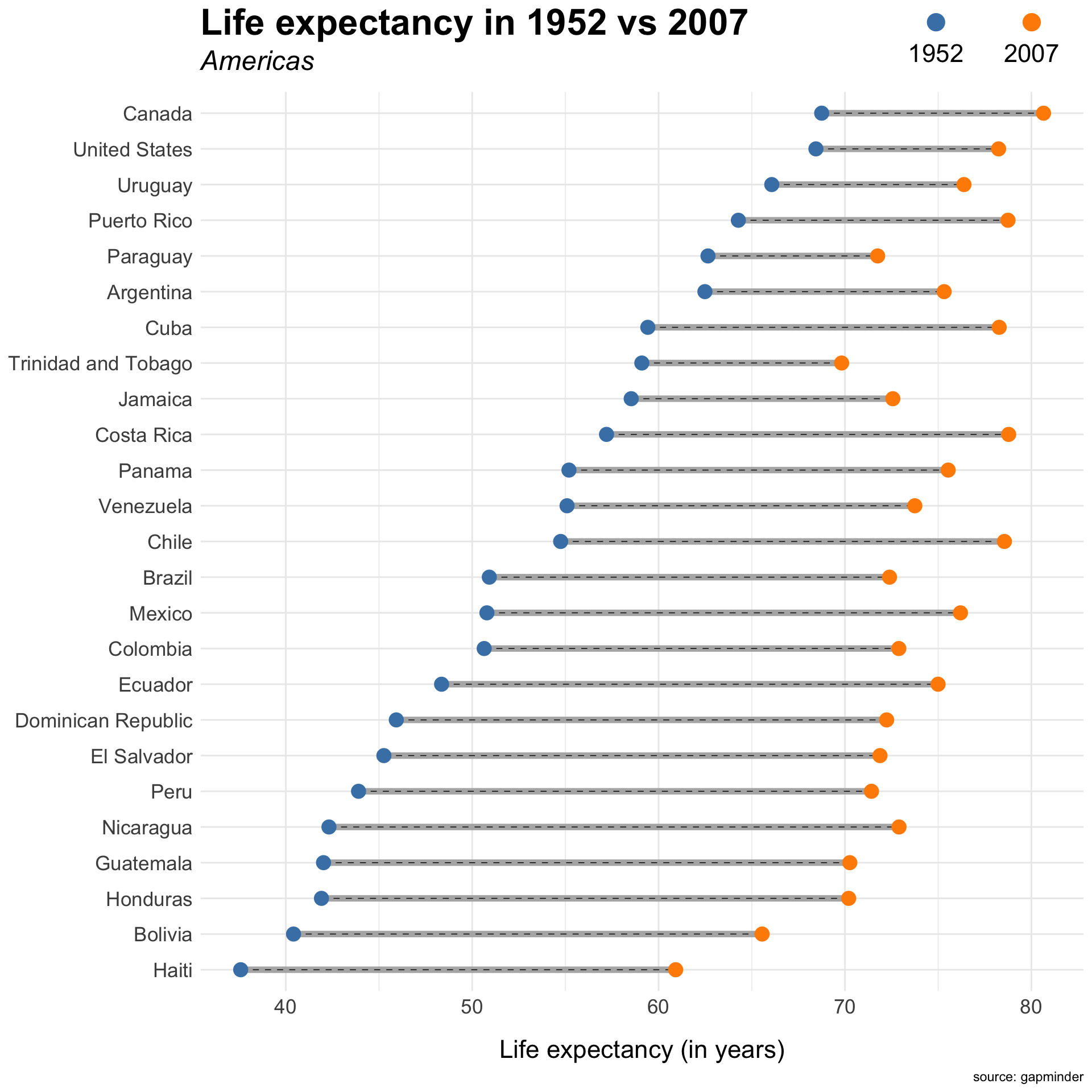
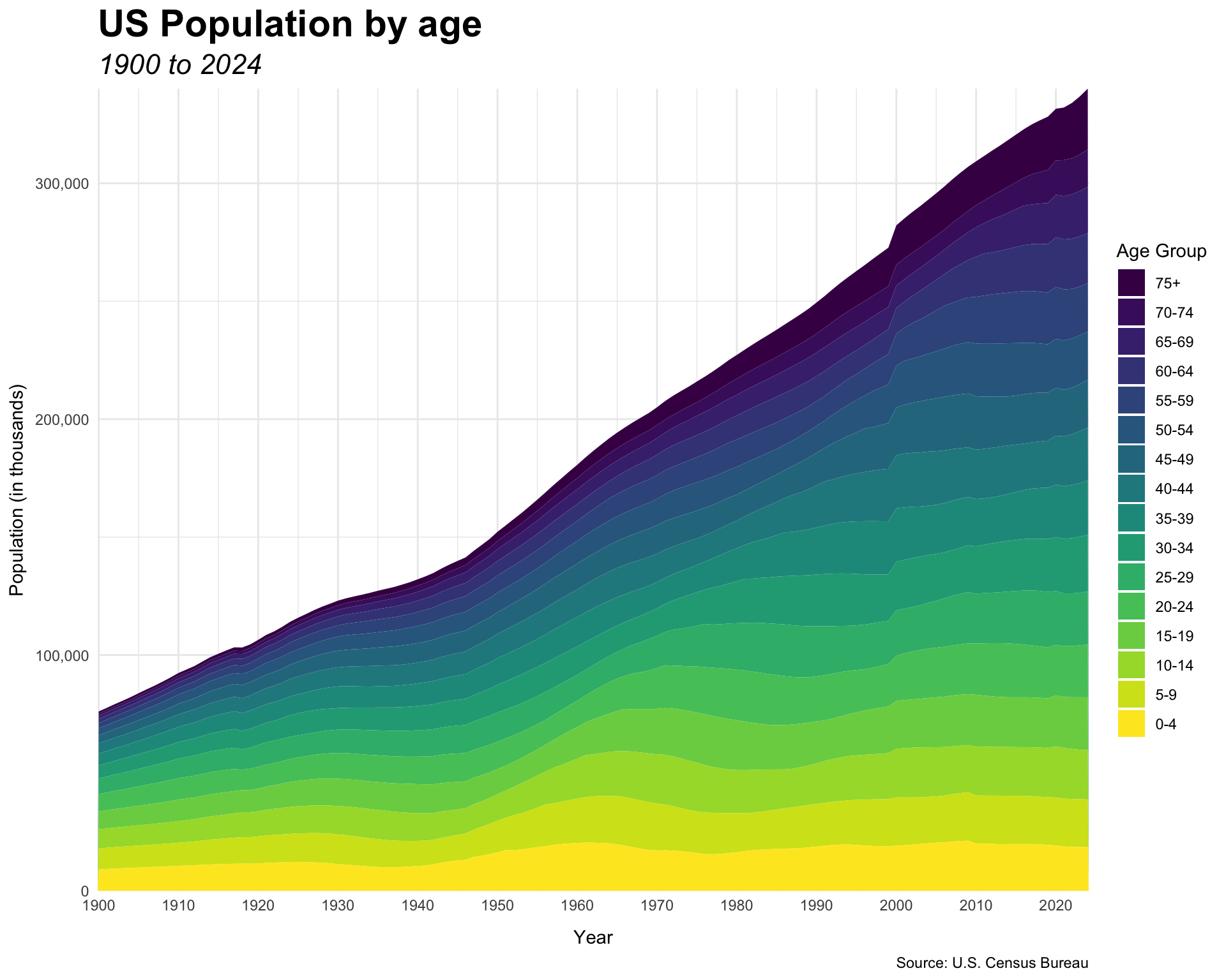
pop2 <- pop |>filter(age_group !="all", sex =="both") |>mutate(age_group =factor(age_group,levels =c("0-4", "5-9", "10-14", "15-19", "20-24", "25-29", "30-34", "35-39", "40-44", "45-49", "50-54", "55-59", "60-64", "65-69", "70-74", "75+") ),age_group =fct_rev(age_group))pop2 |>ggplot(aes(x = year,y = population/1000, fill = age_group)) +geom_area(color =NA) +labs(title ="US Population by age",subtitle ="1900 to 2024",caption ="Source: U.S. Census Bureau",x ="Year",y ="Population (in thousands)",fill ="Age Group") +scale_fill_viridis_d() +scale_y_comma(expand =c(0,0)) +scale_x_continuous(breaks =seq(1900,2020, 10),expand =c(0,0)) +theme_minimal() +theme(axis.title.x =element_text(margin =margin(t =10)),axis.title.y =element_text(margin =margin(r =5)),plot.title =element_text(size =rel(2),face ="bold"),plot.subtitle =element_text(size =rel(1.5),face ="italic") )
Question 4. Stream Charts
Code
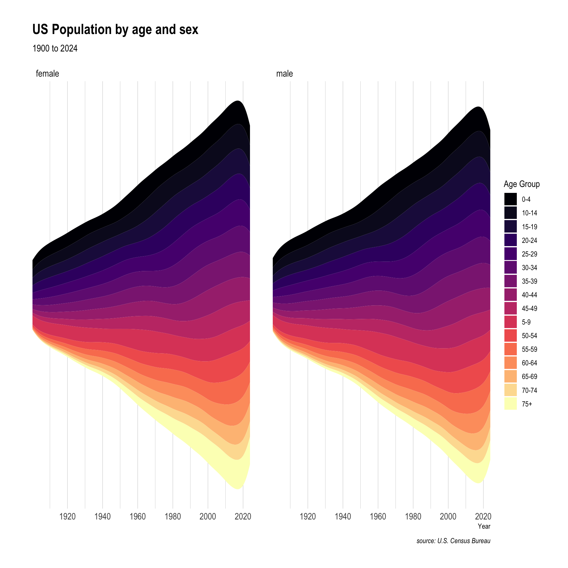
pop |>filter(age_group !="all", sex !="both") |>ggplot(aes(x = year,y = population, fill = age_group)) +geom_stream() +facet_wrap(~sex) +labs(title ="US Population by age and sex",subtitle ="1900 to 2024",caption ="source: U.S. Census Bureau",x ="Year",y ="",fill ="Age Group") +scale_fill_viridis_d(option ="magma") +scale_x_continuous(breaks =seq(1900,2020, 20),expand =c(0,0)) +theme_ipsum() +theme(panel.grid.major.y =element_blank(),panel.grid.minor.y =element_blank(),axis.text.y =element_blank())
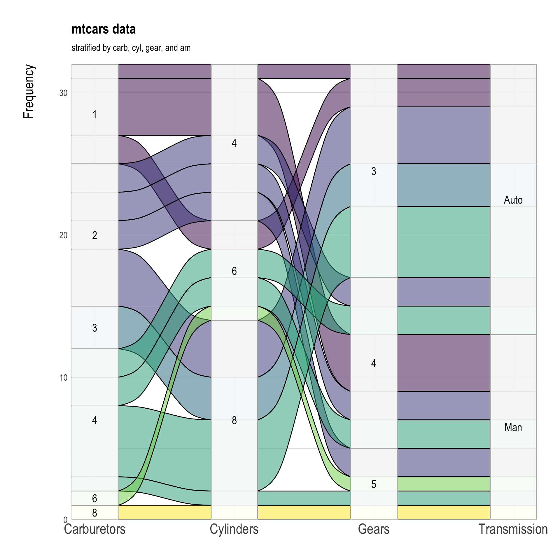
Question 5. Alluvial Diagrams
Use variables am, cyl, gear, and carb in the data.frame datasets::mtcars.
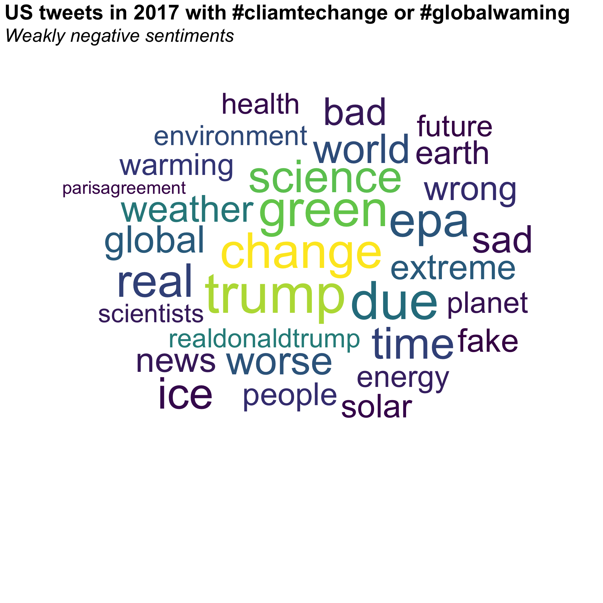
x_words <- x_cc_neg_weak |>mutate(content =str_remove_all(content, "<[^>]+>"), # remove HTML tagscontent =str_remove_all(content, "http[s]?://\\S+"), # remove URLscontent =str_squish(content) # trim ends and collapse repeated whitespace into single spaces ) |>unnest_tokens(word, content) |>anti_join(stop_words, by ="word") |>filter(str_detect(word, "^[a-z]+$") # keep only pure alphabetic words ) |>count(word, sort =TRUE) |>filter(!(word %in%c("climatechange", "globalwarming","rt", "climate"))) |>filter(dense_rank(-n) <=30)x_words |>ggplot(aes(label = word, size = n,color = n)) +geom_text_wordcloud_area() +scale_size_area(max_size =50)+scale_color_viridis_c(option ="D") +theme_minimal() +theme(panel.grid =element_blank(),plot.title =element_text(size =rel(2.25),face ='bold' ),plot.subtitle =element_text(size =rel(2),face ='italic',margin =margin(b =-160) ) ) +labs(title ="US tweets in 2017 with #cliamtechange or #globalwaming",subtitle ="Weakly negative sentiments")
Code
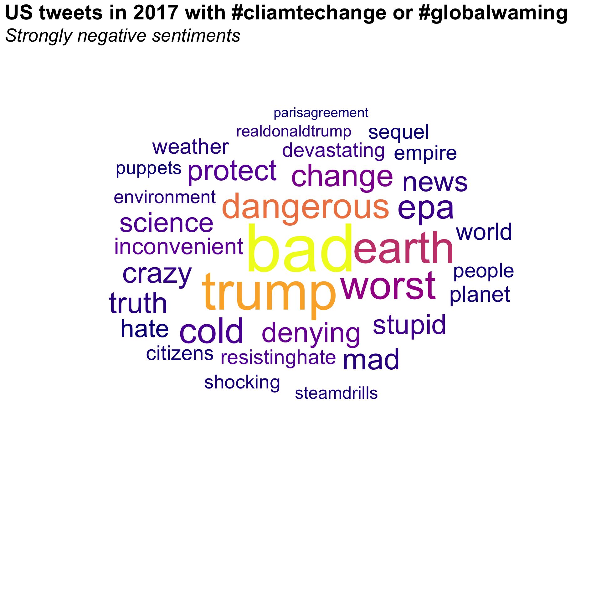
x_words <- x_cc_neg_strong |>mutate(content =str_remove_all(content, "<[^>]+>"), # remove HTML tagscontent =str_remove_all(content, "http[s]?://\\S+"), # remove URLscontent =str_squish(content) # trim ends and collapse repeated whitespace into single spaces ) |>unnest_tokens(word, content) |>anti_join(stop_words, by ="word") |>filter(str_detect(word, "^[a-z]+$") # keep only pure alphabetic words ) |>count(word, sort =TRUE) |>filter(!(word %in%c("climatechange", "globalwarming","rt", "climate"))) |>filter(dense_rank(-n) <=30)x_words |>ggplot(aes(label = word, size = n,color = n)) +geom_text_wordcloud_area() +scale_size_area(max_size =50) +scale_color_viridis_c(option ="C") +theme_minimal() +theme(panel.grid =element_blank(),plot.title =element_text(size =rel(2.25),face ='bold' ),plot.subtitle =element_text(size =rel(2),face ='italic',margin =margin(b =-160) ) ) +labs(title ="US tweets in 2017 with #cliamtechange or #globalwaming",subtitle ="Strongly negative sentiments")
Discussion
Welcome to our Classwork 10 Discussion Board! 👋
This space is designed for you to engage with your classmates about the material covered in Classwork 10.
Whether you are looking to delve deeper into the content, share insights, or have questions about the content, this is the perfect place for you.
If you have any specific questions for Byeong-Hak (@bcdanl) regarding the Classwork 10 materials or need clarification on any points, don’t hesitate to ask here.