library(tidyverse)
library(skimr)
library(ggthemes)
library(rmarkdown)Homework 1
ggplot2 · dplyr Fundamentals
📌 Directions
Submit one Quarto document (
.qmd) to Brightspace:danl-310-hw1-LASTNAME-FIRSTNAME.qmd
(e.g.,danl-310-hw1-choe-byeonghak.qmd)
Due: February 18, 2026, 11:59 P.M. (ET)
For visualization questions, you must provide:
- the
ggplot2code, and
- a written comment (2–4 sentences) interpreting the corresponding figure.
- the
Unless a question says otherwise, use
dplyrverbs (filter(),distinct(),select(),mutate(),group_by(),summarise(),arrange(),count(), etc.) andggplot2.
✅ Setup
Part 1. Data Visualization & Summaries
A. Orange Juice Promotions (oj)
Use the following dataset for Questions 1–6.
oj <- read_csv("https://bcdanl.github.io/data/dominick_oj_na.csv")Question 1. Quick inspection
- Print the first 10 rows of
oj. - Use
skimr::skim()(or another method) to summarize the variables.
Show answer
- First 10 rows of
oj
# head()
oj |>
  head(10)
# A tibble: 10 × 4
sales price brand ad_status
<dbl> <dbl> <chr> <chr>
1 8256 3.87 tropicana No Ad
2 6144 3.87 tropicana No Ad
3 3840 3.87 tropicana No Ad
4 8000 3.87 tropicana No Ad
5 8896 3.87 tropicana No Ad
6 7168 3.87 tropicana No Ad
7 10880 3.29 tropicana No Ad
8 7744 3.29 tropicana No Ad
9 8512 3.29 tropicana No Ad
10 5504 3.29 tropicana No Ad # slice()
oj |>
slice(1:10)# A tibble: 10 × 4
sales price brand ad_status
<dbl> <dbl> <chr> <chr>
1 8256 3.87 tropicana No Ad
2 6144 3.87 tropicana No Ad
3 3840 3.87 tropicana No Ad
4 8000 3.87 tropicana No Ad
5 8896 3.87 tropicana No Ad
6 7168 3.87 tropicana No Ad
7 10880 3.29 tropicana No Ad
8 7744 3.29 tropicana No Ad
9 8512 3.29 tropicana No Ad
10 5504 3.29 tropicana No Ad skim()
oj |>
skim()| Name | oj |
| Number of rows | 28947 |
| Number of columns | 4 |
| _______________________ | |
| Column type frequency: | |
| character | 2 |
| numeric | 2 |
| ________________________ | |
| Group variables | None |
Variable type: character
| skim_variable | n_missing | complete_rate | min | max | empty | n_unique | whitespace |
|---|---|---|---|---|---|---|---|
| brand | 0 | 1 | 9 | 11 | 0 | 3 | 0 |
| ad_status | 0 | 1 | 2 | 5 | 0 | 2 | 0 |
Variable type: numeric
| skim_variable | n_missing | complete_rate | mean | sd | p0 | p25 | p50 | p75 | p100 | hist |
|---|---|---|---|---|---|---|---|---|---|---|
| sales | 4 | 1 | 17310.79 | 27478.43 | 64.00 | 4864.00 | 8384.00 | 17408.00 | 716416.00 | ▇▁▁▁▁ |
| price | 5 | 1 | 2.28 | 0.65 | 0.52 | 1.79 | 2.17 | 2.73 | 3.87 | ▁▆▇▅▂ |
Question 2. Brand-level descriptive statistics (filter + group summary)
Filter to the three brands: tropicana, minute.maid, and dominicks. Then compute mean and standard deviation of:
salesprice
for each brand.
Write 2–3 sentences comparing the three brands based on your results.
Show answer
filter()
oj_tr <- oj |>
  filter(brand == "tropicana")

oj_mm <- oj |>
  filter(brand == "minute.maid")

oj_do <- oj |>
  filter(brand == "dominicks")

oj_tr_sum <- oj_tr |> skim()

oj_mm_sum <- oj_mm |> skim()

oj_do_sum <- oj_do |> skim()
group_by()
oj |>
  group_by(brand) |>
skim()| Name | group_by(oj, brand) |
| Number of rows | 28947 |
| Number of columns | 4 |
| _______________________ | |
| Column type frequency: | |
| character | 1 |
| numeric | 2 |
| ________________________ | |
| Group variables | brand |
Variable type: character
| skim_variable | brand | n_missing | complete_rate | min | max | empty | n_unique | whitespace |
|---|---|---|---|---|---|---|---|---|
| ad_status | dominicks | 0 | 1 | 2 | 5 | 0 | 2 | 0 |
| ad_status | minute.maid | 0 | 1 | 2 | 5 | 0 | 2 | 0 |
| ad_status | tropicana | 0 | 1 | 2 | 5 | 0 | 2 | 0 |
Variable type: numeric
| skim_variable | brand | n_missing | complete_rate | mean | sd | p0 | p25 | p50 | p75 | p100 | hist |
|---|---|---|---|---|---|---|---|---|---|---|---|
| sales | dominicks | 2 | 1 | 19833.72 | 32248.67 | 64.00 | 4416.00 | 9152.00 | 21056.00 | 716416.00 | ▇▁▁▁▁ |
| sales | minute.maid | 1 | 1 | 18234.51 | 29991.25 | 320.00 | 4800.00 | 8320.00 | 18560.00 | 591360.00 | ▇▁▁▁▁ |
| sales | tropicana | 1 | 1 | 13864.42 | 17516.55 | 192.00 | 5248.00 | 8000.00 | 13824.00 | 288384.00 | ▇▁▁▁▁ |
| price | dominicks | 1 | 1 | 1.74 | 0.39 | 0.52 | 1.58 | 1.59 | 1.99 | 2.69 | ▁▂▇▃▂ |
| price | minute.maid | 2 | 1 | 2.24 | 0.40 | 0.88 | 1.99 | 2.17 | 2.49 | 3.17 | ▁▂▇▆▂ |
| price | tropicana | 2 | 1 | 2.87 | 0.55 | 1.29 | 2.49 | 2.99 | 3.19 | 3.87 | ▁▃▅▇▅ |
Question 3. Remove missing values
Create a new data frame oj_no_na that removes observations with missing values in either price or sales.
- Show the number of rows in
ojandoj_no_na. - Report how many rows were removed.
Show answer
oj_no_na <- oj |>
  filter(!is.na(price) | !is.na(sales))

oj_no_na |>
  nrow()
[1] 28944Question 4. Price distribution by brand (ggplot + comment)
Using oj_no_na, make a figure that compares the distribution of price across brand.
- Choose ONE main approach (e.g., boxplot, violin plot, density plot, histogram with facets).
- Include clear axis labels and a readable title.
(a) Provide your ggplot2 code:
(b) Comment (2–3 sentences): What differences do you see across brands (center, spread, skewness, outliers, etc.)?
Show answer
ggplot(data = oj_no_na,
       mapping = aes(x = price,
                     fill = brand)) +
  geom_histogram(show.legend = FALSE,
                 bins = 40) +  # use 40 bins for the histogram
  facet_wrap(~brand,
             ncol = 1) +
  labs(x = "Price",
       y = "Count",
       title = "Distribution of Orange Juice Price by Brand")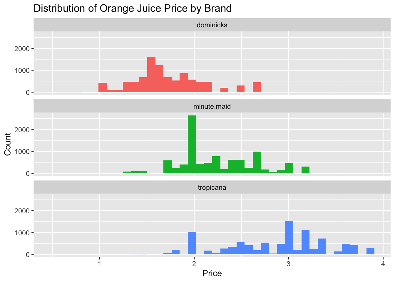
Overall, Dominick’s is the budget option, Tropicana is the luxury option, and Minute Maid lives between.
The mode for each OJ brand is about:
- Dominick’s: $1.5
- Minute Maid: $2.0
- Tropicana: $3.0
Question 5. Log–log price–sales relationship by brand (ggplot + comment)
Using oj_no_na, visualize how the relationship between:
log10(sales)andlog10(price)
varies by brand.
- Use a scatter plot with transparency (e.g.,
alpha = 0.3). - Add a fitted line (e.g.,
geom_smooth(method = "lm", se = FALSE)), and - Use faceting OR color to distinguish brands.
(a) Provide your ggplot2 code:
(b) Comment (2–3 sentences): Do you see evidence that higher prices are associated with lower sales? Does the pattern differ by brand?
Show answer
ggplot(data = oj_no_na,
       mapping = aes(x = log10(sales),
                     y = log10(price),
                     color = brand,
                     fill = brand)) +
  geom_point(alpha = .1) +
geom_smooth(method = "lm") 
- We observe that sales decrease as price increases, which aligns with the basic economic principle of a downward-sloping demand curve: higher prices typically lead to lower sales.
- Tropicana customers are less responsive to price changes compared to customers of other brands.
Question 6. Log–log relationship by brand and ad status (ggplot + comment)
Now extend Question 5 by incorporating ad_status. Visualize how the relationship between:
log10(sales)andlog10(price)
varies by brand and ad_status.
- Use faceting (
facet_grid()orfacet_wrap()), and/or - Use color/shape for
ad_status.
(a) Provide your ggplot2 code:
(b) Comment (2–3 sentences): How does advertising status appear to shift the relationship (level shift, slope change, or no clear difference)?
Show answer
ggplot(data = oj_no_na,
       mapping = aes(x = log10(sales),
                     y = log10(price),
                     color = brand,
                     fill = brand)) +
  geom_point(alpha = .1) +
  geom_smooth(method = "lm") +
  facet_wrap(~ad_status)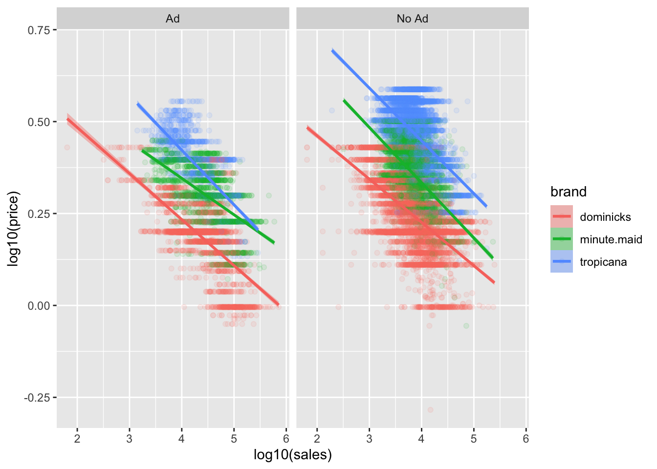
The ads tend to change sales at all prices, they change price sensitivity, and they do both of these things in a brand-specific manner.
We see that being advertised always leads to more price sensitivity, particularly the demand for Minute Maid is much more price sensitive than when it is not.
Why does this happen?
- One possible explanation is that advertisement increases the population of consumers who are considering your brand In particular, it can increase your market beyond brand loyalists, to include people who will be more price sensitive than those who reflexively buy your orange juice every week.
- Indeed, if you observe increased price sensitivity, it can be an indicator that your marketing efforts are expanding your consumer base.
- This why ad campaigns should usually be accompanied by price cuts!
- There is also an alternative explanation. Since the advertised products are often also discounted, it could be that the demand curve is nonlinear—at lower price points the average consumer is more price sensitive.
- The truth is probably a combination of these effects.
B. MLB Batting Trends (mlb_bat)

Use the following dataset for Questions 7–8.
mlb_bat <- read_csv("https://bcdanl.github.io/data/MLB_batting.csv")Question 7. Create yearly hit percentages (data transformation)
Create a data frame mlb_hit_pct that contains yearly hit percentages for each hit_type (Single, Double, Triple, HomeRun).
Your final table should have:
yearhit_typehit_pct(a percentage or proportion)
Show answer
mlb_hit_pct <- mlb_bat |>
  rename(hit_pct = percentage)
Question 8. Visualize trends (ggplot + comment)
Make a figure that shows the yearly trends in hit percentages for each hit_type.
(a) Provide your ggplot2 code:
(b) Comment (2–3 sentences): Which hit types are increasing/decreasing over time? Any notable breaks or eras?
Show answer
ggplot(data = mlb_bat,
       mapping = aes(x = year,
                     y = percentage,
                     color = hit_type,
                     fill = hit_type)) +
  geom_point(size = .5) +
  geom_line() +
  geom_smooth() +
  labs(title = "Hits by Type in Major League Baseball",
       x = "Major League Baseball Season",
       y = "Percentage",
       fill = "Hit",
color = "Hit") 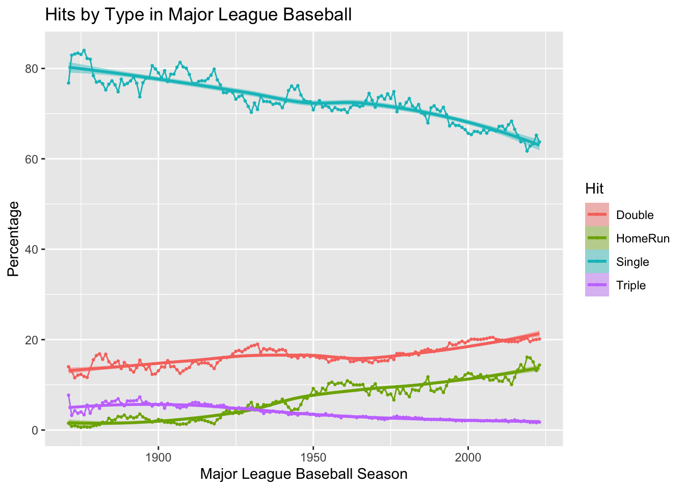
- The trends in MLB show that doubles and home runs have increased steadily over the years, while singles and triples have shown a decline.
- This shift reflects changes in playing style, favoring power hitting and longer hits over traditional base-hitting strategies.
C. Titanic Survival (titanic)
Use the following dataset for Questions 9–13.
titanic <- read_csv("https://bcdanl.github.io/data/titanic_cleaned.csv")Question 9. Two-way count table
Create titanic_class_survival that counts passengers by class and survived.
Show answer
titanic_class_survival <- titanic |>
  count(class, survived)

# Display the `titanic_class_survival` data.frame
titanic_class_survival |>
  paged_table()
Question 10. Age distribution by class and gender (ggplot + comment)
Visualize how the distribution of age varies across class and gender.
(a) Provide your ggplot2 code:
(b) Comment (2–3 sentences): What differences do you see across class and gender?
Show answer
ggplot(data = titanic,
       mapping = aes(x = gender,
                     y = age,
                     fill = gender)) +
  geom_boxplot(show.legend = F) +
  facet_wrap(~class) +
  scale_fill_tableau()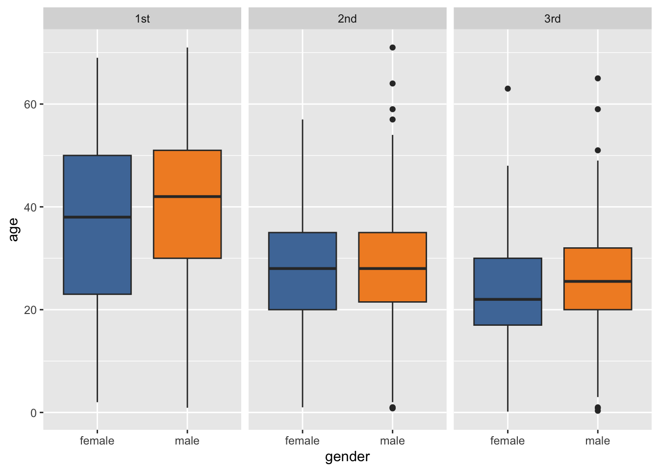
- For both female and male groups, the
agesof the first class passengers in the Titanic ranges wider than the second class and the third class. - For both female and male groups,the median of the first class passengers’s
agesis higher than that of the second class and the third class. - The first quartile of female’s
ageis always lower than that of male’s across all classes. Particularly, the such gap is wider for the first class.
Question 11. Survival rate by class and gender (data + ggplot + comment)
- Create a summary table with the survival rate (proportion survived) by
classandgender. - Visualize the survival rates.
(a) Provide your dplyr code for the summary table:
(b) Provide your ggplot2 code:
(c) Comment (2–3 sentences): Which groups have the highest/lowest survival rates?
Show answer
- Summary table
q11 <- titanic |>
  count(class, gender) |>
  group_by(class) |>
  mutate(survival_by_class = round(n / sum(n), 2)) |>
  group_by(gender) |>
  mutate(survival_by_gender = round(n / sum(n), 2)) |>
  ungroup()

q11 |>
paged_table()- ggplot code
ggplot(data = titanic,
       mapping = aes(y = class,
                     fill = survived)) +
  geom_bar() +
  facet_wrap(~gender) +
  labs(x = "Proportion") +
  scale_fill_tableau()
- The group of Female and the 1st class has the highest survival rate.
- The group of Male and the 3rd class has the lowest survival rate.
Question 12. Conditional distribution of survived (ggplot + comment)
Create a plot that shows the distribution of survived across class and gender using proportions (not raw counts).
(a) Provide your ggplot2 code:
(b) Comment (2–3 sentences): How does using proportions (instead of counts) change your interpretation?
Show answer
ggplot(data = titanic,
       mapping = aes(y = class,
                     fill = survived)) +
  geom_bar(position = "fill") +
  facet_wrap(~gender) +
  labs(x = "Proportion") +
  scale_fill_tableau()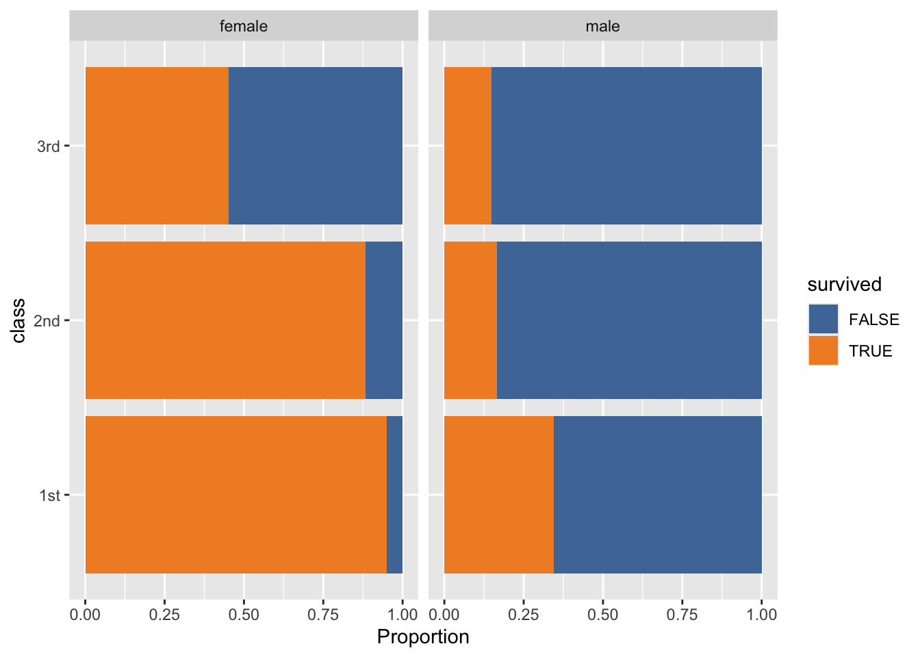
- My interpretation doesn’t change.
Question 13. Short interpretation
Write 3 bullet-point insights supported by your tables/figures in Questions 9–12.
Show answer
Clear gender gap in survival: Across passenger groups, females have a much higher survival rate than males. This shows that survival outcomes are strongly associated with gender.
Clear class gaps in survival: 1st-class passengers survive at higher rates than 2nd- and 3rd-class passengers. This suggests that socioeconomic status (ticket class) is closely linked to survival.
Interaction matters (gender × class): The survival advantage is largest for women in higher classes and smallest for men in lower classes—specifically, Female + 1st class has the highest survival rate, while Male + 3rd class has the lowest survival rate, consistent with the grouped tables/figures.
D. NYC Dog Licenses (nyc_dogs)
Use the following dataset for Questions 14–16.
nyc_dogs <- read_csv("https://bcdanl.github.io/data/nyc_dogs_cleaned.csv")Question 14. Breed frequency table
Create nyc_dogs_breeds with:
- non-missing
breed, n >= 2000, and- sorted by
ndescending.
Show answer
nyc_dogs_breeds <- nyc_dogs |>
  count(breed) |>
  filter(!is.na(breed)) |>
  filter(n >= 2000) |>
  arrange(-n)  # or arrange(desc(n))

nyc_dogs_breeds |>
  paged_table()
Question 15. Visualize the distribution of breeds (ggplot + comment)
Using nyc_dogs_breeds, make a figure that shows the distribution of breed counts.
(a) Provide your ggplot2 code:
(b) Comment (2–3 sentences): Is the distribution concentrated in a few breeds or spread out?
Show answer
ggplot(data = nyc_dogs_breeds,
       mapping = aes(x = n,
                     y = breed)) +
  geom_col()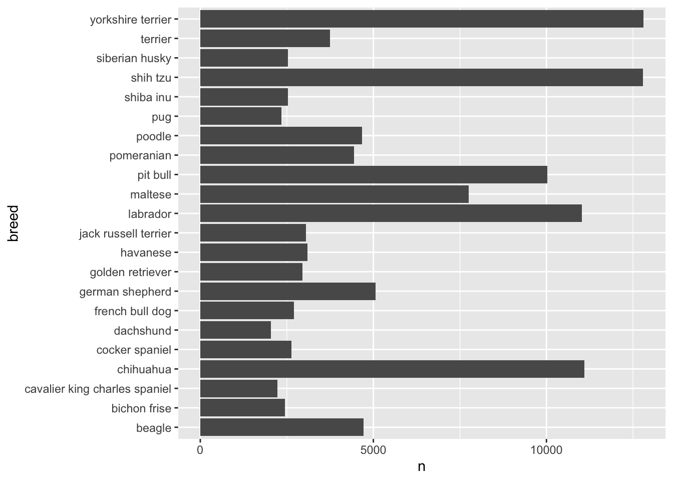
- It’s concentrated in a handful of breeds, for example, yorkshire terrier, shih tzu, chihuahua, labrador, and pit bull.
Question 16. “Top breeds” focus (ggplot + comment)
Create a plot of the top 10 breeds (by count) and comment on what you observe.
(a) Provide your dplyr + ggplot2 code:
(b) Comment (2–3 sentences): Any surprises? What might explain the pattern?
Show answer
ggplot(data = nyc_dogs_breeds |>
         filter(dense_rank(-n) <= 10),
       mapping = aes(x = n,
                     y = fct_reorder(breed, n))) +
  geom_col() +
  labs(y = "Breed")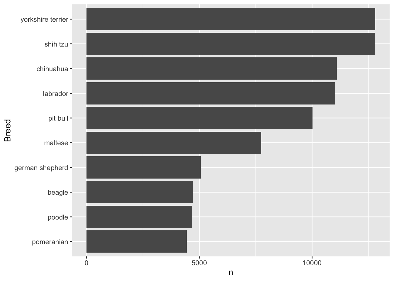
Yorkshire terrier is the most popular breed in NYC, followed by shih tzu, chihuahua, labrador, and pit bull.
More interestingly, this top 5 pattern varies by borough. I recommend checking it out.
Part 2. Data Transformation (nyc_payroll_2025)

For Questions 17–27, use nyc_payroll_2025.
For variable descriptions, see: Citywide Payroll Data (Fiscal Year) on NYC Open Data.
library(readr)
nyc_payroll_2025 <- readr::read_csv("https://bcdanl.github.io/data/nyc_payroll_2025.zip")- Use
curl::curl_download()to download the.ziplocally, then read the CSV inside the zip.- A remote
.zipcannot be streamed directly byreadr::read_csv(), so downloading first avoids the error. - Once the file is local,
readr::read_csv()can read a.zipwhen the archive contains a single CSV (or when you explicitly choose the CSV inside).
- A remote
library(curl)
url <- "https://bcdanl.github.io/data/nyc_payroll_2025.zip"
tmp <- tempfile(fileext = ".zip")

curl_download(url, tmp)
df <- read_csv(tmp)   # works if zip contains a single CSV (or a clear default)
Question 17. Base salary by borough (filter + summarise)
Compute the mean and standard deviation of Base_Salary for workers whose Work_Location_Borough is:
"MANHATTAN""QUEENS"
Report the two means and two SDs in your write-up.
Show answer
q17 <- df |>
  filter(Work_Location_Borough %in% c("MANHATTAN", "QUEENS")) |>
  group_by(Work_Location_Borough) |>
  summarise(Base_Salary_mean = mean(Base_Salary, na.rm = T),
            Base_Salary_sd = sd(Base_Salary, na.rm = T),
            )

q17 |>
  paged_table()
Question 18. High base salary filter
Filter the data to keep only records where Base_Salary >= 100000. Report how many rows remain.
Show answer
df |>
  filter(Base_Salary >= 100000) |>
  nrow()
[1] 141464Question 19. Distinct agency–title pairs
Select only distinct combinations of Agency_Name and Title_Description.
Show answer
q19 <- df |>
  distinct(Agency_Name, Title_Description)

q19 |>
  paged_table()
Question 20. Top paid by regular gross pay
Arrange employees by Regular_Gross_Paid in descending order and show the top 10 rows with:
First_Name,Last_NameAgency_NameTitle_DescriptionRegular_Gross_Paid
Show answer
q20 <- df |>
  arrange(-Regular_Gross_Paid) |>
  filter(
      dense_rank(-Regular_Gross_Paid) <= 10
    ) |>
  select(First_Name, Last_Name, Agency_Name,
         Title_Description, Regular_Gross_Paid)

q20 |>
  paged_table()
Question 21. Select + rename
Select Title_Description and rename it to Title. Also select Agency_Name, First_Name, Last_Name, and Base_Salary.
Show answer
q21 <- df |>
  select(First_Name, Last_Name, Agency_Name, Title_Description, Base_Salary) |>
  rename(Title = Title_Description)

q21 |>
  paged_table()
Question 22. Create new pay variables (mutate())
Use mutate() to create two new variables:
Total_Pay = Regular_Gross_Paid + Total_OT_Paid + Total_Other_PayOT_Share = Total_OT_Paid / Total_Pay
Then show the first 10 rows of:
First_Name,Last_NameAgency_NameBase_SalaryTotal_Pay,OT_Share
Show answer
q22 <- df |>
  mutate(Total_Pay = Regular_Gross_Paid + Total_OT_Paid + Total_Other_Pay,
         OT_Share = Total_OT_Paid / Total_Pay) |>
  select(First_Name, Last_Name, Agency_Name,
         Base_Salary, Total_Pay, OT_Share) |>
  head(10)

q22 |>
  paged_table()
Question 23. Borough pay summary (group_by() + summarise())
Using the variables you created in Question 22, group the data by Work_Location_Borough and compute:
- number of employees
n - mean
Base_Salary - mean
Total_Pay - mean
OT_Share(ignore missing values)
Arrange the results by mean Total_Pay in descending order and show the summary table.
Show answer
q23 <- df |>
  mutate(Total_Pay = Regular_Gross_Paid + Total_OT_Paid + Total_Other_Pay,
         OT_Share = Total_OT_Paid / Total_Pay) |>
  group_by(Work_Location_Borough) |>
  summarise(
    n = n(),
    Base_Salary_mean = mean(Base_Salary, na.rm = T),
    Total_Pay_mean = mean(Total_Pay, na.rm = T),
    OT_Share_mean = mean(OT_Share, na.rm = T)
  ) |>
  arrange(-Total_Pay_mean)

q23 |>
  paged_table()
Question 24. Police Department overtime
Filter to Agency_Name == "POLICE DEPARTMENT" and arrange by Total_OT_Paid.
- Show the 10 smallest overtime values.
- Show the 10 largest overtime values.
Show answer
q24 <- df |>
  filter(Agency_Name == "POLICE DEPARTMENT") |>
  arrange(Total_OT_Paid)


q24_smallest <- q24 |>
  filter(
    dense_rank(Total_OT_Paid) <= 10
  )

q24_largest <- q24 |>
  filter(
    dense_rank(-Total_OT_Paid) <= 10
  )

q24_smallest |>
  relocate(Total_OT_Paid) |>
  paged_table()
q24_largest |>
relocate(Total_OT_Paid) |>
paged_table()Question 25. Per annum employees
Filter to Pay_Basis == "per Annum" and select only:
First_Name,Last_Name,Base_Salary
Show answer
q25 <- df |>
  filter(Pay_Basis == "per Annum") |>
  select(First_Name, Last_Name, Base_Salary)

q25 |>
  paged_table()
Question 26. Borough then salary
Arrange by Work_Location_Borough (ascending) and then Base_Salary (descending). Then show the first 15 rows.
Show answer
q26 <- df |>
  arrange(Work_Location_Borough, -Base_Salary) |>
  head(15)

q26 |>
  relocate(Work_Location_Borough, Base_Salary) |>
  paged_table()
Question 27. Remove missing last names + count
Remove observations where Last_Name is missing (NA). Then report the remaining number of rows.
Show answer
df |>
  filter(!is.na(Last_Name)) |>
  nrow()
[1] 549830Part 3. Quarto Blogging (ice_cream)

Use the following dataset for your blog post.
ice_cream <- read_csv("https://bcdanl.github.io/data/ben-and-jerry-cleaned.csv")Write and publish a blog post about Ben & Jerry’s ice cream using ice_cream.
Your post must include:
- At least 4
ggplot2figures- Each figure must be followed by a short interpretation paragraph (2–6 sentences).
- At least 2 summary tables created with
group_by()+summarise()(orcount()+ related verbs). - Evidence of:
- filtering,
- sorting,
- creating at least one new variable (
mutate()), and - using at least one facet (
facet_wrap()orfacet_grid()).
- A clear data story structure:
- a motivating question,
- what you did (briefly),
- what you found (with evidence),
- a takeaway / conclusion.
Important: Your plots and text should work together. Avoid disconnected charts.