library(tidyverse)Classwork 4
Time Trend Plots
R Packages
For Classwork 4, please load the tidyverse package:
Question 1. Trend in GDP per capita
For Question 1, please load the R package gapminder before starting:
# install.packages("gapminder")
library(gapminder)
??gapminder
The gapminder package provides a built-in dataset named gapminder, which contains country-level data on life expectancy, GDP per capita, and population across time.
Let’s assign it to a new object called df_gapminder:
df_gapminder <- gapminder::gapminderPart A
- 🤖 Task 1: Fill in the blanks in the provided
ggplot()code chunks.
Visualization 1
- Something has gone wrong in this given plot. What happened?
ggplot(data = df_gapminder,
       mapping = aes(__BLANK_1__,
                     y = __BLANK_2__)) +
  geom_point(size = .5) +
  geom___BLANK_3__()
Show answer
ggplot(data = df_gapminder,
       mapping = aes(x = year,
                     y = gdpPercap)) +
  geom_point(size = .5) +
geom_line()- While
ggplotwill make a pretty good guess about the structure of the data, it does not know that the yearly observations are grouped by country.- It starts with the 1952 observation in the first row of the data. It doesn’t know this belongs to Afghanistan.
- Instead of going to Afghanistan 1953, it finds a series of 1952 observations, so it connects all of those first—alphabetically by country—from Afghanistan (1952) down to Zimbabwe (1952).
- Then it moves to the first observation in the next year, 1957.
- It starts with the 1952 observation in the first row of the data. It doesn’t know this belongs to Afghanistan.
Visualization 2
ggplot(data = df_gapminder,
       mapping = aes(__BLANK_1__,
                     y = __BLANK_2__,
                     __BLANK_3__ = country)) +
  geom_point(size = .5,
             color = "black") +
  geom___BLANK_4__()
Show answer
ggplot(data = df_gapminder,
       mapping = aes(x = year,
                     y = gdpPercap,
                     group = country)) +
  geom_point(size = .5,
             color = "black") +
  geom_line()
Visualization 3
ggplot(data = df_gapminder,
       mapping = aes(__BLANK_1__,
                     y = __BLANK_2__,
                     __BLANK_3__ = country)) +
  geom_point(size = .5,
             color = "black") +
  geom___BLANK_4__(show.legend = FALSE)
Show answer
ggplot(data = df_gapminder,
       mapping = aes(x = year,
                     y = gdpPercap,
                     color = country)) +
  geom_point(size = .5,
             color = "black") +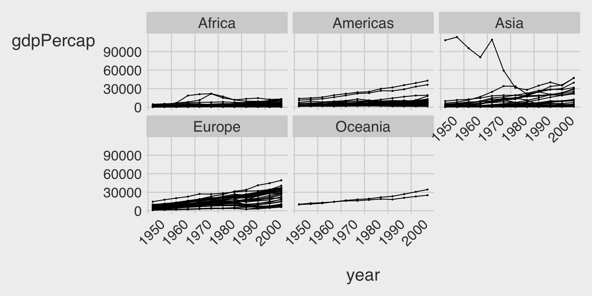
geom_line(show.legend = FALSE)- The plot here is still fairly rough, but it is showing the data properly, with each line representing the trajectory of a country over time.
- The gigantic outlier is Kuwait, in case you are interested.
Part B
- 🤖 Task 1: Fill in the blanks in the provided
ggplot()code chunk.
- 💬 Task 2: Add a brief comment describing how the overall time trend of GDP per capita (
gdpPercap) varies by continent (continent).
Visualization 1
ggplot(data = df_gapminder,
       mapping = aes(__BLANK_1__,
                     y = __BLANK_2__,
                     __BLANK_3__ = country)) +
  geom_point(size = .5,
             color = "black") +
  geom___BLANK_4__(show.legend = FALSE) +
  facet___BLANK_5__( ~ __BLANK_6__)
Show answer
ggplot(data = df_gapminder,
       mapping = aes(x = year,
                     y = gdpPercap,
                     group = country)) +
  geom_point(size = .5,
             color = "black") +
  geom_line(show.legend = FALSE) +
  facet_wrap(~continent) +
  theme(axis.text.x = element_text(angle = 45,
                                   margin = margin(15,0,0,0)))
Visualization 2
- Because we have only five continents it might be worth seeing if we can fit them on a single row (which means we’ll have five columns).
ggplot(data = df_gapminder,
       mapping = aes(__BLANK_1__,
                     y = __BLANK_2__,
                     __BLANK_3__ = country)) +
  geom_point(size = .5,
             color = "black") +
  geom___BLANK_4__(show.legend = FALSE) +
  facet___BLANK_5__( ~ __BLANK_6__,
             __BLANK_7__ = 1)
Show answer
ggplot(data = df_gapminder,
       mapping = aes(x = year,
                     y = gdpPercap,
                     group = country)) +
  geom_point(size = .5,
             color = "black") +
  geom_line(show.legend = FALSE) +
  facet_wrap(~continent,
             nrow = 1) +
  theme(axis.text.x = element_text(angle = 45,
                                   margin = margin(15,0,0,0)))
Visualization 3
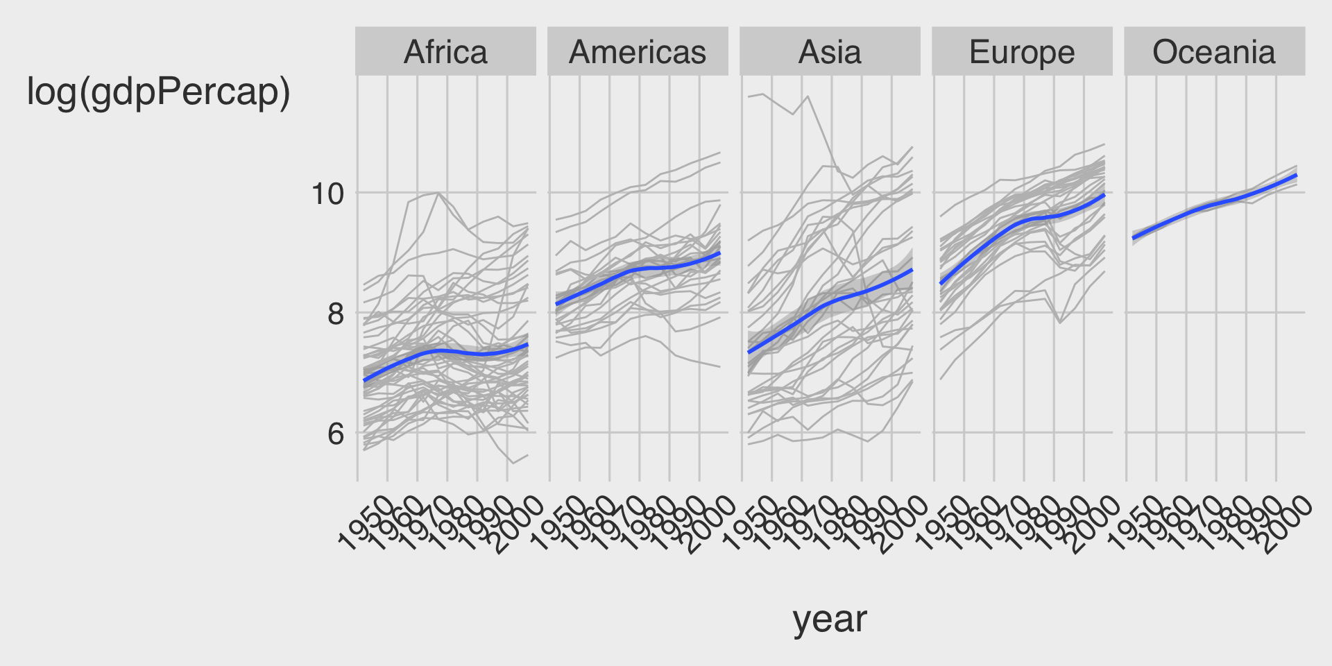
- Since GDP per capita is highly skewed, let’s take a log transformation on it:
ggplot(data = df_gapminder,
       mapping = aes(__BLANK_1__,
                     y = __BLANK_2__,
                     __BLANK_3__ = country)) +
  geom_point(size = .5,
             color = "black") +
  geom___BLANK_4__(show.legend = FALSE) +
  facet___BLANK_5__( ~ __BLANK_6__,
             __BLANK_7__ = 1)
Show answer
ggplot(data = df_gapminder,
       mapping = aes(x = year,
                     y = log(gdpPercap),
                     group = country)) +
  geom_point(size = .5,
             color = "black") +
  geom_line(show.legend = FALSE) +
  facet_wrap(~continent,
             nrow = 1) +
  theme(axis.text.x = element_text(angle = 45,
                                   margin = margin(15,0,0,0)))
Visualization 4
ggplot(data = df_gapminder,
       mapping = aes(__BLANK_1__,
                     y = __BLANK_2__)) +
  geom___BLANK_3__(show.legend = FALSE,
                  color = 'grey',
                  mapping = aes(group = country)) + # Advanced ggplot: we can add a specific aes() to a specific geom.
  geom___BLANK_4__() +
  facet_wrap(~ __BLANK_5__,
             __BLANK_6__ = 1)
Show answer
ggplot(data = df_gapminder,
       mapping = aes(x = year,
                     y = log(gdpPercap))) +
  geom_line(show.legend = FALSE,
            color = 'grey',
            mapping = aes(group = country)) +
  geom_smooth() +
  facet_wrap(~continent,
             nrow = 1) +
  theme(axis.text.x = element_text(angle = 45,
                                   margin = margin(15,0,0,0)))
Discussion
Welcome to our Classwork 4 Discussion Board! 👋
This space is designed for you to engage with your classmates about the material covered in Classwork 4.
Whether you are looking to delve deeper into the content, share insights, or have questions about the content, this is the perfect place for you.
If you have any specific questions for Byeong-Hak (@bcdanl) regarding the Classwork 4 materials or need clarification on any points, don’t hesitate to ask here.
All comments will be stored here.
Let’s collaborate and learn from each other!