library(tidyverse)
library(sf)
library(tigris)
library(scales)
library(ggthemes)
library(hrbrthemes)
library(rmarkdown)Homework 5
Map Visualization with ggplot
📌 Directions
Submit one Quarto document (
.qmd) to Brightspace:danl-310-hw5-LASTNAME-FIRSTNAME.qmd
(e.g.,danl-310-hw5-choe-byeonghak.qmd)
Due: April 27, 2026, 11:59 P.M. (ET)
✅ Setup
Question 1
The following data is for Question 1:
election_panel <- read_csv(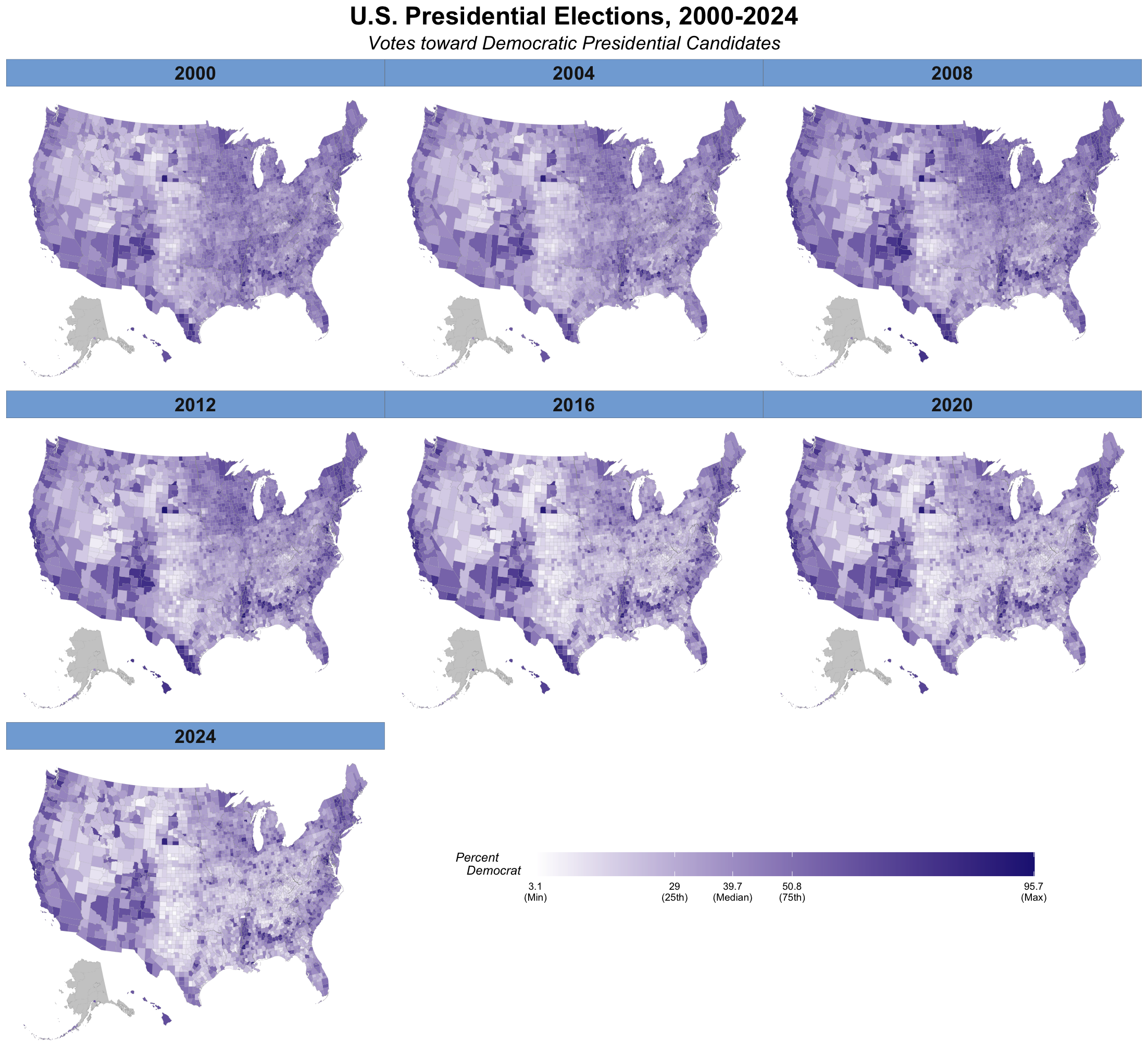
'https://bcdanl.github.io/data/election_panel_2000_2024.csv')- Replicate the following map using
socviz::county_map.- Do not use
coord_map(projection = "albers", lat0 = 39, lat1 = 45). - Use the following colors:
- “#FFFFFF”, “#211f82”, “grey80”, “#81ABD9”
- Do not use
Show answer
county_map <- socviz::county_map
county_map <- county_map |>
  mutate(id = as.integer(id))

election_panel <- election_panel |>
  mutate(id = as.integer(id))

county_full <- county_map |>
  left_join(election_panel,
            by = "id")

county_full <- county_full |>
  arrange(year, county_fips, order)

# Function to create na_map for each year
na_map <- function(yr){
  county_full_na <- county_full |>
    filter(is.na(year)) |>  # Part of Alaska
    select(-year) |>
    mutate( year = yr)
}

county_full_NAmap <- county_full

# Row-binding na_map(yr) to county_full_NAmap for each year
for (yr in as.numeric( levels( factor( county_full$year ) ) ) ){
  county_full_NAmap <- county_full_NAmap |>
    rbind( na_map(yr) )
}
# Also, try it with
# (1) data = county_full
# (2) data = county_full |> filter(!is.na(year))
# (3) data = county_full_NAmap
p1 <- ggplot(data = county_full_NAmap |> filter(!is.na(year)),
mapping = aes(x = long, y = lat, group = group,
fill = pct_DEMOCRAT )) +
geom_polygon(color = "grey60",
linewidth = 0.025)
q <- quantile(county_full$pct_DEMOCRAT,
probs = c(0, 0.25, 0.5, 0.75, 1),
na.rm = TRUE)
p2 <- p1 +
scale_fill_gradient(
low = '#FFFFFF', # transparent white
high = '#211f82', # from party_colors for DEM
na.value = "grey80",
breaks = q,
labels = c(paste0(round(q[1], 1), "\n(Min)"),
paste0(round(q[2], 1), "\n(25th)"),
paste0(round(q[3], 1), "\n(Median)"),
paste0(round(q[4], 1), "\n(75th)"),
paste0(round(q[5], 1), "\n(Max)")
)
)
p2 + labs(fill = "Percent\nDemocrat",
title = "U.S. Presidential Elections, 2000-2024",
subtitle = "Votes toward Democratic Presidential Candidates") +
facet_wrap(.~ year, ncol = 3) +
guides(fill = guide_colourbar(direction = "horizontal", barwidth = 20,
title.hjust = -1, title.vjust = 1)) +
theme_map() +
theme(plot.margin = unit( c(1, 1, 4, 0.5), "cm"),
plot.title = element_text(size = rel(2),
hjust = .5,
face = 'bold'),
plot.subtitle = element_text(size = rel(1.5),
hjust = .5,
face = 'italic'),
legend.title = element_text(face = 'italic',
margin = margin(r = 10)),
legend.position = c(0.5, -.15),
legend.box.margin = margin(-200,0,0,0),
strip.background = element_rect(fill = "#2e74c0",
color = "black", size = .1),
strip.text = element_text(face = 'bold',
size = rel(1.5))
)Question 2
The following data is for Question 2:
ny_income <- read_csv("https://bcdanl.github.io/data/NY_pinc_wide.csv")

p_title <- "Personal Income by County in New York"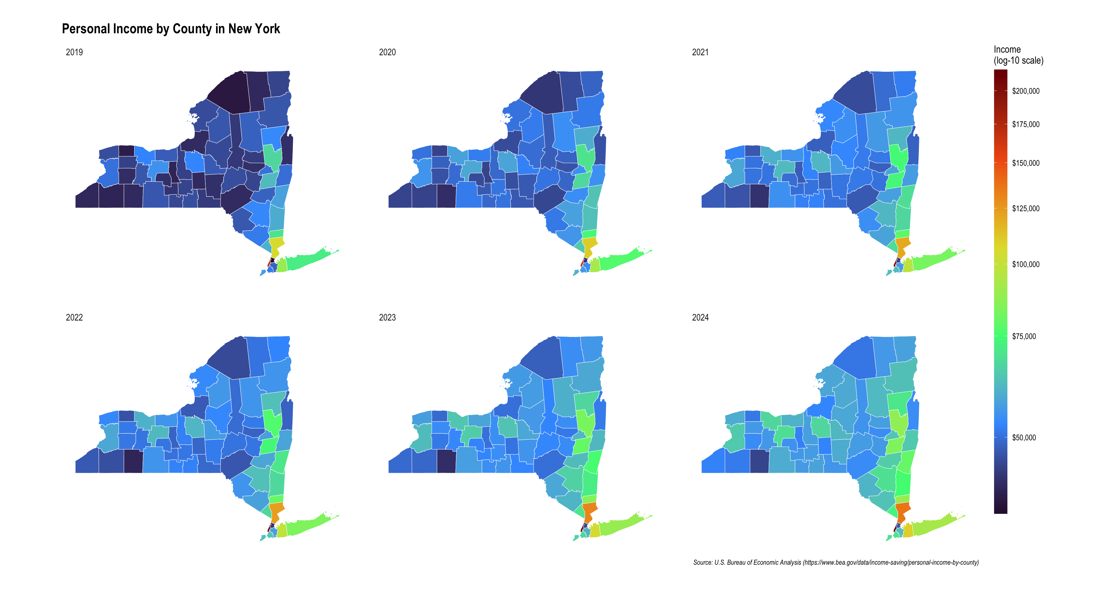
p_caption <- "Source: U.S. Bureau of Economic Analysis (https://www.bea.gov/data/income-saving/personal-income-by-county)"- Replicate the following NY map using
ny_counties_sf,geom_sf(), andscale_fill_viridis_c(trans = "log10"):
ny_counties_sf <- counties(state = "NY", year = 2024, cb = TRUE) |>
  st_as_sf()
This code downloads the county boundary map for New York State and stores it as an sf object, which is a spatial data format commonly used in R for mapping and geographic analysis.
counties(state = "NY", year = 2024, cb = TRUE)- This uses the
counties()function from the tigris package. state = "NY"tells R to download county boundaries for New York.year = 2024requests the 2024 version of the boundary file.cb = TRUEasks for the generalized cartographic boundary file, which is simplified and lighter than the full detailed shapefile. This is usually better for plotting maps.
- This uses the
st_as_sf()- This converts the result into an sf object.
- An
sfobject is a spatial data frame, meaning it stores both:- regular tabular variables, and
- geometry information for map shapes.
Show answer
options(tigris_use_cache = TRUE)

# Read the income data
ny_income <- readr::read_csv("https://bcdanl.github.io/data/NY_pinc_wide.csv")

# Keep county rows only and clean county names
ny_income_long <- ny_income |>
  filter(fips != 36000) |>
  pivot_longer(cols = pincp1969:pincp2024,
               values_to = "income",
               names_to = "year") |>
  mutate(year = str_replace(year, "pincp", ""),
         year = as.integer(year)) |>
  filter(year >= 2019) |>
  mutate(fips = as.character(fips))

# Download NY county geometries
ny_counties_sf <- counties(state = "NY", year = 2024, cb = TRUE) |>
  st_as_sf() |>
  mutate(
    fips = GEOID,
    county_name_map = NAME
  )

# Join map data with income data
ny_map <- ny_counties_sf |>
  left_join(ny_income_long, by = "fips")


ny_map |>
  ggplot() +
  geom_sf(aes(fill = income), color = "white", linewidth = 0.2) +
  facet_wrap(~year) +
  scale_fill_viridis_c(
    trans = "log10",
    breaks = seq(50000, 200000, 25000),
    labels = dollar_format(),
    option = "H",
    na.value = "grey90",
    name = "Income\n(log-10 scale)"
  ) +
  labs(
    title = "Personal Income by County in New York",
    caption = "Source: U.S. Bureau of Economic Analysis (https://www.bea.gov/data/income-saving/personal-income-by-county)"
  ) +
  guides(
    fill = guide_colorbar(barheight = 40)
  ) +
  hrbrthemes::theme_ipsum(base_size = 13) +
  theme(
    panel.grid.major = element_blank(),
    axis.text.x = element_blank(),
    axis.text.y = element_blank(),
    axis.title = element_blank(),
    axis.ticks = element_blank(),
    legend.box.margin = margin(b = 70)
  )