Midterm Exam
DANL 310-01: Data Visualization and Presentation
Overall Performance
Descriptive Statistics
The score distribution is right-skewed: most students clustered in a narrow band in the mid-to-upper range, with a small number of high achievers pulling the mean above the median. The tight interquartile range indicates consistently similar performance across the majority of the class.
The item-level analysis below provides a more granular picture of where points were earned and lost across rubric categories.
Performance by Evaluation Criterion
The table below summarizes the class-average proportion of points earned in each rubric category, based on item-level data.
| Criterion | Weight | Avg. % Earned | Assessment |
|---|---|---|---|
| Geometric Objects | 17.5% | 69% | ✅ Strong |
| Labels | 2.5% | 45% | 🟡 Moderate |
| Code Reproducibility | 7.5% | 47% | 🟡 Moderate |
| Aesthetic Mappings & Facets | 20% | 42% | 🟡 Moderate |
| Data Preparation | 17.5% | 42% | 🟡 Moderate |
| Scales | 10% | 23% | 🔴 Weak |
| Guides | 5% | 20% | 🔴 Weak |
| Themes | 10% | 7% | 🔴 Very Weak |
Strengths
- Geometric objects were the clearest strength. Nearly all students correctly implemented
geom_point()andgeom_smooth()with appropriatealphaandmethod = lmarguments (Q3, Q5).geom_boxplot()and basicaes(x, y)mappings were also well-handled (Q2). - Basic scatter plot construction (Q3, Q5) was solid, with most students successfully applying
facet_wrap(~ component)andscales = "free_x". - Short-answer / interpretive questions (Q8) showed strong reading of visualizations for crude oil trends.
Areas for Improvement
🔴 Themes — Most Missed Category (avg. ~7%)
This was the largest gap across the exam. Very few students were able to implement:
element_rect(fill = 'grey80')for facet strip backgrounds (Q3-14, Q5-14: class mean = 0%)plot.titlebold,plot.subtitleitalic,plot.captionitalic styling (Q6, Q7: mean = 0–3%)legend.box.margin(mean = 0%)legend.textbold face (mean = 7%)
Takeaway: Practice customizing theme() elements systematically. These are details, but they distinguish polished, publication-ready visualizations from functional ones.
🔴 Scales — Consistently Underperformed (avg. ~23%)
Scale customization was broadly weak:
scale_x_percent()/scale_y_percent()(means = 13–15%)scale_y_continuous()with dollar formatting (means = 0–13%)scale_fill_colorblind()/scale_color_colorblind()(means = 7–27%)scale_fill_brewer(palette = "Dark2")(mean = 48% — relatively better)
🔴 Guides — Low Engagement (avg. ~20%)
Legend customization via guides(fill = guide_legend(keyheight = ..., keywidth = ...)) was missed by most students (means = 20%). This was a repeated element across Q6 and Q7.
🟡 Data Preparation — Uneven Performance (avg. ~42%)
pivot_longer()was attempted but often imprecise (mean = 55%)group_by()andsummarise()patterns were weak in Q4 (mean = 27%)- Computing
sum(pct)correctly within a grouped mutate (Q4-05) was especially difficult (mean = 13%) - Basic
mutate()and percentage adjustment logic were moderately handled
🟡 Aesthetic Mappings & Facets — Moderate (avg. ~42%)
geom_col()with stacked fill aesthetics (Q6, Q7) showed moderate success (~40–53%)factor()recoding andfct_reorder()for axis ordering were weak (means = 13–30%)aes(color = ...)for the line layer in Q6 was almost universally missed (mean = 13%)scales = "free_x"in facets was correctly applied by about half the class
Question-Level Highlights
| Question | Topic | Avg. Score |
|---|---|---|
| Q3-01 / Q5-01 | geom_point() |
100% ✅ |
| Q5-02 | geom_smooth() |
100% ✅ |
| Q2-04 | geom_boxplot() |
93% ✅ |
| Q6-13 | scale_y_continuous (dollar) |
0% 🔴 |
| Q3-14 / Q5-14 | element_rect(fill = 'grey80') |
0% 🔴 |
| Q7-15–17 | plot.title/subtitle/caption styling |
0% 🔴 |
| Q4-05 | sum(pct) grouped mutate |
13% 🔴 |
Recommendations Going Forward
- Practice
theme()systematically. Build a personal “theme template” that you can adapt. - Drill scale functions. Make a cheat sheet: when to use
scale_x_continuous(labels = label_dollar())vs.scale_x_percent()vs. customlabel_*functions. - Revisit multi-step data wrangling. The Q4 pipeline was the hardest coding challenge. Practice writing
group_by() |> mutate()/summarize()pipelines. - Read the question plots closely. For Q6/Q7, matching the exact color, line width, and legend formatting required careful visual inspection. Slow down and compare your output to the target systematically.
R Packages
Below is R packages for this exam:
library(tidyverse)
library(skimr)
library(ggthemes)
library(hrbrthemes)
library(rmarkdown)
The following data.frame is for the exam:
eia <- read_csv("https://bcdanl.github.io/data/eia_raw_2025_11.csv")

rmarkdown::paged_table(eia)
Variable Description
year: Yearmonth: Monthmon_yr: Dateretail_price: Retail price (dollars per gallon)refining: Proportion of the retail price attributed to the refining componentdist_mkt: Proportion of the retail price attributed to the distribution and marketing componenttaxes: Proportion of the retail price attributed to taxescrude_oil: Proportion of the retail price attributed to crude oil
Note: For some observations, the sum of refining, dist_mkt, taxes, and crude_oil may not be equal to 100 but ranges from 98 to 100.1, due to rounding errors.
Question 1
Provide R code to create the data.frame q1 from the eia data frame.
The following shows the q1 data.frame:
q1 <- read_csv("https://bcdanl.github.io/data/danl-310-s26-midterm-q1.csv")

rmarkdown::paged_table(q1)
Show answer
q1 <- eia |>
  pivot_longer(cols = refining:taxes,
               names_to = "component",
               values_to = "pct")
Question 2
Provide R code using the q1 data.frame to recreate the ggplot figure below that illustrates how the distribution of pct varies by component.
Use the “Dark2” color palette, provided by the
RColorBrewerpackage.Use the following character vectors for the
componentcategories:
c("crude_oil", "dist_mkt", "refining", "taxes")
c("Crude Oil", "Distribution \n& Marketing", "Refining", "Taxes")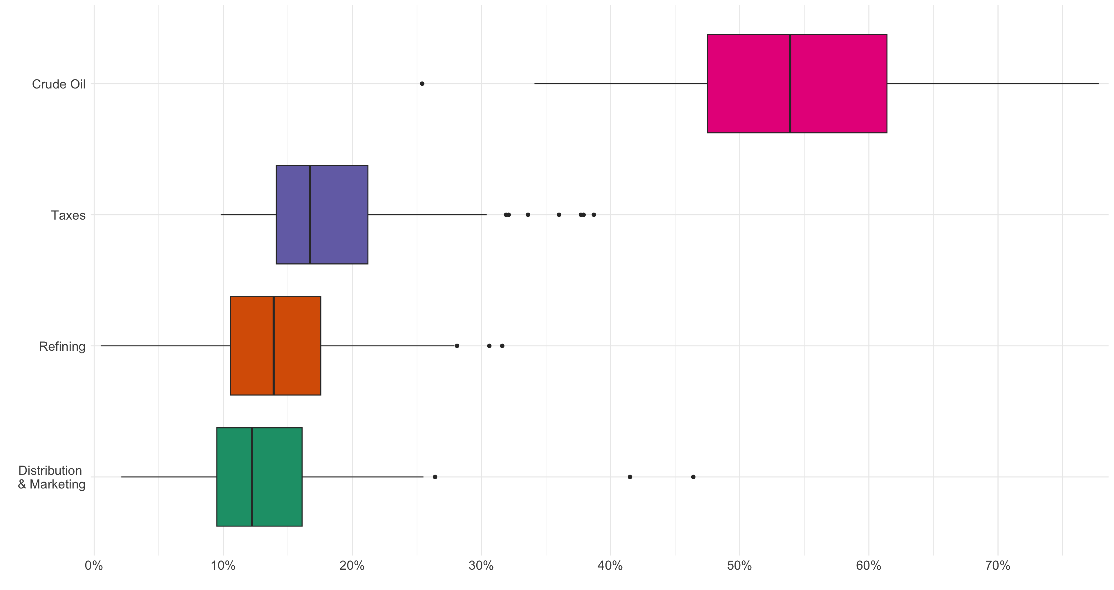
Show answer
q1 |>
  mutate(
    component = factor(component,
                       levels = c("crude_oil", "dist_mkt", "refining", "taxes"),
                       labels = c("Crude Oil", "Distribution \n& Marketing", "Refining", "Taxes")
    )
  ) |>
  ggplot(aes(y = fct_reorder(component, pct),
             x = pct/100,
             fill = fct_reorder(component, pct))) +
  geom_boxplot(show.legend = F) +
  scale_x_percent(breaks = seq(0,.7,.1)) +
  scale_fill_brewer(
    palette = "Dark2"
  ) +
  theme_minimal() +
  theme(axis.text.x = element_text(size = rel(1.5)),
        axis.text.y = element_text(size = rel(1.5)),
  ) +
  labs(y = "",
       x = '')
Question 3
Provide R code using the q1 data.frame to recreate the ggplot figure below that illustrates how the relationship between retail_price and the proportion of retail price varies across the given attributes.
- Use the following colors: “#56B4E9”, “#D55E00”, and “grey80”
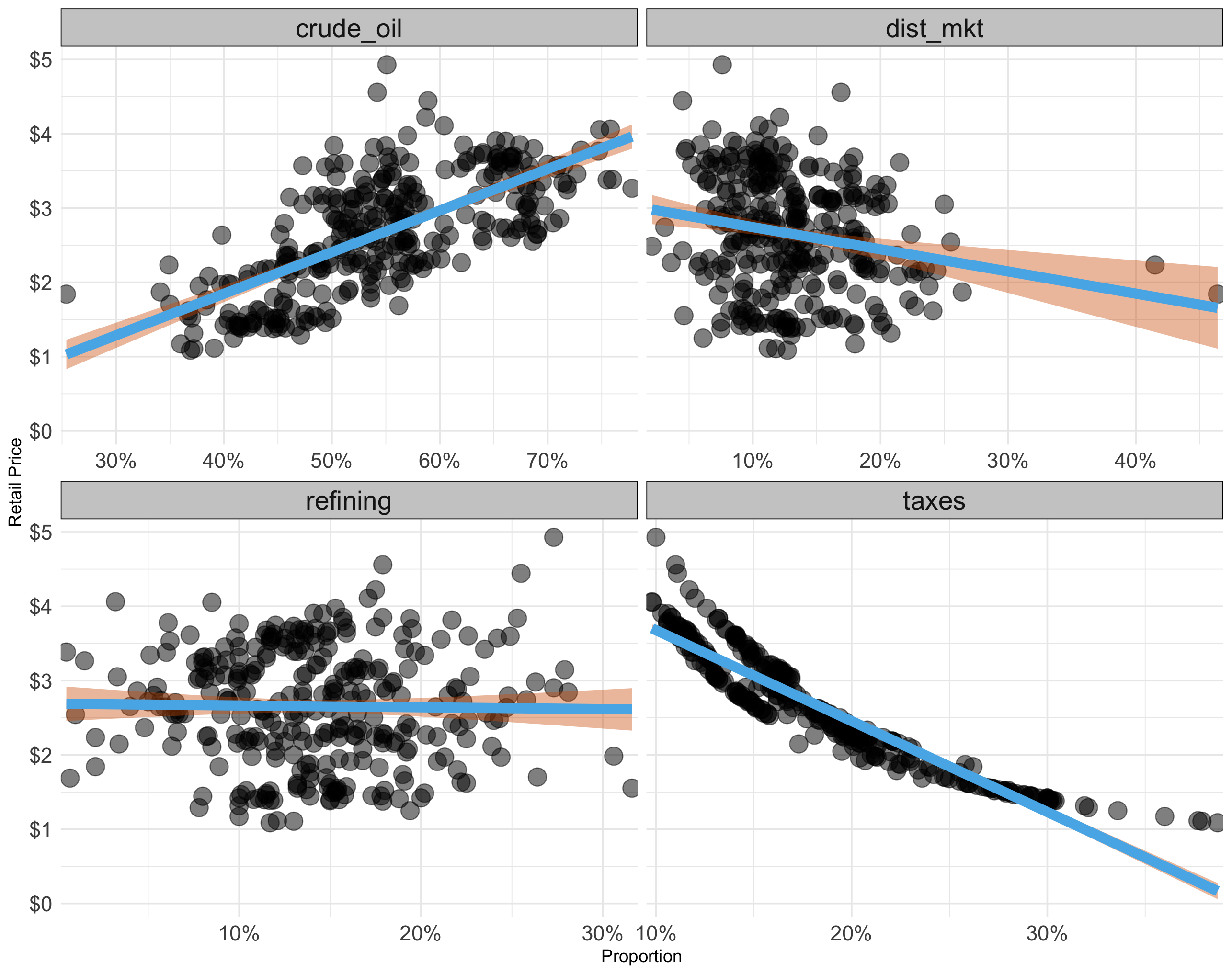
Show answer
q1 |>
  ggplot(aes(x = pct/100,
             y = retail_price)) +
  geom_point(alpha = .5,
             size = rel(5)) +
  geom_smooth(color = "#56B4E9", fill = "#D55E00",
              lwd = 3,
              method = lm) +
  scale_x_percent() +
  scale_y_continuous(labels = scales::dollar) +
  facet_wrap(~component,
             scales = "free_x") +
  theme_minimal() +
  theme(
    strip.background = element_rect(fill = 'grey80'),
    strip.text = element_text(size = rel(1.5)),
    axis.text.x = element_text(size = rel(1.5)),
    axis.text.y = element_text(size = rel(1.5)),
  ) +
  labs(y = "Retail Price",
       x = "Proportion")
Question 4
Provide R code to create the data.frame q4 from the q1 data frame.
- The sum of
pct_adjwithin each month-year is exactly 100. - The sum of
retail_price_decomposedwithin each month-year is exactly theretail_pricefor that month-year.
The following shows the q4 data.frame:
q4 <- read_csv("https://bcdanl.github.io/data/danl-310-s26-midterm-q4.csv")

rmarkdown::paged_table(q4)
Show answer
q4 <- q1 |>
  group_by(mon_yr) |>
  mutate(pct_adj = 100 * pct / sum(pct)) |>
  mutate(retail_price_decomposed = retail_price * pct_adj / 100) |>
  ungroup()
Question 5
Provide R code using the q4 data.frame to recreate the ggplot figure below that illustrates how the relationship between retail_price and retail_price_decomposed varies across the given attributes.
- Use the following colors: “#56B4E9”, “#D55E00”, and “grey80”
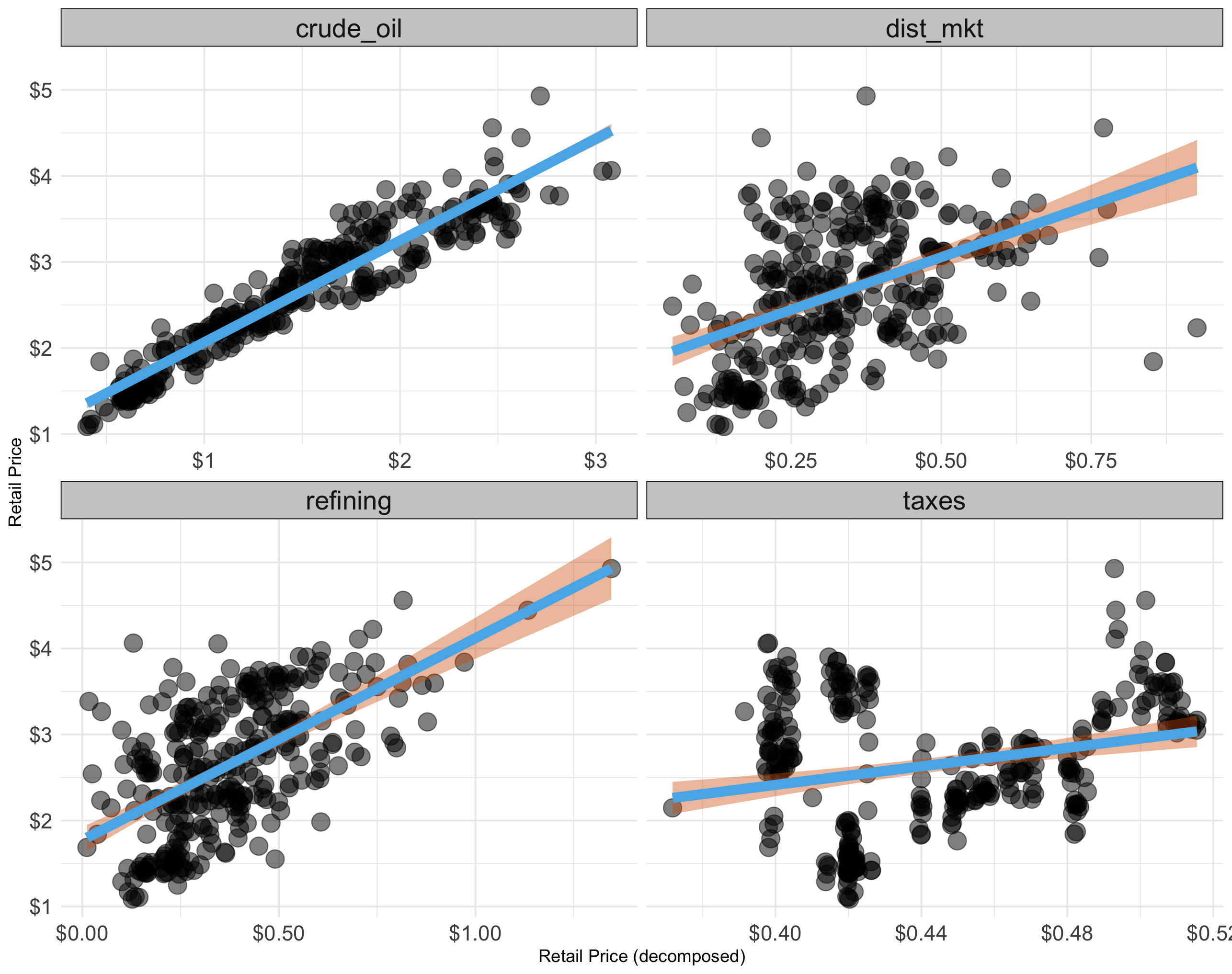
Show answer
q4 |>
  ggplot(aes(x = retail_price_decomposed,
             y = retail_price)) +
  geom_point(alpha = .5,
             size = rel(5)) +
  geom_smooth(color = "#56B4E9", fill = "#D55E00",
              lwd = 3,
              method = lm) +
  # geom_smooth(method = lm, color = "#CC79A7", fill = "#CC79A7") +
  scale_x_continuous(labels = scales::dollar) +
  scale_y_continuous(labels = scales::dollar) +
  facet_wrap(~component,
             scales = "free_x") +
  theme_minimal() +
  theme(
    strip.background = element_rect(fill = 'grey80'),
    strip.text = element_text(size = rel(1.5)),
    axis.text.x = element_text(size = rel(1.5)),
    axis.text.y = element_text(size = rel(1.5)),
  ) +
  labs(y = "Retail Price",
       x = "Retail Price (decomposed)")
Question 6
Provide R code using the q4 data.frame to recreate the ggplot figure below that illustrates how the monthly time trends of retail_price and retail_price_decomposed have been.
- Use the following character vectors for the
componentcategories:
c("crude_oil", "dist_mkt", "refining", "taxes")
c("Crude Oil", "Distribution \n& Marketing", "Refining", "Taxes")- Use the colorblind-friendly scale function provided by the R package,
ggthemes. - Use the following color for the line’s color.
- “#CC79A7”
- Use the following characters for plot labeling:
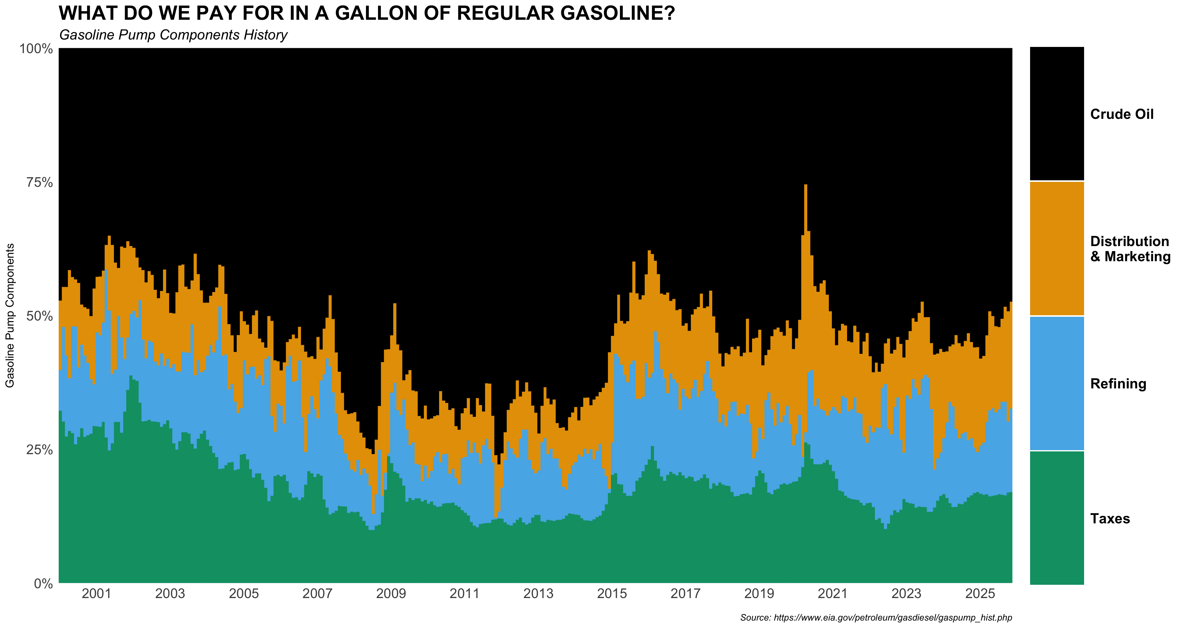
p_title <- 'WHAT DO WE PAY FOR IN A GALLON OF REGULAR GASOLINE?'
p_subtitle <- 'Gasoline Pump Components History'
p_caption <- 'Source: https://www.eia.gov/petroleum/gasdiesel/gaspump_hist.php'- Use the following scale function for x-axis scale:
  scale_x_date(
    date_breaks = "2 year",
    date_labels = "%Y",
    expand = c(0, 0)
  )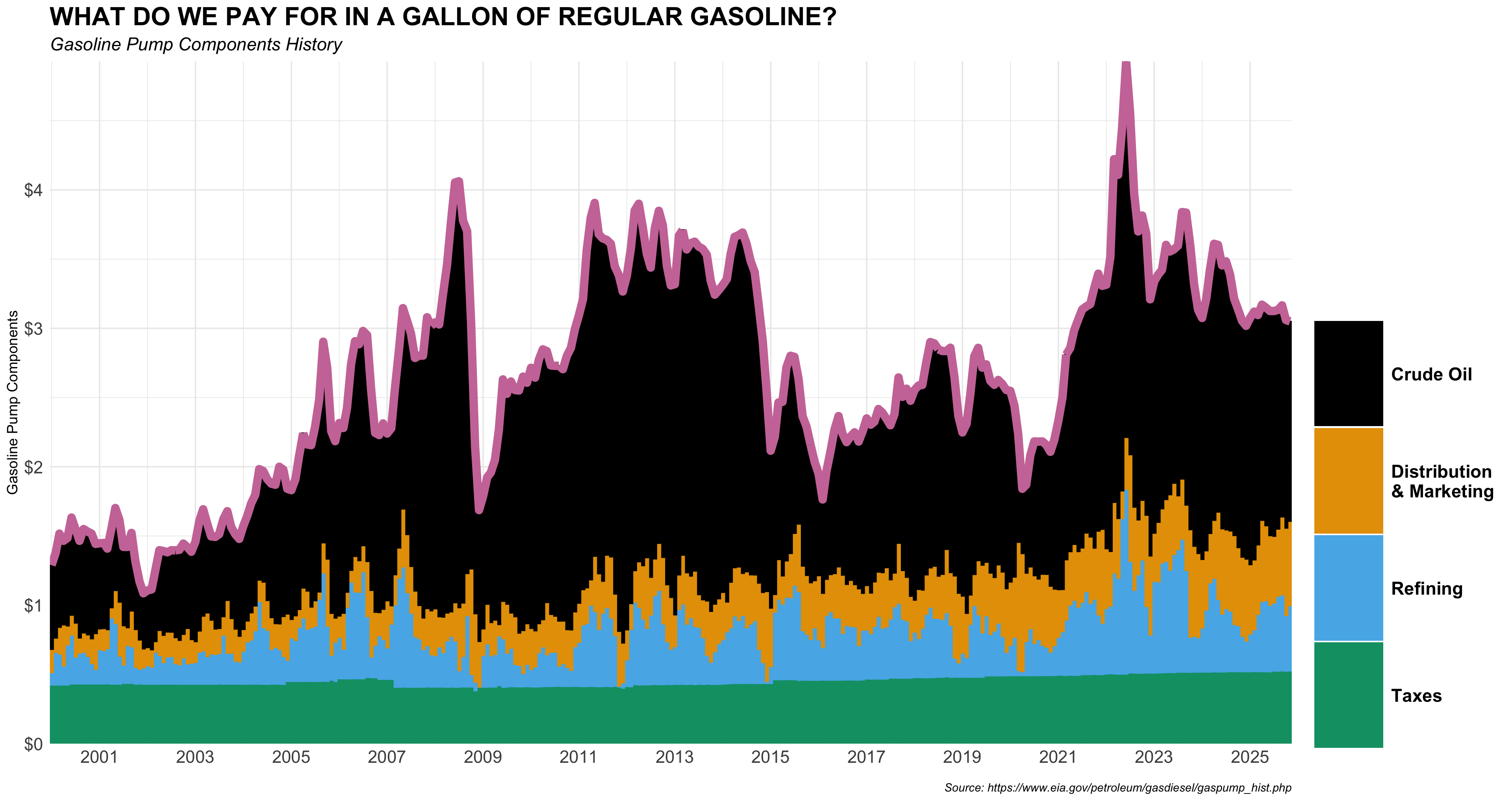
Show answer
q4 |>
  mutate(
    component = factor(component,
                       levels = c("crude_oil", "dist_mkt", "refining", "taxes"),
                       labels = c("Crude Oil", "Distribution \n& Marketing", "Refining", "Taxes")
                       )
  ) |>
  ggplot() +
  geom_col(aes(x = mon_yr,
               y = retail_price_decomposed,
               fill = component,
               color = component)) +
  geom_line(aes(x = mon_yr,
                y = retail_price),
            color = "#CC79A7",
            lwd = 3)  +
  scale_fill_colorblind() +
  scale_color_colorblind() +
  scale_y_continuous(expand = c(0, 0),
                     labels = scales::dollar) +
  scale_x_date(
    date_breaks = "2 year",
    date_labels = "%Y",
    expand = c(0, 0)
  ) +
  labs(
    y = 'Gasoline Pump Components',
    x = "",
    fill = "",
    title = 'WHAT DO WE PAY FOR IN A GALLON OF REGULAR GASOLINE?',
    subtitle = 'Gasoline Pump Components History',
    caption = 'Source: https://www.eia.gov/petroleum/gasdiesel/gaspump_hist.php'
  ) +
  guides(color = "none",
         fill =
           guide_legend(
             keyheight = rel(5.67),
             keywidth = 3.75
           )) +
  theme_minimal() +
  theme(
    # panel.grid = element_blank(),
    plot.title = element_text(face = 'bold', size = rel(1.75)),
    plot.subtitle = element_text(face = "italic", size = rel(1.25)),
    plot.caption = element_text(face = 'italic',
                                margin = margin(0,0,0,0)),
    axis.text.x = element_text(size = rel(1.5)),
    axis.text.y = element_text(size = rel(1.5)),
    legend.box.margin = margin(186, 0, 0, 0),
    legend.text = element_text(face = 'bold',
                               size = rel(1.25)),
  )
Question 7
Provide R code using the q4 data.frame to recreate the ggplot figure below that illustrates how the monthly time trends of pct_adj across components have been.
- Use the following character vectors for the
componentcategories:
c("crude_oil", "dist_mkt", "refining", "taxes")
c("Crude Oil", "Distribution \n& Marketing", "Refining", "Taxes")- Use the colorblind-friendly scale function provided by the R package,
ggthemes. - Use the following characters for plot labeling:
p_title <- 'WHAT DO WE PAY FOR IN A GALLON OF REGULAR GASOLINE?'
p_subtitle <- 'Gasoline Pump Components History'
p_caption <- 'Source: https://www.eia.gov/petroleum/gasdiesel/gaspump_hist.php'- Use the following scale function for x-axis scale:
  scale_x_date(
    date_breaks = "2 year",
    date_labels = "%Y",
    expand = c(0, 0)
  )
Show answer
q4 |>
  mutate(
    component = factor(component,
                       levels = c("crude_oil", "dist_mkt", "refining", "taxes"),
                       labels = c("Crude Oil", "Distribution \n& Marketing", "Refining", "Taxes")
    )
  ) |>
  ggplot() +
  geom_col(aes(x = mon_yr,
               y = pct_adj/100,
               fill = component,
               color = component))  +
  scale_fill_colorblind() +
  scale_color_colorblind() +
  scale_y_percent(expand = c(0, 0)) +
  scale_x_date(
    date_breaks = "2 year",
    date_labels = "%Y",
    expand = c(0, 0)
  ) +
  labs(
    x = '',
    y = 'Gasoline Pump Components',
    fill = "",
    title = 'WHAT DO WE PAY FOR IN A GALLON OF REGULAR GASOLINE?',
    subtitle = 'Gasoline Pump Components History',
    caption = 'Source: https://www.eia.gov/petroleum/gasdiesel/gaspump_hist.php'
  ) +
  guides(color = "none",
         fill =
           guide_legend(
             keyheight = rel(9.1),
             keywidth = 3.75
           )) +
  theme_minimal() +
  theme(
    plot.title = element_text(face = 'bold', size = rel(1.75)),
    plot.subtitle = element_text(face = "italic", size = rel(1.25)),
    plot.caption = element_text(face = 'italic',
                                margin = margin(0,0,0,0)),
    axis.text.x = element_text(size = rel(1.5)),
    axis.text.y = element_text(size = rel(1.5)),
    legend.box.margin = margin(0, 0, 15, 0),
    legend.text = element_text(face = 'bold',
                               size = rel(1.25))
  )
Question 8 (10 points)
No R coding Needed. Use the plots shown above (decomposed-dollar scatterplots, proportion scatterplots, the time-series component shares, and the boxplot of component shares) to interpret gasoline price components.
Focus only on crude_oil and taxes. For each of these two components:
Part 1. Proportion vs. retail_price:
State whether the relationship appears positive, negative, or approximately independent, and briefly justify using evidence from the proportion scatterplot and/or the time-series stacked-share plot.
Show answer
Crude oil: Positive relationship. The proportion scatterplot shows an upward-sloping trend. The time-series stacked-share plot confirms this, as crude oil’s black band expands during high-price periods (e.g., 2008, 2011-2014, 2022).
Taxes: Negative relationship. The proportion scatterplot shows a clear downward slope. The stacked-share plot confirms the green (taxes) band stays roughly constant in dollar terms, so its proportion mechanically falls when the total price rises.
Part 2. Decomposed dollar amount vs. retail_price:
State whether the relationship appears positive, negative, or approximately independent, and briefly justify using evidence from the decomposed-dollar scatterplot.
Show answer
Crude oil: Strong positive relationship. The decomposed-dollar scatterplot shows a tight, steeply upward-sloping line, indicating that higher retail prices are driven primarily by higher crude oil costs.
Taxes: Approximately independent (slightly positive or flat). The scatterplot shows taxes clustered in a very narrow x-axis range (~$0.40-$0.52) with no meaningful upward trend, indicating taxes are essentially fixed in dollar terms regardless of retail price.
Part 3. Intuition (1–2 sentences):
Explain why this pattern makes sense economically (e.g., market-driven vs. policy-driven components, fixed-per-gallon vs. price-sensitive components).
Show answer
Crude oil is market-driven: global supply and demand directly set crude prices, so both the dollar component and its share rise and fall with retail prices.
Taxes are policy-driven fixed per-gallon levies set by government, so they do not respond to market price movements; their dollar amount stays nearly constant, causing their proportion to shrink when prices are high.
Part 4. Stability and variability (1 sentence each):
Using the time-series plot and the boxplot, comment on whether the component share is stable or volatile over time, and whether its share tends to be high or low on average compared to the other components.
Show answer
Crude oil: Highly volatile over time. Its share swings dramatically across the full 25-year period (roughly 35%-75%), and it commands by far the highest average share (~50%+) of all components, as shown clearly by the wide pink boxplot sitting far to the right.
Taxes: Relatively stable over time. Its share fluctuates modestly within a narrow range in the stacked plot, and the boxplot IQR is compact; its average share (~13%-18%) is the lowest among the four components.