library(tidyverse)
library(ggthemes)
library(hrbrthemes)
library(skimr)Homework 3
Data Wrangling with tidyr, forcats, and stringr
📌 Directions
Submit one Quarto document (
.qmd) to Brightspace:danl-310-hw3-LASTNAME-FIRSTNAME.qmd
(e.g.,danl-310-hw3-choe-byeonghak.qmd)
Due: March 9, 2026, 11:59 P.M. (ET)
For visualization questions, you must provide:
- the
ggplot2code, and
- a written comment (2–4 sentences) interpreting the corresponding figure.
- the
✅ Setup
Part 1. IMDb Holiday Movies

- The following is the data.frame for Part 1.
holiday_movies <- read_csv("https://bcdanl.github.io/data/holiday_movies.csv")- The data.frame holiday_movies comes from the Internet Movie Database (IMDb).
Variable description for holiday_movies
tconst: alphanumeric unique identifier of the titletitle_type: the type/format of the title- (movie, video, or tvMovie)
primary_title: the more popular title / the title used by the filmmakers on promotional materials at the point of releasesimple_title: the title in lowercase, with punctuation removed, for easier filtering and groupingyear: the release year of a titleruntime_minutes: primary runtime of the title, in minutesaverage_rating: weighted average of all the individual user ratings on IMDbnum_votes: number of votes the title has received on IMDb (titles with fewer than 10 votes were not included in this dataset)
- The following is the data.frame,
holiday_movies.
rmarkdown::paged_table(holiday_movies,
options = list(rows.print = 20,
cols.print = 6,
pages.print = 0,
paged.print = F
)) - The following is another data.frame holiday_movie_genres that is related with the data.frame holiday_movies:
holiday_movie_genres <- read_csv("https://bcdanl.github.io/data/holiday_movie_genres.csv")rmarkdown::paged_table(holiday_movie_genres,
options = list(rows.print = 20,
cols.print = 6,
pages.print = 0,
paged.print = F
)) - The data.frame holiday_movie_genres include up to three genres associated with the titles that appear in the data.frame.
Variable description for holiday_movie_genres
- tconst: alphanumeric unique identifier of the title
- genres: genres associated with the title, one row per genre
Q1a.
Provide the R code to generate the data.frame, holiday_movie_with_genres, which combines the two data.frames, holiday_movies and holiday_movie_genres:
The following shows the holiday_movie_with_genres data.frame:
holiday_movie_with_genres <- read_csv(
"https://bcdanl.github.io/data/holiday_movie_w_genres.csv"
)rmarkdown::paged_table(holiday_movie_with_genres,
options = list(rows.print = 20,
cols.print = 6,
pages.print = 0,
paged.print = F
))
Show answer
holiday_movies_with_genres <- holiday_movie_genres |>
left_join(holiday_movies)Q1b.
Provide the R code to see how the summary statistics—mean, median, standard deviation, minimum, maximum, first and third quartiles—of average_rating and num_votes varies by popular genres and title_type.
- Consider only the five popular genres, which are selected in terms of the number of titles for each genre.
- Removes the video type of the titles when calculating the summary statistics.
Show answer
popular_genres <- holiday_movies_with_genres |>
group_by(genres) |>
count() |>
ungroup() |>
slice_max(n, n = 5)
holiday_movies_with_genres |>
filter(genres %in% popular_genres$genres,
title_type != 'video') |>
group_by(genres, title_type) |>
skim(average_rating, num_votes) Q1c.
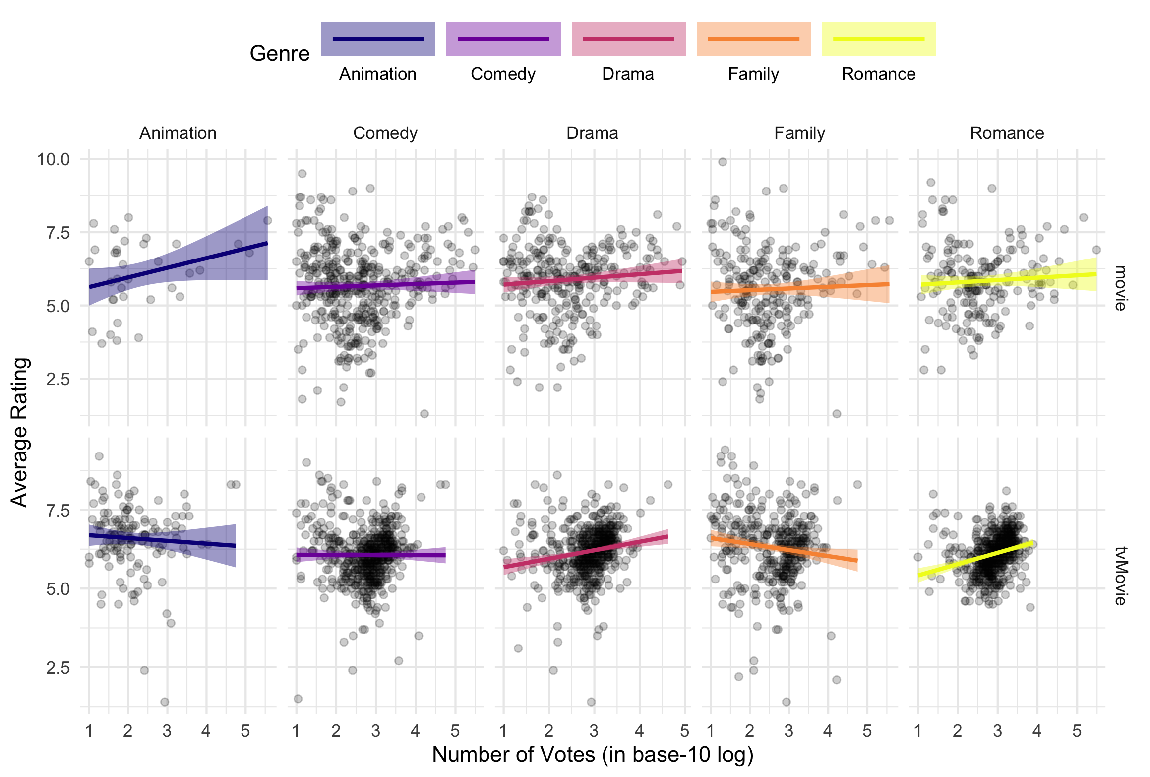
- Provide R code to recreate the ggplot figure illustrating how the relationship between log10(num_votes) and average_rating varies by the popular genres and title_type.
- The five popular genres are selected in terms of the number of titles for each genre.
- The video type of the titles are removed in the ggplot figure.
Show answer
popular_genres <- holiday_movies_with_genres |>
group_by(genres) |>
count() |>
ungroup() |>
slice_max(n, n = 5)
holiday_movies_with_genres |>
filter(genres %in% popular_genres$genres,
title_type != 'video') |>
group_by(genres) |>
mutate(mean_rating = mean(average_rating, na.rm = T)) |>
ggplot(aes(y = average_rating, x = log10(num_votes))) +
geom_point(alpha = .2) +
geom_smooth(aes(color = genres,
fill = genres),
method = lm) +
# coord_cartesian(ylim = c(5,7)) +
facet_grid(title_type~ genres, scales = "free") +
labs(x = "Number of Votes (in base-10 log)",
y = "Average Rating",
color = "Genre",
fill = "Genre") +
scale_color_viridis_d(option = "C") +
scale_fill_viridis_d(option = "C") +
theme_minimal() +
theme(
legend.position = "top"
) +
guides(
color = guide_legend(
keywidth = 4,
label.position = "bottom"
),
fill = guide_legend(
keywidth = 4,
label.position = "bottom"
)
)Q1d.
- Provide a comment to illustrate how the relationship between log10(num_votes) and average_rating varies by the popular genres and title_type.
Show answer
- The association between log10(num_votes) and average_rating depends on both genre and title_type.
- For TV/Movies, the relationship is generally clearer and more positive in Drama and Romance (ratings tend to rise as vote counts increase), while Family shows a negative slope (more-voted titles tend to have slightly lower ratings). Animation is roughly flat to slightly negative, and Comedy is close to flat.
- For Movies, the relationship is independent overall with wide scatter.
- For TV/Movies, the relationship is generally clearer and more positive in Drama and Romance (ratings tend to rise as vote counts increase), while Family shows a negative slope (more-voted titles tend to have slightly lower ratings). Animation is roughly flat to slightly negative, and Comedy is close to flat.
Q1e.
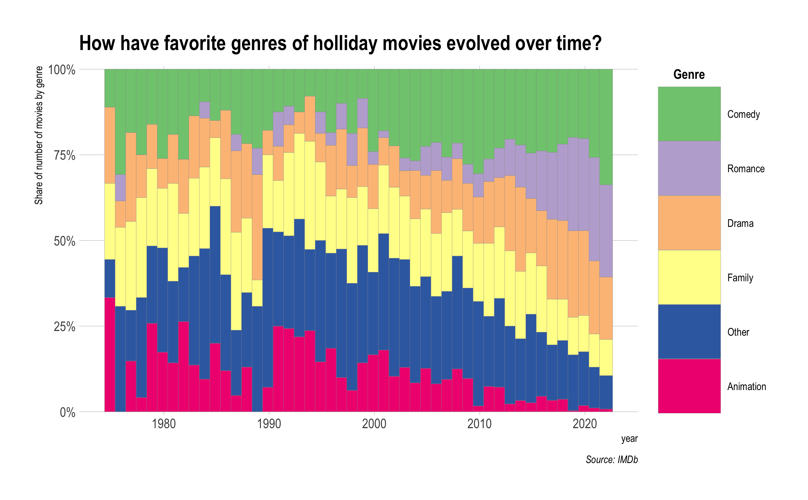
Provide R code to recreate the ggplot figure illustrating the annual trend of the share of number of movies by popular genre from year 1975 to 2022.
- For genres that are not popular, categorize them as “Other”.
- Consider changing the order of categories in genres.
Show answer
holiday_movies_with_genres |>
mutate(genres = ifelse( !(genres %in% popular_genres$genres), "Other", genres )) |>
group_by(year, genres) |>
count() |>
filter(year >= 1975, year <= 2022) |>
ggplot() +
geom_col(aes(x = year, y = n,
fill = fct_reorder2(genres, year, n)),
position = 'fill',
width = rel(1.25),
color = 'grey60',
linewidth = .1) +
labs(y = "Share of number of movies by genre",
fill = "Genre",
title = "How have favorite genres of holliday movies evolved over time?",
caption = "Source: IMDb") +
scale_fill_brewer(palette = "Accent") +
scale_y_percent() +
theme_ipsum() +
theme(panel.grid.minor = element_blank(),
legend.title = element_text(face = "bold",
hjust = .2)) +
guides(
fill = guide_legend(
keyheight = 3.25,
keywidth = 3.75
)
)Q1f.
Provide a comment to illustrate the annual trend of (1) the share of number of movies by popular genre from year 1975 to 2022.
- Which genre has become more popular since 2010?
Show answer
From 1975 to 2022, the genre mix of holiday movies changes quite a bit. In the late 1970s through the 2000s, Other and Family make up a large share of releases, while Animation gradually shrinks over time. Starting around 2010, Romance grows sharply and becomes a major share of holiday releases by the late 2010s and early 2020s. Comedy also becomes more prominent in the 2010s and remains a sizable share in recent years, while Family and Other decline in relative share.
- The genre that has become more popular since 2010 is Romance.
Q1g.
Add the following two variables—christmas and holiday—to the data.frame holiday_movies_with_genres:
christmas:
- TRUE if the simple_title includes “christmas”, “xmas”, “x mas”
- FALSE otherwise
holiday:
- TRUE if the simple_title includes “holiday”
- FALSE otherwise
Show answer
holiday_movies_with_genres <- holiday_movies_with_genres |>
mutate(christmas = ifelse(str_detect(simple_title, "christmas") |
str_detect(simple_title, "xmas") |
str_detect(simple_title, "x mas"),
T, F),
holiday = ifelse(str_detect(simple_title, "holiday"),
T, F),
)Q1h.
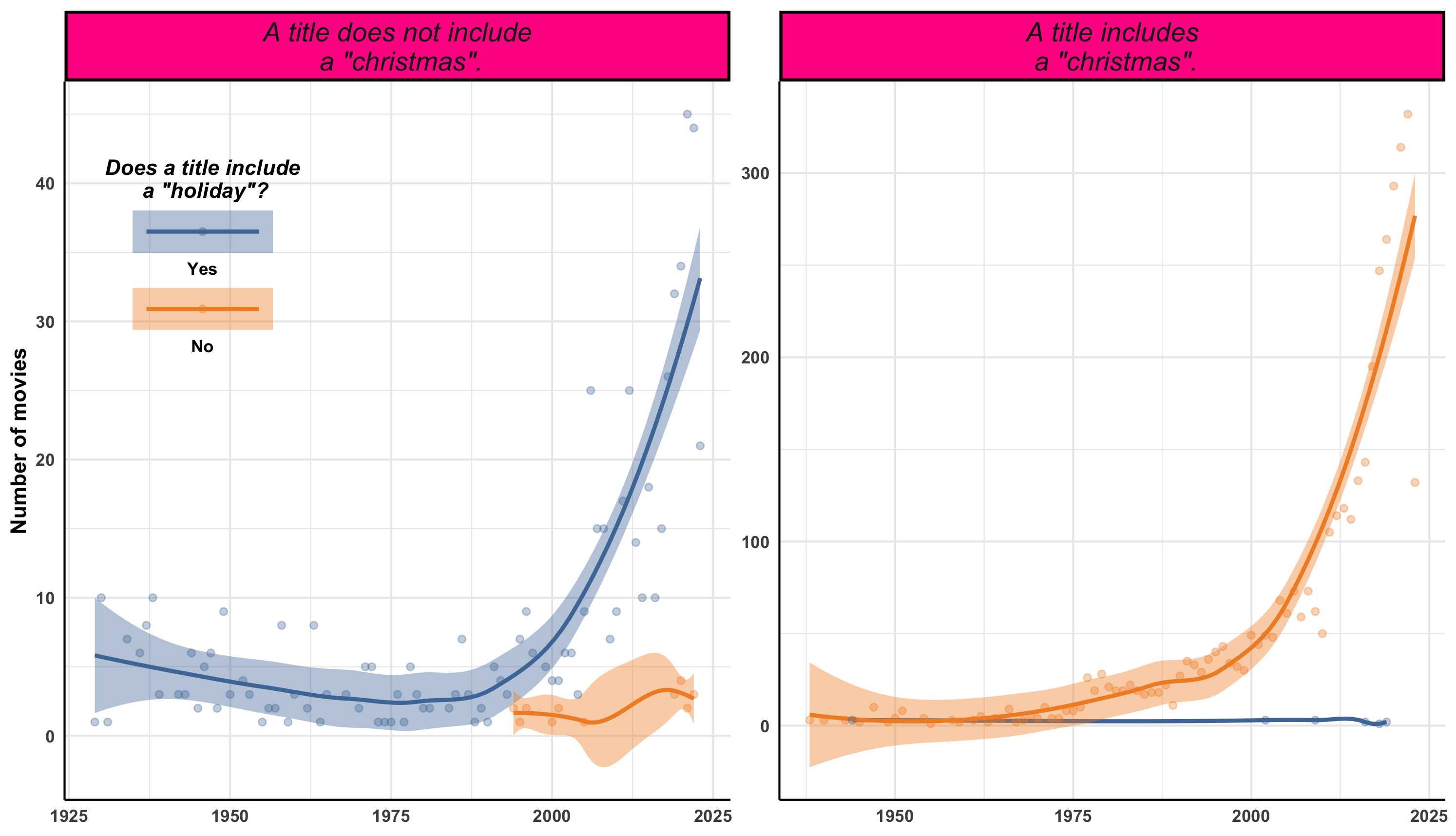
- Provide R code to recreate the ggplot figure illustrating the annual trend of (1) the number of movie titles with “holiday” varies by christmas.
Show answer
holiday_movies_with_genres <- holiday_movies_with_genres |>
mutate(christmas = ifelse(str_detect(simple_title, "christmas") |
str_detect(simple_title, "xmas") |
str_detect(simple_title, "x mas"),
T, F),
holiday = ifelse(str_detect(simple_title, "holiday"),
T, F),
)
holiday_movies_with_genres |>
group_by(year, christmas, holiday) |>
count() |>
mutate(holiday = factor(holiday,
levels = c(TRUE, FALSE),
labels = c("Yes", "No"))) |>
ggplot(aes(x = year, y = n, color = holiday, fill = holiday)) +
geom_smooth() +
geom_point(alpha = .33) +
facet_wrap(christmas~., scales = "free",
labeller = as_labeller(
c(
`TRUE` = 'A title includes\n a "christmas".',
`FALSE` = 'A title does not include\n a "christmas".'
)
)) +
labs(x = NULL,
y = "Number of movies",
color = 'Does a title include\n a "holiday"?',
fill = 'Does a title include\n a "holiday"?') +
scale_color_tableau() +
scale_fill_tableau() +
theme_minimal() +
theme(
legend.position = c(.1, .75),
legend.title.position = "top",
legend.title = element_text(hjust = .5,
face = "bold.italic"),
legend.text = element_text(face = "bold",
margin = margin(5,0,5,0)),
strip.background = element_rect(
fill = "deeppink",
color = "black",
size = 1.5
),
strip.text = element_text(size = rel(1.25),
face = 'italic'),
axis.text.x = element_text(face = "bold"),
axis.text.y = element_text(face = "bold"),
axis.title.y = element_text(face = "bold"),
axis.line.x = element_line(color = 'black'),
axis.line.y = element_line(color = 'black')
) +
guides(
color = guide_legend(
keywidth = 5,
keyheight = 1.5,
label.position = "bottom"
),
fill = guide_legend(
keywidth = 5,
keyheight = 1.5,
label.position = "bottom"
)
)Part 2. TripAdvisor

- The following is the data.frame for Part 2.
tripadvisor <- read_csv("https://bcdanl.github.io/data/tripadvisor_cleaned.csv")TripAdvisor is an online travel research company that empowers people around the world to plan and enjoy the ideal trip.
TripAdvisor wanted to know whether promoting membership on their platform could drive engagement and bookings.
To do so, TripAdvisor had just run an experiment to explore user retention by offering a random subset of customers an easier sign-up process for membership.
Variable description
id: a unique identifier for a user.time:- PRE if time is before the experiment;
- POST if time is in the 28 days after the experiment.
- For each id value, there are two observations—one with time == “PRE” and the other with time == “POST”.
days_visited: Number of days a user visited the TripAdvisor website.easier_signup:- TRUE if a user was exposed to the easier signup process (e.g., one-click signup) during the experiment;
- FALSE otherwise.
became_member:- TRUE if a user became a member during the experiment period;
- FALSE otherwise.
locale_en_US:- TRUE if a user accessed the website from the US;
- FALSE otherwise.
os_type: Windows, Mac, or Othersrevenue_pre: Amount of dollars a user spent on the website before the experimentThe following is the data.frame, tripadvisor.
rmarkdown::paged_table(tripadvisor,
options = list(rows.print = 20,
cols.print = 6,
pages.print = 0,
paged.print = F
)) Q2a.
Using the given data.frame, tripadvisor, create the data.frame, tripadvisor, for which
- time is a factor-type variable of time with the first level, “PRE”.
Show answer
tripadvisor <- tripadvisor |>
mutate(time = factor(time, levels = c("PRE", "POST")),
os_type = factor(os_type, levels = c("Windows", "Mac", "Others") ) )Q2b.
Provide R code to recreate the ggplot figure illustrating how the relationship between time and days_visited varies by easier_signup and became_member.
- Row-wise split is based on easier_signup.
- Column-wise split is based on became_member.
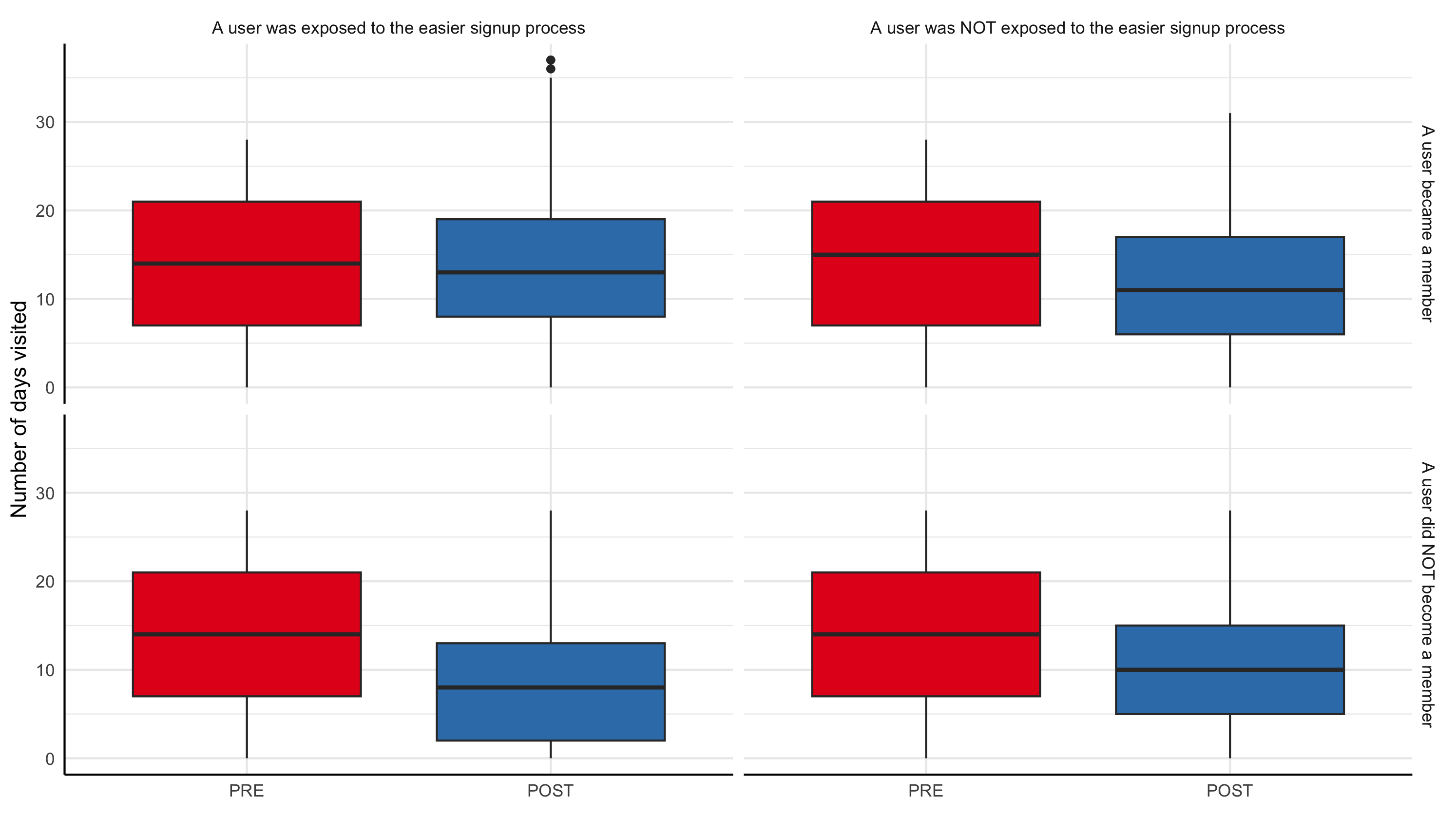
Show answer
tripadvisor |>
mutate(
easier_signup = factor(easier_signup,
levels = c(TRUE,FALSE),
labels = c("A user was exposed to the easier signup process",
"A user was NOT exposed to the easier signup process")),
became_member = factor(became_member,
levels = c(TRUE,FALSE),
labels = c("A user became a member",
"A user did NOT become a member")),
time = factor(time,
levels = c("PRE", "POST"))
) |>
ggplot(aes(y = days_visited,
x = time)) +
geom_boxplot(aes(fill = time),
show.legend = F) +
facet_grid(became_member ~ easier_signup) +
labs(x = "",
y = "Number of days visited") +
scale_fill_brewer(palette = "Set1") +
theme_minimal() +
theme(
axis.line.x = element_line(color = 'black'),
axis.line.y = element_line(color = 'black')
)Q2c.
- Provide a comment to illustrate how the relationship between time and days_visited varies by easier_signup and became_member.
Show answer
- The change in days_visited from PRE to POST depends on both easier_signup and whether the user became a member.
- For users who became members, days_visited stays roughly similar from PRE to POST, regardless of whether they were exposed to the easier signup process.
- For users who did not become members, days_visited drops from PRE to POST, and the decline is much larger for those who were exposed to the easier signup process. This suggests that the change reduced repeat visits among non-members.
- For users who became members, days_visited stays roughly similar from PRE to POST, regardless of whether they were exposed to the easier signup process.
Q2d.
Provide a R code to create the data.frame q2d that includes the variable diff, the difference between (1) the value of days_visited for time == PRE and (2) the value of days_visited for time == POST for each id.
The resulting data.frame should look as follows:
q2d <- read_csv('https://bcdanl.github.io/data/tripadvisor_diff.csv')rmarkdown::paged_table(q2d,
options = list(rows.print = 20,
cols.print = 6,
pages.print = 0,
paged.print = F
)) - Include only the variables as shown above.
- Adjust the order of the variables as shown above.
Show answer
q2d <- tripadvisor |>
pivot_wider(names_from = time,
values_from = days_visited) |>
relocate(PRE, POST, .after = id) |>
mutate(diff = POST - PRE, .before = PRE) |>
select(id:became_member)Q2e.
Provide an R code to calculate how the difference in the mean value of diff varies by easier_signup and became_member using the data.frame q2d.
The resulting data.frame should look as follows:
q2e <- read_csv('https://bcdanl.github.io/data/tripadvisor_diff_mean.csv')rmarkdown::paged_table(q2e,
options = list(rows.print = 20,
cols.print = 6,
pages.print = 0,
paged.print = F
))
Show answer
q2e <- q2d |>
group_by(easier_signup, became_member) |>
summarise(mean_diff = round(mean(diff),2))Q2f.
- Using the resulting data.frame in Q2e, discuss the following question:
- What is the effect of easier signup process on the number of days a user visited the TripAdvisor website?
- How does this effect varies by the status of became_member?
Show answer
From the Q2e summary table (mean_diff), days_visited declines from PRE to POST in every group (all mean_diff values are negative). The size of that decline depends on whether users saw the easier signup process and whether they became a member.
- Among users who did not become members (
became_member = FALSE), the decline is larger with easier signup:- easier_signup = FALSE: mean_diff = -3.89
- easier_signup = TRUE: mean_diff = -5.71
- Effect of easier signup (difference): -5.71 − (-3.89) = -1.82
This suggests easier signup is associated with about 1.82 fewer days visited (a larger drop) among non-members.
- easier_signup = FALSE: mean_diff = -3.89
- Among users who became members (
became_member = TRUE), the decline is smaller with easier signup:- easier_signup = FALSE: mean_diff = -2.60
- easier_signup = TRUE: mean_diff = -0.62
- Effect of easier signup (difference): -0.62 − (-2.60) = +1.98
This suggests easier signup is associated with about 1.98 more days visited (a smaller drop) among members.
- easier_signup = FALSE: mean_diff = -2.60
Overall, the easier signup process appears to reduce engagement among non-members (larger decline), but helps retain engagement among users who become members (smaller decline).
Question 3. Netflix

The following is the data.frame for Question 3:
netflix <- read_csv(
"https://bcdanl.github.io/data/netflix_cleaned.csv")Variable Description
id: unique identifier for each showtitle: titledescription: descriptiondirector: directorsgenre: genres- Each content can belong to multiple genres.
- They are seperated by commas.
- The maximum number of genres a show can belong to is 3.
cast: cast (seperated by commas)production_country: production countries- Each content could be produced in multiple countries.
- They are separated by commas.
- The maximum number of countries in which a show was produced is 8.
release_date: release date (year in which it was released)date_added: date the show was added to Netflix- e.g., the format of the value is character with MONTH, DAY, YEAR
rating: ratingduration: duration (in min for movies and number of seasons (e.g., 2 Seasons) for shows)
- The following is the data.frame, netflix.
rmarkdown::paged_table(netflix,
options = list(rows.print = 20,
cols.print = 6,
pages.print = 0,
paged.print = F
)) Q3a.
Separate the variable
imdb_scoreinto the two numeric variables, imdb and imdb_max, for which- imdb is a value of imdb_score before
/;
- imdb is a value of imdb_score before
- imdb_max is a value of imdb_score after
/.
- imdb_max is a value of imdb_score after
For example, if imdb_score == 6.6/10, then imdb == 6.6 and imdb_max == 10.
Separate the variable
genreinto the following three variables,- genre_1, genre_2, and genre_3,
- for which a value of each variable is one single genre.
Separate the variable production_country into the eight variables, - country_1, country_2, country_3, country_4, country_5, country_6, country_7, and country_8,
- in which a value of each variable is one single country.
The following displays the variables in the resulting data.frame,
netflix_str_cleaned:
netflix_str_cleaned <- read_csv(
"https://bcdanl.github.io/data/netflix_str_cleaned.csv")rmarkdown::paged_table(netflix_str_cleaned)
Show answer
netflix_str_cleaned <- netflix |>
separate(imdb_score, into = c("imdb", "imdb_max"),
sep = "/", convert = T) |>
separate(genre, into = c("genre_1", "genre_2", "genre_3"),
sep = ",", convert = T) |>
separate(production_country, into = c("country_1", "country_2",
"country_3", "country_4",
"country_5", "country_6",
"country_7", "country_8"),
sep = ",", convert = T) Q3b.
- Provide an R code to create the data.frame q3b with only the following two variables:
- country: country that produced a show
- n_shows: number of shows produced in a particular country.
- The following displays the variables in the resulting data.frame,
q3b:
q3b <- read_csv('https://bcdanl.github.io/data/netflix_country.csv')rmarkdown::paged_table(q3b) - Notice that, the observations are arranged by n_shows in descending order.
Show answer
q3b <- netflix_str_cleaned |>
select(starts_with("country")) |>
pivot_longer(col = country_1:country_8,
values_to = "country",
names_to = "n") |>
filter(!is.na(country)) |>
select(-n) |>
count(country) |>
arrange(-n) |>
mutate(country = ifelse( str_sub(country, 1, 1) == " ",
str_sub(country, 2, str_length(country)),
country) ) |>
group_by(country) |>
summarise(n_shows = sum(n, na.rm = T) ) |>
filter(country != "") |>
arrange(-n_shows)