library(tidyverse)
library(ggthemes)
library(hrbrthemes)
library(skimr)
library(rmarkdown)Homework 2
dplyr & ggplot2 with scales, guides, and themes
📌 Directions
Submit one Quarto document (
.qmd) to Brightspace:danl-310-hw2-LASTNAME-FIRSTNAME.qmd
(e.g.,danl-310-hw2-choe-byeonghak.qmd)
Due: March 2, 2026, 2:00 P.M. (ET)
For visualization questions, you must provide:
- the
ggplot2code, and
- a written comment (2–4 sentences) interpreting the corresponding figure.
- the
Unless a question says otherwise, use
dplyrverbs (filter(),distinct(),select(),mutate(),group_by(),summarise(),arrange(),count(), etc.) andggplot2.
✅ Setup
Part 1. Data Visualization
Replicate given ggplot figures.
Question 1
Use datasets::mtcars for Question 1.
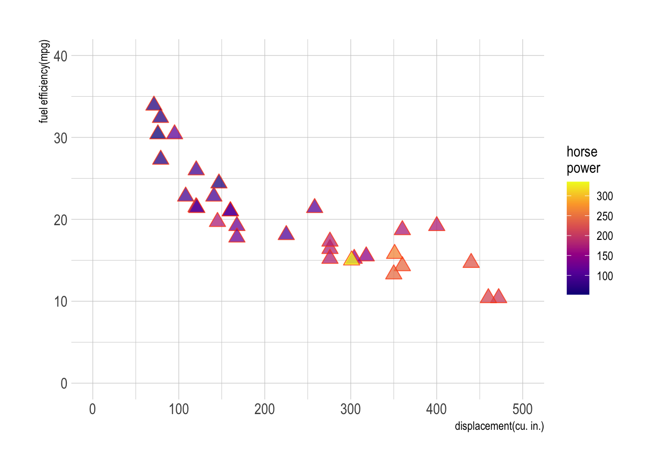
Show answer
m <- ggplot(data = mtcars,
            aes(x = disp, y = mpg, fill = hp))

m + geom_point(size = 4, alpha = .75,
               shape = 24, color = "orangered") + # add scatter plot with color mapped to "hp" variable
  labs(x = "displacement(cu. in.)", y = "fuel efficiency(mpg)",
       fill = "horse\npower")+ # add labels to x and y axes
  scale_fill_viridis_c(option = "C") +
  scale_x_continuous(limits = c(0,500)) +
  scale_y_continuous(limits = c(0,40)) +
  theme_ipsum()
Question 2
Use the following data.frame for Question 2.
popgrowth_df <- read_csv(
  'https://bcdanl.github.io/data/popgrowth.csv')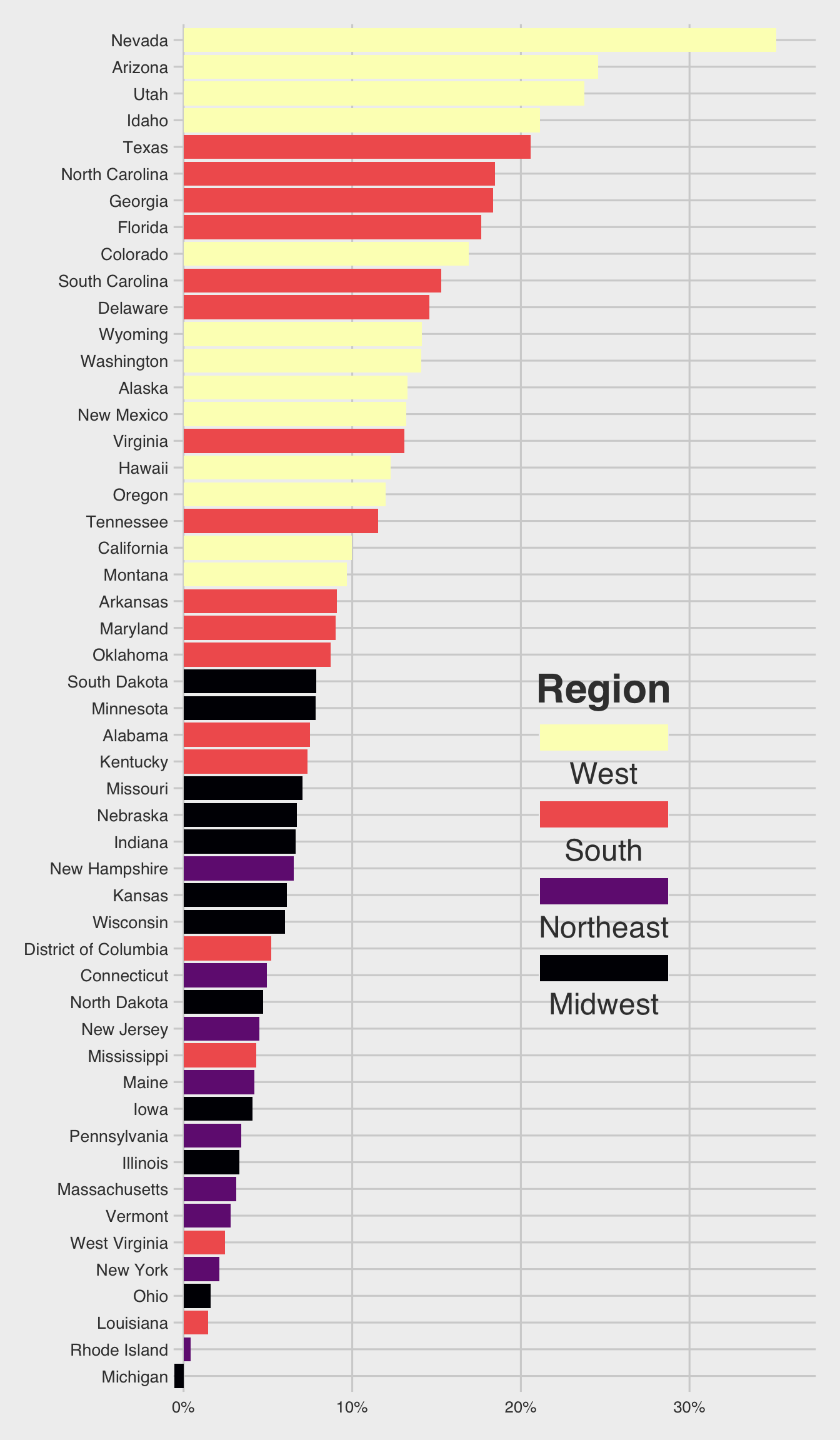
Show answer
Chunk option #| fig-height: 10 is used to create a 10-inch height of ggplot figure.
p <- ggplot(popgrowth_df,
            aes(y = fct_reorder(state, popgrowth),
                x = 100*popgrowth,
                fill = region))
p + geom_col() + # Add the geom for the columns
  labs(x = "population growth, 2000 to 2010",
       fill = "Region") +
  scale_x_continuous(
    labels = scales::percent_format(accuracy = 1, scale = 1) # Set percent labels for x axis
   ) +
  scale_fill_viridis_d(option = "A") +
    guides(fill = guide_legend(reverse = TRUE,
                             title.position = "top",
                             label.position = "bottom",
                             keywidth = 5,
                             ncol = 1)) +
  theme_fivethirtyeight() +
  theme(legend.position = c(.67, .4), # Set legend position
        legend.title = element_text(hjust = .5,
                                    face = "bold",
                                    size = rel(2),
                                    margin = margin(0,0,10,0)),
        legend.text = element_text(size = rel(1.5)),
        legend.background = element_rect(fill = NA),
        axis.text.y = element_text( size = 10,
                                    margin = margin(t = 0, r = 0, b = 0, l = 0) )) # Adjust the size and margin for y axis text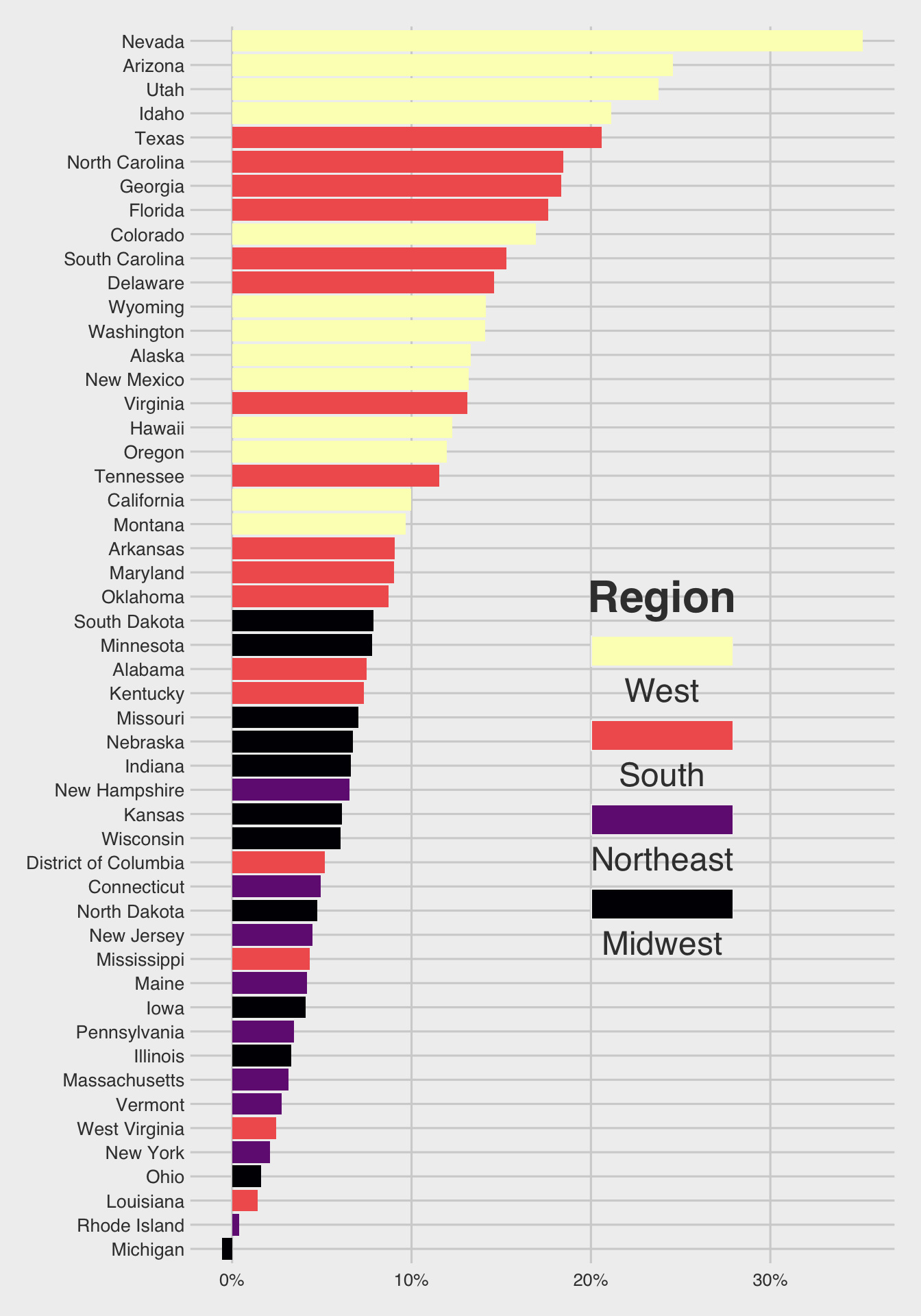
Question 3
Use the following data.frame for Question 3.
male_Aus <- read_csv(
  'https://bcdanl.github.io/data/aus_athletics_male.csv')
Show answer
colors <- c("#BD3828", rep("#808080", 4))
fills <- c("#BD3828D0", rep("#80808080", 4))

p <- ggplot(male_Aus,
            aes(x=height, y=pcBfat,
                shape = sport,
                color = sport,
                fill = sport))

# Add geom_point layer with custom size
p + geom_point(size = 3) +

# Set shape values for different sports
  scale_shape_manual(values = 21:25) +

# Set color values for different sports
  scale_color_manual(values = colors) +

# Set fill values for different sports
  scale_fill_manual(values = fills) +

# Set x and y axis labels
  labs(x = "height (cm)",
       y = "% body fat" )
Question 4
Use the following data.frame for Question 4.
titanic <- read_csv(
  'https://bcdanl.github.io/data/titanic_cleaned.csv')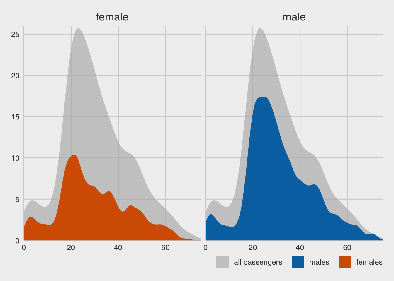
Show answer
ggplot only
p <- ggplot(titanic, aes(x = age, y = after_stat(count) ) )

# Add a density line plot for all passengers with transparent color, and fill legend with "all passengers"
p + geom_density(
    data = titanic |> select( -gender),
    aes(fill = "all passengers"),  # adding a new category, "all passengers" to the `fill` mapping.
    color = NA
  ) +
  # Add another density line plot for each gender with transparent color, and fill legend with gender
  geom_density(aes(fill = gender),
               bw = 2,
               color = NA) +

  # Create separate density line plots for male and female passengers
  facet_wrap(~gender) +

  labs(x = "passenger age (years)",
       y = "count",
       fill = NULL,) +
  # Set the x-axis limits, name, and expand arguments
  scale_x_continuous(limits = c(0, 75)
                     ) +
  # Set the y-axis limits, name, and expand arguments
  scale_y_continuous(limits = c(0, 26),
                     breaks = seq(0, 25, 5)
                     ) +
  # Set the manual color and fill values, breaks, and labels for the legend
  scale_fill_manual(
    values = c("#b3b3b3a0", "#0072B2", "#D55E00"),
    breaks = c("all passengers", "male", "female"),
    labels = c("all passengers  ", "males  ", "females"),
  ) +
  # guides(
  #   fill = guide_legend(
  #     direction = "horizontal")
  # ) +
  # Set the Cartesian coordinate system to allow for data points to fall outside the plot limits
  # Set the x-axis line to blank, increase the strip text size, and set the legend position and margin
  theme_fivethirtyeight() +
  theme(
    axis.line.x = element_blank(),
    strip.text = element_text(size = 14,
                              margin = margin(0, 0, 0.2, 0, "cm")),
    # legend.position = "bottom",
    legend.justification = "right"
  )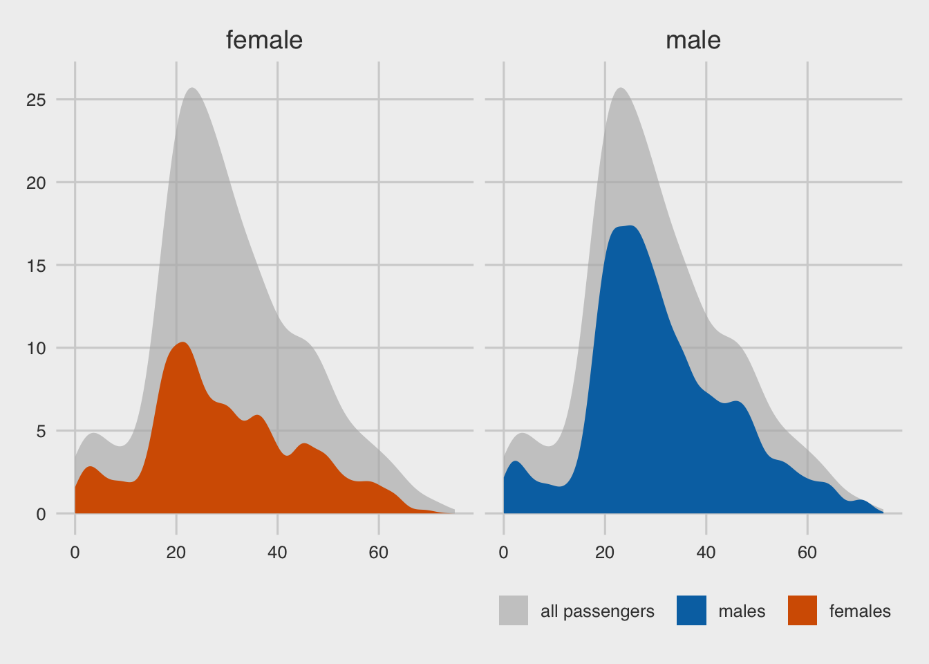
With data transformation
titanic_all_male <- titanic |>
  mutate(gender = "male",            # facet
         gender2 = "all passengers"  # fill
         )

titanic_all_female <- titanic |>
  mutate(gender = "female",
         gender2 = "all passengers"
         )

titanic_all2 <- bind_rows(titanic_all_male,
                          titanic_all_female)

titanic <- titanic |>
  mutate(gender2 = gender)  # fill

p <- ggplot(titanic, aes(x = age, y = after_stat(count) ) )

# Add a density line plot for all passengers with transparent color, and fill legend with "all passengers"
p + geom_density(
  data = titanic_all2,
  aes(fill = gender2),
  color = NA
) +
  # Add another density line plot for each gender with transparent color, and fill legend with gender
  geom_density(aes(fill = gender2),
               adjust = 0.5,
               color = NA) +

  # Create separate density line plots for male and female passengers
  facet_wrap(~gender) +

  labs(x = "passenger age (years)",
       y = "count",
       fill = NULL,) +
  # Set the x-axis limits, name, and expand arguments
  scale_x_continuous(limits = c(0, 75)
  ) +
  # Set the y-axis limits, name, and expand arguments
  scale_y_continuous(limits = c(0, 26),
                     breaks = seq(0, 25, 5)
  ) +
  # Set the manual color and fill values, breaks, and labels for the legend
  scale_fill_manual(
    values = c("#b3b3b3a0", "#0072B2", "#D55E00"),
    breaks = c("all passengers", "male", "female"),
    labels = c("all passengers  ", "males  ", "females"),
  ) +
  # guides(
  #   fill = guide_legend(
  #     direction = "horizontal")
  # ) +
  # Set the Cartesian coordinate system to allow for data points to fall outside the plot limits
  # coord_cartesian(clip = "off") +
  # Set the x-axis line to blank, increase the strip text size, and set the legend position and margin
  theme_fivethirtyeight() +
  theme(
    axis.line.x = element_blank(),
    strip.text = element_text(size = 14,
                              margin = margin(0, 0, 0.2, 0, "cm")),
    # legend.position = "bottom",
    legend.justification = "right"
  )
Question 5
Use the following data.frame for Question 5.
cows_filtered <- read_csv(
  'https://bcdanl.github.io/data/cows_filtered.csv')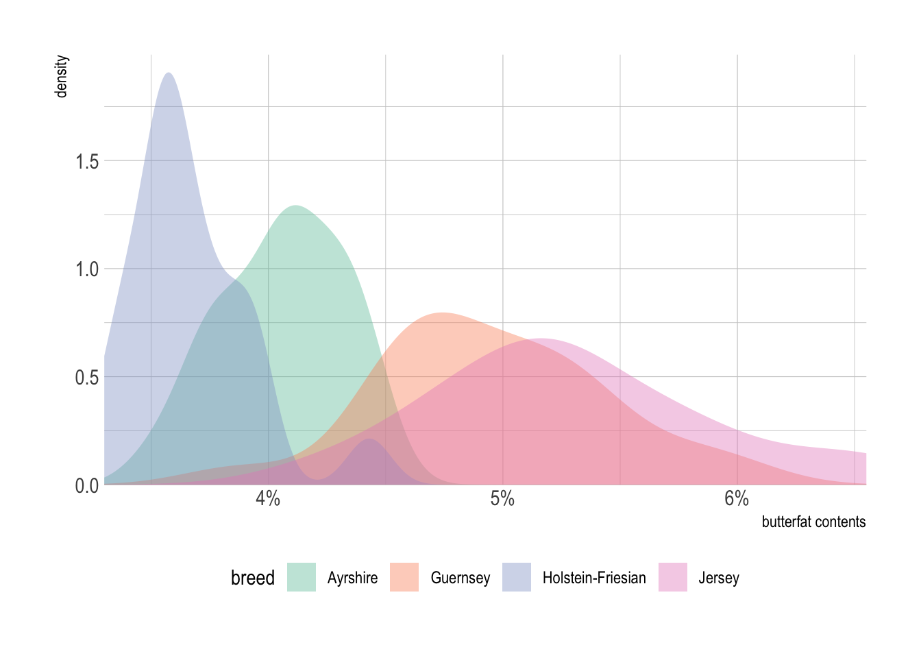
Show answer
p <- ggplot(cows_filtered,
            aes(x = butterfat,
                fill = breed))

# add a density line for each breed with some transparency
p + geom_density(alpha = .4, color = NA) +

  labs(x = "butterfat contents" ) +   # set axis label

  scale_x_continuous(
    # expand = c(0, 0), # remove padding from axis limits
    labels = scales::percent_format(accuracy = 1, scale = 1) # format axis labels as percentages with 1 decimal point
) +

  scale_y_continuous(limits = c(0, 1.99),
                     expand = c(0, 0)) +
  scale_fill_brewer(palette = 'Set2') +

# set plot area properties
  # coord_cartesian(clip = "off") + # allow density lines to extend beyond axis limits
  theme_ipsum() +
  theme(axis.line.x = element_blank(),
        legend.position = 'bottom') # remove x-axis line
Part 2. Data Transformation + Visualization
Load the data.frame for Part 2.
path <- 'https://bcdanl.github.io/data/GHG_emissions_by.csv'
ghg_emissions <- read_csv(path)
Question 6
Provide both ggplot code and a simple comment to describe the yearly trend of GHG emissions for each sector.
Show answer
ghg_emissions |>
  group_by(Sector, Year) |>
  summarise(GHG_emissions = sum(GHG_emissions, na.rm = T)) |>
  ggplot(aes(x = Year,
             y = GHG_emissions,
             color = Sector, fill = Sector)) +
  geom_line() +
  geom_point(color = 'black', size = .25) +
  geom_smooth(method = lm) +
  facet_wrap(.~ Sector, scales = 'free_y') +
  scale_y_comma() +
  scale_color_colorblind() +
  scale_fill_colorblind() +
  guides(fill = "none",
         color = "none") +
  theme_ipsum()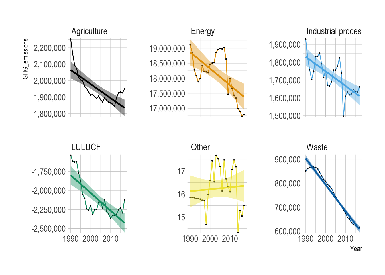
Overall, GHG emissions decreased over the years across all the sectors, except for the “Other” category.
LULUCF
Land Use, Land-Use Change, and Forestry (LULUCF) is a greenhouse gas inventory sector covering emissions and removals from managed land, forests, and soil, crucial for climate change mitigation. It acts as both a source (via deforestation) and a sink (via carbon absorption) of CO\(_2\)
Question 7
Provide both ggplot code and a simple comment to describe the yearly trend of United States of America’s GHG emissions for each sector.
Show answer
ghg_emissions |>
  filter(Party == "United States of America") |>
  ggplot(aes(x = Year,
             y = GHG_emissions,
             color = Sector, fill = Sector)) +
  geom_line(aes(color = Sector)) +
  geom_point(color = 'black', size = .25) +
  geom_smooth(method = lm) +
  facet_wrap(.~ Sector, scales = 'free_y') +
  scale_y_comma() +
  scale_color_colorblind() +
  scale_fill_colorblind() +
  guides(fill = "none",
         color = "none") +
  theme_ipsum()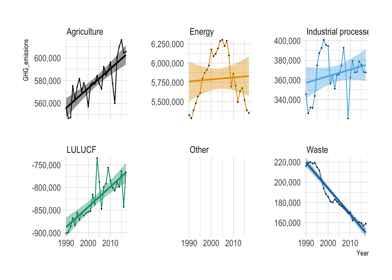
Overall, GHG emissions increased over the years in Agriculture, Industrial Process, and LULUCF.
Overall, GHG emissions decreased over the years in the Waste sector.
GHG emissions from Energy sector initially increased since 1990 and then started decreasing since 2005.
Question 8
For each party, calculate the yearly percentage change in GHG emissions for each sector.
Show answer
q8 <- ghg_emissions |>
  filter(GHG_emissions > 0) |>
  group_by(Party, Sector) |>
  mutate(year_gap = Year - lag(Year)) |>
  filter(year_gap == 1) |>
  mutate(pct = (GHG_emissions - lag(GHG_emissions)) / lag(GHG_emissions),
         pct = round(100 * pct, 2) )

q8 |>
  paged_table()
q8_negative <- ghg_emissions |>
filter(GHG_emissions < 0) |>
group_by(Party, Sector) |>
mutate(year_gap = Year - lag(Year)) |>
filter(year_gap == 1) |>
# Calculate percentage change between consecutive years
mutate(pct = (GHG_emissions - lag(GHG_emissions)) / lag(GHG_emissions),
# Round the percentage change to 2 decimal places
pct = round(100 * pct, 2) )
q8_negative |>
paged_table()Question 9
Which party has reduced GHG emissions most from 1990 level to 2017 level in terms of the percentage change in GHG emissions?
Show answer
q9 <- ghg_emissions |>
  filter(Year %in% c(1990, 2017)) |>
  group_by(Party, Year) |>
  summarize(GHG_emissions = sum(GHG_emissions, na.rm = T)) |>
  group_by(Party) |>  # this group_by() is not necessary
  mutate(prop = (GHG_emissions - lag(GHG_emissions)) / lag(GHG_emissions) ) |>
  ungroup() |>
  slice_min(prop, n = 1)

q9 |>
  paged_table()
Question 10
Which sector has reduced GHG emissions most from 1990 level to 2017 level in terms of the percentage change in GHG emissions?
Show answer
q10 <- ghg_emissions |>
  filter(Year %in% c(1990, 2017)) |>
  group_by(Sector, Year) |>
  summarize(GHG_emissions = sum(GHG_emissions, na.rm = T)) |>
  group_by(Sector) |>  # this group_by() is not necessary
  mutate(prop = (GHG_emissions - lag(GHG_emissions)) / lag(GHG_emissions) ) |>
  ungroup() |>
  select(Sector, prop) |>
  filter(!is.na(prop)) |>
  arrange(prop)

q10 |>
  paged_table()
To identify which sector reduced GHG emissions the most from 1990 to 2017, I calculate the percentage change in total GHG emissions for each sector:
\[ \text{percent change} = \frac{\text{GHG}_{2017} - \text{GHG}_{1990}}{\text{GHG}_{1990}} \times 100 \]
However, the LULUCF sector has negative emissions, so the usual percentage-change formula is not directly interpretable as a reduction measure. When the baseline emission level is negative, a positive percentage change can actually mean the sector became a stronger carbon sink, rather than indicating an increase in emissions in the usual sense.
Therefore, I exclude LULUCF from the direct comparison and compare only sectors with positive 1990 emissions.
The sector with the most negative value of
\[ \frac{\text{GHG}_{2017} - \text{GHG}_{1990}}{\text{GHG}_{1990}} \times 100 \]
is the sector that reduced GHG emissions the most in percentage terms among sectors with positive baseline emissions.
Note: LULUCF should be reported separately because its negative emissions make the standard percentage-change formula misleading for ranking emission reductions.