library(tidyverse)
library(skimr)
library(ggthemes)
library(hrbrthemes)
library(rmarkdown)Midterm Exam
DANL 310-01: Data Visualization and Presentation
Honor Pledges
I solemnly swear that I will not cheat or engage in any form of academic dishonesty during this exam.
I will not communicate with other students or use unauthorized materials.
I will uphold the integrity of this exam and demonstrate my own knowledge and abilities.
By taking this pledge, I acknowledge that academic dishonesty undermines the academic process and is a violation of the trust placed in me as a student.
I accept the consequences of any violation of this promise.
- Student’s Name: [YOUR_NAME_HERE]
The web-link for the exam questions is here
Below is R packages for this exam:
The following data.frame is for the exam:
eia <- read_csv("https://bcdanl.github.io/data/eia_raw_2025_11.csv")

rmarkdown::paged_table(eia)
Variable Description
year: Yearmonth: Monthmon_yr: Dateretail_price: Retail price (dollars per gallon)refining: Proportion of the retail price attributed to the refining componentdist_mkt: Proportion of the retail price attributed to the distribution and marketing componenttaxes: Proportion of the retail price attributed to taxescrude_oil: Proportion of the retail price attributed to crude oil
Note: For some observations, the sum of refining, dist_mkt, taxes, and crude_oil may not be equal to 100 but ranges from 98 to 100.1, due to rounding errors.
Question 1
Provide R code to create the data.frame q1 from the eia data frame.
The following shows the q1 data.frame:
q1 <- read_csv("https://bcdanl.github.io/data/danl-310-s26-midterm-q1.csv")

rmarkdown::paged_table(q1)
Answer:
# YOUR CODE HEREQuestion 2
Provide R code using the q1 data.frame to recreate the ggplot figure below that illustrates how the distribution of pct varies by component.
Use the “Dark2” color palette, provided by the
RColorBrewerpackage.Use the following character vectors for the
componentcategories:
c("crude_oil", "dist_mkt", "refining", "taxes")
c("Crude Oil", "Distribution \n& Marketing", "Refining", "Taxes")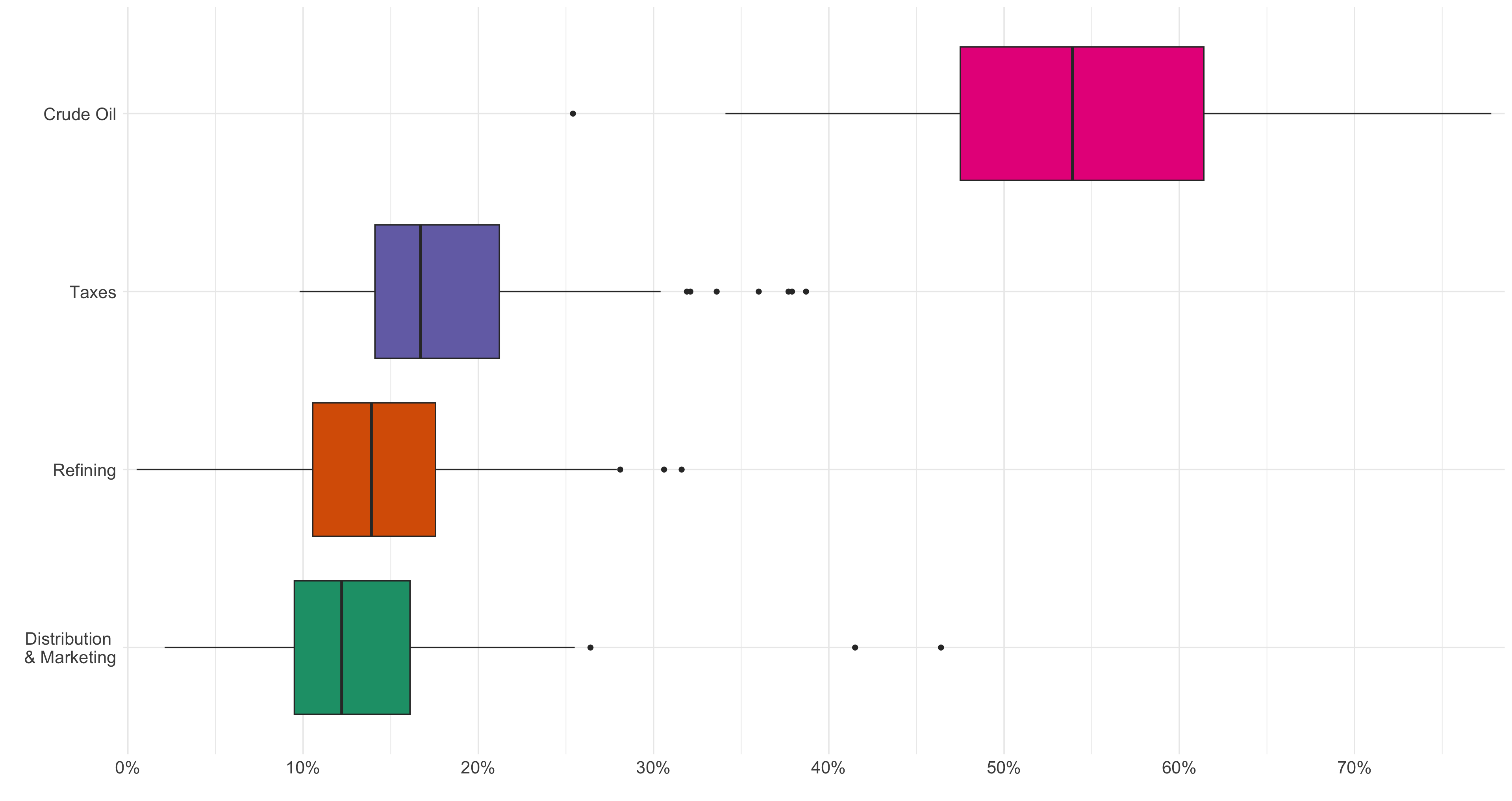
Answer:
# YOUR CODE HEREQuestion 3
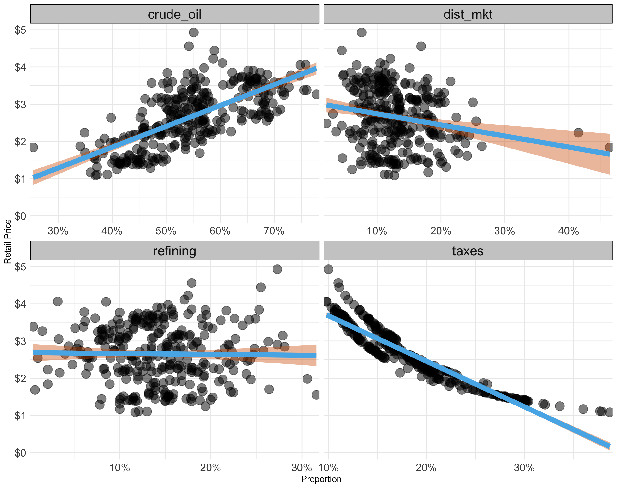
Provide R code using the q1 data.frame to recreate the ggplot figure below that illustrates how the relationship between retail_price and the proportion of retail price varies across the given attributes.
- Use the following colors: “#56B4E9”, “#D55E00”, and “grey80”
Answer:
# YOUR CODE HEREQuestion 4
Provide R code to create the data.frame q4 from the q1 data frame.
- The sum of
pct_adjwithin each month-year is exactly 100. - The sum of
retail_price_decomposedwithin each month-year is exactly theretail_pricefor that month-year.
The following shows the q4 data.frame:
q4 <- read_csv("https://bcdanl.github.io/data/danl-310-s26-midterm-q4.csv")

rmarkdown::paged_table(q4)
Answer:
# YOUR CODE HEREQuestion 5
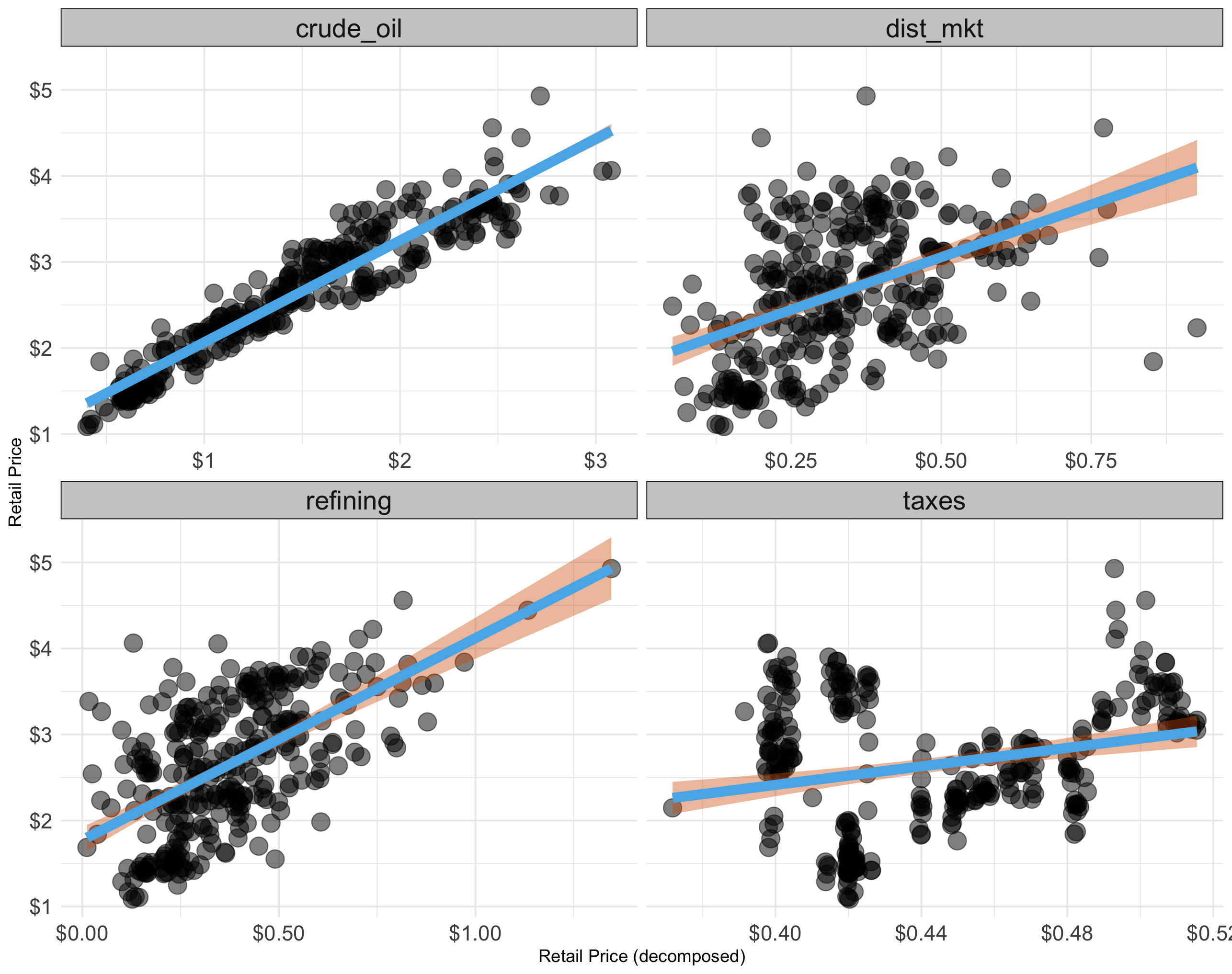
Provide R code using the q4 data.frame to recreate the ggplot figure below that illustrates how the relationship between retail_price and retail_price_decomposed varies across the given attributes.
- Use the following colors: “#56B4E9”, “#D55E00”, and “grey80”
Answer:
# YOUR CODE HEREQuestion 6
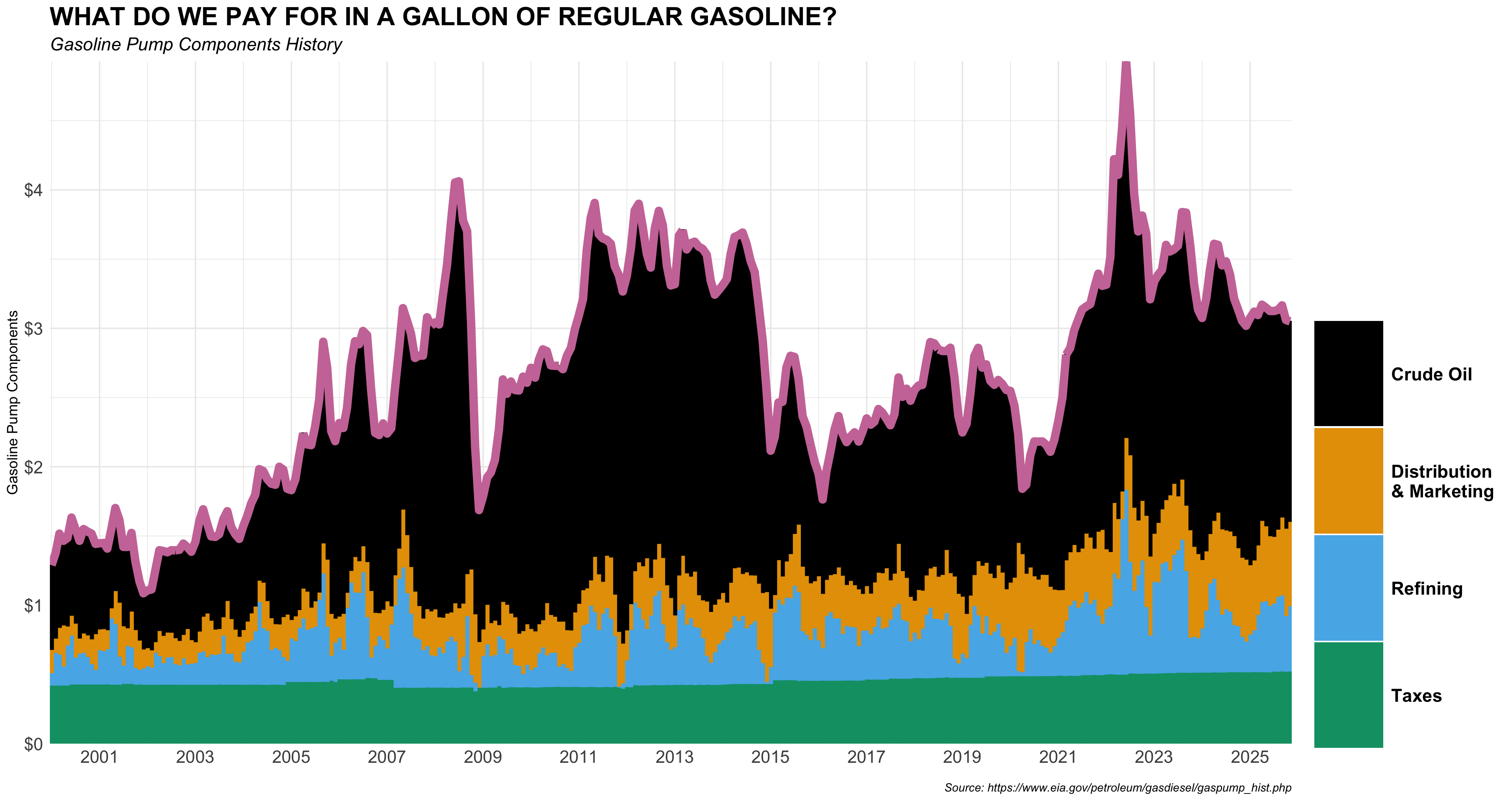
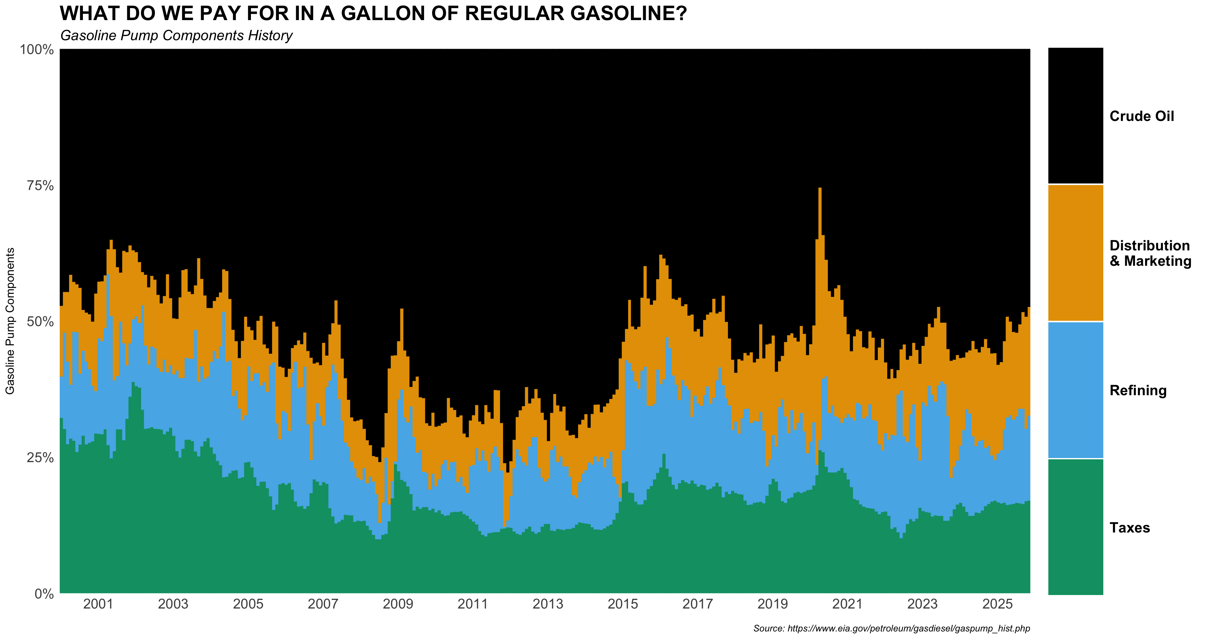
Provide R code using the q4 data.frame to recreate the ggplot figure below that illustrates how the monthly time trends of retail_price and retail_price_decomposed have been.
- Use the following character vectors for the
componentcategories:
c("crude_oil", "dist_mkt", "refining", "taxes")
c("Crude Oil", "Distribution \n& Marketing", "Refining", "Taxes")- Use the colorblind-friendly scale function provided by the R package,
ggthemes. - Use the following color for the line’s color.
- “#CC79A7”
- Use the following characters for plot labeling:
p_title <- 'WHAT DO WE PAY FOR IN A GALLON OF REGULAR GASOLINE?'
p_subtitle <- 'Gasoline Pump Components History'
p_caption <- 'Source: https://www.eia.gov/petroleum/gasdiesel/gaspump_hist.php'- Use the following scale function for x-axis scale:
  scale_x_date(
    date_breaks = "2 year",
    date_labels = "%Y",
    expand = c(0, 0)
  )
Answer:
# YOUR CODE HEREQuestion 7
Provide R code using the q4 data.frame to recreate the ggplot figure below that illustrates how the monthly time trends of pct_adj across components have been.
- Use the following character vectors for the
componentcategories:
c("crude_oil", "dist_mkt", "refining", "taxes")
c("Crude Oil", "Distribution \n& Marketing", "Refining", "Taxes")- Use the colorblind-friendly scale function provided by the R package,
ggthemes. - Use the following characters for plot labeling:
p_title <- 'WHAT DO WE PAY FOR IN A GALLON OF REGULAR GASOLINE?'
p_subtitle <- 'Gasoline Pump Components History'
p_caption <- 'Source: https://www.eia.gov/petroleum/gasdiesel/gaspump_hist.php'- Use the following scale function for x-axis scale:
  scale_x_date(
    date_breaks = "2 year",
    date_labels = "%Y",
    expand = c(0, 0)
  )
Answer:
# YOUR CODE HEREQuestion 8 (10 points)
No R coding Needed. Use the plots shown above (decomposed-dollar scatterplots, proportion scatterplots, the time-series component shares, and the boxplot of component shares) to interpret gasoline price components.
Focus only on crude_oil and taxes. For each of these two components:
- Proportion vs.
retail_price:
State whether the relationship appears positive, negative, or approximately independent, and briefly justify using evidence from the proportion scatterplot and/or the time-series stacked-share plot.
Answer:
- Decomposed dollar amount vs.
retail_price:
State whether the relationship appears positive, negative, or approximately independent, and briefly justify using evidence from the decomposed-dollar scatterplot.
Answer:
- Intuition (1–2 sentences):
Explain why this pattern makes sense economically (e.g., market-driven vs. policy-driven components, fixed-per-gallon vs. price-sensitive components).
Answer:
- Stability and variability (1 sentence each):
Using the time-series plot and the boxplot, comment on whether the component share is stable or volatile over time, and whether its share tends to be high or low on average compared to the other components.
Answer: