ev <- read_csv("https://bcdanl.github.io/data/electric_vehicles_WA.csv")

ev |>
paged_table()Classwork 9
Add Labels and Make Notes on ggplot
Part 1. Electric Vehicles in Washington State
county: County where the vehicle is registered.state: State where the vehicle is registered.postal_code: ZIP code of the vehicle registration location.model_year: Model year of the vehicle.make: Manufacturer brand of the vehicle.model: Specific model name of the vehicle.electric_vehicle_type: Type of electric vehicle, such as BEV or PHEV.- BEV (Battery Electric Vehicle): A fully electric vehicle powered only by a battery and electric motor.
- PHEV (Plug-in Hybrid Electric Vehicle): A vehicle that has both a battery-powered electric motor and a gasoline engine.
clean_alternative_fuel_vehicle_cafv_eligibility: Whether the vehicle is eligible for Clean Alternative Fuel Vehicle (CAFV) programs.electric_range: Estimated number of miles the vehicle can travel on electric power.base_msrp: Base manufacturer’s suggested retail price (MSRP) of the vehicle in U.S. dollars.vehicle_location: Geographic location of the vehicle, recorded as a point with longitude and latitude.
Question 1. Data Transformation
Create summary datasets:
- Top 10 counties by number of EVs
- Top 10 makes by number of EVs
- Average electric range for makes with at least 500 vehicles
Show answer
# Top 10 counties by number of EVs
top_counties <- ev |>
  count(county, state) |>
  slice_max(n, n = 10, with_ties = T)

# Top 10 makes by number of EVs
top_makes <- ev |>
  count(make) |>
  slice_max(n, n = 10, with_ties = T)

# Average electric range for makes with at least 500 vehicles
top_ranges <- ev |>
  group_by(make) |>
  summarize(n = n(),
            electric_range_avg = mean(electric_range, na.rm = T)) |>
  filter(n >= 500) |>
  slice_max(electric_range_avg, n = 10, with_ties = T)
Question 2. Basic geom_text() on a scatterplot
Create a data.frame
range_by_make, which summarizes average electric range for makes.Create a scatterplot using
range_by_makewith:x = n_makey = avg_range
Then add text labels showing the make name using geom_text().
Show answer
range_by_make <- ev |>
  group_by(make) |>
  summarize(n_make = n(),
            avg_range = mean(electric_range, na.rm = T))

range_by_make |>
  filter(n_make >= 500) |>
  ggplot(aes(x = n_make, y = avg_range)) +
  geom_point(alpha = .5) +
  geom_text(aes(label = make)) +
  theme_ipsum()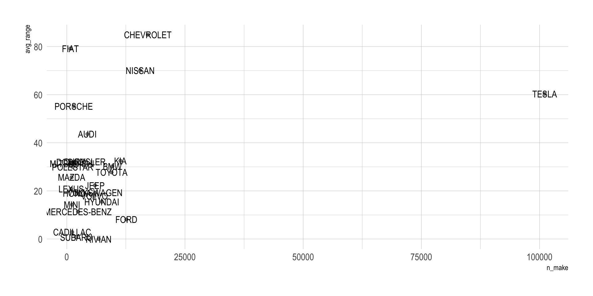
Question 3. Improve label placement in geom_text()
Modify your plot from Question 2 and improve readability by changing some arguments inside geom_text().
Tasks
- Try
vjust - Try
hjust - Try
size - Try
color
Show answer
range_by_make |>
  mutate(tesla = ifelse(make == "TESLA", T, F)) |>
  ggplot(aes(x = n_make,
             y = avg_range,
             label = make)) +
  geom_point(alpha = .5) +
  geom_text(size = 7.5,
            hjust = 0,
            vjust = 1,
            nudge_x = 500,
            check_overlap = T,
            aes(color = tesla),
            show.legend = F) +
  scale_color_manual(values = c( "grey", "maroon")) +
  scale_x_continuous(limits = c(0, 110000) ) +
theme_ipsum() 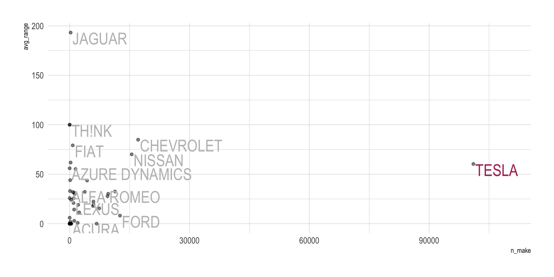
Question 4. Use geom_text_repel()
Recreate the scatterplot from Question 2, but use geom_text_repel() instead of geom_text().
Tasks
Use at least these arguments:
sizebox.paddingmax.overlaps
Show answer
range_by_make |>
  mutate(tesla = ifelse(make == "TESLA", T, F)) |>
  filter(n_make >= 500) |>
  ggplot(aes(x = n_make, y = avg_range)) +
  geom_point(alpha = .5) +
  geom_text_repel(size = 7.5,
                  aes(color = tesla,
                      label = make),
                  show.legend = F,
                  max.overlaps = 15,
                  box.padding = .5) +
  scale_color_manual(values = c( "grey", "maroon")) +
  theme_ipsum()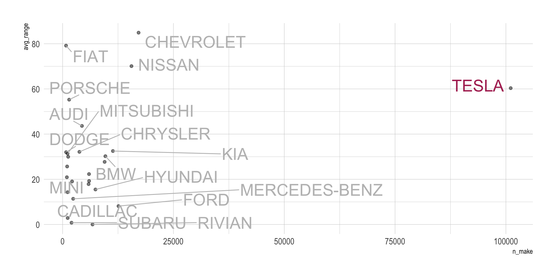
Question 5. Add a custom note with annotate()
Using the range_by_make scatterplot, add a custom annotation with annotate() that points out the make with the highest average electric range.
Tasks
- Add a short text note such as
"Highest average range" - Place the annotation near the relevant point
- Also, add a segment or arrow.
Show answer
range_by_make |>
  mutate(tesla = ifelse(make == "TESLA", T, F)) |>
  ggplot(aes(x = n_make,
             y = avg_range,
             label = make)) +
  geom_point(alpha = .5) +
  geom_text_repel(size = 7.5,
                  aes(color = tesla),
                  show.legend = F,
                  max.overlaps = 15,
                  box.padding = .5) +
  annotate(
    geom = "label",
    label = "Highest average range",
    x = 25000*1.5,
    y = (175+200)/2,
    hjust = 0
  ) +
  annotate(
    geom = "segment",
    x = 25000*1.5, xend = 12500*1.5,
    y = (175+200)/2, yend = (175+200)/2,
    color = "darkorange",
    linewidth = 0.7,
    arrow = arrow(length =
                    unit(0.15, "in"))
  ) +
  annotate(
    geom = "rect",
    label = "Highest average range",
    xmin = 0, xmax = 12500*1.5,
    ymin = 175, ymax = 205,
    fill = "darkorange",
    alpha = .5
  ) +

  scale_color_manual(values = c( "grey", "maroon")) +
  theme_ipsum()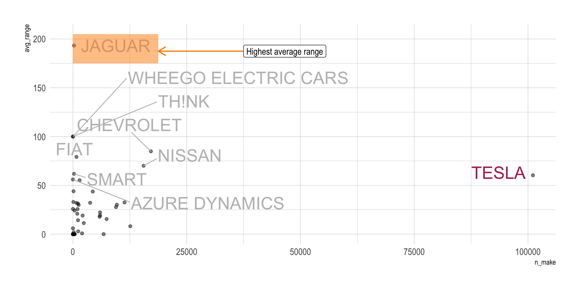
Question 6. geom_col() with numbers on top of bars
Use county_counts to create a bar chart with:
- EV counts on the x-axis
- counties on the y-axis
- bars created with
geom_col()
Then add the count values on top of the bars using geom_text().
Tasks
- reorder counties by count
- place the numbers slightly above the bars
Show answer
top_counties <- ev |>
  count(county, state) |>
  slice_max(n, n = 10, with_ties = T)

top_counties |>
  mutate(
    county = fct_reorder(county, n)
  ) |>
  ggplot(aes(x = n,
             y = county,
             fill = county)) +
  geom_col() +
  geom_text(aes( label = scales::comma( n ) ),
            hjust = 0,
            nudge_x = 1000
  ) +
  scale_fill_viridis_d() +
  hrbrthemes::scale_x_comma(limits = c(0, max(top_counties$n)*1.15)) +
  guides(fill = "none") +
  theme_ipsum() +
  labs(y = "",
       x = "Number of EVs")
top_counties |>
  mutate(
    county = fct_reorder(county, n),
    pct = round( n / sum(n), 2)
  ) |>
  ggplot(aes(x = n,
             y = county,
             fill = county)) +
  geom_col() +
  geom_text(aes( label = scales::percent(pct) ),
            hjust = 0,
            nudge_x = 1000
  ) +
  scale_fill_viridis_d() +
  scale_x_comma(limits = c(0, max(top_counties$n)*1.15),
                breaks = seq(0,125000, 25000)) +
  guides(fill = "none") +
  theme_ipsum() +
  labs(y = "",
       x = "Number of EVs")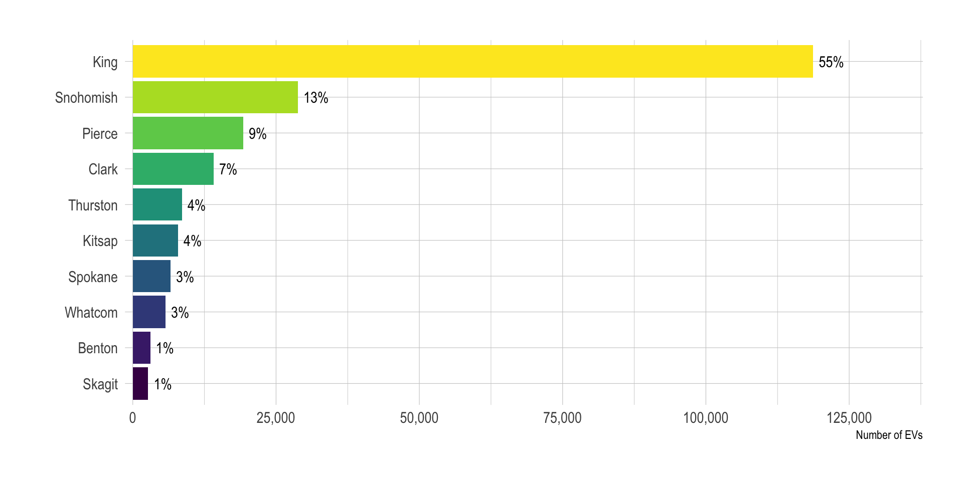
Question 7. geom_bar() with numbers that match bar heights
Use the original ev data to create a bar chart of electric_vehicle_type with geom_bar().
Then add labels that show the number of vehicles in each category.
Tasks
- build the bars with
geom_bar() - add count labels on top of the bars
- make sure the numbers correspond to the bar heights
Show answer
ev_type <- ev |>
  count(electric_vehicle_type)

# geom_col()
# geom_bar(stat = "identity")

ev_type |>
  mutate(
    electric_vehicle_type = fct_reorder(electric_vehicle_type, n)
  ) |>
  ggplot(aes(x = n,
             y = electric_vehicle_type,
             fill = electric_vehicle_type)) +
  geom_bar(stat = "identity") +
  geom_text(aes( label = scales::comma(n) ),
            hjust = 0,
            nudge_x = 1000
  ) +
  scale_fill_viridis_d() +
  scale_x_comma(limits = c(0, max(ev_type$n)*1.15)) +
  guides(fill = "none") +
  theme_ipsum() +
  labs(y = "",
       x = "Number of EVs")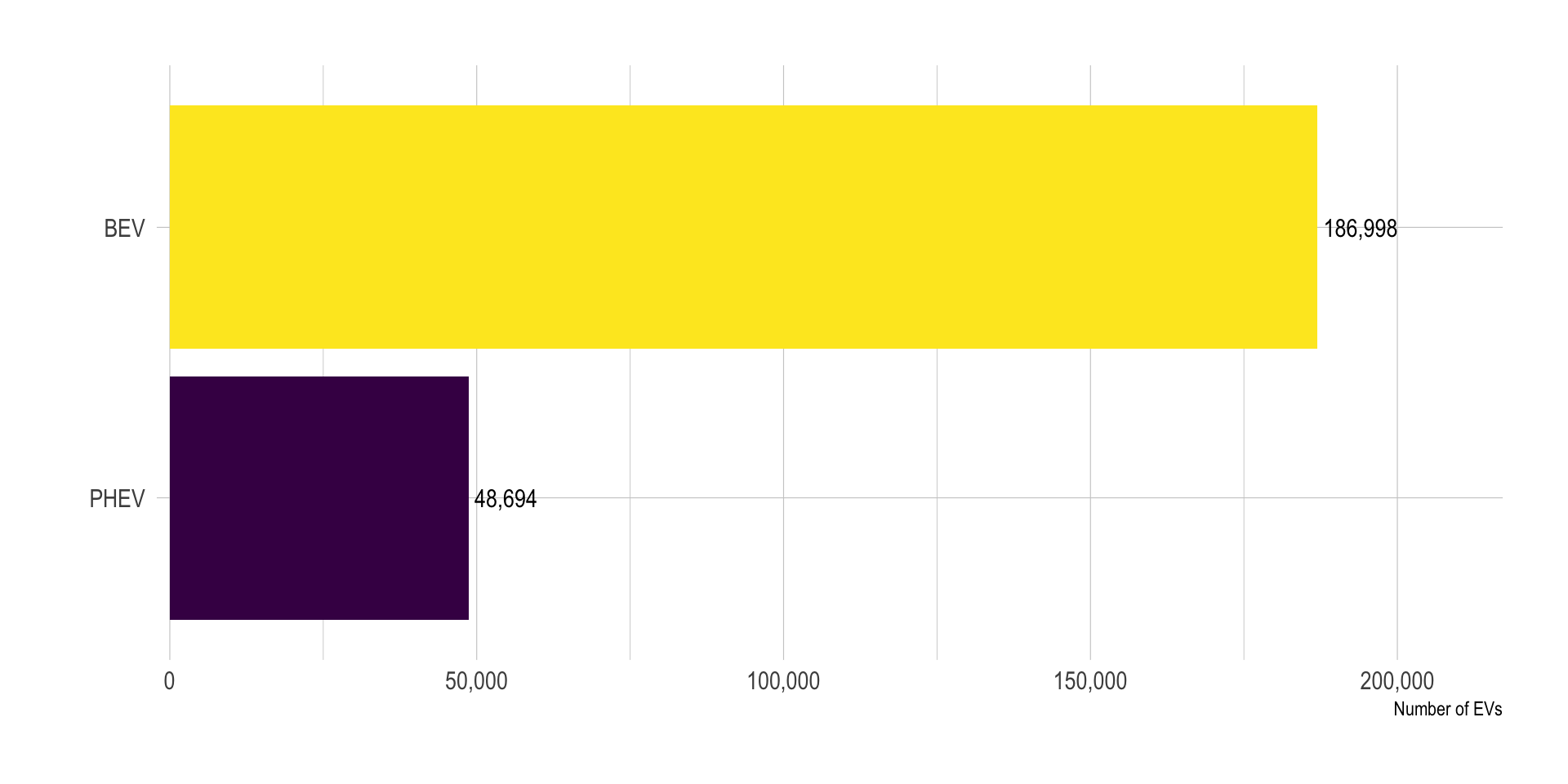
Question 8. Highlight one bar with annotate()
Using your county bar chart from Question 6, add an annotation that highlights the county with the largest number of EVs.
Show answer
top_counties <- ev |>
  count(county, state) |>
  slice_max(n, n = 10, with_ties = T)

top_counties |>
  mutate(
    county = fct_reorder(county, n)
  ) |>
  ggplot(aes(x = n,
             y = county,
             fill = county)) +
  geom_col() +
  geom_text(aes( label = scales::comma(n) ),
            hjust = 0,
            nudge_x = 1000
  ) +
  scale_fill_manual(
    values = c(rep("grey", 9), "red4")
  ) +
  scale_x_comma(limits = c(0, max(top_counties$n)*1.15)) +
  guides(fill = "none") +
  theme_ipsum() +
  labs(y = "",
       x = "Number of EVs")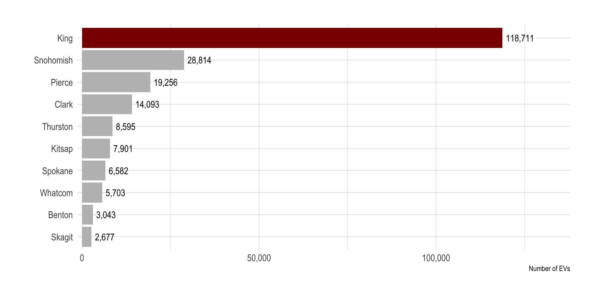
Discussion
Welcome to our Classwork 9 Discussion Board! 👋
This space is designed for you to engage with your classmates about the material covered in Classwork 9.
Whether you are looking to delve deeper into the content, share insights, or have questions about the content, this is the perfect place for you.
If you have any specific questions for Byeong-Hak (@bcdanl) regarding the Classwork 9 materials or need clarification on any points, don’t hesitate to ask here.
All comments will be stored here.
Let’s collaborate and learn from each other!