uk_soccer <- read_csv("https://bcdanl.github.io/data/premier_league_2022.csv")

rmarkdown::paged_table(uk_soccer)Classwork 8
Data Wrangling with tidyr, forcats, and stringr
Part 1. Premier League Soccer

Variable description
Date: The date when the match was played
HomeTeam: The home team
AwayTeam: The away team
FTHG: The home team’s goals after the match ends (full-time)
FTAG: The away team’s goals after the match ends (full-time)
FTR: The match result after the match ends (full-time)
- The value of FTR is “H” if FTHG is greater than FTAG;
- The value of FTR is “D” if FTHG is equal to FTAG;
- The value of FTR is “A” if FTHG is less than FTAG.
HTHG: The home team’s goals at the half-time of the match
HTAG: The away team’s goals at the half-time of the match
HTR: The match result at the halftime of the match
- The value of HTR is “H” if HTHG is greater than HTAG;
- The value of HTR is “D” if HTHG is equal to HTAG;
- The value of HTR is “A” if HTHG is less than HTAG.
Q1a.
Create the following two data.frames, tott_home and tott_away:
- tott_home includes all the observations whose HomeTeam is “Tottenham”.
- tott_home includes only the two variables, FTR and HTR.
- tott_away includes all the observations whose AwayTeam is “Tottenham”.
- tott_away includes only the two variables, FTR and HTR.
Show answer
tott_home <- uk_soccer |>
  filter(HomeTeam == "Tottenham") |>
  select(FTR, HTR)

tott_away <- uk_soccer |>
  filter(AwayTeam == "Tottenham") |>
select(FTR, HTR)- Below is the data.frame,
tott_home.
rmarkdown::paged_table(tott_home) - Below is the data.frame,
tott_away.
rmarkdown::paged_table(tott_away) Q1b.
- Create the following four data.frames.
- home_htr that counts the number of observations for each value of HTR in tott_home.
- home_ftr that counts the number of observations for each value of FTR in tott_home.
- away_htr that counts the number of observations for each value of HTR in tott_away.
- away_ftr that counts the number of observations for each value of FTR in tott_away.
Show answer
home_htr <- tott_home |> count(HTR)
home_ftr <- tott_home |> count(FTR)
away_htr <- tott_away |> count(HTR)
away_ftr <- tott_away |> count(FTR)- Below is the data.frame,
home_htr.
rmarkdown::paged_table(home_htr) - Below is the data.frame,
home_ftr.
rmarkdown::paged_table(home_ftr) - Below is the data.frame,
away_htr.
rmarkdown::paged_table(away_htr) - Below is the data.frame,
away_ftr.
rmarkdown::paged_table(away_ftr) Q1c.
- Create the following two data.frames:
- home_results is created using home_ftr and home_htr;
- away_results is created using away_ftr and away_htr.
Show answer
home_results <-
  left_join(home_ftr, home_htr,
            by = c('FTR' = 'HTR')) |>
  rename(result = FTR,
         FTR = n.x, HTR = n.y) |>
  mutate(tott_location = "Home", .before = 1)

away_results <-
  left_join(away_ftr, away_htr,
            by = c('FTR' = 'HTR')) |>
  rename(result = FTR, FTR = n.x, HTR = n.y) |>
mutate(tott_location = "Away", .before = 1)- Below is the data.frame, home_results.
rmarkdown::paged_table(home_results) - Variable result in home_results is:
- A if the away team won the match;
- D if the home and away teams made draws;
- H if the home team won the match.
- Variable FTR in home_results is variable n in home_ftr;
- Variable HTR in home_results is variable n in home_htr;
- Below is the data.frame, away_results.
rmarkdown::paged_table(away_results) - Variable result in away_results is:
- A if the away team won the match;
- D if the home and away teams made draws;
- H if the home team won the match.
- Variable FTR in away_results is variable n in away_ftr;
- Variable HTR in away_results is variable n in away_htr;
Q1d.
- For variable result in home_results data.frame, replace:
- “A” with “Lose”;
- “D” with “Draw”;
- “H” with “Win”.
- For variable result in away_results data.frame, replace:
- “A” with “Win”;
- “D” with “Draw”;
- “H” with “Lose”.
Show answer
home_results <- home_results |>
  mutate(result = ifelse(result == "A", "Lose",
                         ifelse(result == "D", "Draw", "Win")))
away_results <- away_results |>
  mutate(result = ifelse(result == "A", "Win",
ifelse(result == "D", "Draw", "Lose")))- Below is the data.frame, home_results.
rmarkdown::paged_table(home_results) - Below is the data.frame, away_results.
rmarkdown::paged_table(away_results) Q1e.
- Create the data.frame, tott_results, that combines the two data.frames home_results and away_results.
Show answer
home_results <- home_results |>
  pivot_longer(cols = FTR:HTR,
               names_to = "time",
               values_to = "count")

away_results <- away_results |>
  pivot_longer(cols = FTR:HTR,
               names_to = "time",
               values_to = "count")

tott_results <- home_results |>
rbind(away_results)- Below is the data.frame, tott_results.
rmarkdown::paged_table(tott_results) Q1f.
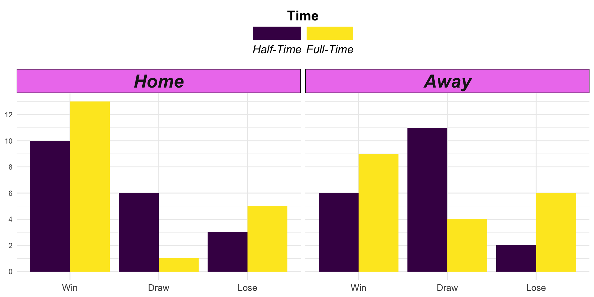
- Provide R code to recreate the ggplot figure illustrating how Tottenham Hotspur’s result varies by time and tott_location.
- Variable time is “Half-Time” if it is “HTR” in Q1e.
- Variable time is “Full-Time” if it is “FTR” in Q1e.
- Ensure that the order of values in result, time, and tott_location are properly set to recreate the ggplot.
Show answer
tott_results |>
  mutate(result = factor(result,
                         levels = c("Win", "Draw", "Lose")),
         time = ifelse(time == "FTR",
                       "Full-Time", "Half-Time"),
         time = factor(time,
                       levels = c("Half-Time", "Full-Time")),
         tott_location = factor(tott_location,
                                levels = c("Home", "Away"))) |>
  ggplot(aes(x = result,
             y = count, fill = time)) +
  geom_col(position = 'dodge') +
  facet_wrap(.~tott_location) +
  scale_fill_viridis_d() +
  scale_y_continuous(breaks = seq(0,12,2)) +
  theme_minimal() +
  theme(
    legend.position = "top",
    legend.title.position = "top",
    legend.title = element_text(hjust = .5,
                                face = "bold",
                                size = rel(1.5)),
    legend.text = element_text(hjust = .5,
                                face = "italic",
                                size = rel(1.25)),
    strip.text = element_text(size = rel(2),
                              face = "bold.italic"),
    strip.background = element_rect(fill = "violet"),
    axis.text.x = element_text(size = rel(1.25))
  ) +
  guides(
    fill = guide_legend(
      label.position = "bottom",
      keywidth = 4
    )
  ) +
  labs(
    fill = "Time",
    x = NULL,
    y = NULL
  )
Q1g.
- Provide a comment to illustrate how Tottenham Hotspur’s performance varies by time and tott_location using the visualization in Q1f.
Show answer
- Tottenham’s results shift noticeably from half-time to full-time, and the pattern differs by home vs away.
- Home: Full-time outcomes are more positive. Compared with half-time, Tottenham has more wins and fewer draws. This suggests that they often turn half-time draws into full-time wins at home.
- Away: Half-time results are draw-heavy, but by full-time there are fewer draws and more losses. This indicates that away matches are more likely to move from level at half-time to a loss by full-time (even though wins also increase).
- Home: Full-time outcomes are more positive. Compared with half-time, Tottenham has more wins and fewer draws. This suggests that they often turn half-time draws into full-time wins at home.
Part 2. Taylor Swift
Q2a.
- Below is the data.frame for Q2a in Part 2.
taylor_albums <- read_csv("https://bcdanl.github.io/data/taylor_albums.csv")- Below is the data.frame,
taylor_albums.
rmarkdown::paged_table(taylor_albums) Variable description
album_name: The name of the album. NA if the song was released separately from one of Taylor’s studio albums or EPs.
metacritic_score: The official album rating from metacritic.
user_score: The user rating from metacritic.
ep: Logical. Is the album a full studio album (FALSE) or an extended play (TRUE).
album_release: The date the album was released, in the format (YYYY-MM-DD).
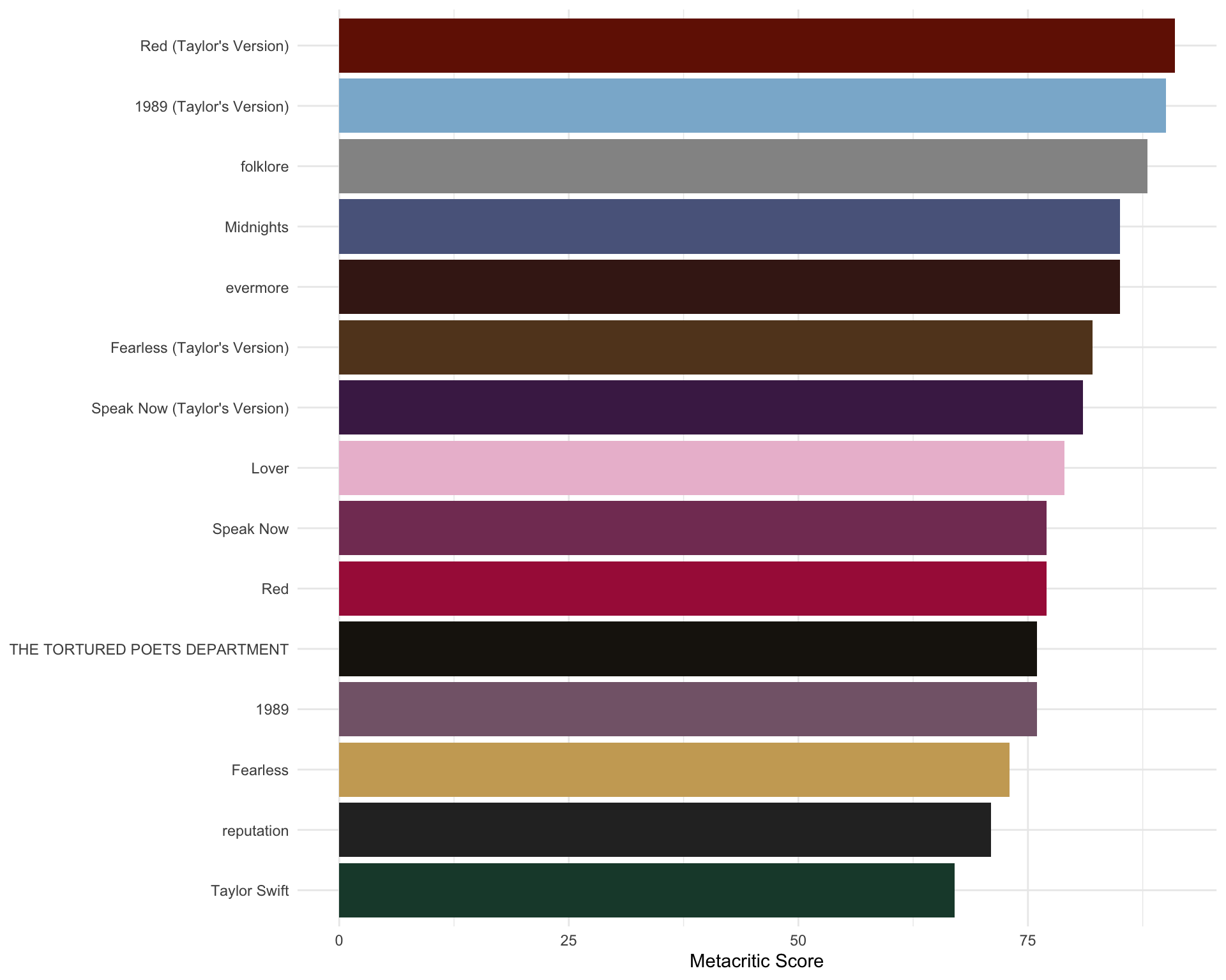
Provide R code to recreate the ggplot figure illustrating the Taylor Swift’s Album’s metacritic_scores
album_colors <- c(
  "Taylor Swift" = "#1D4737",
  "Fearless" = "#CBA863",
  "Fearless (Taylor's Version)" = "#624324",
  "Speak Now" = "#833C63",
  "Speak Now (Taylor's Version)" = "#4a2454",
  "Red" = "#A91E47",
  "Red (Taylor's Version)" = "#731803",
  "1989" = "#846578",
  "1989 (Taylor's Version)" = "#8BB5D2",
  "reputation" = "#2C2C2C",
  "Lover" = "#EBBED3",
  "folklore" = "#949494",
  "evermore" = "#421E18",
  "Midnights" = "#5A658B",
  "THE TORTURED POETS DEPARTMENT" = "#1C160F"
)
Show answer
album_colors <- c(
  "Taylor Swift" = "#1D4737",
  "Fearless" = "#CBA863",
  "Fearless (Taylor's Version)" = "#624324",
  "Speak Now" = "#833C63",
  "Speak Now (Taylor's Version)" = "#4a2454",
  "Red" = "#A91E47",
  "Red (Taylor's Version)" = "#731803",
  "1989" = "#846578",
  "1989 (Taylor's Version)" = "#8BB5D2",
  "reputation" = "#2C2C2C",
  "Lover" = "#EBBED3",
  "folklore" = "#949494",
  "evermore" = "#421E18",
  "Midnights" = "#5A658B",
  "THE TORTURED POETS DEPARTMENT" = "#1C160F"
)

ggplot(data = taylor_albums |> filter(!is.na(metacritic_score)),
       aes(x = metacritic_score,
           y = fct_reorder(album_name, metacritic_score))) +
  geom_col(aes(fill = album_name), show.legend = FALSE) +
  scale_fill_manual(values = album_colors) +
  labs(y = NULL,
       x = "Metacritic Score") +
  theme_minimal()
Q2b
- Below is the data.frame for Q2b in Part 2.
taylor_album_songs <- read_csv("https://bcdanl.github.io/data/taylor_album_songs.csv")- Below is the data.frame,
taylor_album_songs.
rmarkdown::paged_table(taylor_album_songs) Variable description
album_name: The name of the album. NA if the song was released separately from one of Taylor’s studio albums or EPs.ep: Logical. Is the album a full studio album (FALSE) or an extended play (TRUE).album_release: The date the album was released, in the ISO-8601 format (YYYY-MM-DD).track_number: The order of the song on the album or EP.track_name: The name of the song.artist: The name of the song artist. Usually Taylor Swift, but will show other artists for songs that Taylor is only featured on.featuring: Any artists that are featured on the track.bonus_track: Logical. Is the track only present on a deluxe edition of the album (TRUE) or is does it also appear on the standard version (FALSE).promotional_release: The date the song was released as a promotional single, in the ISO-8601 format (YYYY-MM-DD).. NA if the song was never released as a promotional single.single_release: The date the song was released as an official single, in the ISO-8601 format (YYYY-MM-DD). NA if the song was never released as an official single.track_release: The date the song was first publicly released. This is the earliest of album_release, promotional_release, and single_release.
The next set of variables come from the Spotify API. See the documentation at https://developer.spotify.com/documentation/web-api/reference/ for complete details.
danceability: How suitable a track is for dancing. 0.0 = least danceable, 1.0 = most danceable.energy: Perceptual measure of intensity and activity. 0.0 = least energy, 1.0 = most energy.key: The key the track is in. Integer maps to standard Pitch Class notation.loudness: Loudness of track in decibels (dB), averaged across the track.mode: Modality of a track (major/minor). 0 = minor, 1 = major.speechiness: The presence of spoken words in a track. Values above 0.66 indicate that the track is probably made entirely of spoken words. Values between 0.33 and 0.66 indicate both music and speech. Values less than 0.33 indicate the track is probably music or other non-speech tracks.acousticness: Confidence that the track is acoustic. 0.0 = low confidence, 1.0 = high confidence.instrumentalness: Confidence that the track is an instrumental track (i.e., no vocals). 0.0 = low confidence, 1.0 = high confidence.liveness: Confidence that the track is a live recording (i.e., an audience is present). 0.0 = low confidence, 1.0 = high confidence.valence: Musical positiveness conveyed by the track. 0.0 = low valence (e.g., sad, depressed, angry), 1.0 = high valence (e.g., happy, cheerful, euphoric).tempo: Estimated tempo of the track in beats per minute (BPM).time_signature: Estimated overall time signature.duration_ms: Duration of the track in milliseconds.explicit: Logical. Does the track contain explicit lyrics (TRUE) or not (FALSE).
Finally, the last set of variables includes those calculated from the Spotify API data, and a list-column containing song lyrics.
key_name: Corresponds directly to the key, but the integer is converted to the key name using Pitch Class notation (e.g., 0 becomes C).mode_name: Corresponds directly to the mode, but the integer is converted to the mode name (e.g., 0 becomes minor).key_mode: A combination of the key_name and mode_name variables (e.g., C minor).Provide R code to recreate the ggplot figure illustrating the Taylor Swift’s Album songs’ acousticness across track_number (normalized)
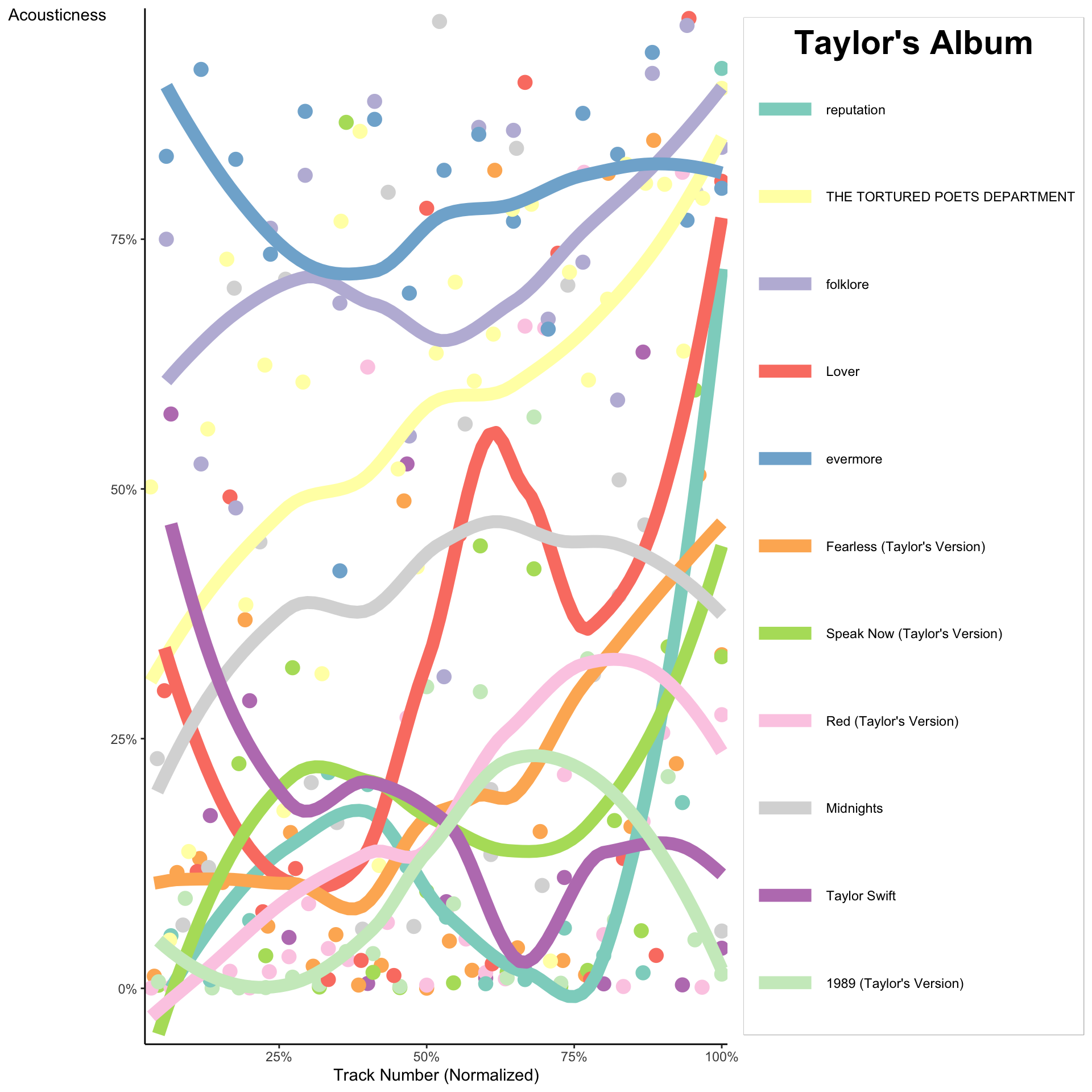
Show answer
taylor_album_songs |>
  filter(
    !is.na(album_name),
    !is.na(album_release),
    !is.na(danceability)
  ) |>
  group_by(album_name) |>
  mutate(
    track_number_normalized = track_number / max(track_number)
  ) |>
  ungroup() |>
  mutate(
    album_name_reordered = fct_reorder2(album_name,
                                        track_number_normalized, acousticness)
  ) |>
  ggplot(aes(
    y = acousticness,
    x = track_number_normalized,
    color = album_name_reordered
  )) +
  geom_point(size = 4,
             show.legend = F) +
  geom_smooth(se = F,
              lwd = 4,
              alpha = .5) +
  scale_color_brewer(palette = "Set3")  +
  scale_x_percent() +
  scale_y_percent() +
  theme_classic() +
  theme(
    axis.title.y = element_text(angle = 0),
    legend.box.background = element_rect(color = 'grey'),
    legend.title = element_text(face = "bold",
                                size = rel(2),
                                hjust = .5)
  ) +
  guides(
    color = guide_legend(
      keyheight = 4,
      keywidth = 3
    )
  ) +
  labs(
    color = "Taylor's Album",
    x = "Track Number (Normalized)",
    y = "Acousticness"
  )
Discussion
Welcome to our Classwork 8 Discussion Board! 👋
This space is designed for you to engage with your classmates about the material covered in Classwork 8.
Whether you are looking to delve deeper into the content, share insights, or have questions about the content, this is the perfect place for you.
If you have any specific questions for Byeong-Hak (@bcdanl) regarding the Classwork 8 materials or need clarification on any points, don’t hesitate to ask here.
All comments will be stored here.
Let’s collaborate and learn from each other!