titanic_details <- read_csv("https://bcdanl.github.io/data/titanic_details.csv")

rmarkdown::paged_table(titanic_details)Classwork 7
ggplot scales, guides, and themes
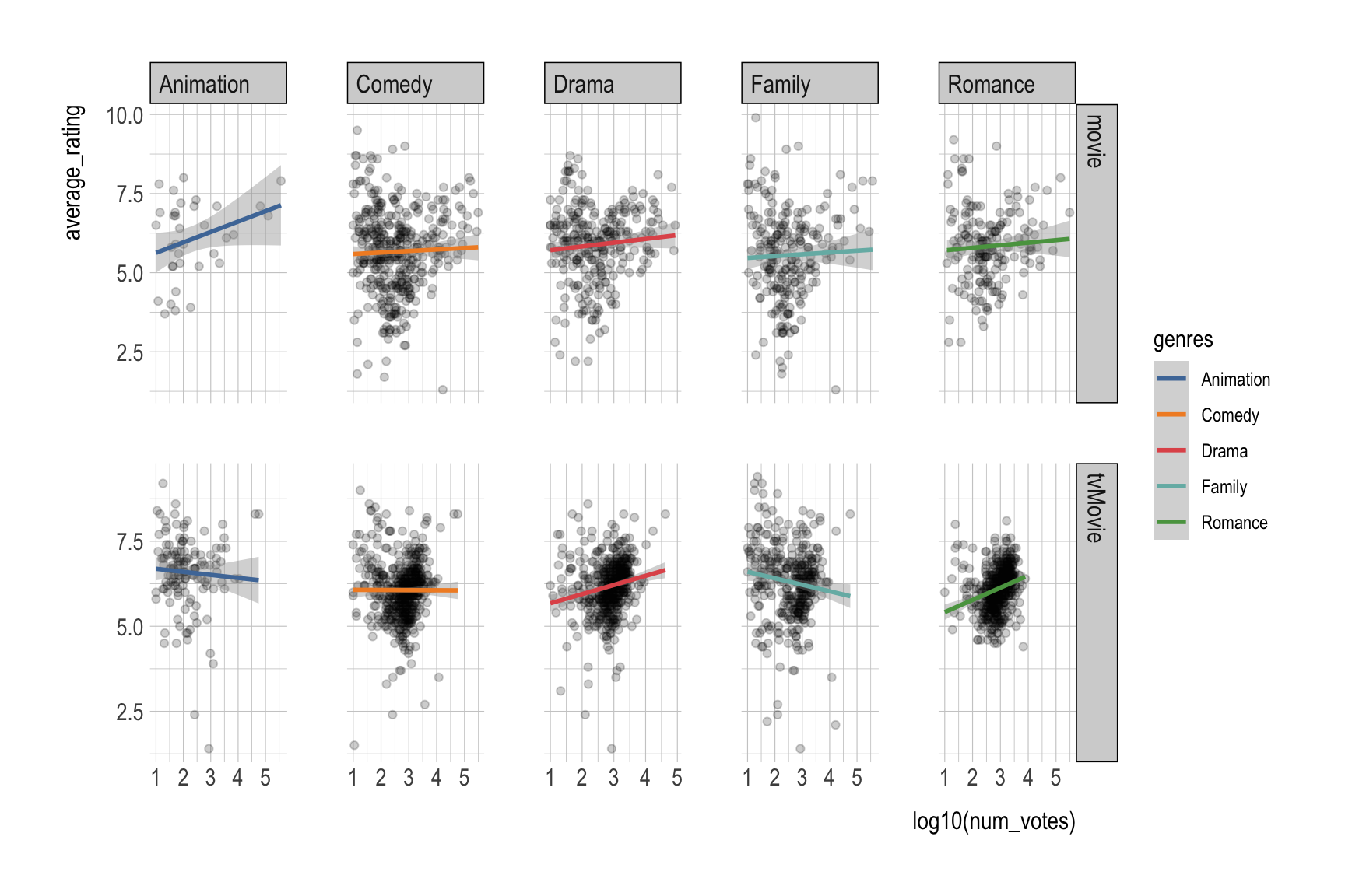
Part 1. Titanic
Question 1: Pick the right scale
Using titanic_details (variables: age, fare, class, survived, gender):
- Make a scatter plot of
agevsfare, color byclass. - Put
fareon a log scale. - Format x/y labels to be readable (use
label_number()and/orscales::dollar).
Starter:
ggplot(titanic_details,
       aes(x = age, y = fare,
           color = class)) +
  geom_point(alpha = 0.6)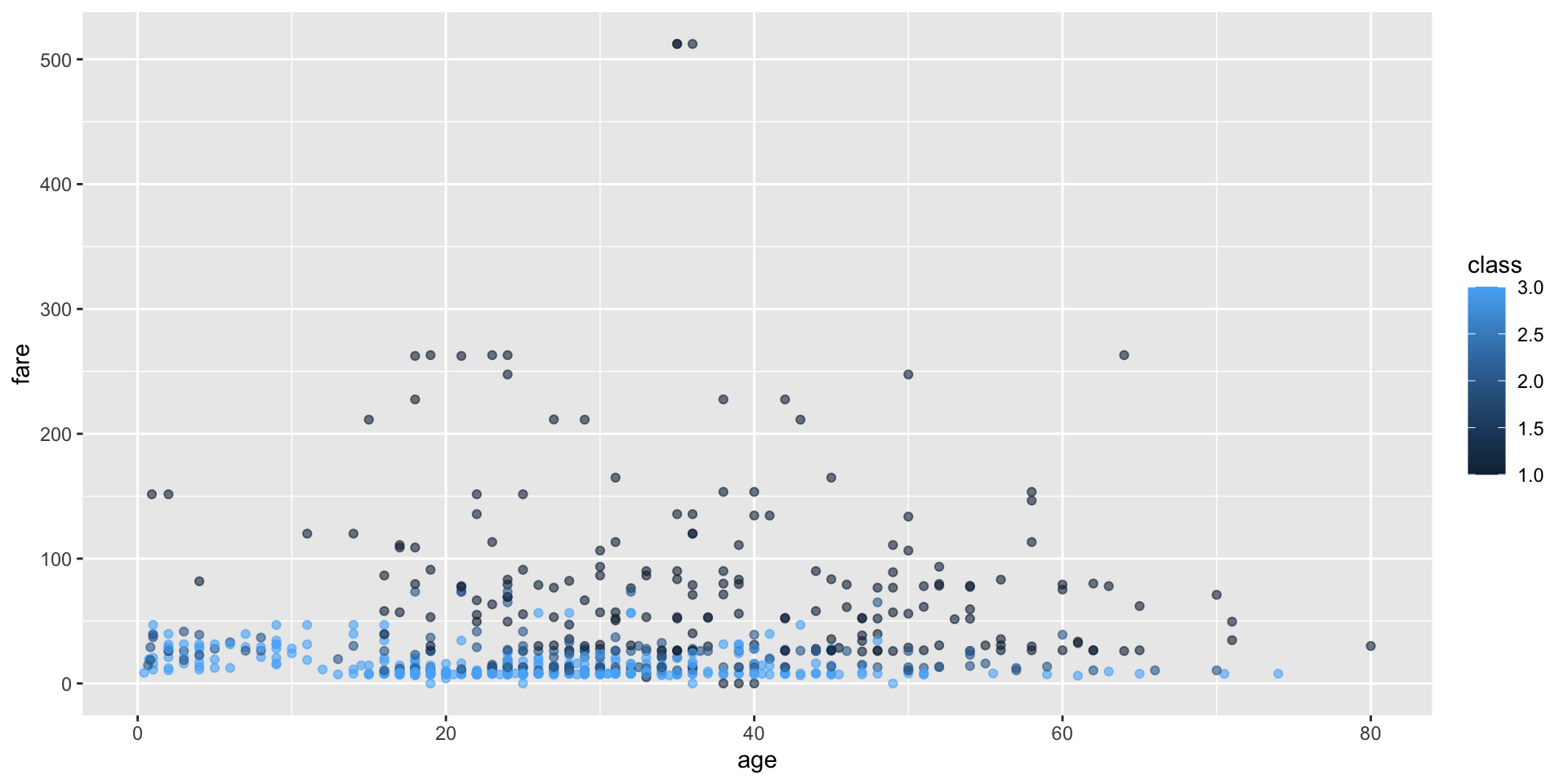
Question 2: Control the legend with guides()
Starting from our Practice 1 plot:
- Move the legend to the top (
theme()). - Make the legend a single row (
guides()). - Remove the legend for
coloronly (keep other legends if we have them).
Question 3: A “house style” theme
Starting from any ggplot you made in Questions 1–2, use theme() arguments to create a consistent “house style.”
Update your plot so that it:
- Moves the legend to the top using
legend.position. - Makes the plot title purple using
plot.title = element_text(...). - Removes minor gridlines using
panel.grid.minor = element_blank(). - Rotates the x-axis text by 45 degrees using
axis.text.x = element_text(...). - Makes the x-axis title bold (and slightly larger) using
axis.title.x = element_text(...).
Show answer
p <- ggplot(titanic_details,
       aes(x = age, y = fare,
           color = factor(class),
           size = factor(class))) +
  geom_point(alpha = 0.6)


p +
  geom_smooth(aes(fill = factor(class))) +
  scale_color_viridis_d(option = "D",
                        labels = c("First", "Second", "Third"),
                        name = "Passenger Class") +
  scale_fill_viridis_d(option = "D",
                        labels = c("First", "Second", "Third"),
                        name = "Passenger Class") +
  scale_y_continuous(trans = "log",
                     breaks = c(10, 50, 100, 150, 200, 250, 300),
                     labels = scales::label_number(prefix = "USD ",
                                                   suffix = " (1999 value)")) +
  guides(
    color = guide_legend(
      nrow = 1,
      keywidth = 5,
      reverse = T,
      label.position = "bottom",
      title.position = "left"
    ),
    # fill = guide_legend(
    #   nrow = 1
    # ),
    # color = "none",
    fill = "none",
    size = "none"
  ) +
  theme(
    panel.grid.minor = element_blank(),
    legend.position = c(.25,.5),   # "top", "right", "bottom", "left", c(.5,.5)
    plot.title = element_text(color = "purple",
                              face = "bold.italic",
                              size = rel(1.5),
                              hjust = .5),
    axis.text.x = element_text(angle = 45),
    axis.title.x = element_text(face = "bold",
                                size = rel(1.5),
                                hjust = 1,
                                margin = margin(30,0,0,0)),
    axis.title.y = element_text(face = "bold",
                                size = rel(1.5),
                                hjust = 1,
                                margin = margin(0,50,0,0))
  ) +
  labs(title = "Age vs. Fare")
Part 2. Organ Donation in the OECD
# install.packages("socviz")
organdata <- socviz::organdata

organdata |>
  rmarkdown::paged_table()
In R Console, run ??socviz::organdata to see the description of variables.
p <- ggplot(data = organdata,
            mapping = aes(x = roads,
                          y = donors,
                          color = world))
p + geom_point()
Question 4
- Put
roadson a log10 scale. - Make y-axis text break at 5, 15, and 25
- Make y-axis text appear as “Five”, “Fifteen”, and “Twenty Five”
- Set color legend categories as
- “Corporatist”
- “Liberal”,
- “Social Democratic”
- “Unclassified”
Show answer
p +
  geom_point() +
  scale_x_log10() +
  scale_y_continuous(breaks = c(5, 15, 25),
                     labels = c("Five", "Fifteen", "Twenty Five")) +
  scale_color_tableau(
    labels = c("Coporalist",
               "Liberal",
               "Social Democratic",
               "Unclassified"),
    na.value = "grey60"
  ) +
  theme_ipsum() +
  theme(legend.position = "top") +
  guides(color =
           guide_legend(label.position = "bottom",
                        keywidth = 3,
                        override.aes = list(size = 5))) +
  labs(color = "World")
ifelse()can also be used:
organdata |>
  mutate(world = ifelse(is.na(world), "Unclassified", world),
         world = ifelse(world == "SocDem", "Social Democratic", world),
         ) |>
  ggplot(mapping = aes(x = roads,
                          y = donors,
                          color = world)) +
  geom_point()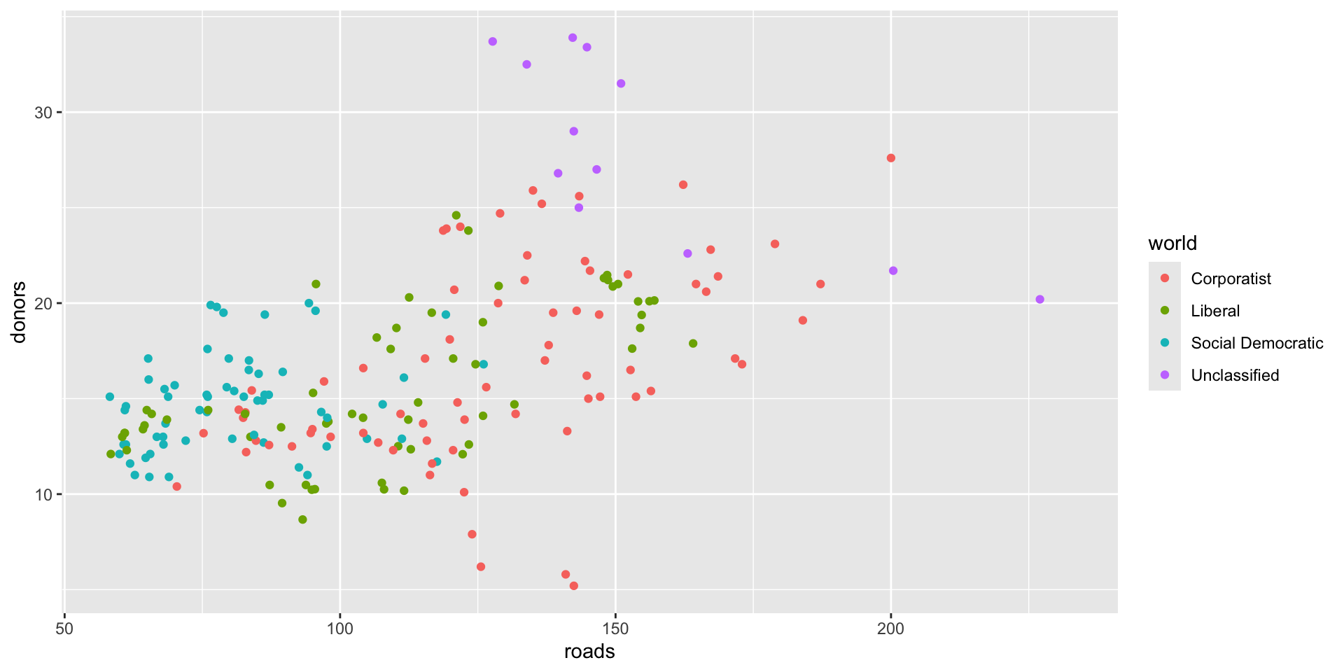
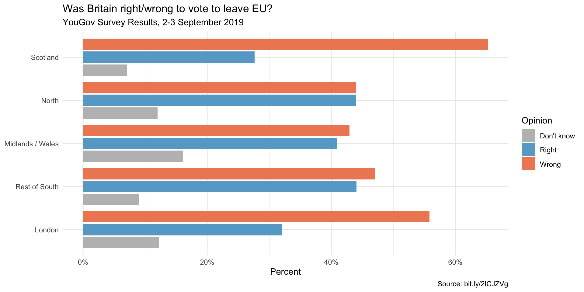
Part 3. Survey on Brexit
In September 2019, YouGov survey asked 1,639 GB adults the following question:
In hindsight, do you think Britain was right/wrong to vote to leave EU?
- Right to leave
- Wrong to leave
- Don’t know
The data from the survey is in brexit.csv.
brexit <- read_csv('https://bcdanl.github.io/data/brexit.csv')Source: https://bit.ly/2lCJZVg
- Use the following colors:
- “gray”
- “#67a9cf”
- “#ef8a62”
Question 5
- Replicate the following visualization
Show answer
brexit <- brexit |>
  mutate(
    region = fct_relevel(region,
                         "london", "rest_of_south", "midlands_wales", "north", "scot"),
    region = fct_recode(region,
                        London = "london",
                        `Rest of South` = "rest_of_south",
                        `Midlands / Wales` = "midlands_wales",
                        North = "north",
                        Scotland = "scot")
  )

ggplot(brexit,
       aes(y = opinion, fill = opinion)) +
  geom_bar() +
  facet_wrap( ~ region,
             nrow = 1,
             labeller = label_wrap_gen(width = 12)) +
  guides(fill = "none") +
  labs(
    title = "Was Britain right/wrong to vote to leave EU?",
    subtitle = "YouGov Survey Results, 2-3 September 2019",
    caption = "Source: bit.ly/2lCJZVg",
    x = NULL, y = NULL
  ) +
  scale_fill_manual(values = c(
    "gray",
    "#67a9cf",
    "#ef8a62"
  )) +
  theme_minimal()
Question 6
- Replicate the following visualization
- How is the story this visualization telling different than the story the plot in q7a?

Show answer
ggplot(brexit,
       aes(y = opinion, fill = opinion)) +
  geom_bar() +
  facet_wrap(~region, scales = 'free_x',
    nrow = 1, labeller = label_wrap_gen(width = 12),
    # ___
  ) +
  guides(fill = "none") +
  labs(
    title = "Was Britain right/wrong to vote to leave EU?",
    subtitle = "YouGov Survey Results, 2-3 September 2019",
    caption = "Source: bit.ly/2lCJZVg",
    x = NULL, y = NULL
  ) +
  scale_fill_manual(values = c(
    "Wrong" = "#ef8a62",
    "Right" = "#67a9cf",
    "Don't know" = "gray"
  )) +
  theme_minimal()
Question 7
- First, calculate the proportion of wrong, right, and don’t know answers in each region and then plot these proportions (rather than the counts) and then improve axis labeling.
- Replicate the following visualization
- How is the story this visualization telling different than the story the plot in q7b?
Show answer
ggplot(q7, aes(y = opinion, x = prop,
               fill = opinion)) +
  geom_col() +
  facet_wrap(~region,
    nrow = 1, labeller = label_wrap_gen(width = 12),
    # ___
  ) +
  guides(fill = "none") +
  labs(
    title = "Was Britain right/wrong to vote to leave EU?",
    subtitle = "YouGov Survey Results, 2-3 September 2019",
    caption = "Source: bit.ly/2lCJZVg",
    x = 'Percent', y = NULL
  ) +
  scale_fill_manual(values = c(
    "Wrong" = "#ef8a62",
    "Right" = "#67a9cf",
    "Don't know" = "gray"
  )) +
  scale_x_continuous(labels = scales::percent) +
  theme_minimal()
Question 8
Recreate the same visualization from the previous exercise, this time dodging the bars for opinion proportions for each region, rather than faceting by region and then improve the legend.
- How is the story this visualization telling different than the story the previous plot tells?
Show answer
ggplot(q7, aes(y = region, x = prop,
               fill = opinion)) +
  geom_col(position = "dodge2") +
  labs(
    title = "Was Britain right/wrong to vote to leave EU?",
    subtitle = "YouGov Survey Results, 2-3 September 2019",
    caption = "Source: bit.ly/2lCJZVg",
    x = 'Percent', y = NULL, fill = 'Opinion'
  ) +
  scale_fill_manual(values = c(
    "Wrong" = "#ef8a62",
    "Right" = "#67a9cf",
    "Don't know" = "gray"
  )) +
  scale_x_continuous(labels = scales::percent) +
  theme_minimal()
Part 4. Student Debt Data
studebt <- socviz::studebt

studebt |>
  rmarkdown::paged_table()
Question 9
Replicate the below bar chart
- Use the following colors:
- “#1B9E77”
- “#D95F02”

Show answer
p_xlab <- "Amount Owed, in thousands of Dollars"
p_title <- "Outstanding Student Loans"
p_subtitle <- "44 million borrowers owe a total of $1.3 trillion"
p_caption <- "Source: FRB NY"

f_labs <- c(`Borrowers` = "Percent of\nall Borrowers",
            `Balances` = "Percent of\nall Balances")

p <- ggplot(data = studebt,
            mapping = aes(x = pct/100, y = Debt, fill = type))
p + geom_bar(stat = "identity") +
    scale_fill_manual(values = c("#1B9E77", "#D95F02")) +
    scale_x_continuous(labels = scales::percent) +
    guides(fill = "none") +
    theme_ipsum() +
    theme(strip.text.x = element_text(face = "bold")) +
    labs(x = NULL, y = p_xlab,
      caption = p_caption,
      title = p_title,
      subtitle = p_subtitle) +
    facet_grid(~ type, labeller = as_labeller(f_labs))
Question 10
Replicate the below bar chart:
Show answer
p_xlab <- "Amount Owed, in thousands of Dollars"
p_title <- "Outstanding Student Loans"
p_subtitle <- "44 million borrowers owe a total of $1.3 trillion"
p_caption <- "Source: FRB NY"

f_labs <- c(`Borrowers` = "Percent of\nall Borrowers",
            `Balances` = "Percent of\nall Balances")

p <- ggplot(studebt, aes(x = pct/100, y = type, fill = Debtrc))
p + geom_bar(stat = "identity", color = "gray80") +
  scale_y_discrete(labels = as_labeller(f_labs)) +
  scale_x_continuous(labels = scales::percent) +
  scale_fill_viridis_d() +
  guides(fill = guide_legend(reverse = TRUE,
                             title.position = "top",
                             label.position = "bottom",
                             keywidth = 3,
                             nrow = 1)) +
  labs(x = NULL, y = NULL,
       fill = "Amount Owed, in thousands of dollars",
       caption = p_caption,
       title = p_title,
       subtitle = p_subtitle) +
  theme_ipsum() +
  theme(legend.position = "top",
        axis.text.y = element_text(face = "bold", hjust = 1, size = 12),
        axis.ticks.length = unit(0, "cm"),
        panel.grid.major.y = element_blank())
Discussion
Welcome to our Classwork 7 Discussion Board! 👋
This space is designed for you to engage with your classmates about the material covered in Classwork 7.
Whether you are looking to delve deeper into the content, share insights, or have questions about the content, this is the perfect place for you.
If you have any specific questions for Byeong-Hak (@bcdanl) regarding the Classwork 7 materials or need clarification on any points, don’t hesitate to ask here.
All comments will be stored here.
Let’s collaborate and learn from each other!