# install.packages("nycflights13")
library(ggthemes)
library(tidyverse)Classwork 6
Data Transformatio with dplyr
R Packages
For Classwork 6, please load the following R packages and :
Questions 1-9
Create the data.frame nycflights13::flights.
flights <- nycflights13::flightsQuestion 1
Find all flights that
- Had an arrival delay of two or more hours
- Flew to Houston (IAH or HOU)
- Were operated by United (UA), American (AA), or Delta (DL)
- Departed in summer (July, August, and September)
- Arrived more than two hours late, but didn’t leave late
- Were delayed by at least an hour for the depature, but reduced the delay over 30 minutes during flight
- Departed between midnight and 6am (inclusive)
Show answer
# Had an arrival delay of two or more hours
flights |>
  filter(arr_delay > 120)
# A tibble: 10,034 × 19
year month day dep_time sched_dep_time dep_delay arr_time sched_arr_time
<int> <int> <int> <int> <int> <dbl> <int> <int>
1 2013 1 1 811 630 101 1047 830
2 2013 1 1 848 1835 853 1001 1950
3 2013 1 1 957 733 144 1056 853
4 2013 1 1 1114 900 134 1447 1222
5 2013 1 1 1505 1310 115 1638 1431
6 2013 1 1 1525 1340 105 1831 1626
7 2013 1 1 1549 1445 64 1912 1656
8 2013 1 1 1558 1359 119 1718 1515
9 2013 1 1 1732 1630 62 2028 1825
10 2013 1 1 1803 1620 103 2008 1750
# ℹ 10,024 more rows
# ℹ 11 more variables: arr_delay <dbl>, carrier <chr>, flight <int>,
# tailnum <chr>, origin <chr>, dest <chr>, air_time <dbl>, distance <dbl>,
# hour <dbl>, minute <dbl>, time_hour <dttm># Flew to Houston (IAH or HOU)
flights |>
filter(dest == "IAH" | dest == "HOU")# A tibble: 9,313 × 19
year month day dep_time sched_dep_time dep_delay arr_time sched_arr_time
<int> <int> <int> <int> <int> <dbl> <int> <int>
1 2013 1 1 517 515 2 830 819
2 2013 1 1 533 529 4 850 830
3 2013 1 1 623 627 -4 933 932
4 2013 1 1 728 732 -4 1041 1038
5 2013 1 1 739 739 0 1104 1038
6 2013 1 1 908 908 0 1228 1219
7 2013 1 1 1028 1026 2 1350 1339
8 2013 1 1 1044 1045 -1 1352 1351
9 2013 1 1 1114 900 134 1447 1222
10 2013 1 1 1205 1200 5 1503 1505
# ℹ 9,303 more rows
# ℹ 11 more variables: arr_delay <dbl>, carrier <chr>, flight <int>,
# tailnum <chr>, origin <chr>, dest <chr>, air_time <dbl>, distance <dbl>,
# hour <dbl>, minute <dbl>, time_hour <dttm>flights |>
filter(dest %in% c("IAH", "HOU"))# A tibble: 9,313 × 19
year month day dep_time sched_dep_time dep_delay arr_time sched_arr_time
<int> <int> <int> <int> <int> <dbl> <int> <int>
1 2013 1 1 517 515 2 830 819
2 2013 1 1 533 529 4 850 830
3 2013 1 1 623 627 -4 933 932
4 2013 1 1 728 732 -4 1041 1038
5 2013 1 1 739 739 0 1104 1038
6 2013 1 1 908 908 0 1228 1219
7 2013 1 1 1028 1026 2 1350 1339
8 2013 1 1 1044 1045 -1 1352 1351
9 2013 1 1 1114 900 134 1447 1222
10 2013 1 1 1205 1200 5 1503 1505
# ℹ 9,303 more rows
# ℹ 11 more variables: arr_delay <dbl>, carrier <chr>, flight <int>,
# tailnum <chr>, origin <chr>, dest <chr>, air_time <dbl>, distance <dbl>,
# hour <dbl>, minute <dbl>, time_hour <dttm># Were operated by United (UA), American (AA), or Delta (DL)
flights |>
filter(carrier %in% c("UA", "AA", "DL"))# A tibble: 139,504 × 19
year month day dep_time sched_dep_time dep_delay arr_time sched_arr_time
<int> <int> <int> <int> <int> <dbl> <int> <int>
1 2013 1 1 517 515 2 830 819
2 2013 1 1 533 529 4 850 830
3 2013 1 1 542 540 2 923 850
4 2013 1 1 554 600 -6 812 837
5 2013 1 1 554 558 -4 740 728
6 2013 1 1 558 600 -2 753 745
7 2013 1 1 558 600 -2 924 917
8 2013 1 1 558 600 -2 923 937
9 2013 1 1 559 600 -1 941 910
10 2013 1 1 559 600 -1 854 902
# ℹ 139,494 more rows
# ℹ 11 more variables: arr_delay <dbl>, carrier <chr>, flight <int>,
# tailnum <chr>, origin <chr>, dest <chr>, air_time <dbl>, distance <dbl>,
# hour <dbl>, minute <dbl>, time_hour <dttm># Departed in summer (July, August, and September)
flights |>
filter(month %in% c(7,8,9))# A tibble: 86,326 × 19
year month day dep_time sched_dep_time dep_delay arr_time sched_arr_time
<int> <int> <int> <int> <int> <dbl> <int> <int>
1 2013 7 1 1 2029 212 236 2359
2 2013 7 1 2 2359 3 344 344
3 2013 7 1 29 2245 104 151 1
4 2013 7 1 43 2130 193 322 14
5 2013 7 1 44 2150 174 300 100
6 2013 7 1 46 2051 235 304 2358
7 2013 7 1 48 2001 287 308 2305
8 2013 7 1 58 2155 183 335 43
9 2013 7 1 100 2146 194 327 30
10 2013 7 1 100 2245 135 337 135
# ℹ 86,316 more rows
# ℹ 11 more variables: arr_delay <dbl>, carrier <chr>, flight <int>,
# tailnum <chr>, origin <chr>, dest <chr>, air_time <dbl>, distance <dbl>,
# hour <dbl>, minute <dbl>, time_hour <dttm># Arrived more than two hours late, but didn’t leave late
flights |>
filter(arr_delay > 120,
dep_delay <= 0)# A tibble: 29 × 19
year month day dep_time sched_dep_time dep_delay arr_time sched_arr_time
<int> <int> <int> <int> <int> <dbl> <int> <int>
1 2013 1 27 1419 1420 -1 1754 1550
2 2013 10 7 1350 1350 0 1736 1526
3 2013 10 7 1357 1359 -2 1858 1654
4 2013 10 16 657 700 -3 1258 1056
5 2013 11 1 658 700 -2 1329 1015
6 2013 3 18 1844 1847 -3 39 2219
7 2013 4 17 1635 1640 -5 2049 1845
8 2013 4 18 558 600 -2 1149 850
9 2013 4 18 655 700 -5 1213 950
10 2013 5 22 1827 1830 -3 2217 2010
# ℹ 19 more rows
# ℹ 11 more variables: arr_delay <dbl>, carrier <chr>, flight <int>,
# tailnum <chr>, origin <chr>, dest <chr>, air_time <dbl>, distance <dbl>,
# hour <dbl>, minute <dbl>, time_hour <dttm># Were delayed by at least an hour for the depature, but reduced the delay over 30 minutes during flight
flights |>
filter(dep_delay >= 60,
dep_delay - arr_delay > 30) |>
select(dep_delay, arr_delay)# A tibble: 1,844 × 2
dep_delay arr_delay
<dbl> <dbl>
1 285 246
2 116 73
3 162 128
4 99 66
5 65 28
6 102 67
7 65 1
8 60 24
9 177 141
10 137 105
# ℹ 1,834 more rows# Departed between midnight and 6am (inclusive)
flights |>
filter( dep_time >= 0 , dep_time <= 600 ) |>
arrange(dep_time)# A tibble: 9,344 × 19
year month day dep_time sched_dep_time dep_delay arr_time sched_arr_time
<int> <int> <int> <int> <int> <dbl> <int> <int>
1 2013 1 13 1 2249 72 108 2357
2 2013 1 31 1 2100 181 124 2225
3 2013 11 13 1 2359 2 442 440
4 2013 12 16 1 2359 2 447 437
5 2013 12 20 1 2359 2 430 440
6 2013 12 26 1 2359 2 437 440
7 2013 12 30 1 2359 2 441 437
8 2013 2 11 1 2100 181 111 2225
9 2013 2 24 1 2245 76 121 2354
10 2013 3 8 1 2355 6 431 440
# ℹ 9,334 more rows
# ℹ 11 more variables: arr_delay <dbl>, carrier <chr>, flight <int>,
# tailnum <chr>, origin <chr>, dest <chr>, air_time <dbl>, distance <dbl>,
# hour <dbl>, minute <dbl>, time_hour <dttm>flights |>
filter( (dep_time >= 0 & dep_time <= 600) | dep_time == 2400 ) |>
arrange(-dep_time)# A tibble: 9,373 × 19
year month day dep_time sched_dep_time dep_delay arr_time sched_arr_time
<int> <int> <int> <int> <int> <dbl> <int> <int>
1 2013 10 30 2400 2359 1 327 337
2 2013 11 27 2400 2359 1 515 445
3 2013 12 5 2400 2359 1 427 440
4 2013 12 9 2400 2359 1 432 440
5 2013 12 9 2400 2250 70 59 2356
6 2013 12 13 2400 2359 1 432 440
7 2013 12 19 2400 2359 1 434 440
8 2013 12 29 2400 1700 420 302 2025
9 2013 2 7 2400 2359 1 432 436
10 2013 2 7 2400 2359 1 443 444
# ℹ 9,363 more rows
# ℹ 11 more variables: arr_delay <dbl>, carrier <chr>, flight <int>,
# tailnum <chr>, origin <chr>, dest <chr>, air_time <dbl>, distance <dbl>,
# hour <dbl>, minute <dbl>, time_hour <dttm>Question 2
How could you use arrange() to sort all missing values to the start?
Show answer
flights |>
  arrange( desc( is.na(dep_delay) ) )
# A tibble: 336,776 × 19
year month day dep_time sched_dep_time dep_delay arr_time sched_arr_time
<int> <int> <int> <int> <int> <dbl> <int> <int>
1 2013 1 1 NA 1630 NA NA 1815
2 2013 1 1 NA 1935 NA NA 2240
3 2013 1 1 NA 1500 NA NA 1825
4 2013 1 1 NA 600 NA NA 901
5 2013 1 2 NA 1540 NA NA 1747
6 2013 1 2 NA 1620 NA NA 1746
7 2013 1 2 NA 1355 NA NA 1459
8 2013 1 2 NA 1420 NA NA 1644
9 2013 1 2 NA 1321 NA NA 1536
10 2013 1 2 NA 1545 NA NA 1910
# ℹ 336,766 more rows
# ℹ 11 more variables: arr_delay <dbl>, carrier <chr>, flight <int>,
# tailnum <chr>, origin <chr>, dest <chr>, air_time <dbl>, distance <dbl>,
# hour <dbl>, minute <dbl>, time_hour <dttm>Question 3
Brainstorm as many ways as possible to select dep_time, dep_delay, arr_time, and arr_delay from flights.
Show answer
flights |>
  select(starts_with("dep"), starts_with("arr"))
# A tibble: 336,776 × 4
dep_time dep_delay arr_time arr_delay
<int> <dbl> <int> <dbl>
1 517 2 830 11
2 533 4 850 20
3 542 2 923 33
4 544 -1 1004 -18
5 554 -6 812 -25
6 554 -4 740 12
7 555 -5 913 19
8 557 -3 709 -14
9 557 -3 838 -8
10 558 -2 753 8
# ℹ 336,766 more rowsflights |>
select(ends_with("_time"), ends_with("_delay"), -starts_with("sched"), -starts_with("air"))# A tibble: 336,776 × 4
dep_time arr_time dep_delay arr_delay
<int> <int> <dbl> <dbl>
1 517 830 2 11
2 533 850 4 20
3 542 923 2 33
4 544 1004 -1 -18
5 554 812 -6 -25
6 554 740 -4 12
7 555 913 -5 19
8 557 709 -3 -14
9 557 838 -3 -8
10 558 753 -2 8
# ℹ 336,766 more rowsQuestion 4
- Find the 10 most delayed flights using a ranking function.
- How do you want to handle ties?
Show answer
q4_arr <- flights |>
  mutate(rank_min = min_rank(-arr_delay),
         rank_dense = dense_rank(-arr_delay),
         ) |>
  arrange(rank_dense) |>
  relocate(starts_with("rank"), arr_delay)

q4_dep <- flights |>
  mutate(rank_min = min_rank(-dep_delay),
         rank_dense = dense_rank(-dep_delay),
         ) |>
  arrange(rank_dense) |>
  relocate(starts_with("rank"), dep_delay)
Question 5
Which carrier has the worst arrival delays within each origin airport?
Show answer
q5 <- flights |>
  group_by(origin) |>
  filter(arr_delay == max(arr_delay, na.rm = T)) |>
  relocate(origin, carrier, arr_delay)
Question 6
Which plane (tailnum) has the worst on-time arrival record?
Show answer
q6 <- flights |>
  filter(arr_delay == max(arr_delay, na.rm = T)) |>
  relocate(tailnum)
Question 7
What time of day should you fly if you want to avoid delays as much as possible?
Show answer
q7 <- flights |>
  mutate(is_delayed = ifelse(arr_delay >= 30, T, F)) |>
  count(hour, is_delayed) |>
  group_by(hour) |>
  mutate(prop = 100 * n / sum(n)) |>
  filter(is_delayed) |>
  arrange(prop)
Question 8
For each destination, compute the total minutes of delay. For each flight, compute the proportion of the total delay for its destination.
Show answer
q8 <- flights |>
  group_by(dest) |>
  mutate(tot_pos_dep_delay = sum(dep_delay[dep_delay > 0], na.rm = T),
         tot_pos_arr_delay = sum(arr_delay[arr_delay > 0], na.rm = T),
         tot_neg_dep_delay = sum(dep_delay[dep_delay < 0], na.rm = T),
         tot_neg_arr_delay = sum(arr_delay[arr_delay < 0], na.rm = T)
         ) |>
  mutate(prop_pos_dep_delay = dep_delay / tot_pos_dep_delay,
         prop_pos_arr_delay = arr_delay / tot_pos_arr_delay,
         prop_neg_dep_delay = dep_delay / tot_neg_dep_delay,
         prop_neg_arr_delay = arr_delay / tot_neg_arr_delay,

         prop_pos_dep_delay = ifelse(prop_pos_dep_delay <= 0, NA, prop_pos_dep_delay),
         prop_pos_arr_delay = ifelse(prop_pos_arr_delay <= 0, NA, prop_pos_arr_delay),

         prop_neg_dep_delay = ifelse(prop_neg_dep_delay > 0, NA, prop_neg_dep_delay),
         prop_neg_arr_delay = ifelse(prop_pos_arr_delay > 0, NA, prop_neg_arr_delay)
         ) |>
  select(dest, dep_delay, arr_delay, starts_with("tot"), starts_with("prop"))
Question 9
Find all destinations that are flown by at least two carriers. Use that information to rank the carriers.
Show answer
flights |>
  count(dest) |>
  nrow()
[1] 105q9 <- flights |>
count(dest, carrier) |>
group_by(dest) |>
filter( n() >= 2 ) |>
group_by(carrier) |>
summarize(tot_flights = sum(n),
n_dest = n()) |>
arrange(-tot_flights)Questions 10-11
Consider the tech_stocks data.frame.
tech_stocks <- read_csv(
  "https://bcdanl.github.io/data/tech_stocks_2015_2024.csv"
)
Question 10
For each Ticker, compute the daily stock return as the percent change in the Close price from the previous trading day to the current day.
Show answer
q10 <- tech_stocks |>
  group_by(Ticker) |>
  mutate(Close_lag = lag(Close)) |>
  select(Date, Ticker, starts_with("Close"), Volume) |>
  mutate(return = 100 * (Close - Close_lag) / Close_lag,
         return_rounded = round(return, 2))
Question 11
Provide a ggplot showing the relationship between daily stock return and daily trading volume (Volume) for each company (Ticker), and write a brief comment describing any visible pattern (e.g., positive/negative association, strength, outliers, and whether it differs across tickers).
Show answer
q10 |>
  ggplot(aes(x = return, y = Volume,
             color = Ticker,
             fill = Ticker)) +
  geom_point(alpha = .1) +
  geom_smooth()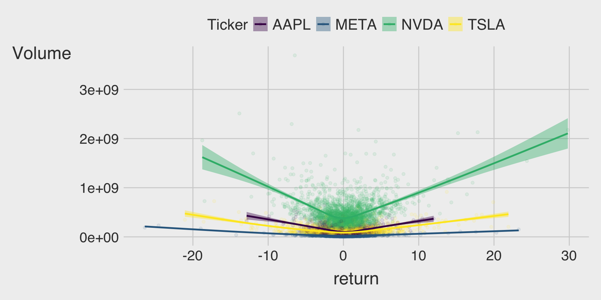
Discussion
Welcome to our Classwork 6 Discussion Board! 👋
This space is designed for you to engage with your classmates about the material covered in Classwork 6.
Whether you are looking to delve deeper into the content, share insights, or have questions about the content, this is the perfect place for you.
If you have any specific questions for Byeong-Hak (@bcdanl) regarding the Classwork 6 materials or need clarification on any points, don’t hesitate to ask here.
All comments will be stored here.
Let’s collaborate and learn from each other!