library(tidyverse)Classwork 3
Color vs. Facet
R Packages
For Classwork 3, please load the tidyverse package:
Question 1. NBC Show Data
The nbc_show dataset comes from NBC’s TV pilots, containing information about television shows, their viewership metrics, and audience engagement.
nbc_show <- read_csv("https://bcdanl.github.io/data/nbc_show.csv")- Gross Ratings Points (
GRP):
Measures the estimated total viewership of a show — an indicator of its broadcast marketability.- 📺 A higher
GRPsuggests broader exposure and a more marketable program.
- 📺 A higher
- Projected Engagement (
PE):
Captures how attentive and engaged viewers were after watching a show — a more suitable measure of audience engagement.- 🧠 After viewing, audiences take a short quiz testing order and detail recall.
- This reflects their level of attention and retention (for both the show and its ads).
- High
PEvalues indicate strong viewer engagement.
- 🧠 After viewing, audiences take a short quiz testing order and detail recall.
Tasks
- 🤖 Task 1: Fill in the blanks in the provided
ggplot()code chunk.
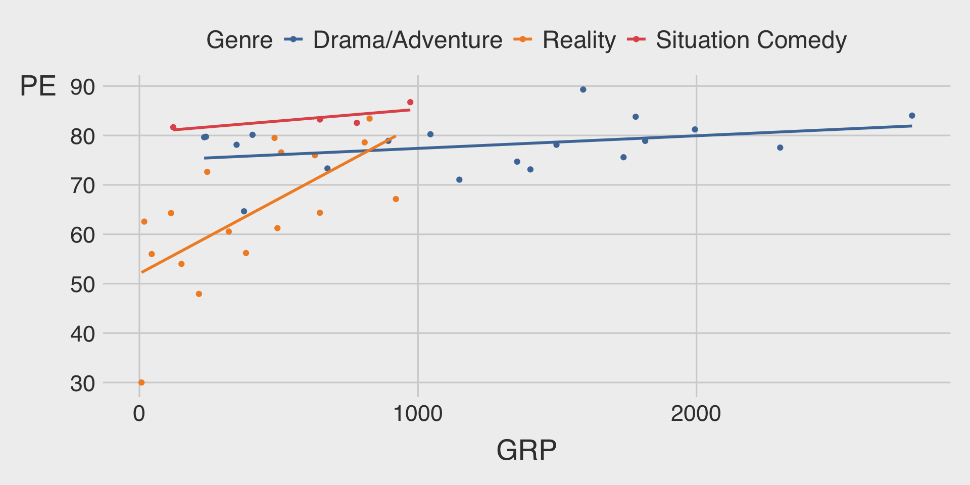
- 💬 Task 2: Add a brief comment describing the relationship between gross ratings points (
GRP) and projected engagement (PE) varies by genre (Genre).
(1) Color
ggplot(__BLANK_1__ = nbc_show,
       mapping = aes(x = GRP,
                     y = PE,
                     __BLANK_2__ = Genre)) +
  geom_point() +
  geom_smooth(__BLANK_3__,
              se = FALSE)   # se = FALSE turns off the ribbon
Show answer
ggplot(data = nbc_show,
       mapping = aes(x = GRP,
                     y = PE,
                     color = Genre)) +
  geom_point() +
  geom_smooth(method = "lm",
              se = FALSE)   # se = FALSE turns off the ribbon
(2) Facet
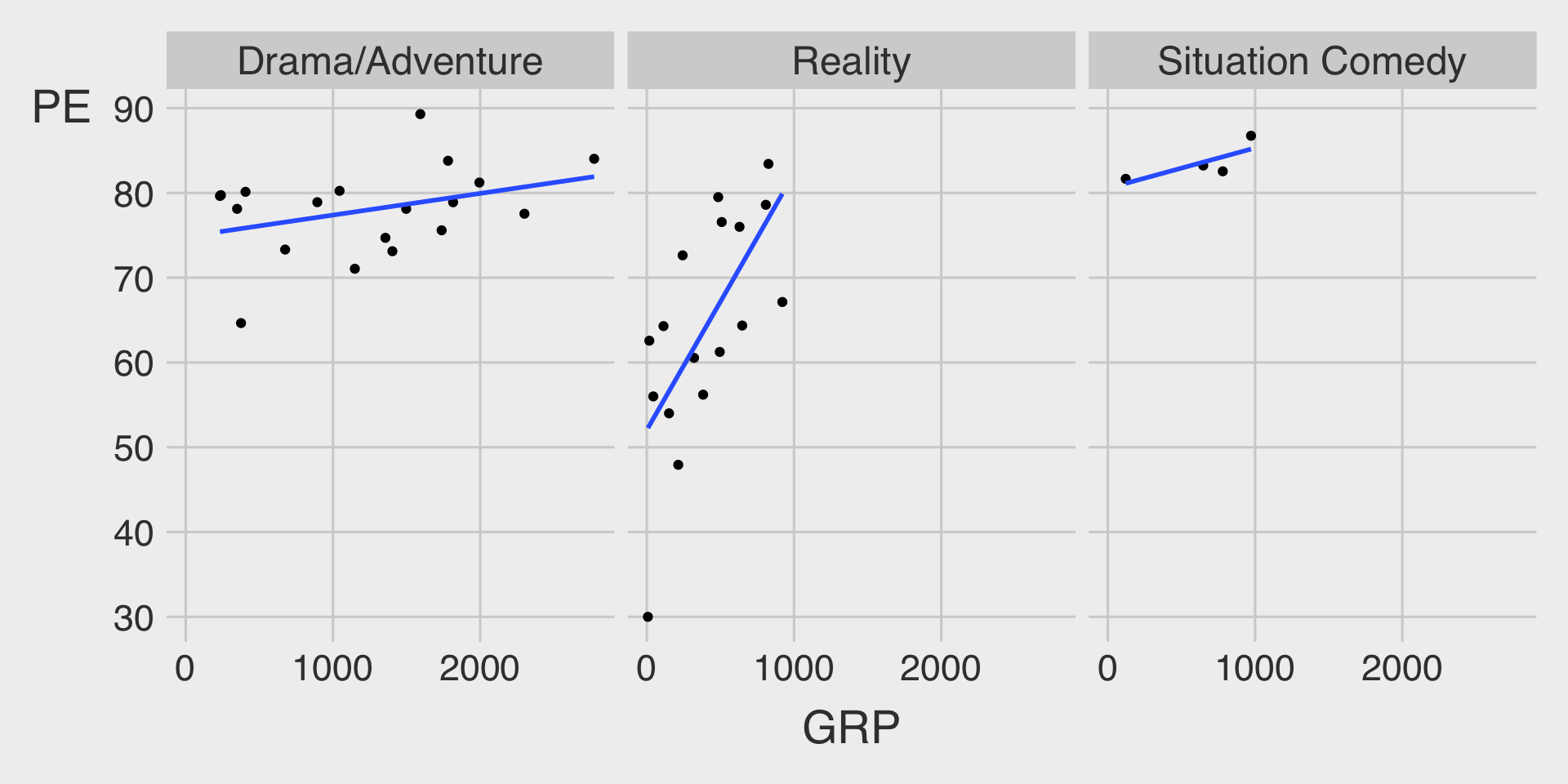
ggplot(data = nbc_show,
       mapping = aes(x = GRP,
                     y = PE)) +
  geom_point() +
  geom_smooth(method = __BLANK_1__,
              se = FALSE) +  # se = FALSE turns off the ribbon
  __BLANK_2___wrap(__BLANK_3__)
Show answer
ggplot(data = nbc_show,
       mapping = aes(x = GRP,
                     y = PE)) +
  geom_point() +
  geom_smooth(method = "lm",
              se = FALSE) +  # se = FALSE turns off the ribbon
  facet_wrap(~Genre)
(3) Facet with Color
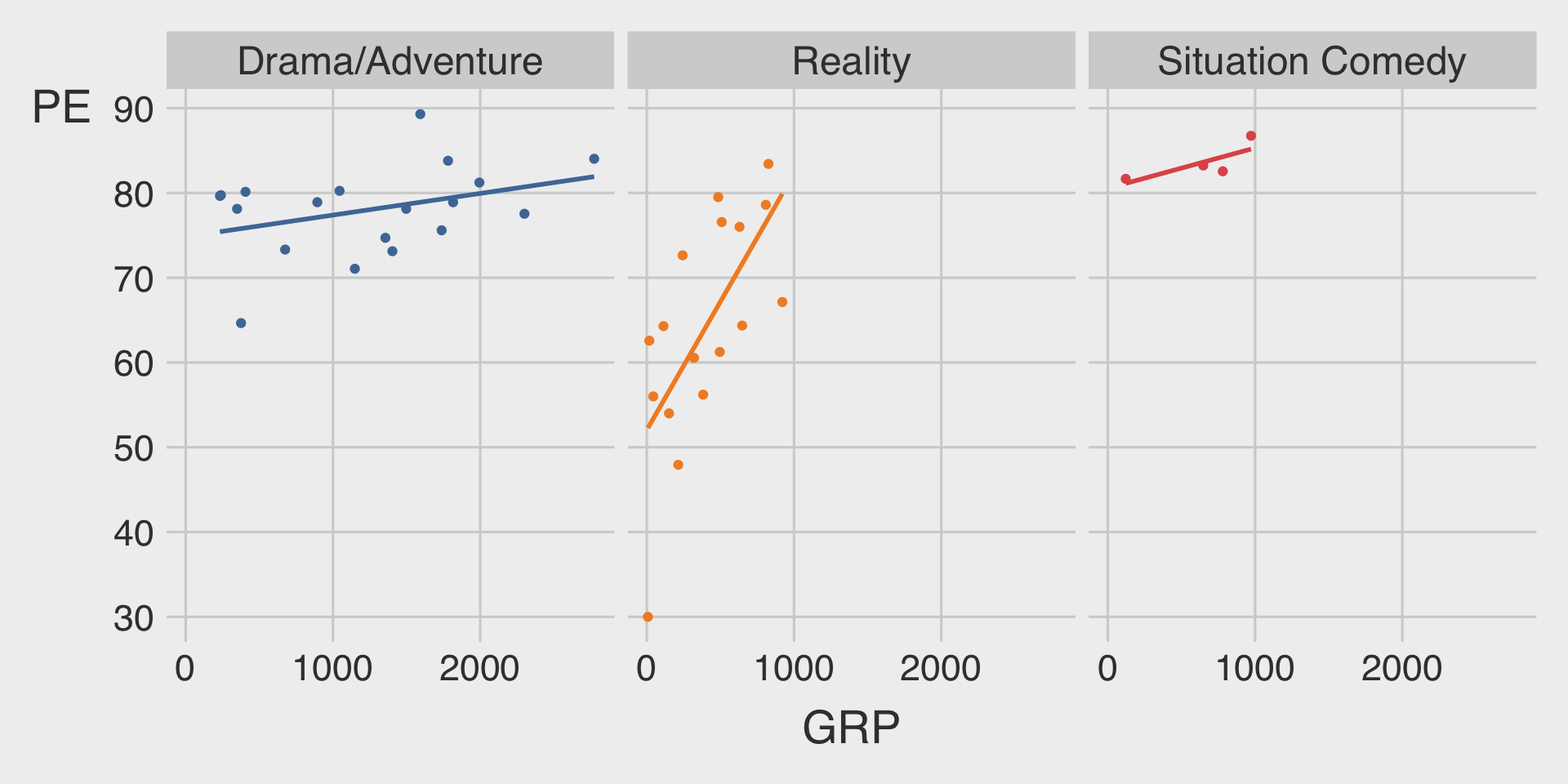
ggplot(data = nbc_show,
       mapping = aes(x = GRP,
                     y = PE,
                     color = __BLANK_1__)) +
  geom_point(show.legend = FALSE) +  # show.legend = FALSE turns of legend
  geom_smooth(method = __BLANK_2__,
              show.legend = FALSE,   # show.legend = FALSE turns of legend
              se = FALSE) +  # se = FALSE turns off the ribbon
  __BLANK_3___wrap(__BLANK_4__)
Show answer
ggplot(data = nbc_show,
       mapping = aes(x = GRP,
                     y = PE,
                     color = Genre)) +
  geom_point(show.legend = FALSE) +
  geom_smooth(method = "lm",
              show.legend = FALSE, # show.legend = FALSE turns of legend
              se = FALSE) +  # se = FALSE turns off the ribbon
  facet_wrap(~Genre)
Question 2. GDP per capita and Life Expectancy
For Question 2, please load the R package gapminder before starting:
# install.packages("gapminder")
library(gapminder)
??gapminder
The gapminder package provides a built-in dataset named gapminder, which contains country-level data on life expectancy, GDP per capita, and population across time.
Let’s assign it to a new object called df_gapminder:
df_gapminder <- gapminder::gapminderTasks
- 🤖 Task 1: Fill in the blanks in the provided
ggplot()code chunk.
- 💬 Task 2: Add a brief comment describing the relationship between GDP per capita (
gdpPercap) and life expectancy (lifeExp) varies by continents (continent).
(1) Color: Only Scatterplot
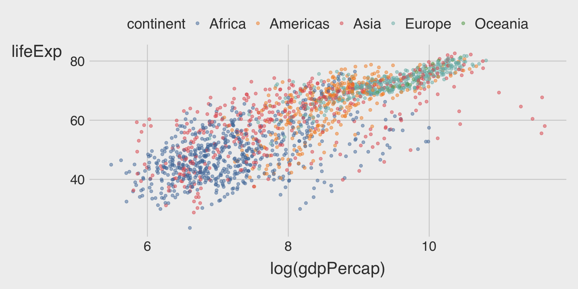
ggplot(__BLANK_1__ = df_gapminder,
       mapping = aes(__BLANK_2__ = log(gdpPercap),
                     __BLANK_3__ = lifeExp,
                     __BLANK_4__ = continent)) +  # different colors are used to distinguish continents
  geom_point(__BLANK_5__)  # Add 50% transparency to reduce overplotting
Show answer
ggplot(data = df_gapminder,
       mapping = aes(x = log(gdpPercap),
                     y = lifeExp,
                     color = continent)) +  # different colors are used to distinguish continents
geom_point(alpha = .5) # Add 50% transparency to reduce overplotting- While transparency (
alpha) in the scatterplot partially reduces overplotting, it does not fully address the issue, especially in dense regions. - This is because, in general, the mixing of overlapping transparent colors may be no longer represent the colors of the categories.
- Adding fitted lines clarifies the differences in relationships across continents.
(2) Color: Scatterplot with Fitted Line
ggplot(__BLANK_1__ = df_gapminder,
       mapping = aes(__BLANK_2__ = log(gdpPercap),
                     __BLANK_3__ = lifeExp,
                     __BLANK_4__ = continent)) +  # different colors are used to distinguish continents
  geom_point(__BLANK_5__) +  # Add 50% transparency to reduce overplotting
  geom___BLANK_6__(method = "lm")
Show answer
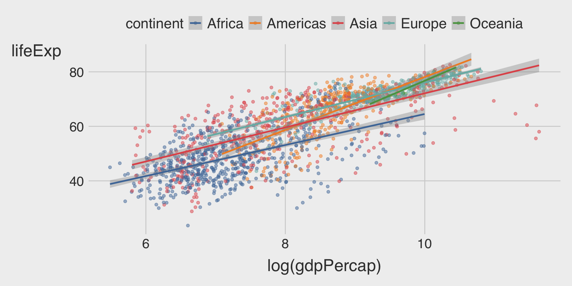
ggplot(data = df_gapminder,
       mapping = aes(x = log(gdpPercap),
                     y = lifeExp,
                     color = continent)) +  # different colors are used to distinguish continents
  geom_point(alpha = .5) + # Add transparency to reduce overplotting
geom_smooth(method = "lm")- The different slopes of the fitted lines across continents imply that the relationship between GDP per capita and life expectancy differs by continent.
- Continents like the Americas and Oceania display steeper slopes, indicating a stronger positive association between GDP per capita and life expectancy.
- This suggests that for the same percentage increase in GDP per capita, the improvement in life expectancy is greater in these regions compared to others.
(3) Facet: Scatterplot with Fitted Line
ggplot(__BLANK_1__ = df_gapminder,
       mapping = aes(__BLANK_2__ = log(gdpPercap),
                     __BLANK_3__ = lifeExp,
                     __BLANK_4__ = continent)) +
  geom_point(__BLANK_5__ = 0.3) +  # Add 70% transparency to reduce overplotting
  geom___BLANK_6__(method = "lm") +
  facet___BLANK_7__(~continent)
Show answer
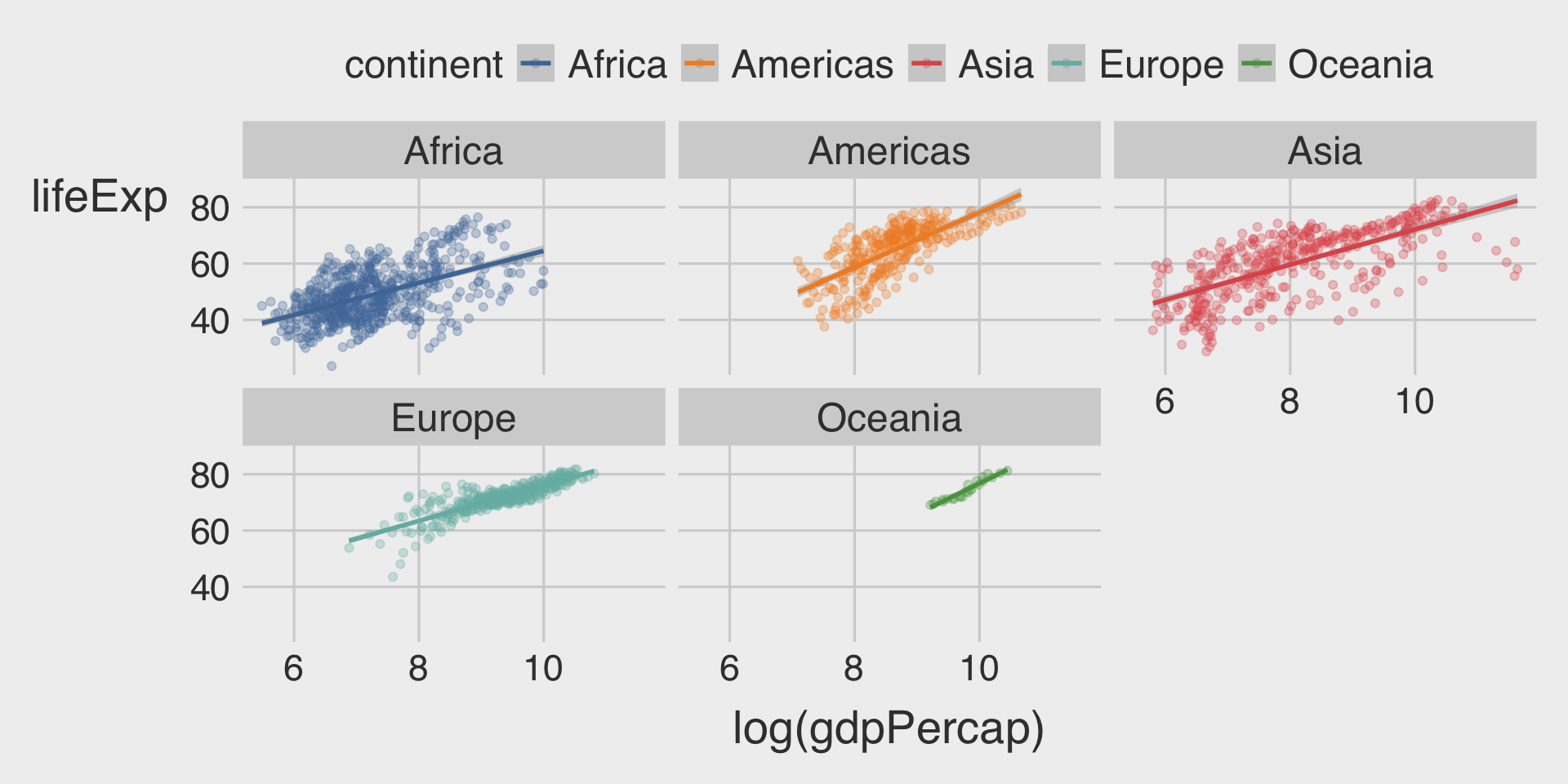
ggplot(data = df_gapminder,
       mapping = aes(x = log(gdpPercap),
                     y = lifeExp,
                     color = continent)) +
  geom_point(alpha = .3) +
  geom_smooth(method = "lm") +
facet_wrap(~continent)- The faceted view significantly reduces overplotting and provides a more detailed look at regional differences.
- However, using
coloronly can make it easier to compare the slope of the fitted lines across continents.
- However, using
Question 3. Color vs. Facet
- What are the advantages of using faceting instead of the
coloraesthetic?
- What are the disadvantages?
- How might this trade-off change if you were working with a larger dataset?
Show answer
- Advantages of Faceting
- Clarity for Multiple Categories: Faceting avoids the visual clutter of overlapping points and lines, especially when the number of categories (e.g.,
Genre) is large. - Highlights Individual Patterns: By splitting the data into separate plots, it’s easier to observe specific trends or outliers within each genre.
- Improved Readability: Each genre gets its own visual space, avoiding the need to distinguish between multiple colors.
- Clarity for Multiple Categories: Faceting avoids the visual clutter of overlapping points and lines, especially when the number of categories (e.g.,
- Disadvantages of Faceting
- Difficult Cross-Category Comparison: Observations in separate facets cannot be directly compared. Audiences need to read through all facets.
- Impact with Larger Dataset
- More Data Points: Overlapping increases, making faceting a more practical option to reduce clutter. Color aesthetics may struggle to show patterns with dense data points.
- More Categories: Differentiating between colors becomes harder as the number of categories increases. In such cases, faceting is clearer.
- Transparency Issues: Using transparency (
alpha) with many overlapping points and colors can result in a loss of clear category identification.
Discussion
Welcome to our Classwork 3 Discussion Board! 👋
This space is designed for you to engage with your classmates about the material covered in Classwork 3.
Whether you are looking to delve deeper into the content, share insights, or have questions about the content, this is the perfect place for you.
If you have any specific questions for Byeong-Hak (@bcdanl) regarding the Classwork 3 materials or need clarification on any points, don’t hesitate to ask here.
All comments will be stored here.
Let’s collaborate and learn from each other!