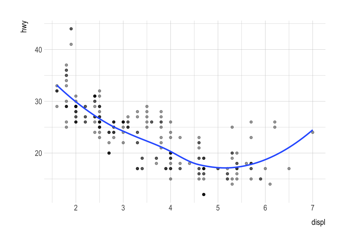
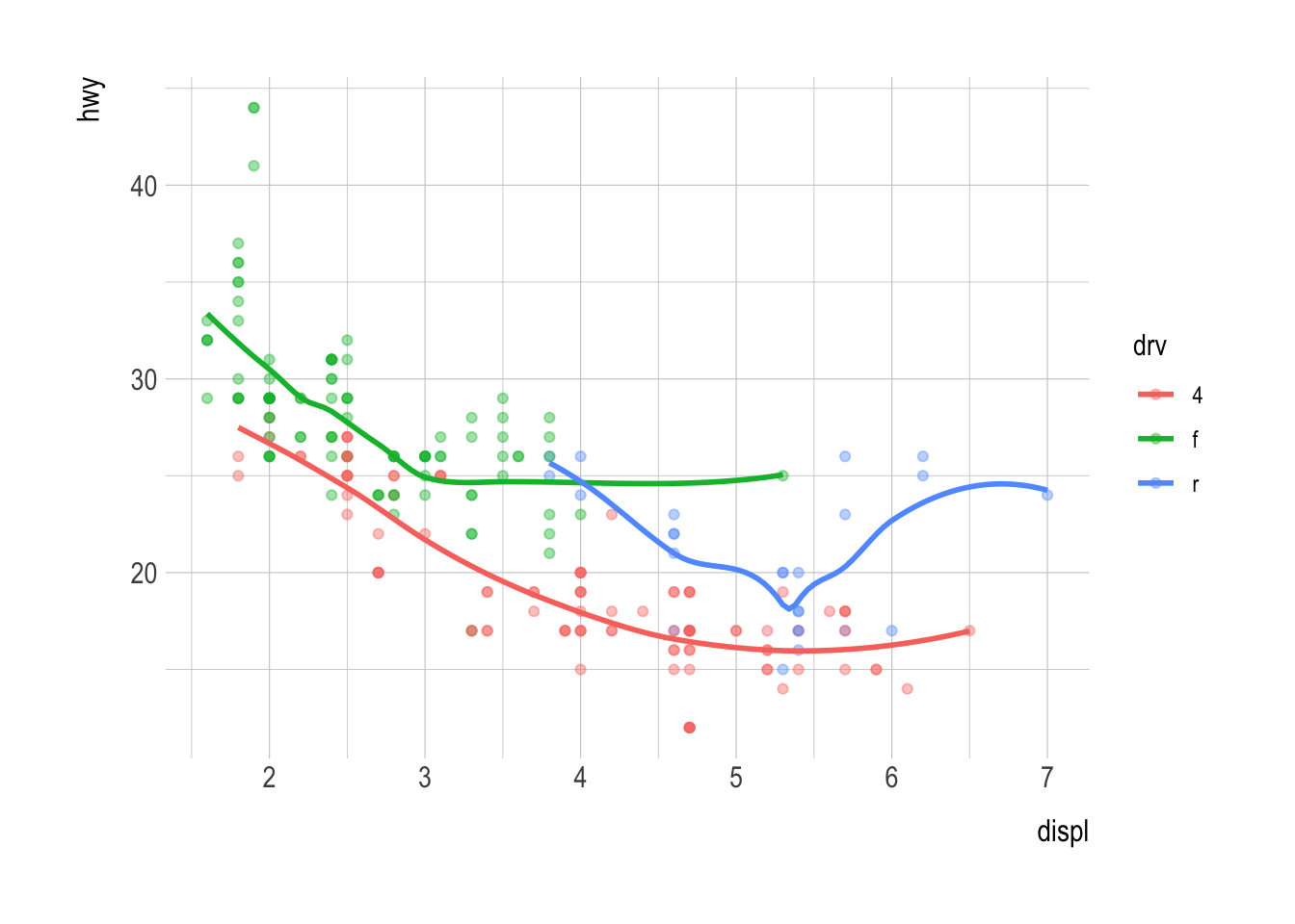
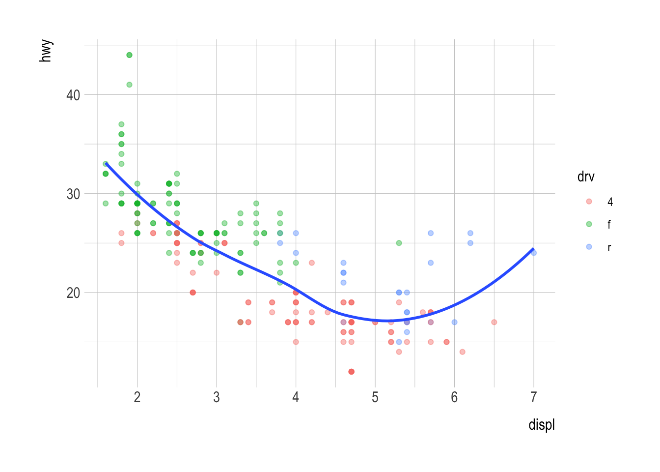
ggplot(data = mpg,
       mapping = aes(x = displ, y = hwy,
                     color = drv)) +
  geom_point(alpha = .4) +
geom_smooth(se = FALSE)Classwork 7
ggplot - Geometric Objects; Statistical Transformation; and Position Adjustment
Question 1. Geometric Objects
Q1a.
Run this code in your head and predict what the output will look like. Then, run the code in R and check your predictions.
Q1b.
What does show.legend = FALSE do? What happens if you remove it? Why do you think I used it earlier in the lecture?
Answer:
ggplot(data = mpg) +
  geom_point(mapping = aes(x = displ, y = hwy,
                           color = drv),
             alpha = .5,
             show.legend = FALSE)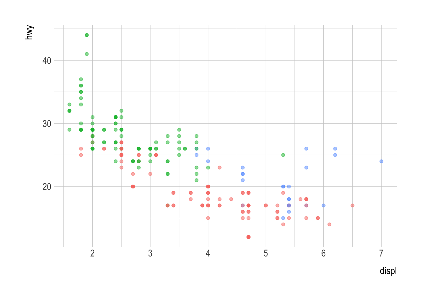
Q1c.
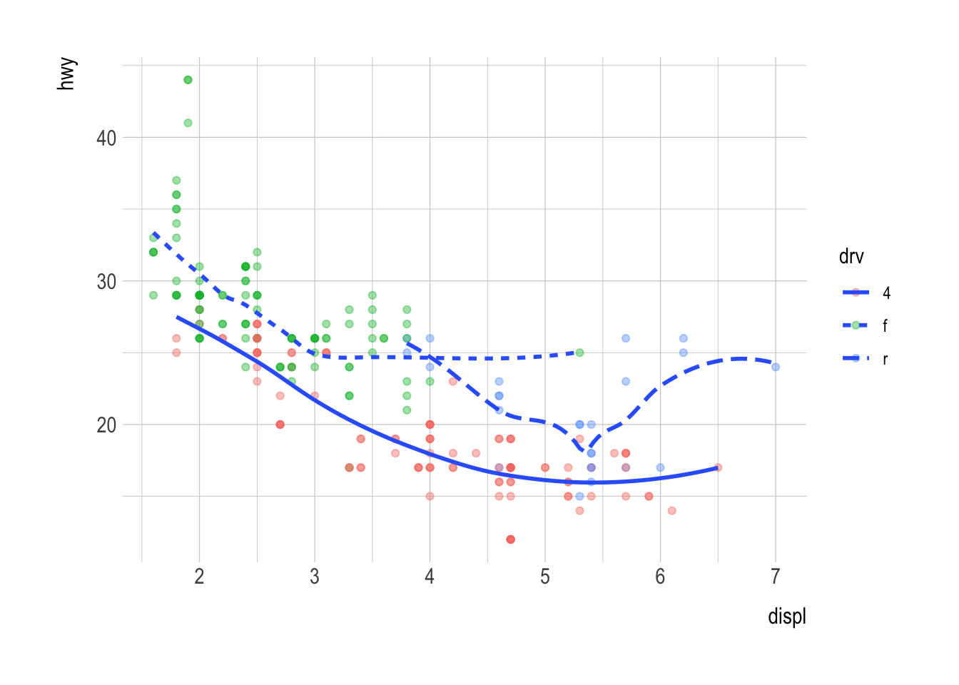
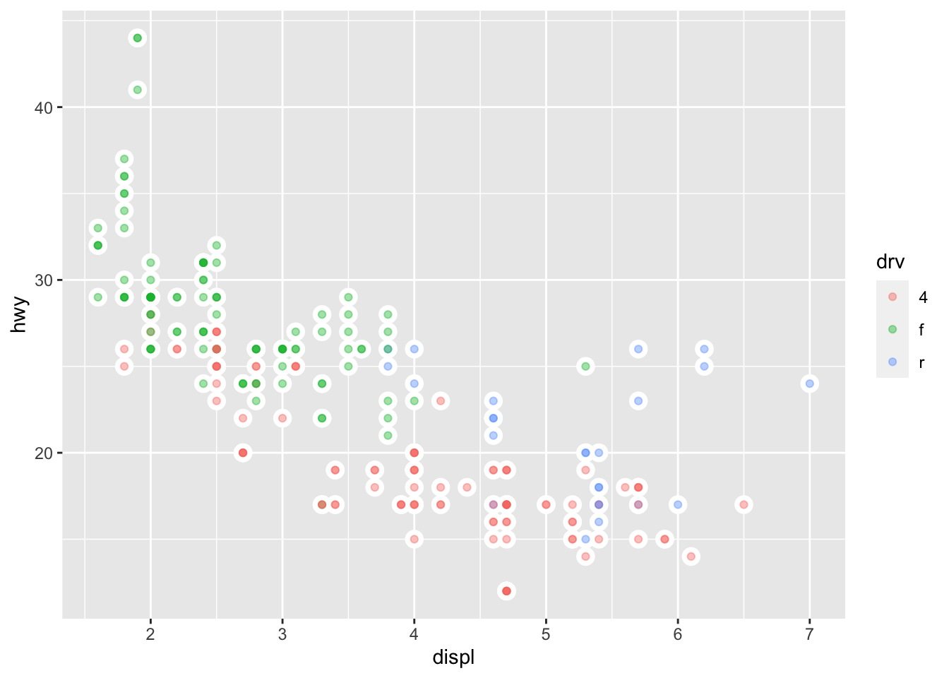
Recreate the R code necessary to generate the following graphs.
(a)
(b)
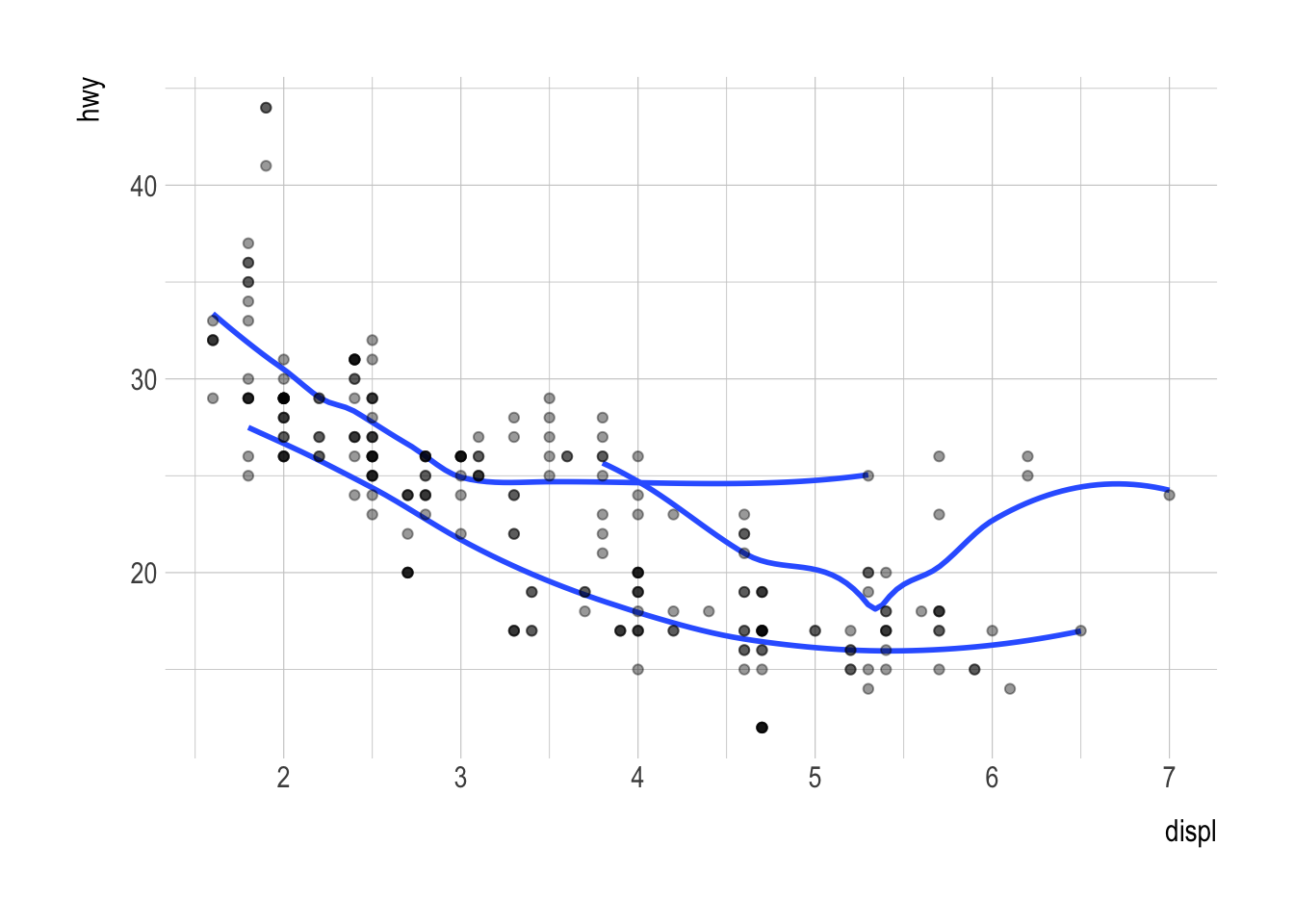
(c)
(d)
(e)
(f)
Q1d.
- Use the data.frame,
organdata_simpleto visualize the yearly trend of the variabledonorsfor each country.
organdata_simple <- read_csv('https://bcdanl.github.io/data/organdata_simple.csv')Question 2. Statistical Transformation and Position Adjustment
Q2a.
What does geom_col() do? How is it different to geom_bar()?
Answer:
Q2b.
Install the R package,
nycflights13, which provides theflightsdata.frame.Visualize the distribution of
carrier.Visualize how the distribution of
carriervaries byorigin.
Answer: