library(tidyverse)

oj <- read_csv("http://bcdanl.github.io/data/dominick_oj_na.csv")

ggplot(data = oj,
       mapping = aes(x = price, y = sales,
                     color = brand)) +
  geom_point(alpha = .3) +
  geom_smooth(method = "lm") +
  labs(title = "Scatter Plot of Sales vs. Price",
       x = "Price",
y = "Sales")Homework 5
Generative AI for Data Analysis
- Please answer all of the following questions thoroughly.
- Prepare your answers in a Word document and submit the document to Brightspace.
- For Homework Assignment 5, using a generative artificial intelligence (AI) tool is required.
- Choose one generative AI tool of your preference.
- Copy your full conversation with the AI tool and paste it into your Word document.
- You may submit multiple times, but only your most recent submission will be graded.
- The assignment is due on Tuesday, December 9, 2024, at 11:59 PM (Eastern Time).
Question 1. Choice of Generative AI Tool
What generative AI tool have you used for this homework assignment?
Question 2. Python Visualization with the seaborn Library
seaborn
seabornis a Python data visualization library that provides a high-level, elegant interface for creating informative and attractive graphics.- You can think of it as the Python counterpart to R’s
ggplot2: it emphasizes clear defaults, aesthetic color palettes, and concise syntax for complex visualizations.
- Because of its intuitive design and visually appealing output, I recommend using
seabornas the default choice for visualization in Python.
- You can think of it as the Python counterpart to R’s
- Provide your conversation with generative AI to do the following tasks:
- Translate the following R
ggplotcode into Pythonseaborncode to generate a scatter plot showing the relationship between “sales” and “price” using the CSV file,http://bcdanl.github.io/data/dominick_oj_na.csv. - Make a step-by-step comparison between the Python code and the R code to understand how each part corresponds to the other.
- Translate the following R
Question 2. Python Data Analysis with the pandas Library
pandas
pandasis Python’s primary library for data manipulation and analysis, offering powerful tools for working with tabular data.- You can think of it as the Python counterpart to R’s
dplyr(tidyverse): it provides clear, expressive functions for filtering, transforming, summarizing, and reshaping data.
- You can think of it as the Python counterpart to R’s
- Because of its intuitive syntax and flexible data structures — DataFrame (similar to a data.frame in R) and Series (similar to a vector in R) —
pandasis the default foundation for most data analysis workflows in Python.
Provide your conversation with a generative AI tool to complete the following tasks:
Translate the R
dplyrcode below into equivalent Python code usingpandasto perform the same data-manipulation steps on the CSV file
http://bcdanl.github.io/data/dominick_oj_na.csv.Make a step-by-step comparison between the Python code and the R code, explaining how each part of the
dplyrpipeline corresponds to the equivalent operation inpandas.
library(tidyverse)

oj <- read_csv("http://bcdanl.github.io/data/dominick_oj_na.csv")

oj |>
  select(brand, price, sales) |>
  filter(price > 1.5) |>
  mutate(log_sales = log(sales)) |>
  arrange(desc(price))
Question 4. Debugging R Code with Generative AI
- Provide your conversation with generative AI to debug the following code:
- Explain to the generative AI the error message you received when running the code below:
oj |>
  counting(brand, ad_status)
Question 5. Data Transformation with Generative AI Assistance
- Provide your conversation with generative AI for adding a new variable,
revenue, to theojdata frame.- The
revenuevariable should be computed as the product ofsalesandpriceto provide information about the weekly revenue for each orange juice brand.
- The
library(tidyverse)
oj <- read_csv("http://bcdanl.github.io/data/dominick_oj_na.csv")
Question 6. Understanding R ggplot and dplyr Code with Generative AI
- Provide your conversation with a generative AI tool to complete the following task:
- In the code below, add a comment (
#) with a brief explanation for each line of the R code below to show your understanding of what the code is doing.
- In the code below, add a comment (
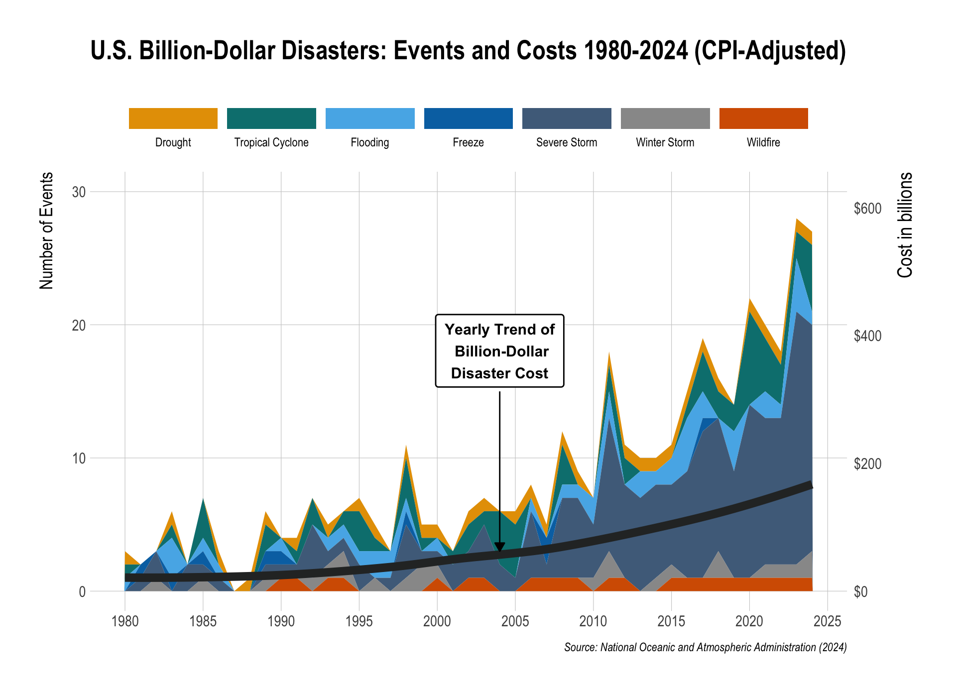
library(tidyverse)
library(hrbrthemes)
library(ggthemes)
library(grid)
library(scales)

events_raw <- read_csv("https://bcdanl.github.io/data/time-series-US-cost-1980-2024.csv",
                       comment = "#") |>
  select(-matches("upper|lower", ignore.case = TRUE))

events_counts <- events_raw |>
  select(Year, matches("Count$"))

events_long <- events_counts |>
  pivot_longer(
    cols      = -Year,
    names_to  = "hazard",
    values_to = "count"
  ) |>
  mutate(
    hazard = str_remove(hazard, " Count$"),
    hazard = factor(
      hazard,
      levels = c(
        "Drought",
        "Tropical Cyclone",
        "Flooding",
        "Freeze",
        "Severe Storm",
        "Winter Storm",
        "Wildfire"
      )
    )
  ) |>
  filter(!is.na(hazard))

cost_df <- events_raw |>
  select(Year, matches("All Disasters.*Cost", ignore.case = TRUE)) |>
  rename(cost_billion = 2)

plot_df <- events_long |>
  left_join(cost_df, by = "Year")


max_count <- max(plot_df$count, na.rm = TRUE)
max_cost  <- max(plot_df$cost_billion, na.rm = TRUE)
cost_scale <- max_count / max_cost


hazard_cols <- c(
  "Drought"          = "#E69F00",  # orange
  "Tropical Cyclone" = "#007F7F",  # green
  "Flooding"         = "#56B4E9",  # light blue
  "Freeze"           = "#0072B2",  # dark blue
  "Severe Storm"     = "#4F6D8A",  # purple
  "Winter Storm"     = "#999999",  # gray
  "Wildfire"         = "#D55E00"   # red
)

ggplot(plot_df, aes(x = Year)) +
  geom_area(
    aes(y = count, fill = hazard),
    position = "stack",
    color = NA
  ) +
  geom_smooth(
    aes(y = cost_billion * cost_scale),
    linewidth = 3,
    color = "#2c2e2f",
    se = FALSE
  ) +
  geom_label(
    data = tibble(
      Year = 2004,
      y    = max_count * 0.95,
      lab  = "Yearly Trend of\n Billion-Dollar\nDisaster Cost"
    ),
    aes(x = Year, y = y, label = lab),
    inherit.aes = FALSE,
    hjust = 0.5,
    vjust = 0.5,
    size  = 4,
    fontface = "bold",
    label.size = .5,
    label.r = unit(0.15, "lines"),
    label.padding = unit(0.5, "lines")
  ) +
  annotate(
    "segment",
    x = 2004,
    xend = 2004,
    y = 15,
    yend = 3,
    color = "black",
    linewidth = 0.5,
    arrow = arrow(length = unit(0.25, "cm"), type = "closed")
  ) +
  scale_fill_manual(
    values = hazard_cols,
    name   = ""
  ) +
  scale_y_continuous(
    name = "Number of Events",
    breaks = seq(0,30,10),
    limits = c(0,30),
    sec.axis = sec_axis(
      ~ . / cost_scale,
      name = "Cost in billions",
      labels = label_dollar(prefix = "$")
    )
  ) +
  scale_x_continuous(
    breaks = seq(1980,2025,5)
  ) +
  labs(
    x = NULL,
    fill = "",
    title = "U.S. Billion-Dollar Disasters: Events and Costs 1980-2024 (CPI-Adjusted)",
    caption = "Source: National Oceanic and Atmospheric Administration (2024)"
  ) +
  theme_ipsum() +
  theme(
    plot.title = element_text(hjust = 0.5,
                              size = rel(1.75)),
    panel.grid.minor = element_blank(),
    axis.title.y = element_text(size = rel(1.5),
                                margin = margin(0,12,0,0)),
    axis.title.y.right = element_text(size = rel(1.12),
                                      margin = margin(0,0,0,12)),
    legend.position = "top",
    legend.box = "horizontal",
    legend.direction = "horizontal"
  ) +
  guides(
    fill = guide_legend(
      title.position = "top",
      label.position = "bottom",
      keywidth = unit(4.75, "lines"),
      nrow = 1
    )
  )
References
- Billion-Dollar Weather and Climate Disasters, National Oceanic and Atmospheric Administration (2025)