library(tidyverse)
library(skimr)
library(ggthemes)
library(gapminder)Homework 4
Data Transformation & Visualization in R — Part II
Multiple Choice Questions
Question 1
When visualizing grouped data, which of the following best describes the difference between using the aes(color = ...) aesthetic and using facet_wrap(…)`?
Show answer
Answer: color aesthetic mapping differentiates groups within the same plot, while faceting displays each group in its own panel
Explanation:
aes(color = ...)keeps all groups in the same plot, distinguishing them by different colors.facet_wrap()separates each group into its own subplot, giving each its own panel and axes.- Faceting is helpful when groups overlap too much in one plot or when per-group trends need to be seen clearly.
Question 2
In ggplot2, what does setting scales = "free_y" in facet_wrap() do?
Show answer
Answer: Allows the y-axis scale to vary by facet while the x-axis is shared across facets
Explanation:
scales = "free_y"means each facet gets its own y-axis scale, but all facets share the same x-axis.- This is useful when groups differ greatly in magnitude on the y-axis, preventing small groups from appearing flat.
Question 3
Which of the following statements about data visualizations is true?
Show answer
Answer: They are useful for showing “what” is happening in the data.
Explanation: Data visualizations are excellent tools for understanding “what” is happening, but they often do not explain “why” trends occur, which requires additional analysis or narratives.
Question 4
In the ggplot2 syntax ggplot(data, aes(x, y)) + geom_point(), what does aes() stand for?
Show answer
Answer: Aesthetic mappings
Explanation: The aes() function in ggplot2 stands for aesthetic mappings, linking data variables to visual properties like x, y, color, fill or shape.
Question 5
The equation \(\Delta\log(x) \approx \Delta x / x_{0}\) demonstrates that a small change in the natural logarithm of \(x\), from an initial value \(\log(x_0)\) to an ending value \(\log(x_{1})\), where the change in \(x\) is given by \(\Delta x = x_{1} - x_{0}\), can be approximated by:
Show answer
Answer: The percentage change in \(x\)
Explanation: When \(x\) changes by a small amount, the natural logarithm of \(x\) changes approximately by the percentage change in \(x\).
Question 6
Which of the following statements about mapping and setting aesthetics in ggplot2 is FALSE?
Show answer
Answer: You can set aesthetics manually within aes() by assigning fixed values.
Explanation: Manually setting fixed aesthetics (e.g., color = "red") should be done outside of aes(). Inside aes(), values are mapped a variable in a data.frame.
Question 7
Which of the following is NOT a way to explicitly inform ggplot about the grouping structure in a line plot?
Show answer
Answer: Using the size aesthetic.
Explanation: The size aesthetic does not explicitly inform ggplot about grouping in a line plot, whereas group, color, and linetype do.
Question 8
If you have a data frame with a date variable and want to plot a time series for each category in a variable called group_var, what is the minimal aesthetic mapping required in ggplot2 to correctly plot separate lines for each group?
Show answer
Answer: Both mapping = aes(x = date_var, y = value_var, color = group_var) and mapping = aes(x = date_var, y = value_var, group = group_var)
Explanation: Both options correctly separate lines for each group. group ensures proper grouping, while color differentiates groups visually.
Question 9
When creating a vertical boxplot in ggplot2, which of the following mappings is correct?
Show answer
Answer: Map a categorical variable to x and a numeric variable to y.
Explanation: In a vertical boxplot, the x-axis typically represents categories, while the y-axis represents the numeric variable whose distribution is being summarized.
Question 10
Which of the following functions is used to apply a color-blind friendly palette to the fill aesthetic in ggplot2?
Show answer
Answer: scale_fill_tableau() or scale_fill_manual()
Explanation: - The scale_fill_tableau() function, part of the ggthemes package, extends ggplot2 with Tableau-inspired themes and scales, including color-blind friendly palettes.
- The
scale_fill_manual()function can used to apply a custom color palette, including color-blind friendly palettes, to the fill aesthetic in ggplot2.
Data Visualization with ggplot
The followings are the R packages for this homework assignment:
Questions 11-17
Consider the following titanic data.frame for Questions 11-17:
titanic <- read_csv("https://bcdanl.github.io/data/titanic_cleaned.csv")Question 11
How would you create the following data.frame, titanic_class_survival?
- The
titanic_class_survivaldata.frame counts the number of passengers who survived and those who did not survive within eachclassin thetitanicdata.frame.
Complete the code by filling in the blanks.
__BLANK 1__ <- titanic |>
  count(__BLANK 2__)
Show answer
titanic_class_survival <- titanic |>
  count(class, survived)
Question 12
How would you describe the variation in the distribution of age across classes and genders?
Complete the code by filling in the blanks.
ggplot(data = __BLANK 1__,
       mapping = aes(x = gender,
                     __BLANK 2__ = age,
                     __BLANK 3__ = gender)) +
  __BLANK 4__(show.legend = F) +
  __BLANK 5__(~class) +
  scale_fill_tableau()
Show answer
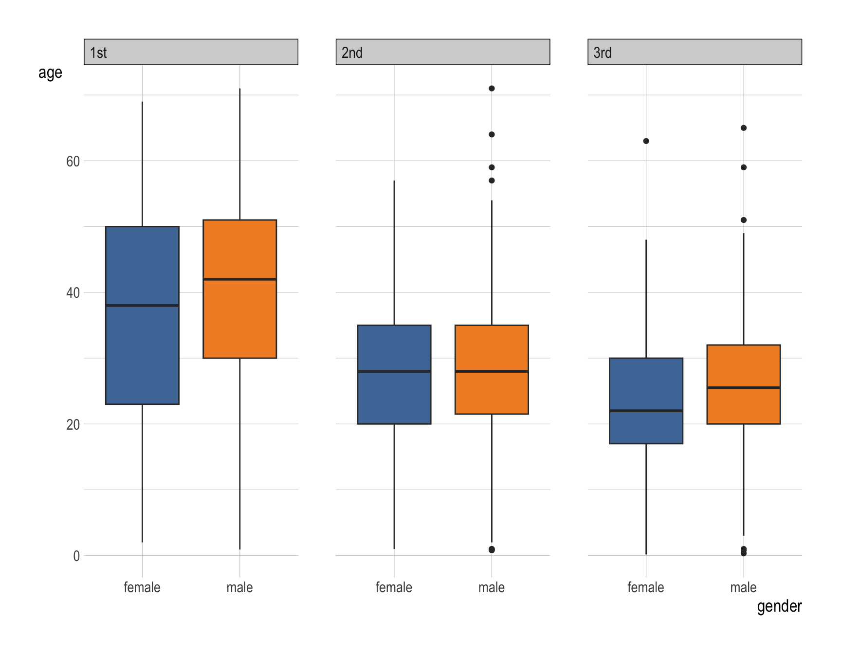
ggplot(data = titanic,
       mapping = aes(x = gender,
                     y = age,
                     fill = gender)) +
  geom_boxplot(show.legend = F) +
  facet_wrap(~class) +
  scale_fill_tableau()
Question 13
Provide a comment on the variation in the distribution of age across classes and genders.
Show answer
- For both female and male groups, the
agesof the first class passengers in the Titanic ranges wider than the second class and the third class. - For both female and male groups,the median of the first class passengers’s
agesis higher than that of the second class and the third class. - The first quartile of female’s
ageis always lower than that of male’s across all classes. Particularly, the such gap is wider for the first class.
Question 14
How would you describe the variation in the distribution of survived across classes and genders?
Complete the code by filling in the blanks.
ggplot(data = __BLANK 1__,
       mapping = aes(__BLANK 2__ = class,
                     __BLANK 3__ = survived)) +
  __BLANK 4__() +
  __BLANK 5__(~gender) +
  labs(x = "Proportion") +
  scale_fill_tableau()
Show answer
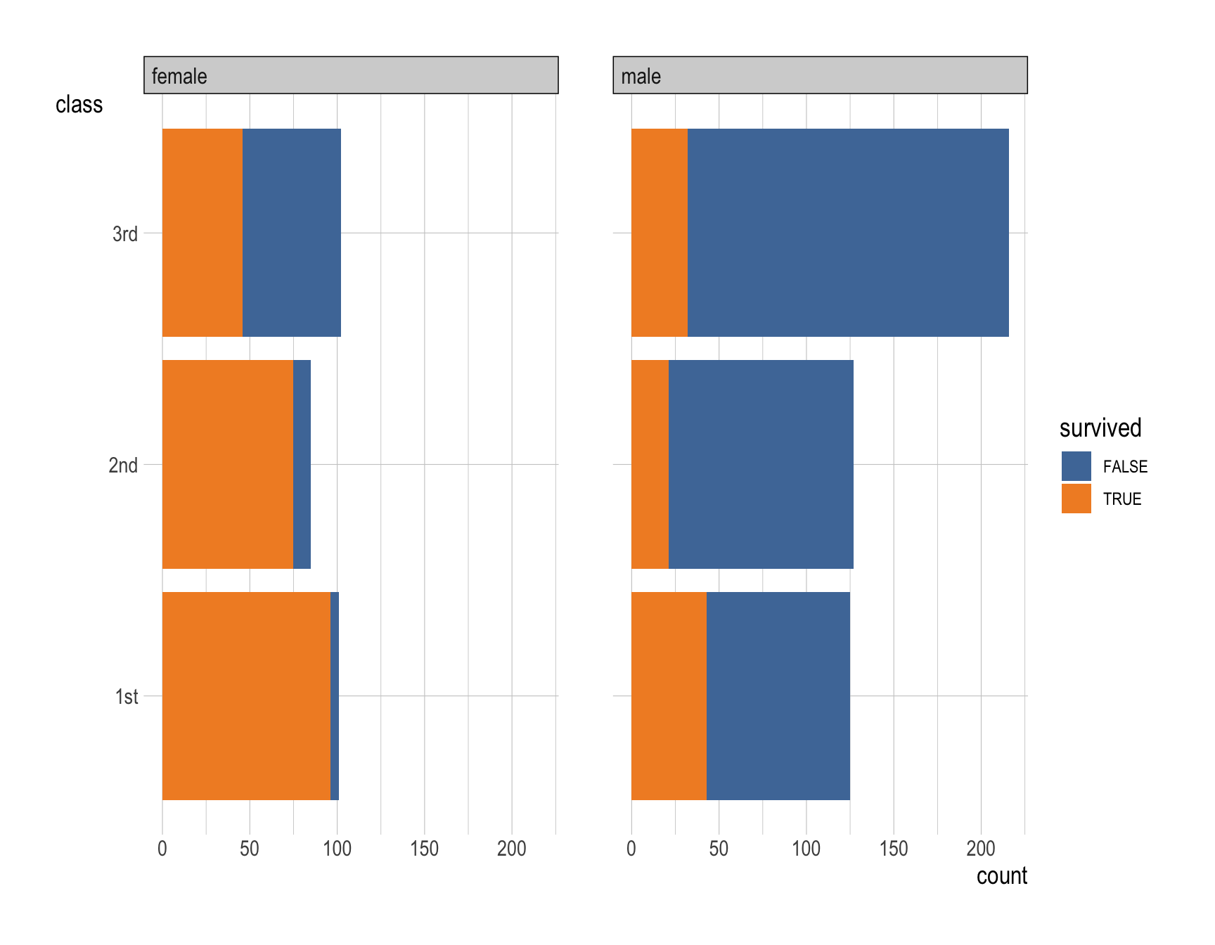
ggplot(data = titanic,
       mapping = aes(y = class,
                     fill = survived)) +
  geom_bar() +
  facet_wrap(~gender) +
  labs(x = "Proportion") +
  scale_fill_tableau()
Question 15
How would you describe the variation in the distribution of survived across classes and genders?
Complete the code by filling in the blanks.

ggplot(data = __BLANK 1__,
       mapping = aes(__BLANK 2__ = class,
                     __BLANK 3__ = survived)) +
  __BLANK 4__(position = __BLANK 5__) +
  __BLANK 6__(~gender) +
  labs(x = "Proportion") +
  scale_fill_tableau()
Show answer
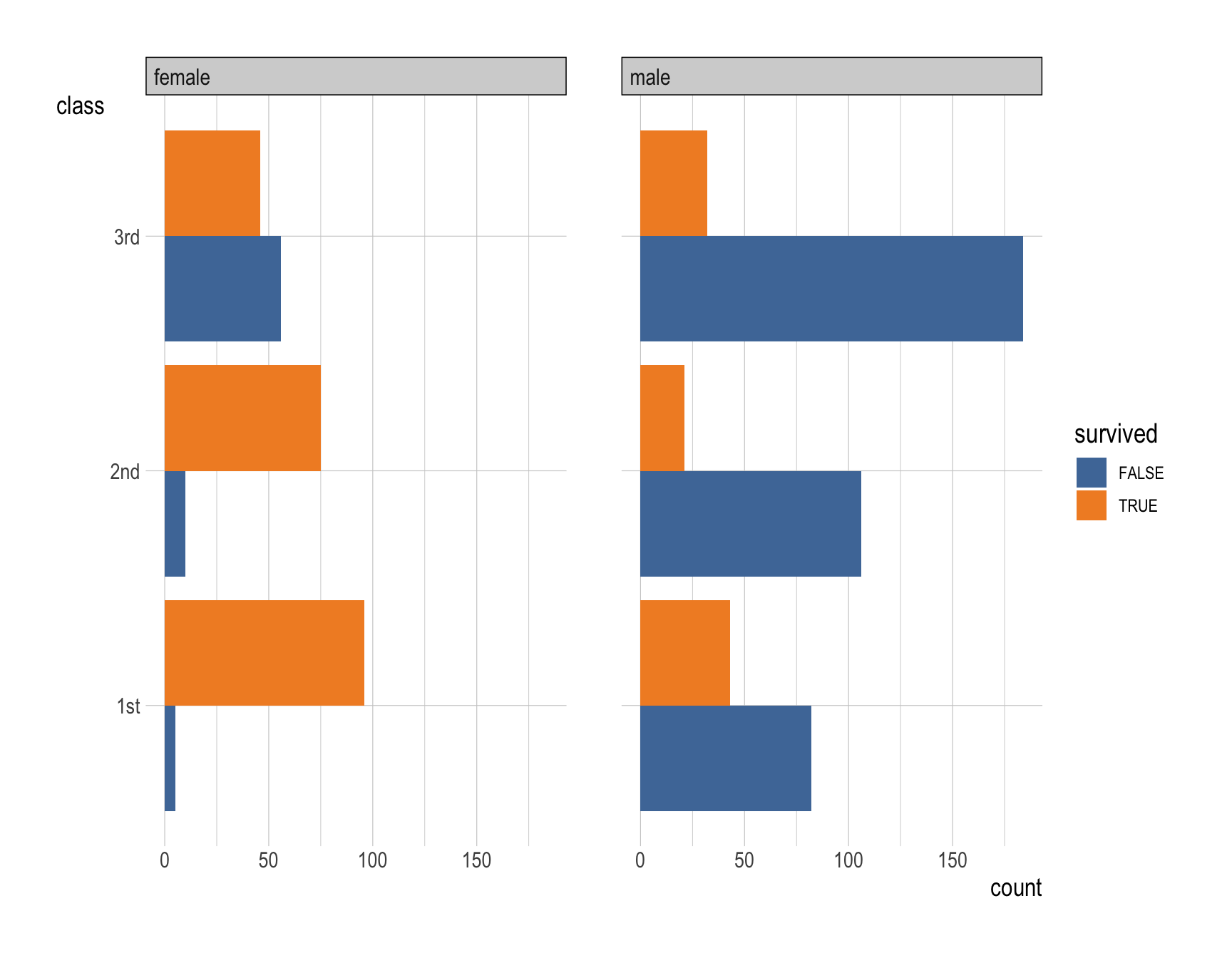
ggplot(data = titanic,
       mapping = aes(y = class,
                     fill = survived)) +
  geom_bar(position = "fill") +
  facet_wrap(~gender) +
  labs(x = "Proportion") +
  scale_fill_tableau()
Question 16
How would you describe the variation in the distribution of survived across classes and genders?
Complete the code by filling in the blanks.
ggplot(data = __BLANK 1__,
       mapping = aes(__BLANK 2__ = class,
                     __BLANK 3__ = survived)) +
  __BLANK 4__(position = __BLANK 5__) +
  __BLANK 6__(~gender) +
  scale_fill_tableau()
Show answer
ggplot(data = titanic,
       mapping = aes(y = class,
                     fill = survived)) +
  geom_bar(position = "dodge") +
  facet_wrap(~gender) +
  scale_fill_tableau()
Question 17
Provide a comment on the variation in the distribution of survived across classes and genders.
Show answer
- First-class passengers had the highest survival rate.
- Survival rates decline progressively in second and third classes.
- Female passengers generally had a much higher survival rate compared to male passengers.
- Female first-class passengers had the highest survival rates, followed by female second-class and third-class passengers.
- Male survival rates were considerably lower in all classes, with third-class males experiencing the lowest survival likelihood.
- These patterns may be attributed to the influence of both socioeconomic status and gender norms prevalent in the early 1900s.
Questions 18-20
Consider the following nyc_dogs data.frame for Questions 18-20:
nyc_dogs <- read_csv("https://bcdanl.github.io/data/nyc_dogs_cleaned.csv")- The
nyc_dogsdata.frame contains data on licensed dogs in New York city.
Question 18
How would you create the following data.frame, nyc_dogs_breeds?
- The
nyc_dogs_breedsdata.frame counts the number of occurrences for each value in thebreedvariable in thenyc_dogsdata.frame.- The
nyc_dogs_breedsdata.frame keeps observations if- The number of occurrences (
n) is greater than or equal to 2000; - The value of
breedis not missing.
- The number of occurrences (
- The observations in the
nyc_dogs_breedsdata.frame is arranged bynin descending order.
- The
Complete the code by filling in the blanks.
__BLANK 1__ <- nyc_dogs |>
  __BLANK 2__ |>
  filter(__BLANK 3__(breed)) |>
  filter(__BLANK 4__) |>
  arrange(__BLANK 5__)
Show answer
nyc_dogs_breeds <- nyc_dogs |>
  count(breed) |>
  filter(!is.na(breed)) |>
  filter(n >= 2000) |>
  arrange(-n)  # or arrange(desc(n))
Question 19
How would you describe the distribution of breed using the nyc_dogs_breeds data.frame?
Complete the code by filling in the blanks.
ggplot(data = __BLANK 1__,
       mapping = aes(x = __BLANK 1__,
                     __BLANK 3__)) +
  __BLANK 4__()
Show answer
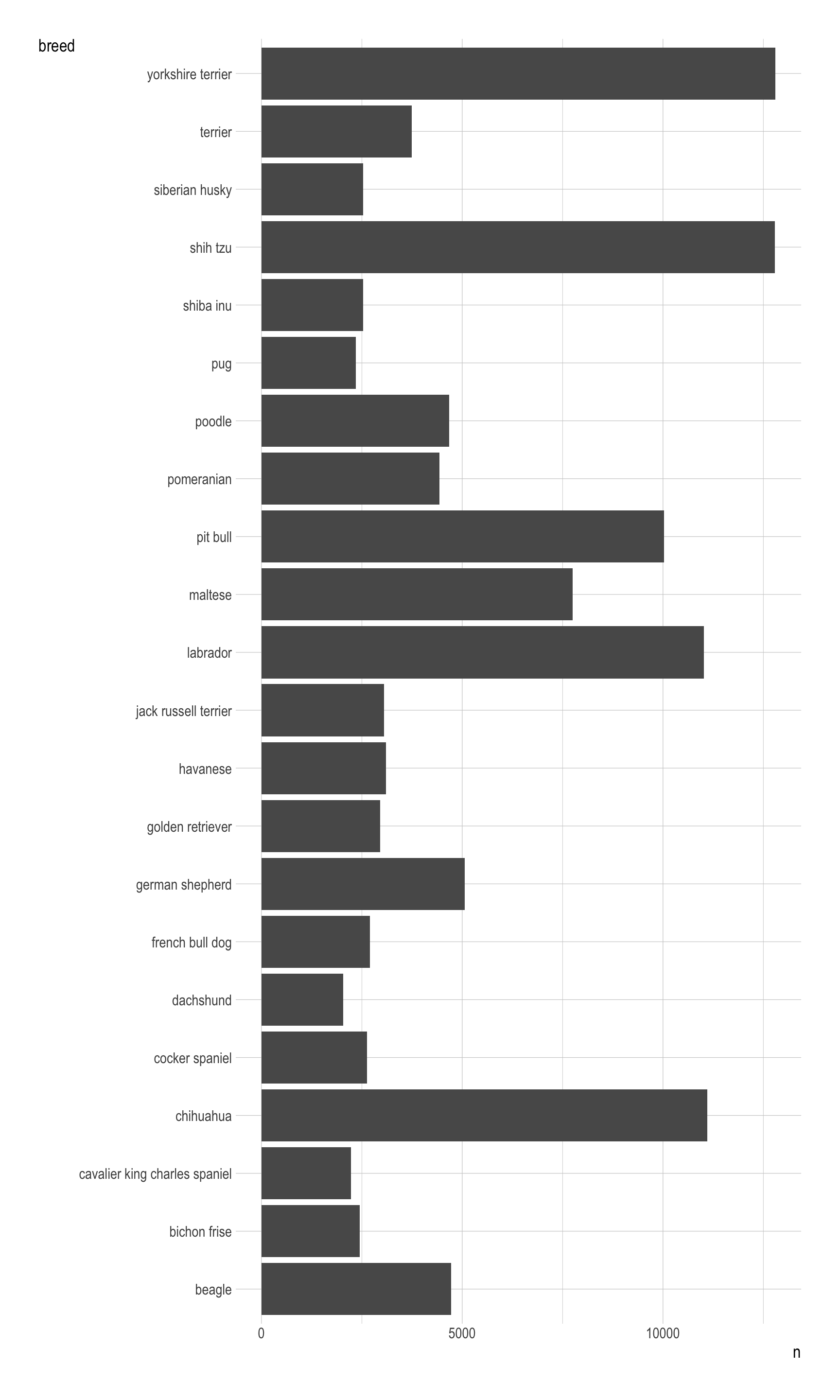
ggplot(data = nyc_dogs_breeds,
       mapping = aes(x = n,
                     y = breed)) +
  geom_col()
Question 20
How would you describe the distribution of breed using the nyc_dogs_breeds data.frame?
Complete the code by filling in the blanks.
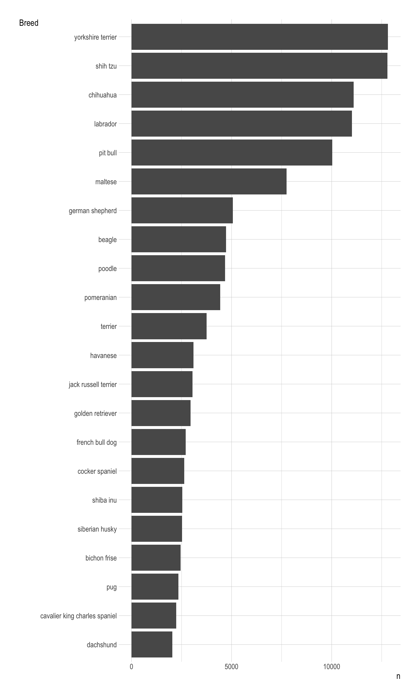
ggplot(data = __BLANK 1__,
       mapping = aes(x = __BLANK 1__,
                     __BLANK 3__)) +
  __BLANK 4__() +
  labs(y = "Breed")
Show answer
ggplot(data = nyc_dogs_breeds,
       mapping = aes(x = n,
                     y = fct_reorder(breed, n))) +
  geom_col() +
  labs(y = "Breed")