Homework Assignment 3 - Example Answers
Descriptive Statistics
The following provides the descriptive statistics for each part of the homework, as well as the final score of HW3:
Short-Answer Questions
True or False
- One guest speaker in our DANL career session emphasized the importance of adaptability and the ability to learn new technologies in a rapidly changing tech landscape. (True/False)
Answer: True
Explanation: Adaptability and continuous learning are crucial in the tech industry, as highlighted by the speaker.
- The narrative in data storytelling bridges the gap between data and insights. (True/False)
Answer: True
Explanation: The narrative connects raw data to meaningful insights, explaining the “why” and “how.”
- Clutter in data visualization refers to visual elements that occupy space but do not improve understanding. (True/False)
Answer: True
Explanation: Clutter can distract from the main message and increase cognitive load.
- Proficiency in one programming language can facilitate learning others. (True/False)
Answer: True
Explanation: Fundamental programming concepts often transfer between languages.
Multiple Choice
- In Data Storytelling, the “Big Idea” must meet which of the following criteria?
- Articulate your unique point of view
- Be a question
- Be a complete sentence
- Both A and C
Answer: D. Both A and C
Explanation: The Big Idea should articulate a unique perspective, convey what’s at stake, and be a complete sentence.
- Which of the following graphs is most appropriate for visualizing the distribution of a numerical variable?
- Bar Chart
- Histogram
- Pie Chart
- Scatterplot
Answer: B. Histogram
Explanation: Histograms are ideal for showing the distribution of numerical data.
- Which of the following is a measure of the asymmetry of a distribution in a histogram?
- Skewness
- Kurtosis
- Variance
- Mean
Answer: A. Skewness
Explanation: Skewness quantifies the asymmetry of a distribution.
- Which of the following is a reason to use a logarithmic scale when plotting data?
- When data is symmetrically distributed in a bell-shaped pattern
- When the variable is categorical
- When the variable has a wide range of skewed data
- To increase the size of small values
Answer: C. When the variable has a wide range of skewed data
Explanation: Logarithmic scales compress large ranges of data, making it easier to observe trends and compare values that vary greatly in size, from very small to very large. They are especially useful for visualizing skewed data with wide-ranging values, as they prevent very large values from visually overwhelming smaller ones.
- According to the text, which of the following is important for data storytelling?
- Including as much data as possible
- Understanding your audience’s needs
- Using complex jargon
- Focusing solely on visual aesthetics
Answer: B. Understanding your audience’s needs
Explanation: Tailoring the message to the audience is crucial for effective communication.
Short Essay
- What is overplotting in the context of scatterplots?
Answer:
Overplotting occurs when data points overlap in a scatterplot, making it difficult to see individual observations. It can obscure patterns and make the visualization less effective.
Data Transformation and Visualization with R tidyverse
The followings are the R packages for this homework assignment:
library(tidyverse)
library(skimr)
Questions 11-18
Consider the following oj data.frame for Questions 11-18:
oj <- read_csv("https://bcdanl.github.io/data/dominick_oj_na.csv")Question 11
How can you filter the data.frame oj to calculate descriptive statistics (mean and standard deviation) of sales and price for tropicana, minute.maid, and dominicks, respectively?
oj_tr <- oj |>
  filter(__BLANK__ "tropicana")

oj_mm <- oj |>
  filter(__BLANK__ "minute.maid")

oj_do <- oj |>
  filter(__BLANK__ "dominicks")

oj_tr_sum <- skim(oj_tr)
oj_mm_sum <- skim(oj_mm)
oj_do_sum <- skim(oj_do)Answer:
# Filter the dataset to include only rows where the brand is "tropicana"
oj_tr <- oj |>
  filter(brand == "tropicana")

# Filter the dataset to include only rows where the brand is "minute.maid"
oj_mm <- oj |>
  filter(brand == "minute.maid")

# Filter the dataset to include only rows where the brand is "dominicks"
oj_do <- oj |>
  filter(brand == "dominicks")

# Generate descriptive statistics for the Tropicana subset
oj_tr_sum <- skim(oj_tr)

# Generate descriptive statistics for the Minute Maid subset
oj_mm_sum <- skim(oj_mm)

# Generate descriptive statistics for the Dominick's subset
oj_do_sum <- skim(oj_do)
Question 12
How would you create a new data.frame, oj_no_NA, in which there is no missing value in price and sales?
oj_no_NA <- oj |>
filter(__BLANK__)Answer:
# # Filter the dataset to include only observations where both 'price' and 'sales' are not missing (i.e., no NA values)
oj_no_NA <- oj |>
  filter(!is.na(price) & !is.na(sales))
Question 13
How would you describe how the distribution of price varies by brand?
ggplot(data = __BLANK 1__,
       mapping = aes(x = __BLANK 2__,
                     __BLANK 3__)) +
  __BLANK 4__(show.legend = FALSE,  # `show.legend = FALSE` turns off legend
              __BLANK 5__ = 40) +
  facet_wrap(__BLANK 6__,
__BLANK 7__ = 1)Answer:
ggplot(data = oj,  # or oj_no_NA
       mapping = aes(x = price,  # set 'price' as the x-axis variable
                     fill = brand)) +  # fill the histogram bars by 'brand' for color differentiation
  geom_histogram(show.legend = FALSE,  # plot histograms without a legend
                 bins = 40) +  # use 40 bins for the histogram
  facet_wrap(~brand,  # create separate panels for each 'brand'
             ncol = 1)  # arrange the panels in a single column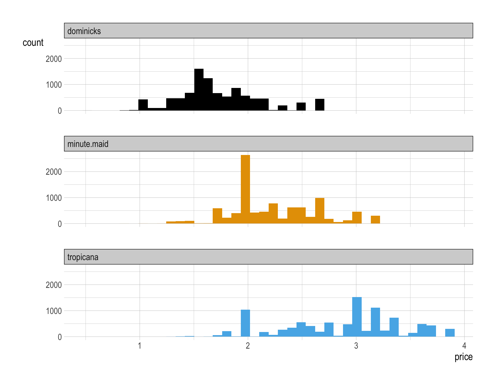
Question 14
Provide a comment to describe how the distribution of price varies by brand.
Answer: Overall, Dominick’s is the budget option, Tropicana is the luxury option, and Minute Maid lives between.
Question 15
How would you describe how the relationship between (1) the base-10 log of sales and (2) the base-10 log of price varies by brand?
ggplot(data = __BLANK 1__,
       mapping = aes(x = __BLANK 2__,
                     y = __BLANK 3__,
                     __BLANK 4__ = brand,
                     __BLANK 5__ = brand)) +
  geom_point(__BLANK 6__ = .1) +
geom_smooth(__BLANK 7__)Answer:
ggplot(data = oj,  # specify the dataset to be used for the plot
       mapping = aes(x = log10(sales),  # apply log10 transformation to 'sales' for the x-axis
                     y = log10(price),  # apply log10 transformation to 'price' for the y-axis
                     color = brand,  # color points based on 'brand' categories
                     fill = brand)) +  # use 'brand' to fill colors for ribbons around smoothed lines
  geom_point(alpha = .1) +  # add scatter plot points with low opacity for better visibility of dense areas
  geom_smooth(method = "lm")  # add a linear regression line for each brand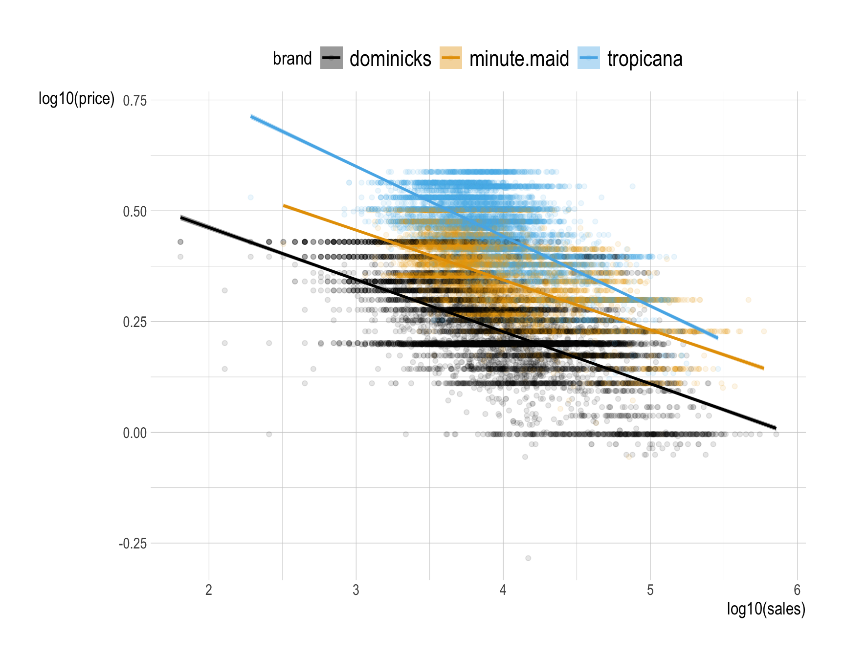
Question 16
Provide a comment to describe how the relationship between (1) the natural log of sales and (2) the natural log of price varies by brand?
Answer:
- In economics, the vertical axis typically represents price, while the horizontal axis represents quantity.
- However, for ease of interpretation, let’s switch the axes and use the natural logarithm:
ggplot(data = oj,
       mapping = aes(x = log(price),
                     y = log(sales),
                     color = brand,
                     fill = brand)) +
  geom_point(alpha = .1) +
  geom_smooth(method = "lm")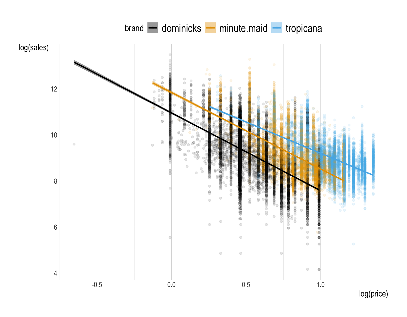
- We observe that sales decrease as price increases, which aligns with the basic economic principle of a downward-sloping demand curve: higher prices typically lead to lower sales.
- More specifically, sales decrease by a certain percentage (the slope) for every 1% increase in price.
- In economics, this concept is known as price elasticity of demand, which measures how responsive consumers are to price changes when buying orange juice.
- Tropicana customers are less responsive to price changes compared to customers of other brands.
- Additionally, at the same price, Tropicana sells more than Minute Maid, which in turn sells more than Dominick’s.
- This is expected, as Tropicana is considered a premium product and is more desirable at the same price point.
Question 17
How would you visualize how the relationship between (1) the base-10 log of sales and (2) the base-10 log of price varies by brand and ad_status?
ggplot(data = __BLANK 1__,
       mapping = aes(x = __BLANK 2__,
                     y = __BLANK 3__,
                     __BLANK 4__ = brand,
                     __BLANK 5__ = brand)) +
  geom_point(__BLANK 6__ = .1) +
  geom_smooth(__BLANK 7__) +
facet_wrap(__BLANK 8__)Answer:
ggplot(data = oj,
       mapping = aes(x = log10(sales),
                     y = log10(price),
                     color = brand,
                     fill = brand)) +
  geom_point(alpha = .1) +
  geom_smooth(method = "lm") +
  facet_wrap(~ad_status)  # create separate panels for each level of 'ad_status'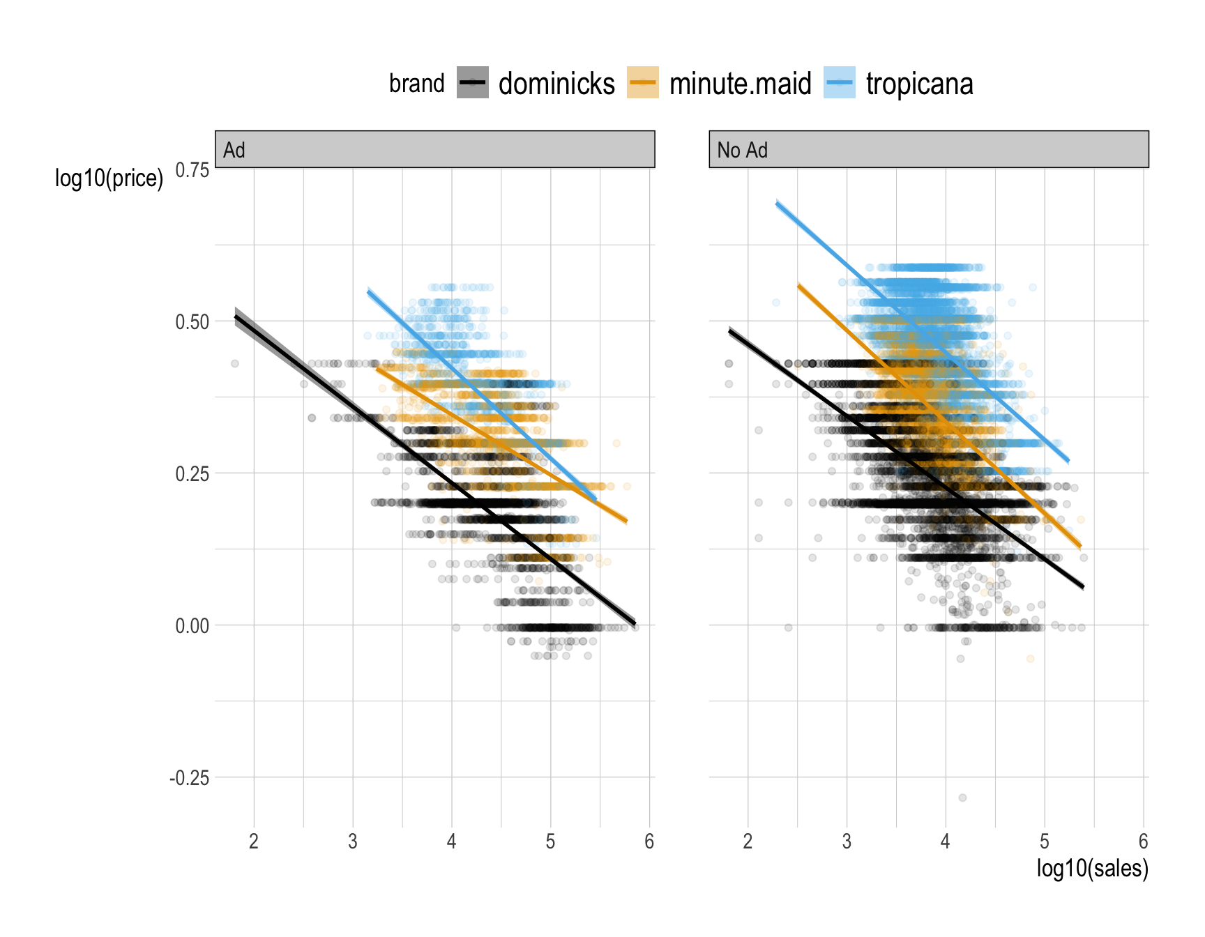
Question 18
Provide a comment to describe how the relationship between (1) the natural log of sales and (2) the natural log of price varies by brand and ad_status.
Answer:
For interpretation purpose, let’s use the natural log, and switch axes:
ggplot(data = oj,
       mapping = aes(x = log(price),
                     y = log(sales),
                     color = brand,
                     fill = brand)) +
  geom_point(alpha = .1) +
  geom_smooth(method = "lm") +
  facet_wrap(~ad_status)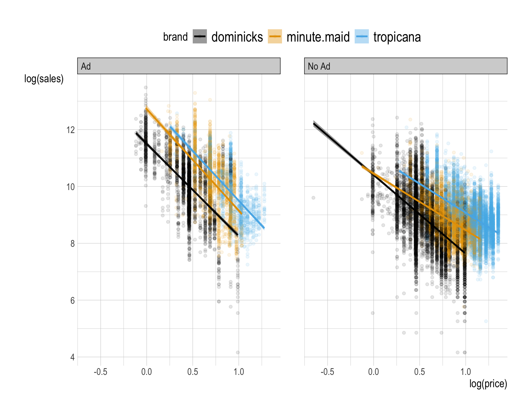
The ads tend to change sales at all prices, they change price sensitivity, and they do both of these things in a brand-specific manner.
We see that being advertised always leads to more price sensitivity, particularly the demand for Minute Maid is much more price sensitive than when it is not.
Why does this happen?
- One possible explanation is that advertisement increases the population of consumers who are considering your brand. In particular, it can increase your market beyond brand loyalists, to include people who will be more price sensitive than those who reflexively buy your orange juice every week. Indeed, if you observe increased price sensitivity, it can be an indicator that your marketing efforts are expanding your consumer base.
- This why ad campaigns should usually be accompanied by price cuts!
- There is also an alternative explanation. Since the advertised products are often also discounted, it could be that the demand curve is nonlinear—at lower price points the average consumer is more price sensitive.
- The truth is probably a combination of these effects.
- One possible explanation is that advertisement increases the population of consumers who are considering your brand. In particular, it can increase your market beyond brand loyalists, to include people who will be more price sensitive than those who reflexively buy your orange juice every week. Indeed, if you observe increased price sensitivity, it can be an indicator that your marketing efforts are expanding your consumer base.
Questions 19-20
Consider the following mlb_bat data.frame for Questions 19-20:
mlb_bat <- read_csv("https://bcdanl.github.io/data/MLB_batting.csv")Question 19
How would you describe the yearly trends in hit percentages for each hit_type (e.g., Single, Double, Triple, and HomeRun)?
ggplot(data = __BLANK 1__,
       mapping = aes(x = __BLANK 2__,
                     y = __BLANK 3__,
                     color = __BLANK 4__,
                     fill = __BLANK 5__)) +
  __BLANK 6__() +
  __BLANK 7__() +
  __BLANK 8__() +
  labs(title = "Hits by Type in Major League Baseball",
       x = "Major League Baseball Season",
       y = "Percentage",
       fill = "Hit",
       color = "Hit")  # labs() allows for
# labeling x, y, color, fill, title, etc.Answer:
ggplot(data = mlb_bat,  # specify the dataset to be used for the plot
       mapping = aes(x = year,  # set 'year' as the x-axis variable
                     y = percentage,  # set 'percentage' as the y-axis variable
                     color = hit_type,  # color lines and points by 'hit_type' categories
                     fill = hit_type)) +  # fill ribbon area by 'hit_type'
  geom_point(size = .5) +  # add points for each data observation
  geom_line() +  # connect points with lines to show trends over time
  geom_smooth() +  # add a smoothed line to show overall trends for each 'hit_type'
  labs(title = "Hits by Type in Major League Baseball",
       x = "Major League Baseball Season",
       y = "Percentage",
       fill = "Hit",
       color = "Hit")  # labs() allows for labeling x, y, color, fill, title, etc.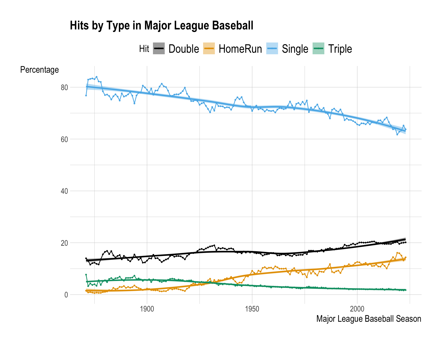
Question 20
Write a comment explaining how you would describe the yearly trends in hit percentages for each hit_type (e.g., Single, Double, Triple, and HomeRun).
Answer:
The trends in MLB show that doubles and home runs have increased steadily over the years, while singles and triples have shown a decline. This shift reflects changes in playing style, favoring power hitting and longer hits over traditional base-hitting strategies.
General Tips on Describing the Distribution
- When describing the distribution of a variable, we are typically interested in several key characteristics:
- Center: The central tendency of the data, such as the mean or median, which indicates the typical or average value.
- Spread: How spread the values are within the variable, showing the range and standard deviation of values.
- Common Values: Identifying frequent values and the mode.
- Rare Values: Recognizing unusual or infrequent values.
- Shape: The overall shape of the distribution, such as whether it’s symmetric, skewed left or right, or having multiple groups with multiple peaks.
- Add Narration if Available: If possible, connect the distribution to real-world phenomena and/or your idea that could help explain it, adding insight into what is happening.
General Tips on Describing the Relationship Between Two Variables
- Start with determining whether the two variables have a positive association, a negative association, or no association.
- E.g., A negative slope in the fitted line indicates that sales decrease as the price increases, while a positive slope would indicate that sales increase with price. A zero slope means that there is no relationship between sales and price; changes in price do not affect sales.

- When a question asks you to describe how the relationship varies by another variable, examine both the direction of the slope (negative, positive, or none) from the fitted line and the steepness of the slope (steep or shallow).
- The slope of the fitted straight line is the rate at which the “y” variable (like grades) changes as the “x” variable (like study hours) changes. In simple terms, it shows how much one thing goes up or down when the other thing changes.
- For example, a comment such as, “The plot shows a negative relationship between sales and price” does not address how the relationship differs by brand.
- Be specific.
- For example, a comment such as, “The plot illustrates how the relationship between the natural log of sales and the natural log of price varies across brands, with each brand showing a unique regression line and scatter pattern,” simply rephrases the question, and does not actually answer it at all.
- The focus is on the relationship, not the distribution.
- While adding a comment on the distribution of a single variable can be helpful, the question is primarily about the relationship between the two variables.
- Add Narration if Available: If possible, connect the relationship to real-world phenomena and/or your idea that could help explain it, adding insight into what is happening.
General Tips on Describing the Time Trend of a Variable
- Start with Identifying the Overall Trend: Look for the general direction of the trend over time.
- Is it moving upward, downward, or remaining relatively constant?
- Be specific: A comment like “The trend shows the evolution of hitting techniques in the MLB over time” simply rephrases the question, and does not actually answer it at all.
Note Patterns and Cycles: Identify any repeating patterns, such as seasonal fluctuations (e.g., monthly or quarterly changes) or long-term cycles. These patterns can indicate regular influences on the variable over time.
Highlight Any Significant Fluctuations: Describe any sharp increases, decreases, or irregular spikes in the data.
Add Narration if Available: If possible, connect trends to real-world events or factors and/or your idea that could explain them, helping to interpret why the trend behaves a certain way over time.
