# install.packages("ggthemes")
library(ggthemes)
library(tidyverse)

flights <- nycflights13::flightsClasswork 14
Distribution Plots and Counting
R Packages
For Classwork 14, please load the following R packages and create the data.frame nycflights13::flights:
Question 1
🤖 Task: Fill in the blanks in the provided ggplot() code chunk to visualize the distribution of air_time (minutes spent in the air).
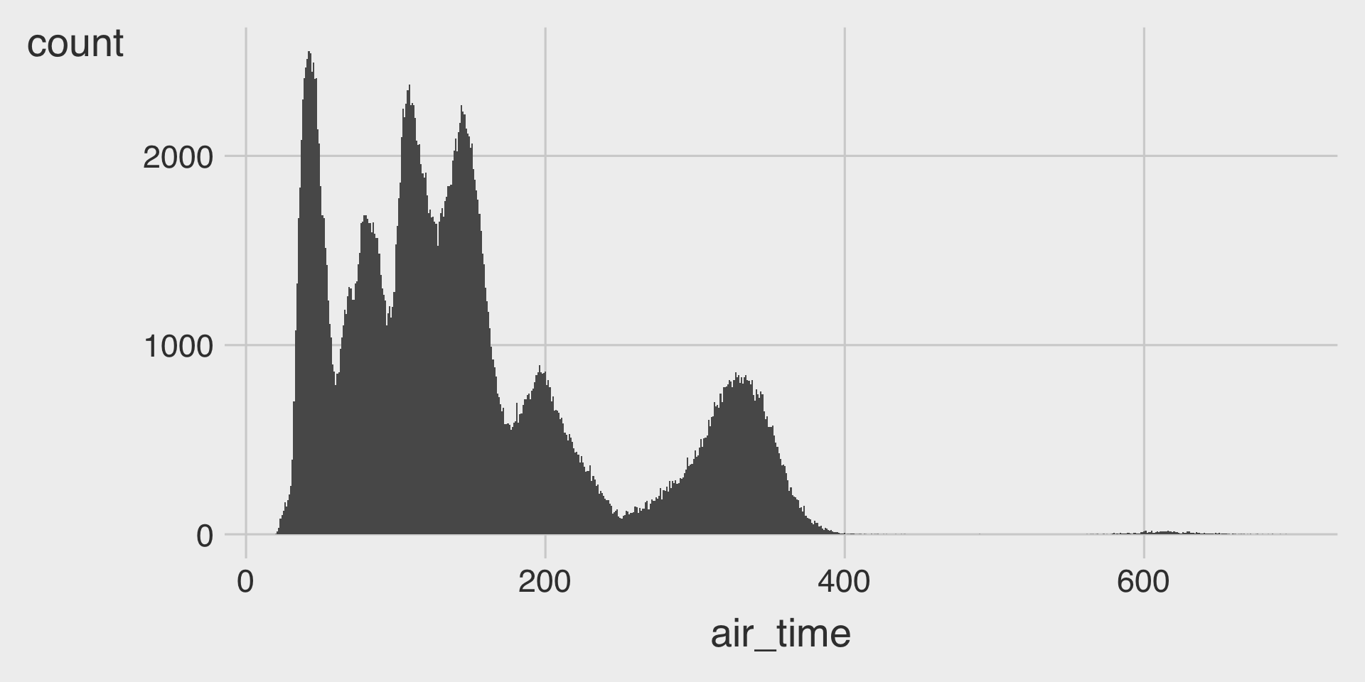
ggplot(data = flights,
       mapping = aes(__BLANK_1__)) +
  geom___BLANK_2__(__BLANK_3__ = 1)
Question 2
🤖 Task: Fill in the blanks in the provided ggplot() code chunk to visualize how the distribution of air_time (minutes spent in the air) varies by origin.
Part A. Histograms
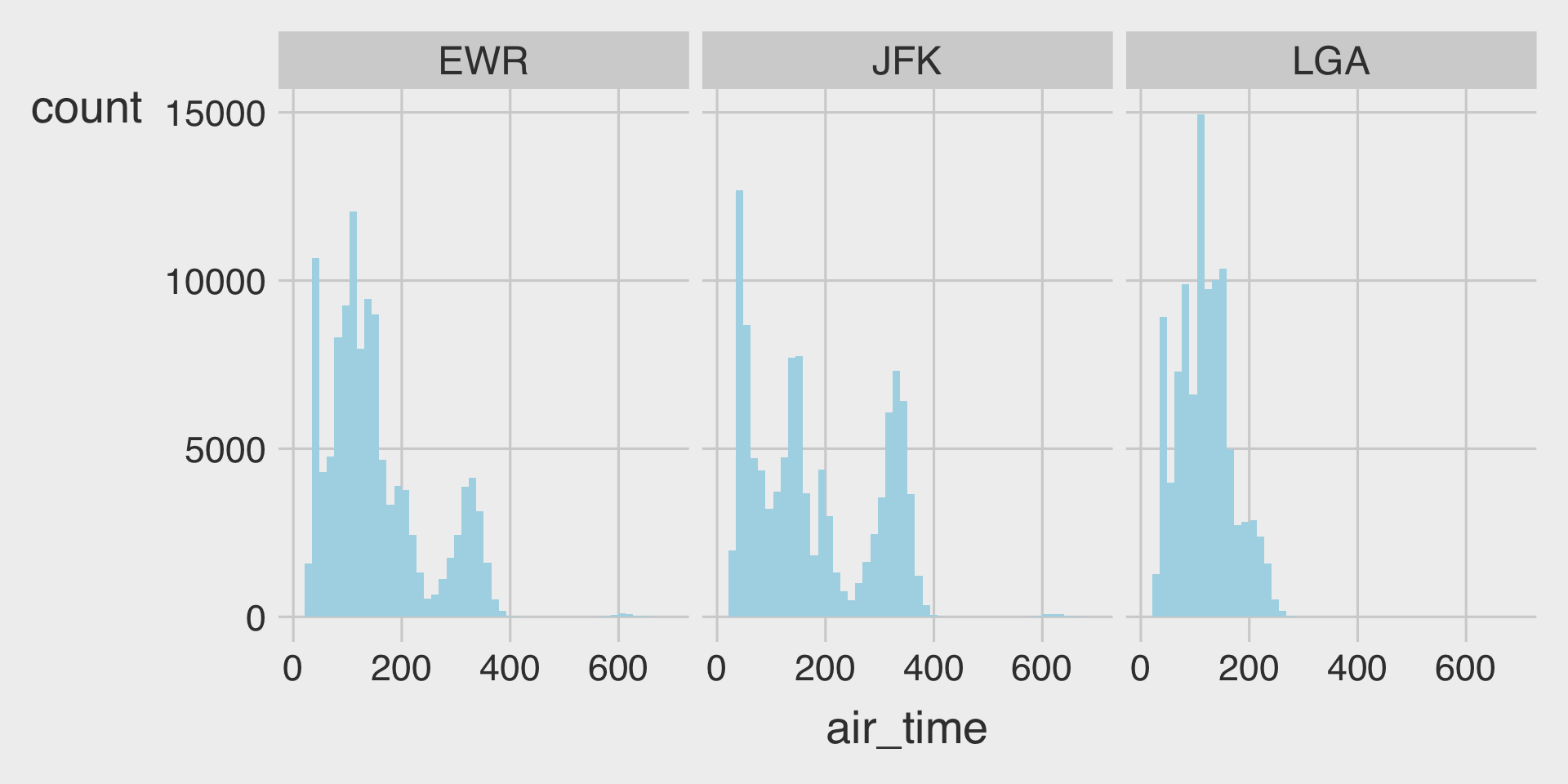
ggplot(data = flights,
       mapping = aes(__BLANK_1__)) +
  geom___BLANK_2__(__BLANK_3__ = 50,
                   __BLANK_4__ = "lightblue") +
  facet_wrap(__BLANK_5__)
Part B. Boxplots
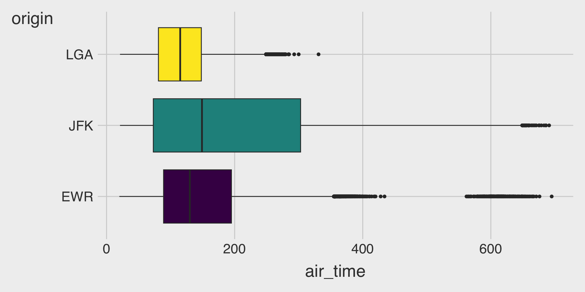
ggplot(data = flights,
       mapping = aes(__BLANK_1__,
                     y = __BLANK_2__,
                     __BLANK_3__,
                     )) +
  geom___BLANK_4__(show.legend = FALSE)
Question 3
🤖 Task: Create the data frame top3_n, containing two variables and five observations:
carrier: the top 3 carriers ranked by number of flights
n: the number of flights operated by each of those carriers
__BLANK_1__ <- flights |>
  __BLANK_2__ |>
  __BLANK_3__( desc(n) ) |>
  head(3)  # returns the first 3 observations in the given data.frame
Question 4
🤖 Task: Create the data.frame top3_carriers, containing six variables (month, day, dep_time, carrier, origin, and dest) and all observations for flights operated by only the top 3 carriers identified in Question 3.
__BLANK_1__ <- flights |>
  filter(__BLANK_2__) |>
  __BLANK_3__(month, day, dep_time, carrier, origin, dest)
Question 5
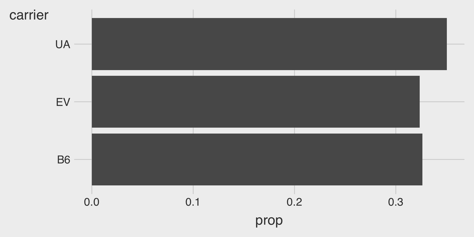
🤖 Task: Fill in the blanks in the provided ggplot() code chunks to visualize the distribution of carrier using the top3_carriers data.frame.
Part A. Bar Charts

ggplot(data = top3_carriers,
       mapping = aes(__BLANK_1__,
                     fill = __BLANK_2__)) +
  geom___BLANK_3__(show.legend = FALSE)
Part B. Proportion Bar Charts
ggplot(data = top3_carriers,
       mapping = aes(__BLANK_1__,
                     x = __BLANK_2__,
                     __BLANK_3__ = 1)) +
  geom___BLANK_4__(show.legend = FALSE)
Question 6
🤖 Task: Fill in the blanks in the provided ggplot() code chunks to visualize how the distribution of carrier varies by origin using the top3_carriers data.frame.
Part A. Stacked Bar Charts
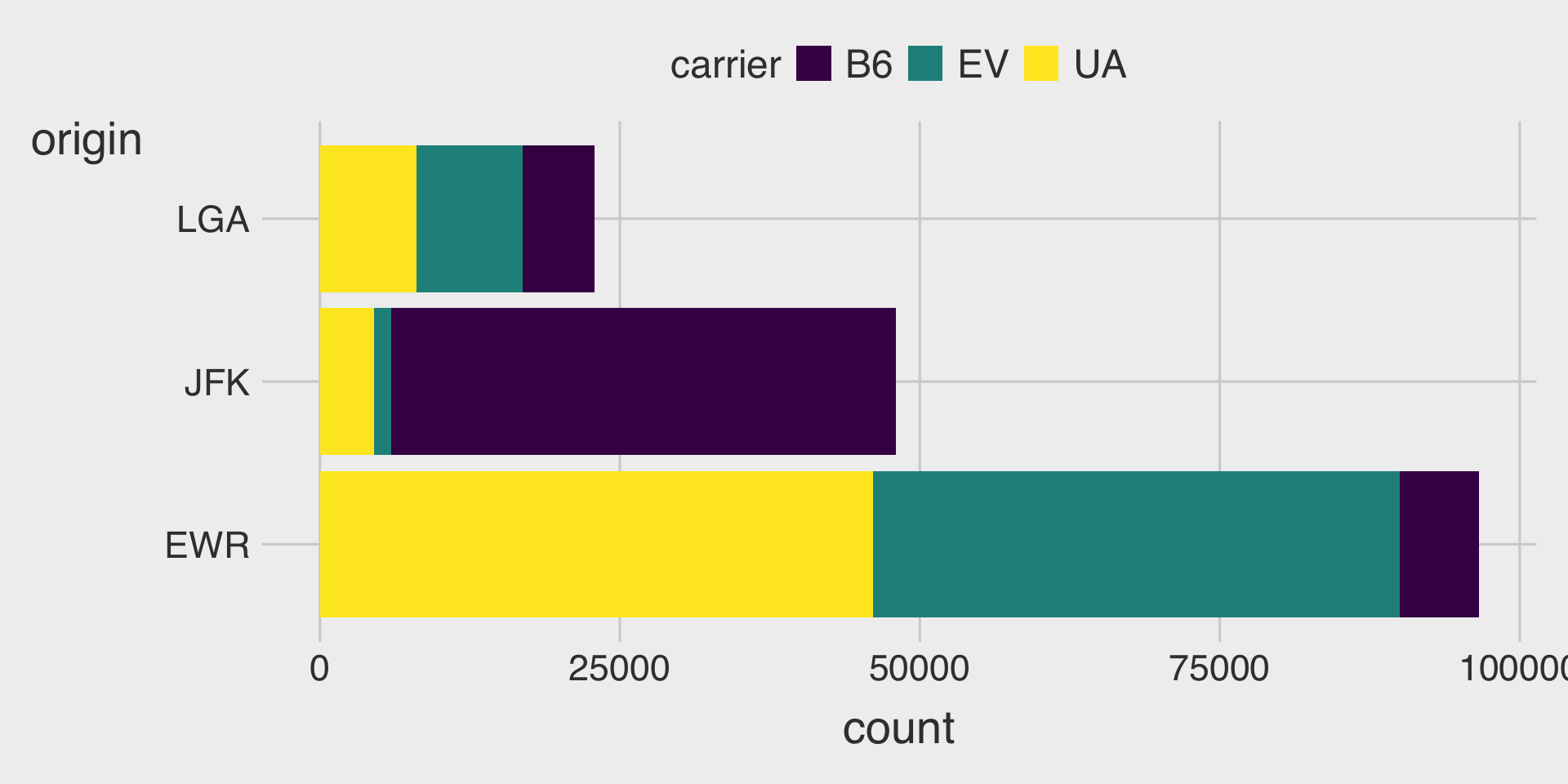
ggplot(data = __BLANK_1__,
       mapping = aes(y = __BLANK_2__,
                     __BLANK_3__)) +
  geom_bar()
Part B. 100% Stacked Bar Charts
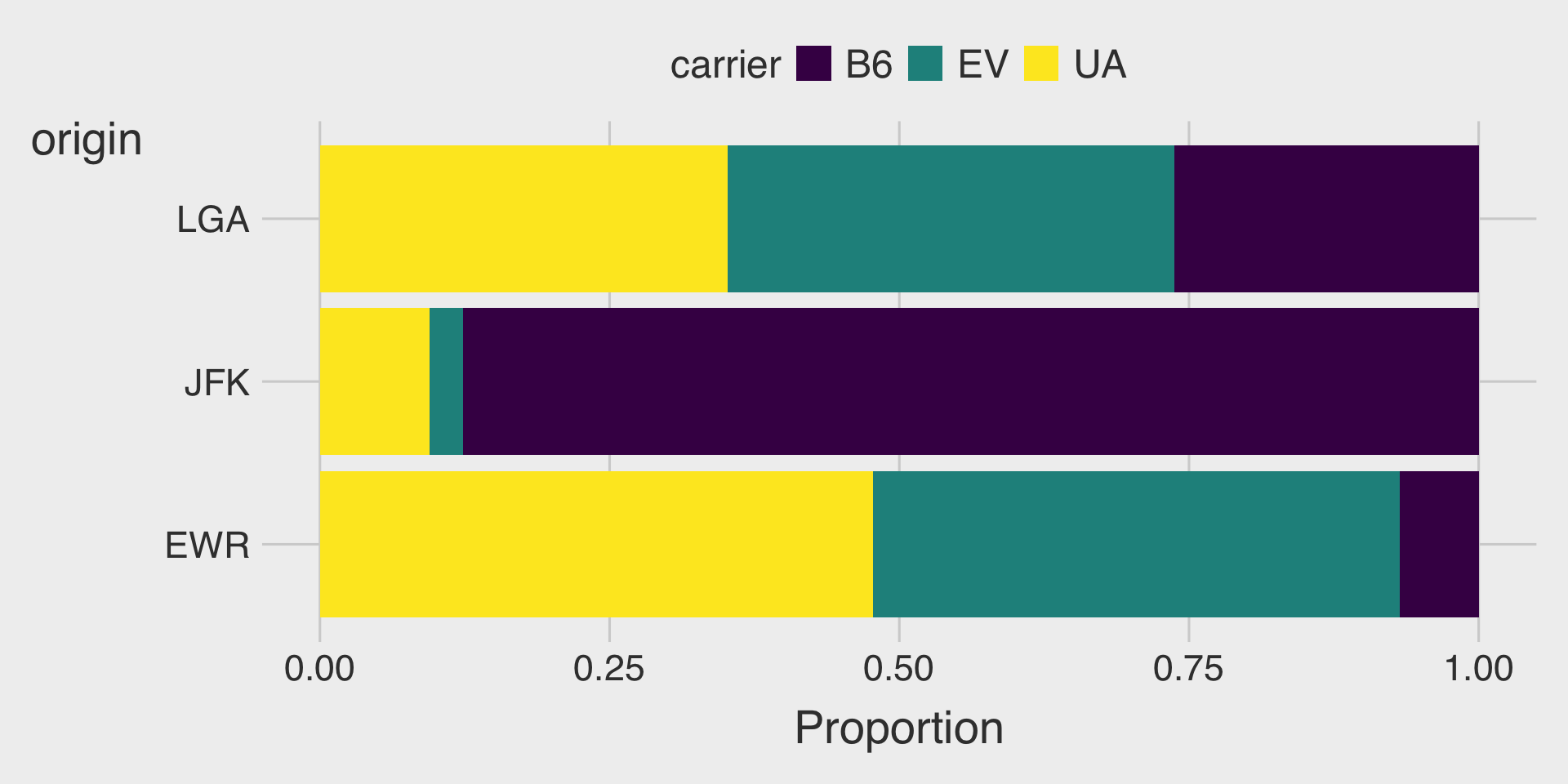
ggplot(data = __BLANK_1__,
       mapping = aes(y = __BLANK_2__,
                     __BLANK_3__)) +
  geom_bar(position = __BLANK_4__) +
  labs(x = "Proportion") # label x-axis title
Part C. Clustered Bar Charts
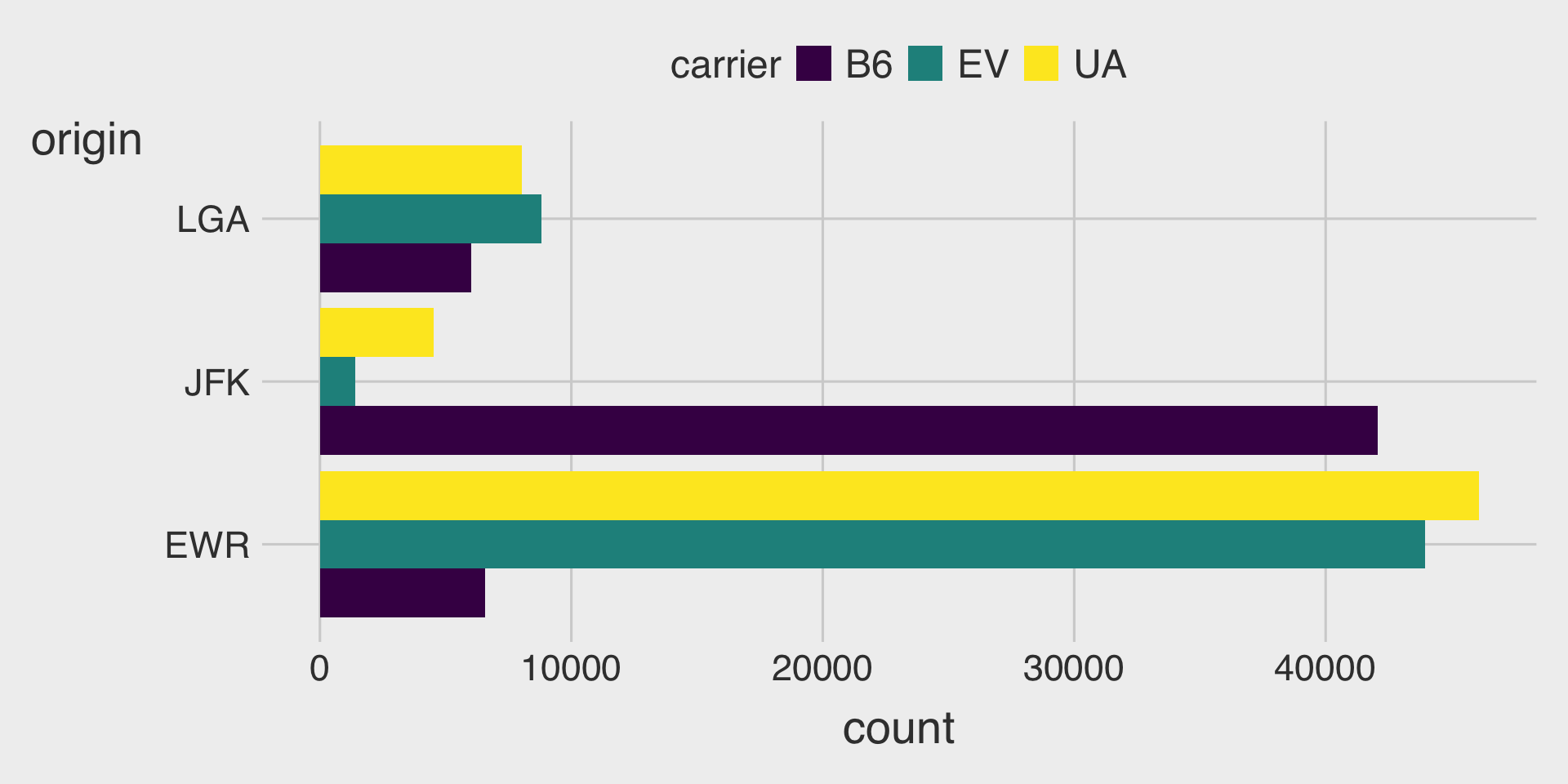
ggplot(data = __BLANK_1__,
       mapping = aes(y = __BLANK_2__,
                     __BLANK_3__)) +
  geom_bar(position = __BLANK_4__)
Part D. Facetted Bar Charts
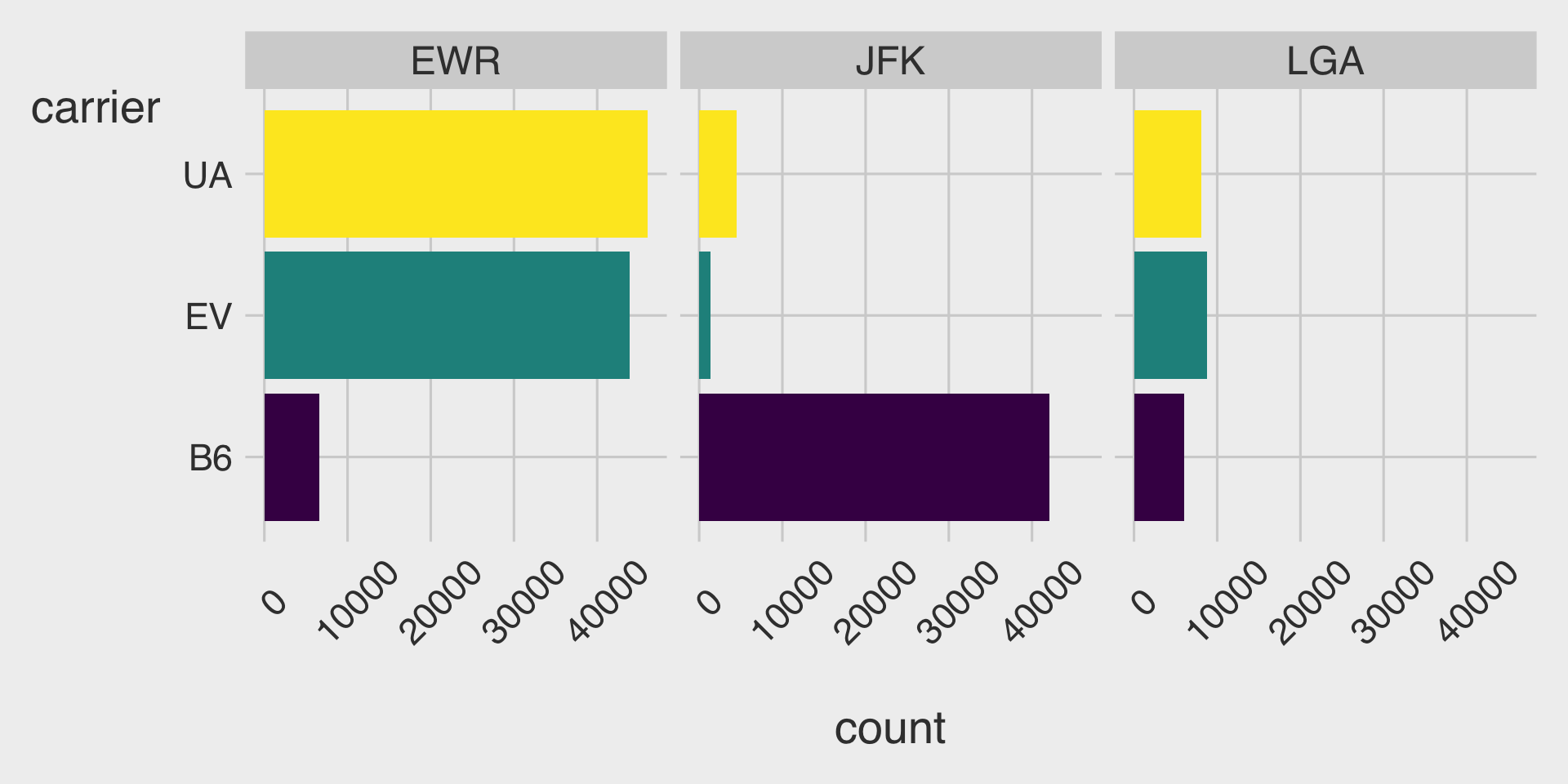
ggplot(data = __BLANK_1__,
       mapping = aes(y = __BLANK_2__,
                     __BLANK_3__)) +
  geom_bar(show.legend = FALSE) +
  facet_wrap(__BLANK_4__)
Question 7
🤖 Task: Fill in the blanks in the provided ggplot() code chunk to visualize the distribution of carrier using the top3_n data.frame.
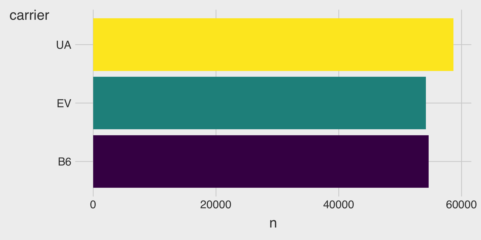
ggplot(data = top3_n,
       mapping = aes(x = __BLANK_1__,
                     y = __BLANK_2__,
                     __BLANK_3__)) +
  geom___BLANK_4__(show.legend = FALSE)
Question 8
🤖 Task: Fill in the blanks in the provided ggplot() code chunk to visualize the sorted distribution of carrier’ using the top3_n data.frame.
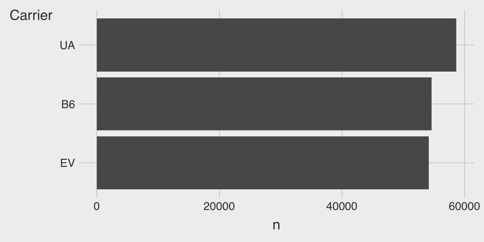
ggplot(data = top3_n,
       mapping = aes(x = __BLANK_1__,
                     y = __BLANK_2__)) +
  geom___BLANK_3__() +
  labs(y = "Carrier")   # label y-axis title
Question 9
🤖 Task: Create a data.frame named carrier_per_origin with the following variables:
origin: the origin airport
carrier: the airline carrier
n: the number of flights operated by each carrier from each origin airport
The carrier_per_origin data.frame should contain the count of flights for every carrier–origin combination.
carrier_per_origin <- flights |>
  __BLANK__ |>
  arrange(origin, -n)