library(tidyverse)Classwork 13
Time Trend Plots
R Packages
For Classwork 13, please load the tidyverse package:
Question 1. Trend in GDP per capita
For Question 1, please load the R package gapminder before starting:
# install.packages("gapminder")
library(gapminder)
??gapminder
The gapminder package provides a built-in dataset named gapminder, which contains country-level data on life expectancy, GDP per capita, and population across time.
Let’s assign it to a new object called df_gapminder:
df_gapminder <- gapminder::gapminderPart A
- 🤖 Task 1: Fill in the blanks in the provided
ggplot()code chunks.
Visualization 1
- Something has gone wrong in this given plot. What happened?
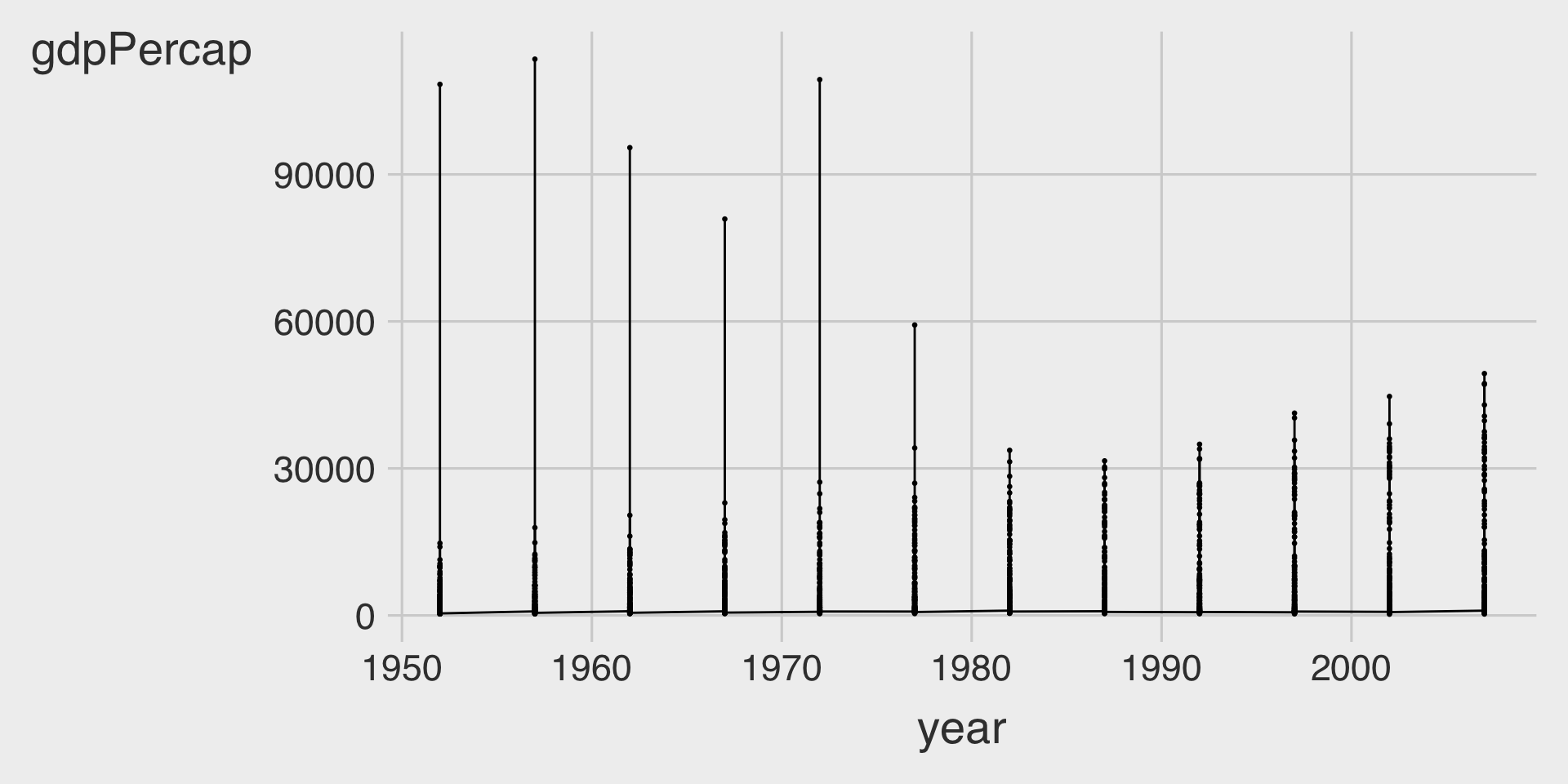
ggplot(data = df_gapminder,
       mapping = aes(__BLANK_1__,
                     y = __BLANK_2__)) +
  geom_point(size = .5) +
  geom___BLANK_3__()
Visualization 2
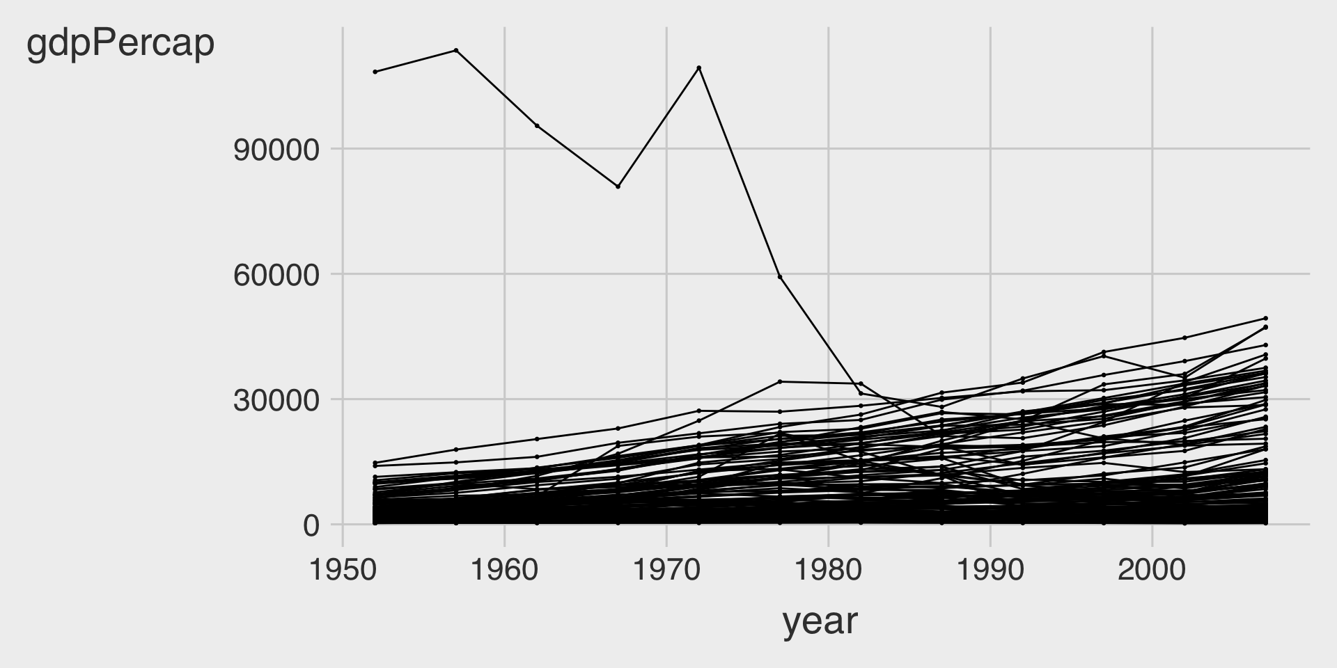
ggplot(data = df_gapminder,
       mapping = aes(__BLANK_1__,
                     y = __BLANK_2__,
                     __BLANK_3__ = country)) +
  geom_point(size = .5,
             color = "black") +
  geom___BLANK_4__()
Visualization 3
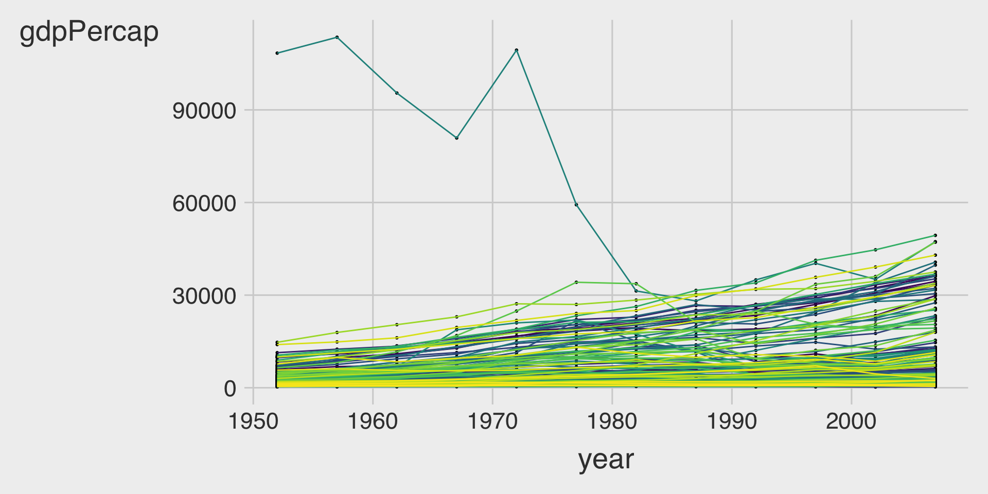
ggplot(data = df_gapminder,
       mapping = aes(__BLANK_1__,
                     y = __BLANK_2__,
                     __BLANK_3__ = country)) +
  geom_point(size = .5,
             color = "black") +
  geom___BLANK_4__(show.legend = FALSE)
Part B
- 🤖 Task 1: Fill in the blanks in the provided
ggplot()code chunk.
- 💬 Task 2: Add a brief comment describing how the overall time trend of GDP per capita (
gdpPercap) varies by continent (continent).
Visualization 1
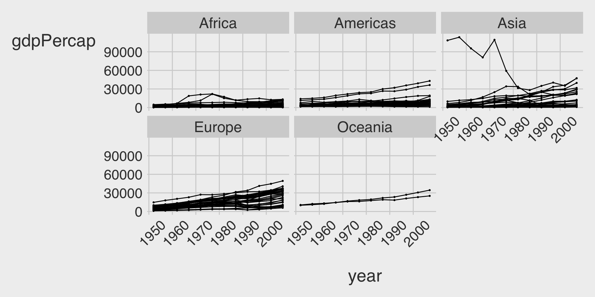
ggplot(data = df_gapminder,
mapping = aes(__BLANK_1__,
y = __BLANK_2__,
__BLANK_3__ = country)) +
geom_point(size = .5,
color = "black") +
geom___BLANK_4__(show.legend = FALSE) +
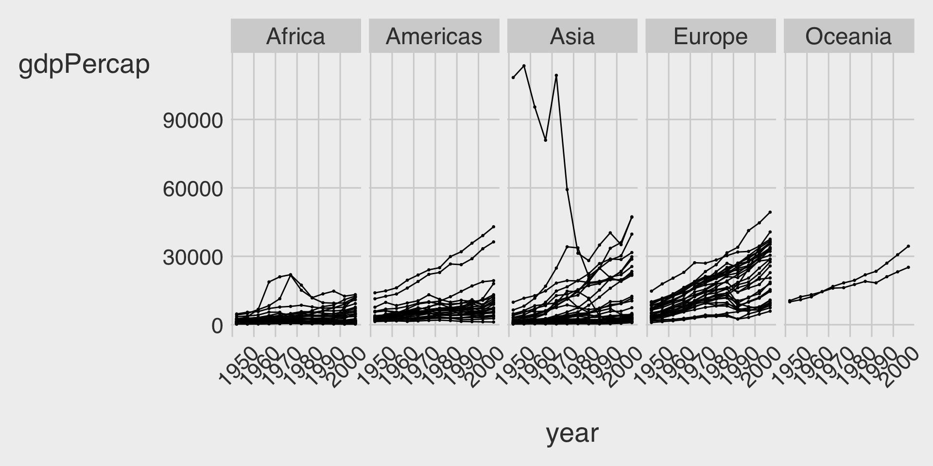
facet___BLANK_5__( ~ __BLANK_6__)Visualization 2
- Because we have only five continents it might be worth seeing if we can fit them on a single row (which means we’ll have five columns).
ggplot(data = df_gapminder,
       mapping = aes(__BLANK_1__,
                     y = __BLANK_2__,
                     __BLANK_3__ = country)) +
  geom_point(size = .5,
             color = "black") +
  geom___BLANK_4__(show.legend = FALSE) +
  facet___BLANK_5__( ~ __BLANK_6__,
             __BLANK_7__ = 1)
Visualization 3
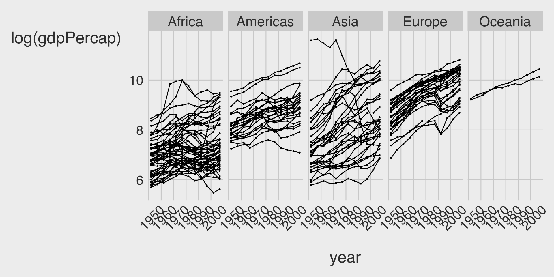
- Since GDP per capita is highly skewed, let’s take a log transformation on it:
ggplot(data = df_gapminder,
       mapping = aes(__BLANK_1__,
                     y = __BLANK_2__,
                     __BLANK_3__ = country)) +
  geom_point(size = .5,
             color = "black") +
  geom___BLANK_4__(show.legend = FALSE) +
  facet___BLANK_5__( ~ __BLANK_6__,
             __BLANK_7__ = 1)
Visualization 4
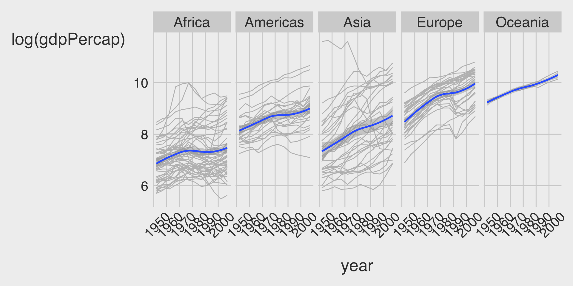
ggplot(data = df_gapminder,
       mapping = aes(__BLANK_1__,
                     y = __BLANK_2__)) +
  geom___BLANK_3__(show.legend = FALSE,
                  color = 'grey',
                  mapping = aes(group = country)) + # Advanced ggplot: we can add a specific aes() to a specific geom.
  geom___BLANK_4__() +
  facet_wrap(~ __BLANK_5__,
             __BLANK_6__ = 1)