library(tidyverse)Classwork 11
Relationship Plots
R Packages
For Classwork 11, please load the tidyverse package:
Question 1. Ice Cream Sales and Shark Attacks
Consider the data frame df, which records monthly ice cream sales and shark attacks.
df <- read_csv("http://bcdanl.github.io/data/icecream-shark-df.csv")Part A
- 🤖 Task 1: Fill in the blanks in the provided
ggplot()code chunk.
- 💬 Task 2: Add a brief comment describing the relationship between ice cream sales (
IceCreamSales) and shark attacks (SharkAttacks).
ggplot(data = __BLANK_1__,
       mapping = aes(x = __BLANK_2__,
                     y = __BLANK_3__)) +
  geom___BLANK_4__() +
  geom___BLANK_5__()
Part B

- ❓ Is the observed relationship one of correlation or causation? Explain your reasoning.
- Consider the following monthly trends for
IceCreamSalesandSharkAttacks:
- Consider the following monthly trends for
Monthly Trend of IceCreamSales
Monthly Trend of SharkAttacks
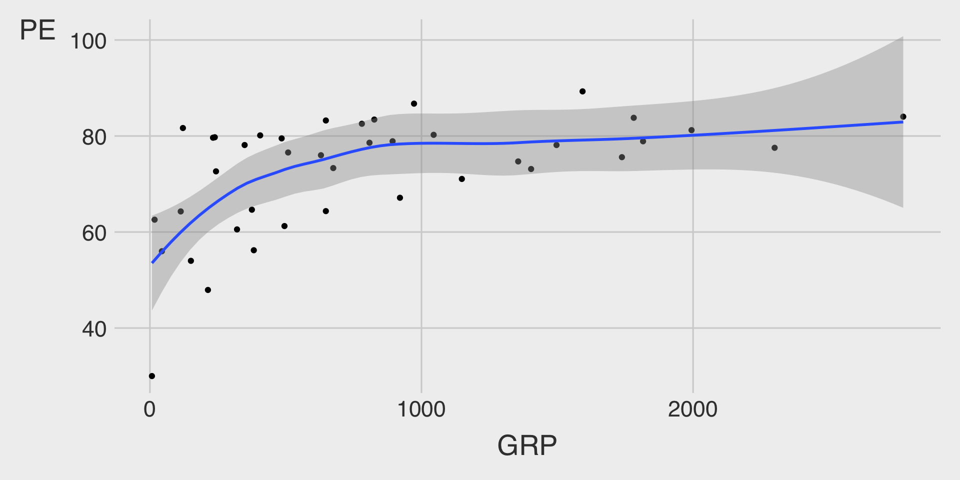
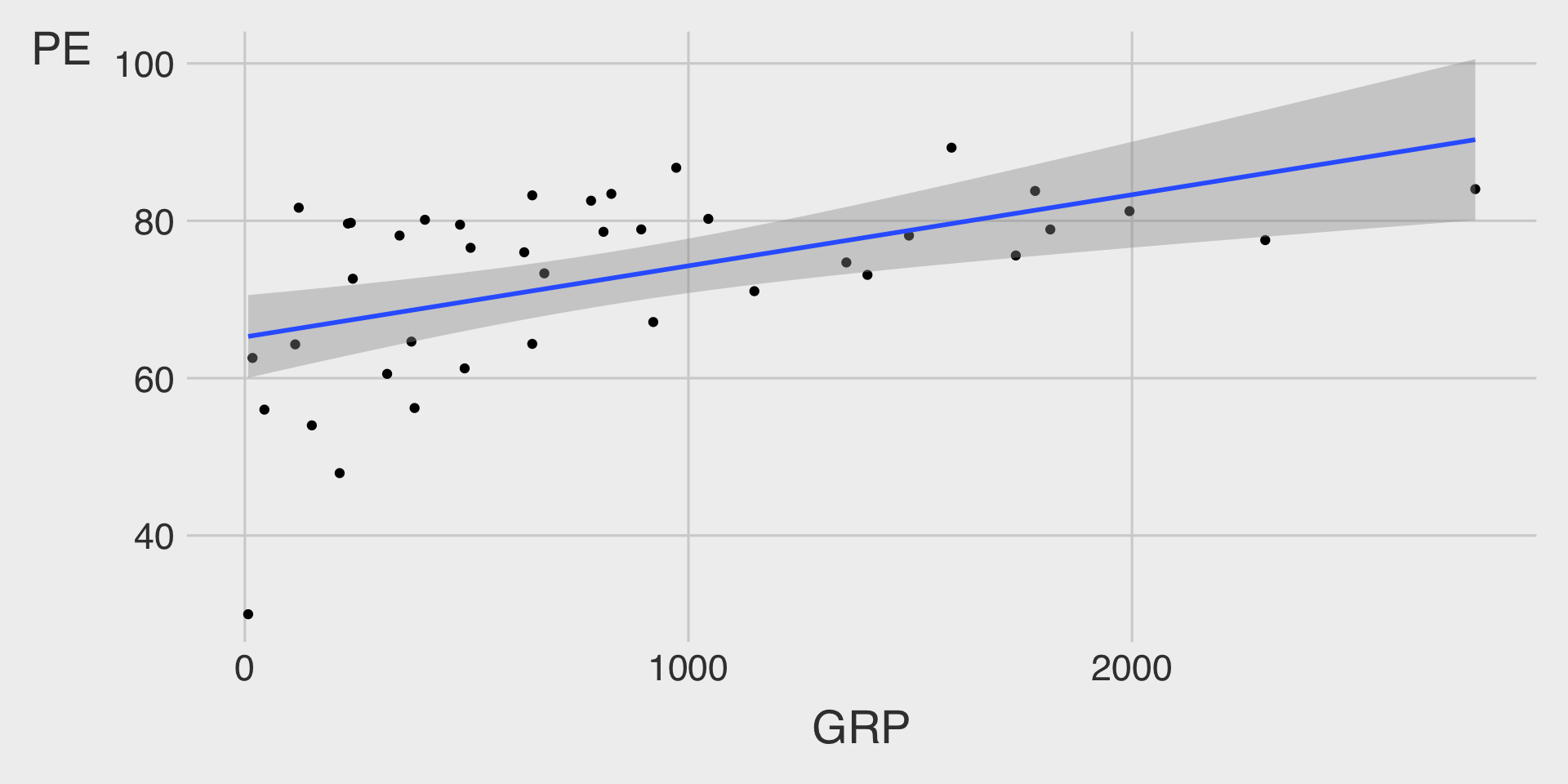
Question 2. NBC Show Data
The nbc_show dataset comes from NBC’s TV pilots, containing information about television shows, their viewership metrics, and audience engagement.
nbc_show <- read_csv("https://bcdanl.github.io/data/nbc_show.csv")- Gross Ratings Points (
GRP):
Measures the total viewership of a show — an indicator of its broadcast marketability.- 📺 A higher
GRPsuggests broader exposure and a more marketable program.
- 📺 A higher
- Projected Engagement (
PE):
Captures how attentive and engaged viewers were after watching a show — a more suitable measure of audience engagement.- 🧠 After viewing, audiences take a short quiz testing order and detail recall.
- This reflects their level of attention and retention (for both the show and its ads).
- High
PEvalues indicate strong viewer engagement.
- 🧠 After viewing, audiences take a short quiz testing order and detail recall.
Tasks
Since GRP reflects how many people watch a show and PE reflects how engaged or attentive those viewers are, it’s reasonable to expect some connection between the two — shows that reach more people may also have higher engagement, although not always.
Our goal is to see whether greater viewership tends to coincide with stronger engagement (and how this varies by genre in Classwork 12).
- 🤖 Task 1: Fill in the blanks in the provided
ggplot()code chunks.
- 💬 Task 2: Add a brief comment describing the relationship between
GRPandPE.
(1) Scatterplot with a Non-Linear Fitted Line
ggplot(data = __BLANK_1__,
       mapping = aes(x = __BLANK_2__,
                     y = __BLANK_3__)) +
  geom_point() +
  geom___BLANK_4__()
(2) Scatterplot with a Linear Fitted Line
ggplot(data = __BLANK_1__,
mapping = aes(x = __BLANK_2__,
y = __BLANK_3__)) +
geom_point() +
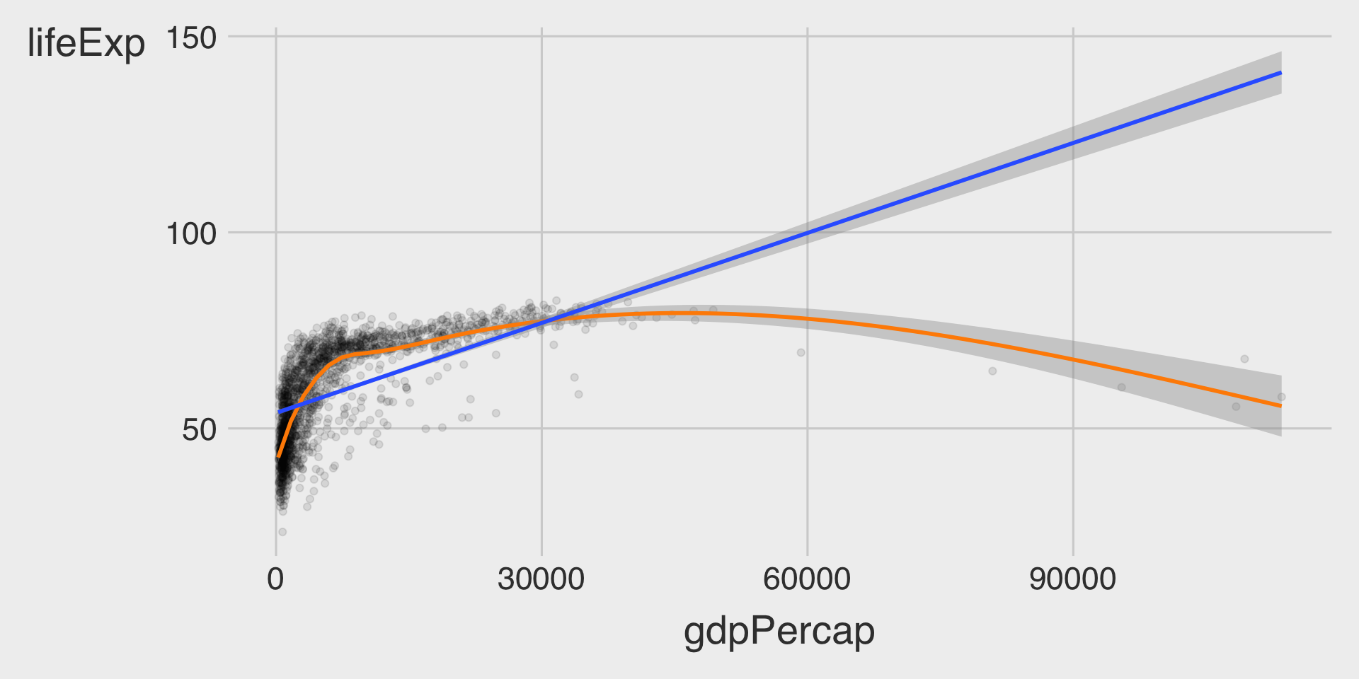
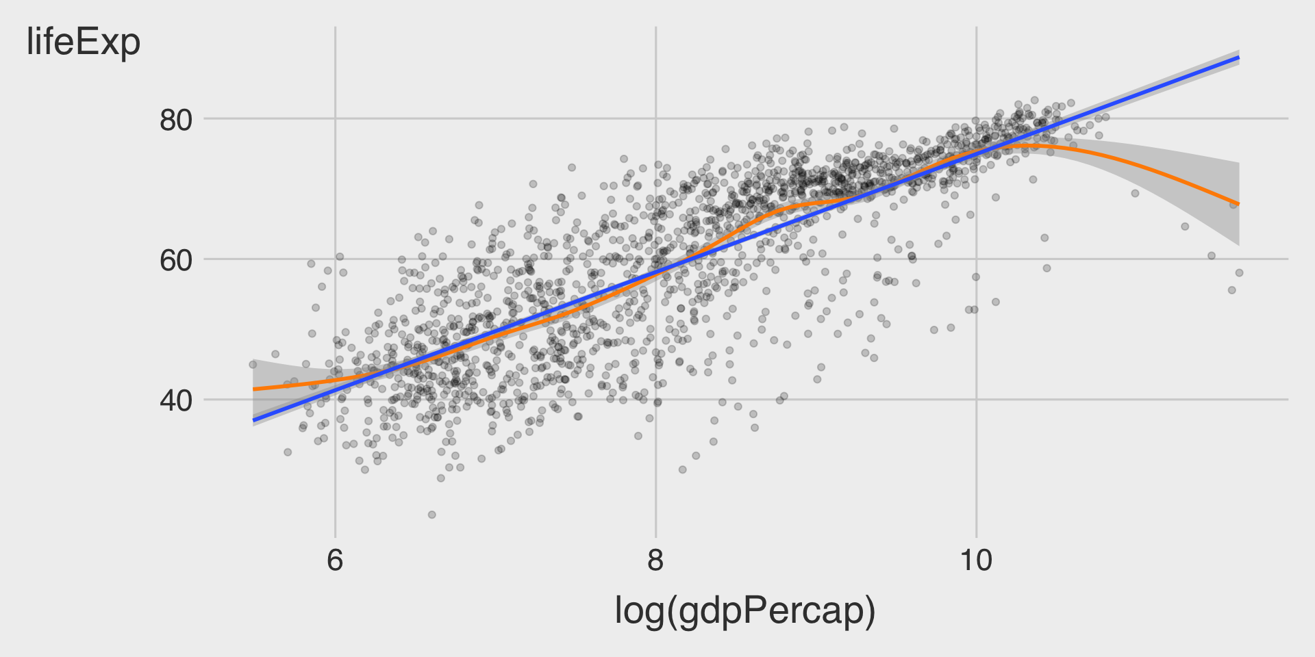
geom___BLANK_4__(method = __BLANK_5__)Question 3. GDP per capita vs. Life Expectancy
For Question 3, please install the R package gapminder before starting:
install.packages("gapminder")
library(gapminder)
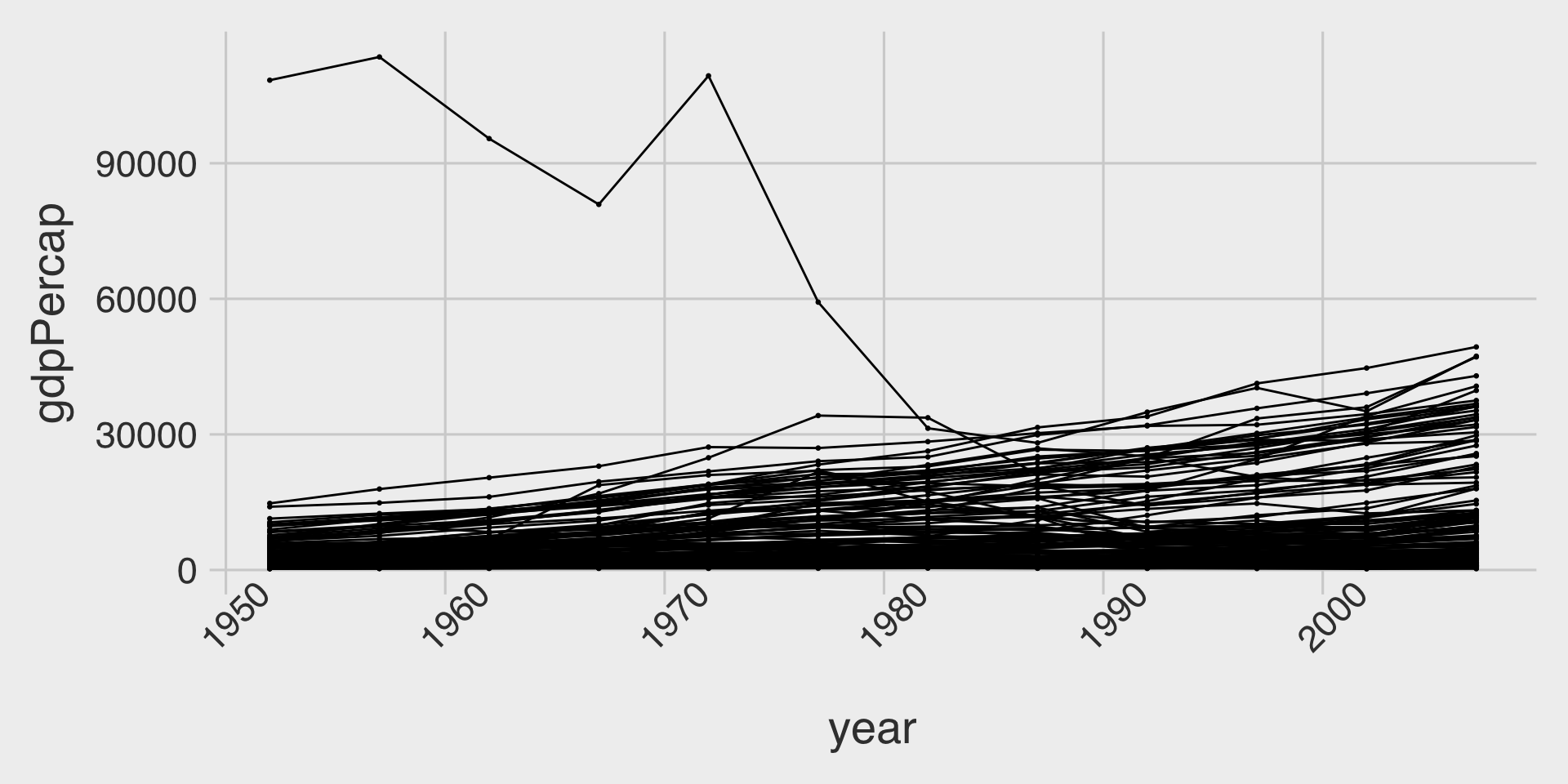
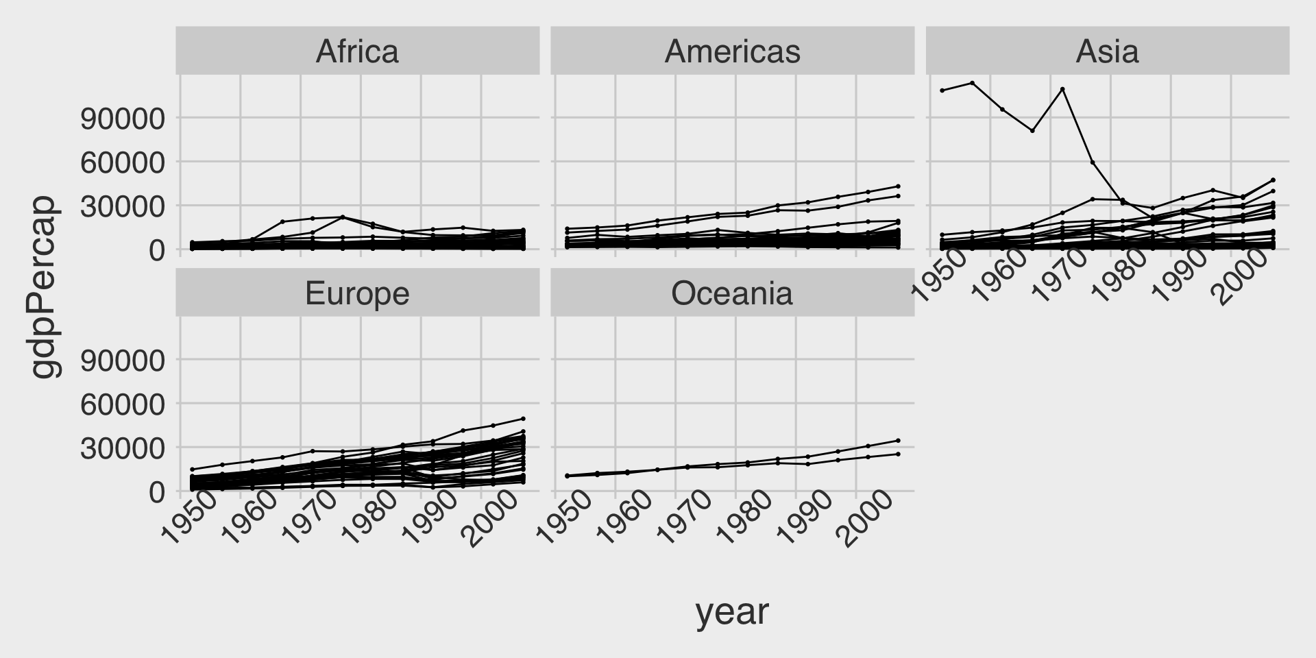
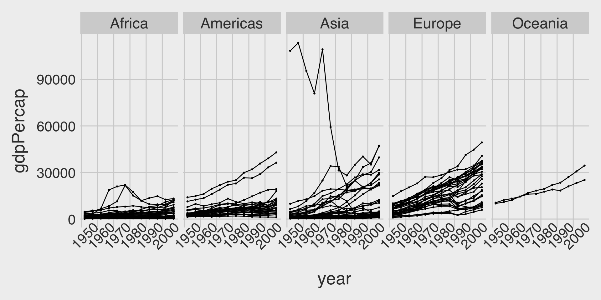
??gapminderThe gapminder package provides a built-in dataset named gapminder, which contains country-level data on life expectancy, GDP per capita, and population across time.
Let’s assign it to a new object called df_gapminder:
df_gapminder <- gapminder::gapminderTasks
- 🤖 Task 1: Fill in the blanks in the provided
ggplot()code chunks.
- 💬 Task 2: Add a brief comment describing the relationship between GDP per capita (
gdpPercap) and life expectancy (lifeExp).
(1) gdpPercap vs. lifeExp
ggplot(data = __BLANK_1__,
       mapping = aes(x = __BLANK_2__,
                     y = __BLANK_3__)) +
  geom_point(__BLANK_4__ = .1) + # Add transparency to reduce overplotting
  geom_smooth(__BLANK_5__ = "darkorange") +
  geom_smooth(__BLANK_6__)
(2) log(gdpPercap) vs. lifeExp
ggplot(data = __BLANK_1__,
       mapping = aes(x = __BLANK_2__,
                     y = __BLANK_3__)) +
  geom_point(__BLANK_4__ = .2) + # Add transparency to reduce overplotting
  geom_smooth(__BLANK_5__ = "darkorange") +
  geom_smooth(__BLANK_6__)