Lecture 3
Solar Adoption Data: Measurement, Theory, and Research Design
Byeong-Hak Choe
SUNY Geneseo
August 31, 2026
🎯 Today we turn one distinction into a research plan
By the end of class, you should be able to:
distinguish technical potential from observed adoption;
connect environmental-economic mechanisms to variables;
audit a building-level snapshot without changing its meaning; and
choose one bounded contribution to the shared project.
Activate what you already know: NPV, externalities, subsidies, credit constraints, dplyr, and careful denominators.
Frame this as an application of familiar environmental economics and dplyr, not as a new methods survey. Spatial modeling and new API collection come only after the question, permissions, and data structure are clear.
[Sources]
../methods.qmd
../research.qmd
danl-econ-399-lec-02-2026-0826.qmd
[/Sources]
🏠 Two sunny roofs can produce two different choices
Same sunlight. Similar roof. What could explain the difference?
Suitable roof A
Similar sunshine · similar usable area
Installs solar
Suitable roof B
Similar sunshine · similar usable area
Does not install
Returns · finance · information · tenure · installers · policy · preferences · risk
Collect rapid hypotheses without evaluating them yet. Sort responses into returns, finance, information/social, physical, and institutional constraints. Ask which explanations require household or market data rather than roof data.
[Sources]
[/Sources]
🔐 Research design includes permissions and credentials
01 · Secure
No API key in source code.
Restrict replacement keys.
Monitor usage.
02 · Verify
Review current storage rules.
Review publication and attribution.
Confirm permitted use before class access.
03 · Minimize
No raw coordinates or building IDs for students.
No Google content in course ML.
The collection script contains a plaintext key; do not display it. Rotate or revoke it before project work. The April 2026 service terms and current policies create material use, storage, and attribution questions. This is a governance checkpoint, not a legal conclusion. Until review is complete, keep the snapshot faculty-only and use open NYSERDA/ACS data for student analysis and modeling.
[Sources]
Faculty research archive: data_google_solar_collection.py
https://developers.google.com/maps/api-security-best-practices
https://cloud.google.com/archive/maps-platform/terms/maps-service-terms-20260422
https://cloud.google.com/maps-platform/terms
https://developers.google.com/maps/documentation/solar/policies
../data.qmd
[/Sources]
🪜 Potential is only the first rung of the outcome ladder
Solar resource sunshine
Technical potential roof + layout
Economic potential NPV
Market potential constraints
Realized adoption installation
Realized outcomes generation + bills + emissions
Each arrow adds actors, choices, data, and uncertainty. Later outcomes cannot be inferred automatically from earlier rungs.
Define each rung in plain language and ask where an estimated panel count belongs. Technical potential is generation possible irrespective of financial or social constraints; it is not a forecast.
[Sources]
https://sunroof.withgoogle.com/assets/data-explorer-methodology.pdf
https://doi.org/10.2172/1236153
https://developers.google.com/maps/documentation/solar/methodology
[/Sources]
🧭 Which gap? Technical potential is not the benchmark
01 · TECHNICAL What is physically possible?
roof · sunshine · modeled layouts
Google snapshot
02 · PRIVATE What is worthwhile for this decision-maker?
tariff · price · finance · tenure · risk · hassle
not observed
03 · SOCIAL What maximizes social value?
carbon · pollution · grid effects · spillovers
not observed
04 · OBSERVED What actually happened?
installation · timing · realized output
needs adoption data
Deployment gap technical ↔︎ observed
Private investment gap private optimum ↔︎ observed
Social welfare gap social optimum ↔︎ observed
The Google snapshot populates one benchmark; it cannot diagnose an inefficient gap by itself.
Ask which benchmark the current files populate. The answer is technical potential, plus modeled financial scenarios that are not household-specific private optima. A solarPanels row is an algorithmic placement, not an installed module. The difference between modeled potential and observed adoption is descriptive; calling it inefficient requires a credible private or social benchmark.
[Sources]
https://doi.org/10.1016/0301-4215(94)90138-4
Gerarden, Newell & Stavins (2017) · local PDF · DOI Faculty research archive: google_maps_dataset_data_description_revised.md
https://developers.google.com/maps/documentation/solar/building-insights
Faculty research archive: data_google_solar_collection.py
[/Sources]
💵 Adoption occurs when expected private value clears private costs
ADOPTi = 1 if
Heterogeneity changes every term.
Time
discount rate · waiting · policy risk
Money
cash · credit · tax appetite · financing
Friction
search · permits · disruption · quality risk
Connect the inequality to discounted NPV from environmental economics. Ask where electricity prices, tax credits, credit access, uncertainty, and option value enter. A positive calculated NPV with non-adoption does not automatically prove a market failure; omitted hassle costs and risk may rationalize delay.
[Sources]
[/Sources]
🧩 Four explanations for the same nonadoption
MODEL / MEASUREMENT The projected return is wrong.
Generic tariff · old imagery · omitted roof repair
Compare models with quotes, production, and updated roofs.
RATIONAL HETEROGENEITY Waiting is privately reasonable.
Moving risk · replacement timing · uncertainty · option value
Observe household circumstances and adoption timing.
MARKET FAILURE A correctable wedge blocks adoption.
Information · credit · split incentives · spillovers
Use policy, credit, tenure, or information variation.
BEHAVIORAL FRICTION The decision process is distorted.
Inattention · present bias · inertia · complexity
Test targeted information, simplification, or reminders.
Policy follows the diagnosed mechanism—not the size of the raw technical-potential gap.
Use a rapid classification exercise: an omitted roof replacement is model error; a household expecting to move may be rationally waiting; a renter–owner split is a market failure; ignored future savings may be inattention. Emphasize that the same nonadoption pattern can support different—or no—policy responses. Students must name evidence that distinguishes the diagnoses.
[Sources]
[/Sources]
⚖️ Private incentives and social value need not align
PRIVATE NPV ≠ SOCIAL NPV
Household / firm
avoided retail bills;
export compensation;
tax credits and rebates; and
resilience and preferences.
Society
avoided marginal generation;
climate and local pollution;
network and integration costs; and
learning and information spillovers.
Policy may correct an externality—but tariff and subsidy design also determine who can respond and who pays.
Taxes, rebates, and bill credits are mostly transfers in social accounting; the underlying resource and externality effects remain. Retail-rate net metering can make private value exceed avoided system cost because retail prices recover more than marginal energy. Ask when a policy could increase deployment yet remain regressive.
[Sources]
[/Sources]
🌐 Opportunity, ability, and access differ
Opportunity
sunshine · roof geometry · ownership
Ability
income · liquidity · credit · tax appetite
Access
information · installer quotes · programs
technical potential → economic feasibility → realized adoption
Equity analysis asks where groups fall out of the funnel—and why.
Distinguish unequal technical potential from unequal conversion of potential into adoption. Tenure can operate at several stages: renters may lack decision authority even when a roof is suitable. Avoid treating tract-level demographic correlations as household-level causal evidence.
[Sources]
[/Sources]
🔬 A theory becomes testable when it implies a comparison
Up-front rebate
Adoption rises when immediate cost falls
Before/after a discrete policy change; nearby control markets
Peer learning
Prior nearby installs raise later adoption
Exposure over time; rule out shared neighborhood demand
Installer access
Fewer viable quotes suppress adoption
Quote availability holding measured demand and site traits fixed
Credit / liquidity
High-NPV sites still fail to convert
Comparable potential across financing access or tenure
Prediction + comparison + assumptions = an empirical design. A regression alone is not the design.
For each row, ask what alternative story could generate the same raw correlation. The project can begin descriptively, but every table should still name its comparison and denominator.
[Sources]
[/Sources]
📚 Policy evidence: incentives work—but incidence matters
Rebate discontinuity / quasi-experiment
A rebate change increased installations; substantial inframarginal transfers remain possible.
Dynamic structural model
Households heavily discount future subsidies; up-front support can be more effective.
Tariff and subsidy accounting
Retail rate design can shape private solar value as much as the export credit.
Modeled heterogeneous benefits
Uniform subsidies can be poorly aligned with avoided pollution benefits.
Policy can raise adoption and still misallocate benefits or transfers.
Read each study as design → estimand → limitation, not as a list of conclusions. Hughes and Podolefsky estimate roughly 10 percent more installations after a rebate increase and simulate 53 percent fewer without the program; stress setting and assumptions. Sexton and coauthors study heterogeneous environmental benefits, not observed household welfare.
[Sources]
[/Sources]
🧑🤝🧑 Diffusion and equity: clusters are clues, not causal answers
Diffusion / market frictions
Spatial clustering may reflect peers, sorting, common policy, or shared installers.
Contrast a descriptive participation gap with evidence about why the gap exists. Bollinger and Gillingham estimate a 0.78 percentage-point increase in adoption probability from one additional prior zip-code installation at the mean; keep the unit and context attached. Use the Sunter replication exchange to teach that tract-level composition is not household identity.
[Sources]
[/Sources]
🧾 An evidence matrix disciplines literature claims
Do rebates change installs?
Discrete rebate change
Local response to the policy
External validity; inframarginal recipients
Do peers affect adoption?
Prior nearby installs over time
Effect of additional prior exposure
Shared shocks and sorting
Who receives quotes?
Installer-platform inquiries
Conditional quote gap
Selection into requesting quotes
Who adopts?
Installed-system + income data
Descriptive participation gap
Not a causal mechanism
Pair prompt (2 minutes): Choose one result. What can it support—and what would overclaim?
Ask the driver to state a defensible sentence and the auditor to identify one missing assumption. This activity can be shortened if earlier discussion runs long.
[Sources]
[/Sources]
🌞 Umbrella question: where does rooftop potential become adoption?
How do technical potential, household and neighborhood conditions, and policy or market access jointly shape realized distributed-solar deployment?
01 · Measure
Where is modeled rooftop potential—and how reliable is the match?
02 · Link
How does open deployment data align with geography and time?
03 · Explain
Which mechanisms predict conversion, gaps, and heterogeneity?
First milestone: a defensible descriptive baseline—not a causal verdict.
Present this as a faculty-led umbrella with small, mergeable student contributions. The project starts with measurement and provenance; causal questions require later designs and additional data.
[Sources]
../research.qmd
https://data.ny.gov/Energy-Environment/Statewide-Distributed-Solar-Projects-Beginning-200/wgsj-jt5f
https://www.census.gov/data/developers/data-sets/acs-5year.html
https://www.census.gov/geographies/mapping-files/time-series/geo/tiger-line-file.html
Faculty research archive: google_maps_dataset_data_description_revised.md
[/Sources]
🔽 10,000 queries narrow to 4,829 valid matches
10,000 candidate points
8,311 API returned a building
4,829 ≤ 30 m valid building match
4,791 valid + potential values
48.29% of input points become valid building matches.
Ask students to name the denominator before interpreting each percentage. Found means the API returned its nearest building, not that the returned building is the intended candidate. The final 4,791 count excludes valid matches without reported potential values.
[Sources]
Faculty research archive: solar_building_insights_all_candidates_2026-05-28.csv
Faculty research archive: solar_valid_buildings_2026-05-28.csv
Faculty research archive: google_maps_dataset_data_description_revised.md
[/Sources]
📍 “Found” means nearest returned building; distance decides validity
≤ 30 m
> 30 m
input point
returned building
returned building
3,482 points returned a building but failed the 30 m rule. Median distance among valid matches: 12.89 m.
One row is one query point joined to the nearest returned building. The 30-meter rule is a project definition, not a guarantee that the building identity is correct. Use input_id for joins; Google building names are not unique in this snapshot.
[Sources]
Faculty research archive: google_maps_dataset_data_description_revised.md
Faculty research archive: solar_building_insights_all_candidates_2026-05-28.csv
Faculty research archive: solar_valid_buildings_2026-05-28.csv
[/Sources]
📊 Coverage varies across the nine sampled metros
FOUND VALID
Percent of sampled input points · denominator differs by metro
Coverage and matching diagnostics—not solar-adoption rates.
Found and valid rates use input points within each metro as the denominator. Do not interpret the rates as solar adoption, and do not rank metros on solar suitability from these bars alone. New York City supplies 67.45 percent of all valid matches, so unweighted pooled summaries largely describe NYC.
[Sources]
Faculty research archive: solar_building_insights_all_candidates_2026-05-28.csv
Faculty research archive: solar_valid_buildings_2026-05-28.csv
Faculty research archive: google_maps_dataset_data_description_revised.md
[/Sources]
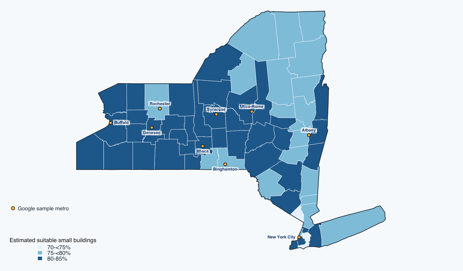
🗺️ Statewide rooftop suitability needs a different benchmark
STATEWIDE MODEL 62 counties
NREL ZIP estimates aggregated with modeled small-building counts.
PROJECT SNAPSHOT 9 sampled metros
Newer building detail—but not a statewide building sample.
Estimated share of small buildings with a PV-suitable roof plane · NREL 2016 model
This is a physical benchmark—not installed solar, private NPV, or an adoption rate.
The map estimates the share of small buildings—footprint below 5,000 square feet—with at least one roof plane meeting NREL’s shade, tilt, orientation, and contiguous-area criteria. County values are building-count-weighted aggregations of ZIP-code estimates, not simple averages.
Treat the colors as broad context rather than a county ranking. NREL reports a model root-mean-square error of about 4.2 percentage points, while the New York county estimates span only about 72 to 85 percent. The source model was published in 2016 and relies mostly on 2006–2014 inputs.
Gold dots show public metro centers for our Google sample; they are not raw building coordinates. The NREL map describes statewide physical suitability, while the Google snapshot provides newer building-level detail in nine selected areas. Neither layer measures adoption.
[Sources]
https://data.nlr.gov/submissions/121
https://www.nlr.gov/docs/fy16osti/65298.pdf
https://data.openei.org/submissions/8194
https://tigerweb.geo.census.gov/
Faculty research archive: solar_valid_buildings_2026-05-28.csv
[/Sources]
📏 The building distribution has a long right tail
Maximum modeled panel count among valid buildings with potential
MEDIAN 43
MEAN 131
MAX 20,567
1 10 100 1k 10k 100k
One typical building is much smaller than the mean. Report medians and IQRs before averages—and inspect the extreme structures.
The horizontal scale is logarithmic. Among 4,791 valid buildings with potential, the median is 43 panels, the interquartile range is 25–76, the mean is 131, and the maximum is 20,567. The heavy tail likely mixes residences with very large structures; building type is not explicitly observed in the current flat files.
[Sources]
Faculty research archive: solar_valid_buildings_2026-05-28.csv
Faculty research archive: google_maps_dataset_data_description_revised.md
[/Sources]
🗂️ Multiple table grains—and one export trap
candidatesone input point + nearest returned building
10,000
valid_buildingsone input point passing the 30 m rule
4,829
roof_segmentsone modeled roof segment
78,351
panelsone algorithmic panel placement
2,310,912
panel_configsone modeled system configuration
682,527
financial_analysesone hypothetical monthly-bill scenario
189,267
Export trap: Child files include found-but-invalid matches. For panels, 1,682,259 of 2,310,912 rows are attached to invalid parents.
|> semi_join (valid_buildings,by = "input_id" )
Have students predict the row grain before revealing each definition. The collector comments imply child rows should be valid-only, but the implemented condition exports children whenever found is true. Filter child tables with a semi-join to the vetted valid-building parent table before analysis.
[Sources]
Faculty research archive: google_maps_dataset_data_description_revised.md
Faculty research archive: data_google_solar_collection.py
Faculty research archive: solar_building_insights_all_candidates_2026-05-28.csv
Faculty research archive: solar_valid_buildings_2026-05-28.csv
Faculty research archive: solar_panels_2026-05-28.csv
Faculty research archive: solar_panel_configs_2026-05-28.csv
[/Sources]
👥 Work in pairs: one driver, one denominator auditor
Driver
reads the file;
states the row grain;
writes one dplyr pipeline; and
narrates each transformation.
Denominator auditor
names the denominator;
checks unique keys;
predicts join multiplication; and
challenges one causal word.
Swap roles after the first result. Your deliverable is one table and one cautious sentence.
The auditor is not a passive checker. They must predict output grain before each summarize or join. Use the next slide for the work itself.
[Sources]
../methods.qmd
danl-econ-399-lec-02-2026-0826.qmd
[/Sources]
💻 Beginner audit: valid-match rates by metro
<- file.path ("/Volumes/Extreme SSD" ,"solar-adoption" , "data" ,paste0 ("solar_building_insights_" ,"all_candidates_2026-05-28.csv" ))<- read_csv (candidate_file)<- candidates |> group_by (metro) |> summarise (input_n = n (),found_n = sum (found),valid_n = sum (valid_building_match),valid_rate = valid_n / input_n|> arrange (desc (valid_rate))
Before running
One output row represents…?
What is the denominator of valid_rate?
Why is the mean of the TRUE/FALSE match flag equivalent here?
What claim can this table support?
Predict → run → inspect → explain
THIS AUDIT · FACULTY SSD /Volumes/Extreme SSD/solar-adoption/data/
Let pairs answer the four prompts before running code. One output row is one metro. The denominator is sampled input points in that metro. Because logical TRUE/FALSE values coerce to 1/0 in arithmetic, the mean is the fraction TRUE after missingness is addressed. This audit uses the faculty-only Google file at /Volumes/Extreme SSD/solar-adoption/data/solar_building_insights_all_candidates_2026-05-28.csv. The public NYSERDA county-year file supports Classwork 2 and the open-data workflow, but it cannot replace the candidate file here because it has no metro, found, or valid_building_match fields.
[Sources]
Faculty research archive: /Volumes/Extreme SSD/solar-adoption/data/solar_building_insights_all_candidates_2026-05-28.csv
https://bcdanl.github.io/data/nyserda_solar_county_year_2026-06-30.csv
../methods.qmd
danl-econ-399-lec-02-2026-0826.qmd
[/Sources]
🧪 Three audit findings change the analysis before modeling begins
SELECTION 67.45% of all valid matches come from New York City
GEOGRAPHY DRIFT 531 valid returned buildings lie outside New York State
TIME MISMATCH 2012–2024 imagery dates underlie a May 2026 snapshot
Sampling, boundaries, and vintage belong in every estimate—not only in a limitations paragraph.
These are not cosmetic cleaning issues; each changes the population represented by a summary. Valid matches include 504 buildings in New Jersey and 27 in Ontario. Filter region_code before a New York-specific analysis. Imagery vintage can be a source of measurement heterogeneity; it is not the household adoption date.
[Sources]
Faculty research archive: solar_building_insights_all_candidates_2026-05-28.csv
Faculty research archive: solar_valid_buildings_2026-05-28.csv
Faculty research archive: google_maps_dataset_data_description_revised.md
[/Sources]
✍️ Match claims to the strength of the data
Defensible now
“Among sampled points in the NYC metro, 55.2% had a returned building within 30 meters.”
“Modeled panel capacity is highly right-skewed among valid matches.”
Not supported
“55.2% of NYC buildings adopted solar.”
“Low-income households have less rooftop potential.”
“Peer effects caused the observed clusters.”
Name the sample · unit · measure · denominator · time · uncertainty.
Have students repair one unsupported sentence aloud. A suitable model result is not an adoption outcome, and a metro sample is not a census of its buildings.
[Sources]
[/Sources]
🧱 Work begins with an open-data backbone
observed distributed-solar projects
deployment outcome
income · tenure · housing · demographics
community context
tracts · counties · boundaries
spatial join frame
Faculty-only checkpoint: use the retained Google potential snapshot only after institutional review of terms, retention, attribution, and student access.
Open outcome + open context first; restricted potential may be joined later.
This stack supports a useful adoption-and-equity project even if the Google snapshot remains unavailable for class use. NYSERDA supplies observed project records; ACS and TIGER supply context and geography. Verify current documentation and vintages at download time. Do not use Google Maps Content to train course machine-learning models.
[Sources]
https://data.ny.gov/Energy-Environment/Statewide-Distributed-Solar-Projects-Beginning-200/wgsj-jt5f
https://www.census.gov/data/developers/data-sets/acs-5year.html
https://www.census.gov/geographies/mapping-files/time-series/geo/tiger-line-file.html
../data.qmd
https://cloud.google.com/maps-platform/terms
https://cloud.google.com/archive/maps-platform/terms/maps-service-terms-20260422
https://developers.google.com/maps/documentation/solar/policies
[/Sources]
🛤️ A five-step path into the shared project
1
REPRODUCE run an existing audit
2
AUDIT document grain, keys, and limits
3
PROPOSE one bounded issue or question
4
BRANCH isolated QMD, script, or note
5
REVIEW peer audit, then faculty merge
Rotating roles: literature / theory · provenance / QA · open adoption + ACS · visualization / spatial · reproducibility
No billable API calls · no credentials · no raw property coordinates · no restricted-data ML
Students enter through bounded tasks that can be reproduced, reviewed, and merged. No student should run the billable API or receive keys or raw property identifiers. Faculty retain responsibility for restricted-data governance. A first contribution can be a literature evidence row, a documented data audit, or an open-data visualization—not necessarily code infrastructure.
[Sources]
../research.qmd
../milestones.qmd
../data.qmd
https://developers.google.com/maps/api-security-best-practices
[/Sources]
✅ Choose your first contribution
Write one researchable question.
Name its outcome and denominator.
Choose one mechanism and one comparison.
State one claim the available data cannot support.
Potential is measured. Adoption is chosen. Research explains the gap.
Collect the four-line response before students leave. Use responses to form project teams by mechanism and task type rather than by ambition alone. Close by repeating the central distinction: the current Google files measure modeled potential, not adoption.
[Sources]
../research.qmd
../milestones.qmd
Faculty research archive: google_maps_dataset_data_description_revised.md
[/Sources]