Reference 3
Data Storytelling and Visualization
️📊💡 Data Storytelling
“The narrative is the key vehicle to convey insights, and the visualizations are important proof points to back up the narrative.” Ryan Fuller, Corporate Vice President, M365 Data Strategy at Microsoft
- Data visualizations are useful for showing “what” is happening in the data.
- However, they often fall short in explaining the “why” and the “how” or providing the necessary context to uncover underlying reasons.
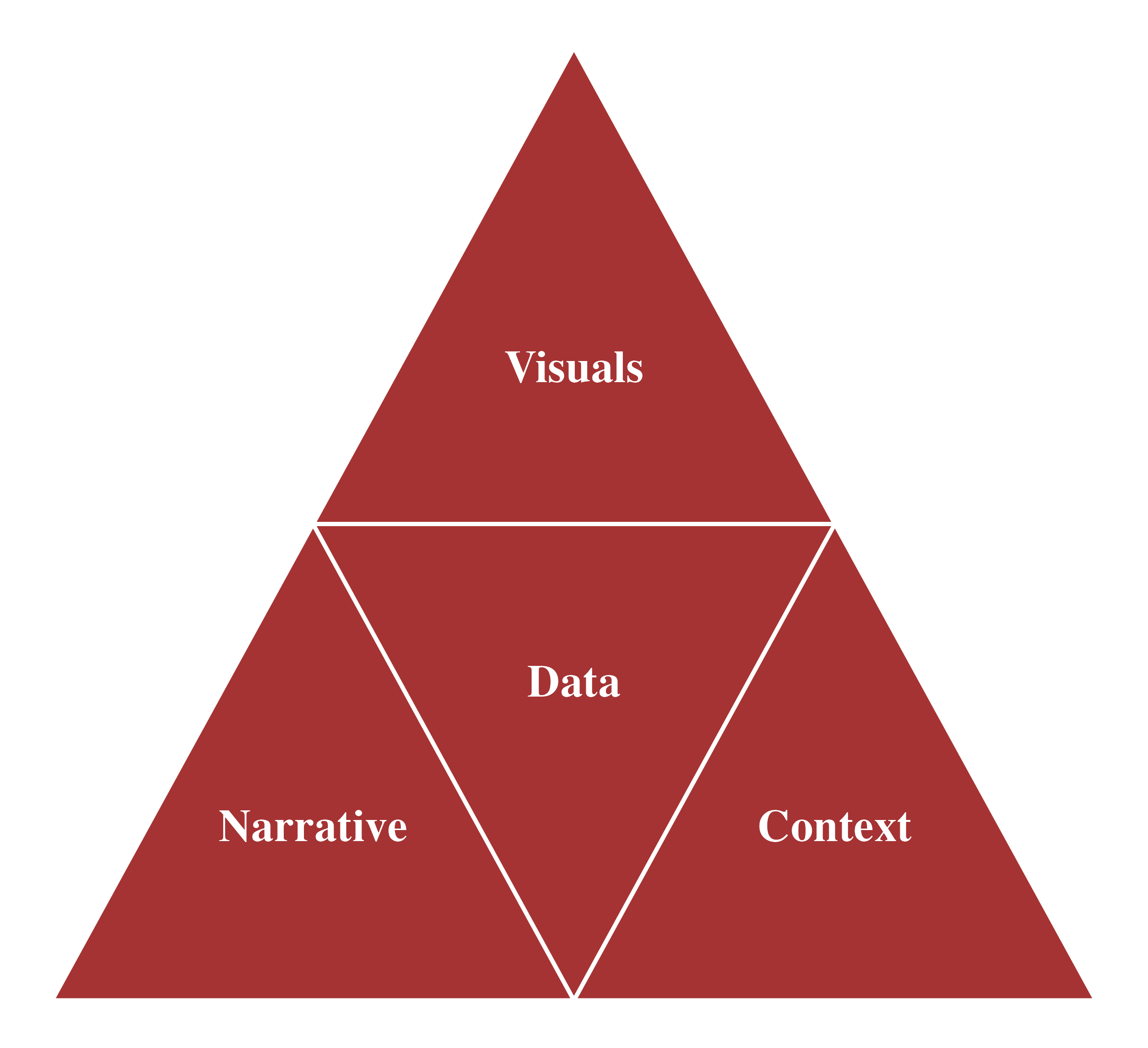
- Data Storytelling: Bridge the gap between data and insight by integrating descriptive statistics, data transformation, visualization, and narration within the appropriate audience context to communicate findings effectively and support data-informed decision-making.
Data Storytelling - Context
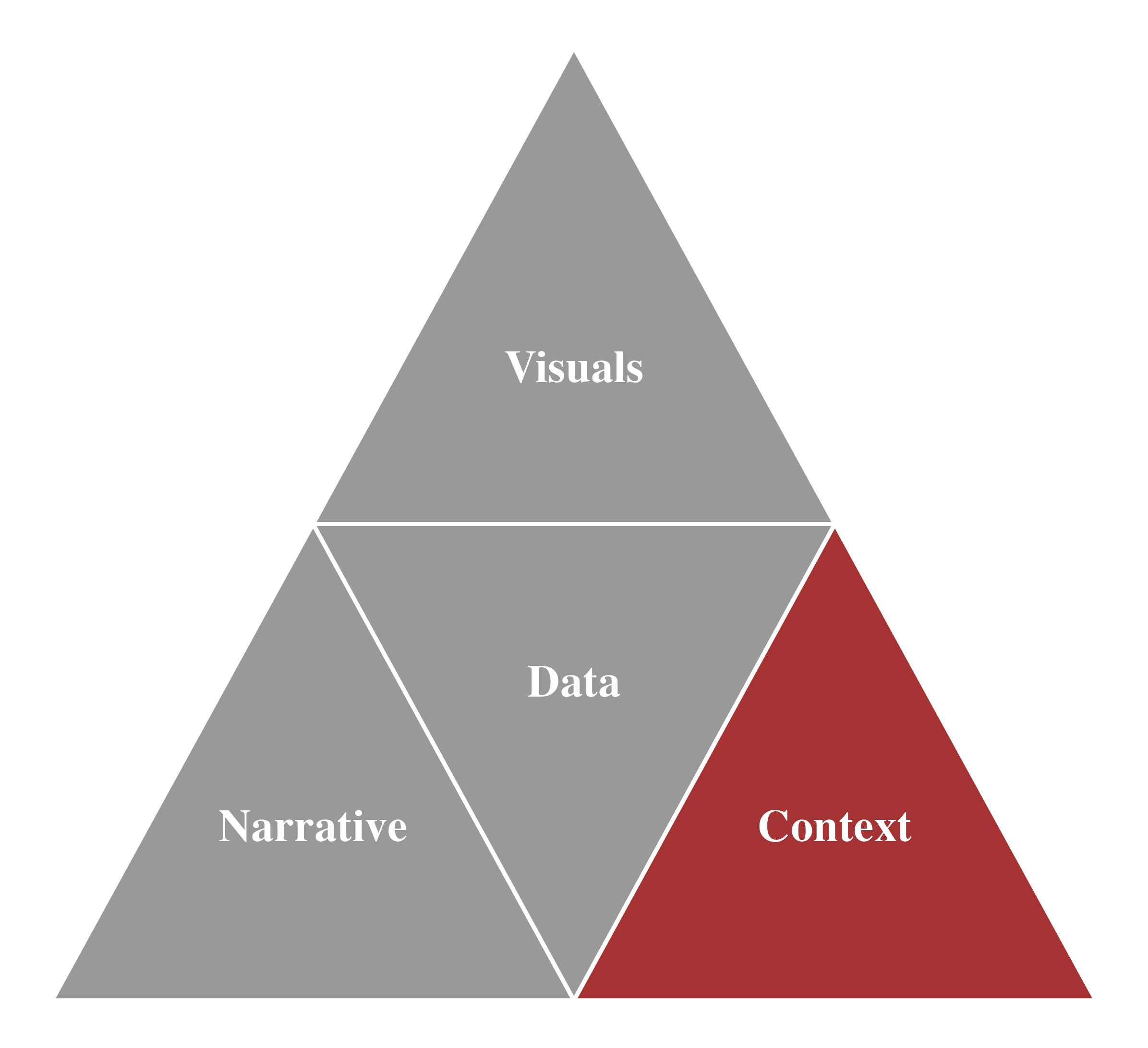
Context - Who, What, and How
- Before creating a data visualization or communication, it’s essential to spend time understanding the context behind your message.
- Who is your audience?
- What do you want your audience to understand or act upon?
- How will you present the data to effectively support your point?
Context - Who
- To whom are you communicating?
- Gain a clear understanding of whom you’re communicating with and how they perceive you.
- The more precisely you define your audience, the better you can tailor your message for successful communication.
Context - What
- What do you need your audience to know or do?
- Make your communication relevant by aligning it with your audience’s interests and needs.
- Clearly articulate why they should care about your message.
- Adopt a confident stance; as the analyst, you are the subject matter expert.
Context - How
- How would you present your data to help make your point?
- Use data as compelling evidence to build and tell your story.
- Choose data transformations and visualizations that effectively convey your message.
Data Storytelling - Data
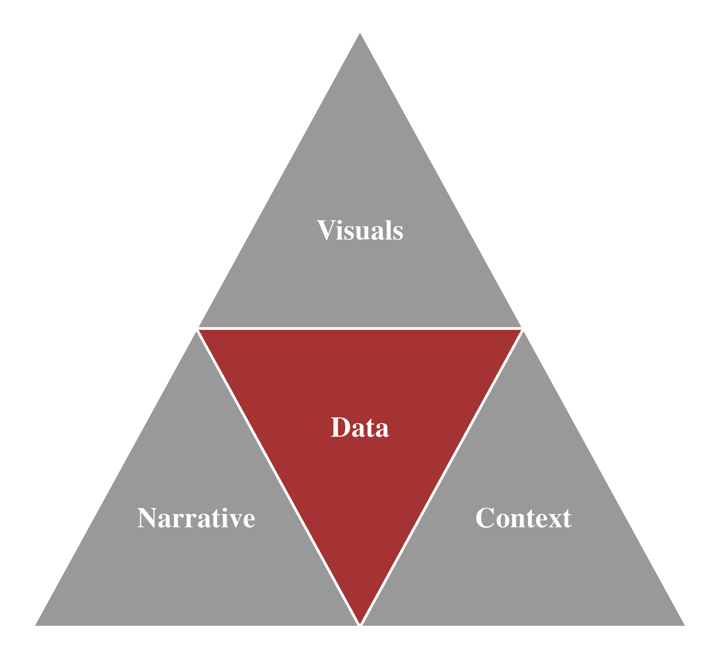
Understanding Your Data
- Prior to doing any storytelling or analysis, it is critical to understand your data and its limitations
- How was the information collected?
- What is the source of the data?
- What is missing variable from the data?
- What is missing observation from the data?
- What is missing value (
NA) from the data?
Data Storytelling - Narrative
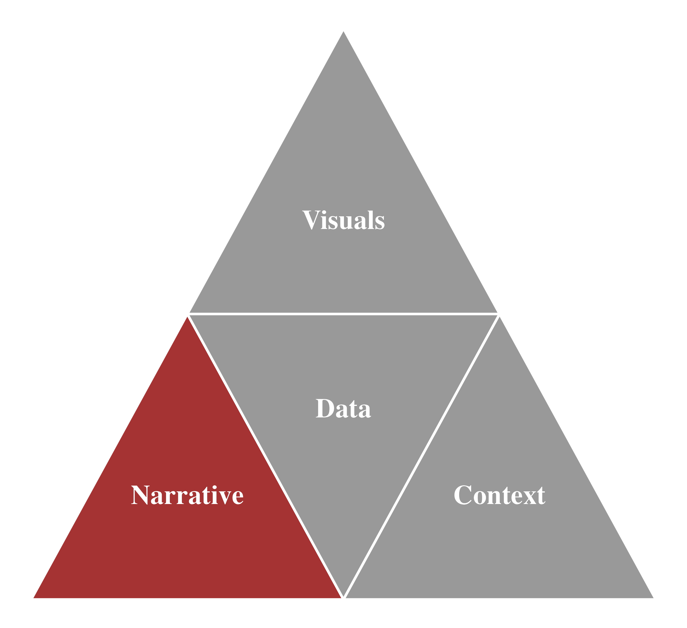
The Foundations of a Narrative
The 3-Minute Story & Big Idea
“I would have written a shorter letter, but I did not have the time.” - Blaise Pascal
- Purpose: Boil the “so-what” down to a concise statement
- Challenges: Being concise is often more difficult than being verbose
3-Minute Story
- If you had only 3 minutes, what would you say?
- Goal: Be clear and articulate the key message
- Useful in:
- Quick updates (e.g., elevator pitches)
- Shortened time slots (e.g., 5-minute briefings)
- Know exactly what to communicate and adjust to the time
Big Idea
- Must meet three criteria:
- Articulate your unique point of view
- Convey what’s at stake
- Be a complete sentence
The Foundations of a Narrative - Example
- 3-Minute Story
- Science department initiative: Resolve issues with incoming 4th-graders’ negative attitudes toward science
- Piloted a summer learning program with 2nd and 3rd-graders
- Survey results: Significant improvement in positive perceptions toward science
- Big Idea
- “The pilot summer learning program was successful at improving students’ perceptions of science, and we recommend continuing and expanding it.”
Data Storytelling - Visualization
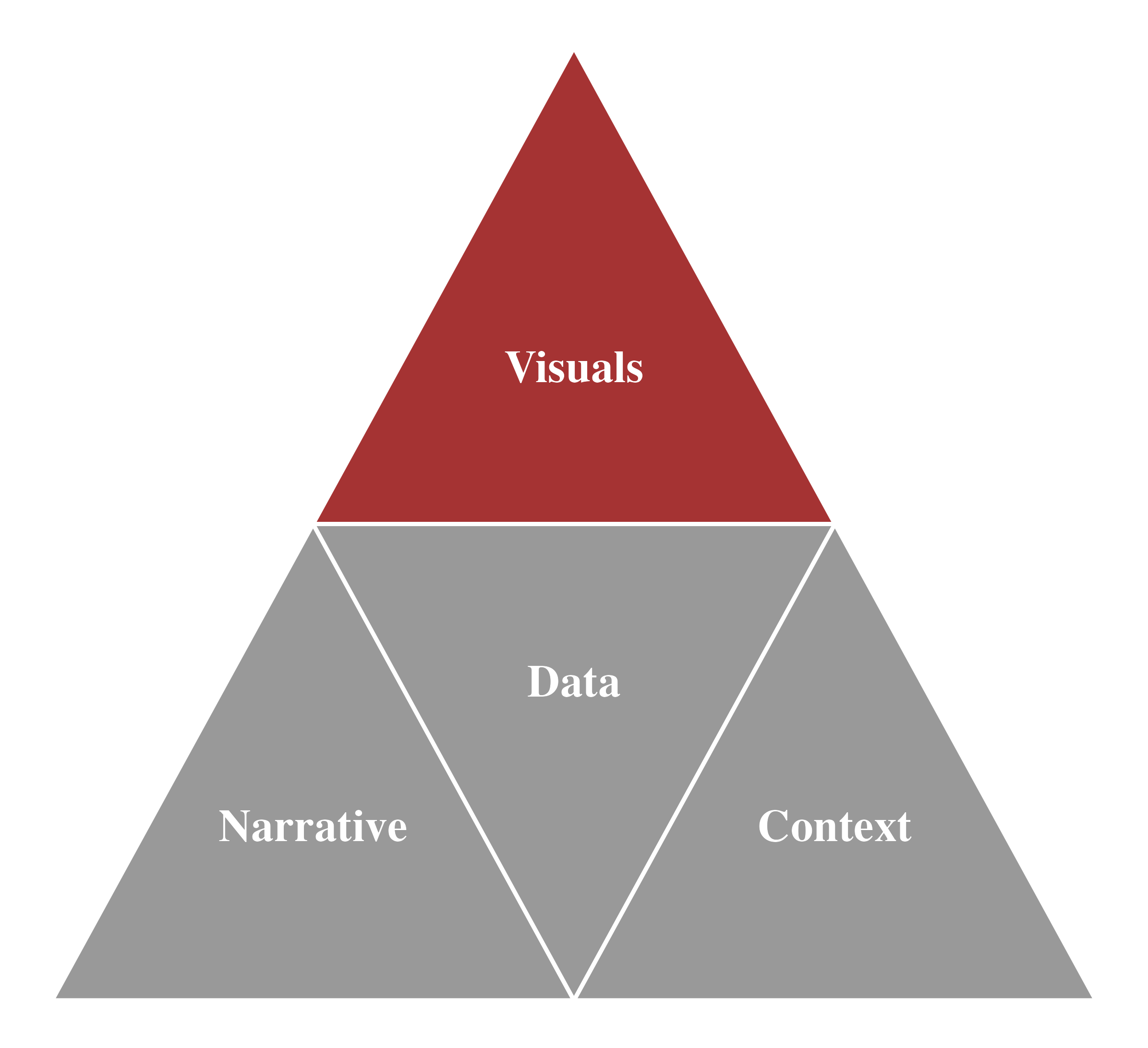
Data Visualization: Convert data into meaningful graphics for better understanding of data.
There are many different graphs and other types of visual displays of information.
We will visualize:
- The distribution of a categorical variable
- The distribution of a numeric variable
- The relationship between two numeric variables
- The time trend of a numeric variable
Distribution
Distribution and Variation
Distribution
- Distribution describes how the values of a variable are spread or grouped within a dataset (
data.frame).- It reveals the overall pattern of how observations differ or cluster.
- Understanding distribution helps us see where data are concentrated and where they are sparse.
- It reveals the overall pattern of how observations differ or cluster.
Variation
- Variation is the tendency of a variable’s values to differ from one measurement to another.
- In everyday life, we observe variation everywhere — measuring the same numeric variable twice often gives slightly different results.
- Recognizing variation helps us understand change and spread in data.
- In everyday life, we observe variation everywhere — measuring the same numeric variable twice often gives slightly different results.
✨ Together, distribution and variation form the foundation of data analysis.
🔍 Key Questions When Analyzing Distribution
Which values are most common, and why?
Which values are rare, and why?
→ Does this pattern align with your expectations, or reveal something surprising?How wide is the spread?
→ Are the values tightly clustered or widely dispersed? (e.g., range, IQR, standard deviation)Are there any outliers?
→ What causes them — data errors, unusual events, or genuine variation?What is the shape of the distribution?
→ Is it symmetric, skewed, unimodal, or bimodal?Are there patterns or subgroups?
→ Do certain categories or conditions show different distributions?
Distribution
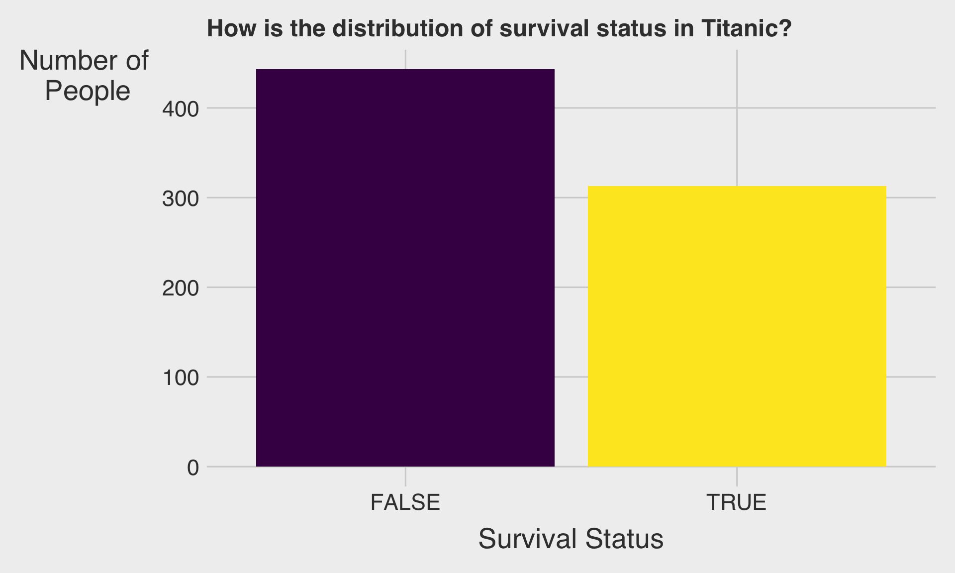
- How you visualize the distribution of a variable depends on the type of variable: categorical or numerical.
- Categorical Variables: Represent categories or groups (e.g., colors, departments, types)
- Common visualizations:
Bar charts - Example: Distribution of favorite sports among students
- Common visualizations:
- Numerical Variables: Represent numbers with meaningful values (e.g., age, income, temperature)
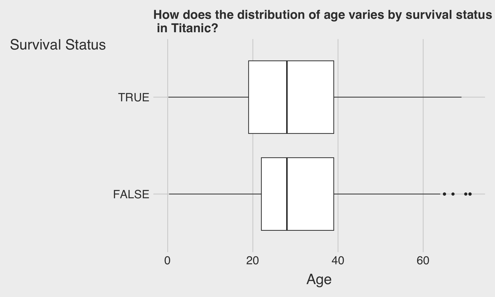
- Common visualizations: Histograms, Box plots
- Example: Distribution of heights in a class
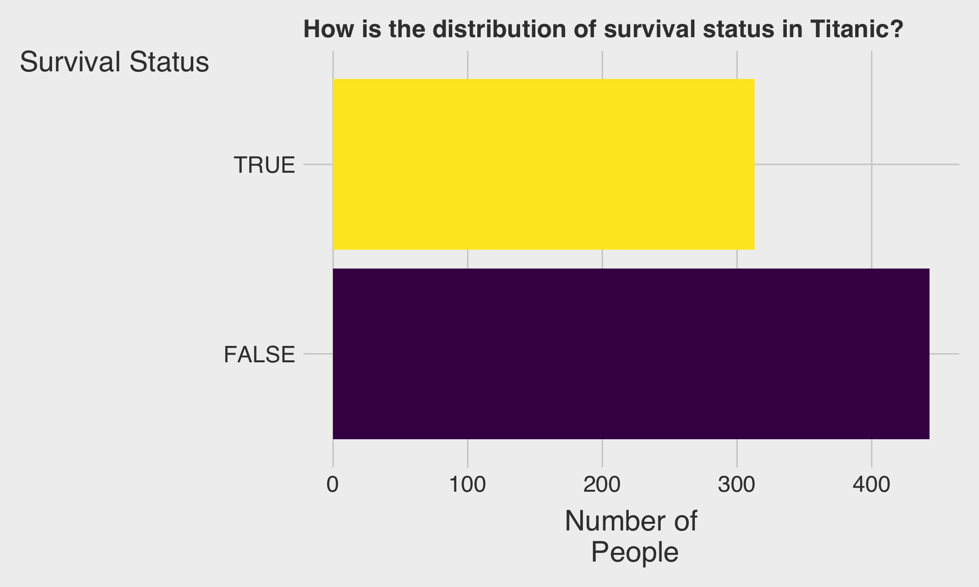
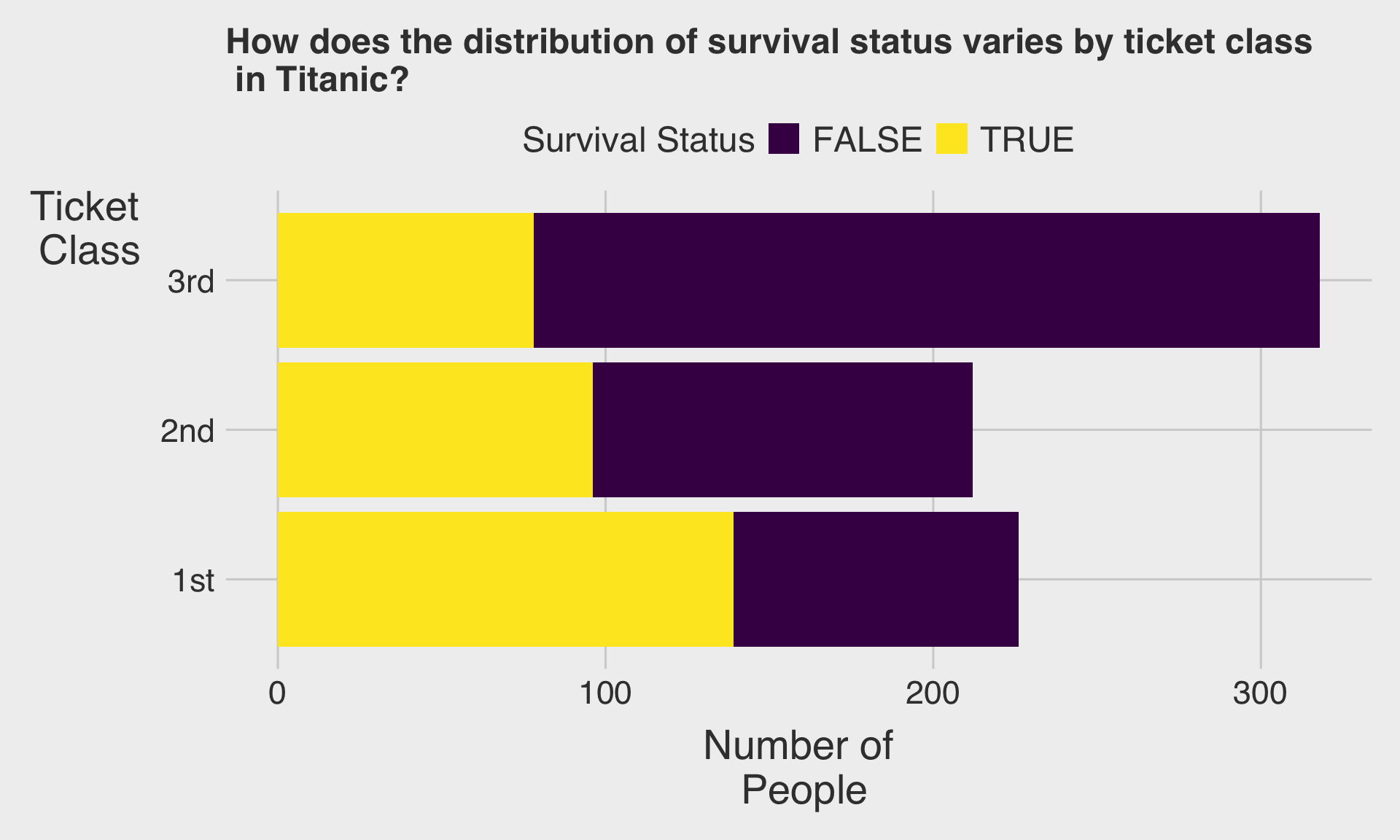
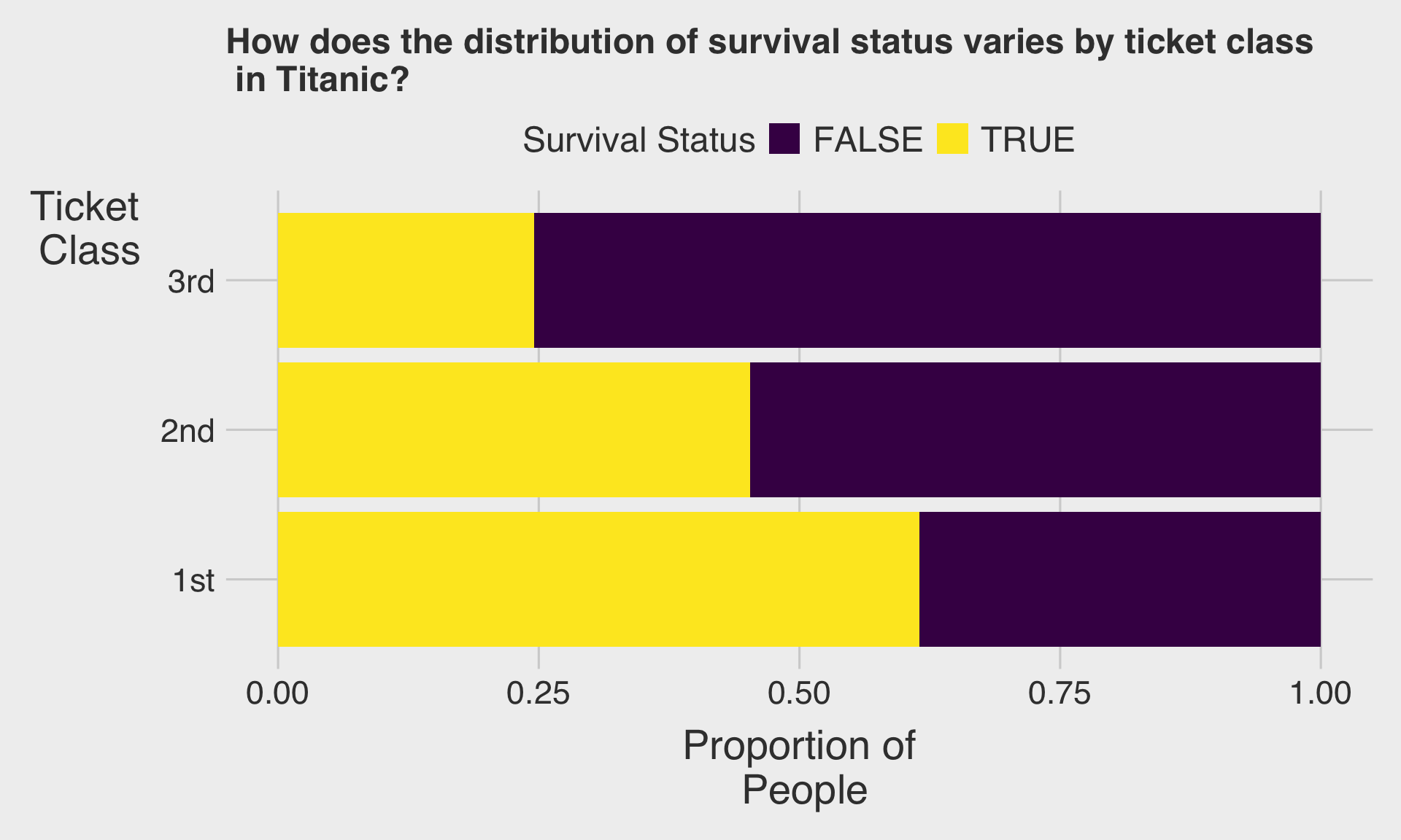
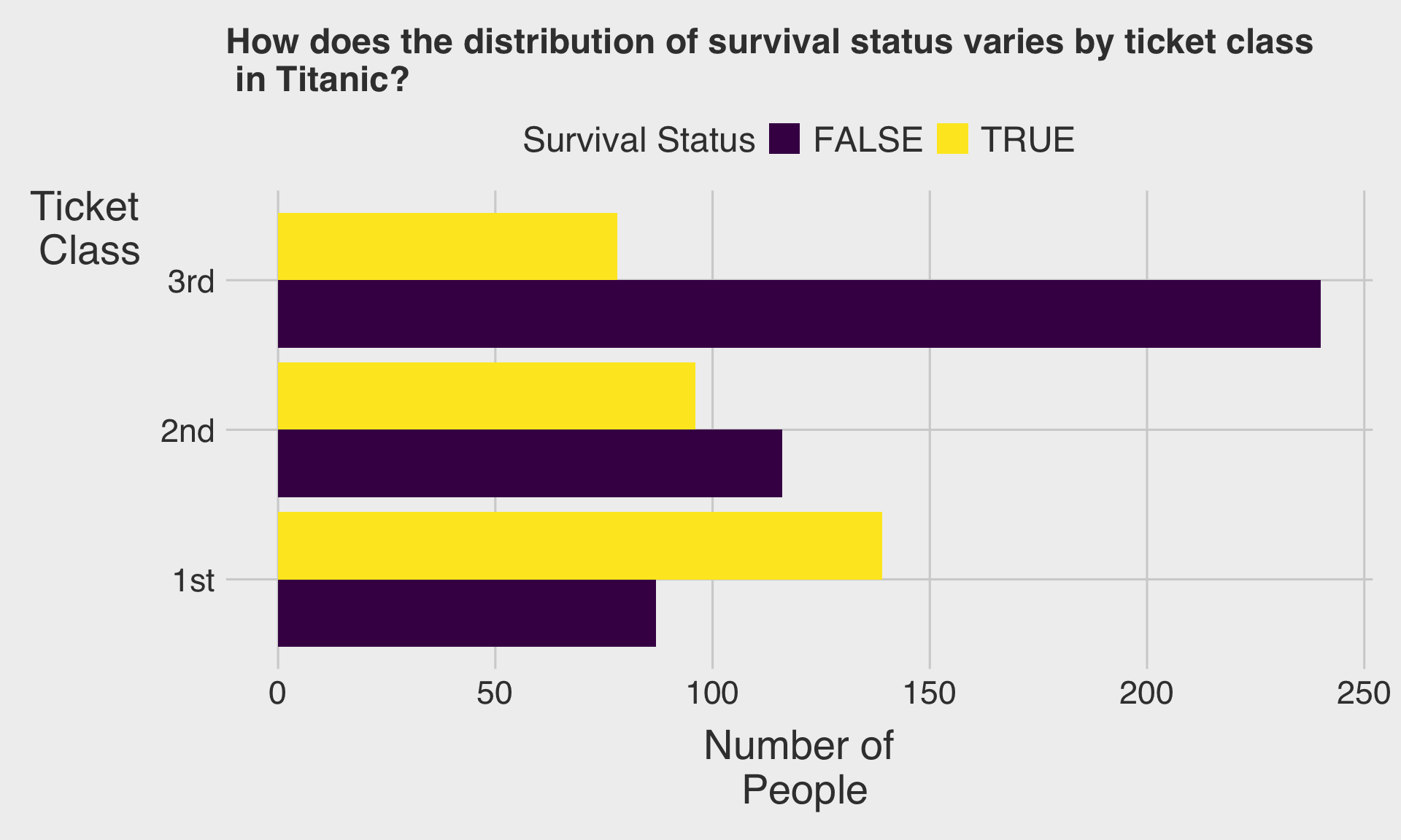
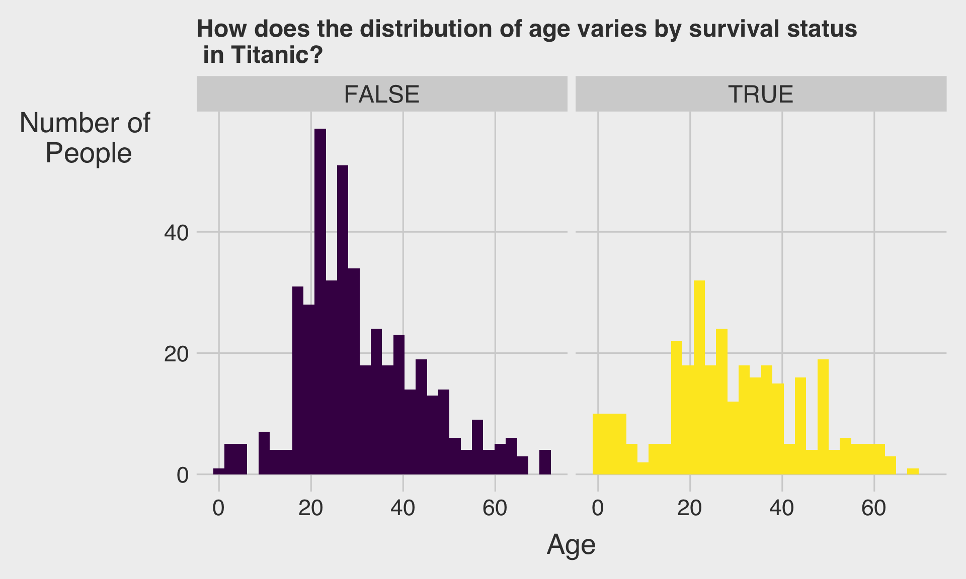
Titanic Data
Bar Chart
Horizontal Bar Chart
Stacked Bar Chart
100% Stacked Bar Chart
Clustered Bar Chart
Histogram
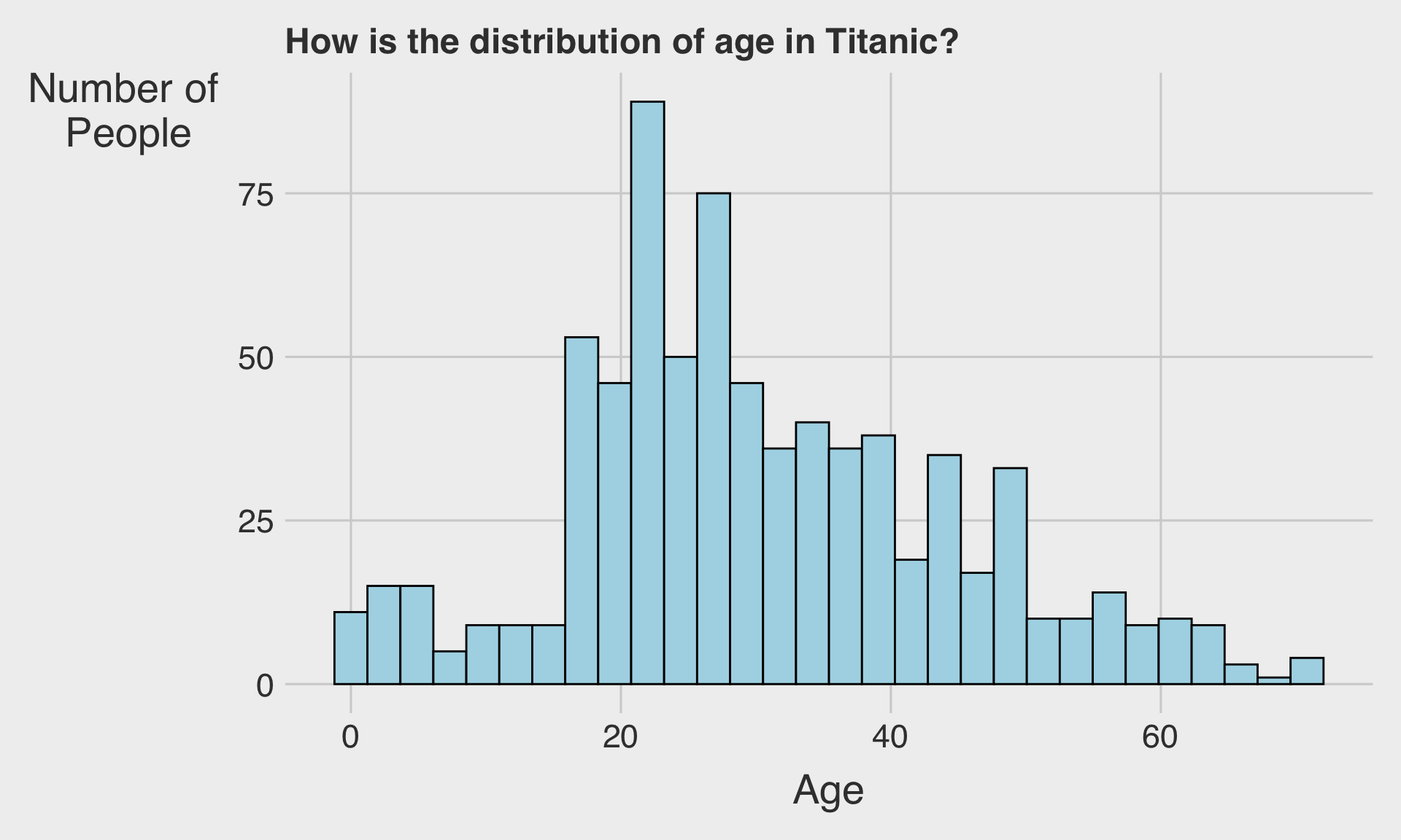
Histogram
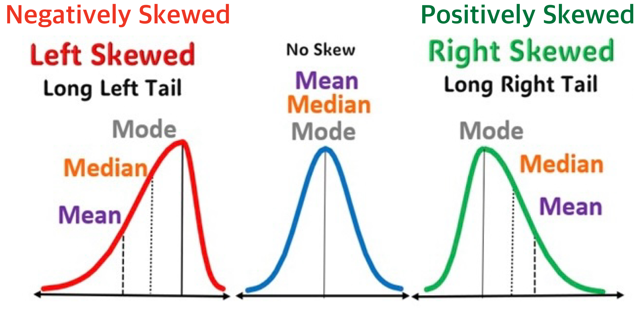
⚖️ Skewness
- In a distribution, skewness describes the asymmetry of a distribution.
- It shows whether the data are stretched more to the left or right of the center.
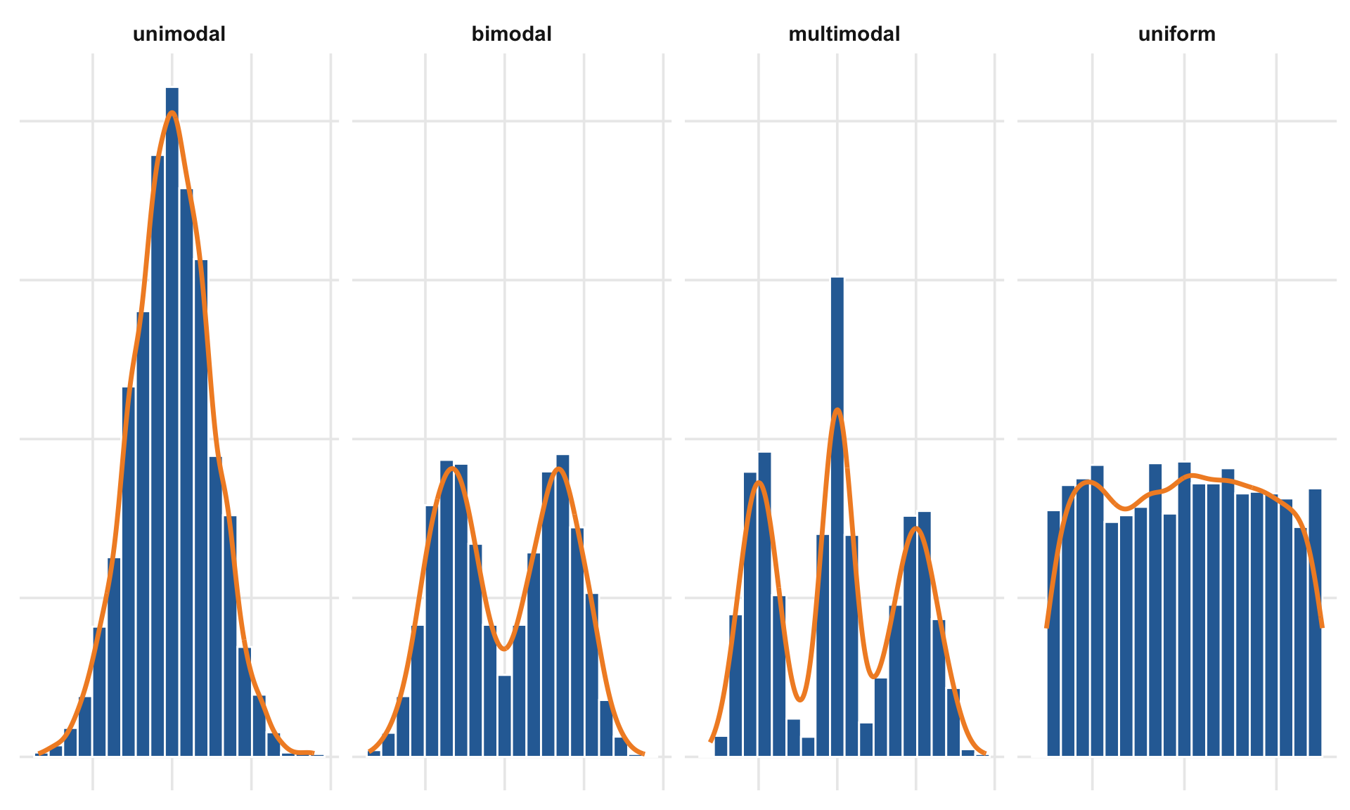
🏔️ Modality
- How many peaks does the distribution have?
- Is it unimodal (one peak) or bimodal (two peaks)?
- Or perhaps uniform or multimodal?
- Is it unimodal (one peak) or bimodal (two peaks)?
Boxplot
Relationship
🔗 Relationship
When examining plots with two numeric variables, we look for co-variation — the tendency of two variables to change together in a related way.
🔍 Key questions to ask:
- Are the variables positively related (as one increases, the other increases)?
- Are they negatively related (as one increases, the other decreases)?
- Or is there no clear relationship between them?
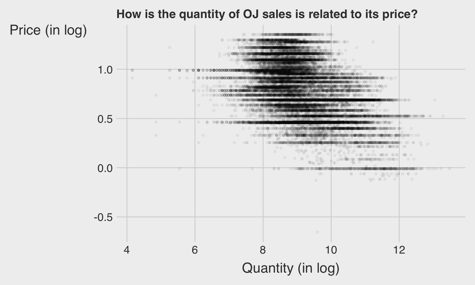
Common visualizations:
- Scatterplot
- Fitted line or curve to reveal the pattern of association
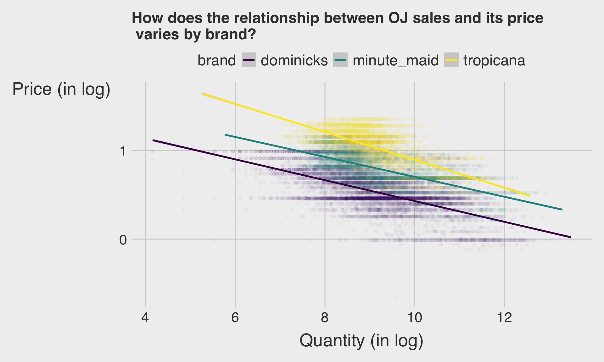
Orange Juice Sales
Scatterplot
Scatterplot with Fitted Line
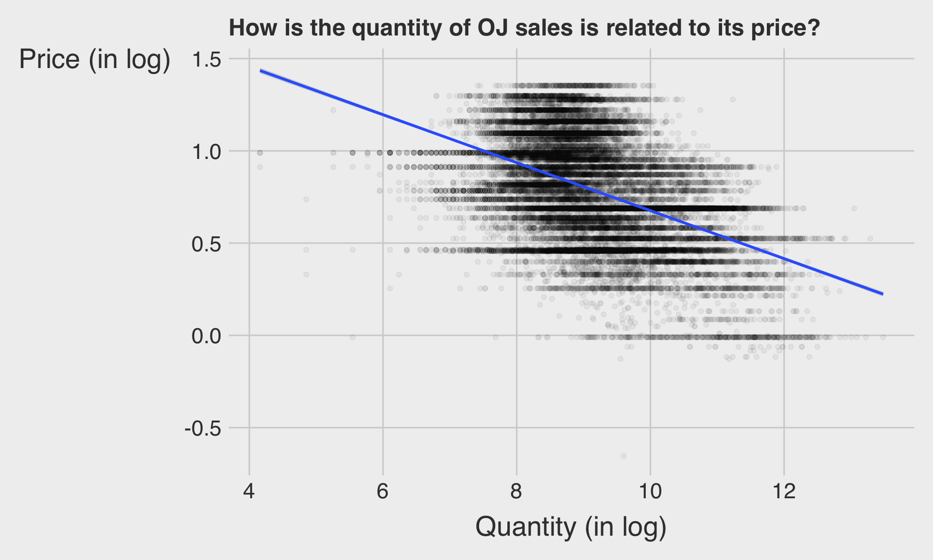
Scatterplot with Fitted Line
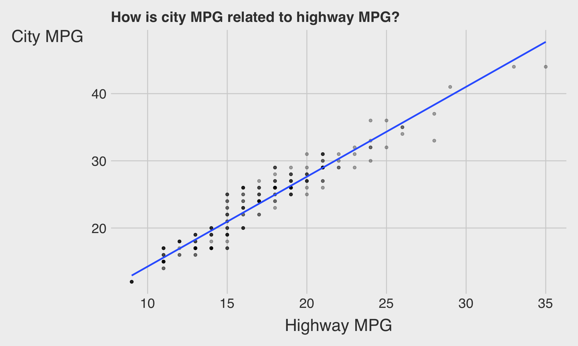
MPG Data
Scatterplot with Fitted Line
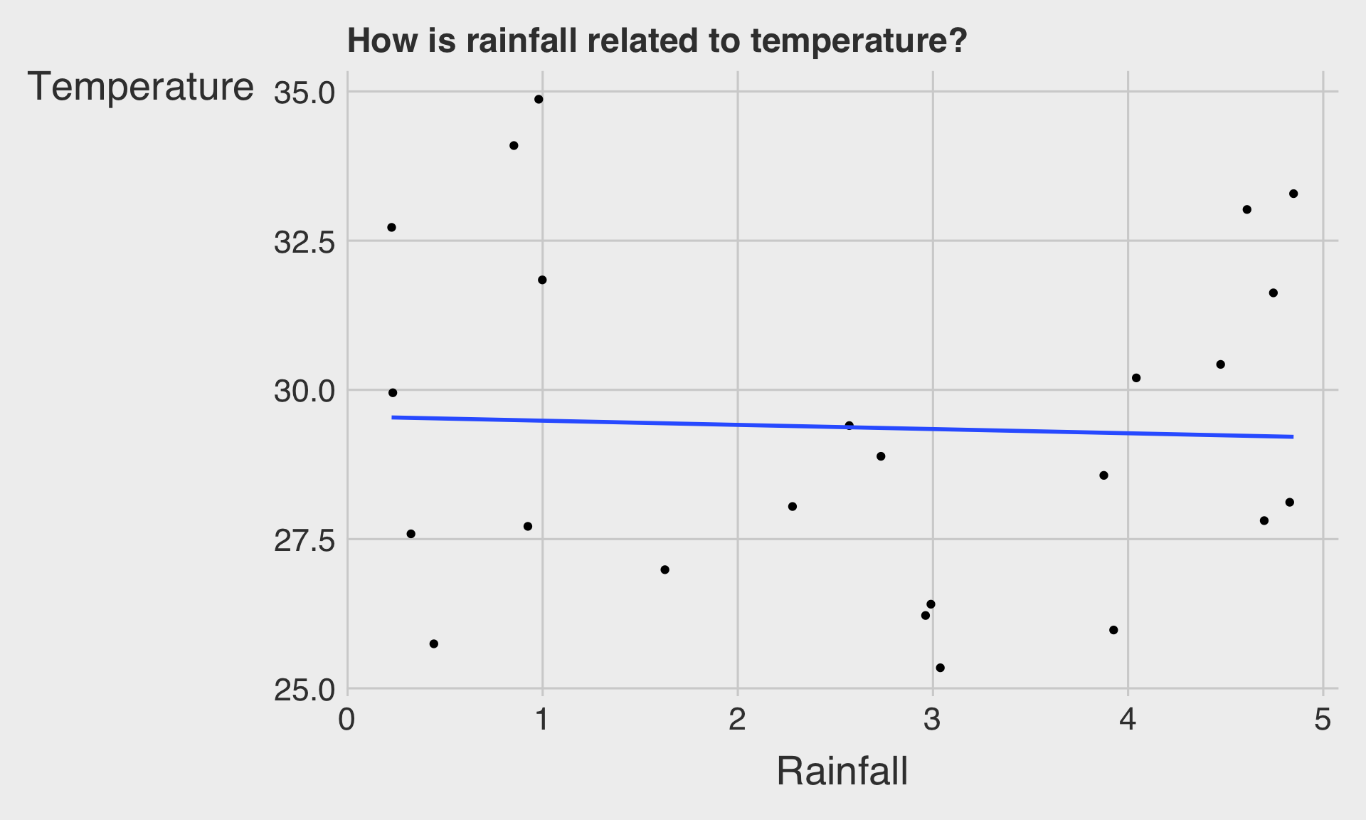
Weather Data
Scatterplot with Fitted Line
⚙️ Input vs. Outcome: Plotting Relationships
Be mindful of how you place variables on the axes.
- It’s standard practice to put the input variable on the x-axis and the outcome variable on the y-axis.
Input Variable → represents the potential cause or influencing factor.
Outcome Variable → represents the potential effect or result.
- Example: Advertising budget (input) vs. sales revenue (outcome)
Correlation Does Not Imply Causation
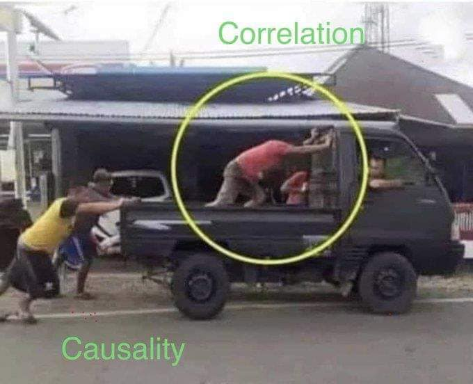
- Just because you uncover a relationship doesn’t mean you’ve identified the “causal” relationship.
⚠️ Correlation ≠ Causation
- Caution: A strong correlation between two variables does not mean that one causes the other to change.
- Two variables can move together by coincidence or due to a third, unseen factor.
- Correlation describes the strength and direction of a linear relationship between two variables:
- Positive / Negative → direction of relationship
- Strong / Weak → how clear (or uncertain) the relationship is
- Slope → the rate of change in the outcome per unit of input
- Positive / Negative → direction of relationship
- Causation means that one variable directly affects another.
- Demonstrating causation requires controlled experiments or supporting evidence beyond correlation.
- e.g.,: Smoking causes an increase in lung cancer risk (causation).
- Demonstrating causation requires controlled experiments or supporting evidence beyond correlation.
Time Trend
⏰ Time Trend
A time trend (or time series) plot shows how a variable changes over time, revealing trends, patterns, and fluctuations.
- The x-axis represents time, and the y-axis represents the measured variable.
It helps us observe the overall direction of change — whether the variable is increasing, decreasing, or remaining relatively stable over time.
Common visualizations:
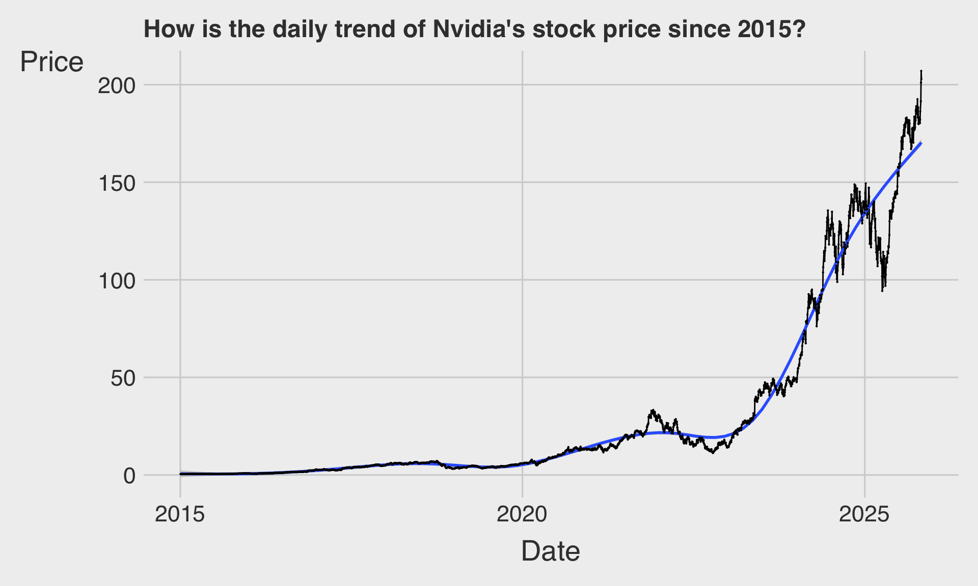
- Line chart
- Fitted curve to smooth short-term fluctuations
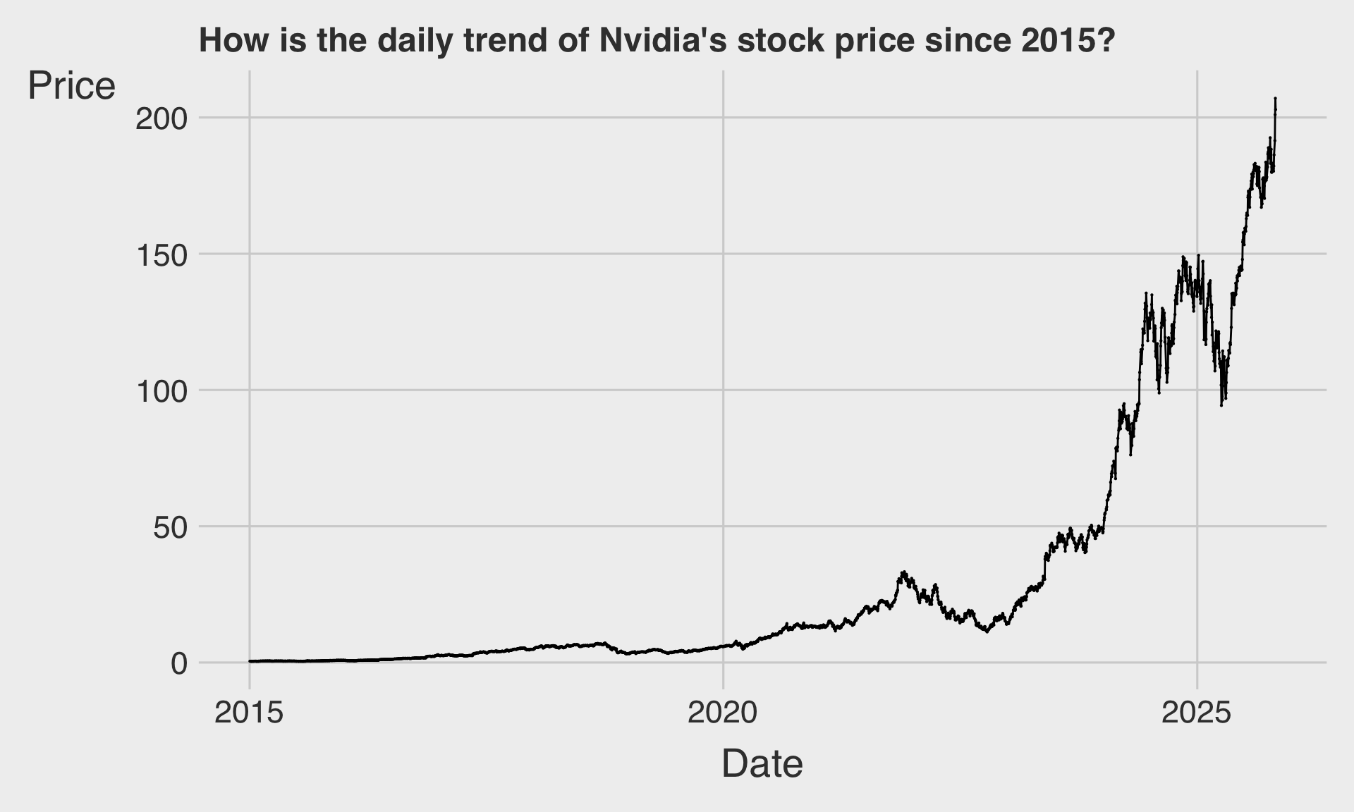
NVDA Stock Price Data
Line Chart
Line Chart with Fitted Curve
Discussion
Welcome to our Reference 3 Discussion Board! 👋
This space is designed for you to engage with your classmates about the material covered in Reference 3.
Whether you are looking to delve deeper into the content, share insights, or have questions about the content, this is the perfect place for you.
If you have any specific questions for Byeong-Hak (@bcdanl) regarding the Reference 3 materials or need clarification on any points, don’t hesitate to ask here.
All comments will be stored here.
Let’s collaborate and learn from each other!