library(tidyverse)
library(skimr)
library(ggthemes)
library(hrbrthemes)
library(rmarkdown)Example Questions for DANL 310 Final Exam
DANL 310-01: Data Visualization and Presentation
Below are R packages for this exam:
Data for the exam
Use the following code to download and read the data.
url <- "https://bcdanl.github.io/data/labor_supply.zip"

zip_path <- tempfile(fileext = ".zip")
extract_dir <- tempdir()

download.file(url, destfile = zip_path, mode = "wb")
unzip(zip_path, exdir = extract_dir)

cps <- read_csv(file.path(extract_dir, "labor_supply.csv"))rmarkdown::paged_table(cps |> head(15),
options = list(rows.print = 15))rmarkdown::paged_table(cps |> tail(15),
options = list(rows.print = 15))You can also download the zip file from this link
Description of Variables
YEAR: YearSEX: 1 if Male; 2 if FemaleNCHLT5: Number of own children under age 5 in a householdLABFORCE(labor force status):0= Not in universe (NIU)- NIU means the person was not asked the labor force questions because they are outside the Replicate population for those questions (for example, children, active-duty armed forces, or other excluded groups depending on the survey rules).
1= Not in the labor force- Neither employed nor actively looking for work.
2= In the labor force- Either employed (working for pay) or unemployed but actively seeking work.
ASECWT(sample weight):- This weight tells you how many people in the population a given observation represents.
- If you sum
ASECWTwithin a year, you get an estimate of the total U.S. population for that year that are not members of the armed force.
- The labor force participation rate (LFPR) is calculated as:
\[ (\text{Labor Force Participation Rate}) \, = \, \frac{(\text{Size of population in labor force})}{(\text{Size of population that are not members of the armed force})} \]
In this exam, when you compute yearly LFPR, use the survey weight ASECWT.
Question 1
Create below data.frame called q1 from cps.
Your q1 data.frame should:
- exclude observations with NIU labor force status,
- compute the weighted yearly LFPR by
YEAR,SEX, andNCHLT5, - have one row for each
YEAR-SEX-NCHLT5combination.
The resulting data.frame should contain these variables:
YEARSEXNCHLT5LFPR
Complete the code by filling in the blanks.
q1 <- cps |>
  filter(LABFORCE [?] 0) |>
  mutate(
    LABFORCE = [?],
    labor_supply = LABFORCE * ASECWT
  ) |>
  group_by([?]) |>
  summarize(
    LFPR = sum(labor_supply, na.rm = TRUE) / sum([?], na.rm = TRUE)
  )
Show answer
q1 <- cps |>
  filter(LABFORCE != 0) |>
  mutate(
    LABFORCE = LABFORCE - 1,
    labor_supply = LABFORCE * ASECWT
  ) |>
  group_by(YEAR, SEX, NCHLT5) |>
  summarize(
    LFPR = sum(labor_supply, na.rm = TRUE) / sum(ASECWT, na.rm = TRUE)
  )
Question 2
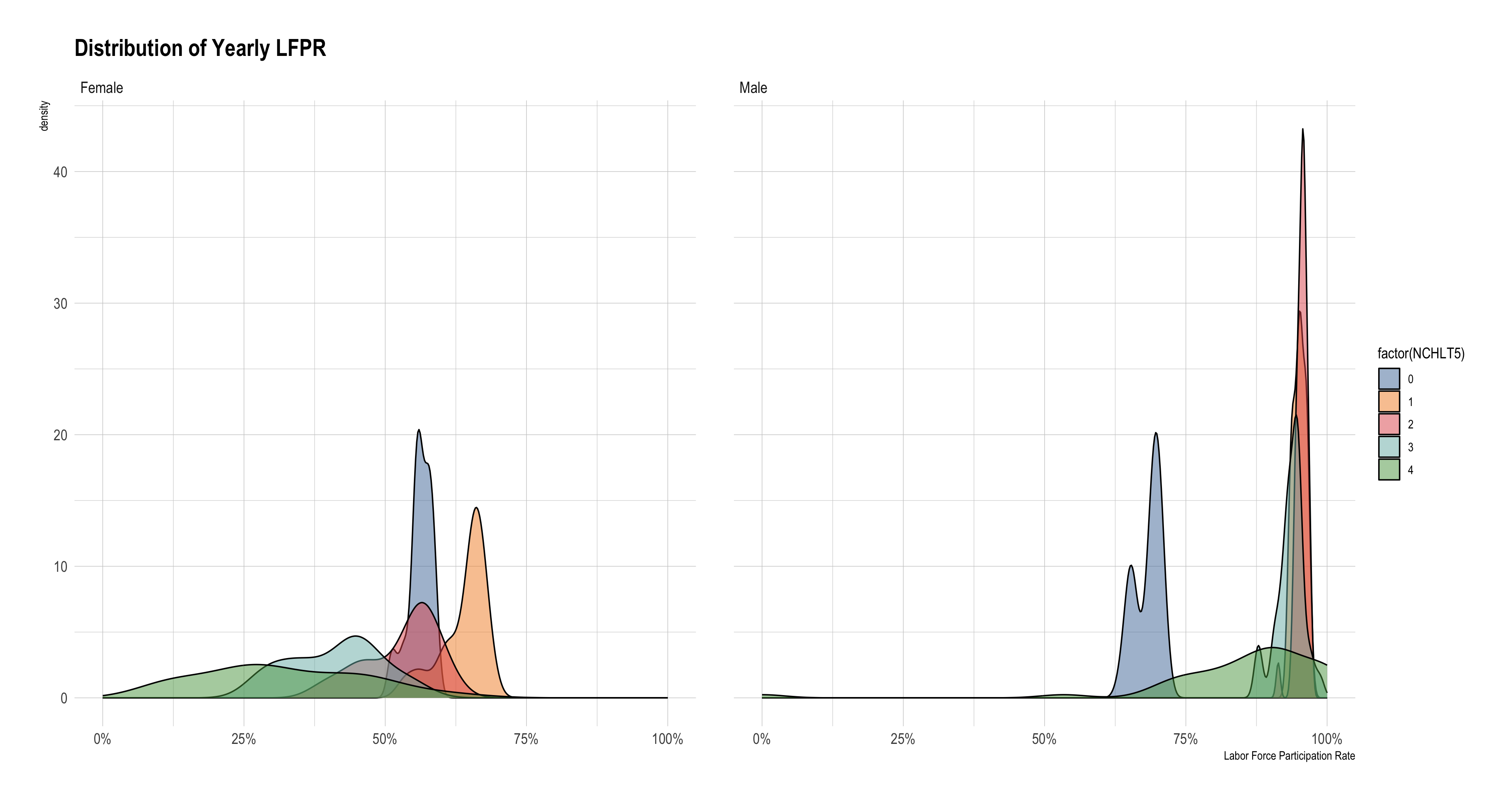
Using the q1 data.frame, recreate the figure below.
The figure shows the distribution of yearly LFPR:
using only
NCHLT5whose value is less than or equal to 4.Use one of the colorblind-friendly scale functions provided by the R package,
ggthemes.
Target figure:
q1 |>
  filter(NCHLT5 < 5) |>
  mutate(SEX = ___(1)___(
    SEX == 1 ~ "Male",
    SEX == 2 ~ "Female"
  )) |>
  ggplot(aes(x = LFPR, fill = factor(NCHLT5))) +
  ___(2)___(alpha = 0.5) +
  facet_wrap(~ SEX) +
  scale____(3)____tableau() +
  scale_x_continuous(labels = scales::label_percent()) +
  labs(
    title = "Distribution of Yearly LFPR",
    x = "Labor Force Participation Rate"
  ) +
  theme_ipsum()
Complete the code by filling in the blanks.
- (1)
ifelse; (2)geom_density; (3)color - (1)
ifelse; (2)geom_histogram; (3)color - (1)
ifelse; (2)geom_density; (3)fill - (1)
ifelse; (2)geom_histogram; (3)fill - (1)
if_else; (2)geom_density; (3)color - (1)
if_else; (2)geom_histogram; (3)color - (1)
if_else; (2)geom_density; (3)fill - (1)
if_else; (2)geom_histogram; (3)fill - (1)
case_when; (2)geom_density; (3)color - (1)
case_when; (2)geom_histogram; (3)color - (1)
case_when; (2)geom_density; (3)fill - (1)
case_when; (2)geom_histogram; (3)fill
Show answer
q1 |>
  filter(NCHLT5 < 5) |>
  mutate(SEX = case_when(
    SEX == 1 ~ "Male",
    SEX == 2 ~ "Female"
  )) |>
  ggplot(aes(x = LFPR, fill = factor(NCHLT5))) +
  geom_density(alpha = 0.5) +
  facet_wrap(~ SEX) +
  scale_fill_tableau() +
  scale_x_continuous(labels = scales::label_percent()) +
  labs(
    title = "Distribution of Yearly LFPR",
    x = "Labor Force Participation Rate"
  ) +
  theme_ipsum()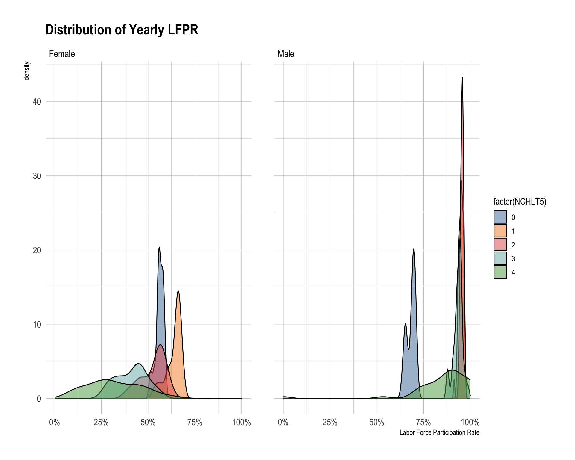
Question 3
Create below data.frame called q3 from cps.
Your q3 data.frame should:
- exclude observations with NIU labor force status,
- create
SEXthat has values"Male"and"Female"corresponding to the variable description, - create a variable called
childsuch that"No Child Under Age 5 in Household"if the value ofNCHLT5is zero,"Having Children Under Age 5 in Household"otherwise,
- compute the weighted yearly LFPR by
SEXandchild.
The resulting data.frame should contain these variables:
YEARSEXchildLFPR
Complete the code by filling in the blank [?].
q3 <- cps |>
  filter(LABFORCE != 0) |>
  mutate(LABFORCE = LABFORCE - 1) |>
  mutate(SEX = case_when(
    SEX == 1 ~ "Male",
    SEX == 2 ~ "Female"
  )) |>
  mutate(labor_supply = LABFORCE * ASECWT,
         child = ifelse([?],
                        "No Child Under Age 5 in Household",
                        "Having Children Under Age 5 in Household")) |>
  group_by(YEAR, SEX, child) |>
  summarize(LFPR = sum(labor_supply) / sum(ASECWT, na.rm= T) ) |>
  filter(!is.na(child)) |>
  ungroup()
Show answer
q3 <- cps |>
  filter(LABFORCE != 0) |>
  mutate(LABFORCE = LABFORCE - 1) |>
  mutate(SEX = case_when(
    SEX == 1 ~ "Male",
    SEX == 2 ~ "Female"
  )) |>
  mutate(labor_supply = LABFORCE * ASECWT,
         child = ifelse(NCHLT5 == 0,
                        "No Child Under Age 5 in Household",
                        "Having Children Under Age 5 in Household")) |>
  group_by(YEAR, SEX, child) |>
  summarize(LFPR = sum(labor_supply) / sum(ASECWT, na.rm= T) ) |>
  filter(!is.na(child)) |>
  ungroup()
Question 4
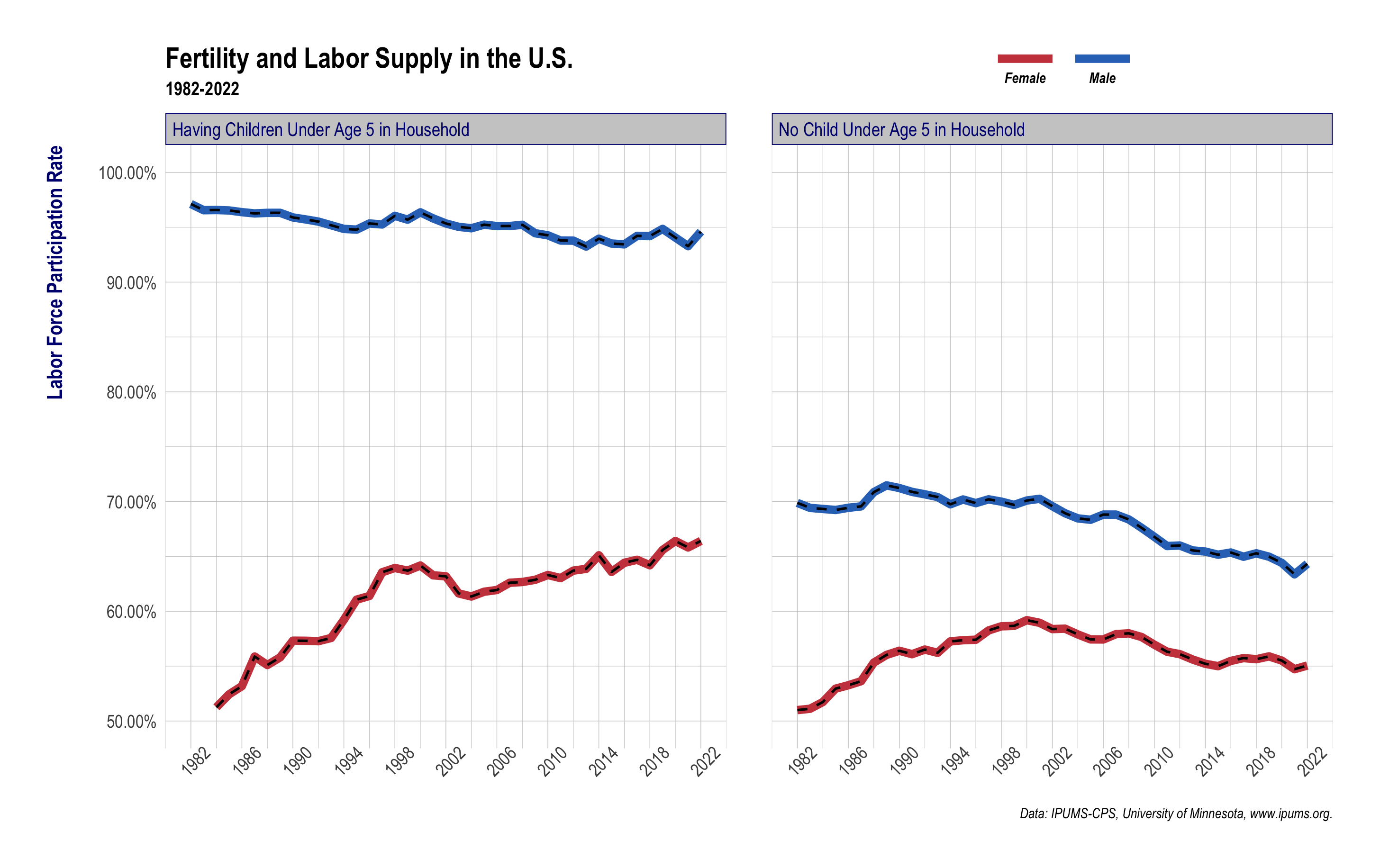
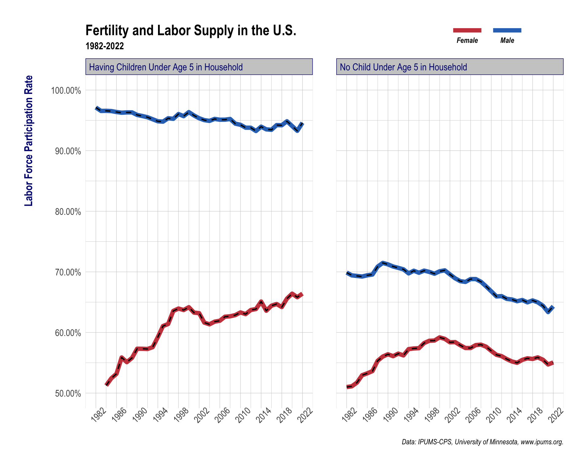
Using the q3 data.frame, recreate the figure below.
The figure shows the yearly trend of LFPR by child and SEX.
Use the following labels:
p_title <- "Fertility and Labor Supply in the U.S."
p_subtitle <- "1982-2022"
p_caption <- "Data: IPUMS-CPS, University of Minnesota, www.ipums.org."
Use the following colors for sex:
c("#2E74C0", "#CB454A")Target figure:
 Complete the code by filling in the blanks.
q3 |>
  ggplot(aes(x = _________, y = _________,
             _________ = factor(SEX)
             )
         ) +
  geom_line(lwd = 2.5) +
  geom_line(lwd = .75, color = 'black', lty = 2,
            aes(_________ = factor(SEX))) +
  facet_grid( . ~ factor(child)) +
  scale_x_continuous( breaks = seq(1982, 2022, 4) ) +
  scale_y_continuous( labels = scales::_________,
                      breaks = _________,
                      limits = c(.5, 1)) +
  scale_color_manual( labels = c("Female", "Male"),
                      values = c("#CB454A", "#2E74C0") ) +
  labs(x = NULL,
       y = "Labor Force Participation Rate",
       color = NULL,
       title = "Fertility and Labor Supply in the U.S.",
       subtitle = "1982-2022",
       caption = "Data: IPUMS-CPS, University of Minnesota, www.ipums.org.") +
  guides(
    _________ = guide_legend(
      _________ = "bottom",
      _________ = 3,
      )
  ) +
  theme_ipsum() +
  theme(axis.title.y = element_text(size = rel(1.5),
                                    face = 'bold',
                                    margin = margin(r = 20),
                                    color = 'navy'),
        axis.text.x = element_text(_________),
        plot.subtitle = element_text(margin = margin(t = -5, b = 25),
                                     face = 'bold'),
        _________ = 'top',
        legend.text = element_text(_________ = 'bold.italic',
                                   margin = margin(t = 0)),
        legend.box.margin = margin(-65, 0, 0, 400),
        _________ =
          element_rect(fill = 'grey80',
                       color = 'navy'),
        strip.text = element_text(color = 'navy')
        )
Show answer
q3 |>
  ggplot(aes(x = YEAR, y = LFPR,
             color = factor(SEX)
             )
         ) +
  geom_line(lwd = 2.5) +
  geom_line(lwd = .75, color = 'black', lty = 2,
            aes(group = factor(SEX))) +
  facet_grid( . ~ factor(child)) +
  scale_x_continuous( breaks = seq(1982, 2022, 4) ) +
  scale_y_continuous( labels = scales::percent_format(accuracy = 0.01),
                      breaks = seq(.5,1,.1),
                      limits = c(.5, 1)) +
  scale_color_manual( labels = c("Female", "Male"),
                      values = c("#CB454A", "#2E74C0") ) +
  labs(x = NULL,
       y = "Labor Force Participation Rate",
       color = NULL,
       title = "Fertility and Labor Supply in the U.S.",
       subtitle = "1982-2022",
       caption = "Data: IPUMS-CPS, University of Minnesota, www.ipums.org.") +
  guides(
    color = guide_legend(
      label.position = "bottom",
      keywidth = 3,
      )
  ) +
  theme_ipsum() +
  theme(axis.title.y = element_text(size = rel(1.5),
                                    face = 'bold',
                                    margin = margin(r = 20),
                                    color = 'navy'),
        axis.text.x = element_text(angle = 45),
        plot.subtitle = element_text(margin = margin(t = -5, b = 25),
                                     face = 'bold'),
        legend.position = 'top',
        legend.text = element_text(face = 'bold.italic',
                                   margin = margin(t = 0)),
        legend.box.margin = margin(-65, 0, 0, 400),
        strip.background =
          element_rect(fill = 'grey80',
                       color = 'navy'),
        strip.text = element_text(color = 'navy')
        )
Question 5
Create below data.frame called q5 from q3.
Your q5 data.frame should create the following variables:
male_lfpr: weighted yearly male LFPR bychildfemale_lfpr: weighted yearly female LFPR bychildgap: yearly gender gap in LFPR (difference betweenmale_lfprandfemale_lfpr)
\[ \text{gap} = \text{male\_lfpr} - \text{female\_lfpr} \]
The resulting data.frame should contain these variables:
YEARchildmale_lfprfemale_lfprgap
Complete the code by filling in the blanks.
q5 <- q3 |>
  _____(1)____(names_from = SEX, values_from = LFPR) |>
  _____(2)____(
    male_lfpr = Male,
    female_lfpr = Female
  ) |>
mutate(gap = male_lfpr - female_lfpr)- (1)
pivot_longer; (2)rename - (1)
pivot_longer; (2)distinct - (1)
pivot_wider; (2)rename - (1)
pivot_wider; (2)distinct
Show answer
q5 <- q3 |>
  pivot_wider(names_from = SEX, values_from = LFPR) |>
  rename(
    male_lfpr = Male,
    female_lfpr = Female
  ) |>
  mutate(gap = male_lfpr - female_lfpr)
Question 6
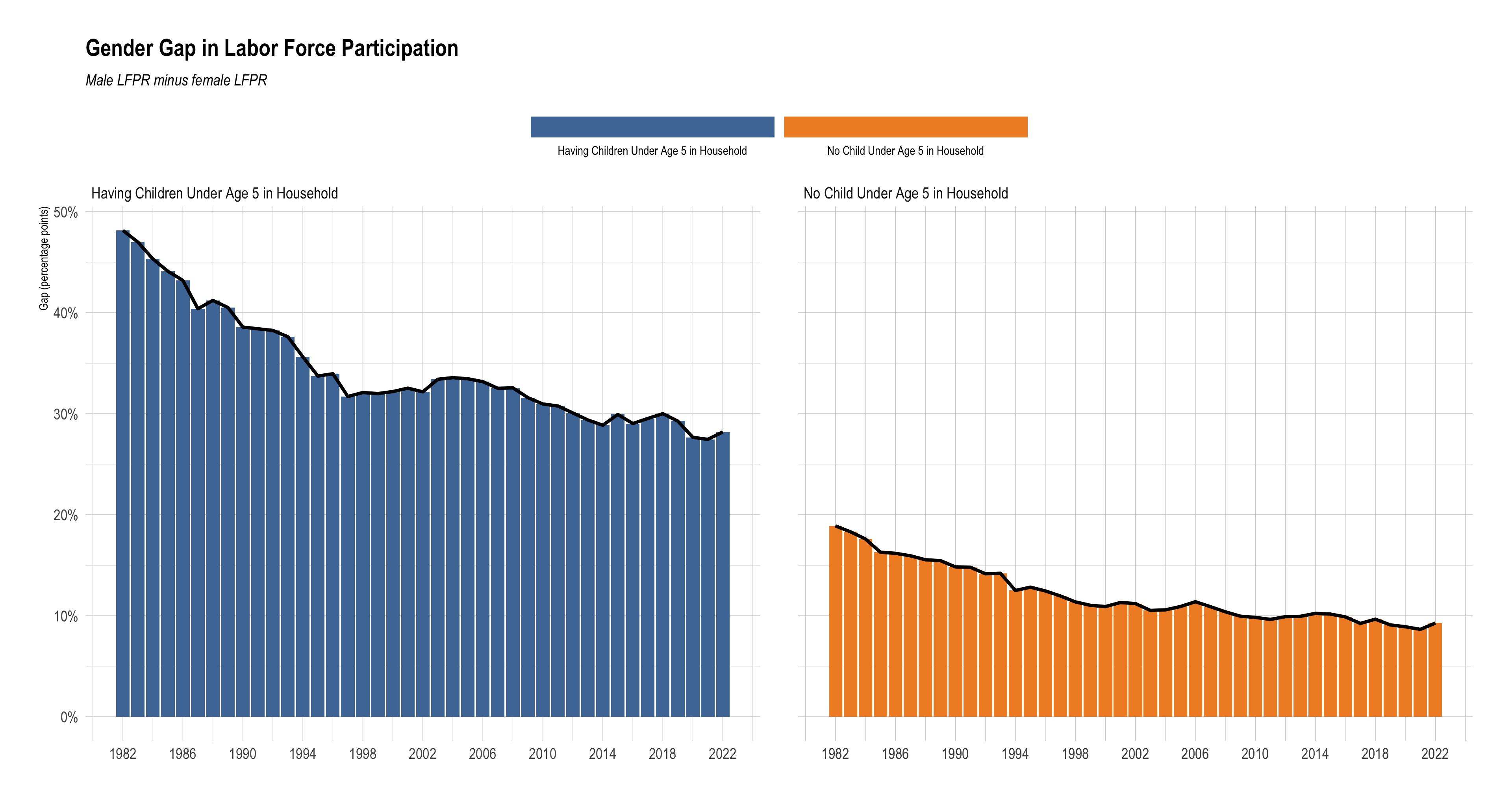
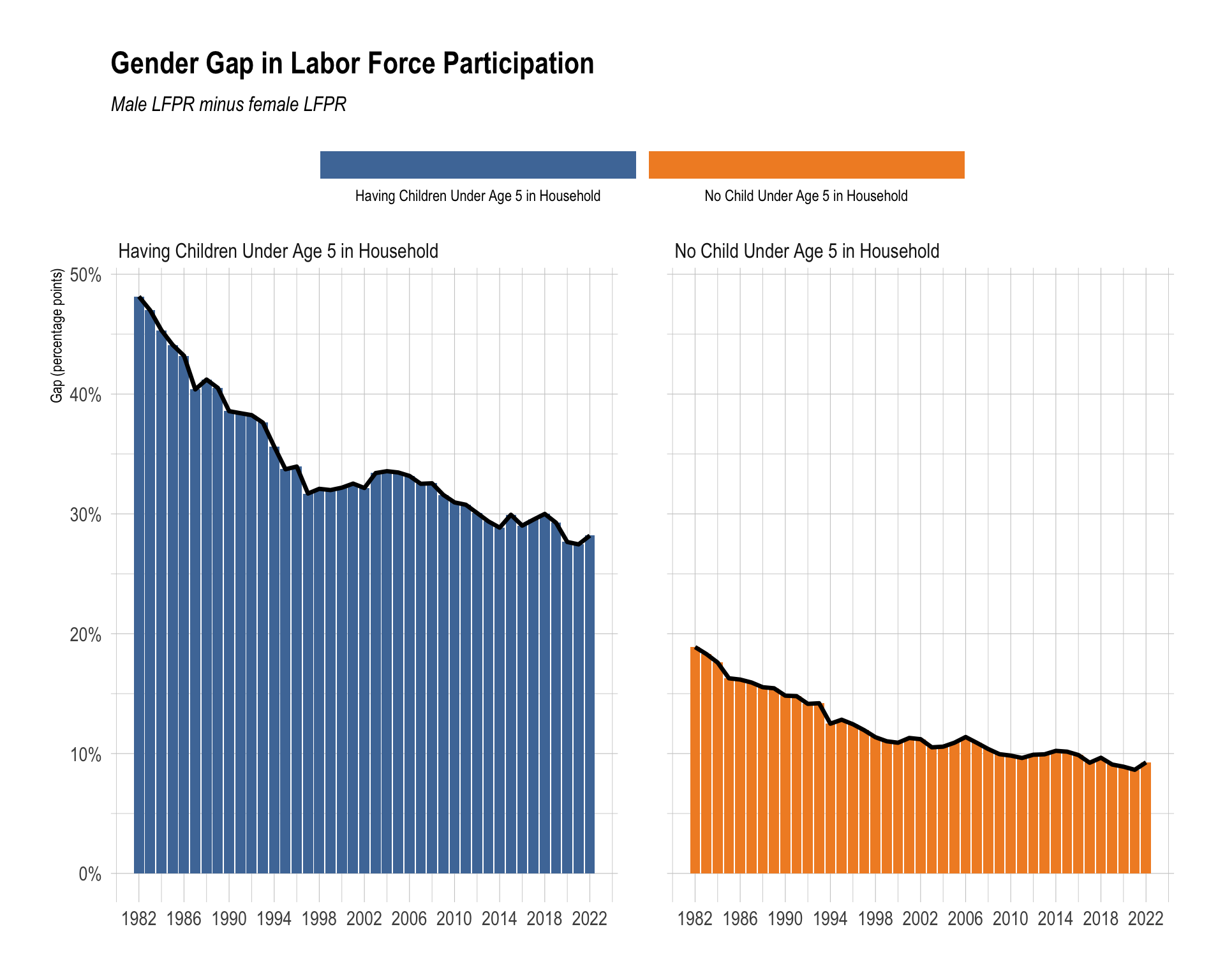
Using the q5 data.frame, recreate the figure below.
The figure shows the yearly trend of gap by child
- Use one of the colorblind-friendly scale functions provided by the R package,
ggthemes. - Use the following labels
p_title <- "Gender Gap in Labor Force Participation"
p_subtitle <- "Male LFPR minus female LFPR"
Target figure:
Complete the code by filling in the blanks.
q5 |>
  ggplot(aes(x = YEAR, y = gap)) +
  ____(1)____(aes(fill = child)) +
  ____(2)____(linewidth = 1.2) +
  facet_wrap(~child) +
  scale_y_continuous(labels = label_percent(accuracy = 1)) +
  scale_x_continuous(breaks = seq(1982, 2022, by = 4)) +
  scale_____(3)_____tableau() +
  labs(
    title = "Gender Gap in Labor Force Participation",
    subtitle = "Male LFPR minus female LFPR",
    x = NULL,
    y = "Gap (percentage points)",
    fill = NULL
  ) +
  guides(
    fill = guide_legend(
      label.position = "bottom",
      keywidth = rel(13)
    )
  ) +
  theme_ipsum() +
  theme(
    ____(4)____ = "top",
    plot.title = element_text(face = "bold"),
    plot.subtitle = element_text(face = "italic")
  )
Show answer
q5 |>
  ggplot(aes(x = YEAR, y = gap)) +
  geom_col(aes(fill = child) ) +
  geom_line(linewidth = 1.2) +
  facet_wrap(~child) +
  scale_y_continuous(labels = label_percent(accuracy = 1)) +
  scale_x_continuous(breaks = seq(1982, 2022, by = 4)) +
  scale_color_tableau() +
  scale_fill_tableau() +
  labs(
    title = "Gender Gap in Labor Force Participation",
    subtitle = "Male LFPR minus female LFPR",
    x = NULL,
    y = "Gap (percentage points)",
    fill = NULL
  ) +
  guides(
    fill = guide_legend(
      label.position = "bottom",
      keywidth = rel(13)
    )
  ) +
  theme_ipsum() +
  theme(
    legend.position = "top",
    plot.title = element_text(face = "bold"),
    plot.subtitle = element_text(face = "italic")
  )
Question 7
Part A: q7 data.frame
Create below data.frame q7 from cps.
Your q7 data.frame should:
- exclude observations with NIU labor force status,
- create
SEXthat has values"Male"and"Female"corresponding to the variable description, - create
share_with_child, defined as the weighted share of people in each year-and-sex group who live in a household with at least one child under age 5.
Complete the code by filling in the blanks.
q7 <- cps |>
  filter(LABFORCE != 0) |>
  mutate(
    SEX = case_when(
      SEX == 1 ~ "Male",
      SEX == 2 ~ "Female"
    ),
    child = if_else(
      ____(1)____,
      "Having Children Under Age 5 in Household",
      "No Child Under Age 5 in Household"
    ),
    has_child_u5 = if_else(____(2)____, 1, 0),
    child_weight = has_child_u5 * ASECWT
  ) |>
  group_by(____(3)____) |>
  summarize(
    share_with_child = sum(____(4)____, na.rm = TRUE) / sum(ASECWT, na.rm = TRUE)
  ) |>
  ungroup()
Show answer
q7 <- cps |>
  filter(LABFORCE != 0) |>
  mutate(
    SEX = case_when(
      SEX == 1 ~ "Male",
      SEX == 2 ~ "Female"
    ),
    child = if_else(
      NCHLT5 > 0,
      "Having Children Under Age 5 in Household",
      "No Child Under Age 5 in Household"
    ),
    has_child_u5 = if_else(NCHLT5 > 0, 1, 0),
    child_weight = has_child_u5 * ASECWT
  ) |>
  group_by(YEAR, SEX) |>
  summarize(
    share_with_child = sum(child_weight, na.rm = TRUE) / sum(ASECWT, na.rm = TRUE)
  ) |>
  ungroup()
Part B: Figure
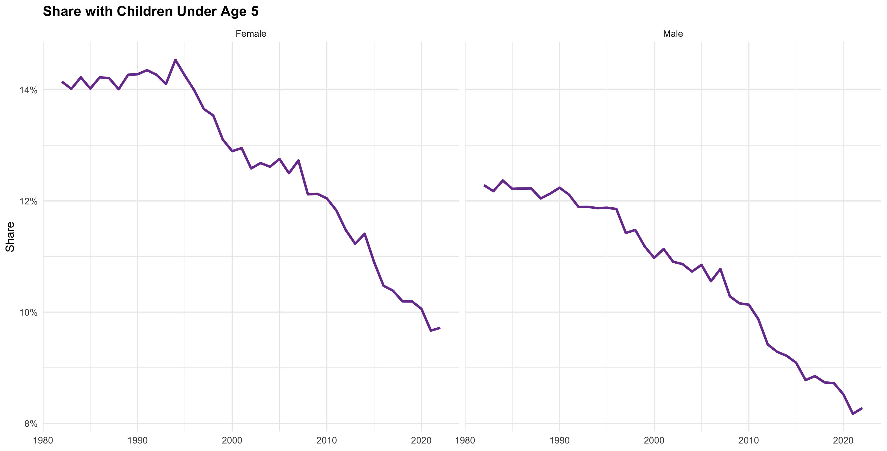
Using the q7 data.frame, recreate the figure below.
The figure shows the yearly share of people with children under age 5 by SEX.
Target figure for q7:
Complete the code by filling in the blanks.
q7 |>
  ggplot(aes(x = ____(1)____, y = ____(2)____)) +
  geom_line(linewidth = 1.2, color = "#7A3E9D") +
  facet_wrap(____(3)____) +
  scale_y_continuous(labels = label_percent(accuracy = 1)) +
  labs(
    title = "Share with Children Under Age 5",
    x = NULL,
    y = "Share"
  ) +
  theme_minimal(base_size = 12) +
  theme(plot.title = element_text(face = "bold"))
Show answer
q7 |>
  ggplot(aes(x = YEAR, y = share_with_child)) +
  geom_line(linewidth = 1.2, color = "#7A3E9D") +
  facet_wrap(~ SEX) +
  scale_y_continuous(labels = label_percent(accuracy = 1)) +
  labs(
    title = "Share with Children Under Age 5",
    x = NULL,
    y = "Share"
  ) +
  theme_minimal(base_size = 12) +
  theme(plot.title = element_text(face = "bold"))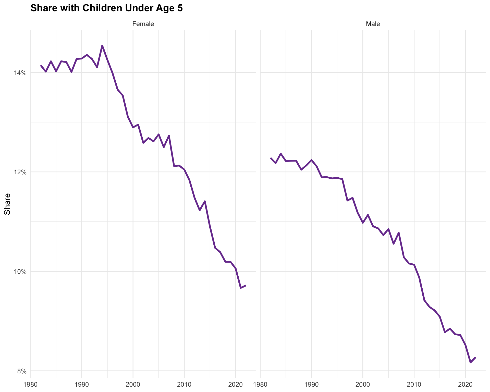
Question 8 (15 points)
Write a short overall interpretation of the five figures shown in Questions 2, 4, 6, and 7.
Your interpretation should discuss patterns related to:
- differences between males and females,
- differences by child status,
- how the gender gap changes over time,
- how the share with children under age 5 changes over time,
- how the distribution of yearly LFPR differs across groups.
A strong answer should not merely describe one figure at a time. Instead, it should synthesize the figures into a coherent story about labor supply in the U.S.
Show answer
The four figures together show a clear long-run change in labor supply patterns in the U.S. from 1982–2022. Across nearly all groups, males have higher labor force participation rates (LFPR) than females, but the gender gap has narrowed substantially over time. The reduction in the gap is especially strong among households with children under age 5, where female LFPR increased steadily while male LFPR remained consistently high. In contrast, among households without young children, female LFPR rose during earlier decades but later leveled off or slightly declined, while male LFPR gradually declined over time.
The figures also show that having young children is strongly associated with labor supply differences. Women with children under age 5 participate in the labor force at lower rates than men with young children, but the increase in female participation over time suggests that mothers have become more attached to the labor market. At the same time, the share of both males and females living with children under age 5 has steadily declined since the 1980s, reflecting broader demographic changes such as lower fertility rates and delayed childbearing.
The gender gap figure reinforces these patterns by showing that the male–female LFPR difference fell dramatically over time, especially for households with young children. However, the gap remains larger for households with children than for those without children, suggesting that caregiving responsibilities still affect women’s labor supply more strongly than men’s.
Finally, the LFPR distribution plots show substantial variation across groups. Male LFPR distributions are concentrated at relatively high participation rates regardless of child status, while female distributions are lower and more spread out. Women with more children tend to have lower and more dispersed LFPR distributions, indicating greater heterogeneity in labor market attachment. Overall, the figures tell a coherent story of declining fertility, rising female labor force participation, and a gradual narrowing—but not elimination—of gender differences in labor supply in the United States.