library(tidyverse)
library(rmarkdown)
library(skimr)
library(ggthemes)
library(socviz)
library(geofacet)Classwork 11
Map Visualization I
Loading R packages
Part 1. Climate Opinion Map
The following data is for Part 1:
climate_opinion_long <- read_csv(
  'https://bcdanl.github.io/data/climate_opinion_2021.csv')
Variable Description
belief:human: Estimated percentage who think that global warming is caused mostly by human activities.happening: Estimated percentage who think that global warming is happening.
Question 1
- Filter
climate_opinion_long, so thatclimate_opinion_longhas only estimated percentage of people who think that global warming is caused mostly by human activities.
Answer:
# WRITE CODE HEREclimate_opinion_long <- climate_opinion_long |>
filter(belief == 'human')Question 2
- Join the two data.frames,
socviz::county_mapand the resulting data.frame in Question 1.
county_map <-
  read_csv("https://bcdanl.github.io/data/socviz_county_map.csv")
Answer:
# WRITE CODE HEREcounty_map <- county_map |>
mutate(id = as.integer(id))
county_full <- county_map |>
left_join(climate_opinion_long)Question 3
qtiles <- quantile(climate_opinion_long$perc,
                   probs = c(0, 0.25, 0.5, 0.75, 1),
                   na.rm = TRUE)

brk <- as.numeric(qtiles)

lab <- paste0(round(qtiles, 1),
              "\n(",
              c("Min", "25th", "50th", "75th", "Max"),
              ")")

p1 <- ggplot(data = county_full) +
  geom_polygon(mapping = aes(x = long, y = lat, group = group,
                             fill = perc),
               color = "grey60",
               linewidth = 0.1)

p2 <- p1 + scale_fill_gradient2(
  low = '#2E74C0',
  high = '#CB454A',
  mid = 'white',
  na.value = "grey80",
  midpoint = quantile(climate_opinion_long$perc, .5, na.rm = T),
  breaks = brk,
  labels = lab,
  guide = guide_colorbar( direction = "horizontal",
                          barwidth = 25,
                          title.vjust = 1 )
)

p <- p2 + labs(fill = "Percent\nBelief", title = "U.S. Climate Opinion, 2021",
               caption = "Sources: Yale Program on Climate Change Communication\n(https://climatecommunication.yale.edu/visualizations-data/ycom-us/)") +
  theme_map() +
  theme(plot.margin = unit( c(1, 1, 3.85, 0.5), "cm"),
        plot.title = element_text(size = rel(2),
                                  hjust = .5),
        plot.caption = element_text(hjust = 1),
        legend.position = c(0.5, -.15),
        legend.justification = c(.5,.5),
        aspect.ratio = .8,
        strip.background = element_rect( colour = "black",
                                         fill = "white",
                                         color = "grey80" )
  ) +
  guides(fill = guide_colourbar(direction = "horizontal",
                                barwidth = 25,
                                title.vjust = 1)
         )
p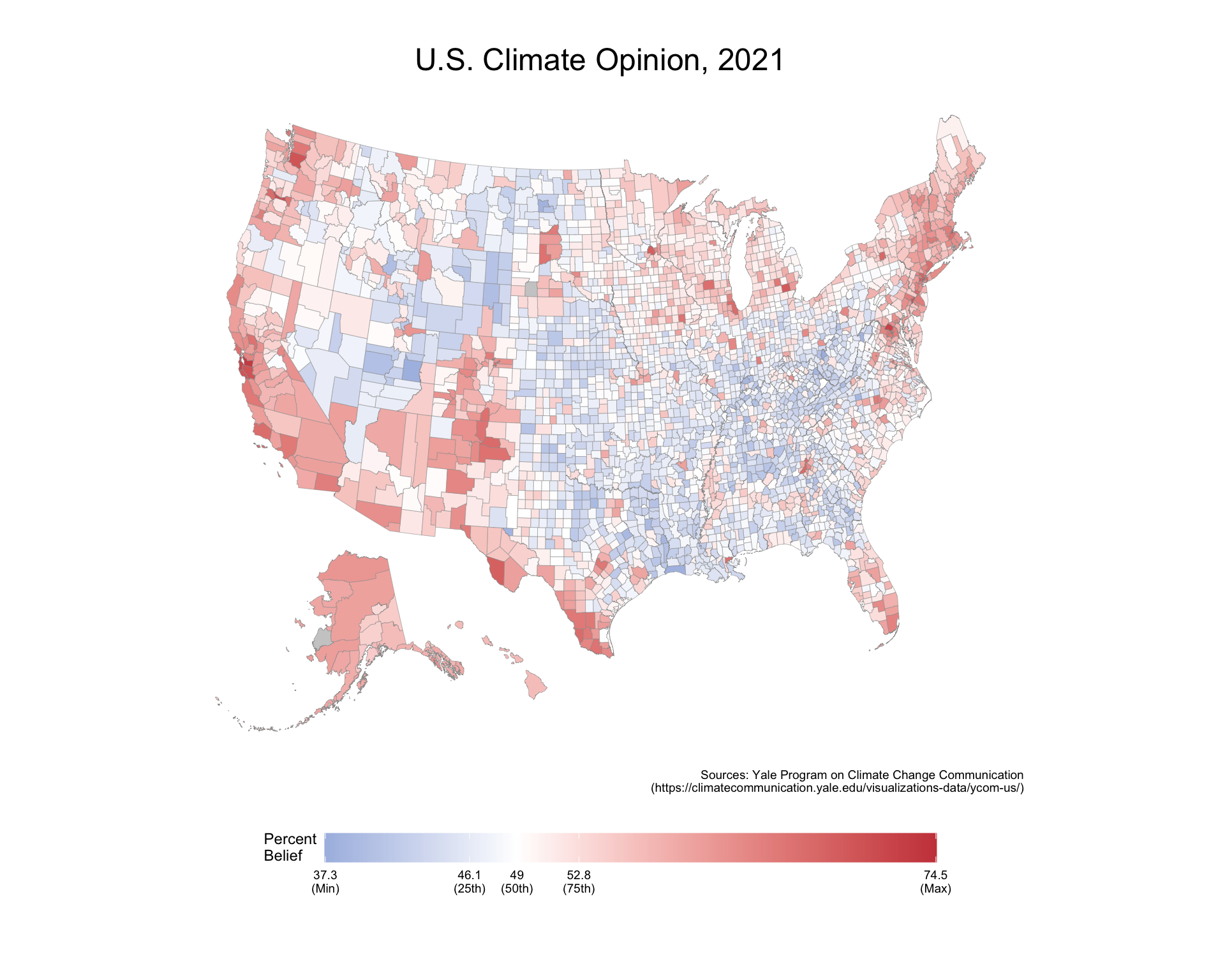
- Replicate the above map.
- Do not use
coord_map(projection = "albers", lat0 = 39, lat1 = 45).
- Do not use
p_caption <- "Sources: Yale Program on Climate Change Communication\n(https://climatecommunication.yale.edu/visualizations-data/ycom-us/)"Answer:
# WRITE CODE HEREPart 2. Pitbull in NYC
The following data set is for Part 2:
nyc_dog_license <- read_csv(
  'https://bcdanl.github.io/data/nyc_dog_license.csv')
nyc_zips_coord <- read_csv(
'https://bcdanl.github.io/data/nyc_zips_coord.csv')nyc_zips_df <- read_csv(
'https://bcdanl.github.io/data/nyc_zips_df.csv')Question 4
nyc_zips_df <- nyc_zips_df |>
  left_join(nyc_zips_coord)

nyc_dogs <- nyc_dog_license |>
  group_by(breed_rc) |>
  summarise(N = n()) |>
  filter(dense_rank(-N)<=5)

nyc_fb <- nyc_dog_license |>
  group_by(zip_code, breed_rc) |>
  count() |>
  group_by(zip_code) |>
  mutate(pct = round((n / sum(n))*100, 2)) |>
  filter(breed_rc %in% c('Pit Bull (or Mix)'))


fb_map <- nyc_zips_df |>
  left_join( nyc_fb )
fb_map |>
ggplot(mapping = aes(x = X, y = Y,
fill = pct,
group = zip_code)) +
annotate("richtext",
x = quantile(fb_map$X, .075, na.rm = T),
y = quantile(fb_map$Y, .60, na.rm = T),
label = "<img src='https://bcdanl.github.io/lec_figs/pitbull.png' width='750'/>",
fill = NA,
color = NA) +
geom_polygon(color = "gray80",
size = 0.1) +
scale_fill_viridis_c(option = "inferno",
breaks = seq(0, 25, 2.5)) +
labs(fill = "Percent of All Licensed Pit Bull",
title = "New York City's Pit Bull",
subtitle = "By Zip Code. Based on Licensing Data") +
theme_map() +
theme(legend.justification = c(.5,.5),
legend.position = 'top',
legend.direction = "horizontal",
plot.title = element_text(hjust = .5,
vjust = .5,
face = 'bold',
size = rel(2.5)),
plot.subtitle = element_text(hjust = .5,
vjust = .5,
size = rel(1.25))) +
coord_map(projection = "albers", lat0 = 39, lat1 = 45) +
guides(fill = guide_legend(title.position = "top",
label.position = "bottom",
keywidth = 2, nrow = 1))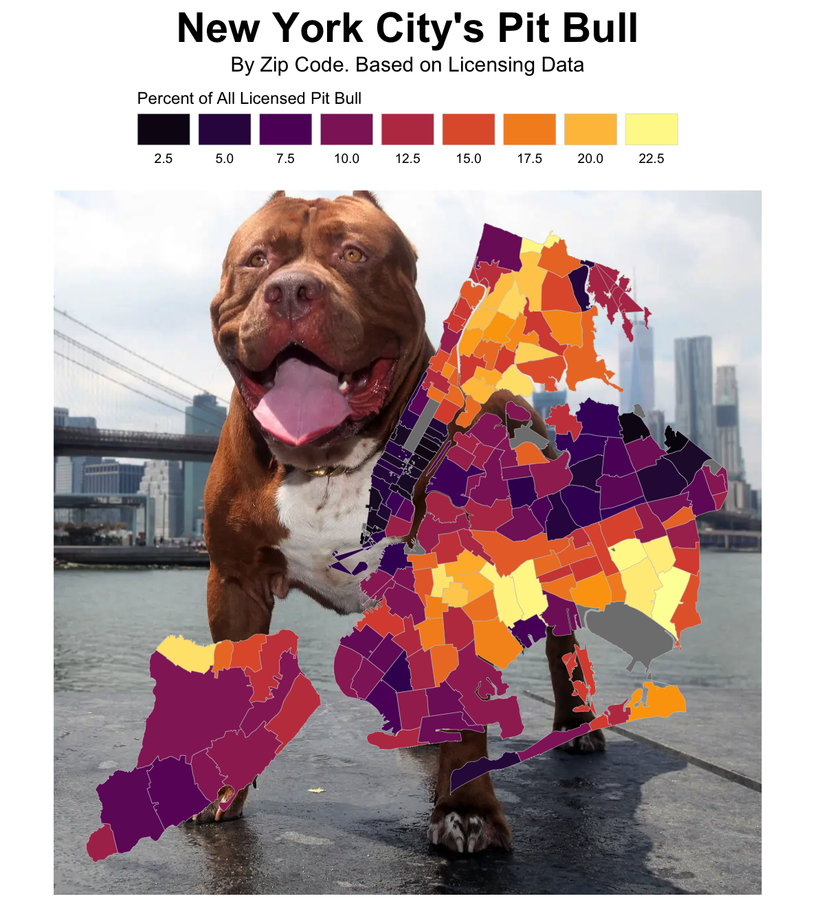
Replicate the above ggplot.
- You should calculate the proportion of
Pit Bull (or Mix)for each zip code. - You should join data.frames properly.
- Choose the color palette from the
viridisscales - Use
coord_map(projection = "albers", lat0 = 39, lat1 = 45). - To insert the image, use the following
annotate():
- You should calculate the proportion of
# install.packages("ggtext")
library(ggtext)

annotate("richtext",
          x =  ,
          y = quantile(DATAFRAME$Y, .60, na.rm = T),
         label = "<img src='https://bcdanl.github.io/lec_figs/pitbull.png' width='750'/>",
         fill = NA,
color = NA) - Note that the size of ggplot figure is 6.18 (width) x 6.84 (height)
```{.r}
#| fig-width: 6.18
#| fig-height: 6.84

# YOUR CODE IS HERE
```
Answer:
# WRITE CODE HEREQuestion 5
q1b <- fb_map |>
  select(zip_code, po_name, borough, pct) |>
  distinct() |>
  slice_max(pct, n = 1)

q1b |>
paged_table()- Write an R code to identify the
zip_codewith the highest proportion ofPit Bull (or Mix), as shown above.
Answer:
# WRITE CODE HEREPart 3. Unemployment Rate Maps with geofacet::facet_geo()
The following data is for Part 3:
unemp_house_prices <- read_csv(
  'https://bcdanl.github.io/data/unemp_house_prices.csv')
Question 6
adjust_labels <- as_labeller(
  function(x) {
    case_when(
      x == "New Hampshire" ~ "N. Hampshire",
      x == "District of Columbia" ~ "DC",
      x == "North Carolina" ~ "N. Carolina",
      x == "South Carolina" ~ "S. Carolina",
      TRUE ~ x
    )
  }
)

unemp_house_prices |>
  filter(
    date >= ymd("2008-01-01")
  ) |>
  ggplot(aes(date, unemploy_perc)) +
  geom_area(fill = "#56B4E9", alpha = 0.7) +
  geom_line() +
  scale_y_continuous(
    name = "unemployment rate",
    limits = c(0, 16),
    breaks = c(0, 5, 10, 15),
    labels = c("0%", "5%", "10%", "15%")
  ) +
  scale_x_date(
    name = NULL,
    breaks = ymd(c("2009-01-01", "2011-01-01",
                   "2013-01-01", "2015-01-01", "2017-01-01")),
    labels = c("'09", "'11", "'13", "'15", "'17")
  ) +
  facet_geo(~state, labeller = adjust_labels) +
  theme(
    strip.text = element_text(
      size = rel(.5),
      hjust = .5,
      margin = margin(3, 3, 3, 3)
    ),
    axis.line.x = element_blank(),
    axis.text.x = element_text(size = rel(.5)),
    axis.text.y = element_text(size = rel(.5))
  )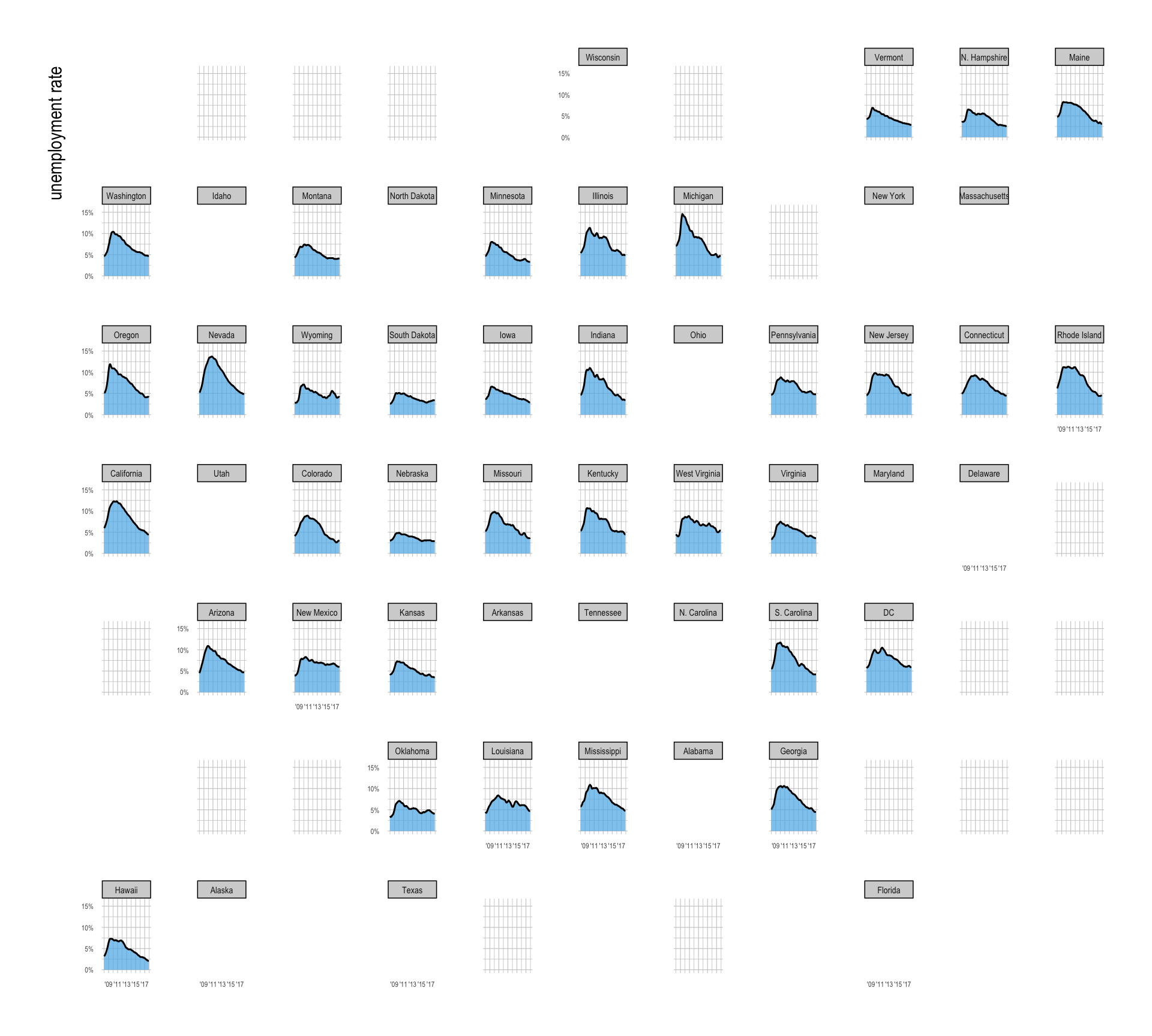
Use geom_area(), geom_line(), and facet_geo(~state, labeller = adjust_labels) to replicate the above figure.
- Since the
datecolumn in theunemp_house_pricesdata.frame is of typeDate, you may need to useymd()to convert a character string like"2008-01-01"into aDatevalue:
unemp_house_prices |>
  filter(
    date >= ymd("2008-01-01")
)scale_x_date(
breaks = ymd(c("2009-01-01", "2011-01-01",
"2013-01-01", "2015-01-01", "2017-01-01"))
)- Use the following
as_labeller()for labeling lengthy state names:
adjust_labels <- as_labeller(
  function(x) {
    case_when(
      x == "New Hampshire" ~ "N. Hampshire",
      x == "District of Columbia" ~ "DC",
      x == "North Carolina" ~ "N. Carolina",
      x == "South Carolina" ~ "S. Carolina",
      TRUE ~ x
    )
  }
)
Answer:
# WRITE CODE HEREDiscussion
Welcome to our Classwork 11 Discussion Board! 👋
This space is designed for you to engage with your classmates about the material covered in Classwork 11.
Whether you are looking to delve deeper into the content, share insights, or have questions about the content, this is the perfect place for you.
If you have any specific questions for Byeong-Hak (@bcdanl) regarding the Classwork 11 materials or need clarification on any points, don’t hesitate to ask here.
All comments will be stored here.
Let’s collaborate and learn from each other!