Lecture 18
Data Visualization with seaborn
April 25, 2025
Exploratory Data Analysis
Exploratory Data Analysis (EDA)
- EDA combines descriptive statistics, data transformation, and data visualization to help you:
- Generate meaningful questions about your data
- Explore answers through visualizations, transformations, and descriptive statistics
- Refine your understanding by iterating on your questions and exploring new ones
- While descriptive statistics and data transformations are useful for exploring data, visualizations often reveal patterns in data more clearly.
Data Visualization
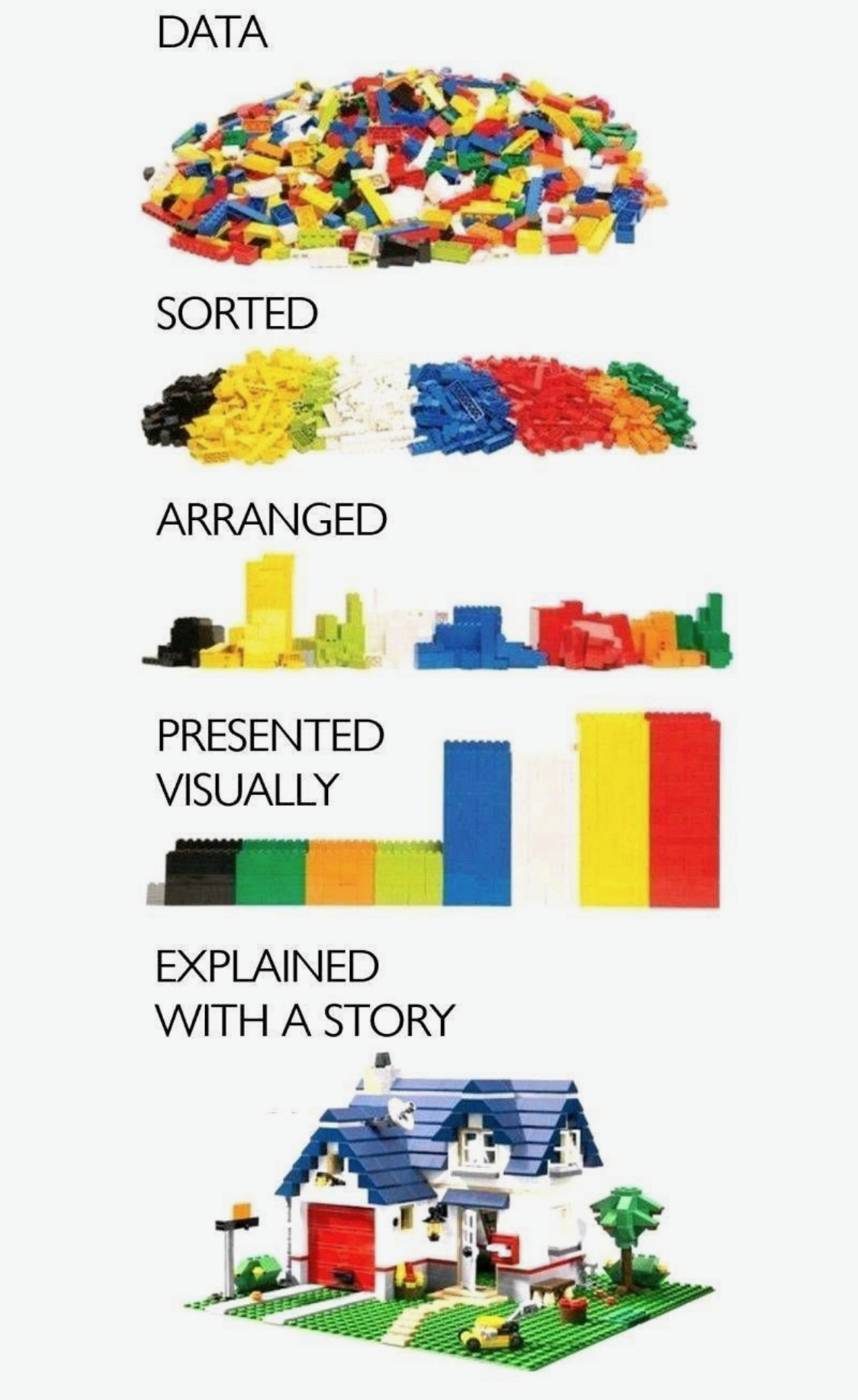
Graphs and charts let us explore and learn about the structure of the information we have in
DataFrame.Good data visualizations make it easier to communicate our ideas and findings to other people.
Key Points in Data Visualization
A graphic should display as much information as it can, with the lowest possible cognitive strain to the viewer.
Strive for clarity.
- Make the data stand out.
- Avoid too many superimposed elements (e.g., too many curves in the same graphing space).
- Avoid having the data all skewed to one side or the other of your graph.
- Make the data stand out.
Visualization is an iterative process.
- We should try making data visualization informative as much as we can.
Categorical vs. Continuous Variables
- A categorical variable is a variable whose value is obtained by counting.
- Number of red marbles in a jar
- Number of heads when flipping three coins
- Students’ letter grade
- US state/county
- Categorical variables should be
categoryorstring(objectinDataFrame).
- A continuous variable is a variable whose value is obtained by measuring and can have a decimal or fractional value.
- Height/weight of students
- Time it takes to get to school
- Fuel efficiency of a vehicle (e.g., miles per gallon)
- Continuous variables should be
float.- We can use
astype('float')to make a variablefloat.
- We can use
For data visualization,
integer-type variables could be treated as either categorical or continuous, depending on the context of analysis.If the values of an integer-type variable means an intensity or an order, the integer variable could be treated as continuous.
- A variable of age integers (18, 19, 20, 21, …) could be continuous.
- A variable of integer-valued MPG (27, 28, 29, 30, …) could be continuous.
Otherwise, the integer variable is categorical.
- A variable of month integers (1, ,2, …, 12) is categorical.
We can use
astype('int')to make a variableint.
Making Discoveries from Visualization
- From the distribution plots, we want to see the variation, the tendency of the values of a variable to change.
- Which values are the most common? Why?
- How normal is the data? How many peaks are there in the distribution?
- Which values are rare?
From the plots with two or more variables, we want to see co-variation, the tendency for the values of two or more variables to vary together in a related way.
What type of co-variation occurs between variables?
- Are they positively associated?
- Are they negatively associated?
- Are there no association between them?
- From time-series plots, we want to see the evolution of a variable over time.
- Is there an overall upward or downward trend?
- Does the trend look linear or non-linear?
- Are there seasonal or cyclical patterns (e.g., yearly, weekly)?
- Do we observe any outliers, shocks, or structural breaks that merit closer inspection?
- Is there an overall upward or downward trend?
A distribution of a variable
- Categorical (e.g., bar charts and more)
- Continuous (e.g., histograms, box plots, and more)
A relationship between two continuous variables (e.g., scatter plots, best fitting lines)
A time trend of a variable (e.g., line plots, best fitting lines and more)
Exploring how distributions, relationships, and time trends vary across categories can reveal important patterns and insights.
Please check out general tips on data visualization in the project page.
Getting started with seaborn
Getting started with seaborn
![]()
seabornis a Python data visualization library based onmatplotlib.- It allows us to easily create beautiful but complex graphics using a simple interface.
Data Visualization Workflow with seaborn
Read the descriptions of variables in a
DataFrameif available.Check the unit of an observation: Are all values in one single observation measured for:
- One organization (e.g., university, company)?
- One geographic unit (e.g., zip code, county, state, country)?
- One person?
- One person in a specific point of time (e.g., year, month, week)?
- One geographic unit in a specific point of time?
- One organization in a specific point of time?
- Prepare a DataFrame for visualization.
- Adding new variables
- Filtering observations
- Making
DataFramelonger/wider - Group operations
- Figure out whether variables of interests are categorical or continuous.
- Check what types of the variables are (e.g.,
float,int,datetime64,object,category). - Use
astype(DTYPE)if needed.
- Check what types of the variables are (e.g.,
- Choose appropriate
- Geometric objects (e.g.,
sns.histplot,sns.scatterplot) - Aesthetic mappings (
(x = , y = , hue = )) - Faceting (
FacetGrid(DATA, row = , col = ).map(GEOMETRIC_OBJECT, VARIABLES)orcol/rowparameters in the function of geometric object)
- Geometric objects (e.g.,
Pay attention to the unit of
xandyaxes.Repeat the process until you are satisfied with the visualization output.
Datasets and Plot Styles in seaborn
- Let’s get the names of
DataFrames provided by theseabornlibrary:
- Matplotlib provides plot styles:
- Let’s use the
titanicandtipsDataFrames:
Bar Chart with sns.countplot()
- Mapping
data: DataFrame.x: Name of a categorical variable (column) in DataFrame
- A bar chart is used to plot the frequency of the different categories.
- It is useful to visualize how values of a categorical variable are distributed.
- A variable is categorical if it can only take one of a small set of values.
- We use
sns.countplot()function to plot a bar chart
- Mapping
hue: Name of a categorical variable
We can further break up the bars in the bar chart based on another categorical variable.
- This is useful to visualize how the distribution of a categorical variable varies by another categorical variable.
Histogram with sns.histplot()
- Mapping
bins: Number of binsbinwidth: Width of each bin
- A histogram is a continuous version of a bar chart.
- It is used to plot the frequency of the different values.
- It is useful to visualize how values of a continuous variable are distributed.
- We use
sns.histplot()function to plot a histogram - Use either
binsorbinwidth.- The shape of a histogram is sensitive to
bins/binwidth - We should experiment on
bins/binwidth.
- The shape of a histogram is sensitive to
Boxplot with sns.boxplot()
- A boxplot computes a summary of the distribution and then display a specially formatted box.
- It is useful to visualize how values of a continuous variable are distributed across different values of a categorical variable.
- We use
sns.boxplot()function to plot a boxplot.
Scatter plot with sns.scatterplot() and sns.lmplot()
- Mapping
x: Name of a continuous variable on the horizontal axisy: Name of a continuous variable on the vertical axis
A scatter plot is used to display the relationship between two continuous variables.
- We can see co-variation as a pattern in the scattered points.
We use
sns.scatterplot()function to plot a scatter plot.
To the scatter plot, we can add a
hue-VARIABLEmapping to display how the relationship between two continuous variables varies byVARIABLE.Suppose we are interested in the following question:
- Q. Does a smoker and a non-smoker have a difference in tipping behavior?
- From the scatter plot, it is often difficult to clearly see the relationship between two continuous variables.
sns.lmplot()adds a line that fits well into the scattered points.- The best fitting line describes the overall relationship between two continuous variables.
- In a scatter plot, adding transparency with
alphahelps address many data points on the same location.- We can map
alphato number between 0 and 1.alpha = 0: Full transparencyalpha = 1: No transparency
- We can map
To the scatter plot, we can add a
hue-VARIABLEmapping to display how the relationship between two continuous variables varies byVARIABLE.Using the fitted lines, let’s answer the following question:
- Q. Does a smoker and a non-smoker have a difference in tipping behavior?
Line cahrt with sns.lineplot()
- Mapping
x: Name of a continuous variable (often time variable) on the horizontal axisy: Name of a continuous variable on the vertical axis
- A line chart is used to display the trend in a continuous variable or the change in a continuous variable over a categorical variable.
sns.lineplot()draws a line by connecting the scattered points in order of the variable on the x-axis, so that it highlights exactly when changes occur.
# New data
healthexp = (
  sns.load_dataset("healthexp")
  .sort_values(["Country", "Year"])
  .query("Year <= 2020")
  )

sns.lineplot(data = healthexp,
             x =  'Year',
             y =  'Life_Expectancy',
hue = 'Country')- For line charts, we often need to group or connect observations to visualize the number of distinct lines.
Faceting
- Faceting allows us to plot subsets (facets) of our data across subplots.
- We create a
.FacetGrid()object with the data we will be using and define how it will be subset with therowandcolarguments: - We then use the
.map()method to run a plotting function on each of the subsets, passing along any necessary arguments.
Visualizing DataFrames with seaborn
Let’s do Classwork 12!