Lecture 28
Bar Chart ggplot()
November 11, 2024
Distribution ggplot() - Bar Chart
Bar Chart with geom_bar()
Bar charts are used to visualize the distribution of a categorical variable.
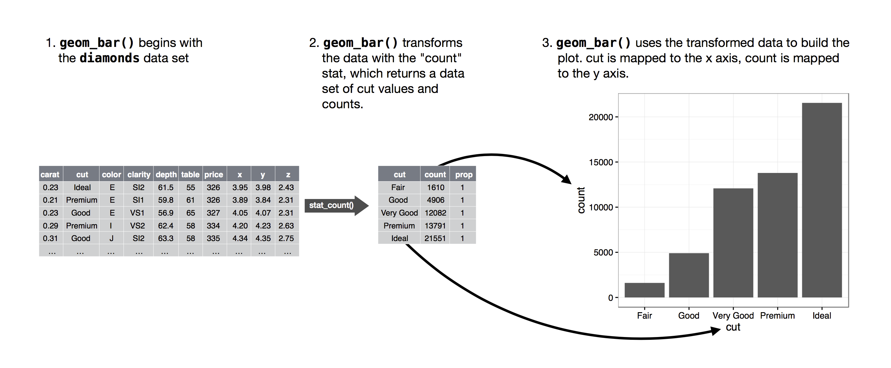
geom_bar()divides data into bins and count the number of observations in each bin.

Bar Chart with geom_bar()
Diamond Dataset
Bar Chart with geom_bar()
geom_bar()creates a bar chart.- We map either the
xoryaesthetic to the variable.
- We map either the
Bar Chart with geom_bar()
Horizontal Bar Chart
- Bar charts can be horizontal or vertical.
- A horizontal bar chart is a good option for long category names.
Bar Chart with geom_bar()
Counting Occurrences of Each Category in a Categorical Variable
- The figure below demonstrates how the counting process works with
geom_bar().

count(): Counting Occurrences of Each Category in a Categorical Variable
- The data transformation function
count()is a quick and efficient way to calculate the frequency of each unique value in a categorical variable.
diamonds |> count(cut)returns the data.frame with the two variables,cutandn:n: the number of occurrences of each unique value in thecutvariable in thediamondsdata.frame
Bar Chart with geom_bar()
Colorful Bar Chart with the fill Aesthetic
- We can color a bar chart using the
fillaesthetic.
count(): Counting Occurrences Across Two Categorical Variables
- The data transformation function
count()calculates the frequency of each unique combination of values across two categorical variables.
diamonds |> count(cut, clarity)returns the data.frame with the three variables,cut,clarity, andn:n: the number of occurrences of each unique combination of values incutandclarity
Bar Chart with geom_bar()
Stacked Bar Charts with the fill Aesthetic

- This describes how the distribution of
clarityvaries bycut, with total bar height for overall count and segments for eachclaritylevel.
Bar Chart with geom_bar()
100% Stacked Bar Charts with the fill Aesthetic & the position="fill"

- This describes how the distribution of
clarityvaries bycut, displaying the proportion of eachclaritywithin eachcut.
Bar Chart with geom_bar()
Clustered Bar Charts with the fill Aesthetic & the position="dodge"
- This shows how the distribution of
clarityvaries bycut, with separate bars for eachclaritylevel within eachcutcategory.
Stacked vs. 100% Stacked vs. Clustered
Choosing the Right Bar Chart for Comparing Components and Totals


Which type of bar chart is most effective for your data?
Which type of bar chart best meets your visualization goals?
Choosing the Right Bar Chart
Stacked Bar Chart
- Best for showing the breakdown of subcomponents within a category alongside the overall total.
- Useful when your primary focus is on the total bar height while also showing subcomponent contributions.
- Tip: Be cautious using stacked bars if the goal is to make precise comparisons between subcomponents across different bars, as they don’t all start from the same baseline.

- If you need to emphasize total values along with component contributions, use a Stacked Bar Chart
Choosing the Right Bar Chart
100% Stacked Bar Chart
- Shows the proportion of subcomponents within each category as a percentage of the total, normalizing all bars to the same height.
- Allows for easier comparison between categories for subcomponent proportions, as each segment starts from a consistent baseline.
- Ideal Use: When you want to compare relative percentages rather than absolute totals.

- For comparing relative proportions between categories, a 100% Stacked Bar Chart is ideal.
Choosing the Right Bar Chart
Clustered Bar Chart
- Plots each subcomponent as a separate bar, grouped by category, allowing for precise comparisons of each component across categories.
- Ideal Use: When your main goal is to compare individual subcomponents side by side rather than focusing on an overall total or relative percentage.

- When directly comparing individual subcomponents across categories, opt for a Clustered Bar Chart.
Bar Chart with geom_bar()
Stacked Bar Charts using the fill Aesthetic and the position = "stack"
- The default
positionoption isposition = "stack"
Proportion Bar Chart with geom_bar()
after_stat(prop): Calculates the proportion of the total count.group = 1: Ensures the proportions are calculated over the entire data.frame, not within each group ofcut
Bar Chart with geom_col()
geom_col()creates bar charts where the height of bars directly represents values in acolumn in a given data.frame.geom_col()requires bothx- andy- aesthetics.
Bar Chart with geom_col()
Sorted Bar Chart with fct_reorder(CATEGORICAL, NUMERICAL)

fct_reorder(CATEGORICAL, NUMERICAL): Reorders the categories of the CATEGORICAL by the median of the NUMERICAL.
Pie Charts: Alternative to Bar Charts?


- Pie charts show the proportions of a whole.
- Each slice represents a part of the total.
- Is a pie chart a proper alternative to a bar chart?
Pie Charts: Alternative to Bar Charts?
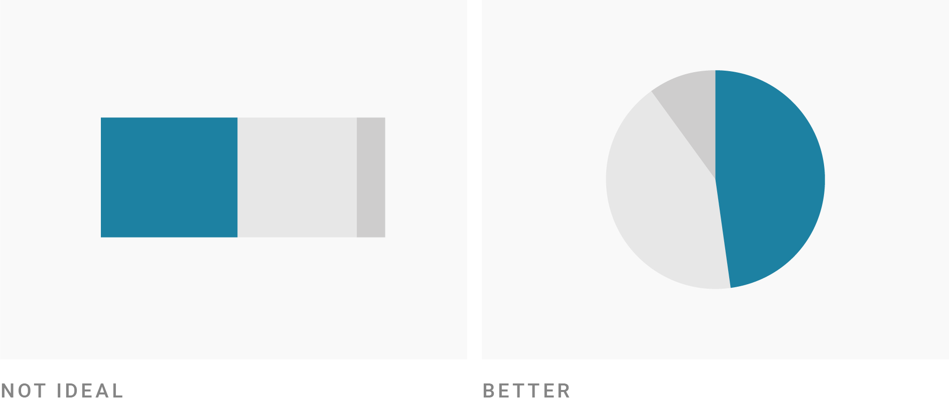
- Humans are better at judging lengths than angles.
- Occasionally, using a pie chart can be a good idea.
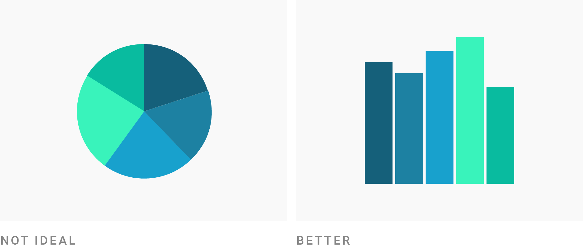
Pie charts work well only if you only have a few categories—four max.
Pie charts work well if the goal is to emphasize simple fractions (e.g., 25%, 50%, or 75%).

Pie Charts: Alternative to Bar Charts?
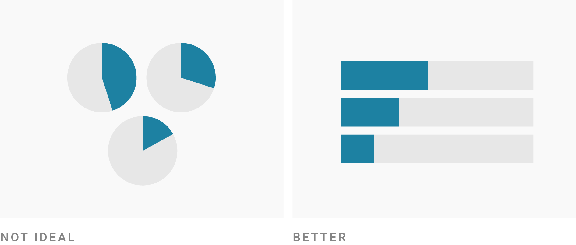
- Pie charts are not the best choice if you want audiences to compare the size of shares.

- Pie charts are not the best choice if you want audiences to compare the distribution across categories.

Distribution of an Integer Variable
For data visualization,
integer-type variables could be treated as either categorical (discrete) or numeric (continuous), depending on the context of analysis.If the values of an integer-type variable means an intensity or an order, the integer variable could be numeric.
- A variable of age integers (18, 19, 20, 21, …) could be numeric.
- A variable of integer-valued MPG (27, 28, 29, 30, …) could be numeric.
If not, the integer variable is categorical.
- A variable of month integers (1, ,2, …, 12) could be categorical.
Distribution of an Integer Variable
Bar Chart for the Age variable

Histogram for the Age variable

- In ggplot, the distribution of an integer variable can appear quite similar when using
geom_bar()andgeom_histogram().- In Python or others, they can be quite different, as shown above.


