Lecture 27
Histogram ggplot(); Boxplot ggplot()
November 8, 2024
Distribution ggplot() - Histogram
Histogram with geom_histogram()
Histograms are used to visualize the distribution of a numeric variable.
Histograms divide data into bins and count the number of observations in each bin.

Histogram with geom_histogram()
Titanic Dataset
Histogram with geom_histogram()

geom_histogram()creates a histogram.- We map the
xaesthetic to the variable.
- We map the
Histogram with geom_histogram() with bins
bins: Specifies the number of bins- The shape of a histogram can be sensitive to the number of bins!
Histogram with geom_histogram() with binwidth
binwidth: Specifies the width of each bin- We choose either the
binsoption or thebinwidthoption.
Histogram with geom_histogram()
Customizing the Aesthetics

fill: Fills the bars with a specific color.color: Adds an outline of a specific color to the bars.
Distribution ggplot() - Boxplot
Boxplot with geom_boxplot()

- Boxplots can be used to visualize how the distribution of a numeric variable varies by a categorical variable.
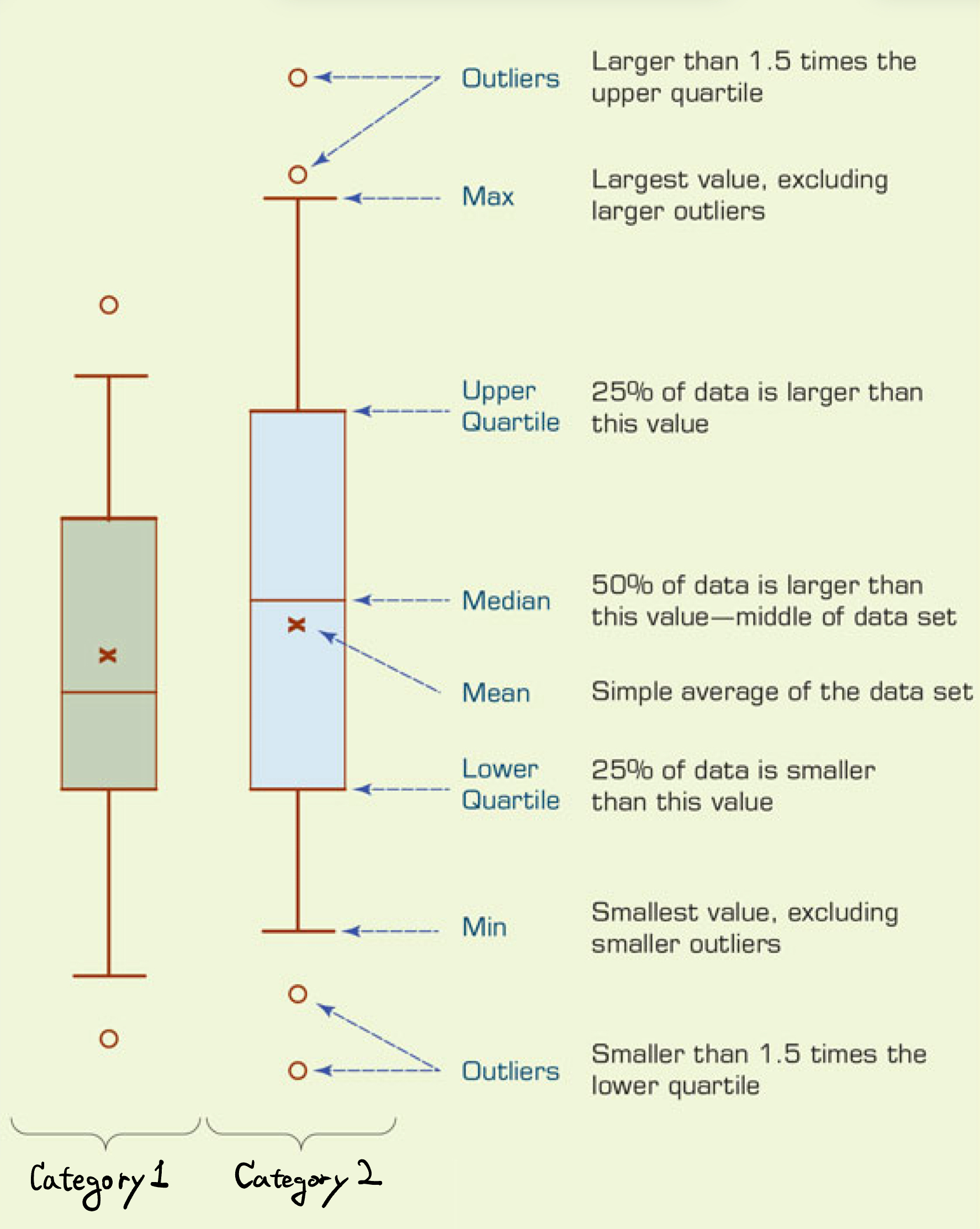
- Boxplots display the median, quartiles, and potential outliers in the data.
Boxplot with geom_boxplot()
geom_boxplot()creates a boxplot;- Mappings: one numeric variable and one categorical variable to the
xandyaesthetics
- Mappings: one numeric variable and one categorical variable to the
Boxplot with geom_boxplot()
Horizontal Boxplots
- Boxplots can be horizontal or vertical.
- A horizontal boxplot is a good option for long category names.
Boxplot with geom_boxplot()
Customizing the Aesthetics
# 1. `show.legend = FALSE` turns off
#     the legend information
# 2. `scale_fill_colorblind()` or
#    `scale_fill_tableau()`
#     applies a color-blind friendly
#     palette to the `fill` aesthetic
# To use the scale_fill_tableau():
library(ggthemes)
ggplot(data = mpg,
       mapping =
         aes(x = hwy,
             y = class,
             fill = class)) +
  geom_boxplot(
    show.legend = FALSE) +
scale_fill_tableau() 
fill: Maps a variable to the fill color of the boxes.scale_fill_tableau(): A color-blind friendly palette to thefillaesthetic.
Boxplot with geom_boxplot()
Sorted Boxplot with fct_reorder(CATEGORICAL, NUMERICAL)

fct_reorder(CATEGORICAL, NUMERICAL): Reorders the categories of the CATEGORICAL by the median of the NUMERICAL.


