Lecture 9
Data Visualization
November 3, 2025
Data Storytelling
→
📊💡 Data-Driven Insights
- Data storytelling bridges the gap between data and insight by integrating descriptive statistics, data transformation, visualization, and narration within the appropriate audience context to communicate findings effectively and support data-informed decision-making.
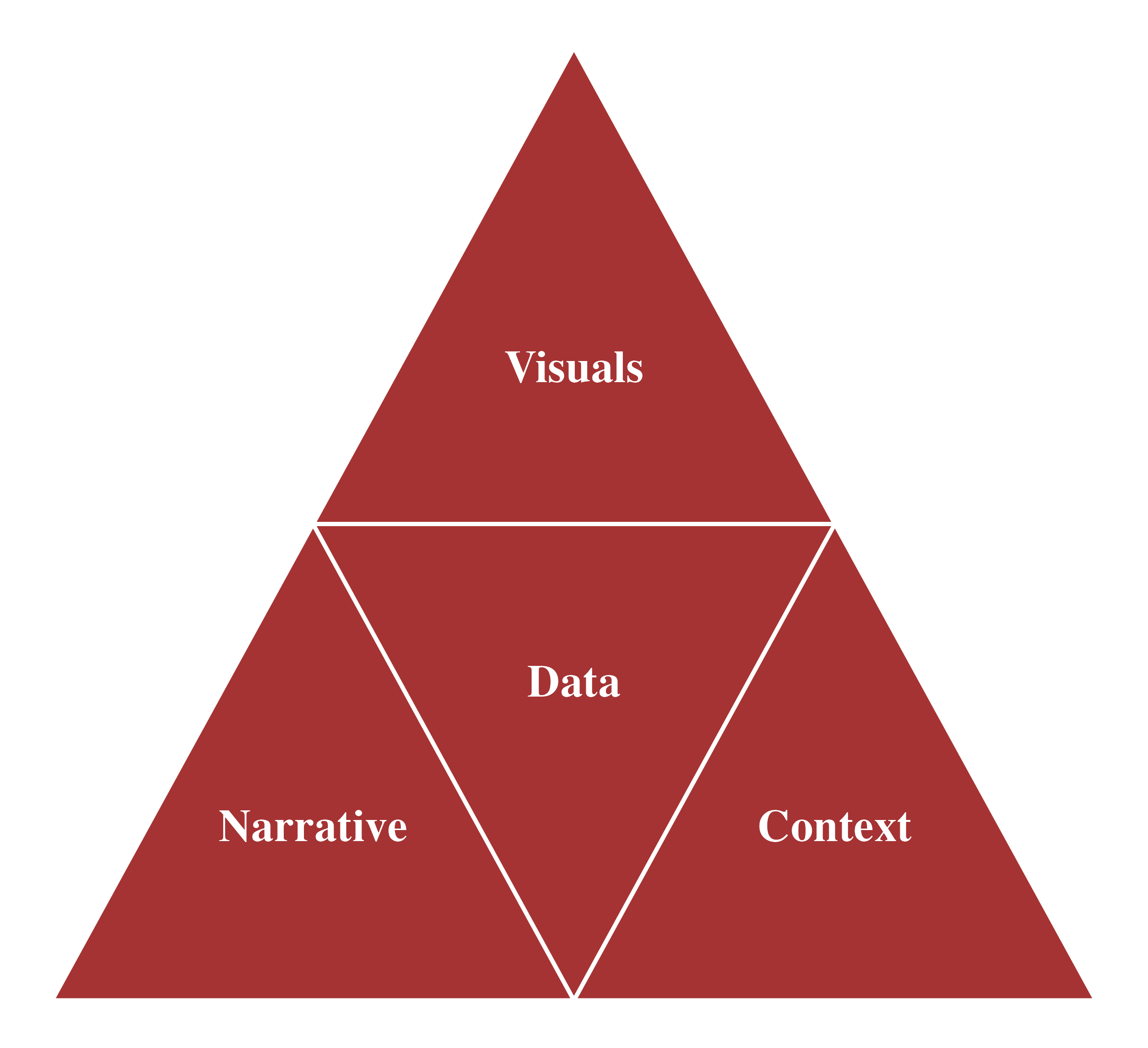
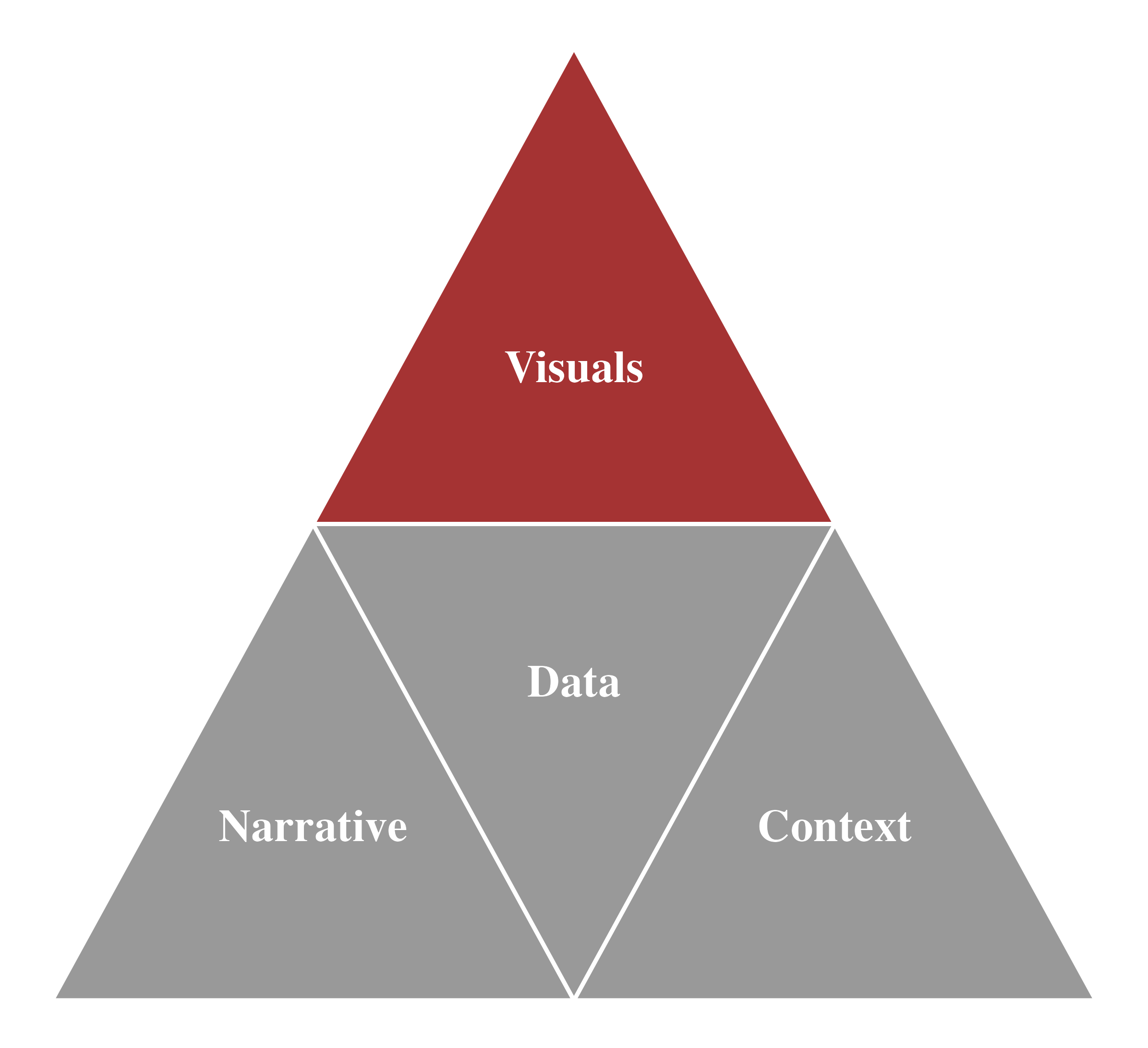
Data Storytelling - Visualization
Data Visualization: Convert data into meaningful graphics for better understanding of data.
There are many different graphs and other types of visual displays of information.
We will visualize:
- The distribution of a categorical variable
- The distribution of a numeric variable
- The relationship between two numeric variables
- The time trend of a numeric variable
Bar Chart

Horizontal Bar Chart

Stacked Bar Chart

100% Stacked Bar Chart

Clustered Bar Chart

Histogram

Histogram

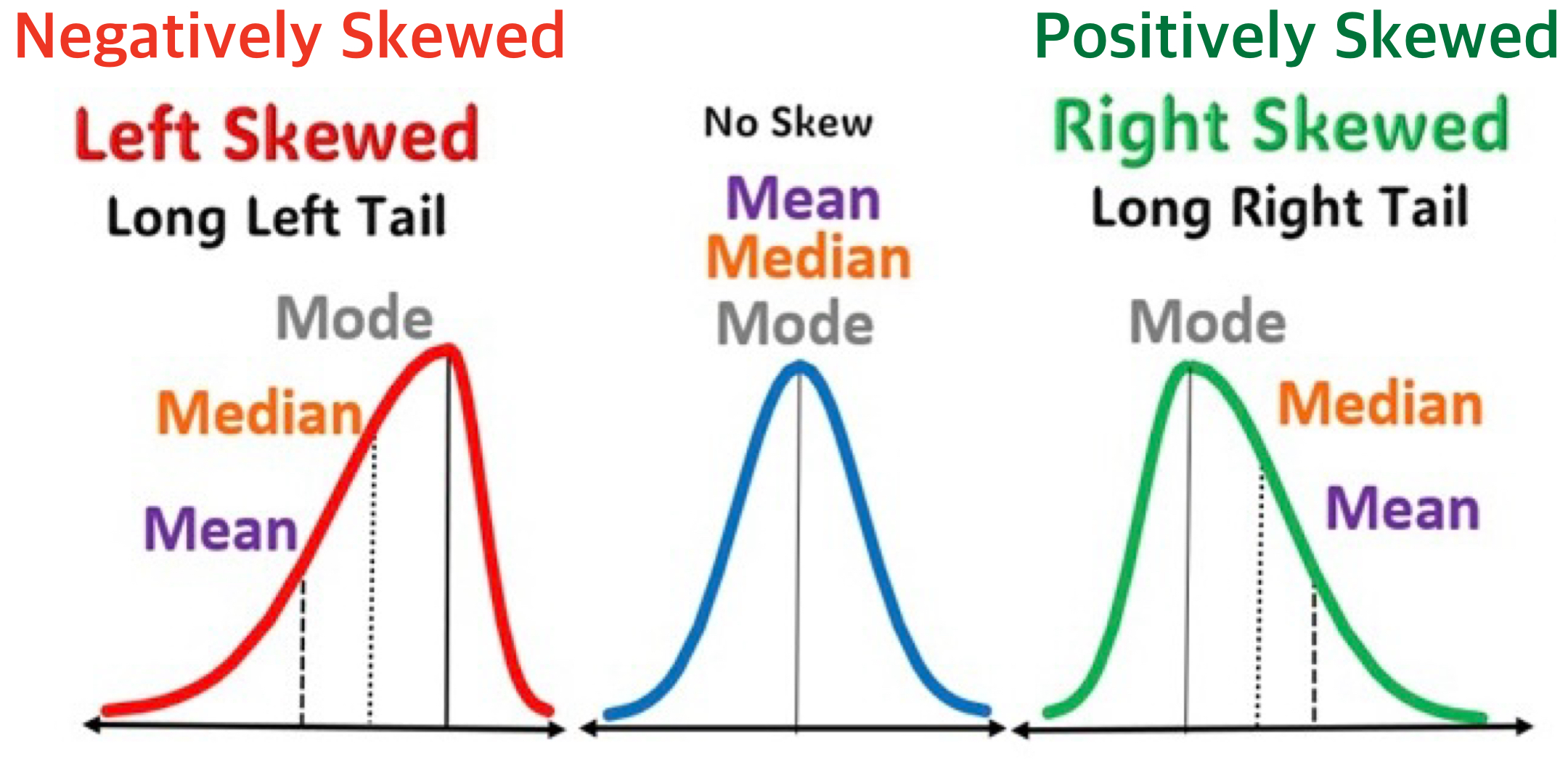
⚖️ Skewness
- In a distribution, skewness describes the asymmetry of a distribution.
- It shows whether the data are stretched more to the left or right of the center.
🏔️ Modality
- How many peaks does the distribution have?
- Is it unimodal (one peak) or bimodal (two peaks)?
- Or perhaps uniform or multimodal?
- Is it unimodal (one peak) or bimodal (two peaks)?

Boxplot

Scatterplot

Scatterplot with Fitted Line

Scatterplot with Fitted Line

Scatterplot with Fitted Line

Scatterplot with Fitted Line

Correlation Does Not Imply Causation
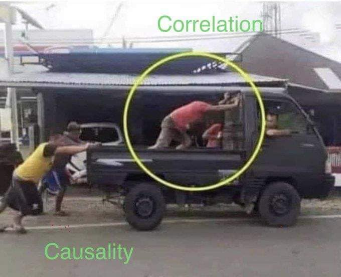
- Just because you uncover a relationship doesn’t mean you’ve identified the “causal” relationship.
Line Chart

Line Chart with Fitted Curve
