Lecture 8
Logistic Regression
March 10, 2025
Logistic Regression
Motivation
- Relationship: Suppose we want to know how much the flight’s origin/destination, weather, and air carrier is associated with the probability that a flight will be delayed.
- Prediction: Suppose we also want to predict whether or not a flight will be delayed, based on facts like the flight’s origin/destination, weather, and air carrier.
- For every flight \(\texttt{i}\), you want to predict \(\texttt{flight_delayed[i]}\), a binary variable ( \(\texttt{TRUE}\) or \(\texttt{FALSE}\)), based on \(\texttt{origin[i]}\), \(\texttt{destination[i]}\), \(\texttt{weather[i]}\), and \(\texttt{air_carrier[i]}\).
- Prediction of a binary variable \(y_{i}\) (0 or 1) is the expected value of \(y_{i}\)—the predicted probability that \(y_{i} = 1\).
Motivation
- The logistic regression model for the probability that a flight will be delayed is formulated as: \[ \begin{align} &\quad\texttt{ Prob( flight_delayed[i] == TRUE ) } \\[.5em] &=\, \texttt{G( b$_{\texttt{0}}$ + b$_{\texttt{origin}}$*origin[i] }\\ &\qquad\quad\,\, + \texttt{b$_{\texttt{destination}}$*destination[i] }\\ &\qquad\quad\,\, + \texttt{b$_{\texttt{weather}}$*weather[i] }\\ &\qquad\quad\,\, + \texttt{b$_{\texttt{air_carrier}}$*air_carrier[i] )}. \end{align} \]
- \(G(z_i)\): the logistic function
\[ \begin{align} \texttt{G(z[i]) = } \dfrac{\texttt{exp(z[i])}}{\texttt{1 + exp(z[i])}}.\notag \end{align} \]
Properties of the Logistic Function
The logistic function \(G(z_i)\) maps the linear combination of predictors to the probability that the outcome \(y_{i}\) is \(1\).
\(z_{i} = b_{0} + b_{1}x_{1, i} + b_{2}x_{2, i} + \,\cdots\, + x_{k, i}\)
\(z_{i} \overset{G}{\rightarrow} \texttt{ Prob} ( y_{i} = 1 )\)
Properties of the Logistic Function

- The logistic function \(G(z_i)\) \[ \begin{align} G(z_i) = \frac{\exp(z_i)}{1 + \exp(z_i)} \end{align} \] ranges between 0 and 1 for any value of \(z_i\)
What is the Logistic Regression doing?
- The logistic regression finds the beta coefficients, \(b_0\), \(b_1\), \(b_2\), \(\cdots\), \(b_{k}\) such that the logistic function \[ G(b_0 + b_{1}x_{1,i} + b_{2}x_{2,i} + \,\cdots\, + b_{k}x_{k,i}) \] is the best possible estimate of the binary outcome \(y_{i}\).
What is the Logistic Regression doing?
The function \(G(z_i)\) is called the logistic function because the function \(G(z_i)\) is the inverse function of a logit (or a log-odd) of the probability that the outcome \(y_{i}\) is 1. \[ \begin{align} G^{-1}(z_i) &\,\equiv\, \text{logit} (\text{Prob}(y_{i} = 1))\\ &\,\equiv \log\left(\, \frac{\text{Prob}(y_{i} = 1)}{\text{Prob}(y_{i} = 0)} \,\right)\\ &\,=\, b_0 + b_{1}x_{1,i} + b_{2}x_{2,i} + \,\cdots\, + b_{k}x_{k,i} \end{align} \]
Logistic regression is a linear regression model for log odds.
What is the Logistic Regression doing?
- Logistic regression can be expressed as linear regression of log odds of \(y_{i} = 1\) on predictors \(x_1, x_2, \cdots, x_k\):
\[ \begin{align} \text{Prob}(y_{i} = 1) &\,=\, G( b_0 + b_{1}x_{1,i} + b_{2}x_{2,i} + \,\cdots\, + b_{k}x_{k,i} )\\ \text{ }\\ \Leftrightarrow\qquad \log\left(\dfrac{\text{Prob}( y_i = 1 )}{\text{Prob}( y_i = 0 )}\right) &\,=\, b_0 + b_{1}x_{1,i} + b_{2}x_{2,i} + \,\cdots\, + b_{k}x_{k,i} \end{align} \]
Assessing Newborn Babies at Risk
- Newborn babies are assessed at one and five minutes after birth using what’s called the Apgar test, which is designed to determine if a baby needs immediate emergency care or extra medical attention.
- A baby who scores below 7 (on a scale from 0 to 10) on the Apgar scale needs extra attention.
- Such at-risk babies are rare, so the hospital doesn’t want to provision extra emergency equipment for every delivery.
- On the other hand, at-risk babies may need attention quickly, so provisioning resources proactively to appropriate deliveries can save lives.
Assessing Newborn Babies at Risk
- We’ll use a sample dataset from the 2010 CDC natality public-use data file.
- The data set records information about all US births, including facts about the mother and father, and about the delivery.
- The sample has just over 26,000 births in a DataFrame.
Assessing Newborn Babies at Risk
| Variable | Type | Description |
|---|---|---|
atRisk
|
Bool | 1 if Apgar < 7, 0 otherwise |
PWGT
|
Num | Prepregnancy weight |
UPREVIS
|
Int | Prenatal visits |
CIG_REC
|
Bool | 1 if smoker, 0 otherwise |
GESTREC3
|
Cat | < 37 weeks or ≥ 37 weeks |
DPLURAL
|
Cat | Single / Twin / Triplet+ |
ULD_MECO
|
Bool | 1 if heavy meconium |
ULD_PRECIP
|
Bool | 1 if labor < 3 hours |
ULD_BREECH
|
Bool | 1 if breech birth |
URF_DIAB
|
Bool | 1 if diabetic |
URF_CHYPER
|
Bool | 1 if chronic hypertension |
URF_PHYPER
|
Bool | 1 if pregnancy hypertension |
URF_ECLAM
|
Bool | 1 if eclampsia |
Assessing Newborn Babies at Risk
- Task 1. Identify the relationship between a predictor and the probability of \(\texttt{atRisk == TRUE}\).
- Task 2. Identify ahead of time situations with a higher probability of \(\texttt{atRisk == TRUE}\).
Building a Logistic Regression Model in PySpark
- The function to build a logistic regression model in PySpark is \(\texttt{GeneralizedLinearRegression(family="binomial", link="logit")}\).
- The outcome variable \(y\) is the binary variable \(\texttt{atRisk}\) (0 or 1).
- The other variables in the table in the previous slide are predictors \(x_{k}\).
- The arguments \(\texttt{family="binomial"}\) and \(\texttt{link="logit"}\) specify the logistic distribution of the outcome variable \(y\).
from pyspark.ml.regression import GeneralizedLinearRegression

dummy_cols_GESTREC3, ref_category_GESTREC3 = add_dummy_variables('GESTREC3', 1)
dummy_cols_DPLURAL, ref_category_DPLURAL = add_dummy_variables('DPLURAL', 0)

# assembling predictors
x_cols = ['PWGT', 'UPREVIS', 'CIG_REC',
          'ULD_MECO', 'ULD_PRECIP', 'ULD_BREECH', 'URF_DIAB',
          'URF_CHYPER', 'URF_PHYPER', 'URF_ECLAM']

assembler_predictors = (
    x_cols +
    dummy_cols_GESTREC3 + dummy_cols_DPLURAL
)

assembler_1 = VectorAssembler(
    inputCols = assembler_predictors,
    outputCol = "predictors"
)

dtrain_1 = assembler_1.transform(dtrain)
dtest_1  = assembler_1.transform(dtest)

# training model
model_1 = (
    GeneralizedLinearRegression(featuresCol="predictors",
                                labelCol="atRisk",
                                family="binomial",
                                link="logit")
    .fit(dtrain_1)
)

# making prediction
dtrain_1 = model_1.transform(dtrain_1)
dtest_1 = model_1.transform(dtest_1)
Deviance and Likelihood
- Deviance is a measure of the distance between the data and the estimated model.
\[ \text{Deviance} = -2 \log(\text{Likelihood}) + C, \] where \(C\) is constant that we can ignore.
Deviance and Likelihood
- Logistic regression finds the beta coefficients, \(b_0, b_1, \,\cdots, b_k\) , such that the logistic function
\[ G(b_0 + b_{1}x_{1,i} + b_{2}x_{2,i} + \,\cdots\, + b_{k}x_{k,i}) \]
is the best possible estimate of the binary outcome \(y_i\).
Logistic regression finds the beta parameters that maximize the log likelihood of the data, given the model, which is equivalent to minimizing the sum of the residual deviances.
- When you minimize the deviance, you are fitting the parameters to make the model and data look as close as possible.
Likelihood Function
- Likelihood is the probability of your data given the model.
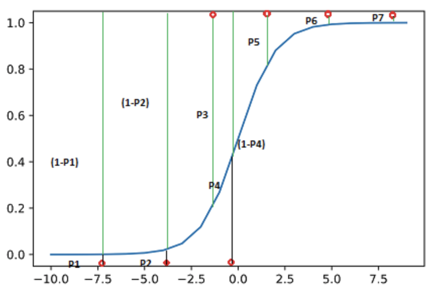
- The probability that the seven data points would be observed:
- \(L = (1-P1)*(1-P2)* P3*(1-P4)*P5*P6*P7\)
- The log of the likelihood: \[ \begin{align} \log(L) &= \log(1-P1) + \log(1-P2) + \log(P3) \\ &\quad+ \log(1-P4) + \log(P5) + \log(P6) + \log(P7) \end{align} \]
Marginal Effects
Marginal Effect of \(x_{k, i}\) on \(\text{Prob}(y_{i} = 1)\)?
- If the baby is prematurely born, the log-odds of being at risk increases by 1.539 relative to the non-premature baby.
Marginal Effect of \(x_{k, i}\) on \(\text{Prob}(y_{i} = 1)\)
- In logistic regression, the effect of \(x_{k, i}\) on \(\text{Prob}(y_{i} = 1)\) is different for each observation \(i\).
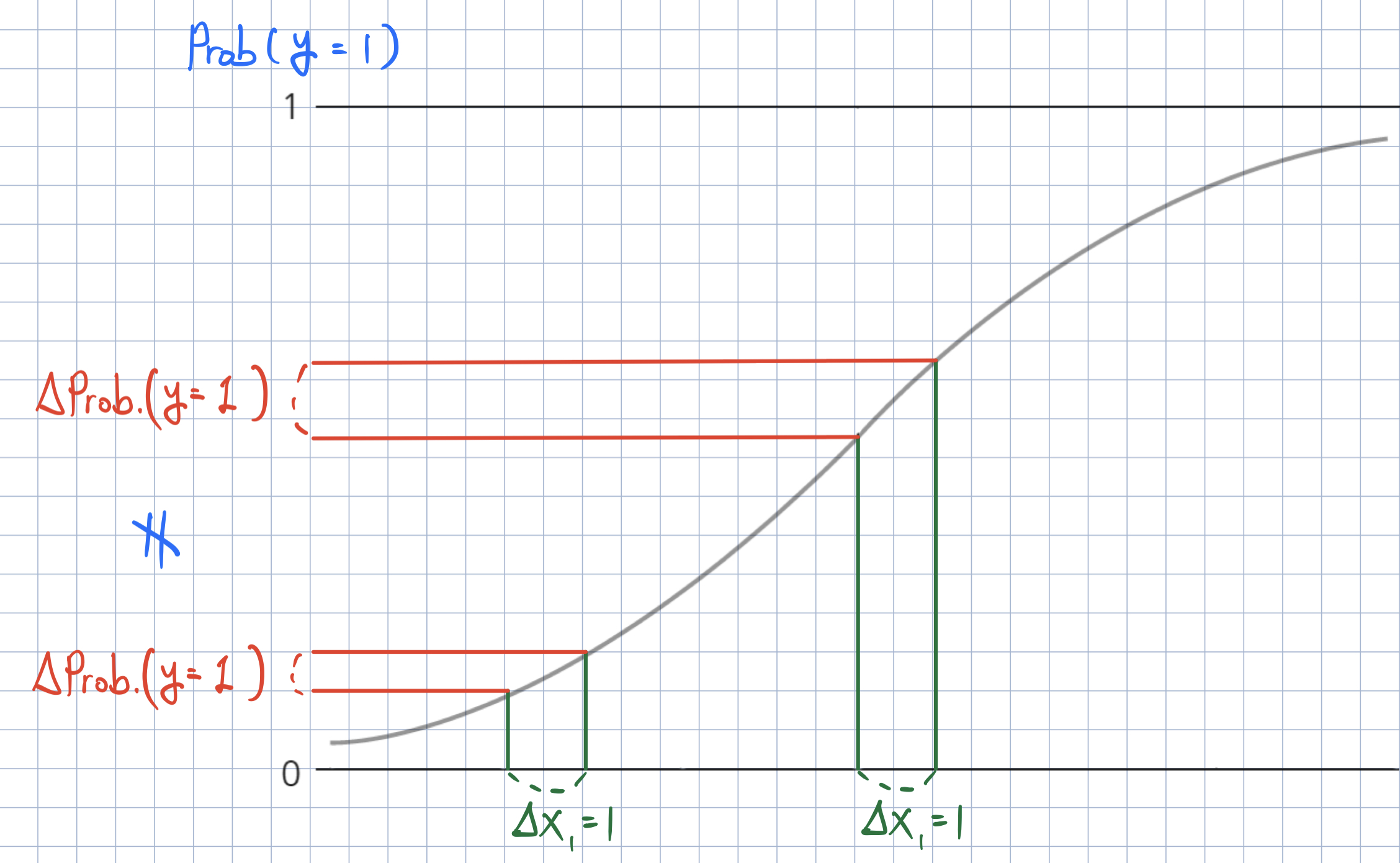
Marginal Effect of \(x_{k, i}\) on \(\text{Prob}(y_{i} = 1)\)
- How can we calculate the effect of \(x_{k, i}\) on the probability of \(y_{i} = 1\)?
- Marginal effect at the mean (MEM): We can obtain the marginal effect at an average observation or representative observations in the training data (MEM) or at representative values (MER)).
- Average marginal effect (AME): We can average the marginal effects across the training data.
def marginal_effects(model, means):
    """
    Compute marginal effects for all predictors in a PySpark GeneralizedLinearRegression model (logit)
    and return a formatted table with statistical significance.

    Parameters:
        model: Fitted GeneralizedLinearRegression model (with binomial family and logit link).
        means: List of mean values for the predictor variables.

    Returns:
        A formatted string containing the marginal effects table.
    """
    global assembler_predictors  # Use the global assembler_predictors list

    # Extract model coefficients, standard errors, and intercept
    coeffs = np.array(model.coefficients)
    std_errors = np.array(model.summary.coefficientStandardErrors)
    intercept = model.intercept

    # Compute linear combination of means and coefficients (XB)
    XB = np.dot(means, coeffs) + intercept

    # Compute derivative of logistic function (G'(XB))
    G_prime_XB = np.exp(XB) / ((1 + np.exp(XB)) ** 2)

    # Helper: significance stars.
    def significance_stars(p):
        if p < 0.01:
            return "***"
        elif p < 0.05:
            return "**"
        elif p < 0.1:
            return "*"
        else:
            return ""

    # Create table to store results
    results = []

    for i, predictor in enumerate(assembler_predictors):
        # Compute marginal effect
        marginal_effect = G_prime_XB * coeffs[i]

        # Compute standard error of the marginal effect
        std_error = G_prime_XB * std_errors[i]

        # Compute z-score and p-value
        z_score = marginal_effect / std_error if std_error != 0 else np.nan
        p_value = 2 * (1 - norm.cdf(abs(z_score))) if not np.isnan(z_score) else np.nan

        # Compute confidence interval (95%)
        ci_lower = marginal_effect - 1.96 * std_error
        ci_upper = marginal_effect + 1.96 * std_error

        # Append results
        results.append([predictor, f"{marginal_effect: .4f}", significance_stars(p_value), f"{ci_lower: .4f}", f"{ci_upper: .4f}"])

    # Convert results to tabulated format
    table_str = tabulate(results, headers=["Variable", "Marginal Effect", "Significance", "95% CI Lower", "95% CI Upper"],
                         tablefmt="pretty", colalign=("left", "decimal", "left", "decimal", "decimal"))

    return table_str

# Example usage:
# means = [0.5, 30]  # Mean values for x1 and x2
# assembler_predictors = ['x1', 'x2']  # Define globally before calling the function
# table_output = mfx_glm(fitted_model, means)
# print(table_output)
% vs. % point
- Let’s say you have money in a savings account. The interest is 3%.
- Now consider two scenarios:
- The bank increases the interest rate by one percent.
- The bank increases the interest rate by one percentage point.
- What is the new interest rate in each scenario? Which is better?
Logistic Regression
Interpreting the Marginal Effect
- How do we interpret the ME? All else being equal,
- There is a 2.05 percentage point increase in the probability of a newborn being at risk if the baby is prematurely born.
- There is a 0.04 percentage point decrease in the probability of a newborn being at risk for each additional parental medical visit.
Classification
Classifier
- Your goal is to use the logistic regression model to classify newborn babies into one of two categories—at-risk or not.
- Prediction from the logistic regression with a threshold on the predicted probabilities can be used as a classifier.
- If the predicted probability that the baby \(\texttt{i}\) is at risk is greater than the threshold, the baby \(\texttt{i}\) is classified as at-risk.
- Otherwise, the baby \(\texttt{i}\) is classified as not-at-risk.
Double Density Plot – Choosing the Optimal Threshold
- Double density plot is useful when picking the classifier threshold.
- Since the classifier is built using the training data, the threshold should also be selected using the training data.
import matplotlib.pyplot as plt
import seaborn as sns

# Filter training data for atRisk == 1 and atRisk == 0
pdf = dtrain_1.select("prediction", "atRisk").toPandas()

train_true = pdf[pdf["atRisk"] == 1]
train_false = pdf[pdf["atRisk"] == 0]

# Create the first density plot
plt.figure(figsize=(8, 6))
sns.kdeplot(train_true["prediction"], label="TRUE", color="red", fill=True)
sns.kdeplot(train_false["prediction"], label="FALSE", color="blue", fill=True)
plt.xlabel("Prediction")
plt.ylabel("Density")
plt.title("Density Plot of Predictions")
plt.legend(title="atRisk")
plt.show()

# Define threshold for vertical line
threshold = 0.02  # Replace with actual value

# Create the second density plot with vertical line
plt.figure(figsize=(8, 6))
sns.kdeplot(train_true["prediction"], label="TRUE", color="red", fill=True)
sns.kdeplot(train_false["prediction"], label="FALSE", color="blue", fill=True)
plt.axvline(x=threshold, color="blue", linestyle="dashed", label=f"Threshold = {threshold}")
plt.xlabel("Prediction")
plt.ylabel("Density")
plt.title("Density Plot of Predictions with Threshold")
plt.legend(title="atRisk")
plt.show()
Performance of Classifier
Confusion matrix
- The confusion matrix summarizes the classifier’s predictions against the actual known data categories.
- Suppose the threshold is set as 0.02.
# Compute confusion matrix
dtest_1 = dtest_1.withColumn("predicted_class", when(col("prediction") > .02, 1).otherwise(0))
conf_matrix = dtest_1.groupBy("atRisk", "predicted_class").count().orderBy("atRisk", "predicted_class")

TP = dtest_1.filter((col("atRisk") == 1) & (col("predicted_class") == 1)).count()
FP = dtest_1.filter((col("atRisk") == 0) & (col("predicted_class") == 1)).count()
FN = dtest_1.filter((col("atRisk") == 1) & (col("predicted_class") == 0)).count()
TN = dtest_1.filter((col("atRisk") == 0) & (col("predicted_class") == 0)).count()

# Print formatted confusion matrix with labels
print("\n Confusion Matrix:\n")
print("                     Predicted")
print("            |  Negative  |  Positive  ")
print("------------+------------+------------")
print(f"Actual Neg. |    {TN:5}   |    {FP:5}  |")
print("------------+------------+------------")
print(f"Actual Pos. |    {FN:5}   |    {TP:5}  |")
print("------------+------------+------------")
Performance of Classifier
Accuracy
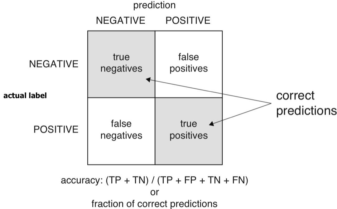
- Accuracy: When the classifier says this newborn baby is at risk or is not at risk, what is the probability that the model is correct?
- Accuracy is defined as the number of items categorized correctly divided by the total number of items.
Performance of Classifier
False positive/negative
- False positive rate (FPR): If the classifier says this newborn baby is at risk, what’s the probability that the baby is not really at risk?
- FPR is defined as the ratio of false positives to predicted positives.
- False negative rate (FNR): If the classifier says this newborn baby is not at risk, what’s the probability that the baby is really at risk?
- FNR is defined as the ratio of false negatives to predicted negatives.
Performance of Classifier
Precision
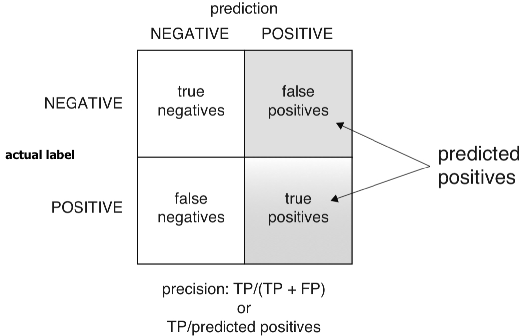
- Precision: If the classifier says this newborn baby is at risk, what’s the probability that the baby is really at risk?
- Precision is defined as the ratio of true positives to predicted positives.
Performance of Classifier
Recall (or Sensitivity)
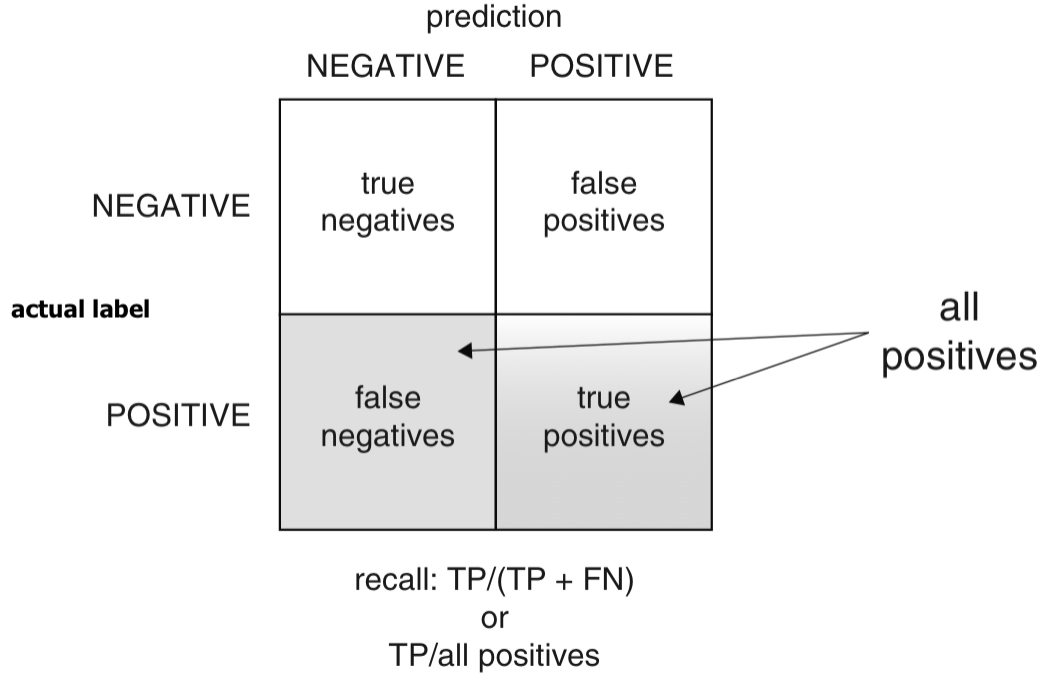
- Recall (or sensitivity): Of all the babies at risk, what fraction did the classifier detect?
- Recall (or sensitivity) is also called the true positive rate (TPR), the ratio of true positives over all actual positives.
Performance of Classifier
Specificity
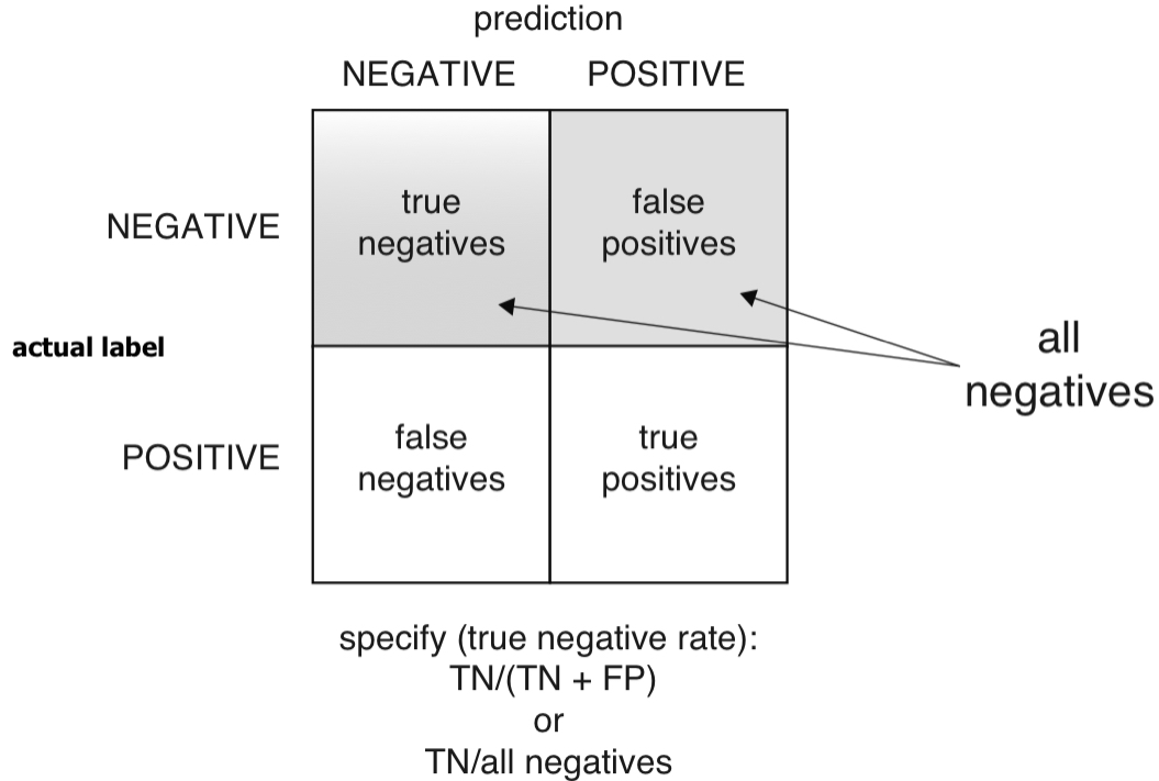
- Specificity: Of all the not-at-risk babies, what fraction did the classifier detect?
- Specificity is also called the true negative rate (TNR), the ratio of true negatives over all actual negatives.
Performance of Classifier
Enrichment
- Average: Average rate of new born babies being at risk
- Enrichment: How does the classifier precisely choose babies at risk relative to the average rate of new born babies being at risk?
- We want a classifier whose enrichment is greater than 2.
accuracy = (TP + TN) / (TP + FP + FN + TN)
precision = TP / (TP + FP)
recall = TP / (TP + FN)
specificity = TN / (TN + FP)
average_rate = (TP + FN) / (TP + TN + FP + FN)  # Proportion of actual at-risk babies
enrichment = precision / average_rate

print(f"Accuracy:  {accuracy:.4f}")
print(f"Precision: {precision:.4f}")
print(f"Recall (Sensitivity): {recall:.4f}")
print(f"Specificity:  {specificity:.4f}")
print(f"Average Rate: {average_rate:.4f}")
print(f"Enrichment:   {enrichment:.4f} (Relative Precision)")
Performance of Classifier
Trade-off between recall and precision/enrichment
- There is a trade-off between recall and precision/enrichment.
- What would be the optimal threshold?
import numpy as np
import matplotlib.pyplot as plt
from sklearn.metrics import precision_recall_curve

pdf = dtest_1.select("prediction", "atRisk").toPandas()

# Extract predictions and true labels
y_true = pdf["atRisk"]  # True labels
y_scores = pdf["prediction"]  # Predicted probabilities

# Compute precision, recall, and thresholds
precision, recall, thresholds = precision_recall_curve(y_true, y_scores)

# Compute enrichment: precision divided by average at-risk rate
average_rate = np.mean(y_true)
enrichment = precision / average_rate

# Define optimal threshold (example: threshold where recall ≈ enrichment balance)
optimal_threshold = 0.02  # Adjust based on the plot

# Plot Enrichment vs. Recall vs. Threshold
plt.figure(figsize=(8, 6))
plt.plot(thresholds, enrichment[:-1], label="Enrichment", color="blue", linestyle="--")
plt.plot(thresholds, recall[:-1], label="Recall", color="red", linestyle="-")

# Add vertical line for chosen threshold
plt.axvline(x=optimal_threshold, color="black", linestyle="dashed", label=f"Optimal Threshold = {optimal_threshold}")

# Labels and legend
plt.xlabel("Threshold")
plt.ylabel("Score")
plt.title("Enrichment vs. Recall")
plt.legend()
plt.grid(True)
plt.show()
Performance of Classifier
Trade-off between sensitivity and specificity
There is also a trade-off between sensitivity and specificity.
The receiver operating characteristic curve (or ROC curve) plot both the true positive rate (recall) and the false positive rate (or 1 - specificity) for all threshold levels.
- Area under the curve (or AUC) can be another measure of the quality of the model.
from sklearn.metrics import roc_curve

# Convert to Pandas
pdf = dtest_1.select("prediction", "atRisk").toPandas()

# Compute ROC curve
fpr, tpr, _ = roc_curve(pdf["atRisk"], pdf["prediction"])

# Plot ROC curve
plt.figure(figsize=(8,6))
plt.plot(fpr, tpr, label=f"ROC Curve (AUC = {auc:.4f})")
plt.plot([0, 1], [0, 1], 'k--', label="Random Guess")
plt.xlabel("False Positive Rate")
plt.ylabel("True Positive Rate")
plt.title("ROC Curve")
plt.legend()
plt.show()
Performance of Classifier
AUC
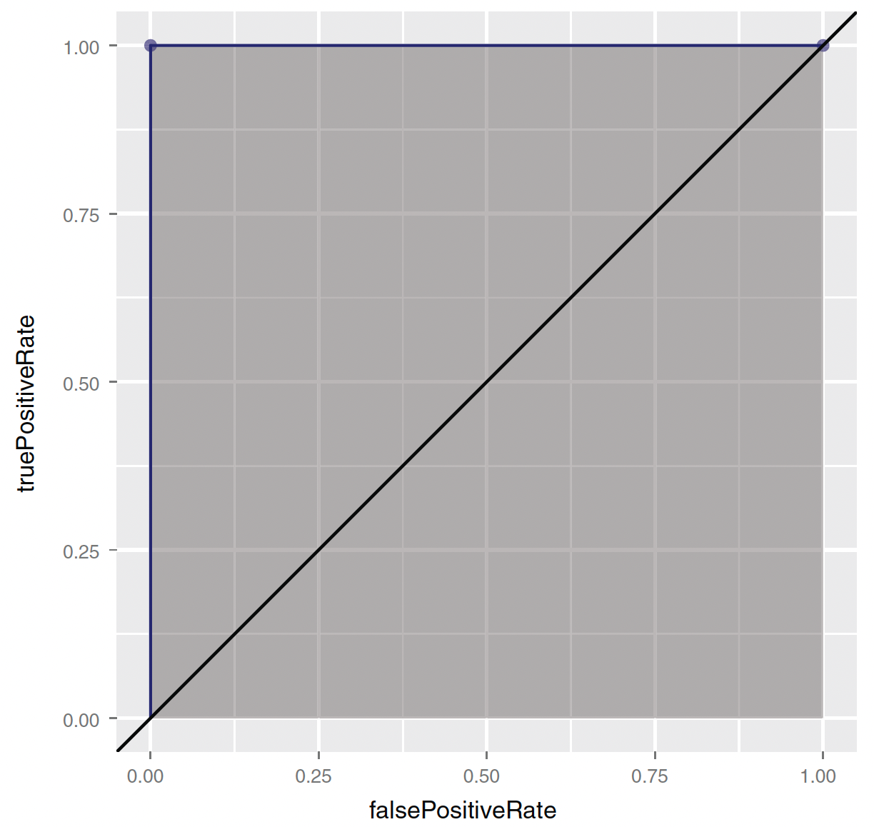
- (0,0)—Corresponding to a classifier defined by the threshold \(\text{Prob}(y_{i} = 1) = 1\):
- Nothing gets classified as at-risk.
Performance of Classifier
AUC

- (1,1)—Corresponding to a classifier defined by the threshold \(\text{Prob}(y_{i} = 1) = 0\):
- Everything gets classified as at-risk.
Performance of Classifier
AUC

- (0,1)—Corresponding to any classifier defined by a threshold between 0 and 1:
- Everything is classified perfectly!
Performance of Classifier
AUC
The AUC for the random model is 0.5.
- You want a classifier whose AUC is close to 1, and greater than 0.5.
When comparing multiple classifiers, you generally want to prefer classifiers that have a higher AUC.
You also want to examine the shape of the ROC to explore possible trade-offs.
Performance of Classifier
- Suppose that you have successfully trained a classifier with acceptable precision and recall using NY hospital data.
- Now you want to apply the same classifier on all hospital data in MA.
- Will the classifier perform as well?
- The proportion of at-risk babies in MA hospitals may differ from that in NY.
- Can this difference impact classifier performance on MA data?
- Let’s examine how classifier performance changes with varying at-risk rates.
dtrain, dtest = df.randomSplit([0.5, 0.5], seed = 1234)

pd_dtrain = dtrain.toPandas()
pd_dtest = dtest.toPandas()

# Set seed for reproducibility
np.random.seed(23464)

# Sample 1000 random indices from the test dataset without replacement
sample_indices = np.random.choice(pd_dtest.index, size=1000, replace=False)

# Separate the selected observations from testing data
separated = pd_dtest.loc[sample_indices]

# Remove the selected observations from the testing data
# Consider this as data from NY hospitals
pd_dtest_NY = pd_dtest.drop(sample_indices)

# Split the separated sample into at-risk and not-at-risk groups
at_risk_sample = separated[separated["atRisk"] == 1]  # Only at-risk cases
not_at_risk_sample = separated[separated["atRisk"] == 0]  # Only not-at-risk cases

# Create test sets for MA hospitals with different at-risk rates
pd_dtest_MA_moreRisk = pd.concat([pd_dtest_NY, at_risk_sample])  # Adds back only at-risk cases
pd_dtest_MA_lessRisk = pd.concat([pd_dtest_NY, not_at_risk_sample])  # Adds back only not-at-risk cases

# Show counts to verify results
print("Original Test Set Size:", pd_dtest.shape[0])
print("Sampled Separated Size:", separated.shape[0])
print("NY Hospitals Data Size:", pd_dtest_NY.shape[0])
print("MA More Risk Data Size:", pd_dtest_MA_moreRisk.shape[0])
print("MA Less Risk Data Size:", pd_dtest_MA_lessRisk.shape[0])
Performance of Classifier
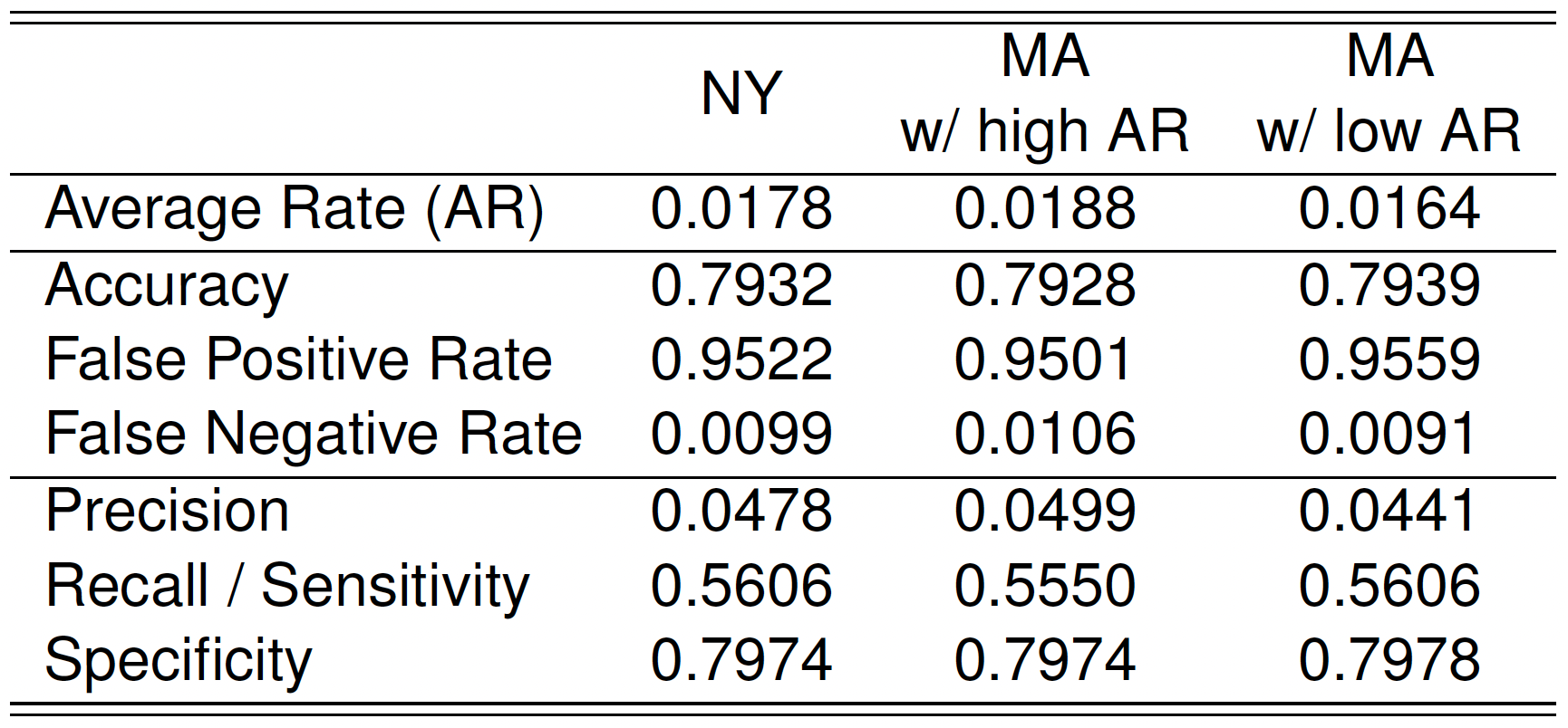
Performance of Classifier
- Which classifier do you prefer for identifying at-risk babies?
- High accuracy, low recall, other things being equal;
- Low accuracy, high recall, other things being equal.
- Accuracy may not be a good measure for the classes that have unbalanced distribution of predicted probabilities (e.g., rare event).
Accuracy Can Be Misleading in Imbalanced Data
- Rare events (e.g., severe childbirth complications) occur in a very small percentage of cases (e.g., 1% of the population).
- A simple model that always predicts “not-at-risk” would be 99% accurate, as it correctly classifies 99% of cases where no complications occur.
- However, this does not mean the simple model is better—accuracy alone does not capture the effectiveness of a model when class distributions are skewed.
- A better model that identifies 5% of cases as “at-risk” and catches all true at-risk cases may appear to have lower overall accuracy than the simple model.
- Missing a severe complication (false negative) can be more costly than mistakenly flagging a healthy case as at risk (false positive).
Separation and Quasi-separation
What is Separation?
- One of the model variables or some combination of the model variables predicts the outcome perfectly for at least a subset of the training data.
- You’d think this would be a good thing; but, ironically, logistic regression fails when the variables are too powerful.
- Separation occurs when a predictor (or combination of predictors) perfectly separates the outcome classes.
- For example, if:
- All
fail = TRUEwhensafety = low, and - All
fail = FALSEwhensafety ≠ low,
then the model can predict the outcome with 100% accuracy based onsafety.
- All
➡️ This leads to infinite (non-estimable) coefficients and convergence problems.
What is Quasi-Separation?
- Quasi-separation occurs when:
- Some, but not all, values of a predictor perfectly predict the outcome.
- Example:
fail = TRUEfor all cars withsafety = low,
- But
failis mixed forsafety = medorhigh.
➡️ Model still suffers from unstable coefficient estimates or high standard errors.
Example of Quasi-separation
- Suppose a car review site rates cars on several characteristics, including affordability and safety rating.
- Car ratings can be “very good,” “good,” “acceptable,” or “unacceptable.”
- Your goal is to predict whether a car will fail the review: that is, get an unacceptable rating.
- Let’s do Classwork 11.