Lecture 8
Map visualization with ggplot
April 13, 2026
🗺️ Draw maps
🗺️ Maps with geospatial data
Data with map drawing, also known as geospatial data, is important for several reasons:
Analysis: Geospatial data can highlight patterns and relationships across spatial units in the data that may not be apparent in other forms of data.
Communication: Maps can be visually striking, especially when the spatial units of the map are familiar entities, like counties in the US.
📋 Map U.S. state-level data
- The
socviz::electiondataset has various measures of the vote and vote shares by state.
- We don’t have to represent spatial data spatially.
🔵🔴 Dot Plot: Setting Up Color and Axes
➕ Dot Plot: Adding Points and a Reference Line
🔵🔴 Dot Plot: Applying Party Colors
🏷️ Dot Plot: Relabeling the X-Axis
🗂️ Dot Plot: Faceting by Census Region with facet_wrap()
📏 Dot Plot: Faceting with Free Space Using ggforce
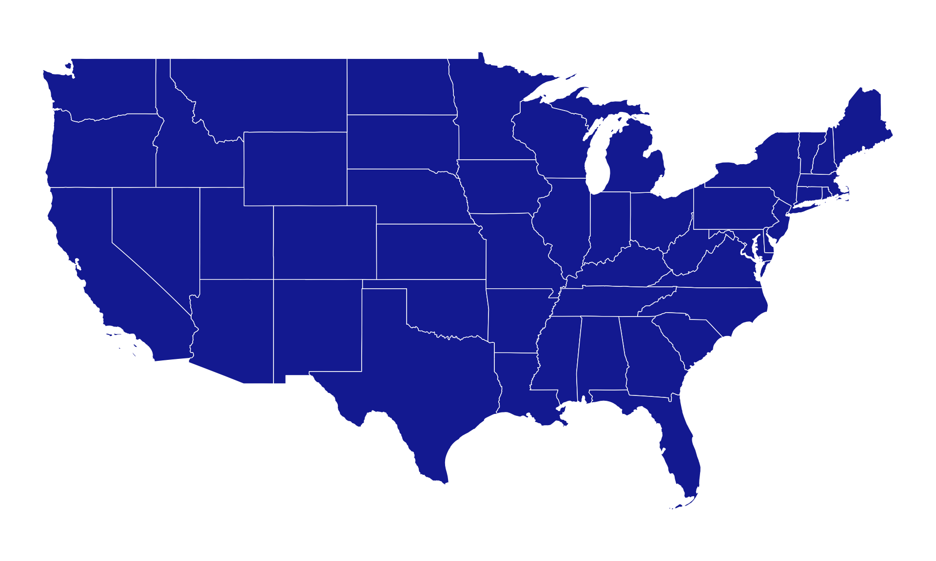
📂 Loading the U.S. State Map Data
🖊️ Drawing State Boundaries with geom_polygon()
geom_polygon()can be used to visualize map data.
- A map is a set of lines drawn in the right order on a grid.
🖌️ Filling States with Color by Region
- Let’s
fillthe map.
🌐 Applying the Albers Projection with coord_map()
- By default, the map is plotted using the venerable Mercator projection.
We can transform the default projection used by
geom_polygon(), via thecoord_map()function.- The Albers projection requires two latitude parameters,
lat0andlat1.
- The Albers projection requires two latitude parameters,
🔗 Joining Election Data to the Map
- Let’s get the
electiondata on to the map
In the map data,
us_states, the state names (in a variable namedregion) are in lower case.Here we can create a variable in the
electiondata frame to correspond to this, using thetolower()function to convert the state names.It is important to know your data and variables well enough to check that they have merged properly.
- FIPS code is useful in joining the data.
🔵 Filling States by Party Winner
- We use our
partycolors for thefill.
🎨 Applying Custom Party Colors with scale_fill_manual()
🗺️ Cleaning Up a Map with theme_map()
theme_map()from ggthemes is a plotting theme designed specifically for maps.- It removes chart elements that are usually useful in regular plots but unnecessary for maps, such as:
- axis text,
- axis ticks,
- grid lines, and
- the default background panel.
- This helps the map look cleaner and allows the geographic shapes and fill colors to stand out more clearly.
📈 Mapping a Continuous Variable: Trump Vote Share
- To the
fillaesthetic, let’s try a continuous measure, such as the percentage of the vote received by Donald Trump (pct_trump).
🎨 Fixing the Color Gradient with scale_fill_gradient()
Blue is not the color we want here.
The color gradient runs in the wrong direction.
Let’s fix these problems using
scale_fill_gradient():
↔︎️ Diverging Color Scale with scale_fill_gradient2()
- For election results, we might prefer a gradient that diverges from a midpoint.
- The
scale_*_gradient2()function gives us a blue-red spectrum that passes through white by default. - We can also re-specify the mid-level color along with the
highandlowcolors.
- The
p0 <- ggplot(
  data = us_states_elec,
  mapping = aes(x = long, y = lat,
                group = group,
                fill = d_points))

p1 <- p0 +
  geom_polygon(color = "gray90", size = 0.1) +
  coord_map(projection = "albers",
            lat0 = 39, lat1 = 45)

p2 <- p1 +
  scale_fill_gradient2() +
  labs(title = "Winning margins",
       fill = "Percent")
p2 + theme_map()
🟣 Customizing Midpoint Color: “Purple America”
- From the
scale_*_gradient2()function, we can also re-specify the mid-level color along with thehighandlowcolors.
🚫 Omitting Washington DC to Rescale the Gradient
- If you take a look at the gradient scale for this first “purple America” map,
p3, you’ll see that it extends very high on the Blue side.- This is because Washington DC is included in the data.
- If we omit Washington DC, we’ll see that our color scale shifts.
p0 <- ggplot(
  data = us_states_elec |>
    filter(region != "district of columbia"),
  aes(x = long, y = lat,
      group = group,
      fill = d_points))

p3 <- p1 +
  scale_fill_gradient2(
    low = "red",
    mid = scales::muted("purple"),
    high = "blue",
    breaks = c(-25, 0, 25, 50, 75))
p3 + theme_map() +
  labs(fill = "Percent",
       title = "Winning margins",
       caption = "DC is omitted.")
🎨 Choropleth Maps
🏛️ America’s ur-choropleths
Choropleth maps display divided geographical areas or regions that are colored, shaded or patterned in relation to a data variable.
County-level US choropleth maps can be aesthetically pleasing, because of the added detail they bring to a national map.
The county-level datasets (
county_mapandcounty_data) are included in thesocvizlibrary.The county map data frame,
county_map, has been processed a little in order to transform it to an Albers projection, and also to relocate (and re-scale) Alaska and Hawaii.
📦 County Choropleth Data: county_map and county_data
The
idfield is the FIPS code for the county.pop_densis population density.hispanicis Hispanic population.We merge the data frames using the shared FIPS column.
👁️ County Map: Initial Plot of Population Density
p1object produces a legible map, but by default it chooses an unordered categorical layout.- This is because the
pop_dens_discvariable is not ordered. pop_dens_discis an un-ordered discrete variable.
⚖️ County Map: Fixing Aspect Ratio with coord_equal()
- The use of
coord_equal()makes sure that the relative scale of our map does not change even if we alter the overall dimensions of the plot.
🔵 County Map: Applying a Sequential Color Scale with scale_fill_brewer()
- We can manually supply the right sort of scale using the
scale_fill_brewer()function, together with a nicer set of labels.
🔖 County Map: Adding a Legend and Theme
- We can also use the
guides()function to make sure each element of the key in the legend appears on the same row.
🟢 County Map: Percent Hispanic Population by County
- We can now do exactly the same thing for our map of percent Hispanic population by county.
hisp_discis an un-ordered factor variable.
p <- ggplot(
  data = county_full,
  mapping = aes(x = long, y = lat,
                fill = hisp_disc,
                group = group))
p1 <- p +
  geom_polygon(color = "gray90", size = 0.05) +
  coord_equal()
p2 <- p1 +
  scale_fill_brewer(palette="Greens")

p2 + labs(fill = "US Population, Percent Hispanic") +
  guides(fill = guide_legend(nrow = 1)) +
  theme_map() +
  theme(legend.position = "bottom")
📐 County Map: The pop_dens6 Variable
Let’s draw a new county-level choropleths.
We have a
pop_dens6variable that divides the population density into six categories.We will map the color scale to the value of variable.
🟠 County Map: Building an Orange Color Palette
[1] "#FEEDDE" "#FDD0A2" "#FDAE6B" "#FD8D3C" "#E6550D" "#A63603"[1] "#A63603" "#E6550D" "#FD8D3C" "#FDAE6B" "#FDD0A2" "#FEEDDE"- We use the
RColorBrewer::brewer.pal()function to manually create two palettes.- The
brewer.pal()function produces evenly-spaced color schemes.
- The
- We use the
rev()function to reverse the order of a vector.
🗺️ County Map: Plotting pop_dens6 with scale_fill_manual()
pop_p <- ggplot(
  data = county_full,
  mapping = aes(x = long, y = lat,
                fill = pop_dens6,
                group = group))

pop_p1 <- pop_p +
  geom_polygon(color = "gray90", size = 0.05) +
  coord_equal()

pop_p2 <- pop_p1 +
  scale_fill_manual(values = orange_pal)

pop_p2 +
  labs(title = "Population Density",
      fill = "People per square mile") +
  theme_map() +
  theme(legend.position = "bottom")
🔄 County Map: Reversing the Color Palette
📊 County Map: Setting Up a Continuous Variable Plot
- Let’s consider a county map of a continuous variable, such as a percent of Hispanic population (
hispanic/pop).
🎨 Gradient Scale Functions: scale_fill_gradient*()
For a continuous variable, we can use
scale_fill_gradient(),scale_fill_gradient2(), orscale_fill_gradient2()function:scale_fill_gradient()produces a two-color gradient.
scale_fill_gradient2()produces a three-color gradient with specified midpoint.scale_fill_gradientn()produces an n-color gradient.For
scale_fill_gradient2(), choose the value and color formidpointcarefully.
🗳️ County Map: Trump Vote Share with a Diverging Gradient
gop_p2 <- gop_p1 +
  scale_fill_gradient2(
    low = '#2E74C0',  # from party_colors for DEM
    mid = '#FFFFFF',  # transparent white
    high = '#CB454A',  # from party_colors for GOP
    na.value = "grey50",
    midpoint = .5)

gop_p2 +
  labs(title = "US Presidential Election 2024",
       fill = "Trump vote share") +
  theme_map() +
  theme(legend.position = "bottom")
📂 Small-Multiple Maps: NY Poverty Data
Sometimes we have geographical data with repeated observations over time.
A common case is to have a country- or state-level measure observed over a period of years (Panel data).
Let’s consider consider the poverty rate determined by level of educational attainment in NY.
📅 Small-Multiple Maps: Drawing a Single Year
🗂️ Small-Multiple Maps: Faceting by Year with facet_wrap()
- We facet the maps just like any other small-multiple with
facet_wrap().
🔷 Hexbin Maps
🟥 Statebins: Trump Vote Share
- As an alternative to state-level choropleths, we can consider
statebins.
library(statebins)  # install.packages("statebins")
p <- ggplot(election, aes( state = state, fill = pct_trump ) )
p1 <- p +
  geom_statebins(lbl_size = 5,
                 border_col = "grey90",
                 border_size = 1)
p2 <- p1 +
  labs(fill = "Percent Trump") +
  coord_equal() +
  theme_statebins( legend_position = c(.45, 1) ) +
  theme( legend.direction="horizontal" )
p2
↔︎️ Statebins: Applying a Diverging Gradient for Trump Vote
🟦 Statebins: Harris Vote Share (Excluding DC)
- Let’s remove DC and use
scale_fill_gradient().
🔵 Statebins: Applying a Single-Hue Gradient for Harris Vote
p2 <- p1 + labs(fill = "Percent Harris") +
  coord_equal() +
  theme_statebins( legend_position = c(.45, 1) ) +
  theme( legend.direction="horizontal" )
p2

p2 + scale_fill_gradient(
    low = '#FFFFFF',  # transparent white
    high = '#2E74C0',  # from party_colors for DEM
    na.value = "grey50")   # set the midpoint value
🎭 Statebins: Setting Up a Party-Colored Plot
Let’s use
scale_fill_manual()tofillcolor byparty.legend_positionallows for adjusting a coordinate for the legend position.
🏆 Statebins: Coloring States by Winning Party
📊 Statebins: Setting Up Discretized Trump Vote Bins
- Let’s discretize a continuous variable using
scale_fill_gradient()withbreaks.
🏷️ Statebins: Binned Color Scale with Custom breaks and Labels
p2 <- p1 + labs(fill = "Percent Trump") +
  coord_equal() +
  theme_statebins( legend_position = c(.2, 1) ) +
  theme( legend.direction="horizontal")

p2 + scale_fill_gradient(breaks = c(5, 21, 41, 48, 57),
                         labels = c("< 5", "5-21",
                                    "21-41", "41-58", "> 57"),
                         low = "#f9ecec", high = "#CB454A") +
  guides(fill = guide_legend())
📐 Draw maps with sf
📁 Shapefiles
Shapefiles are special types of data that include information about geography, such as points (latitude, longitude), paths (a bunch of connected latitudes and longitudes) and areas.
Most government agencies provide shapefiles for their jurisdictions.
For global mapping data, you can use:
🧭 Projections & Coordinate Systems
Projections matter a lot for maps.
You can convert your geographic data between different coordinate reference systems (CRS) with
sf.For instance:
coord_sf(crs = st_crs("XXXX"))(changes CRS on the fly in a plot)st_transform()(permanently converts a data frame to a new CRS)
There are thousands of projections (epsg.io).
You need to specify both the catalog (e.g.
"ESRI"or"EPSG") and the number (e.g."54030"for Robinson).
🌐 Common Projections
ESRI:54002= Equidistant Cylindrical (Gall-Peters)EPSG:3395= MercatorESRI:54009= MollweideESRI:54030= RobinsonEPSG:4326= WGS 84 (GPS system; –180 to 180)EPSG:4269= NAD 83 (common in North America)ESRI:102003= Albers for the contiguous USAlternatively, you can pass projection names like
"+proj=merc","+proj=robin", etc.
⬇️ Shapefiles to Download
- You can download this ZIP file: shapefiles.zip, which contains
- World map: 110m “Admin 0 - Countries” from Natural Earth
- US states: 20m 2022 state boundaries from the US Census Bureau
- US counties: 5m 2022 county boundaries from the US Census Bureau
- US states high resolution: 10m “Admin 1 – States, Provinces” from Natural Earth
- Global rivers: 10m “Rivers + lake centerlines” from Natural Earth
- North American rivers: 10m “Rivers + lake centerlines, North America supplement” from Natural Earth
- Global lakes: 10m “Lakes + Reservoirs” from Natural Earth
- New York K–12 schools, 2012: “New York K-12 School Districts” from the U.S. Census Bureau
🔍 Load and look at data
library(tidyverse)  # For ggplot, dplyr, and friends
library(sf)         # For GIS magic

# Example shapefile loading:
world_map <- read_sf("/Users/bchoe/My Drive/suny-geneseo/spring2026/maps/ne_110m_admin_0_countries/ne_110m_admin_0_countries.shp")
us_states <- read_sf("/Users/bchoe/My Drive/suny-geneseo/spring2026/maps/cb_2022_us_state_20m/cb_2022_us_state_20m.shp")
us_counties <- read_sf("/Users/bchoe/My Drive/suny-geneseo/spring2026/maps/cb_2022_us_county_5m/cb_2022_us_county_5m.shp")
us_states_hires <- read_sf("/Users/bchoe/My Drive/suny-geneseo/spring2026/maps/ne_10m_admin_1_states_provinces/ne_10m_admin_1_states_provinces.shp")
rivers_global <- read_sf("/Users/bchoe/My Drive/suny-geneseo/spring2026/maps/ne_10m_rivers_lake_centerlines/ne_10m_rivers_lake_centerlines.shp")
rivers_na <- read_sf('/Users/bchoe/My Drive/suny-geneseo/spring2026/maps/ne_10m_rivers_north_america/ne_10m_rivers_north_america.shp')
lakes <- read_sf("/Users/bchoe/My Drive/suny-geneseo/spring2026/maps/ne_10m_lakes/ne_10m_lakes.shp")
ny_schools <- read_sf('/Users/bchoe/My Drive/suny-geneseo/spring2026/maps/tl_2021_36_unsd/tl_2021_36_unsd.shp')
🖊️ Basic Plotting
🎨 With color fills
🌈 Using the built-in ‘MAPCOLOR7’ from Natural Earth
🌍 World map: Different Projections
🌍 Robinson projection
〰️ Sinusoidal
📜 Mercator
🇺🇸 US map: Different Projections
🗺️ US map
📐 Albers
🔀 tigris can “shift” AK/HI/PR to lower 48
↙️ Shift them “outside”
📍 Individual States

🔬 Higher resolution from Natural Earth
🔁 Plotting Multiple Layers
🗺️ NY Counties: Initial Plot
➕ Add state boundary + counties
🔗 Unioning Counties into a Single State Boundary
🟩 NY Counties
🏫 Plotting Schools in New York
🏫 NY Schools
🌊 Color by Water
✏️ Creating Your Own Geometry
ny_cities <- tribble(
  ~city,           ~lat,       ~long,
  "New York City", 40.712776,  -74.005974,
  "Albany",        42.652580,  -73.756230,
  "Buffalo",       42.886447,  -78.878369,
  "Rochester",     43.156578,  -77.608849,
  "Syracuse",      43.048122,  -76.147424
)


ny_cities_geometry <- ny_cities |>
  st_as_sf(coords = c("long","lat"), crs = st_crs("EPSG:4326"))

ggplot() +
  geom_sf(data = only_ny_high_adjusted, fill = "#1C4982") +
  geom_sf(data = ny_cities_geometry, size = 3) +
  theme_void()
🏷️ Add labels with geom_sf_label()
📍 Automatic Geocoding
📍 Example with tidygeocoder
library(tidygeocoder)
some_addresses <- tribble(
  ~name, ~address,
  "The White House", "1600 Pennsylvania Ave NW, Washington, DC",
  "State University of New York at Geneseo", "1 College Cir, Geneseo, NY 14454"
)

geocoded_addresses <- some_addresses |>
  geocode(address, method = "census")

# Convert to sf
addresses_geometry <- geocoded_addresses |>
  st_as_sf(coords = c("long","lat"), crs = st_crs("EPSG:4326"))

# Plot on a US map
ggplot() +
  geom_sf(data = lower_48, fill = "#1C4982", color = "white", size = 0.25) +
  geom_sf(data = addresses_geometry, size = 5, color = "white") +
  geom_sf_label(data = addresses_geometry, aes(label = name),
                size = 4, fill = "white", nudge_y = 175000) +
  coord_sf(crs = st_crs("ESRI:102003")) +
  theme_void()
📊 Plotting Other Data on Maps
🌐 Getting World Bank data with WDI
- The
WDIpackage allows users to search and download data from over 40 datasets hosted by the World Bank, including the World Development Indicators (‘WDI’), International Debt Statistics, Doing Business, Human Capital Index, and Sub-national Poverty indicators.
📊 Example with World Bank data
# Suppose wdi_raw is loaded
wdi_clean_small <- wdi_raw |> select(life_expectancy, iso3c)

world_map_with_life_expectancy <- world_sans_antarctica |>
  left_join(wdi_clean_small, by = c("ISO_A3" = "iso3c"))

ggplot() +
  geom_sf(data = world_map_with_life_expectancy,
          aes(fill = life_expectancy),
          size=0.25) +
  coord_sf(crs = st_crs("ESRI:54030")) +
  scale_fill_viridis_c(option="viridis") +
  labs(fill = "Life Expectancy") +
  theme_void() +
  theme(legend.position = "bottom")
🔧 Fix for France & Norway
world_sans_antarctica_fixed <- world_sans_antarctica |>
  mutate(ISO_A3 = case_when(
    ADMIN == "Norway" ~ "NOR",
    ADMIN == "France" ~ "FRA",
    TRUE ~ ISO_A3
  )) |>
  left_join(wdi_clean_small, by = c("ISO_A3" = "iso3c"))

ggplot() +
  geom_sf(data = world_sans_antarctica_fixed, aes(fill = life_expectancy), size=0.25) +
  coord_sf(crs = st_crs("ESRI:54030")) +
  scale_fill_viridis_c(option="viridis") +
  labs(fill = "Life Expectancy") +
  theme_void() +
  theme(legend.position = "bottom")
🌐 Plotting Custom Google Maps with ggmap
🔑 Getting a Google Maps API Key for ggmap
- To use the
ggmappackage with Google Maps, you need an API key. Here’s how to get it:
Go to Google Cloud Console (https://console.cloud.google.com/)
Create or Select a Project
- Click the project dropdown and choose or create a project.
- Enable the Maps API
- Navigate to “APIs & Services” > “Library”
- Search for and enable:
- Maps JavaScript API
- Geocoding API
- Static Maps API (optional)
- Get Your API Key
- Go to “APIs & Services” > “Credentials”
- Click “Create credentials” > “API key”
- Copy the generated key.
⚙️ Setup: Google API Key
google_api: Replace “my_api” with your actual Google API key.register_google(): Allows ggmap to use your Google Maps API.set.api.key(): Allows gmapsdistance to connect to Google’s Distance Matrix API.
📞 Basic Map Calls
get_map(): Downloads a static Google map for New York City at zoom level 10.ggmap(NYC_Map): Plots the map background.
🗽 Another Example
- Same
get_map()call, but for Rochester, NY.
📌 Plotting Specific Locations
Geneseo_Map <- get_map("Geneseo, NY",
                       source = "google",
                       api_key = apiKey,
                       zoom = 14)

locations <- geocode(
  c("South Hall, Geneseo, NY",
    "Newton Hall, Geneseo, NY")
)

locations <- locations |>
  mutate(label = c("South Hall", "Newton Hall"))

ggmap(Geneseo_Map) +
  geom_point(data = locations, size = 1, alpha = .5) +
  geom_text_repel(data = locations,
                  aes(label = label),
                  box.padding = 1.75) +
theme_map()geocode(): Returns latitude and longitude of the string address.
✍️ Custom Fonts with showtext
library(showtext)
font_add_google("Roboto", "roboto")
font_add_google("Lato", "lato")
font_add_google("Poppins", "poppins")
font_add_google("Nunito", "nunito")
font_add_google("Annie Use Your Telescope", "annie")
font_add_google("Pacifico", "pacifico")
showtext_auto() # Enables Google fonts in R plots.showtextcan load fonts from various sources, including system fonts, font files, and Google Fonts.font_add_google(): simplifies adding Google Fonts by fetching and registering fonts directly from the Google Fonts repository using just the font family name.showtext_auto()function enables automatic font rendering for all graphics.
🖋️ Plot again with a custom font
🛣️ Adding Routes
route_df <- route(
  from = "South Hall, Geneseo, NY",
  to   = "Newton Hall, Geneseo, NY",
  mode = "walking",
  structure = "route"  # returns points along the path
)

ggmap(Geneseo_Map) +
  geom_path(data = route_df,
            aes(x = lon, y = lat),
            color = "#1C4982", size = 2,
            lineend = "round") +  # round, butt, square
  geom_point(data = locations,
             aes(x = lon, y = lat),
             size = 2, color = "darkred") +
  geom_text_repel(data = locations,
                  aes(x = lon, y = lat, label = label),
                  family = "nunito",
                  box.padding = 1.75) +
theme_map()route(): Calculates a route between two addresses using Google Maps directions.mode: Type of travel (walking, driving, bicycling, transit).geom_path(): Draws the route line fromroute_dfcoordinates.geom_point(): Marks the start/end points.
🛰️ Different Map Types
# Available maptype options:
# "roadmap", "satellite", "terrain", "hybrid"
Geneseo_Map_Hybrid <- get_map("Geneseo, NY",
                              source = "google",
                              api_key = apiKey,
                              zoom = 14,
                              maptype = "hybrid")

ggmap(Geneseo_Map) +
  geom_path(data = route_df,
            aes(x = lon, y = lat),
            color = "#1C4982",
            size = 2,
            lineend = "round",  # round, butt, square
            arrow = arrow() # Arrow option
            ) +
  geom_point(data = locations,
             aes(x = lon, y = lat),
             size = 2, color = "darkred") +
  geom_text_repel(data = locations,
                  aes(x = lon, y = lat, label = label),
                  family = "nunito",
                  box.padding = 1.75) +
  theme_map()
📌 Plotting Multiple Markers with Custom Icons
# install.packages("ggimage")
library(ggimage)

# Let's suppose we have an icon URL
icon_url <- "https://bcdanl.github.io/lec_figs/marker-icon-red.png"

ggmap(Geneseo_Map) +
  geom_image(data = locations,
             aes(x = lon, y = lat, image = icon_url),
             size = 0.05) +  # tweak size
  geom_text_repel(data = locations,
                  aes(label = label),
                  box.padding = 1.75) +
  theme_map()