eia <- read_csv("https://bcdanl.github.io/data/danl-310-s26-midterm-q4.csv")

titanic <- read_csv("https://bcdanl.github.io/data/titanic_cleaned.csv") |>
  mutate(survived = if_else(survived, "Survived", "Did not\n survive"))

org <- socviz::organdata

netflix <- read_csv("https://bcdanl.github.io/data/netflix_cleaned.csv")Lecture 7
Advanced ggplot Chart Types
March 30, 2026
🏋️ Dumbbell chart: life expectancy change
ggplot(gap_dumbbell, aes(y = country)) +
  geom_segment(aes(x = year_1952,
                   xend = year_2007,
                   yend = country),
               linewidth = 2,
               color = "gray70") +
  geom_point(aes(x = year_1952),
             size = 4, color = "steelblue") +
  geom_point(aes(x = year_2007),
             size = 4, color = "darkorange") +
  labs(
    x = "Life expectancy",
    y = NULL,
    title = "Life expectancy in 1952 vs 2007",
    subtitle = "Selected Asian countries with the largest gains",
    caption = "Data: gapminder"
  )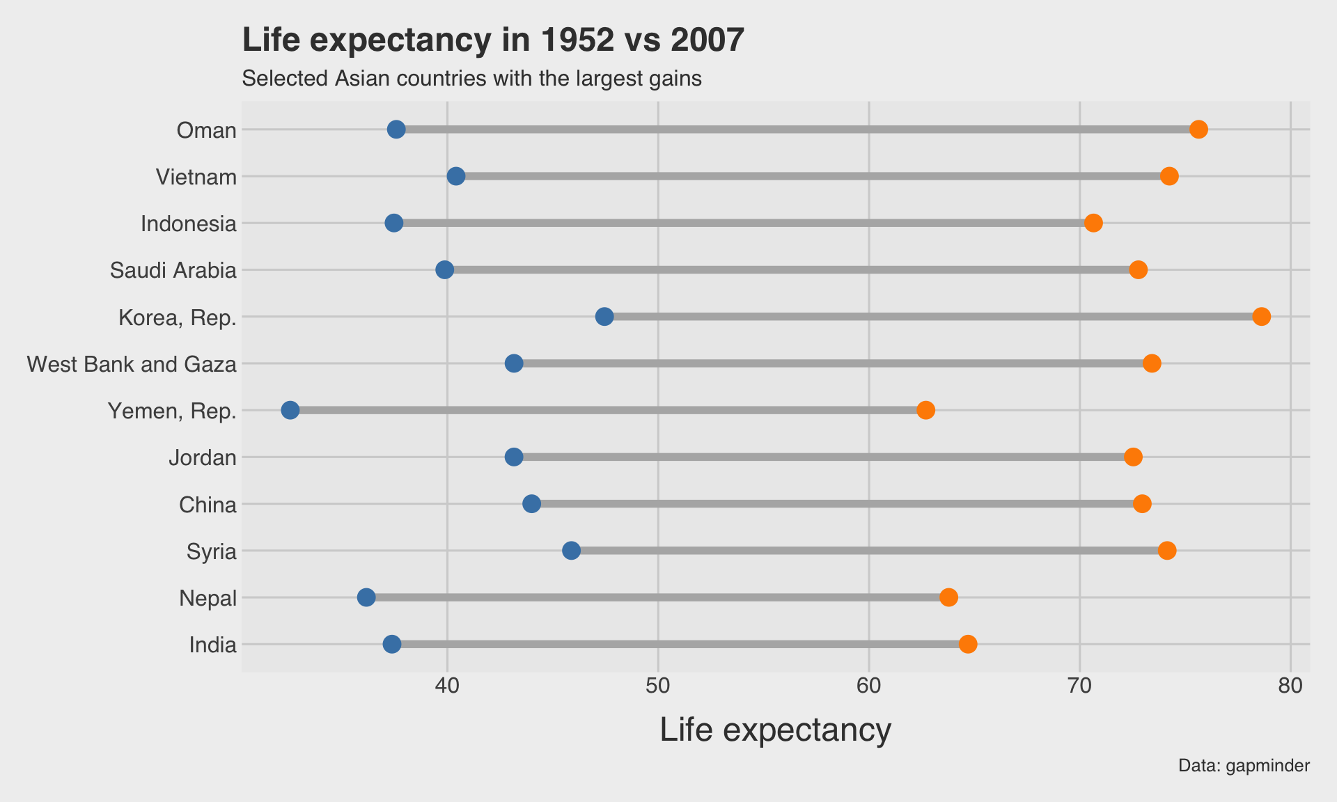
- The segment shows the gap between the two values.
- The two endpoint colors mark the start and end year.
📈 Slope graph: GDP per capita change
ggplot(data = gap_slope_long,
       aes(x = year, y = gdpPercap, group = country, color = country)) +
  geom_line(linewidth = 1.2, show.legend = FALSE) +
  geom_point(size = 3, show.legend = FALSE) +
  geom_text(
    data = gap_slope_long |> filter(year == "1952"),
    aes(label = country),
    hjust = 1,
    size = 3.5,
    show.legend = FALSE
  ) +
  geom_text(
    data = gap_slope_long |> filter(year == "2007"),
    aes(label = country),
    hjust = -0.2,
    size = 3.5,
    show.legend = FALSE
  ) +
  scale_y_continuous(labels = dollar_format()) +
  labs(
    x = NULL,
    y = "GDP per capita",
    title = "Slope graph: GDP per capita in 1952 vs 2007",
    subtitle = "Selected European countries",
    caption = "Data: gapminder"
  ) +
  theme(plot.margin = margin(10, 60, 10, 60))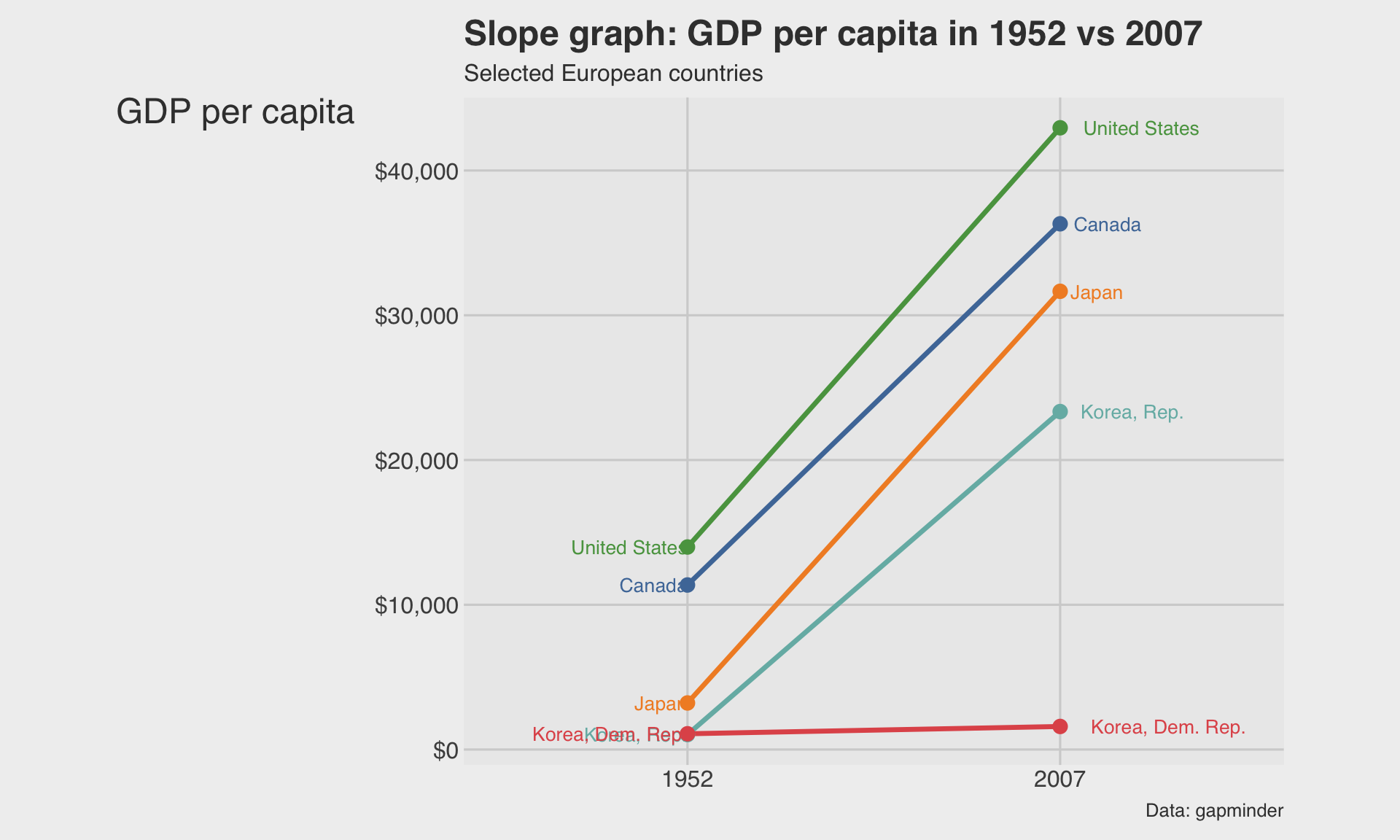
- Labeling both ends helps the audience compare positions directly.
🌊 Stacked area chart: gasoline price components
ggplot(eia,
       aes(x = mon_yr,
           y = retail_price_decomposed,
           fill = component)) +
  geom_area(alpha = 0.9) +
  scale_y_continuous(labels = dollar_format()) +
  labs(
    x = NULL,
    y = "Dollar contribution",
    fill = "Component",
    title = "Gasoline price components over time",
    subtitle = "Monthly EIA gas pump components"
  )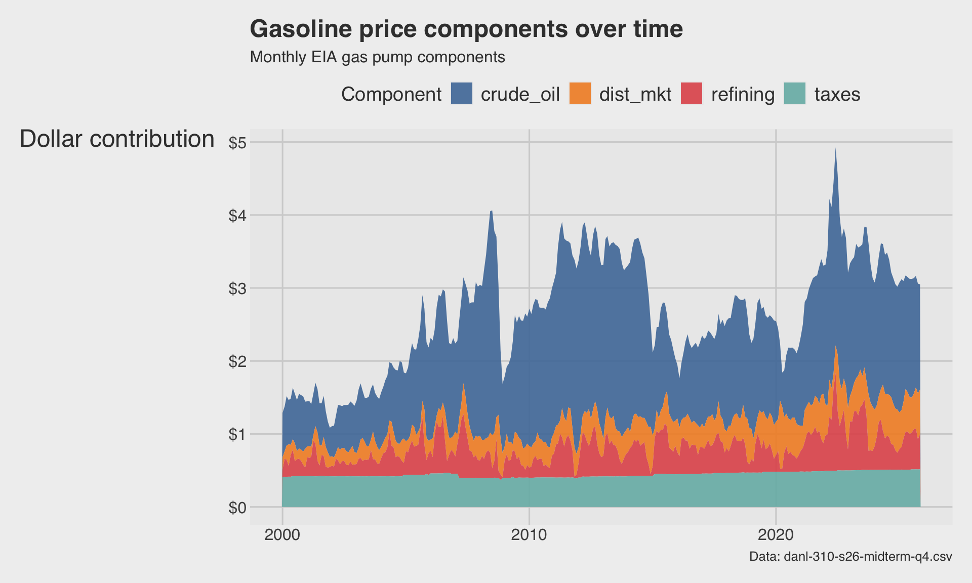
- The total height is the retail gasoline price.
- Each colored band shows one component’s contribution to that total.
🌊 Stream graph: gasoline price components
ggplot(eia,
       aes(x = mon_yr,
           y = retail_price_decomposed,
           fill = component)) +
  ggstream::geom_stream(type = "ridge", bw = 0.6, extra_span = 0.1) +
  scale_y_continuous(labels = dollar_format()) +
  labs(
    x = NULL,
    y = "Smoothed contribution",
    fill = "Component",
    title = "Stream graph: gasoline price components",
    subtitle = "A stream graph emphasizes flow more than precise magnitudes"
  )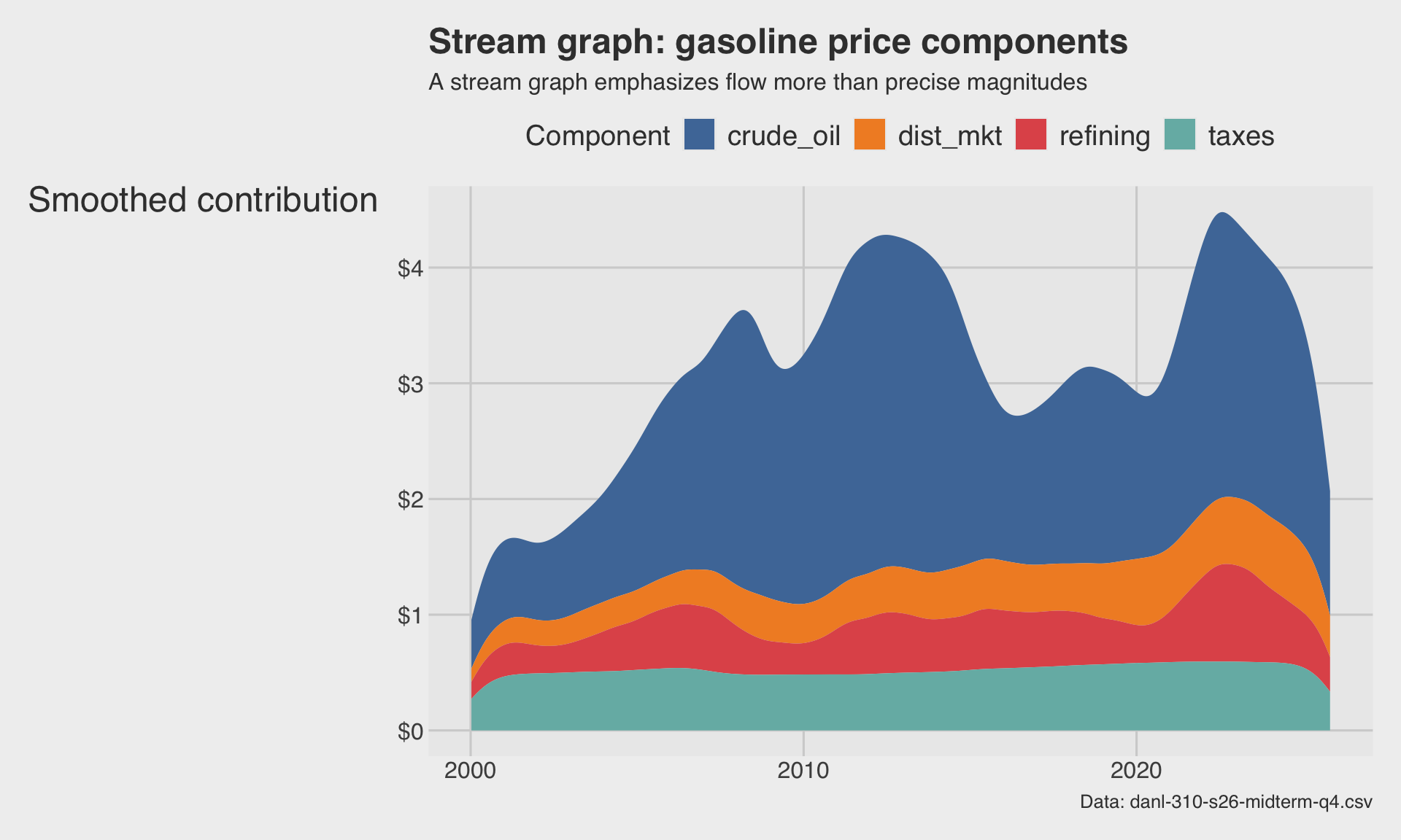
- Stream graphs are good for presentation and storytelling.
- But they trade away some precision for visual appeal.
🔀 Alluvial diagram: class → gender → survival
titanic_alluvial <- titanic |>
  count(class, gender, survived)

ggplot(
  titanic_alluvial,
  aes(axis1 = class, axis2 = gender, axis3 = survived, y = n)
) +
  geom_alluvium(aes(fill = survived), alpha = 0.8) +
  geom_stratum(width = 0.2, color = "gray40", fill = "gray80",
               alpha = .75) +
  geom_text(stat = "stratum", aes(label = after_stat(stratum)), size = 4) +
  scale_x_discrete(limits = c("Class", "Gender", "Survival"), expand = c(.1, .1)) +
  labs(
    x = NULL, fill = NULL,
    y = "Count",
    title = "Titanic passengers",
    subtitle = "Flow from class to gender to survival"
  )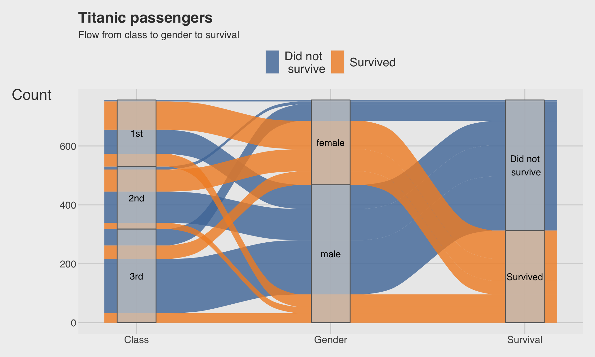
- The bands represent flows between categories.
- Wider bands correspond to larger counts.
🕸️ Radar chart with ggradar()
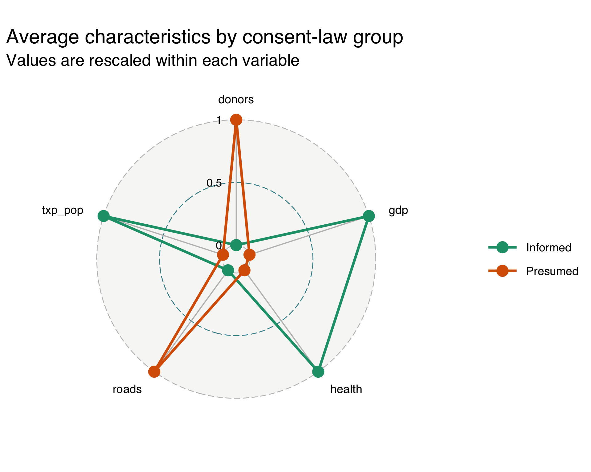
- Each polygon summarizes the average profile of one consent-law group.
- But exact comparison is still harder than with a dumbbell plot or slope chart.
🔢 Scatterplot matrix with GGally::ggpairs()
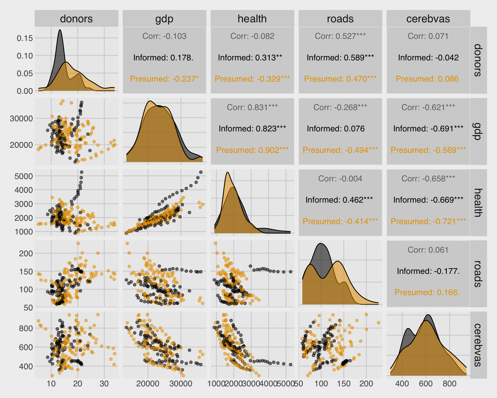
ggpairs()quickly creates a matrix of pairwise plots.- This is a powerful first look before building a more focused figure.
🔢📏 Scatterplot matrix with geom_smooth()
# custom function `my_scatter`
#   for scatterplot w/ a fitted line
my_scatter <- function(data, mapping, ...){
  ggplot(data = data, mapping = mapping) +
    geom_point(alpha = 0.5) +
    geom_smooth(method=lm,
                se=FALSE, ...)
}

ggpairs(org_small,
        columns = 1:5,
        mapping = aes(color = consent_law,
                      alpha = 0.6),
        lower = list(continuous = my_scatter)
  ) +
  scale_color_colorblind() +
  scale_fill_colorblind()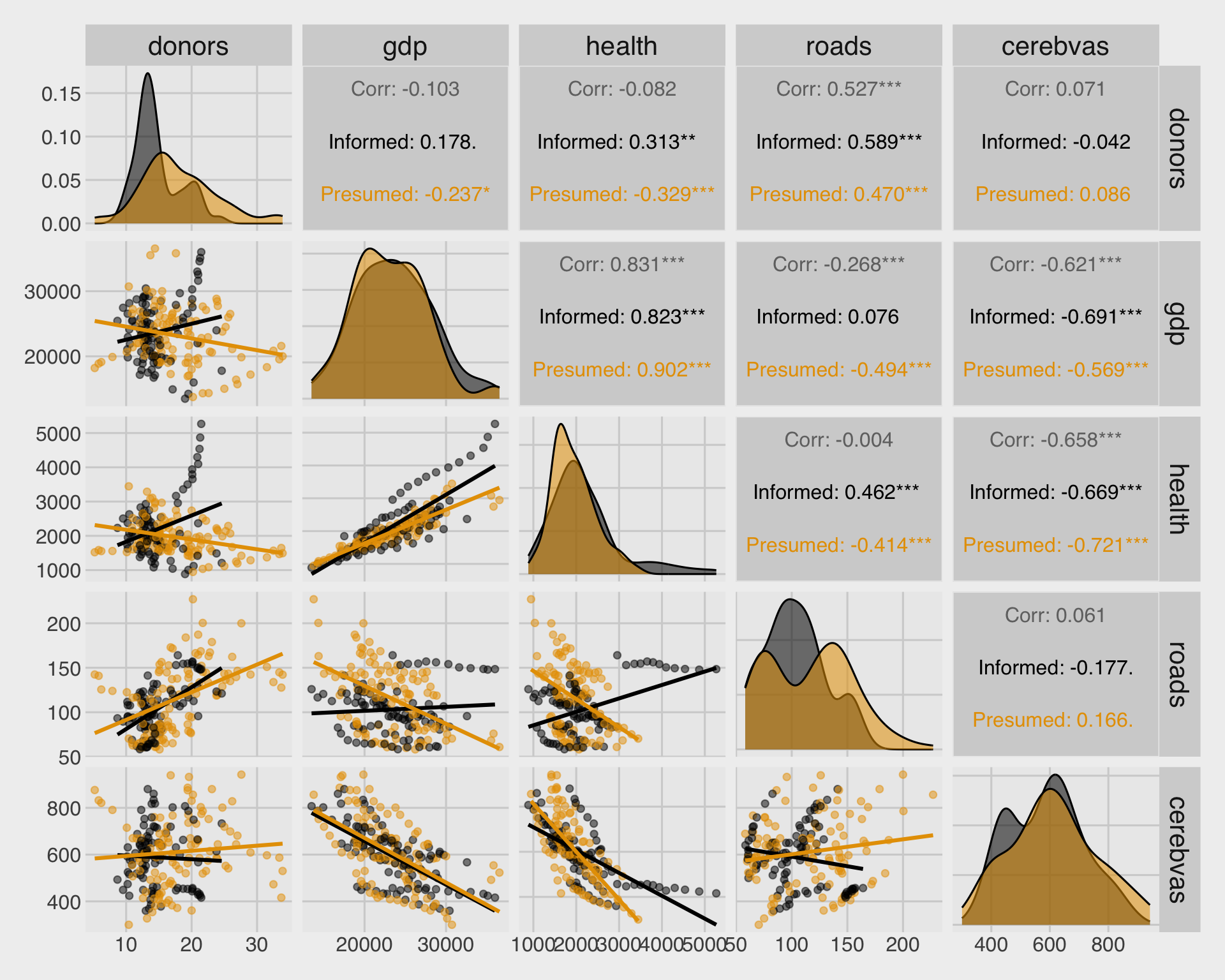
- We can add
geom_smooth()toggpairs()using a custom function.
🗺️ Heatmap: donor rates by country and year
org_heat <- socviz::organdata |>
  filter(!is.na(donors), !is.na(year)) |>
  group_by(country, year) |>
  summarize(donors = mean(donors)) |>
  ungroup()

ggplot(org_heat,
       aes(x = year, y = fct_reorder(country, donors, .fun = mean), fill = donors)) +
  geom_tile() +
  scale_fill_viridis_c() +
  guides(
    fill = guide_colorbar(
      barheight = unit(.6, "cm"),
      barwidth = unit(8, "cm")
  )) +
  labs(
    x = NULL,
    y = NULL,
    fill = "Donors",
    title = "Organ donor rates by country and year",
    subtitle = "Color represents the donor rate"
  )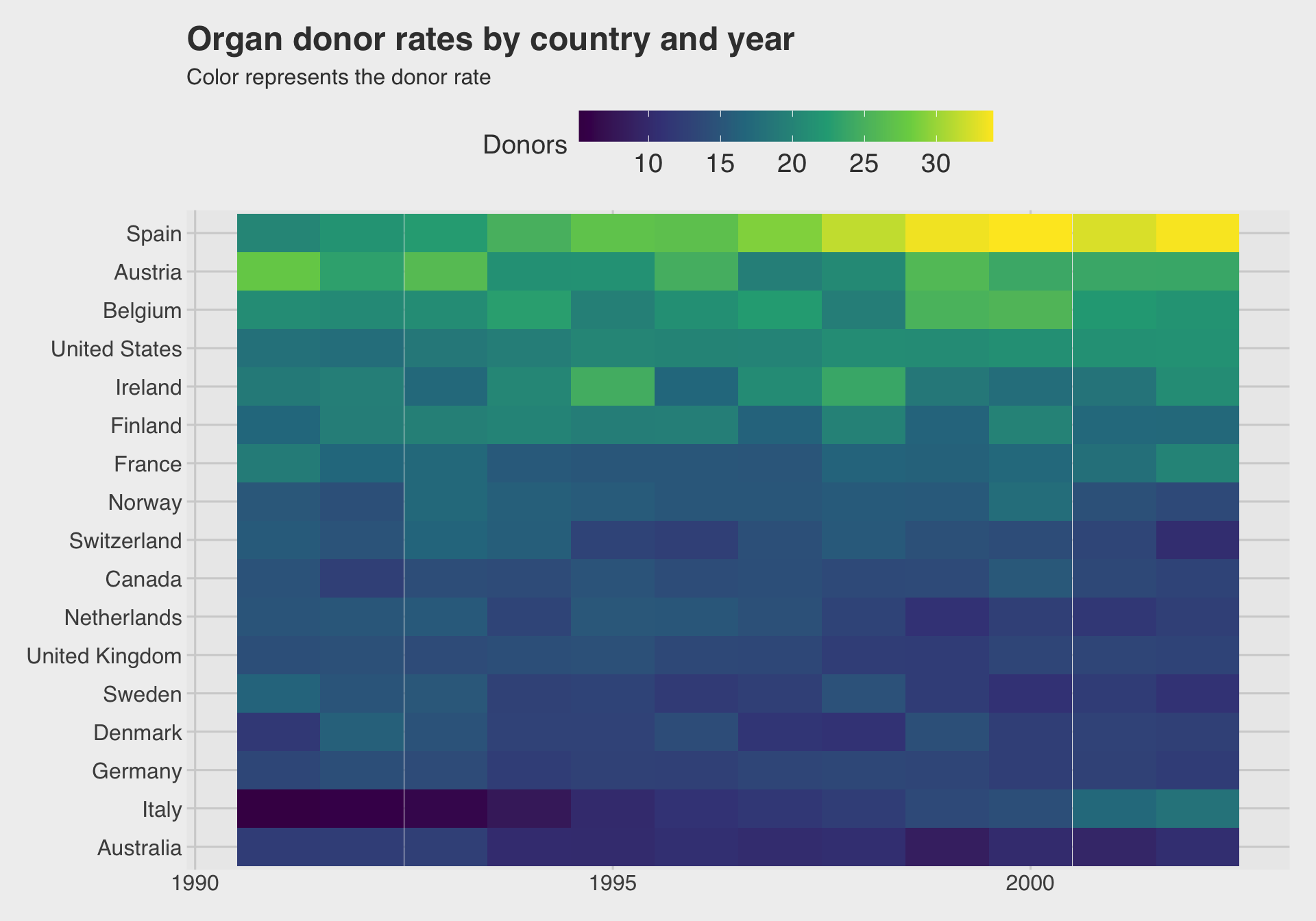
geom_tile()is the main workhorse for heatmaps inggplot2.- The meaning comes from the color scale, so choose it carefully.
🔥 Correlation heatmap with organdata
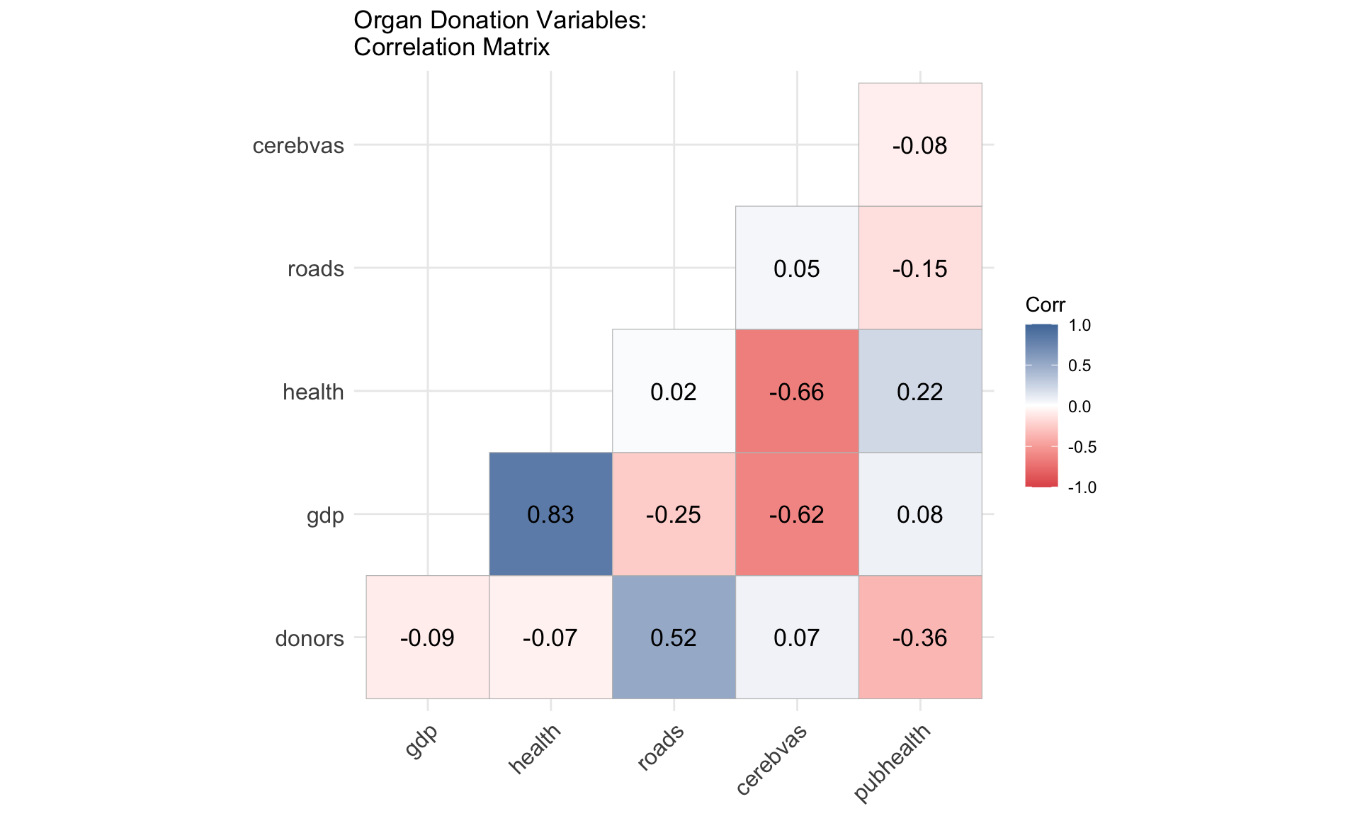
- Values close to 1 indicate strong positive correlation.
- Values close to -1 indicate strong negative correlation.
- Values near 0 indicate weak linear association.
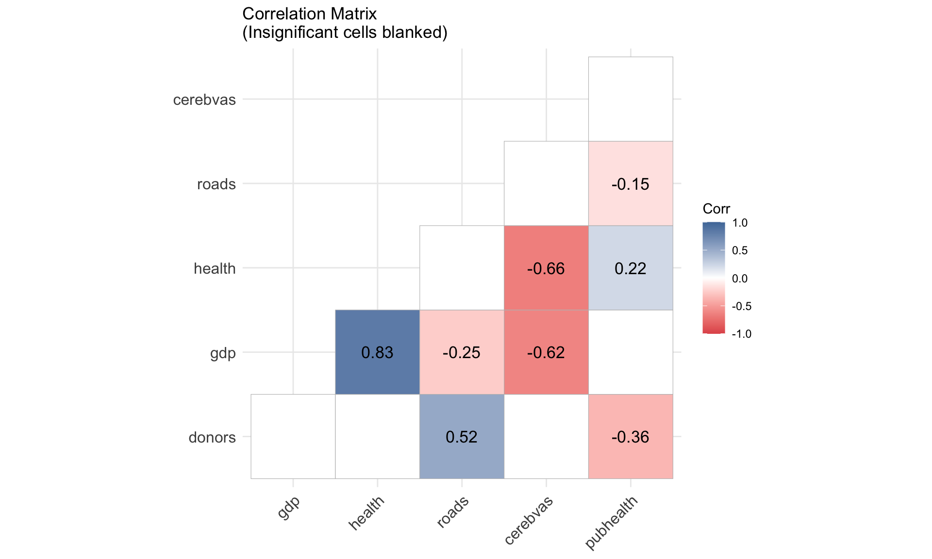
🔥 Correlation heatmap with significance
p_mat <- socviz::organdata |>
    select(donors, gdp, health,
           roads, cerebvas, pubhealth) |>
    drop_na() |>
    cor_pmat()


ggcorrplot(
  org_cor,
  type = "lower",
  p.mat = p_mat,
  insig = "blank",
  lab = TRUE,
  lab_size = 4.5,
  colors = c("#E15759",
             "white",
             "#4E79A7"),
  title = "Correlation Matrix\n(Insignificant cells blanked)"
)
☁️ Word cloud by genre
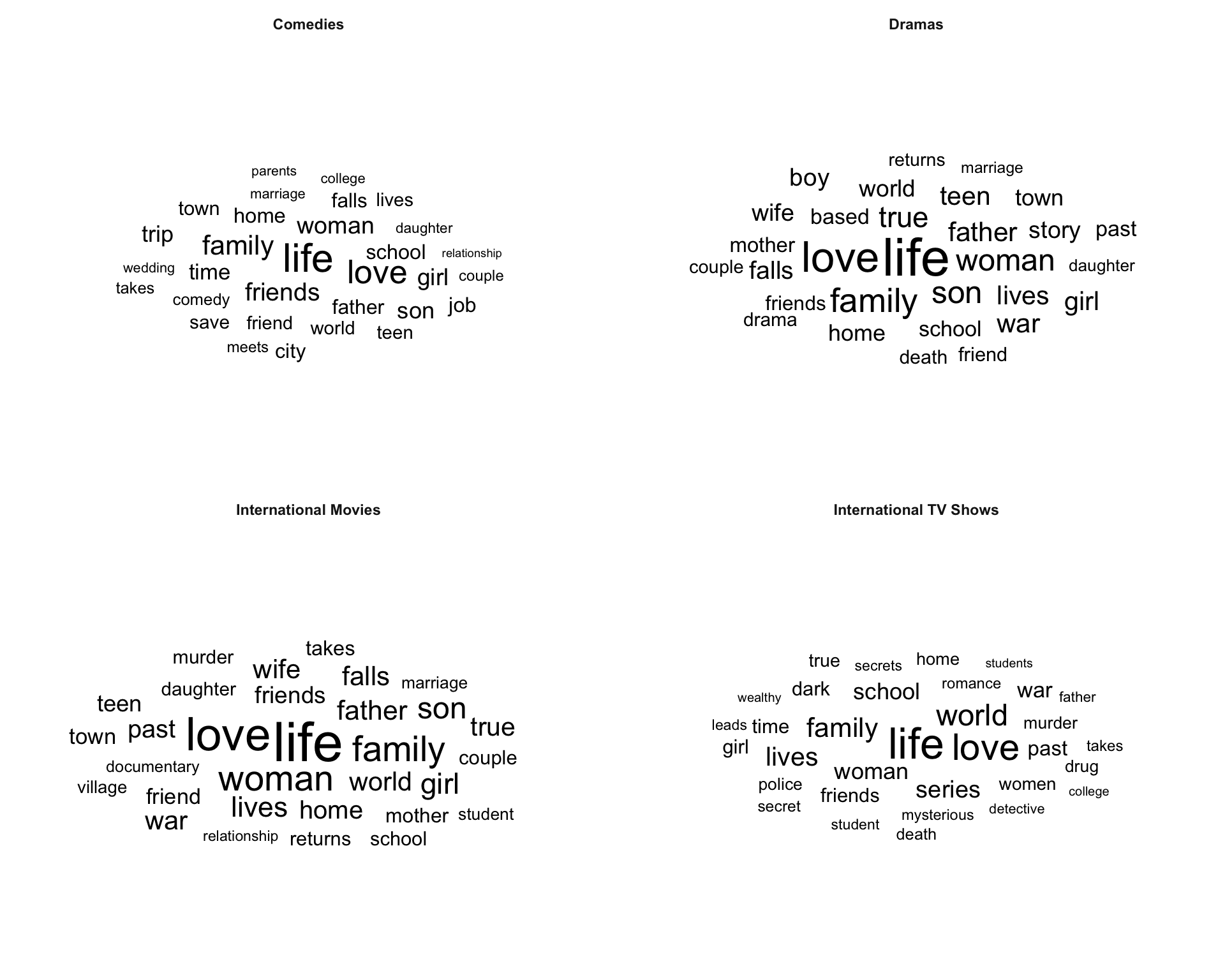
- Larger words appear more often in descriptions for that genre.
- This is useful for quick exploration of text themes.