by_country <- socviz::organdata |>
  group_by(consent_law, country) |>
  summarize(
    donors_mean = mean(donors, na.rm = TRUE),
    donors_sd = sd(donors, na.rm = TRUE),
    gdp_mean = mean(gdp, na.rm = TRUE),
    health_mean = mean(health, na.rm = TRUE),
    roads_mean = mean(roads, na.rm = TRUE),
    cerebvas_mean = mean(cerebvas, na.rm = TRUE)
)Lecture 6
Add Labels and Make Notes on ggplot
March 25, 2026
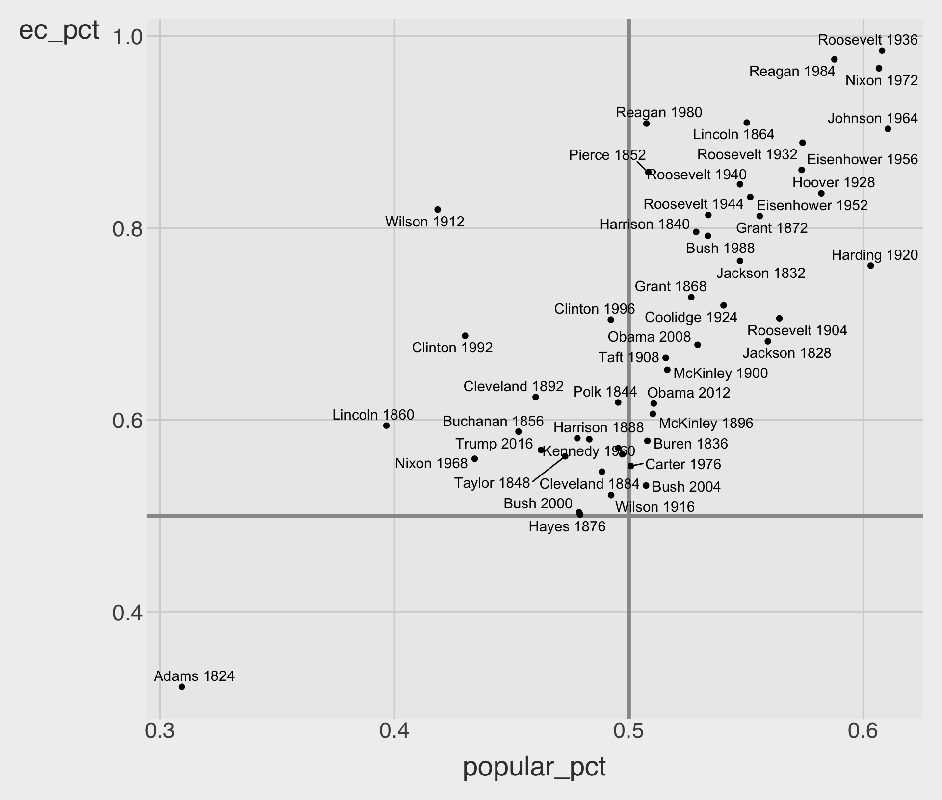
geom_text() basics
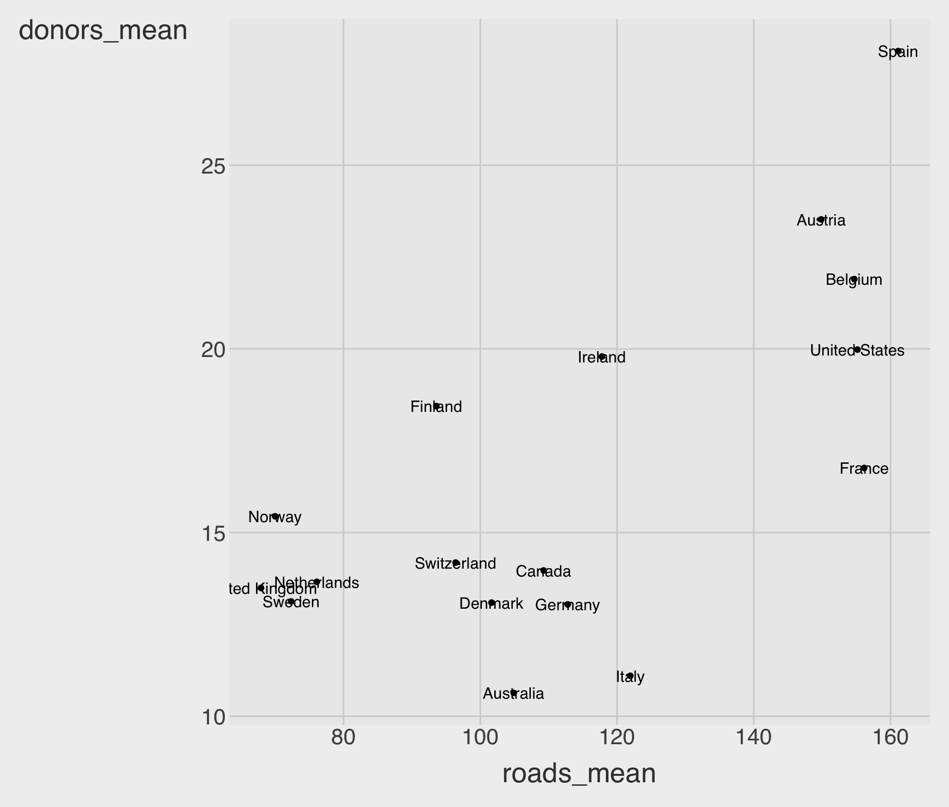
geom_text()draws text at the coordinates given byxandy.- The most important mapped aesthetic is usually
label = .... - Here, each point is labeled with the country name.
geom_text() often overlaps
- By default, labels are centered on the coordinates.
hjust = 0left-justifies text;hjust = 1right-justifies text.- Even with
hjust, labels may still overlap each other or cover points.
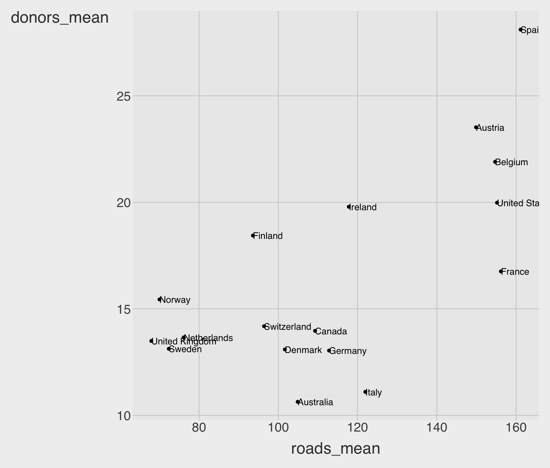
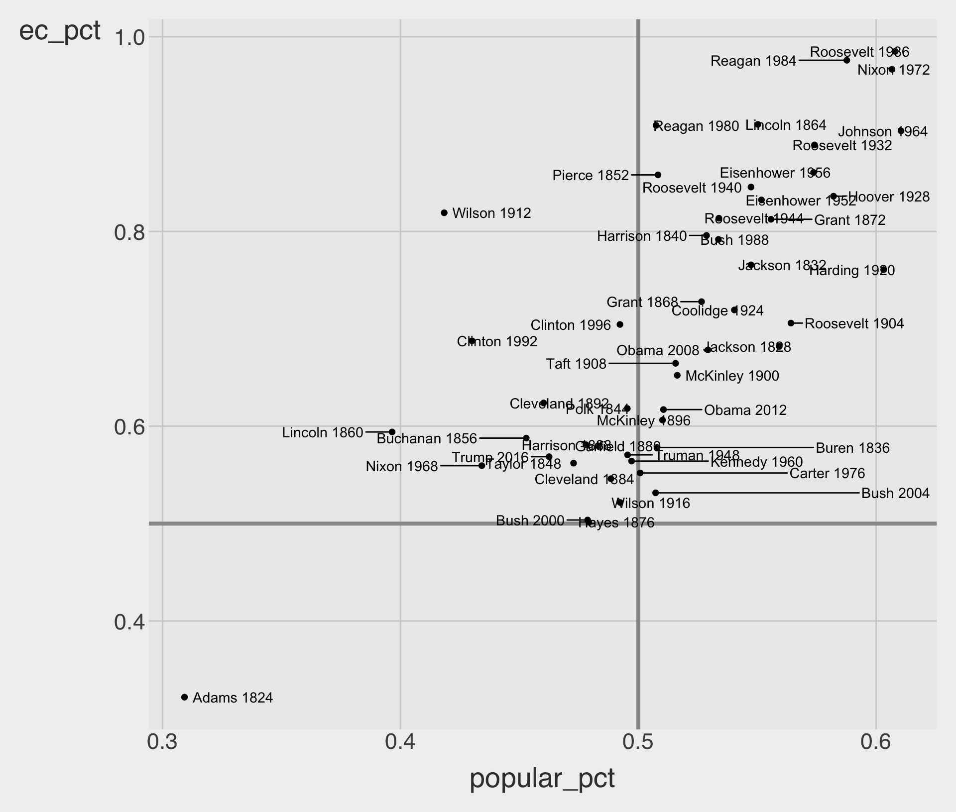
Useful arguments in geom_text()
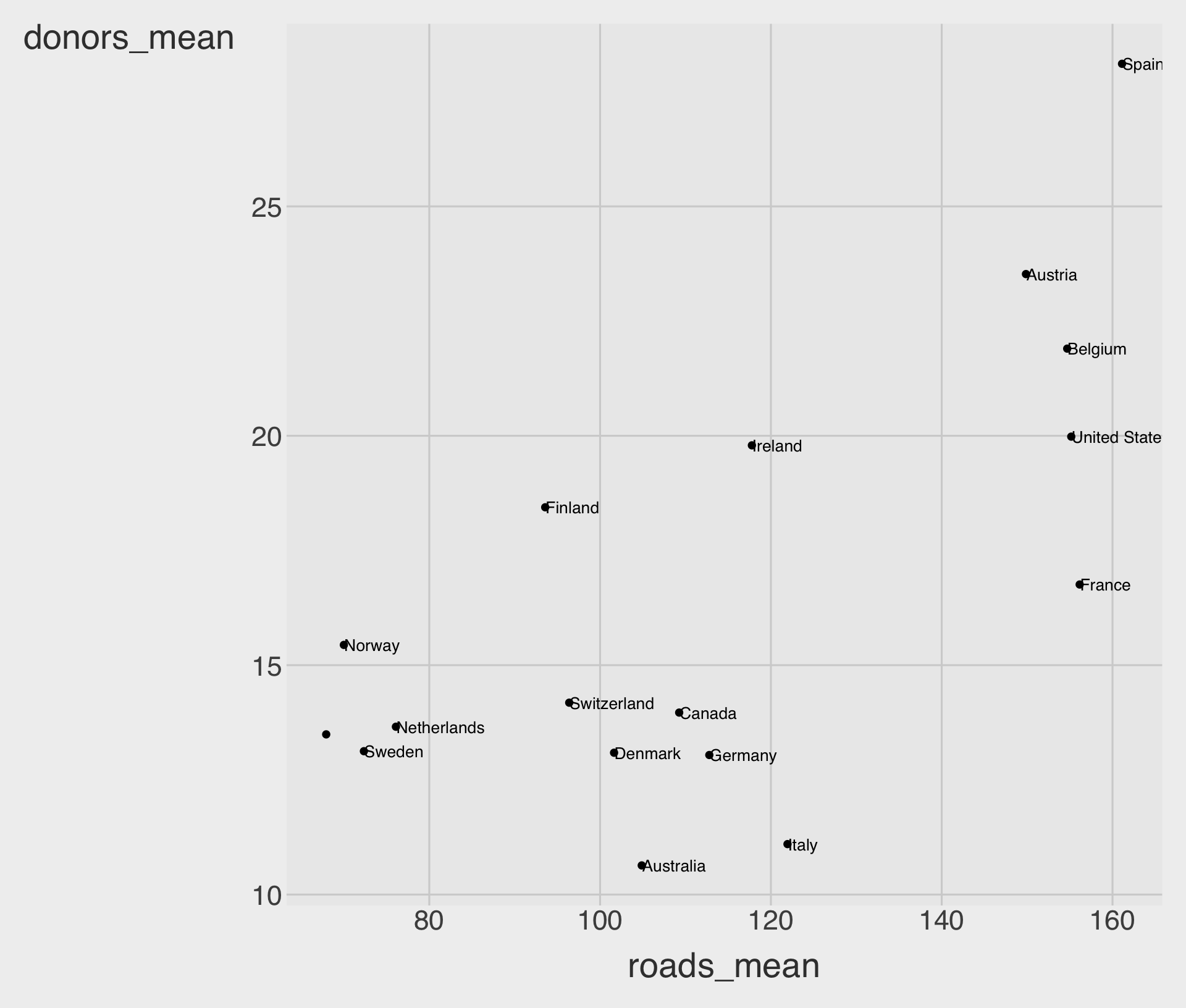
sizechanges text size.nudge_xandnudge_yshift labels a little without changing the data.check_overlap = TRUEdrops some labels when they collide.
geom_hline() and geom_vline()
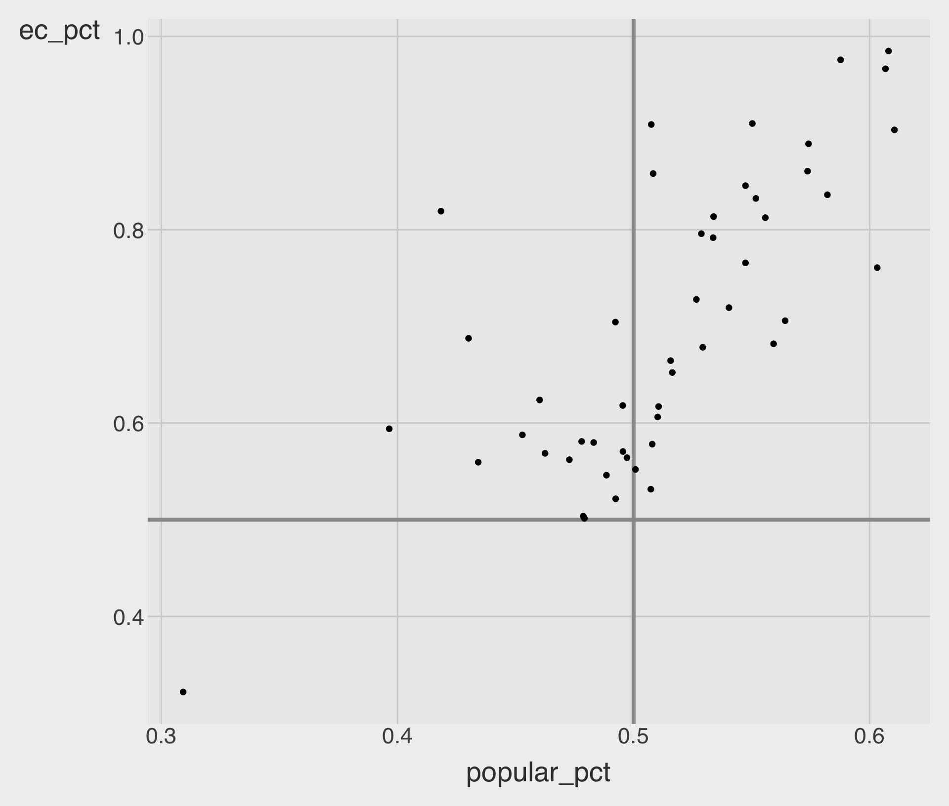
geom_hline(yintercept = ...)adds a horizontal line.geom_vline(xintercept = ...)adds a horizontal line.- Reference lines at 50% help us interpret the margins.
geom_text_repel()
geom_text_repel()tries to keep labels from overlapping each other.- It also tries to avoid placing labels directly on top of points.
- This usually produces a much more readable chart than
geom_text().
Useful arguments in geom_text_repel()
box.paddingadds more empty space around each label, so labels are pushed farther away from nearby labels and points.max.overlapssets the max. number of overlaps a label can have.
Add scales and labels
p_title <- "Presidential Elections:\n Popular & Electoral College Margins"
p_subtitle <- "1824-2016"
p_caption <- "Data for 2016 are provisional."
x_label <- "Winner's share of Popular Vote"
y_label <- "Winner's share of\nElectoral College\nVotes"

p_elec <- p_base +
  geom_text_repel() +
  scale_x_percent() +
  scale_y_percent() +
  labs(
    x = x_label,
    y = y_label,
    title = p_title,
    subtitle = p_subtitle,
    caption = p_caption
  )

p_elec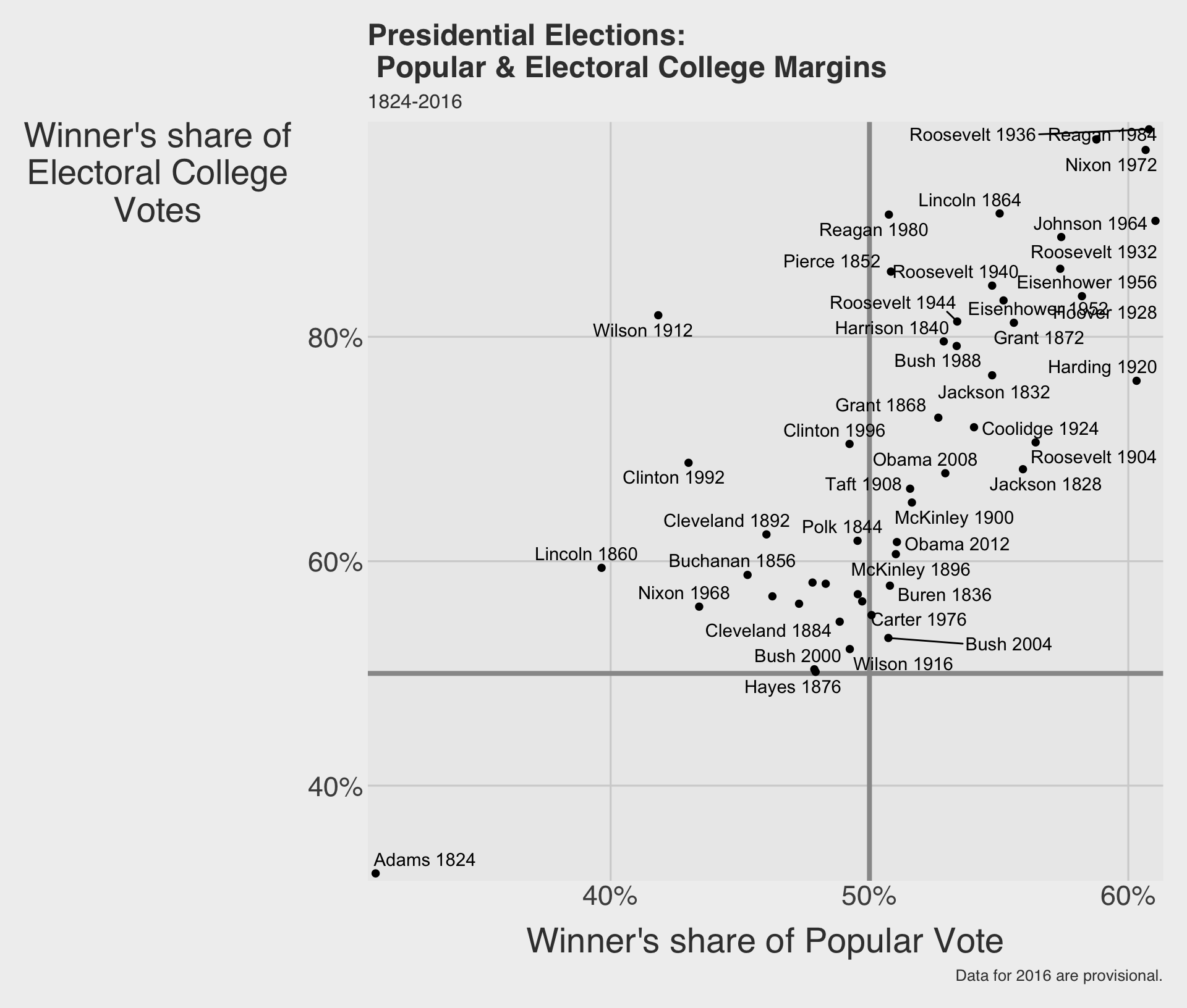
annotate() for fixed notes
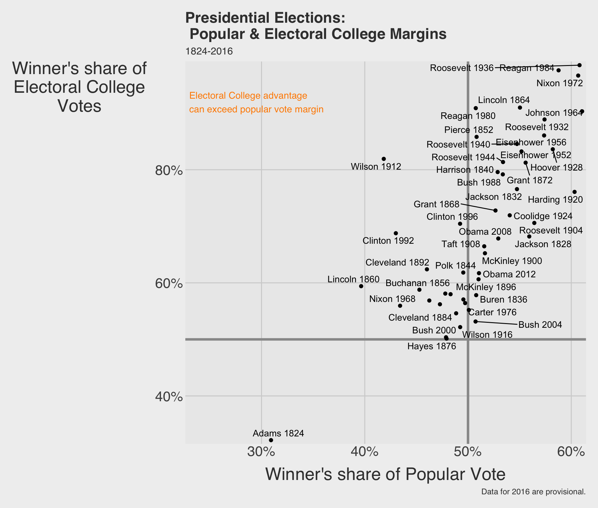
annotate()adds something at a fixed location on the plot.- Unlike
geom_text(), it does not need a whole data frame of observations. - This is useful for one-off explanatory notes.
annotate() can add arrows too
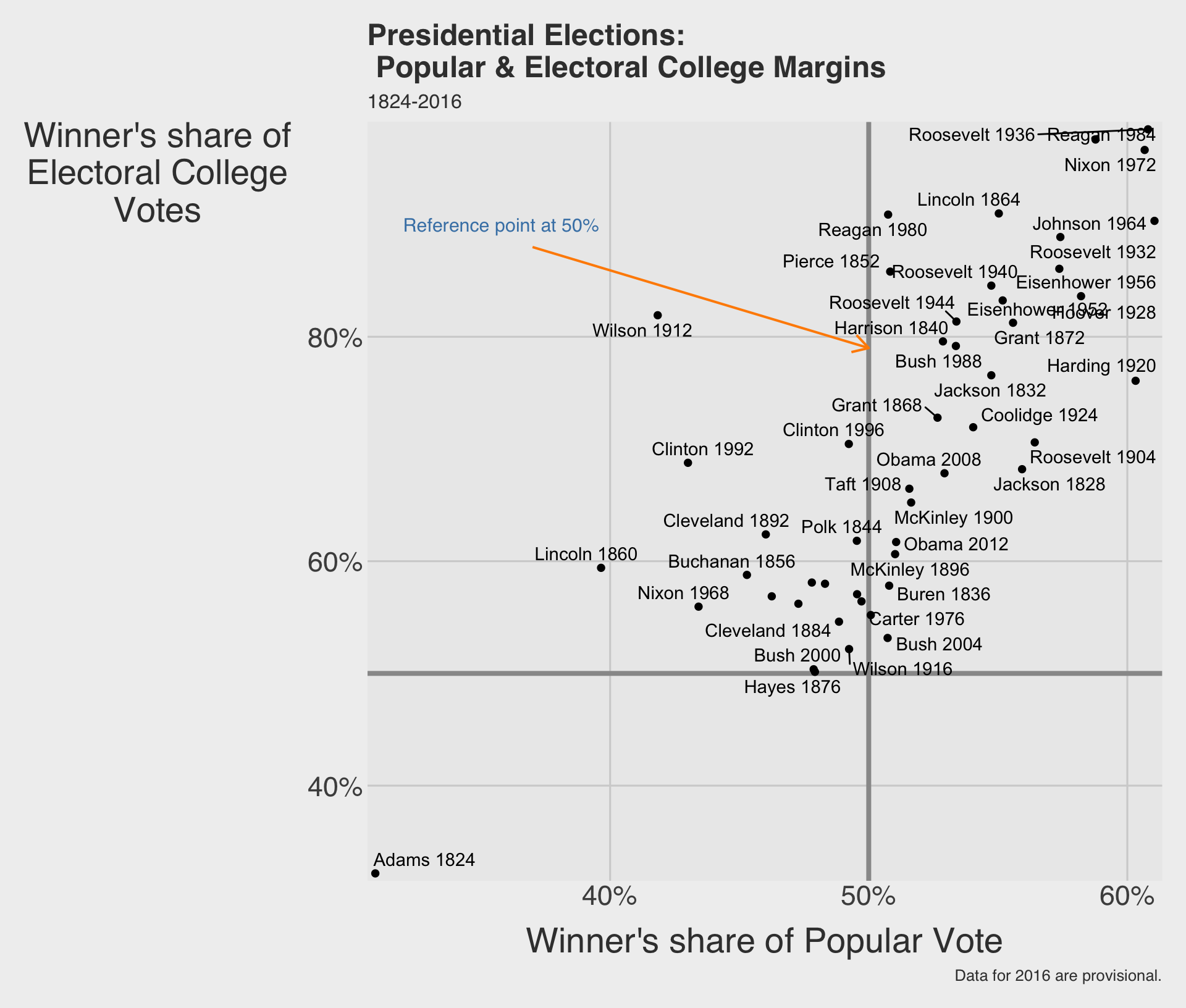
annotate("segment", ...)can draw arrows or line segments.- Pairing text and segments is a common way to call attention to a meaningful part of the chart.
annotate() with images using "richtext"
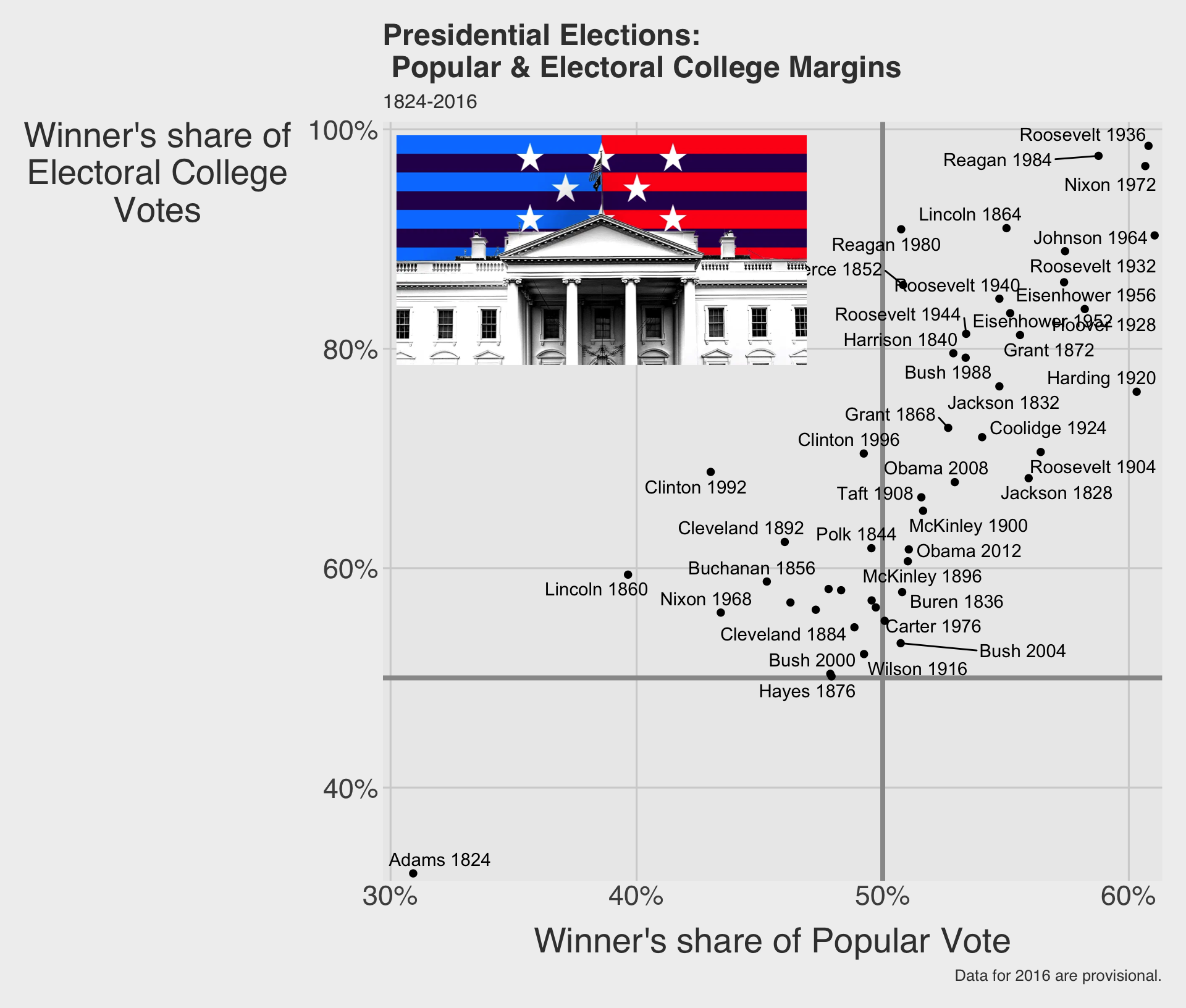
annotate("richtext", ...)renders HTML inside a ggplot.- The
labelaccepts an<img>tag — setsrcto any image URL andwidth/heightto control its size in pixels.