Lecture 5
Show the right number
February 5, 2025
Show the right number
Grouped data and the group aesthetic
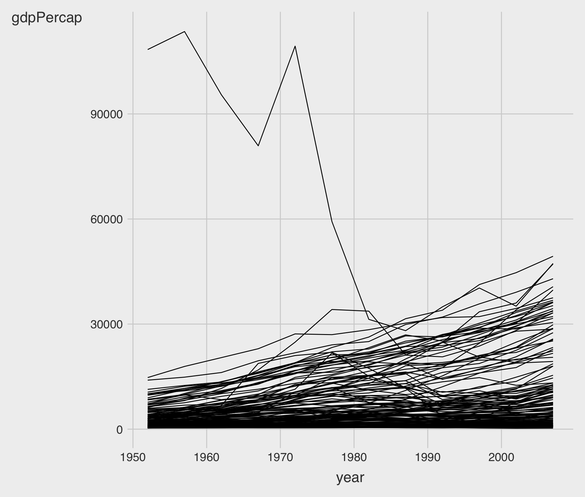
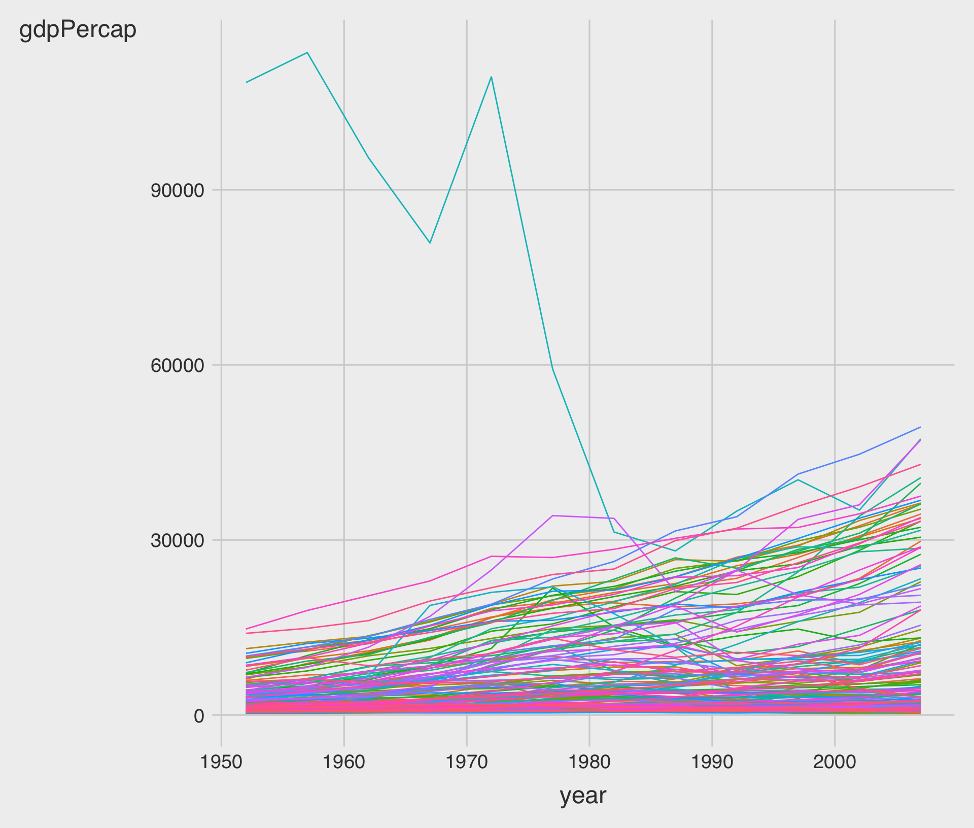
- Let’s get a line plot that draws the trajectory of life expectancy over time for each country in the
gapminderdata.frame.
Show the right number
Grouped data and the group aesthetic
- Without group related parameters,
ggplot()does not know that the yearly observations in the data are grouped by country.
Show the right number
Grouped data and the group aesthetic
- How about
coloraesthetic, instead ofgroup?
Show the right number
Grouped data and the group aesthetic
Show the right number
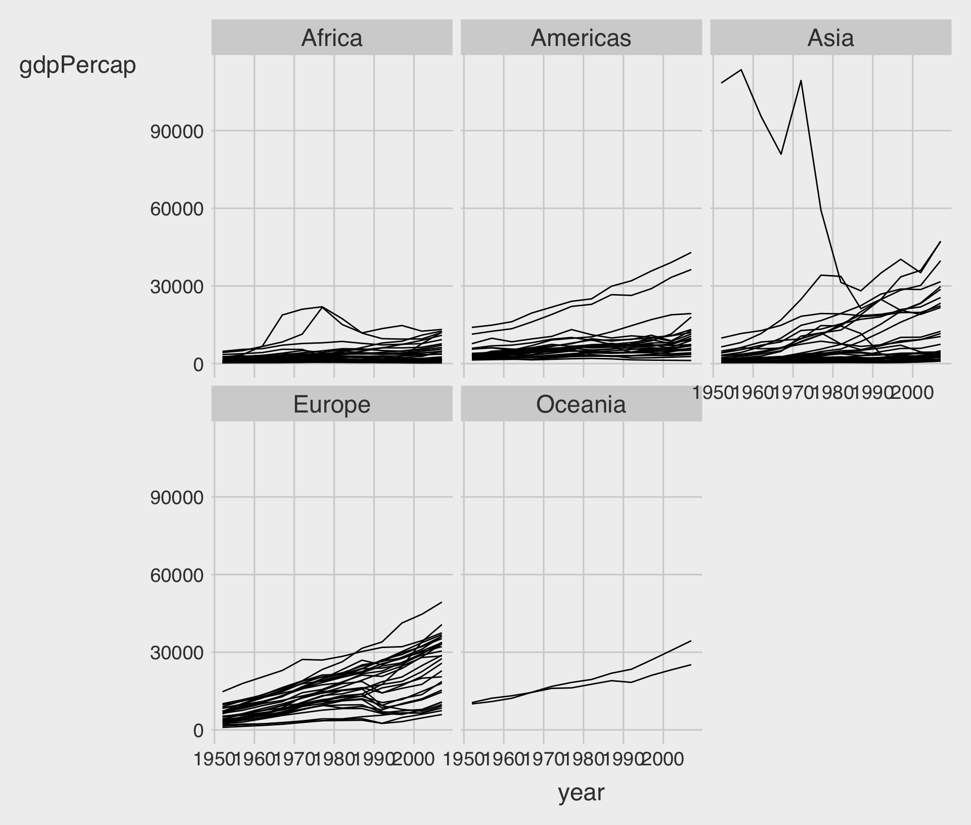
Facet to make small multiples
Show the right number
Facet to make small multiples
- Let’s have all the facetted plots in a single row:
p +
  geom_line(color="gray70",
            aes(group = country)) +
  geom_smooth(size = 1.1,
              method = "loess",
              se = FALSE) +
  facet_wrap(.~ continent, nrow = 1) +
  scale_y_log10(labels=scales::dollar) +
  theme(axis.text.x =
          element_text(
            angle = 45),
        axis.title.x =
          element_text(
            margin = margin(t = 25))) +
  labs(x = "Year",
       y = "GDP per capita",
       title = "GDP per capita on Five Continents")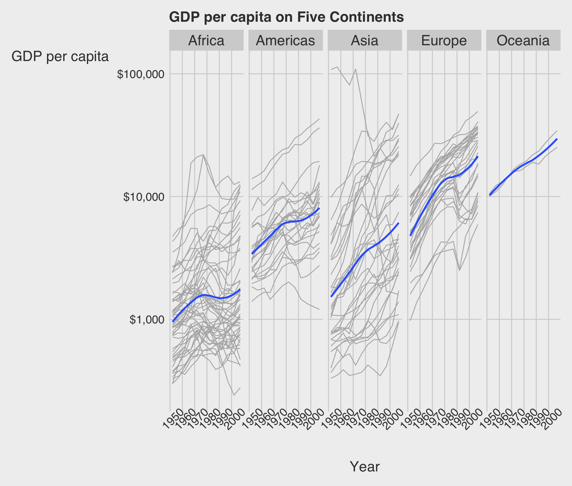
Show the right number
Facet to make small multiples
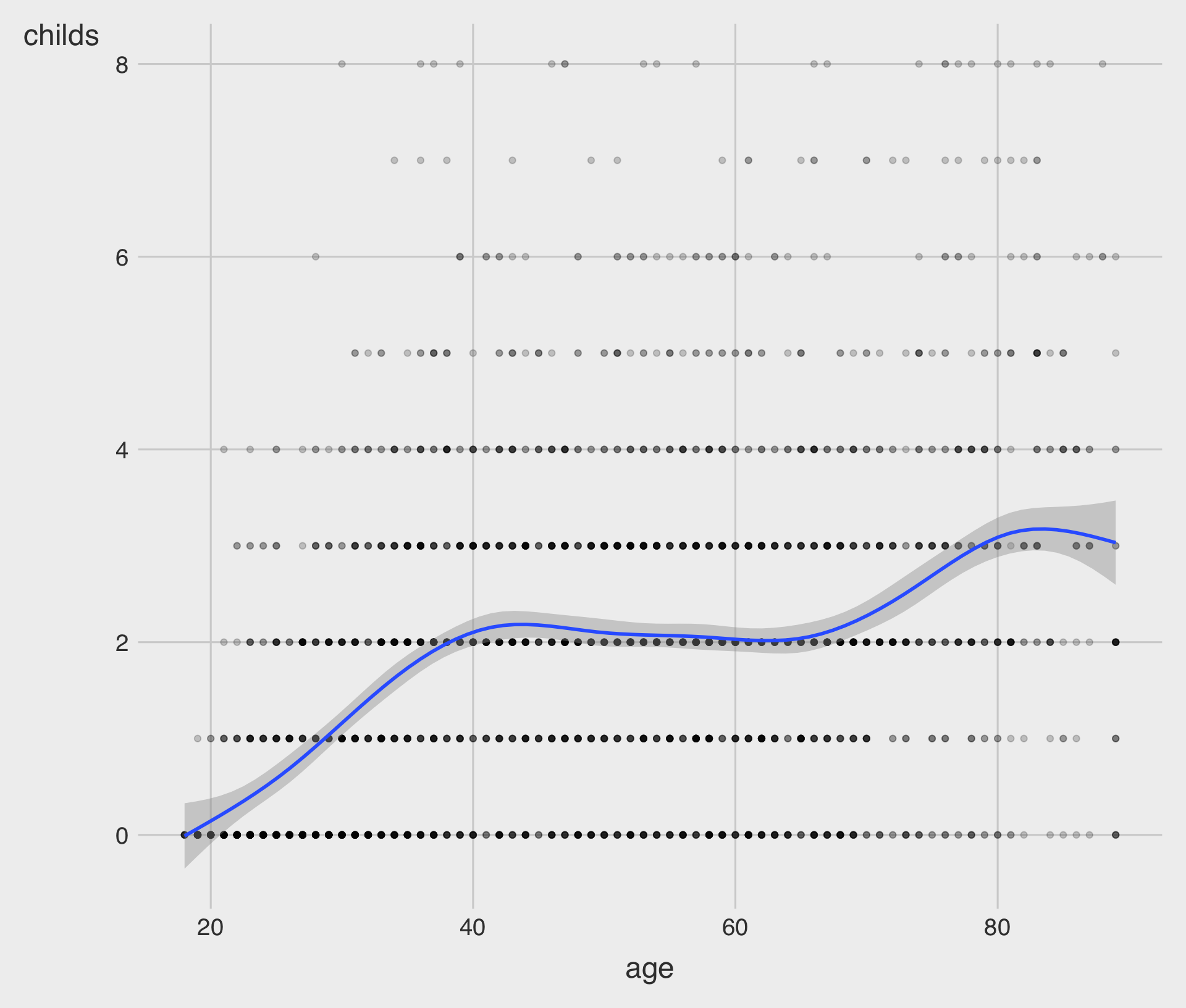
- Describe the relationship between the age of the respondent and the number of children they have using a scatterplot and a fitted curve.
Show the right number
Facet to make small multiples
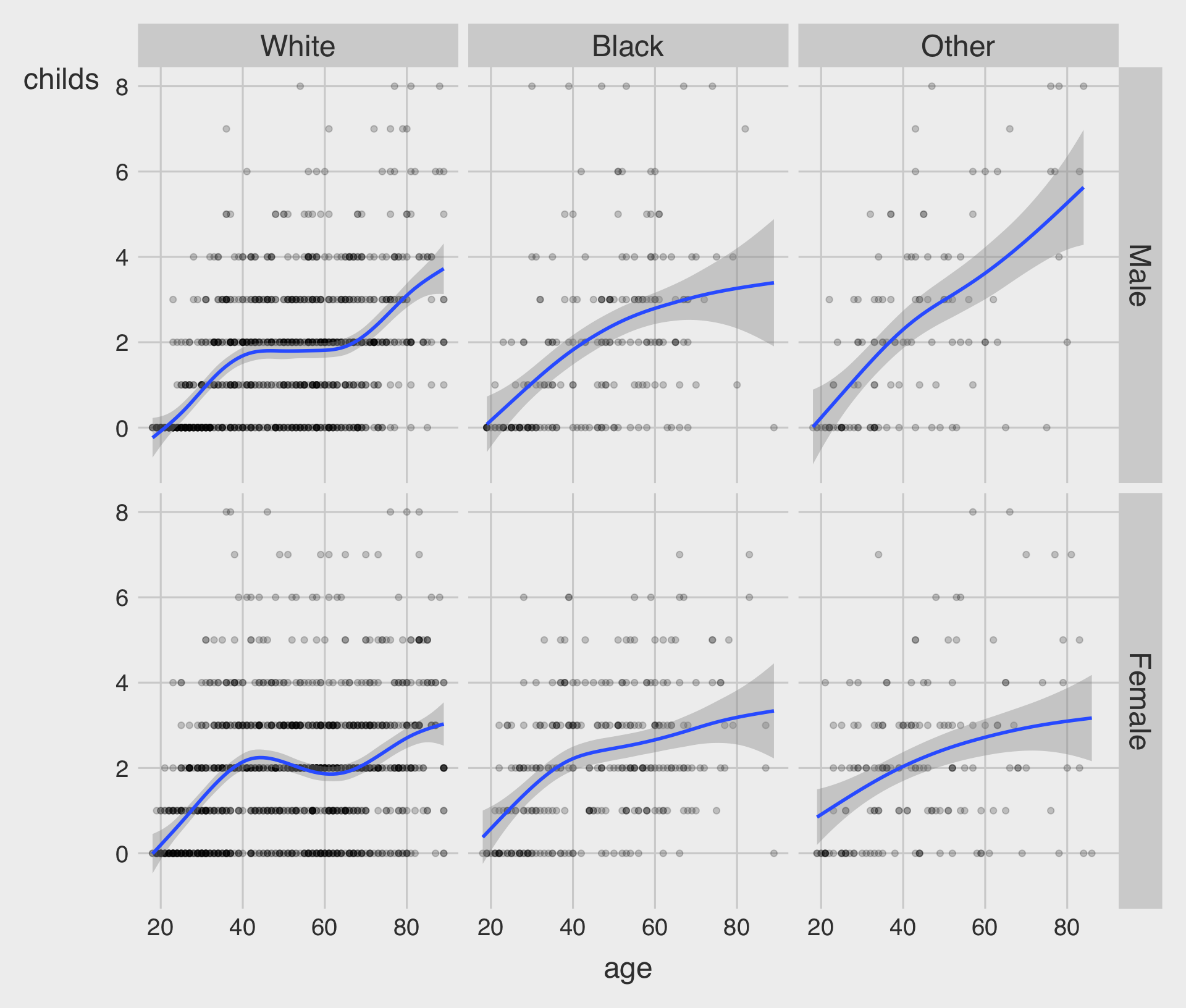
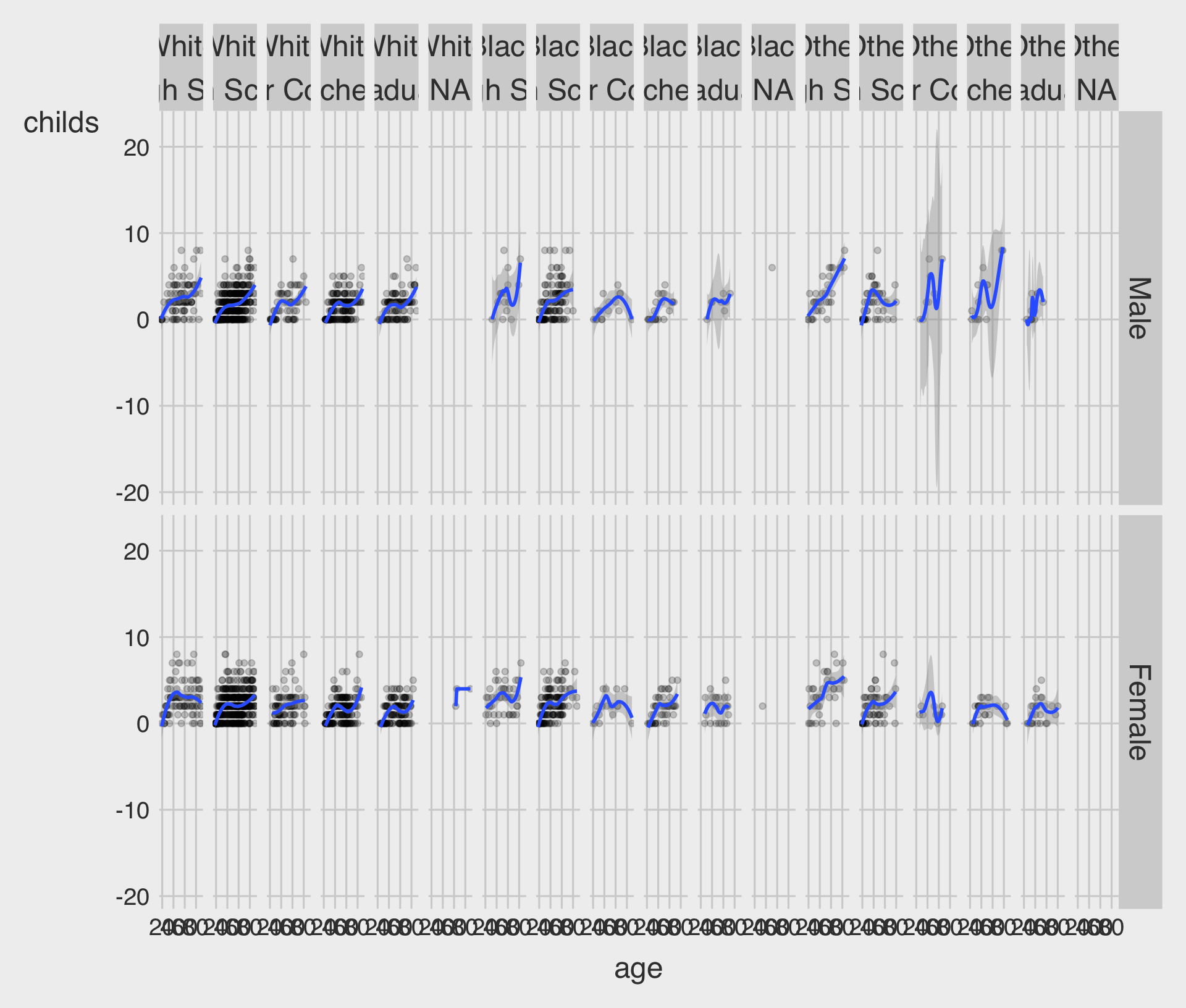
- Describe how the relationship between the age of the respondent and the number of children they have varies by
sexandrace.
Show the right number
Facet to make small multiples
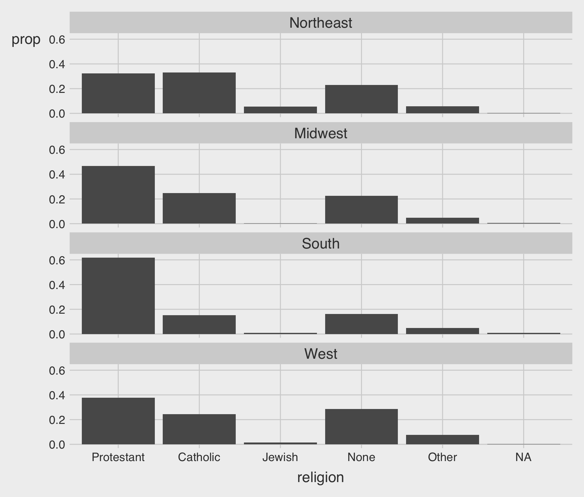
- The
facet_grid()function is best used when you cross-classify some data by two categorical variables.
Show the right number
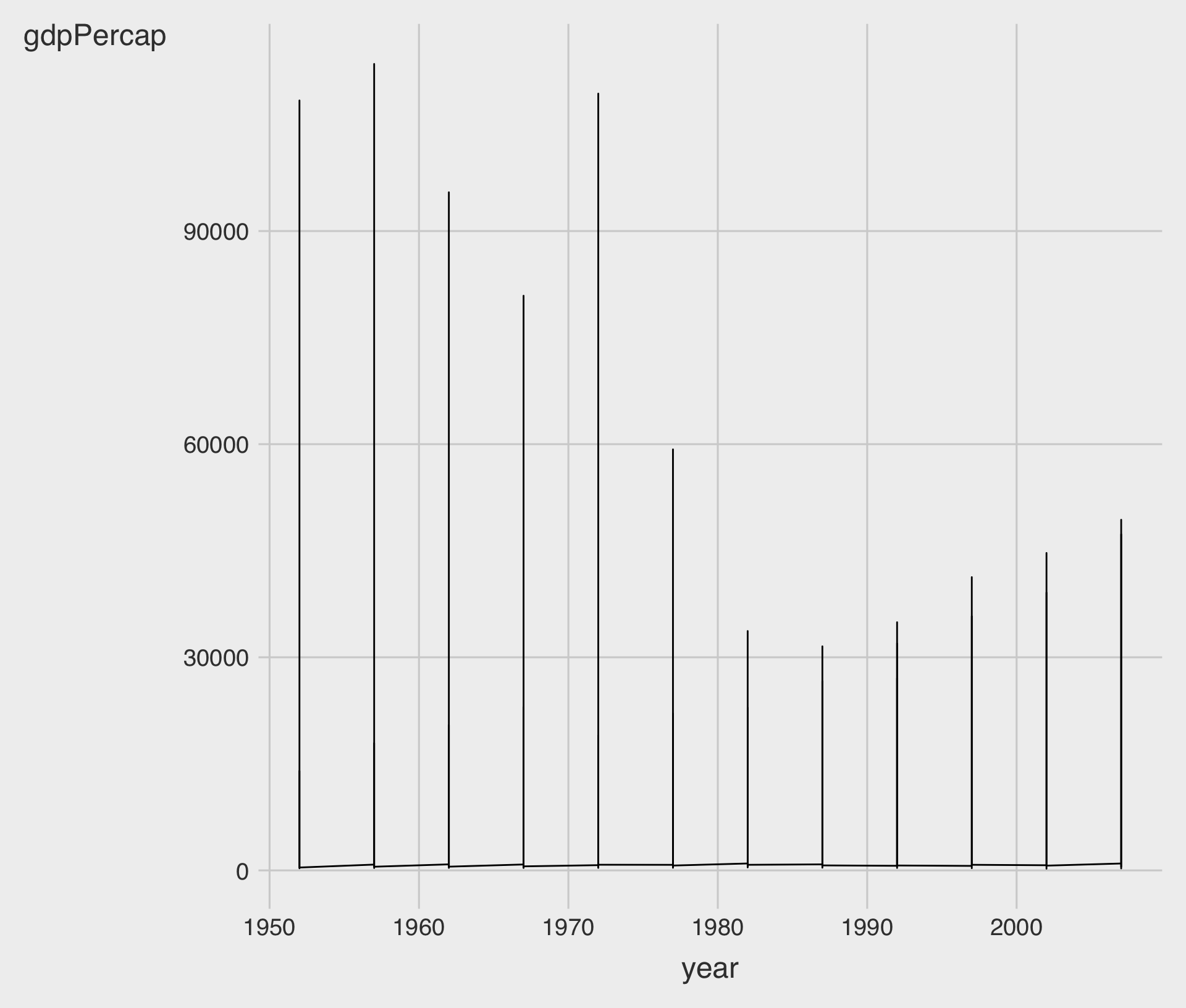
Geoms can transform data
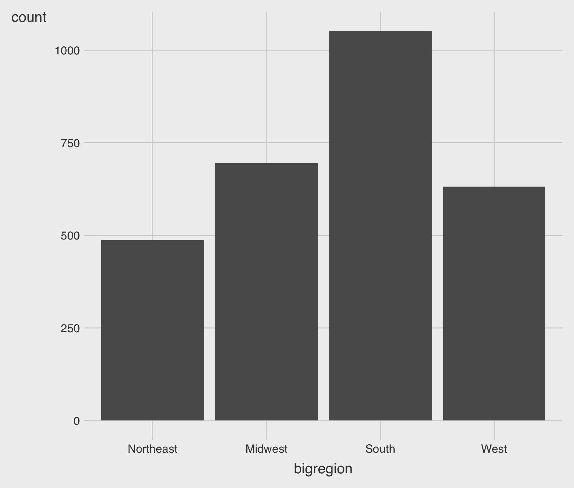
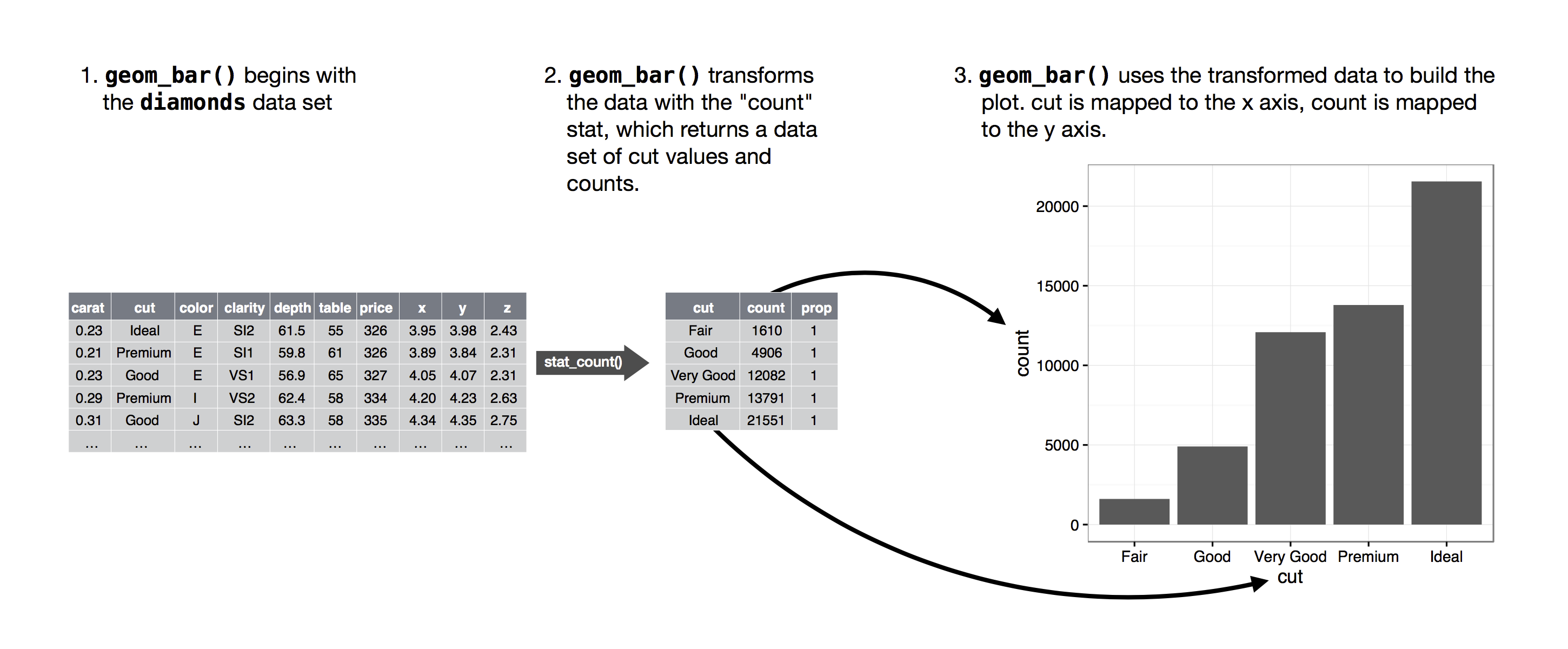
- Let’s plot a bar char:
Show the right number
Geoms can transform data
Show the right number
Geoms can transform data
- To do so we specify
group = 1inside theaes()call.
Show the right number
Geoms can transform data
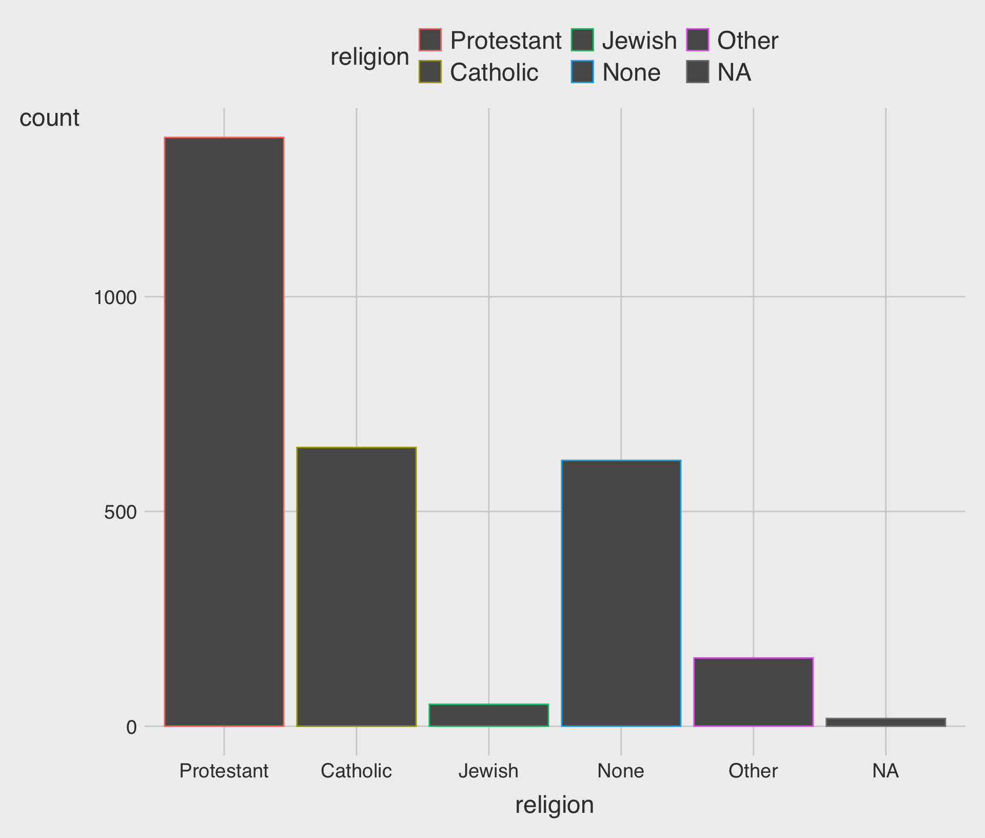
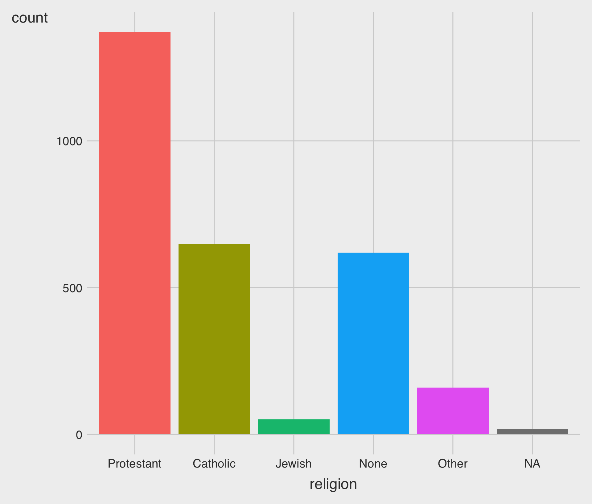
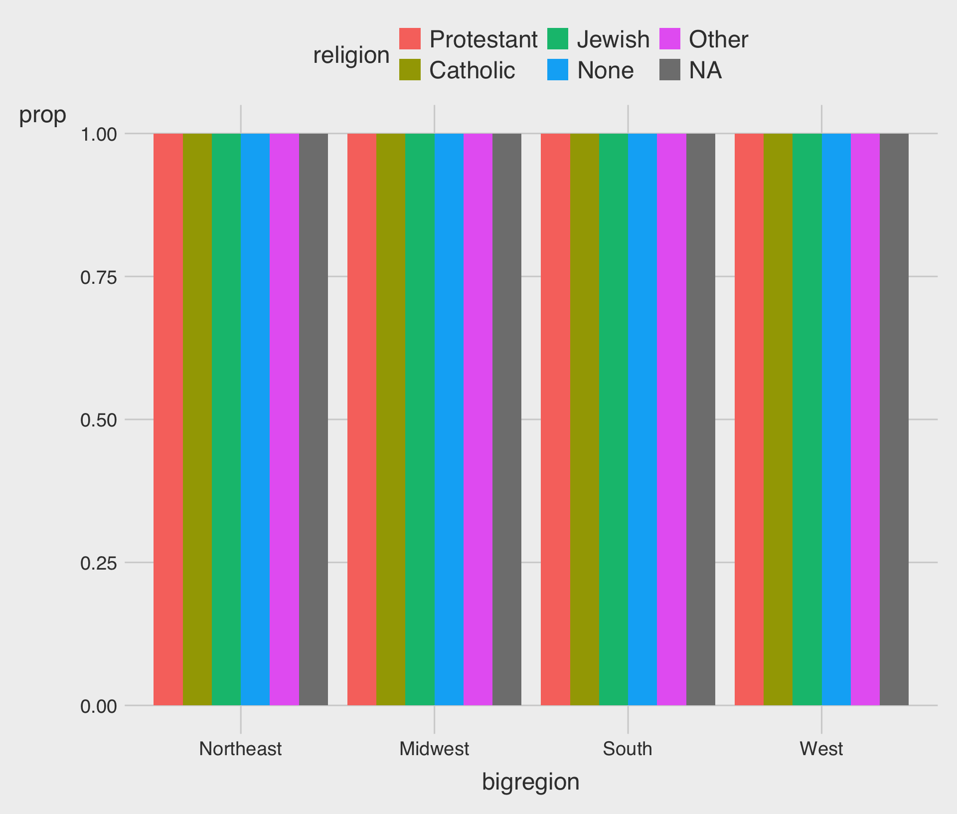
- If we map religion to
color, only the border lines of the bars will be assigned colors, and the insides will remain gray.
Show the right number
Geoms can transform data
Show the right number
Frequency plots the slightly awkward way
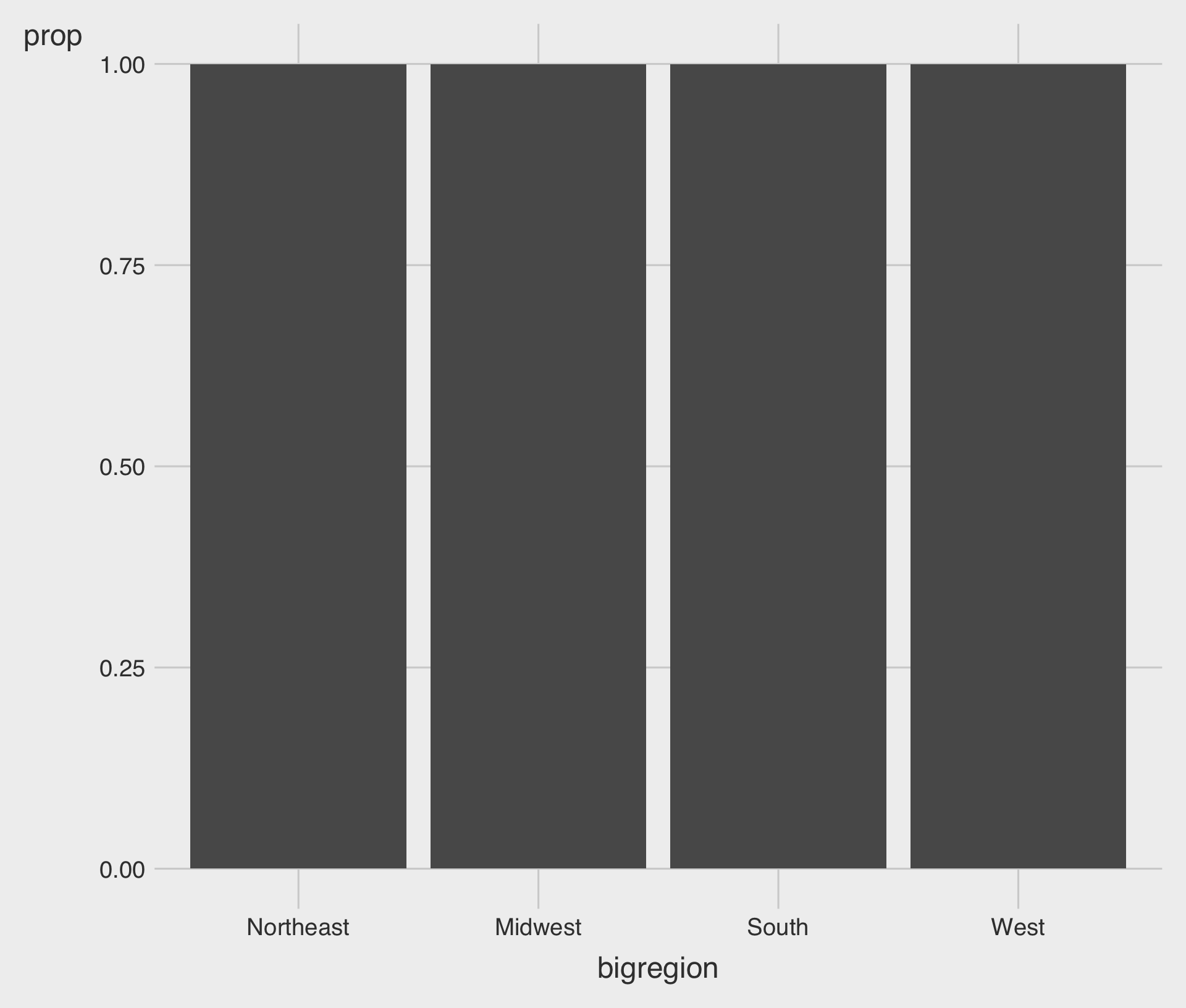
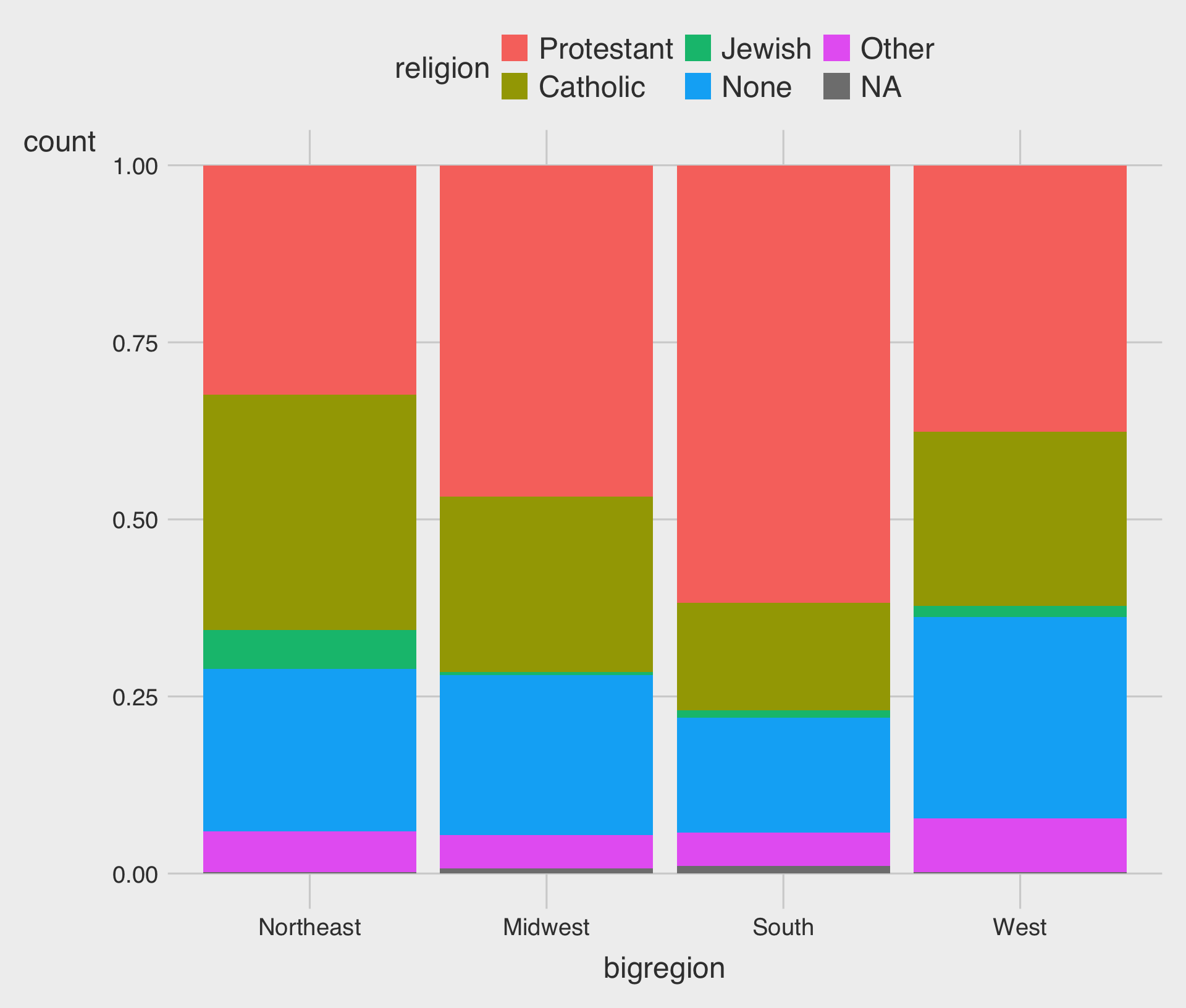
- An alternative choice is to set the
positionargument to"fill".
Show the right number
Frequency plots the slightly awkward way
- We can use
position = "dodge"to make the bars within each region of the country appear side by side.
Show the right number
Frequency plots the slightly awkward way
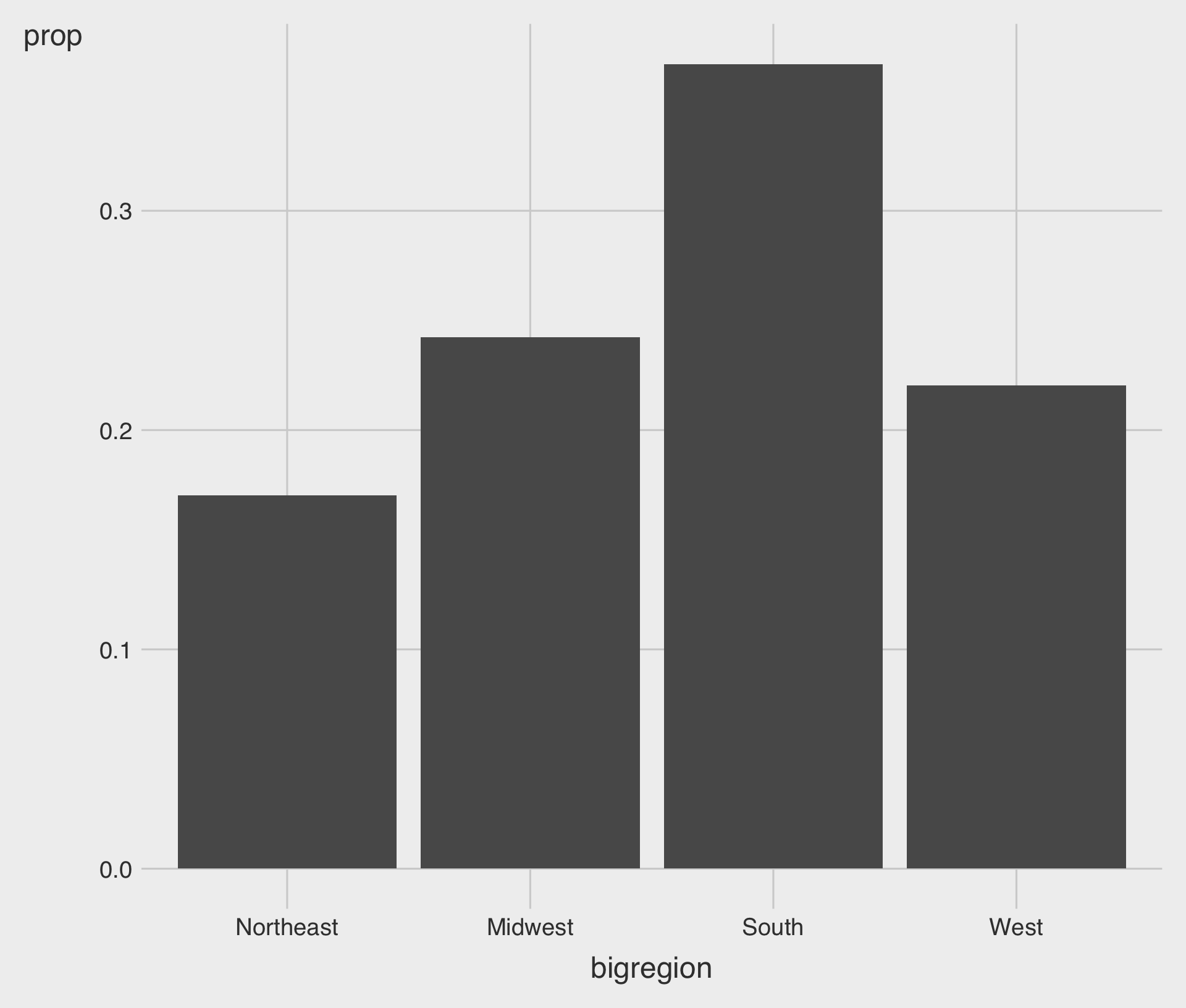
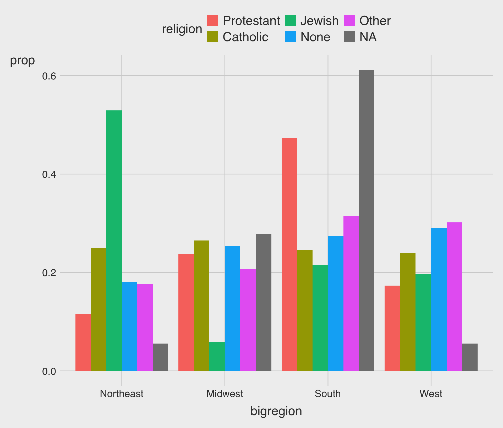
- In this case we should consider grouping variable,
religion, so we mapreligionto thegroupaesthetic.
Show the right number
Frequency plots the slightly awkward way
Show the right number
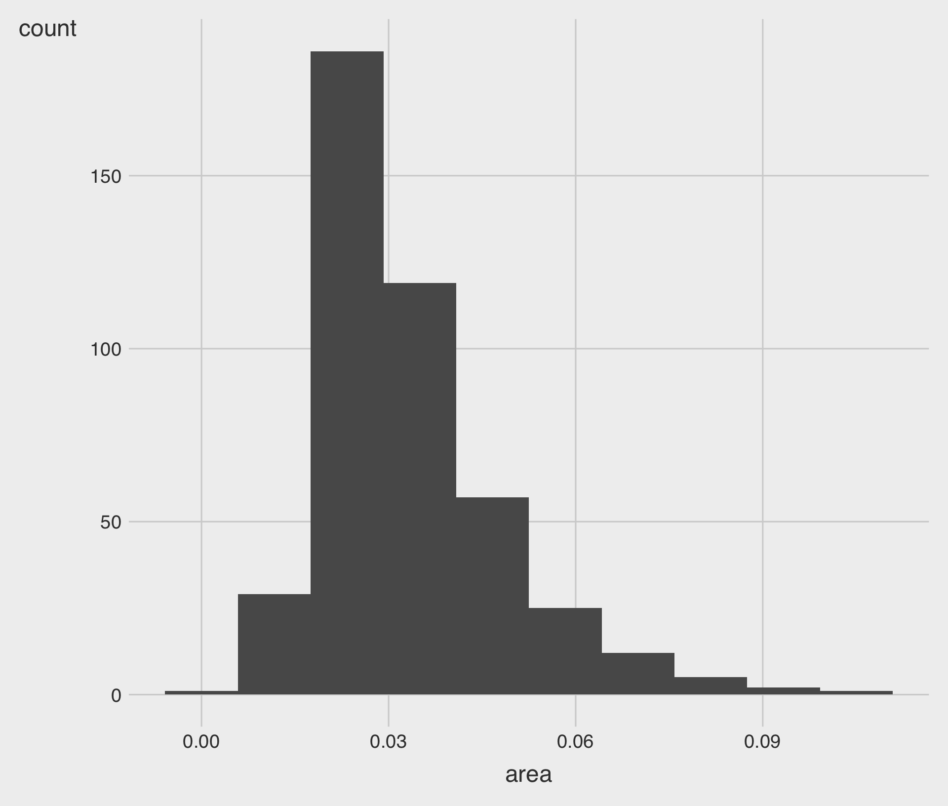
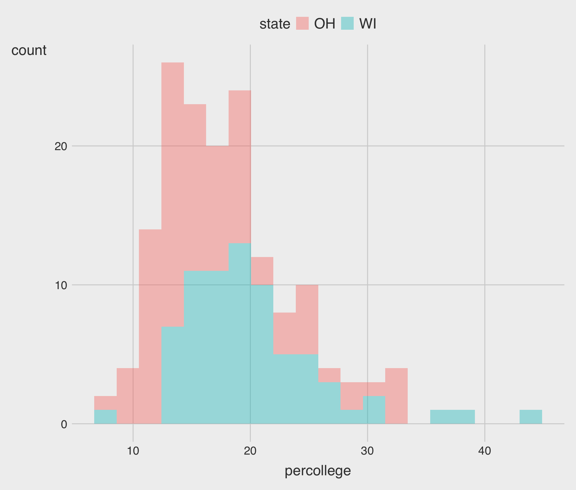
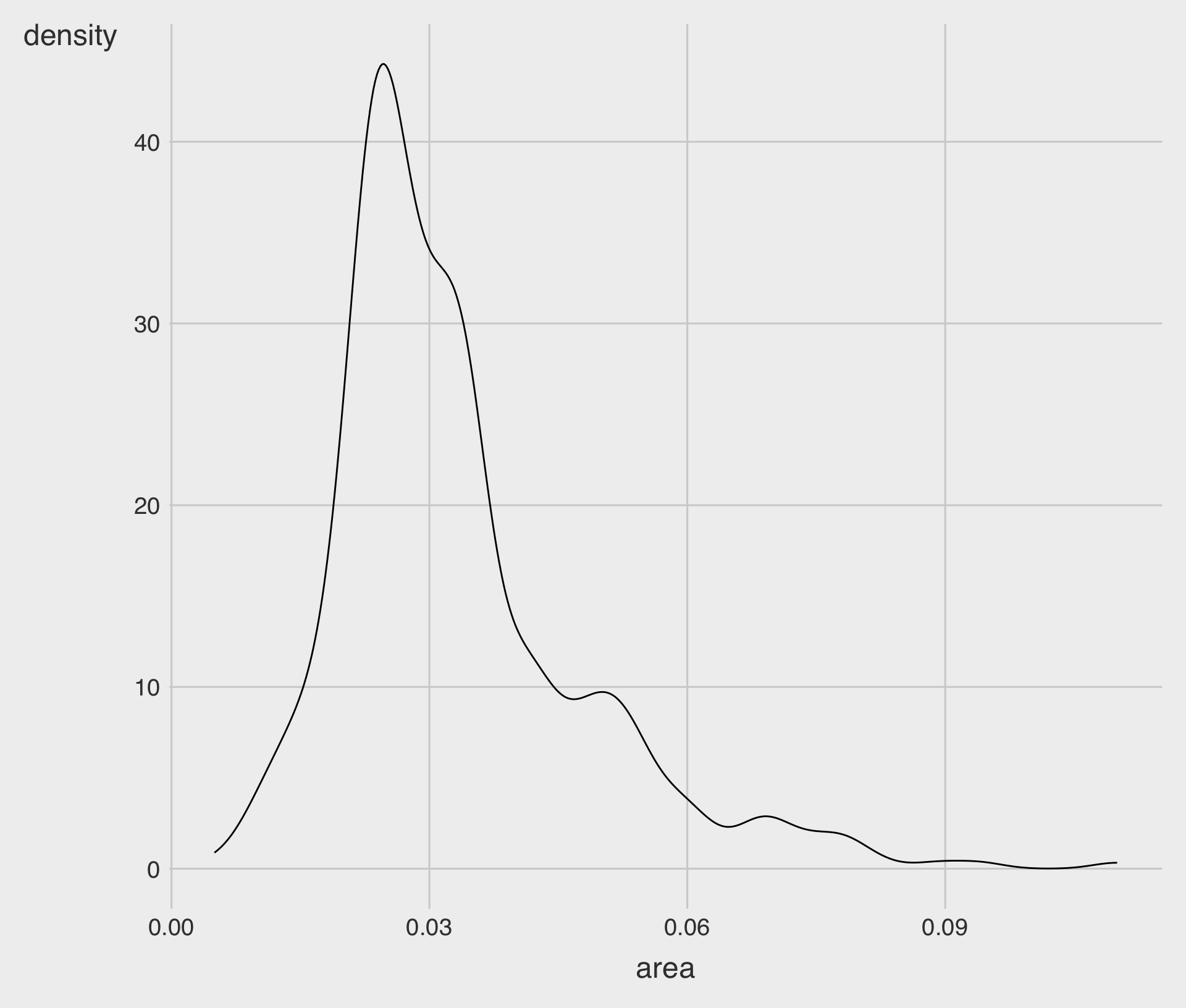
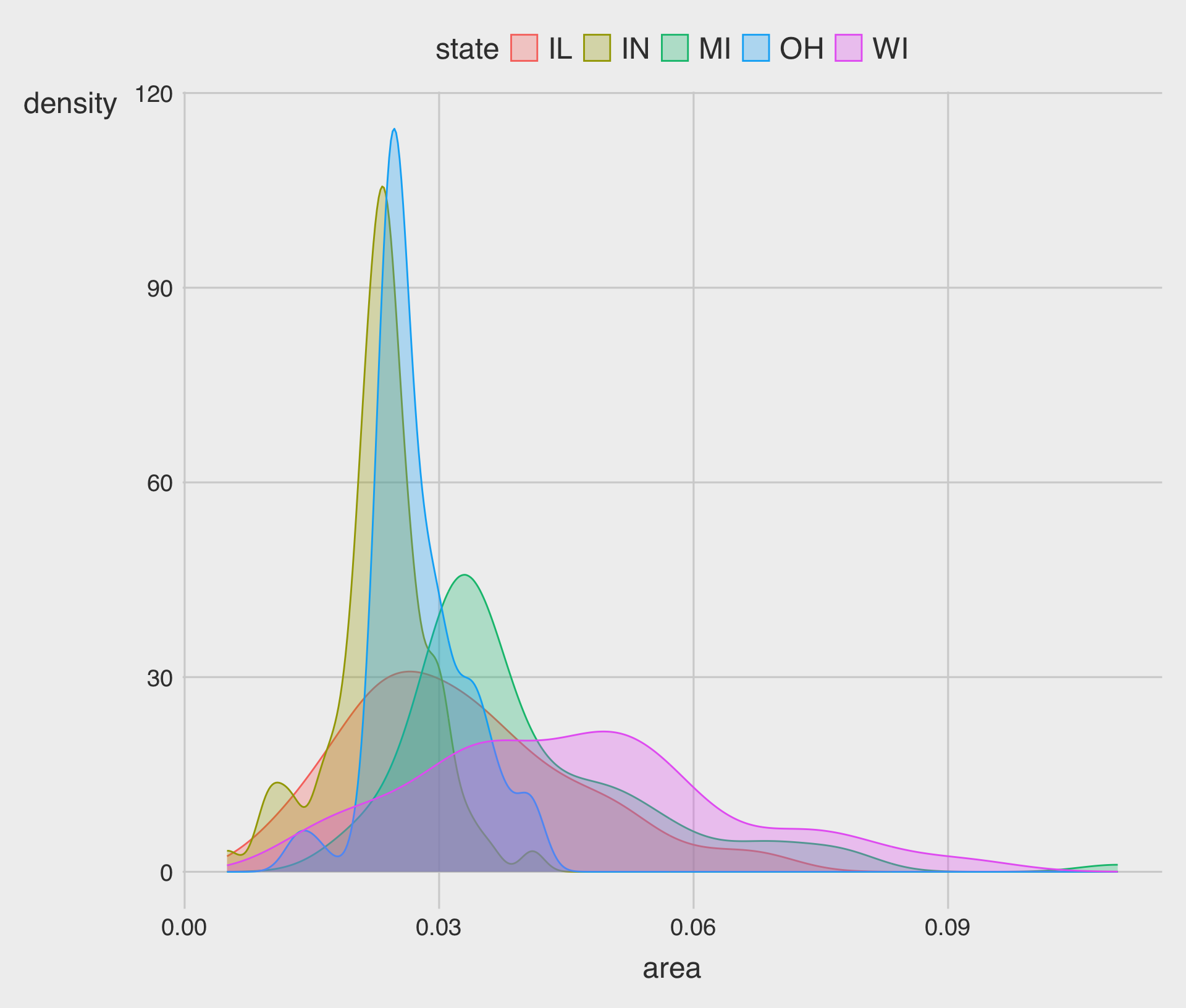
Histograms and density plots
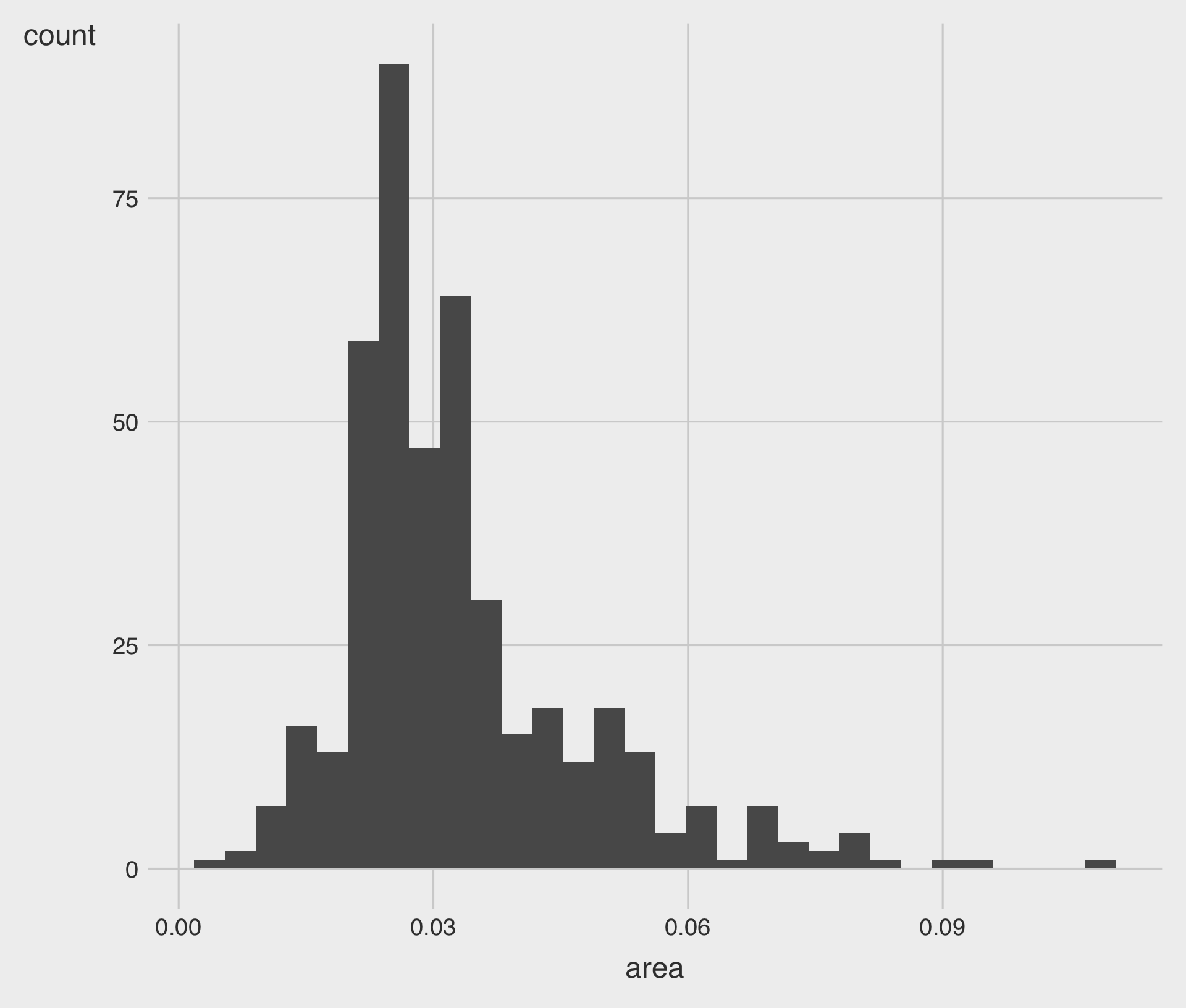
- By default, the
geom_histogram()function will choose a bin size for us based on a rule of thumb.
Show the right number
Histograms and density plots
- When drawing histograms it is worth experimenting with
binsand also optionally theoriginof the x-axis.
Show the right number
Histograms and density plots
Show the right number
Histograms and density plots
Show the right number
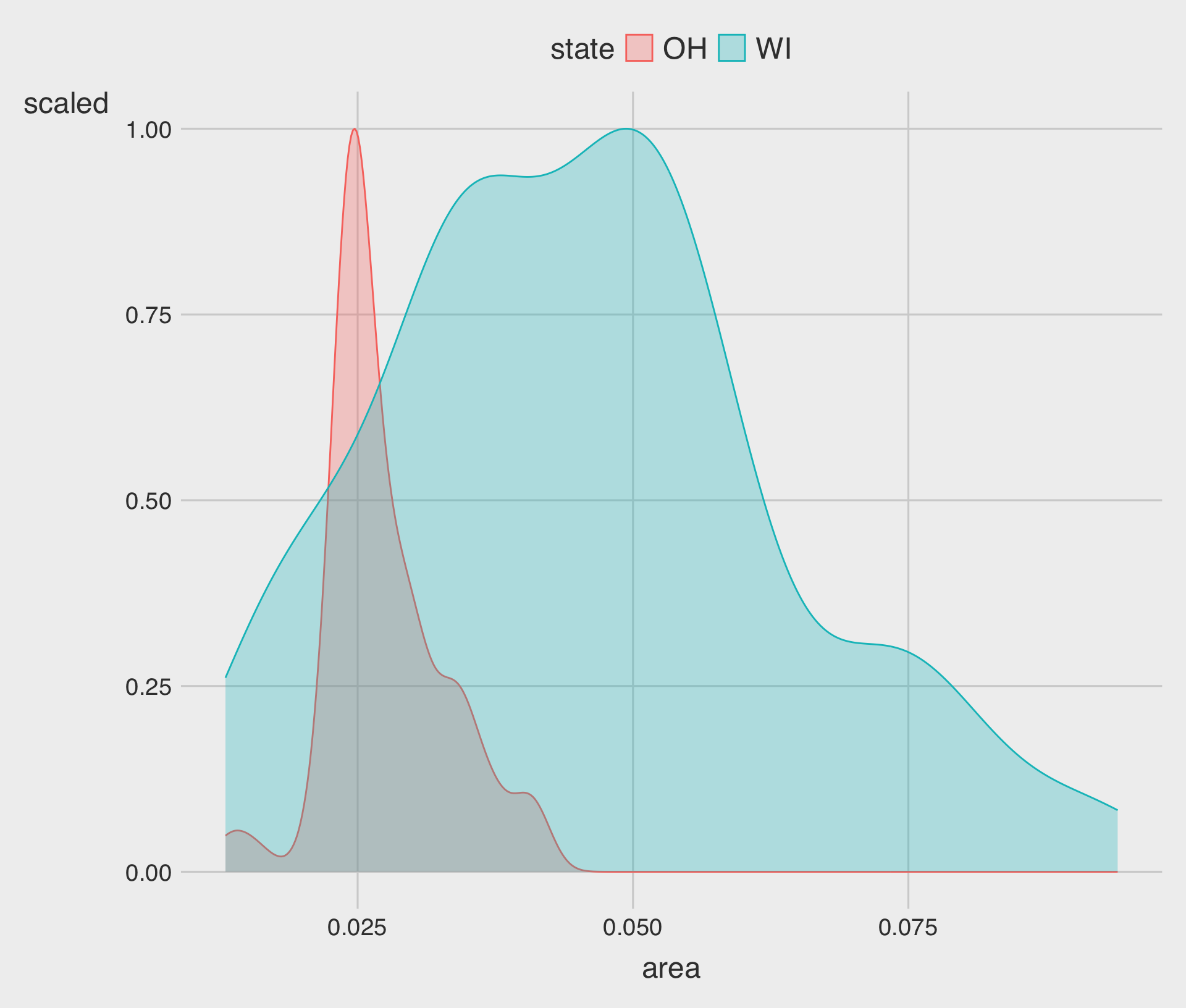
Histograms and density plots
- Here we can use
color(for the lines) andfill(for the body of the density curve) for aesthetic mappings.
Show the right number
Histograms and density plots
Show the right number
Avoid transformations when necessary
- When we call
geom_bar(), it does its calculations on the fly usingstat_count()behind the scenes to produce the counts or proportions it displays.
Show the right number
Avoid transformations when necessary
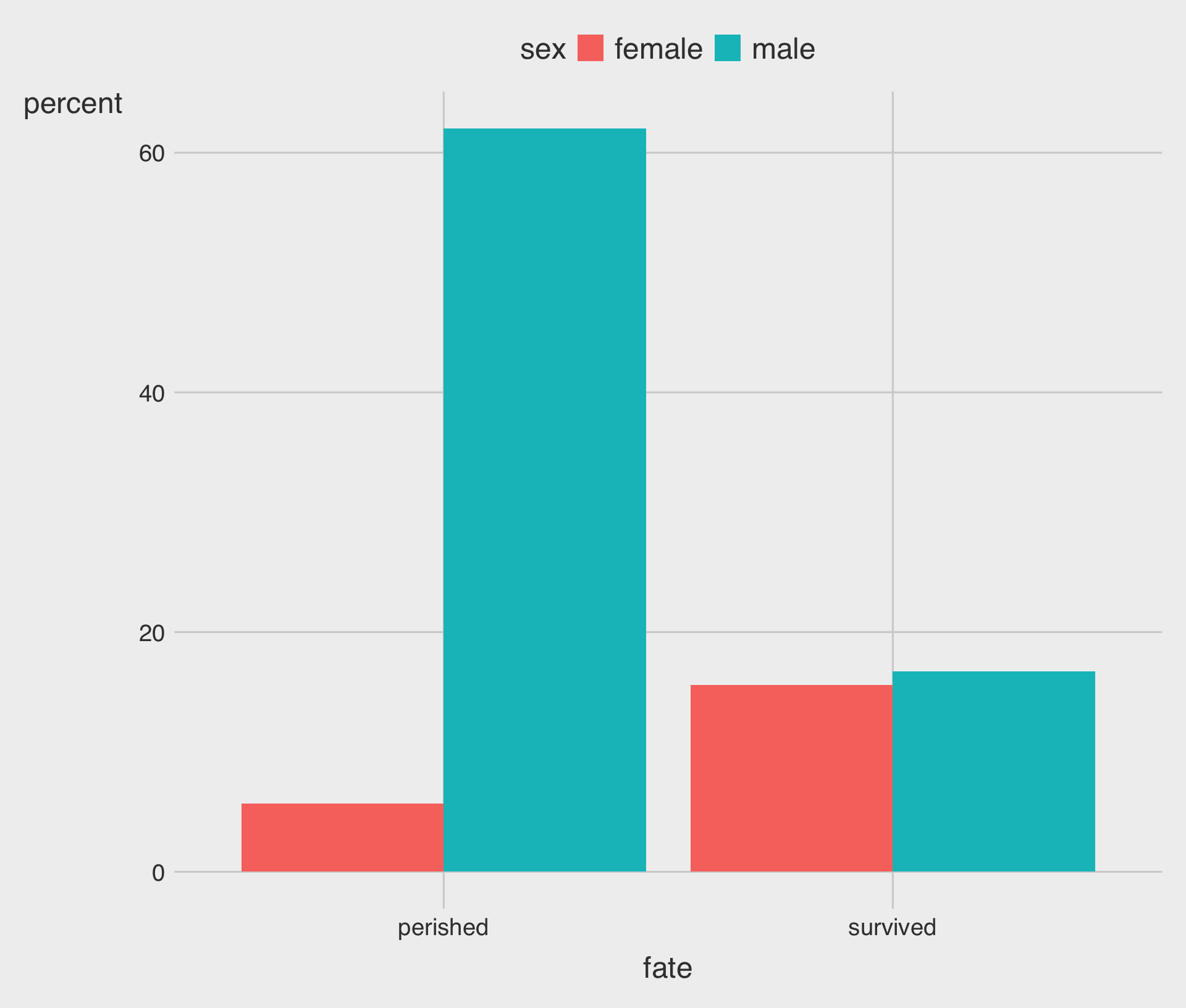
- Should we avoid transforming data if we want to describe the relationship between
fateandpercent?
Show the right number
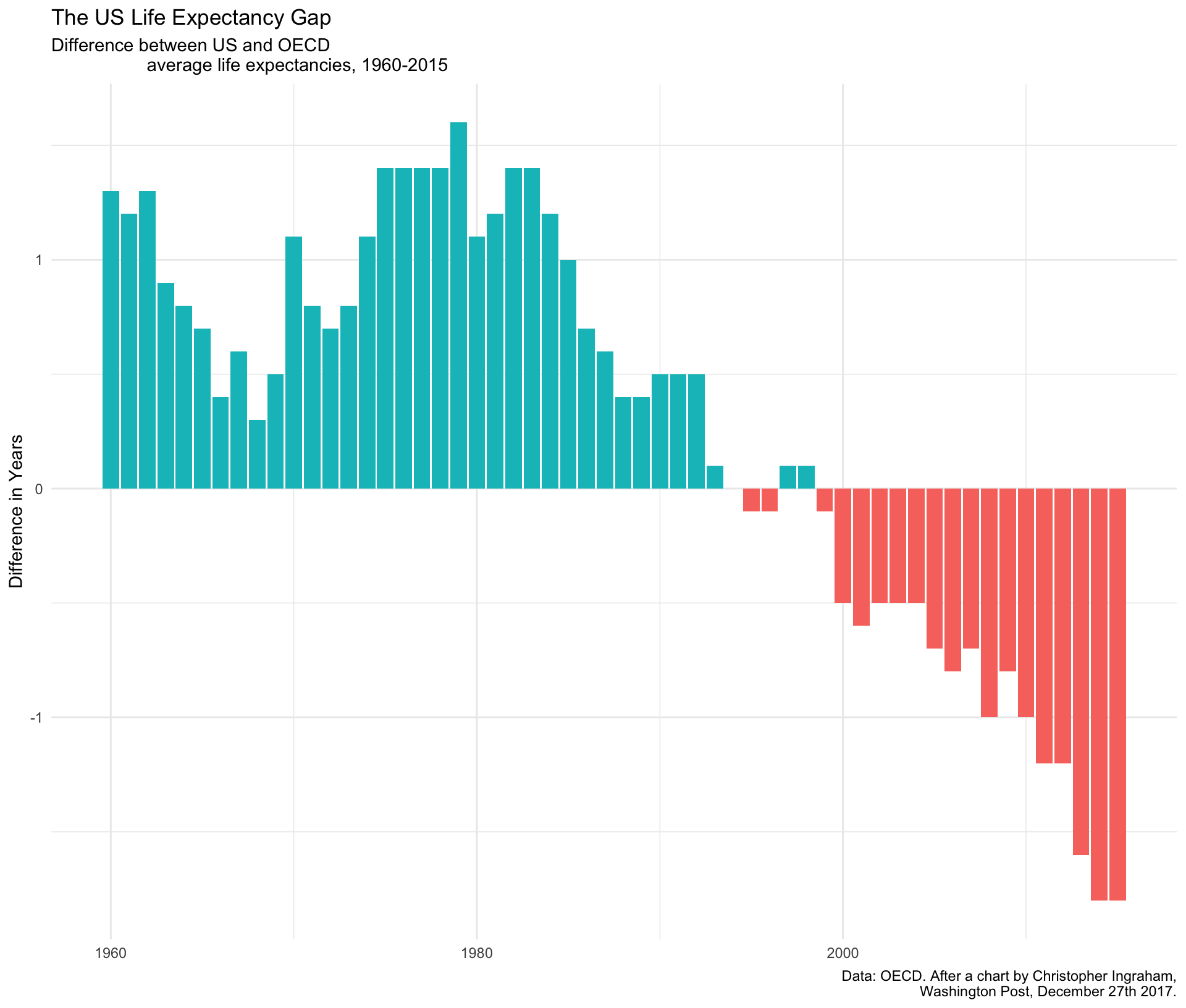
Avoid transformations when necessary
p <- ggplot(data = socviz::oecd_sum,
            mapping =
              aes(x = year,
                  y = diff,
                  fill = hi_lo))
p +
  geom_col() +
  guides(fill = "none") +
  labs(x = NULL,
       y = "Difference in Years",
       title = "The US Life Expectancy Gap",
       subtitle = "Difference between US and OECD
                   average life expectancies, 1960-2015",
       caption = "Data: OECD. After a chart by Christopher Ingraham,
                  Washington Post, December 27th 2017.") +
  theme_minimal()