Lecture 4
ggplot2: Scales, Guides, and Themes (How to Control What We See)
February 28, 2026
What is a scale_*_*()?

A scale control aesthetics mappings:
x/y position:
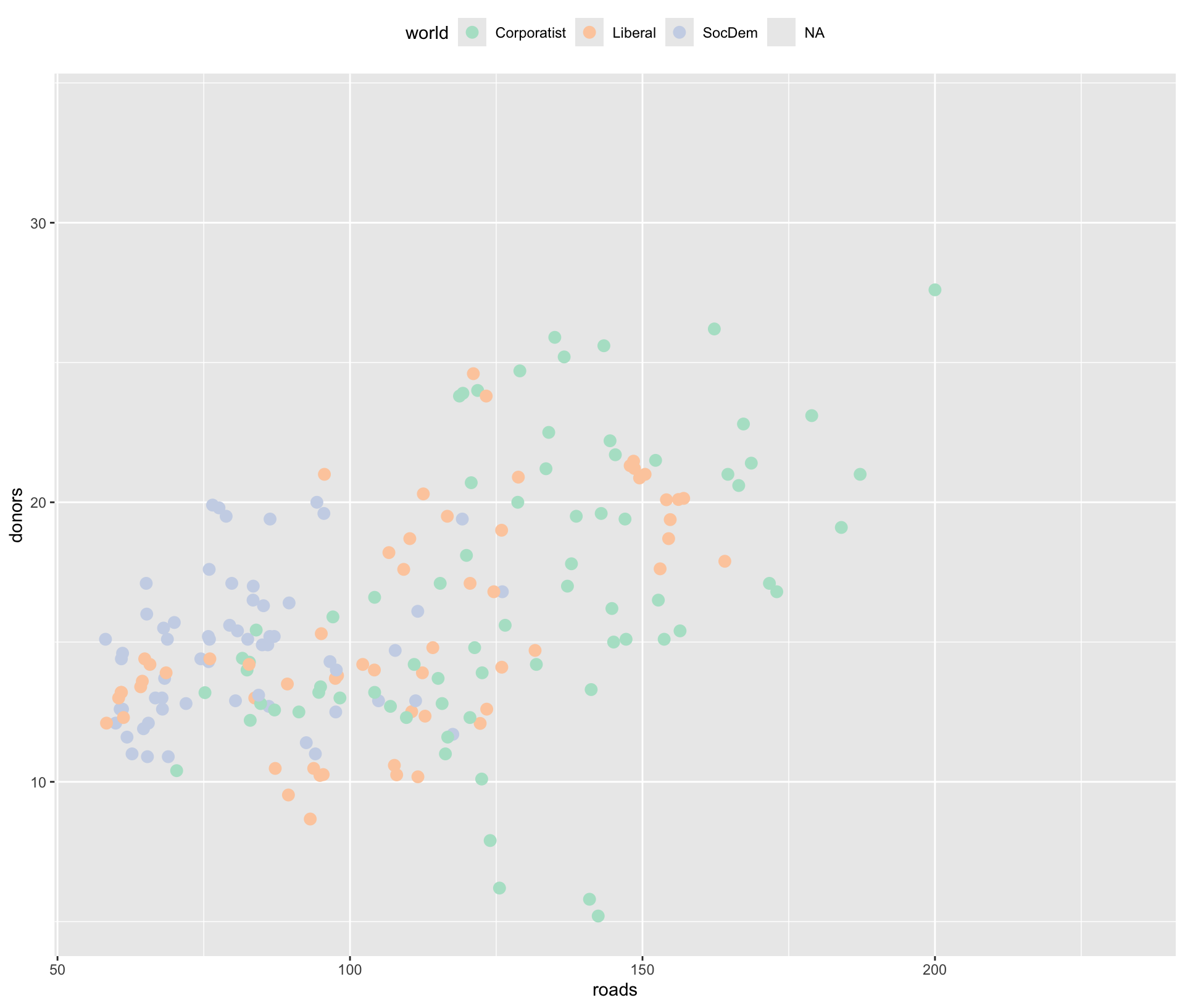
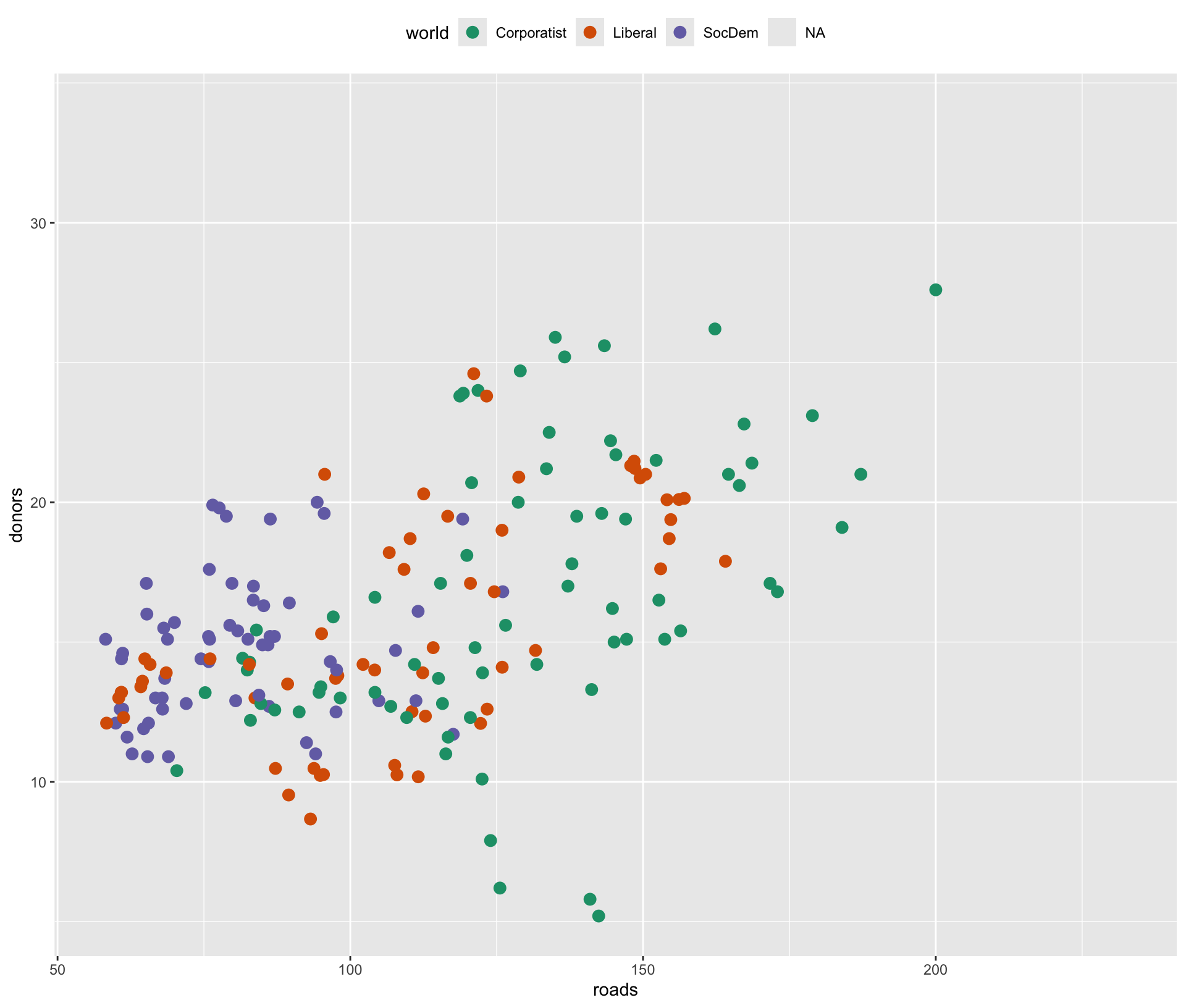
scale_x_*(),scale_y_*()color/fill:
scale_color_*(),scale_fill_*()size/shape/alpha:
scale_size_*(),scale_shape_*(),scale_alpha_*()Each deals with one combination of mapping and scale. Too many to memorize (131 distinct
scale_*_*()functions)!- They are named according to a consistent logic
https://ggplot2tor.com/apps provides a complete guide to scales and themes, as well as aesthetics.
scale_x_continuous(): breaks & labels
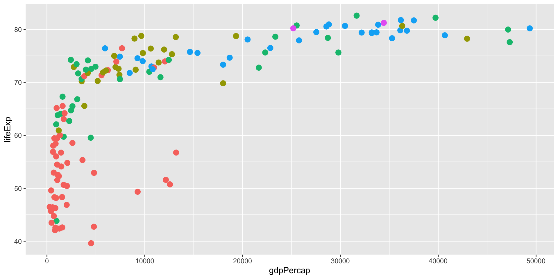
gapminder |>
  filter(year == 2007) |>
  ggplot(aes(x = gdpPercap,
             y = lifeExp,
             color = continent)) +
  geom_point(alpha = 0.8,
             size = 3) +
  geom_smooth(se = F) +
  scale_x_continuous(
    breaks = c(1000, 10000, 50000),
    labels = scales::dollar
  ) +
  labs(
    x = "GDP per capita",
    y = "Life expectancy",
    color = "Continent")
What this controls:
- Where ticks appear (
breaks) - How ticks display text (
labels)
Manual Scales: When We Must Choose Specific Values

- A ton of hex codes for colors are available here:
Sequential
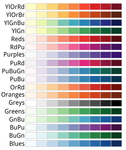
- Sequential palettes are suited to ordered data that progress from low to high.
Diverging
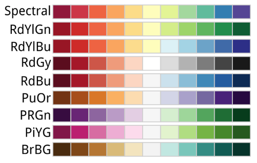
- Diverging palettes put equal emphasis on mid-range critical values and extremes at both ends of the data range.
Qualitative
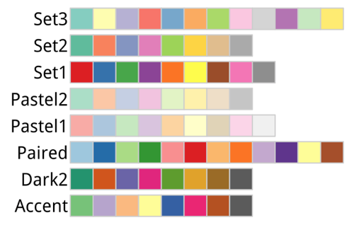
Qualitative palettes do not imply magnitude differences between legend classes.
Qualitative schemes are best suited to representing unordered categorical data.
Display All Color Palettes

scale_color_brewer(palette = ...)
- Use named palettes with
scale_color_brewer(palette = ...).
Pastel2
Dark2
scale_*_manual() with brewer.pal()

- You can then pass hex codes directly into
scale_color_manual()orscale_fill_manual().
Remove a Legend (most common use)
If we don’t want a legend for an aesthetic:
Difference:
guides(color = "none")removes only that guidetheme(legend.position="none")removes all legends
Choose the Guide Type Explicitly
Sometimes ggplot guesses well; sometimes we want control:
Legend Layout: Rows/Columns

Useful when moving legend to top/bottom.
Reorder Multiple Legends (order =)
When we map multiple aesthetics, we can control the order:

Override the Legend Appearance (override.aes)
Sometimes the plot uses alpha/size that makes legend hard to read.

Theme System
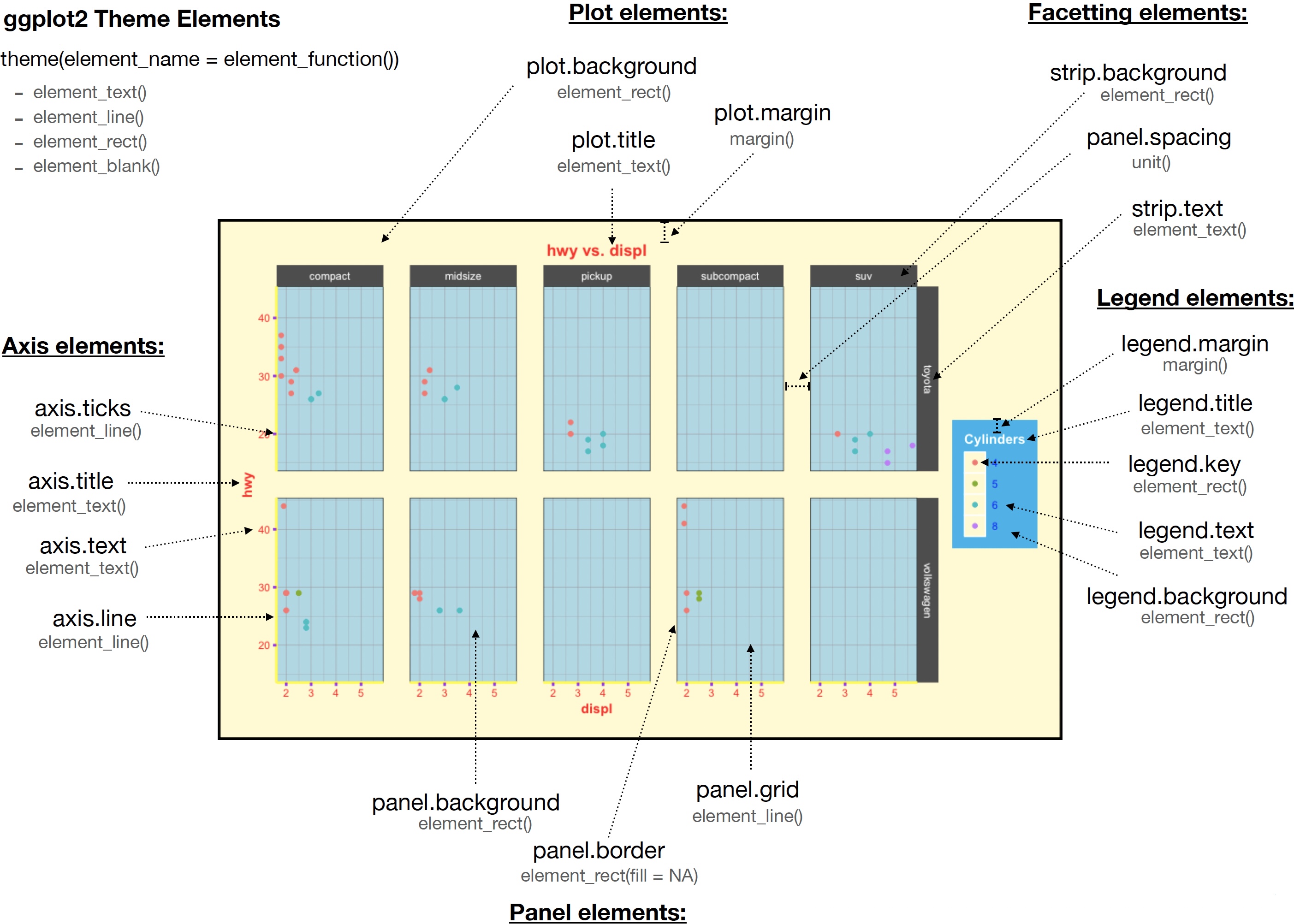
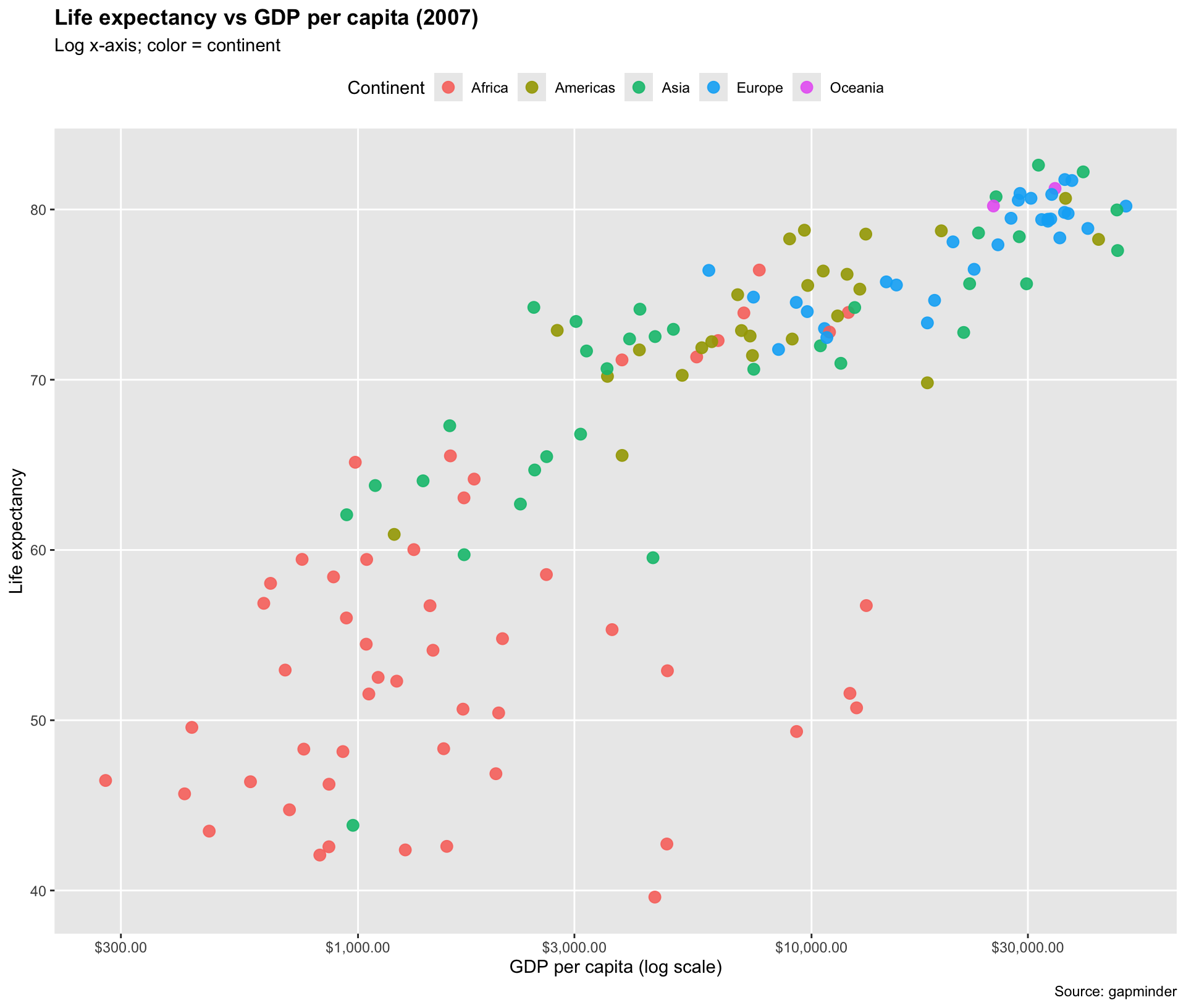
Example: a Clean “Presentation-Ready” Theme
gapminder |>
  filter(year == 2007) |>
  ggplot(aes(gdpPercap, lifeExp,
             color = continent)) +
  geom_point(size = 3, alpha = 0.9) +
  scale_x_log10(labels = scales::dollar) +
  labs(
    title = "Life expectancy vs GDP per capita (2007)",
    subtitle = "Log x-axis; color = continent",
    x = "GDP per capita (log scale)",
    y = "Life expectancy",
    color = "Continent",
    caption = "Source: gapminder"
  ) +
  theme(
    legend.position = "top",
    plot.title = element_text(face = "bold"),
    panel.grid.minor = element_blank()
  )
One Plot, All Three Controls
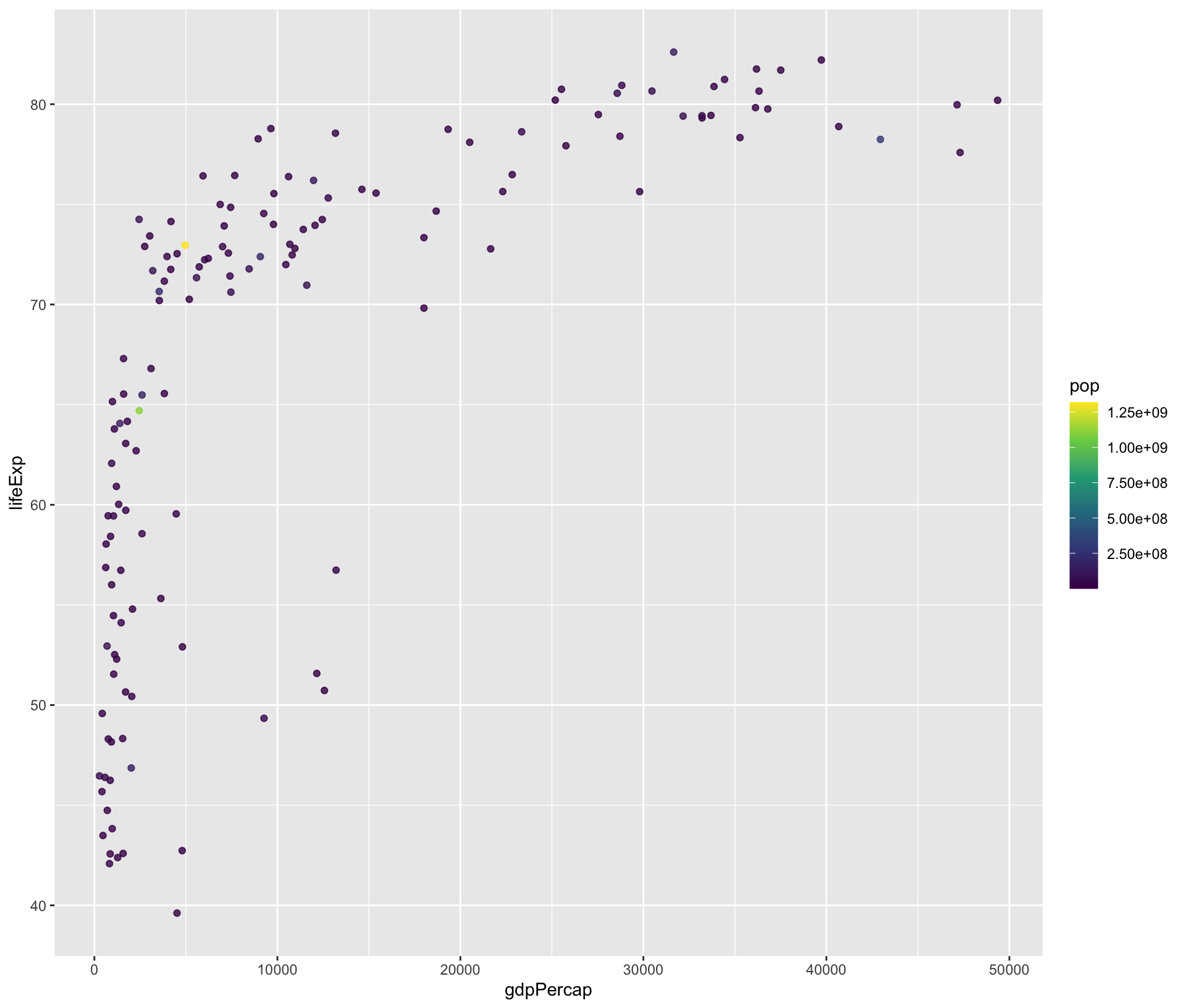
gapminder |>
  filter(year == 2007) |>
  ggplot(aes(gdpPercap, lifeExp,
             color = continent,
             size = pop)) +
  geom_point(alpha = 0.7) +

  # SCALES: transform, breaks, labels
  scale_x_log10(
    breaks = c(500, 2000, 10000, 50000),
    labels = scales::dollar
  ) +
  scale_size_continuous(labels = scales::label_number(scale_cut = scales::cut_si(""))) +

  # GUIDES: legend order + layout
  guides(
    color = guide_legend(order = 1, nrow = 1),
    size   = guide_legend(order = 2)
  ) +

  # THEME: layout + typography
  theme(
    legend.position = "top",
    plot.title = element_text(face = "bold"),
    panel.grid.minor = element_blank()
  ) +

  # labels are not scales/guides/themes, but they coordinate everything
  labs(
    title = "Scales + Guides + Themes in one figure",
    x = "GDP per capita (log scale)",
    y = "Life expectancy",
    color = "Continent",
    size = "Population"
  )