Lecture 18
Aesthetic Mappings; Clutter is Your Enemy!; Design with Colorblind in Mind
October 31, 2024
Happy Halloween, everyone! 🎃👻🎃👻🎃👻🎃👻🎃👻🎃👻


Aesthetic Mappings
Aesthetic Mappings

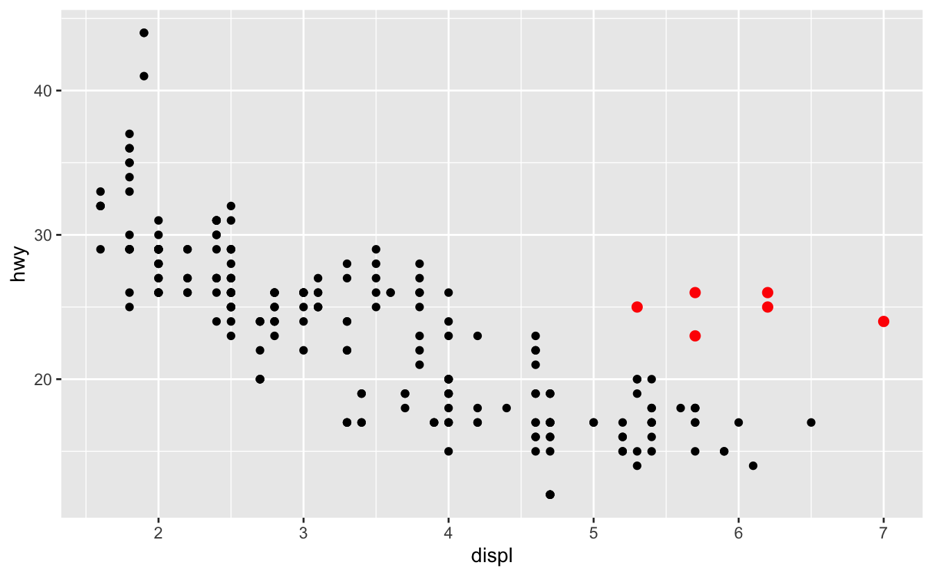
In the plot above, one group of points (highlighted in red) seems to fall outside of the linear trend.
- How can you explain these cars? Are those hybrids?
Aesthetic Mappings

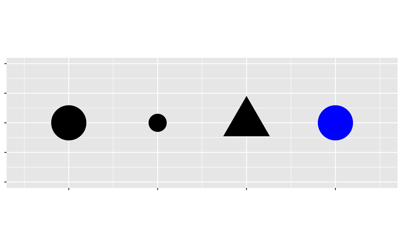
An aesthetic is a visual property (e.g.,
size,shape,color) of the objects (e.g.,class) in your plot.You can display a point in different ways by changing the values of its aesthetic properties.
Aesthetic Mappings
Adding a color to the plot
Aesthetic Mappings
Adding a shape to the plot
Aesthetic Mappings
Adding a size to the plot
Aesthetic Mappings
Specifying a color to the plot, manually
Aesthetic Mappings
Specifying an color to the plot, manually
Aesthetic Mappings
Specifying an fill to the plot, manually

- In general, each
geom_*()has a different set of aesthetic parameters.- E.g.,
fillis available forgeom_smooth(), notgeom_point().
- E.g.,
Aesthetic Mappings
Specifying a size to the plot, manually
Aesthetic Mappings
Specifying an alpha to the plot, manually
- We’ve done this to address the issue of overplotting in the scatterplot.
Aesthetic Mappings
Mapping Aesthetics vs. Setting Them Manually
Aesthetic Mapping
- Links data variables to visible properties on the graph
- Different categories → different colors or shapes
Setting Aesthetics Manually
- Customize visual properties directly in
geom_*()outside ofaes() - Useful for setting fixed colors, sizes, or transparency unrelated to data variables
Clutter is Your Enemy!
Visualization Principle
Cognitive Load
- Every element added to a page or screen demands cognitive load
- Cognitive load: the mental effort needed to process information
- Extra elements = extra brain power for the audience to process
- Example: Overly complex slides or graphs can overwhelm viewers
- Excessive load can lead to disengagement and confusion
- Goal: a graphic should display as much information as it can, with the lowest possible cognitive strain to the viewer.
Visualization Principle
Why Reduce Clutter?
- Clutter: Visual elements that occupy space but do not improve understanding
- Clutter makes information harder to process and can confuse the viewer
- Strive for clarity: Simplified visuals encourage engagement and improve comprehension
- Less clutter = clearer message, more focused audience
- Tips
- Avoid having the data all skewed to one side or the other of your graph.
- Avoid too many superimposed elements, such as too many curves (>4) in the same graphing space.
Clutter is Your Enemy!

- Which one do you prefer?
Log Transformation: Reducing Clutter in Scatterplots
- Problem: When data points are densely packed, it can obscure insights
- Often due to extreme values or skewed distributions
- Dense clusters of points become visual clutter, hiding patterns
- Solution: Apply a log transformation!
- Reduces clutter: Points become evenly distributed across the plot
- Prevents overlapping data points and enhances readability
- Reduces influence of outliers, clarifying patterns
- Improves interpretability by revealing underlying relationships
- Supports focused, informative data communication without extra elements
- Reduces clutter: Points become evenly distributed across the plot
Log Transformation: Reducing Clutter in Scatterplots
A Little Bit of Math for Logarithm
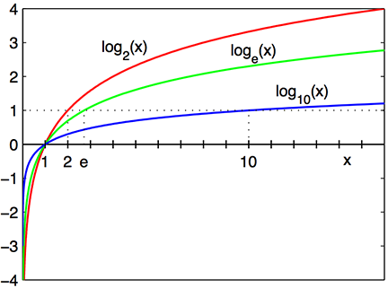
- The logarithm function, \(y = \log_{b}\,(\,x\,)\), looks like ….

Log Transformation: Reducing Clutter in Scatterplots
A Little Bit of Math for Logarithm
\(\log_{10}\,(\,100\,)\): the base \(10\) logarithm of \(100\) is \(2\), because \(10^{2} = 100\)
\(\log_{e}\,(\,x\,)\): the base \(e\) logarithm is called the natural log, where \(e = 2.718\cdots\) is the mathematical constant, the Euler’s number.
\(\log\,(\,x\,)\) or \(\ln\,(\,x\,)\): the natural log of \(x\) .
\(\log_{e}\,(\,7.389\cdots\,)\): the natural log of \(7.389\cdots\) is \(2\), because \(e^{2} = 7.389\cdots\).
In R,
log(x): log ofxwith base e, called natural log.log10(x): log ofxwith base 10.
Log Transformation: Reducing Clutter in Scatterplots
The Use of Logarithm: Wide Range of Skewed Data
- We should consider using a log scale when a variable is heavily skewed.
- It can help visualize both small and large values effectively.


Log Transformation: Reducing Clutter in Scatterplots
The Use of Logarithm: Percentage Change
- Consider using a logarithmic scale when percentage changes are more meaningful than changes in absolute units.
- Percentage changes are widely used in various fields to better interpret relative differences. Examples include:
- Stock prices: Percentage changes reflect the magnitude of gains or losses relative to the initial price.
- Housing prices: Percentage changes show market trends consistently across different neighborhoods or regions.
- GDP growth: Expressed as a percentage to indicate economic performance over time.
- Income levels: A $1,000 increase has a greater impact on a lower-income individual compared to someone with a significantly higher income.
Log Transformation: Reducing Clutter in Scatterplots
The Use of Logarithm: Percentage Change
- For a small change in variable \(x\) from \(x_{0}\) to \(x_{1}\), we have:
\[ \Delta \log(x) = \log(x_{1}) - \log(x_{0}) \approx \frac{x_{1} - x_{0}}{x_{0}} = \frac{\Delta x}{x_{0}}. \]
- This shows that a log transformation effectively represents percentage change!
Log Transformation: Reducing Clutter in Scatterplots
The Use of Logarithm: Percentage Change


- One percent increase in GDP per capita is associated with an increase in life expectancy by 0.084 year (30.66 days)!
Design with Colorblind in Mind
Visualization Principle
Design with Colorblind in Mind

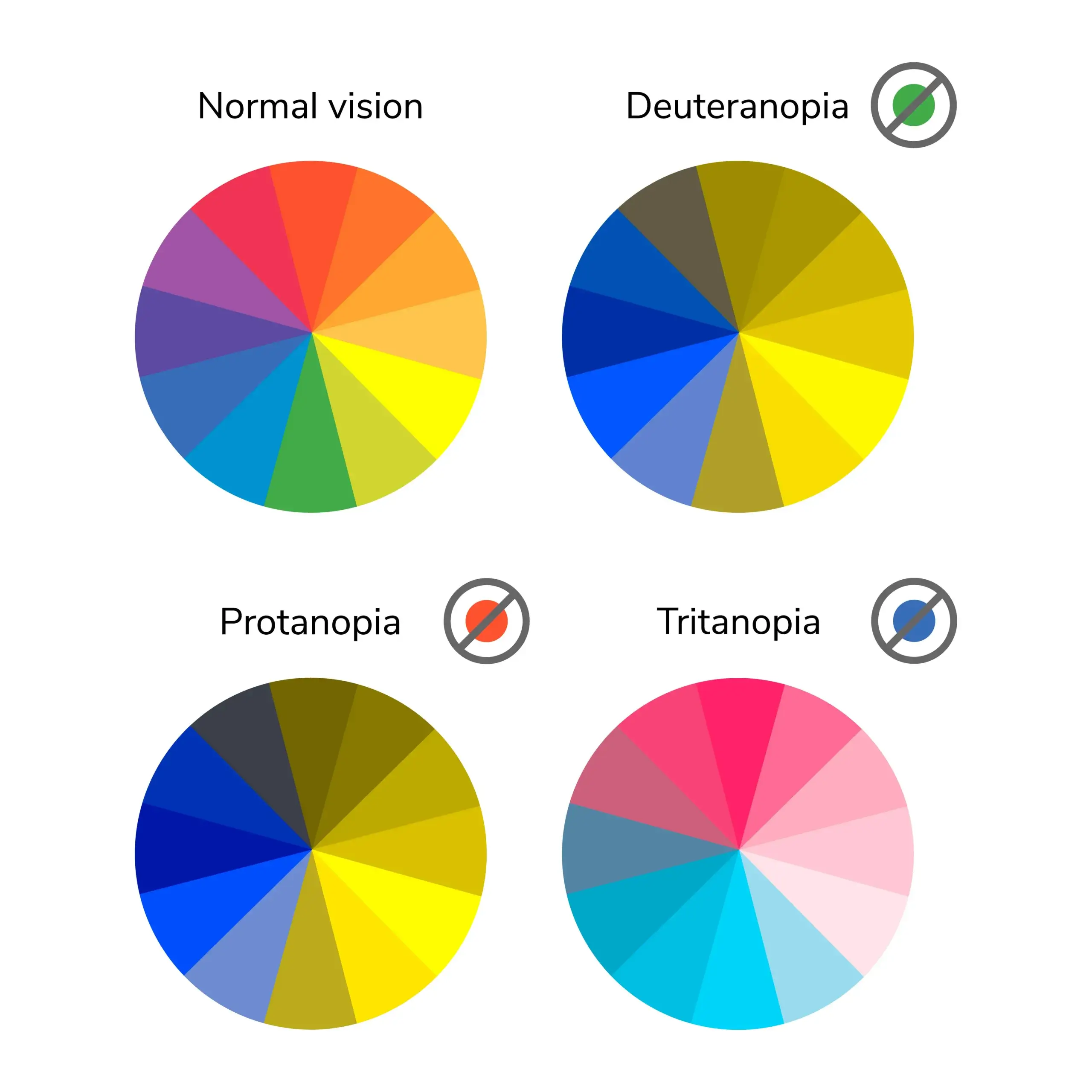
Types of Colorblindness
Roughly 8% of men and half a percent of women are colorblind.
There are several techniques to make visualization more colorblind-friendly:
- Use color palettes that are colorblind-friendly
- Use
shapefor scatterplots andlinetypefor line charts - Have some additional visual cue to set the important numbers apart
Colorblind-Friendly Color Palettes
ggthemes package
- The
ggthemespackage provides various themes forggplot2visualization:- Accessible color palettes, including those optimized for colorblind viewers.
- E.g.,
scale_color_colorblind(),scale_color_tableau()
- E.g.,
- Unique, predefined themes for specific styles
- E.g.,
theme_economist(),theme_wsj()
- E.g.,
- Accessible color palettes, including those optimized for colorblind viewers.
Colorblind-Friendly Color Palettes
ggthemes::scale_color_colorblind()

- When mapping
colorinaes(), we can usescale_color_*()
Colorblind-Friendly Color Palettes
ggthemes::scale_color_tableau()

scale_color_tableau()provides color palettes used in Tableau.
ggplot Themes
ggthemes::theme_economist()

theme_economist()approximates the style of The Economist.
ggplot Themes
ggthemes::theme_wsj()

theme_wsj()approximates the style of The Wall Street Journal.


