Lecture 17
Data Visualization with ggplot; Relationship ggplot()
October 29, 2024
Data Visualization with ggplot
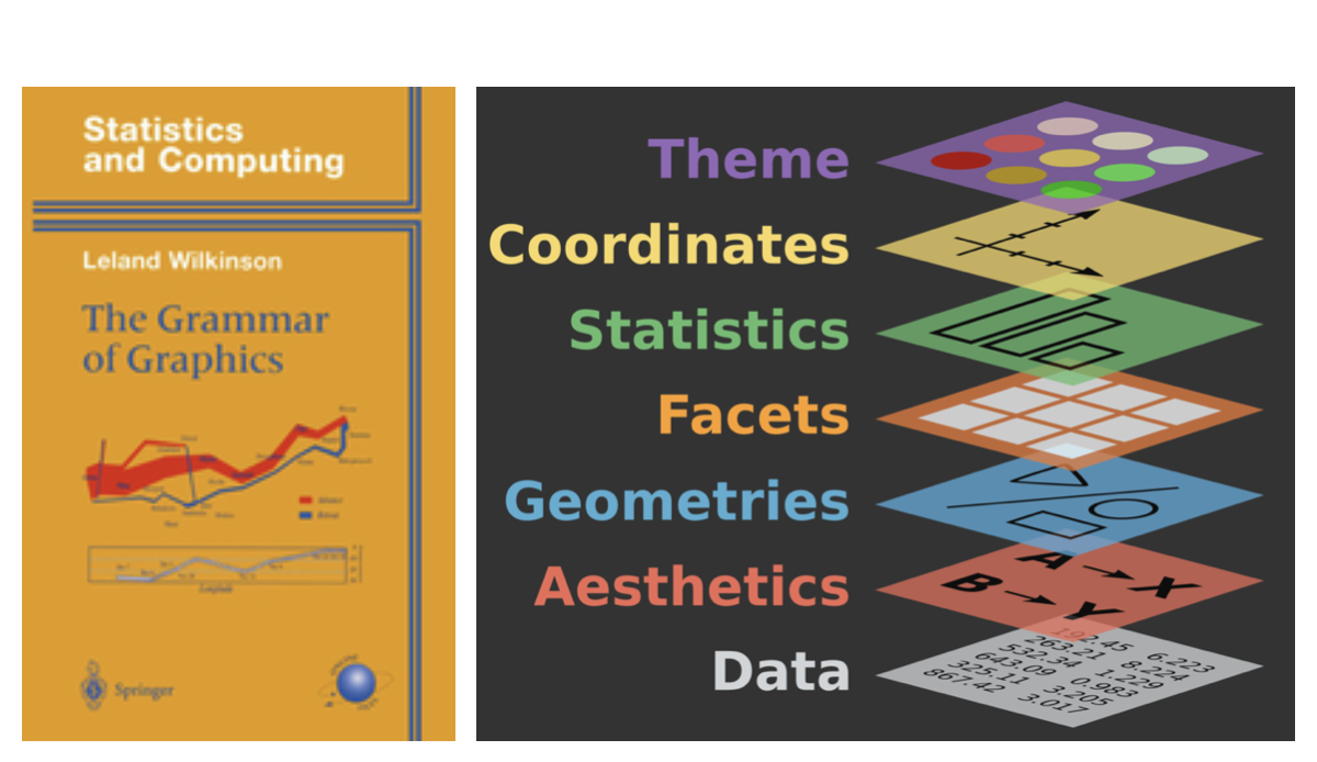
Grammar of Graphics

- A grammar of graphics is a tool that enables us to concisely describe the components of a graphic.
Data Visualization - First Steps
The
mpgdata frame, provided byggplot2, contains observations collected by the US Environmental Protection Agency on 38 models of car.Q. Do cars with big engines use more fuel than cars with small engines?
displ: a car’s engine size, in liters.hwy: a car’s fuel efficiency on the highway, in miles per gallon (mpg).
What does the relationship between engine size and fuel efficiency look like?
Data Visualization - First Steps
Creating a Scatterplot with ggplot
- To plot
mpg, run the above code to putdisplon thex-axis andhwyon they-axis.
Data Visualization - First Steps
Components in the Grammar of Graphics
A
ggplotgraphic is amappingof variables indatatoaesthetic attributes ofgeometric objects.Three Essential Components in
ggplot()Graphics:data: data.frame containing the variables of interest.geom_*(): geometric object in the plot (e.g., point, line, bar, histogram, boxplot).aes(): aesthetic attributes of the geometric object (e.g.,x-axis,y-axis,color,shape,size,fill) mapped to variables in the data.frame.
Data Visualization - First Steps
Creating a Scatterplot with ggplot
- Three Essential Components in This Particular
ggplot():data = mpggeom_point()aes(x = displ, y = hwy)
Relationship ggplot()
Relationship ggplot()
Scatterplot with geom_point()
Relationship ggplot()
Fitted Curve with geom_smooth()
Relationship ggplot()
geom_point() with geom_smooth()

- The geometric object
geom_smooth()draws a smooth curve fitted to the data.
ggplot() workflow
Common problems in ggplot()
- One common problem when creating
ggplot2graphics is to put the+in the wrong place.- Correct Approach: Always place the
+at the end of the previous line, NOT at the beginning of the next line.
- Correct Approach: Always place the
Relationship ggplot()
About geom_smooth()
Using regression—one of the machine learning methods—the
geom_smooth()visualizes the predicted value of theyvariable for a given value of thexvariable.What Does the Grey Ribbon Represent?
- The grey ribbon illustrates the uncertainty around the estimated prediction curve.
- We are 95% confident that the actual relationship between
xandyvariables falls within the grey ribbon.
Relationship ggplot()
geom_point() with geom_smooth(method = lm)
method = "lm"specifies that a linear model (lm), called a linear regression model.
Relationship ggplot()

- How many points are in this plot?
- How many observations are in the
mpgdata.frame?
Relationship ggplot()
Overplotting problem
Many points overlap each other.
- This problem is known as overplotting.
When points overlap, it’s hard to know how many data points are at a particular location.
Overplotting can obscure patterns and outliers, leading to potentially misleading conclusions.
Relationship ggplot()
Overplotting and Transparency with alpha

- We can set a transparency level (
alpha) between 0 (full transparency) and 1 (no transparency) manually.
Relationship ggplot()
Overplotting and Transparency with alpha
- We can set an aesthetic property manually, as seen above, not within the
aes()function but within thegeom_*()function.
Relationship ggplot()
- Be mindful of the variable placement on the axes.
- It’s common practice to place the input variable along the x-axis and the outcome variable along the y-axis.
- Input Variable: Represents the potential “cause.”
- Outcome Variable: Represents the potential “effect.”
- Example: Advertising budget (input) and sales revenue (outcome).
Relationship ggplot()
Correlation does not imply causation

- Just because you uncover a relationship doesn’t mean you’ve identified the “causal” relationship.
Relationship ggplot()
- Caution: Correlation does not imply causation
- A strong correlation does not imply that one variable causes the other to change.
- Correlation measures the strength and direction of a linear relationship between two variables.
- Positive/negative correlation
- Strong/weak correlation
- No correlation
- Causation: Indicates that one variable directly influences or causes a change in another
- Establishing causation requires controlled experimentation or additional evidence
- E.g., Smoking causes an increase in lung cancer risk (causation)


