Lecture 16
Data Visualization - Overview
October 24, 2024
Grading
\[ \begin{align} (\text{Total Percentage Grade}) =&\;\, 0.05\times(\text{Attendance}) \notag\\ &\,+\, 0.15\times(\text{Quiz & Class Participation})\notag\\ & \,+\, 0.15\times(\text{Homework})\notag\\ &\,+\, 0.15\times(\text{Presentation})\notag\\ & \,+\, 0.50\times(\text{Exam}).\notag \end{align} \]
Grading
Grading
You are allowed up to 6 absences without penalty.
- Send me an email if you have standard excused reasons (illness, family emergency, transportation problems, etc.).
For each absence beyond the initial six, there will be a deduction of 1% from the Total Percentage Grade.
The single lowest homework score will be dropped when calculating the total homework score.
- Each homework except for the homework with the lowest score accounts for 20% of the total homework score.
Grading
\[ \begin{align} &(\text{Total Exam Score}) \\ =\, &\text{max}\,\left\{0.50\times(\text{Midterm Exam Score}) \,+\, 0.50\times(\text{Final Exam Score})\right.,\notag\\ &\qquad\;\,\left.0.25\times(\text{Midterm Exam Score}) \,+\, 0.75\times(\text{Final Exam Score})\right\}.\notag \end{align} \]
- The total exam score is the maximum between
- the simple average of the midterm exam score and the final exam score and
- the weighted average of them with one-fourth weight on the midterm exam score and three-third weight on the final exam score:
Grading
\[ \begin{align} &(\text{Total Midterm Exam}) \\ =\, &\text{max}\,\left\{0.50\times(\text{Midterm Exam 1}) \,+\, 0.50\times(\text{Midterm Exam 2})\right.,\notag\\ &\qquad\;\,\left.0.25\times(\text{Midterm Exam 1}) \,+\, 0.75\times(\text{Midterm Exam 2})\right\}.\notag \end{align} \]
- The total midterm exam score is the maximum between
- the simple average of the midterm exam 1 score and the midterm exam 2 score and
- the weighted average of them with one-fourth weight on the midterm exam 1 score and three-third weight on the midterm exam 2 score:
Grading
- Scenario 1
- Suppose your \((\text{Total Exam Score})\) is taken from: \[ \begin{align} &0.25\times(\text{Midterm Exam 1}) \,+\, 0.75\times(\text{Midterm Exam 2})\\ &0.25\times(\text{Midterm Exam}) \,+\, 0.75\times(\text{Final Exam}) \end{align} \]
- \((\text{Midterm Exam 1})\) will then account for only 6.25% of your \(\text{Total Exam Score}\).
Grading
- Scenario 2
- Suppose your \((\text{Total Exam Score})\) is taken from: \[ \begin{align} &0.5\times(\text{Midterm Exam 1}) \,+\, 0.5\times(\text{Midterm Exam 2})\\ &0.25\times(\text{Midterm Exam}) \,+\, 0.75\times(\text{Final Exam}) \end{align} \]
- \((\text{Midterm Exam 1})\) will then account for only 12.5% of your \(\text{Total Exam Score}\).
Data Storytelling
“The narrative is the key vehicle to convey insights, and the visualizations are important proof points to back up the narrative.” Ryan Fuller, Corporate Vice President, M365 Data Strategy at Microsoft
Data visualizations are useful for showing “what” is happening in the data.
- However, they often fall short in explaining the “why” and the “how” or providing the necessary context to uncover underlying reasons.
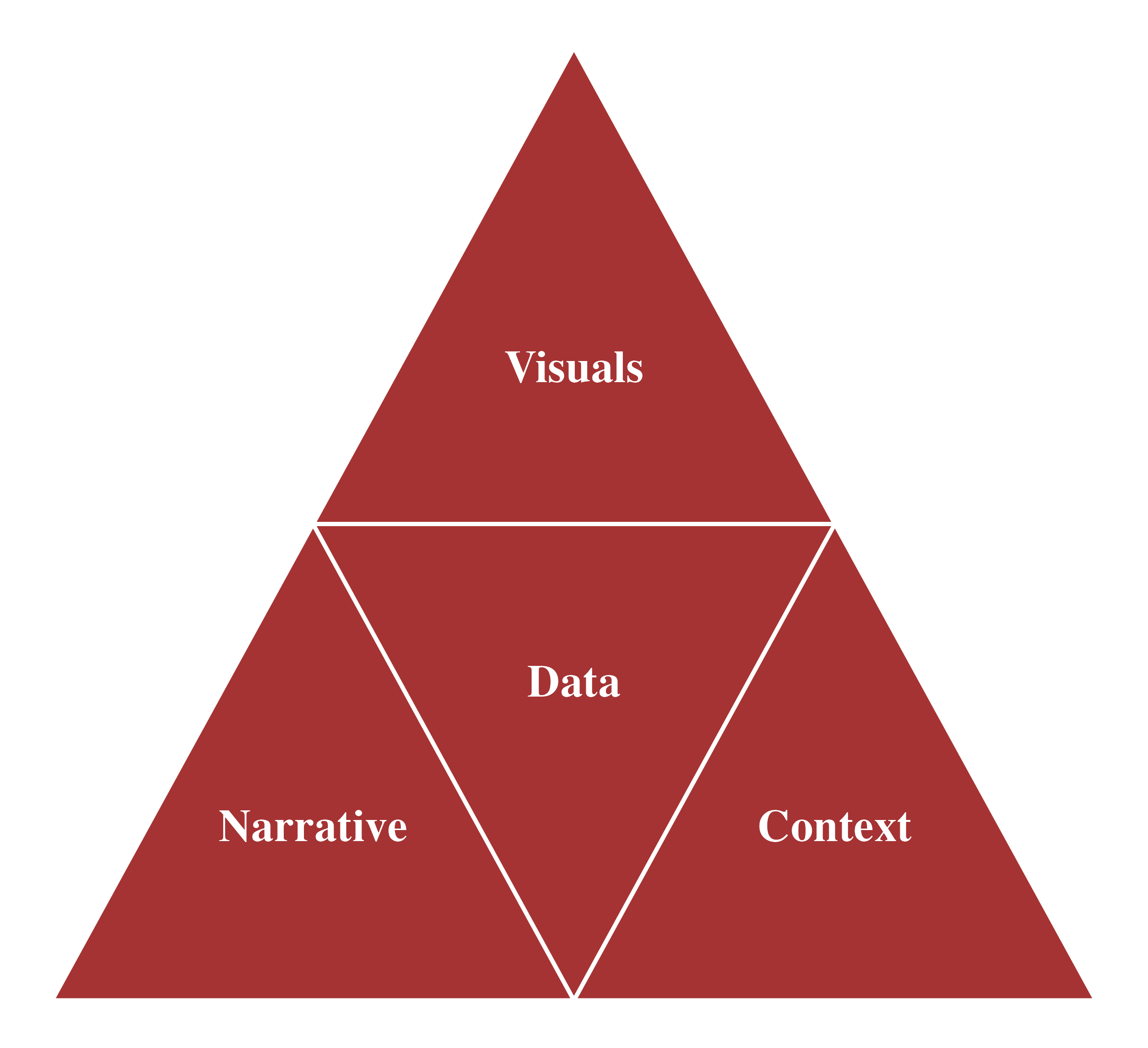
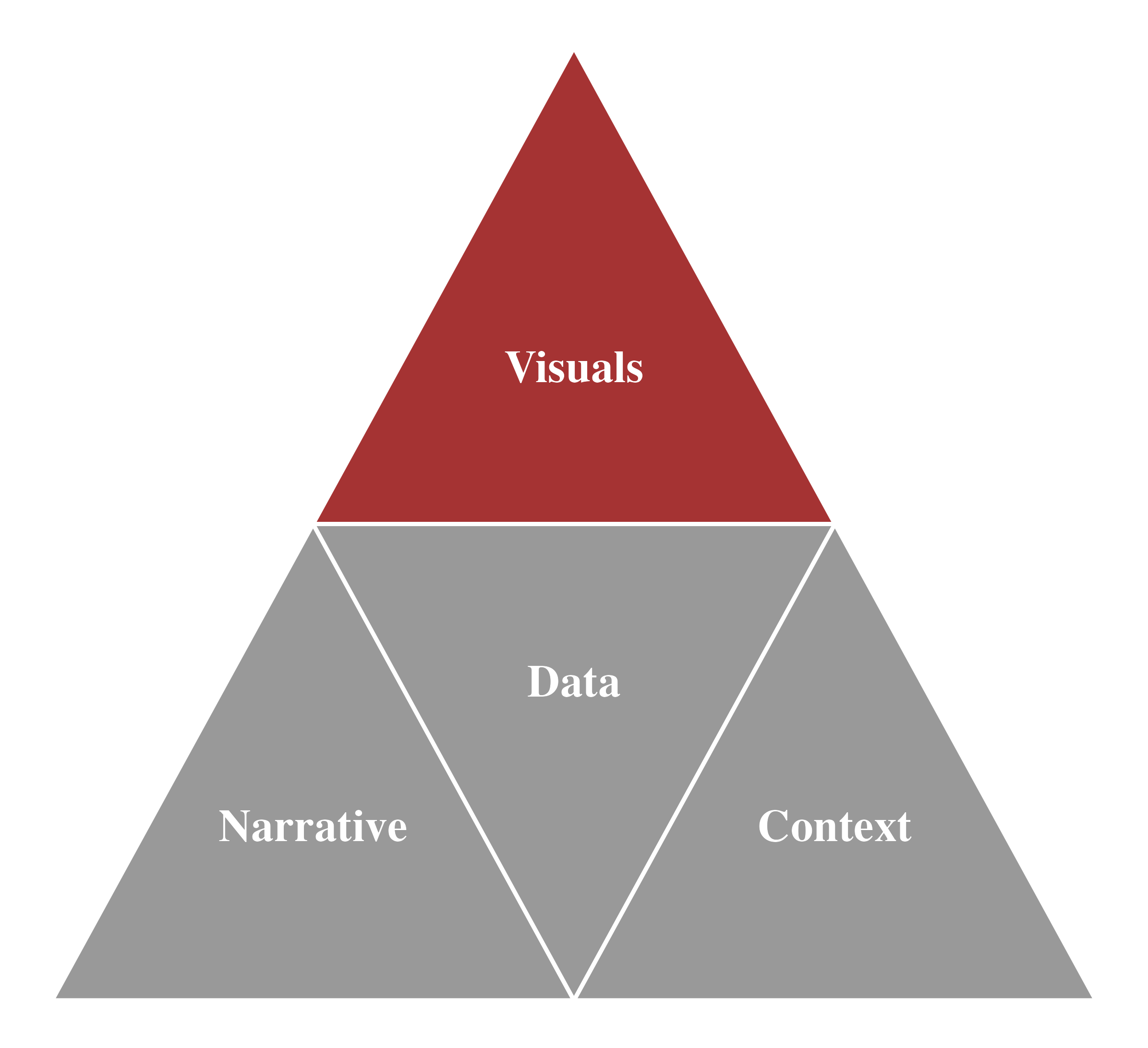
- Data Storytelling: Bridge the gap between data and insights by incorporating descriptive statistics, visualization, and narration within the appropriate audience context to effectively present your findings and drive data-informed decisions.
Data Visualization
Data Storytelling

Data Visualization

Data Visualization
Data Visualization: Convert data into meaningful graphics for better understanding of data.
There are many different graphs and other types of visual displays of information.
We will visualize:
- The distribution of a categorical/numeric variable
- The relationship between two numeric variables
- The time trend of a numeric variable
Data Visualization
Distribution
- Distribution refers to how the values of a variable are spread out or grouped within a data.frame.
- It visualizes what type of variation occurs within a variable.
- Variation is the tendency of the values of a variable to change from measurement to measurement.
- We can see variation easily in real life; if we measure any numeric variable twice, we will be likely to get two different numbers.
- Which values are the most common? Why?
- The mode of a variable is the value that appears most frequently within the set of that variable’s values.
- Which values are rare? Why? Does that match your expectations?
Data Visualization
Distribution
- How you visualize the distribution of a variable depends on the type of variable: categorical or numerical.
- Categorical Variables: Represent categories or groups (e.g., colors, departments, types)
- Common visualizations:
Bar charts - Example: Distribution of favorite sports among students
- Common visualizations:
- Numerical Variables: Represent numbers with meaningful values (e.g., age, income, temperature)
- Common visualizations: Histograms, Box plots
- Example: Distribution of heights in a class
Data Visualization
Skewness
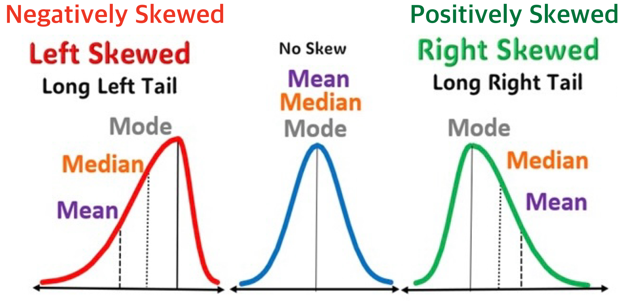
- For a histogram, we can consider a measure of the asymmetry of the distribution—skewness.

Data Visualization
Titanic
Data Visualization
Bar Chart

Data Visualization
Bar Chart

Data Visualization
Stacked Bar Chart

Data Visualization
100% Stacked Bar Chart

Data Visualization
Clustered Bar Chart

Data Visualization
Histogram

Data Visualization
Histogram

Data Visualization
Boxplot

Data Visualization
Relationship
From the plots with two numeric variables, we want to see co-variation, the tendency for the values of two or more variables to vary together in a related way.
What type of co-variation occurs between variables?
- Are they positively associated?
- Are they negatively associated?
- Are there no association between them?
Common visualizations:
- Scatterplot
- Fitted curves/line
Data Visualization
Orange Juice Sales
Data Visualization
Scatterplot

Data Visualization
Scatterplot with Fitted Line

Data Visualization
Scatterplot with Fitted Line

Data Visualization
MPG
Data Visualization
Scatterplot with Fitted Line

Data Visualization
Weather
Data Visualization
Scatterplot with Fitted Line

Data Visualization
Time Trend
A time trend plot, (also known as a time series plot), is used to visualize trends, patterns, and fluctuations in a variable over a specific time period.
- The x-axis typically represents time, while the y-axis represents the variable being measured.
We can check the overall direction in which the time-series variable are moving—upwards, downwards, or staying relatively constant over time.
Common visualizations:
- Line chart
- Fitted Curve
Data Visualization
NVDA Stock Price
Data Visualization
Line Chart

Data Visualization
Line Chart with Fitted Curve

Data Visualization
Visualization Tools
Many tools for visualizing data – Power BI, Tableau, Excel, Python, R, and more
Power BI and Tableau have drag-and-drop interfaces, making them accessible to users with little to no coding experience.
In R, there are multiple packages for creating data visualizations—ggplot2 is the most widely used one.
- While we will briefly use Power BI and Excel for visualization, the primary visualization tool for this course will be ggplot2 in R.
Using ggplot2 helps develop important coding and data skills, which are critical for more advanced data analytics work.