library(tidyverse)
library(skimr)
esg_info <- read_csv("https://bcdanl.github.io/data/stock_esg_simple.csv")Midterm Exam II
Version A
Section 1. Multiple Choice
Question 1
During the ETL process, the “Transform” stage in a DANL 101 context using R is best represented by which set of functions?
read_csv()nrow()andhead()filter(),select(), andleft_join()mean()andsd()
Show answer
Answer: c
These are typical data-wrangling verbs used to transform data.
Question 2
When the distribution of a variable has a single peak and is negatively skewed (i.e., having a long left tail), which of the following is correct?
- Median < Mode < Mean
- Mean < Median < Mode
- Mode < Mean < Median
- Median = Mean = Mode
Show answer
Answer: b
With a long left tail, the mean is pulled left the most, then the median, then the mode stays at the peak:
Mean < Median < Mode.
Question 3
What is NOT an essential component in ggplot() data visualization?
- Data frames
- Geometric objects
- Facets
- Aesthetic attributes
Show answer
Answer: c
Facets are useful but optional. You can build a valid ggplot without them.
Question 4
____(1)____ does not necessarily imply ____(2)____
- Correlation; (2) causation
- Causation; (2) correlation
- Correlation; (2) correlation
- Causation; (2) causation
Show answer
Answer: a
The classic warning: correlation does not imply causation.
Question 5
In the context of the lecture, which of the following correctly interprets a change in log-transformed GDP per capita and its meaning for GDP per capita?
- A one-unit increase in log(GDP per capita) means to a 1% increase in GDP per capita.
- A one-unit increase in log(GDP per capita) means to a 100% increase in GDP per capita.
- A one-unit increase in GDP per capita means an 8.4% increase in GDP per capita.
- A one-unit increase in GDP per capita means a 0.084% increase in GDP per capita.
Show answer
Answer: b
A 1-unit increase in log(GDP per capita) corresponds to GDP per capita multiplying by about e (roughly a 100%+ increase), not just 1%.
Question 6
In a relational database, a key is best described as:
- A column that stores numeric values only
- Any column used in a chart or visualization
- A special column that can never have missing values
- A column that uniquely identifies each row in a table
Show answer
Answer: d
A key is a column (or combination of columns) whose value is unique for each row.
Section 2. Filling-in-the-Blanks
Question 7
When collecting data in real life, measured values often differ. In this context, we can observe ____________________ easily; for example, if we measure any numeric variable (e.g., friends’ heights) twice, we are likely to get two different values.
Show answer
Answer: variability
Question 8
The ____________________ of a variable is the value that appears most frequently within the set of that variable’s values.
Show answer
Answer: mode
Question 9
The gg in ggplot stands for ____________________.
Show answer
Answer: Grammar of Graphics
Question 10
Using ____________________—a machine learning method—the geom_smooth() visualizes the ____________________ value of the y variable for a given value of the x variable. The grey ribbon around the curve illustrates the ____________________ surrounding the estimated curve.
Show answer
Using regression — a machine learning method — the geom_smooth() visualizes the predicted value of the y variable for a given value of the x variable. The grey ribbon around the curve illustrates the uncertainty surrounding the estimated curve.
Question 11
When making a scatterplot, it is a common practice to place the ____________________ variable along the x-axis and the ____________________ variable along the y-axis.
Show answer
x-axis: input variable
y-axis: outcome variable
Question 12
In ggplot, we can set alpha between ____________________ (full transparency) and ____________________ (no transparency) manually to adjust a geometric object’s transparency level.
Show answer
Answer: 0 (full transparency) and 1 (no transparency)
Section 3. Data Transformation and Visualization with R
Questions 13-19
For Questions 13-19, consider the following R packages and the data.frame, esg_info, containing individual company statistics for the Environmental, Social, and Governance (ESG) risk score in 2024.
- The
esg_infodata.frame is with 631 observations and 7 variables. - The first 5 observations in the
esg_infodata.frame are displayed below:
| Ticker | Company_Name | sector | total_esg |
|---|---|---|---|
| A | Agilent Technologies, Inc. | Industrials | 13.6 |
| AA | Alcoa Corporation | Industrials | 24.0 |
| AAL | American Airlines Group Inc. | Consumer Discretionary | 26.4 |
| AAP | Advance Auto Parts, Inc. | Consumer Discretionary | 11.5 |
| AAPL | Apple Inc | Technology | 17.2 |
| Ticker | Company_Name | sector | environmental | social | governance |
|---|---|---|---|---|---|
| A | Agilent Technologies, Inc. | Industrials | 1.1 | 6.4 | 6.1 |
| AA | Alcoa Corporation | Industrials | 13.8 | 5.9 | 4.3 |
| AAL | American Airlines Group Inc. | Consumer Discretionary | 9.9 | 11.6 | 4.8 |
| AAP | Advance Auto Parts, Inc. | Consumer Discretionary | 0.1 | 8.3 | 3.1 |
| AAPL | Apple Inc | Technology | 0.5 | 7.4 | 9.4 |
Description of Variables in esg_info:
Ticker: The stock symbol used to uniquely identify a publicly traded company on financial markets.Company_Name: The full name of the company corresponding to the ticker symbol.sector: The broader industry category to which the company belongs, such as Technology, Healthcare, or Financials.total_esg: The company’s overall Environmental, Social, and Governance (ESG) score. It reflects how well the company is performing in terms of sustainability and ethical impact.environmental: The company’s score related to environmental practices, such as energy efficiency, waste management, and carbon footprint.social: The company’s score related to social practices, including employee relations, diversity, community impact, and human rights.governance: The company’s score related to governance practices, like board structure, executive pay, and shareholder rights.
Interpreting ESG Data
The ESG data helps investors evaluate a company’s sustainability profile and exposure to long-term environmental, social, and governance risks. Here’s how to interpret each metric:
Total ESG Risk Score
- What it means: A composite score reflecting the company’s overall exposure to ESG-related risks.
- How to interpret:
- Higher score = higher risk → More vulnerable to ESG-related issues.
- Example: A company with total_ESG = 15 is considered to have lower ESG risk than one with total_ESG = 30.
- Higher score = higher risk → More vulnerable to ESG-related issues.
Environmental Risk Score
- What it measures: Exposure to environmental risks such as:
- Carbon emissions, waste management, climate change strategy
- Higher score → more environmental liabilities or poor sustainability measures.
- Carbon emissions, waste management, climate change strategy
Governance Risk Score
- What it measures: Exposure to governance-related risks, such as:
- Board structure and independence, executive compensation, shareholder rights, transparency and ethics
- Higher score suggests poor governance structures.
- Board structure and independence, executive compensation, shareholder rights, transparency and ethics
The followings are the summary of the esg_info data.frame, including descriptive statistics for each variable.
| Name | esg_info |
| Number of rows | 631 |
| Number of columns | 7 |
| _______________________ | |
| Column type frequency: | |
| character | 3 |
| numeric | 4 |
| ________________________ | |
| Group variables | None |
Variable type: character
| skim_variable | n_missing | min | max | empty | n_unique |
|---|---|---|---|---|---|
| Ticker | 0 | 1 | 5 | 0 | 631 |
| Company_Name | 0 | 5 | 47 | 0 | 630 |
| sector | 0 | 6 | 22 | 0 | 12 |
Variable type: numeric
| skim_variable | n_missing | mean | sd | p0 | p25 | p50 | p75 | p100 |
|---|---|---|---|---|---|---|---|---|
| total_esg | 0 | 21.62 | 7.08 | 6.4 | 16.30 | 21.20 | 26.10 | 52.0 |
| environmental | 23 | 5.78 | 5.25 | 0.0 | 1.78 | 3.95 | 9.00 | 25.3 |
| social | 23 | 9.02 | 3.57 | 0.8 | 6.70 | 8.90 | 11.20 | 22.5 |
| governance | 23 | 6.83 | 2.40 | 2.4 | 5.20 | 6.30 | 7.93 | 19.4 |
Question 13
Write a code to produce the above summary for the esg_info data.frame, including descriptive statistics for each variable.
Answer: ______________________________________________
Show answer
skim(esg_info)
Question 14
What code would you use to count the number of companies in each sector?
esg_info |> count(Sector)esg_info |> count(Company_Name)esg_info |> count(Company_Name, Sector)esg_info |> count(Sector, Company_Name)
Show answer
Answer: a
Question 15
What is the median value of total_esg? Find this value from the summary of the esg_info data.frame.
Answer: ______________________________________________
Show answer
Answer: 21.2
Question 16
- We are interested in companies whose overall ESG performance is relatively weak.
- To achieve this, we create a new data.frame, a new data.frame,
bottom25_esg, which includes only companies whosetotal_esgvalue is greater than or equal to the third quartile oftotal_esgvariable.
bottom25_esg <- esg_info |>
filter(total_esg >= ___BLANK___)- Using the summary of the
esg_infodata.frame, find condition correctly fills in the BLANK to complete the code above:
- 6.4
- 7.08
- 16.3
- 21.2
- 21.6
- 26.1
Show answer
Answer: f
Question 17
- Additionally, we are interested in companies with excellent environmental or governance performance, despite having weak overall ESG scores.
- To achieve this, we create a new data.frame,
bottom25_esg_filtered, which includes only companies whoseenvironmentalrisk score is at most 3.95 or whosegovernancerisk score is at most 5.2.
bottom25_esg_filtered <- esg_info |>
filter(___BLANK___)- Which condition correctly fills in the BLANK to complete the code above?
environmental <= 3.95 | governance <= 5.2environmental <= 3.95 , governance <= 5.2environmental <= 3.95 & governance <= 5.2environmental <= 3.95 ! governance <= 5.2- Both (b) and (c)
Show answer
Answer: a
Question 18
How would you describe the relationship between environmental and governance using the bottom25_esg_filtered data.frame?
- To identify leader companies, such as environmental leaders and governance leaders, some company names are added to such points in the plot.
- Note that it is NOT required to provide the code for adding these texts to the plot.
Complete the code by filling in the blanks (1)-(4).
ggplot(data = ___(1)___,
       mapping = aes(x = ___(2)___,
                     y = ___(3)___)) +
  geom_point(alpha = 0.5) +
  ___(4)___()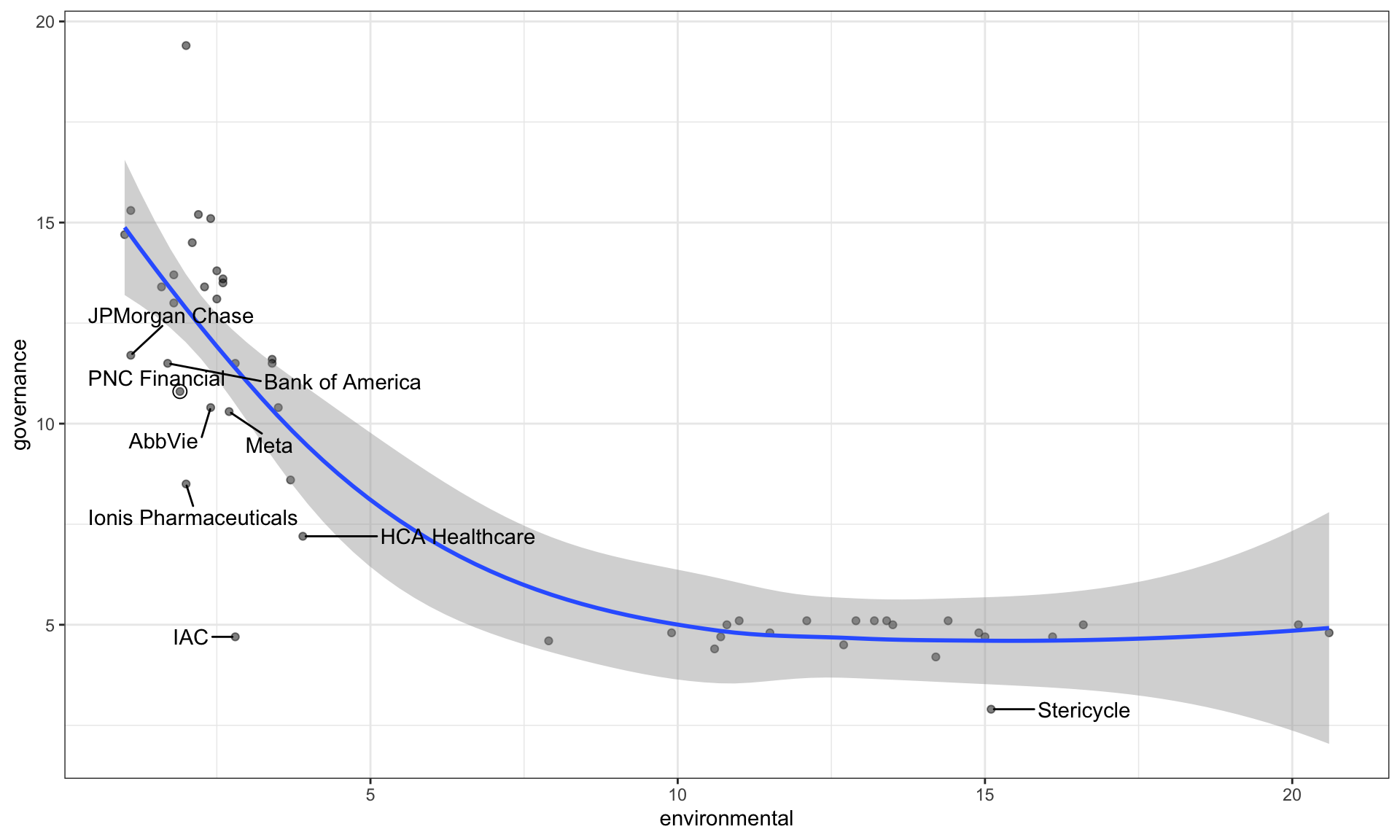
Blank (1)
bottom25_esg_filteredbottom25_esgesg_info
Show answer
Answer: a
Blank (2)
environmentalsocialgovernancetotal_esg
Show answer
Answer: a
Blank (3)
environmentalsocialgovernancetotal_esg
Show answer
Answer: c
Blank (4)
geom_fitgeom_scatterplotgeom_smoothgeom_histogram
Show answer
Answer: c
Environmental Leaders
Which companies qualify as environmental leaders — that is, companies with an environmental risk score below 2.5 whose plotted points lie below the gray ribbon in the figure?
Answer: ______________________________________________
Show answer
JPMorgan Chase, PNC Financial, Bank of America, AbbVie, and Ionis Pharmaceuticals
Governance Leaders
Which companies qualify as governance leaders — that is, companies with an governance risk score below 10 whose plotted points lie below the gray ribbon in the figure?
Answer: ______________________________________________
Show answer
Ionis Pharmaceuticals, HCA Healthcare, IAC, and Stericycle
Relationship
Describe the overall relationship between environmental and governance, in the given plot.
Show answer
Overall, the governance risk score decreases as the environmental risk score increases up to about 10, after which it levels off and remains relatively constant.
This pattern suggests that among companies with weaker overall ESG performance, deterioration in environmental risk is associated with stronger governance up to a threshold, beyond which further changes in environmental risk have little additional correlation with governance risk.
Question 19
How would you describe how the distribution of total_esg varies by sector (sector) using the bottom25_esg_filtered data.frame?
- Note that the
sectorcategories are sorted by the median oftotal_esgin the plot.
Complete the code by filling in the blanks.
ggplot(data = ___(1)___,
       mapping = aes(___(2)___,
                     y = ___(3)___)) +
  ___(4)___() +
  labs(y = "Sector")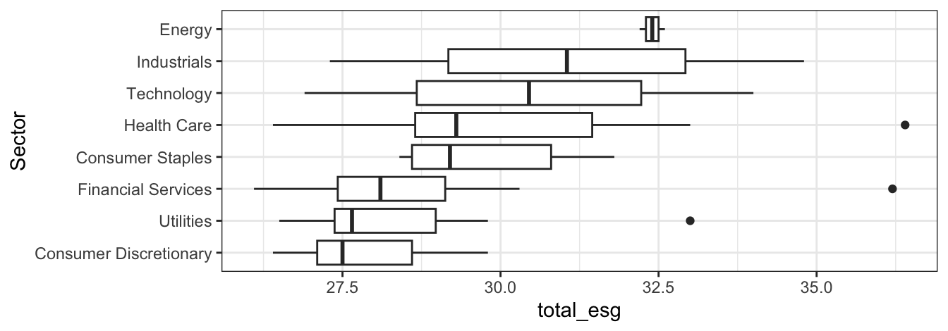
Blank (1)
bottom25_esg_filteredbottom25_esgesg_info
Show answer
a
Blank (2)
x = total_esgy = total_esgx = environmentaly = environmentalx = socialy = socialx = governancey = governance
Show answer
a
Blank (3)
fct_reorder(total_esg, sector)fct_reorder(environmental, total_esg)fct_reorder(total_esg, social)fct_reorder(governance, total_esg)fct_reorder(total_esg, controversy)fct_reorder(sector, total_esg)
Show answer
f
Blank (4)
geom_bargeom_boxgeom_boxplotgeom_histogram
Show answer
c
Question 20


For Question 20, you will use the following R packages and a data.frame named chess_top4, which contains information about chess games played by four of the world’s top online chess players during a special event called “Titled Tuesday” on chess.com. These games were played in a format where each player has 3 minutes to make all their moves, with 1 second added to their clock after each move. The data includes games from October 2022 to October 2024 played only among the following four players:
- Magnus Carlsen
- Hikaru Nakamura
- Alireza Firouzja
- Daniel Naroditsky
Note: Titled Tuesday is a weekly event held every Tuesday on chess.com, where titled chess players (such as Grandmasters and International Masters) compete in online tournaments.
library(tidyverse)
chess_top4 <- read_csv("https://bcdanl.github.io/data/chess_titled_tuesday.csv")
The first 15 observations in the chess_top4 data.frame are displayed below:
| Date | White | Black | Result |
|---|---|---|---|
| 2022-10-11 | Hikaru Nakamura | Magnus Carlsen | White Wins |
| 2022-10-18 | Hikaru Nakamura | Alireza Firouzja | Draw |
| 2022-10-25 | Daniel Naroditsky | Alireza Firouzja | Draw |
| 2022-11-08 | Hikaru Nakamura | Alireza Firouzja | Black Wins |
| 2022-12-13 | Alireza Firouzja | Hikaru Nakamura | Draw |
| 2022-12-20 | Hikaru Nakamura | Alireza Firouzja | White Wins |
| 2022-12-20 | Magnus Carlsen | Hikaru Nakamura | Draw |
| 2023-01-03 | Daniel Naroditsky | Hikaru Nakamura | Black Wins |
| 2023-01-03 | Hikaru Nakamura | Magnus Carlsen | White Wins |
| 2023-01-24 | Hikaru Nakamura | Magnus Carlsen | White Wins |
| 2023-02-28 | Alireza Firouzja | Magnus Carlsen | Draw |
| 2023-02-28 | Hikaru Nakamura | Alireza Firouzja | Draw |
| 2023-02-28 | Hikaru Nakamura | Magnus Carlsen | Draw |
| 2023-02-28 | Magnus Carlsen | Hikaru Nakamura | Draw |
| 2023-03-14 | Hikaru Nakamura | Alireza Firouzja | White Wins |
- The
chess_top4data.frame contains 70 observations and 4 variables, representing 70 unique chess games.
Description of Variables in chess_top4:
Date: The date when the game was played.White: The name of the player who played with the white pieces.Black: The name of the player who played with the black pieces.Result: The outcome of the game, which can be one of the following:- “White Wins” (the player with the white pieces won the game)
- “Black Wins” (the player with the black pieces won the game)
- “Draw” (the game ended in a tie)
Question 20 is about a ggplot code to visualize how the distribution of Result varies among these top 4 chess players.
Part 1
Complete the code by filling in the blanks to replicate the given plot.
- The White player is displayed on the vertical axis.
- The Black player is labeled at the top of each panel.
ggplot(data = chess_top4,
       mapping = aes(___(1)___,
                     fill = ___(2)___)) +
  geom_bar(___(3)___) +
  facet_wrap(___(4)___, ncol = 1) +
  labs(x = "Proportion")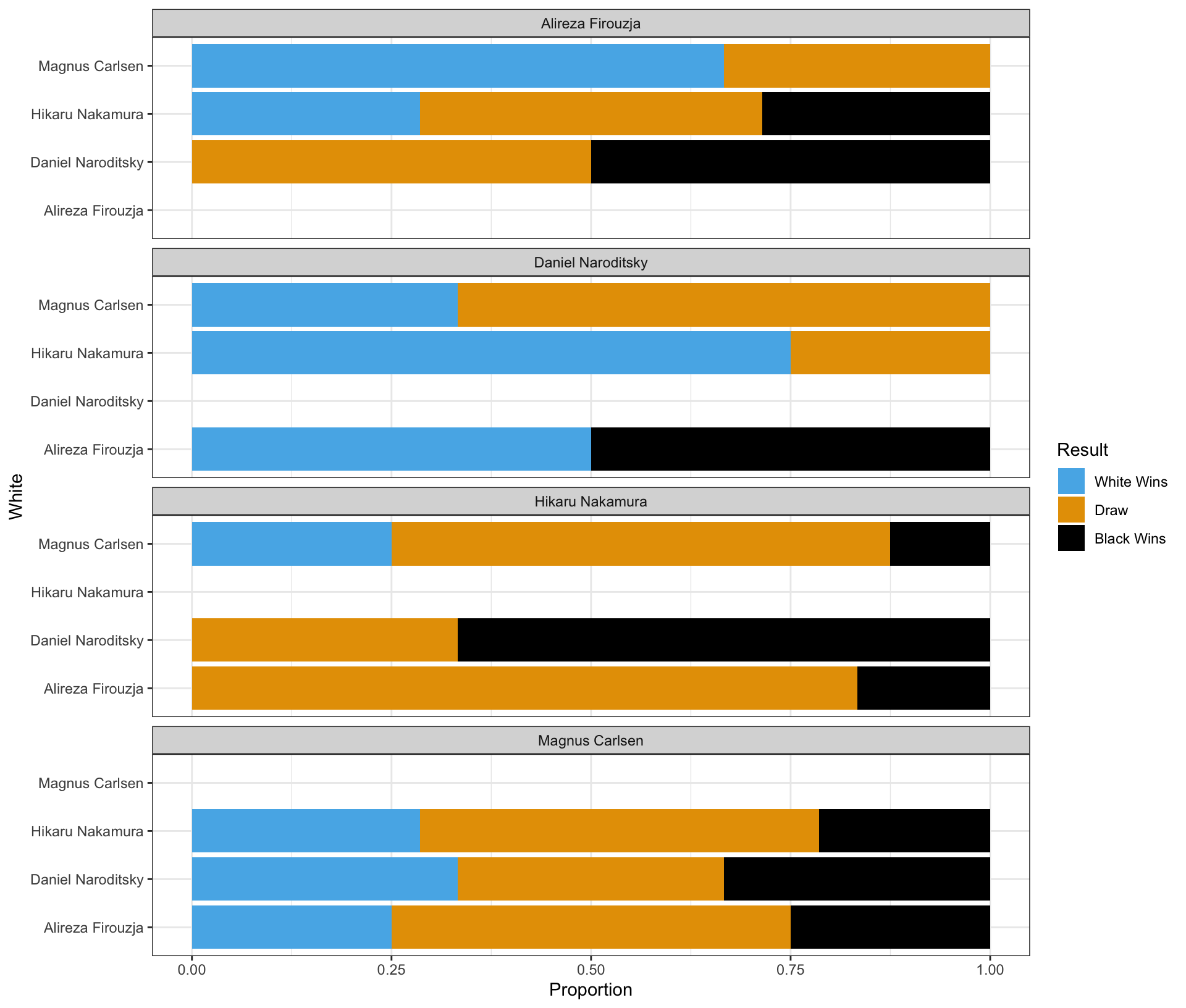
Blank (1)
x = Whitey = Whitex = Blacky = Blackx = Proportiony = Proportion
Show answer
b
Blank (2)
chess_top4WhiteBlackResultcount
Show answer
d
Blank (3)
position = "stack"position = "fill"position = "dodge"- Leaving (3) empty
- Both a and d
- Both b and d
- Both c and d
Show answer
b
Blank (4)
White~WhiteBlack~BlackPlayer~Player- both a and b
- both c and d
- both e and f
- both b and f
- both d and f
Show answer
d
Part 2
Complete the code by filling in the blanks to replicate the given plot.
- The White player is displayed on the vertical axis.
- The Black player is labeled at the top of each panel.
ggplot(data = chess_top4,
       mapping = aes(___(1)___,
                     fill = ___(2)___)) +
  geom_bar(___(3)___) +
  facet_wrap(___(4)___, ncol = 1)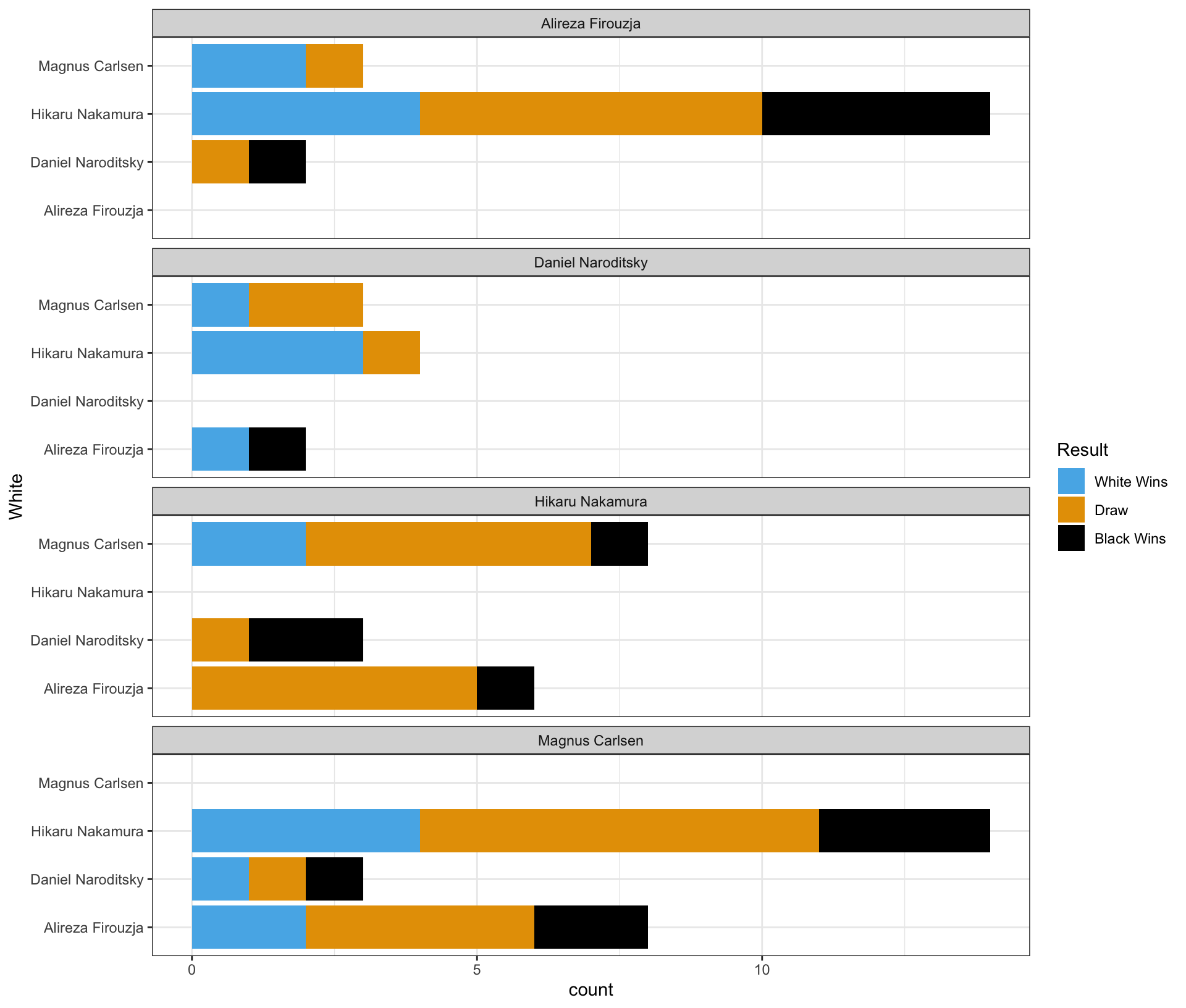
Blank (1)
x = Whitey = Whitex = Blacky = Blackx = county = count
Show answer
b
Blank (2)
chess_top4WhiteBlackResultcount
Show answer
d
Blank (3)
position = "stack"position = "fill"position = "dodge"- Leaving (3) empty
- Both a and d
- Both b and d
- Both c and d
Show answer
e
Blank (4)
White~WhiteBlack~BlackPlayer~Player- both a and b
- both c and d
- both e and f
- both b and f
- both d and f
Show answer
d
Part 3
Complete the code by filling in the blanks to replicate the given plot.
- The White player is displayed on the vertical axis.
- The Black player is labeled at the top of each panel.
ggplot(data = chess_top4,
       mapping = aes(___(1)___,
                     fill = ___(2)___)) +
  geom_bar(___(3)___) +
  facet_wrap(___(4)___, ncol = 1)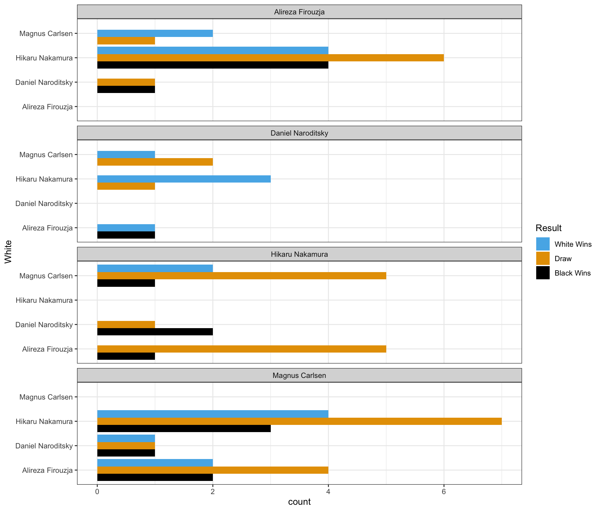
Blank (1)
x = Whitey = Whitex = Blacky = Blackx = county = count
Show answer
b
Blank (2)
chess_top4WhiteBlackResultcount
Show answer
d
Blank (3)
position = "stack"position = "fill"position = "dodge"- Leaving (3) empty
- Both a and d
- Both b and d
- Both c and d
Show answer
c
Blank (4)
White~WhiteBlack~BlackPlayer~Player- both a and b
- both c and d
- both e and f
- both b and f
- both d and f
Show answer
d
Part 4 - Magnus Carlsen vs. Hikaru Nakamura in the Titled Tuesday
Who had more wins in the games where Magnus Carlsen played with the white pieces and Hikaru Nakamura played with the black pieces in the Titled Tuesday?
Answer: ______________________________________________
Show answer
Magnus Carlsen
Who had more wins in the games where Hikaru Nakamura played with the white pieces and Magnus Carlsen played with the black pieces in the Titled Tuesday?
Answer: ______________________________________________
Show answer
Hikaru Nakamura
Who won more games in the encounters between Magnus Carlsen and Hikaru Nakamura in the Titled Tuesday?
Answer: ______________________________________________
Show answer
They had an equal number of wins.
Section 3. Short Essay
Question 21
Explain the “Connection Principle” in the context of line charts and why it is useful for visualizing time-series data.
Show answer
The Connection Principle states that points in a line chart should be visually connected when the data represent a meaningful sequence, such as time. This connection helps viewers naturally perceive trends, patterns, growth, and cycles across periods. It is especially useful in time-series data because it reinforces the idea of continuity and change over time rather than treating each observation as isolated.
Question 22
How does data storytelling bridge the gap between data and insights?
Show answer
Data Storytelling bridges the gap between data and insight by integrating descriptive statistics, data transformation, visualization, and narration within the appropriate audience context to communicate findings effectively and support data-informed decision-making.
Question 23
Provide two main reasons why the log transformation of a variable can be useful.
Show answer
Two main reasons for using a log transformation are:
- It helps reduce skewness in highly right-skewed data, making the distribution more symmetric and the variation easier to see.
- It allows us to interpret changes in percentage terms, which is especially useful for growth rates and economic variables such as income, GDP, stock price, or housing price.
Question 24
Provide at least three techniques to make data visualization more colorblind-friendly.
Show answer
To make visualizations more accessible and colorblind-friendly, consider:
- Using colorblind-friendly color palettes
- Adding non-color cues like
shapeto scatterplots orlinetypeto line charts - Including additional visual cues to highlight important information (e.g., annotations or labels)
- Ensuring strong contrast between colors and between the foreground and background so that elements remain distinguishable.
Question 25
For each of the workplaces represented by our three alumni guest speakers, explain how generative AI is used in their day-to-day work.
Show answer
Across the three alumni workplaces, generative AI is integrated into daily workflows in different but complementary ways.
At the analytics and engineering–focused workplace, many employees (roughly 60–80%) use AI assistants such as Copilot or Claude to support coding, debugging, and data processing. AI significantly speeds up routine analytical tasks, but all outputs still require human review, meaning AI augments rather than replaces analysts.
For a traditional data analyst role, generative AI is commonly used to assist with SQL coding, data summarization, and report drafting. Analysts rely on AI to improve efficiency, but data sensitivity and responsible AI use are essential, so such tools are typically deployed only within secure internal environments.
At the policy and government-related workplace (e.g., the Federal Reserve), the use of public AI tools like ChatGPT is prohibited due to strict data confidentiality rules. Instead, analysts rely on approved internal systems and traditional analytical tools to protect sensitive economic and financial information.
Together, these examples show how generative AI is widely used to increase productivity, while security, privacy, and human oversight remain central across all workplaces.
Social Risk Score